Regression Analysis
Regression models the relationship between a dependent variable and one or more independent variables. This tutorial explains what a regression coefficient means, how RAISINS reports fit and significance, how to check every assumption, and how to run the whole analysis code-free… Read more …
Regression analysis is a widely used statistical technique for studying the relationship between a dependent variable and one or more independent variables. It helps researchers understand how changes in the independent variables influence the dependent variable and enables them to make predictions using the fitted model.
This tutorial introduces the basic concepts of regression analysis, including regression coefficients, model fit, R², the F-test, p-values, and the assumptions of regression. It then provides a step-by-step guide to performing regression analysis in the RAISINS platform. You will learn how to prepare your data, select the dependent and independent variables, use advanced options such as transformations, polynomial and interaction terms, and stepwise selection, interpret the analysis results, check model assumptions, generate publication-ready tables and plots, and use the built-in RA-One AI assistant to better understand your results. No programming knowledge is required.
New to regression analysis? If you would like to strengthen your understanding of the underlying concepts, we recommend reading Chapter 9: Regression Analysis from the Textbook of Agricultural Statistics.
1 What is Regression?
Suppose you collected data from 200 agricultural plots. For each plot, you recorded the crop yield along with the amount of irrigation, fertilizer applied, weed growth, and the harvest month. Now you want to know which of these factors affect crop yield and by how much.
Regression analysis helps answer these questions. It studies the relationship between a dependent variable (the outcome you want to explain or predict) and one or more independent variables (the factors that may influence the outcome).
Regression analysis gives you two useful pieces of information:
- Prediction - It estimates the expected value of the dependent variable for given values of the independent variables.
- Effect estimation - It shows how much the dependent variable changes when an independent variable changes, while keeping all other independent variables constant.
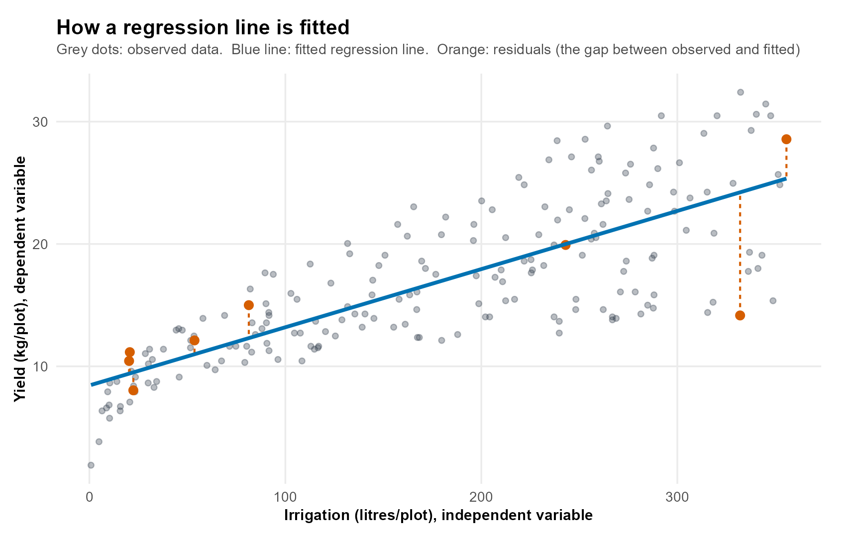
To build the model, RAISINS uses a method called Ordinary Least Squares (OLS). This method finds the line that fits the data best by making the overall gap between the observed values and the values predicted by the model as small as possible. These gaps are called residuals, and they represent the part of the dependent variable that the model cannot explain.
Figure 1 shows what this looks like for a single independent variable. Each grey dot is one observation. The blue line is the fitted regression line. The orange dashed segments are residuals: the vertical distance between an observed point and the line. OLS chooses the line that makes these gaps as small as possible overall.
Behind the scenes (optional): the OLS formula
Most users never need this. In matrix form, OLS estimates the coefficients as:
\[\hat{\beta} = (X'X)^{-1}X'Y\]
This equation gives the least-squares estimates of the regression coefficients. RAISINS computes this automatically; no manual calculation is required.
Regression analysis finds the best-fitting relationship between the dependent variable and one or more independent variables, helping you understand how each independent variable influences the dependent variable and allowing you to make predictions.
1.1 Reading a coefficient
Each independent variable in the model has a coefficient (β). The coefficient shows the expected change in the dependent variable for a one-unit increase in that independent variable, while keeping all other independent variables constant.
- A positive coefficient means the dependent variable increases as the independent variable increases.
- A negative coefficient means the dependent variable decreases as the independent variable increases.
This interpretation always assumes that all other independent variables remain constant. A coefficient never describes an independent variable acting alone; it describes its effect once the others are held fixed.
The intercept (β₀) is the predicted value of the dependent variable when all independent variables are equal to zero. For a categorical variable, it represents the reference category chosen by the model.
\[Y = \beta_0 + \beta_1 X_1 + \beta_2 X_2 + \cdots + \beta_k X_k + \varepsilon\]
1.2 The p-value, in plain language
For each independent variable, RAISINS tests whether it has a real effect on the dependent variable. The p-value answers one question:
If this independent variable actually had no effect on the dependent variable, how likely is it to get a coefficient this large just by chance?
- A large p-value (for example, 0.40) means the observed effect could easily be a coincidence.
- A small p-value (usually less than 0.05) means the independent variable is likely to have a real effect.
In most research, a p-value below 0.05 is treated as statistically significant.
A small p-value does not tell you that an independent variable has a large effect. It only tells you that the observed effect is unlikely to have occurred by chance.
To understand the importance of an independent variable, always consider:
- The coefficient (β) - shows the size and direction of the effect.
- The p-value - shows whether the effect is statistically significant.
- The confidence interval - shows the range within which the true effect is likely to lie.
For example, an independent variable may have a very small coefficient but still be statistically significant if the dataset is large. On the other hand, a large coefficient may not be statistically significant if the dataset is small or the observations are highly variable.
Always interpret the coefficient and the p-value together, rather than relying on the p-value alone.
1.3 Hypothesis testing in regression
For every independent variable included in the regression model, RAISINS performs a hypothesis test to determine whether that variable has a statistically significant relationship with the dependent variable.
The test begins with two hypotheses:
- Null hypothesis (H₀): The independent variable has no effect on the dependent variable. In other words, its regression coefficient is equal to zero.
\[H_0:\beta_i=0\]
- Alternative hypothesis (H₁): The independent variable does affect the dependent variable, so its regression coefficient is not equal to zero.
\[H_1:\beta_i\neq0\]
The p-value helps decide which hypothesis is supported by the data.
- If p < 0.05, the null hypothesis is rejected, suggesting that the independent variable has a statistically significant effect on the dependent variable.
- If p ≥ 0.05, there is insufficient evidence to reject the null hypothesis, indicating that the observed effect could simply be due to random variation.
Remember that failing to reject the null hypothesis does not prove that the independent variable has no effect. It only means that the available data do not provide enough evidence to conclude that an effect exists.
2 Simple or Multiple Regression?
RAISINS supports both Simple Linear Regression (SLR) and Multiple Linear Regression (MLR). The type of regression depends only on the number of independent variables selected for the analysis.
| Regression Type | Independent Variables | Typical Question |
|---|---|---|
| Simple Linear Regression (SLR) | One | How does crop yield change with irrigation? |
| Multiple Linear Regression (MLR) | Two or more | How do irrigation, fertilizer, weed growth, and harvest month together influence crop yield? |
Simple Linear Regression examines the relationship between a dependent variable and a single independent variable. It is useful when you want to study the effect of one factor at a time.
Multiple Linear Regression includes two or more independent variables in the same model. This allows you to estimate the effect of each independent variable while keeping the remaining independent variables constant, making it possible to evaluate the contribution of each factor separately.
One challenge in Multiple Linear Regression is multicollinearity, which occurs when two or more independent variables are highly correlated and provide similar information. This can make it difficult to estimate the individual effect of each variable accurately. RAISINS automatically checks for multicollinearity using the Variance Inflation Factor (VIF/GVIF) in the Assumptions tab.
Independent variables do not have to be numeric. Categorical variables, such as harvest month, can also be included in the regression model.
RAISINS automatically converts categorical variables into the required format using dummy coding. One category is selected as the reference category, and the remaining categories are compared against it.
In the example dataset, the harvest months are April, July, June, and March. Since April comes first alphabetically, it becomes the reference category. Therefore, the coefficient for July represents the expected difference in crop yield between July and April, while keeping all other independent variables constant.
The reference category is represented by the intercept and therefore does not appear as a separate coefficient in the output.
3 Getting to the Module
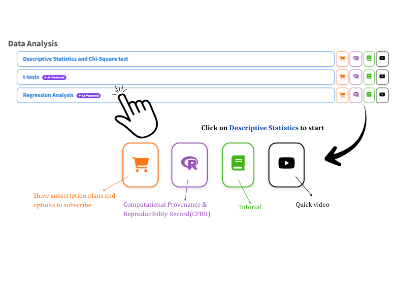
Open the RAISINS home page at www.raisins.live and go to Data Analysis section. Select the Regression Analysis module (Figure 2).
No programming knowledge is required. You upload your data, select the dependent and independent variables, and RAISINS performs the complete analysis and produces publication-ready output.
3.1 Computational Provenance & Reproducibility Record
CPRR (Computational Provenance & Reproducibility Record) provides a transparent and comprehensive record. Click on the icon shown in Figure 2 to access CPRR and know about the computational workflow performed during the analysis. The record for this module states the R version and the exact version of every package used, names the specific function behind each reported result. CPRR lists every default parameter and decision rule applied by the module and provides fully runnable R code that reproduces each analytical step. Users can execute the code in R to independently reproduce and verify the results. It carries its own DOI.
To cite the platform itself in a paper, thesis, or report, use the RAISINS citation, available in APA, Harvard, and BibTeX formats at www.raisins.live/citation.html. That is the primary reference, and for most manuscripts it is all you need.
The CPRR for the regression analysis module is at www.raisins.live/module_record/reg.html.
Cite the RAISINS paper as your primary reference for the platform. Add the CPRR as supporting documentation when a journal asks for details of the computing environment, or when you want your methods section to be precise about versions and functions rather than saying “analysis was carried out using an online tool.” The CPRR supports the citation and ensures computational reproducibility.
4 Preview Mode and Quick Tour
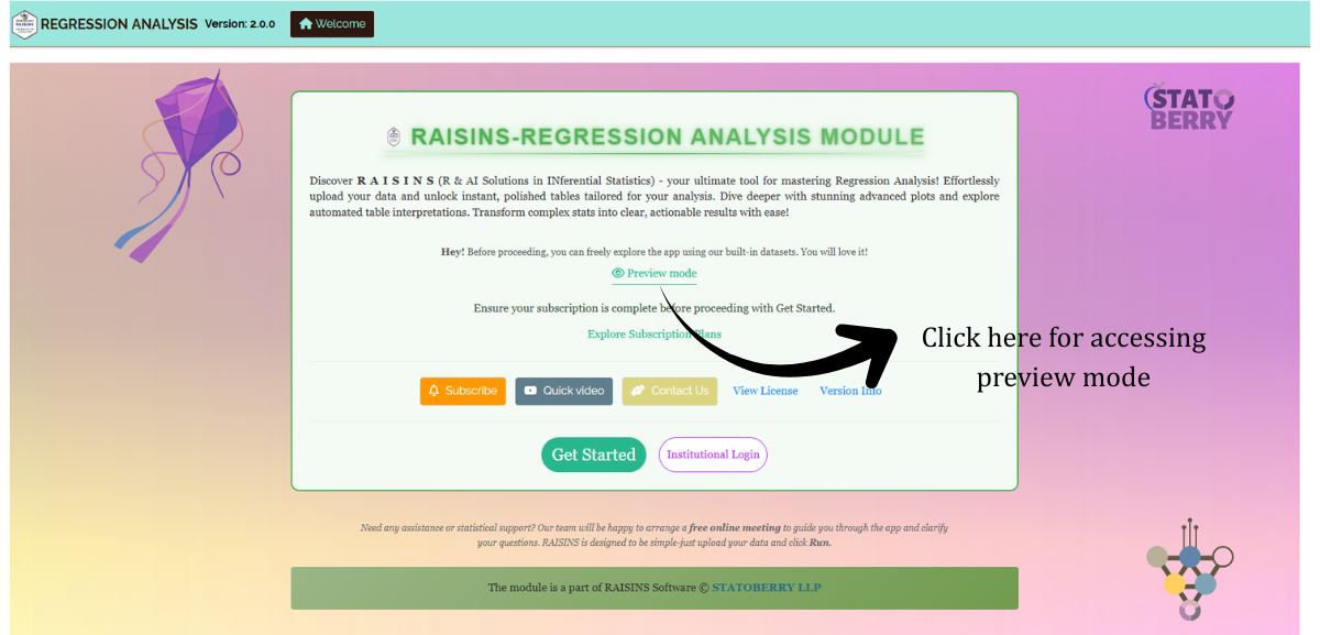
You can explore the entire module before subscribing by using Preview mode on the Welcome page. It loads built-in datasets, so you can try every feature, including the analysis, the assumption checks, and the plots, without uploading your own data.
First-time users are also offered a Quick Tour. This is an interactive, step-by-step walkthrough that highlights each tab and control and explains what it does. You can replay it at any time from the Quick Tour tab in the top navigation.
5 The Example Dataset
This tutorial uses an agricultural dataset containing 200 plots. The same dataset is available from the Datasets tab.
The dependent variable is yield, measured in kg/plot. The four independent variables are:
- irrigation (litres/plot) - the amount of water applied.
- NPK (kg/ha) - the fertilizer dose.
- weedgrowth - a score representing weed pressure.
- harvest - a categorical variable with four levels (april, july, june, march).
The objective is to find out which of these factors influence crop yield, and by how much, after accounting for the others.
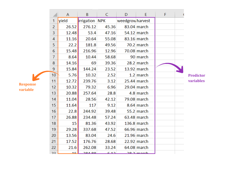
Note that the dataset contains both numeric and categorical independent variables. RAISINS applies dummy coding to the categorical variable automatically. The data layout is shown in Figure 4.
- Prepare your dataset.
- Upload the data.
- Select the dependent and independent variables.
- Run the analysis.
- Examine the coefficients and model statistics.
- Check the regression assumptions.
- Review the diagnostic plots.
- Interpret the results.
- Export the tables and figures.
The sections below walk through each of these steps in detail.
6 Preparing Your Data
The quality of your analysis depends on the quality of your data. RAISINS provides four ways to prepare a correctly formatted dataset:
- Create it in MS Excel.
- Build it inside the app using Create Data.
- Download a built-in Model dataset and use it as a reference.
- Generate it through the RA-One chat assistant.
6.1 Preparing Data in MS Excel
Open a new Excel workbook containing a single sheet. Arrange the data in columns: one column for the dependent variable, and one column for each independent variable. Each row represents one observation.
Numeric independent variables must contain only numbers. Categorical independent variables, such as harvest month, should be entered as consistent text labels. RAISINS will dummy-code them automatically.
Save the file in CSV, XLS or XLSX format. CSV is recommended because it is smaller and loads faster. Avoid blank rows above the data and extra spaces in column names. Refer to Figure 4 for the required layout.
Dataset creation rules
- Column naming - do not use spaces. Use underscores (
_) or dots (.), and avoid symbols such as % and #. Always begin a column name with a letter. - Data arrangement - start at the upper-left corner of the sheet. The row above the data must not be blank.
- Cell management - do not type or delete in empty cells. If needed, select them, right-click, and choose Clear Contents.
- Column relevance - give every column a meaningful name, and remove columns you will not analyse.
- Numeric and categorical columns - the dependent variable and the numeric independent variables must contain only numbers. Entries such as “NA” or ” - ” will cause errors. Categorical independent variables should use consistent text labels, such as “april” and “july”, with no trailing spaces.
How to save as CSV in MS Excel
- Open your workbook, with the data on a single sheet and correctly arranged.
- File → Save As / Save a Copy, then choose a location.
- Save as type → CSV (Comma delimited) (*.csv).
- Name the file without spaces. Use underscores instead.
- Save.
💡 Tip: before saving, confirm that the data is on the first and only sheet, the numeric columns are clean, and the categorical labels are consistent.
6.2 Creating Data Inside RAISINS
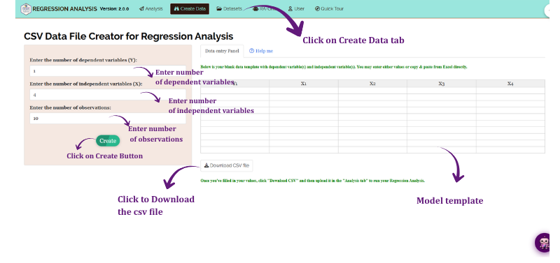
If you are unsure about the required format, RAISINS can generate a template for you:
- Go to the Create Data tab.
- Select the number of Dependent and Independent Variables.
- Select the number of Observations, which is the number of rows.
- Click Create.
The generated layout is shown in Figure 5. Enter your values in the template directly or download the template as a CSV file and enter the values in the downloaded CSV file, then upload it in the Analysis tab.
6.3 Downloading Model Datasets
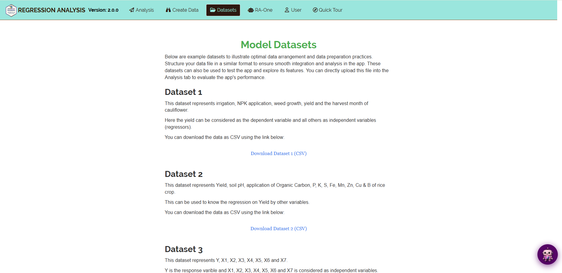
To explore the module before using your own data, download a ready-made example:
- Go to the Datasets tab.
- Click the Download CSV link for the dataset you want.
- Use it as a formatting reference, or upload it directly to run the analysis.
6.4 Creating a Dataset Using RA-One
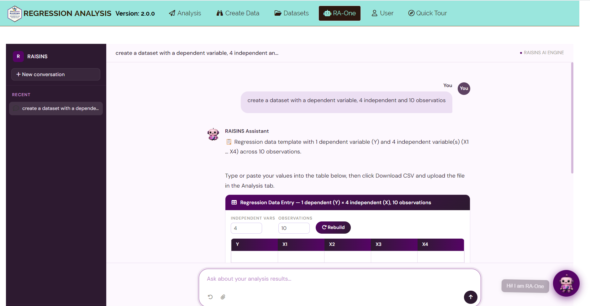
RA-One, the built-in chat assistant, can create a correctly formatted dataset through a simple conversation.
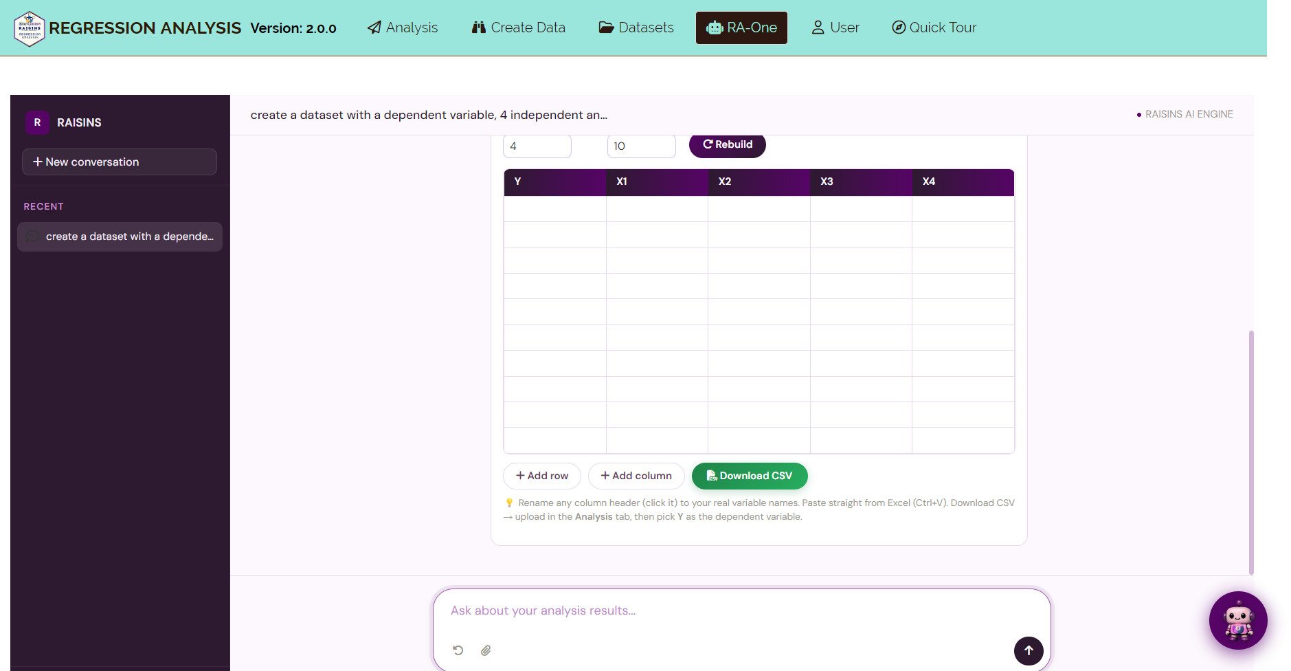
Open RA-One from its navigation tab or from the floating chat bubble. Tell it how many independent variables and how many observations you need, and it generates a template in the required format. Review the template in the chat, download the CSV file, and upload it in the Analysis tab (Figure 7).
7 The Analysis Tab
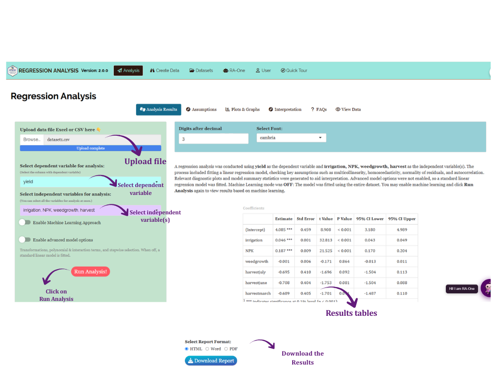
The Analysis tab is where the regression model is fitted (Figure 8).
Click Browse in the sidebar to upload your CSV or Excel file. Two selectors then appear:
- Dependent variable (Y) - select the outcome you want to explain or predict.
- Independent variable(s) (X) - select one variable for Simple Linear Regression, or two or more for Multiple Linear Regression.
If required, enable Advanced Model Options to apply a transformation, add polynomial or interaction terms, or use stepwise selection. These options are covered in detail in Section 12, after you have learned how to check the model assumptions they are often used to fix.
Click Run Analysis. The results appear immediately across the sub-tabs: Analysis Results, Assumptions, Plots & Graphs, Interpretation, FAQs and View Data.
You can also set the number of decimal digits and the font used in the output tables.
8 Analysis Results
The Analysis Results sub-tab presents three tables that together describe the fitted model: the Model Coefficients, the Model Statistics, and the ANOVA table.
Plain R² always increases, or stays the same, when you add another independent variable, even one that has no real relationship with the dependent variable. This makes it a poor way to compare models with different numbers of independent variables.
Adjusted R² corrects for this by penalising extra independent variables that do not improve the model. When you are deciding between two candidate models, compare their Adjusted R² rather than their R².
8.1 Table 1: Model Coefficients
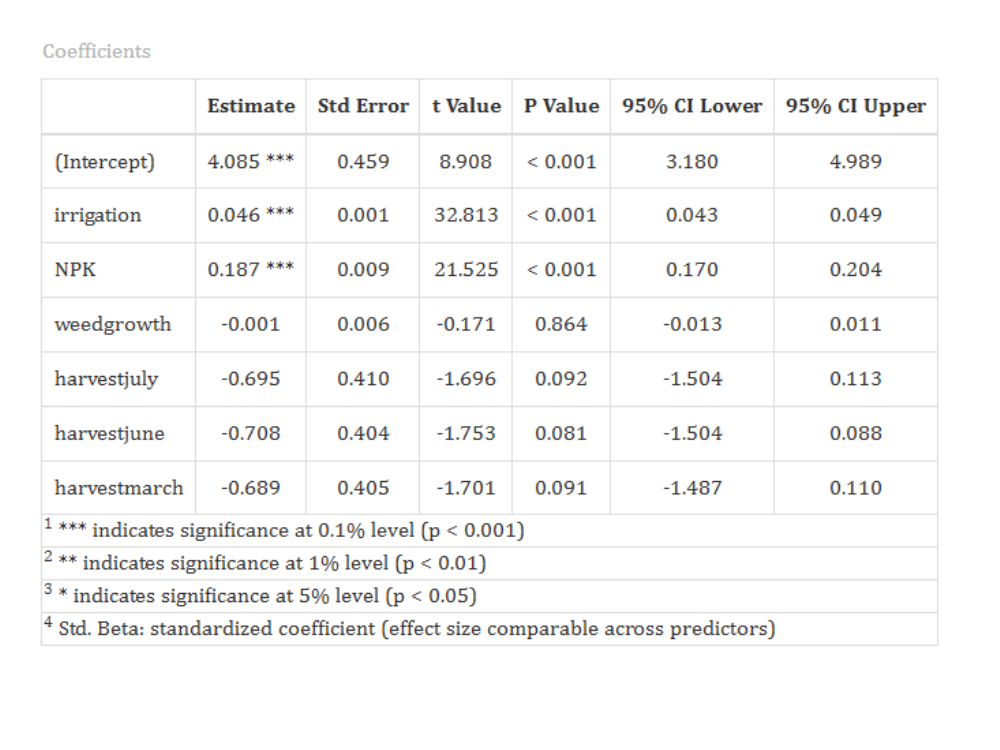
For every term in the model, this table reports the estimated coefficient (β), its standard error, the t-value, and the p-value. The p-value tests whether the true coefficient is equal to zero.
Significance stars are shown next to each estimate. Very small p-values are displayed as “< 0.001” rather than as a rounded value of 0.000.
Understanding the coefficients table
| Column | Meaning |
|---|---|
| Estimate (β) | The change in the dependent variable for a one-unit increase in the independent variable, with the other variables held constant |
| Std. Error | The precision of the estimate. A smaller value indicates a more precise estimate |
| t Value | Estimate ÷ Std. Error. Tests whether the coefficient differs from zero |
| P Value | The probability of obtaining a t-value this extreme if the coefficient were truly zero |
| Significance | *** p < 0.001 · ** p < 0.01 · * p < 0.05 · (blank) not significant |
| 95% CI Lower / Upper | The range within which the true coefficient is likely to lie, with 95% confidence |
| Std. Beta | The coefficient rescaled to standard-deviation units, so it can be compared across independent variables measured in different units |
The t-value reported in the table is calculated as:
\[t = \frac{\hat{\beta}}{SE(\hat{\beta})}\]
The 95% confidence interval shown for each coefficient is calculated as:
\[\hat{\beta} \pm t_{\alpha/2}\, SE(\hat{\beta})\]
A confidence interval that does not contain zero agrees with a p-value below 0.05; both are two views of the same test.
The Estimate (β) column is in the original units of each independent variable, so a coefficient of 0.046 for irrigation (litres/plot) and a coefficient of 0.187 for NPK (kg/ha) cannot be compared directly; the units differ.
Std. Beta rescales every coefficient to standard-deviation units, as if all variables had been standardized before fitting. This makes the coefficients directly comparable: the independent variable with the largest Std. Beta has the strongest relative effect on the dependent variable in this dataset.
Use the ordinary Estimate to describe the size of an effect in real-world units (for a report or a recommendation). Use Std. Beta only to compare which independent variables matter most relative to each other, not to describe the effect in real units.
Interpretation of Figure 9
Once the coefficients are estimated, the model predicts the dependent variable as:
\[\hat{Y} = \hat{\beta}_0 + \hat{\beta}_1 X_1 + \cdots + \hat{\beta}_p X_p\]
For the example dataset, the fitted model is:
\[\widehat{\text{yield}} = 4.085 + 0.046\,(\text{irrigation}) + 0.187\,(\text{NPK}) - 0.001\,(\text{weedgrowth}) + \text{harvest contrasts}\]
Irrigation has the strongest effect (β = 0.046, SE = 0.001, t = 32.81, p < 0.001). Each additional litre of water per plot increases yield by about 0.046 kg/plot. An additional 100 litres therefore increases yield by approximately 4.6 kg.
NPK is also highly significant (β = 0.187, SE = 0.009, t = 21.53, p < 0.001). Each additional kg/ha of fertilizer increases yield by about 0.19 kg/plot.
Weedgrowth is not significant (β = -0.001, t = -0.17, p = 0.864). After accounting for irrigation and fertilizer, weed pressure shows no independent effect in this dataset.
The harvest coefficients are compared against April, which is the reference category. July (β = -0.70, p = 0.092), June (β = -0.71, p = 0.081) and March (β = -0.69, p = 0.091) are all slightly above the 0.05 threshold. There is therefore only weak evidence that harvest month affects yield.
The intercept (4.085, p < 0.001) is the expected yield for an April plot with zero irrigation, zero NPK and zero weed growth.
Each coefficient is a partial effect. It shows the change in yield for a one-unit change in that independent variable, while all the other independent variables are held constant.
An independent variable may be statistically significant but have very little practical value. An important effect may also fail to reach significance in a small dataset. Always consider the size of the coefficient together with the p-value.
8.2 Using the model for prediction
Once a model is fitted, you can use it to predict the dependent variable for new combinations of the independent variables, simply by substituting values into the fitted equation.
Suppose a new plot has:
- Irrigation = 100 litres/plot
- NPK = 60 kg/ha
- Weed growth = 15
- Harvest = July
Substituting these values into the fitted model gives:
\[\hat{Y} = 4.085 + 0.046(100) + 0.187(60) - 0.001(15) - 0.695 \approx 19.2 \text{ kg/plot}\]
The predicted yield for this plot is approximately 19.2 kg/plot. RAISINS calculates predictions internally using full numerical precision, so its answer (19.16 kg/plot) is very slightly different from a manual recalculation using the rounded coefficients shown in the table; the difference here is smaller than the model’s own prediction error.
This single number is the model’s best estimate, but it does not describe how much an individual prediction could vary. A prediction interval (as distinct from the confidence interval discussed earlier) gives a range within which a single new observation is likely to fall, and it is always wider than the confidence interval for the average, because it accounts for the natural variation between individual plots, not just the uncertainty in the fitted line.
8.3 Table 2: Model Statistics
Understanding model statistics
| Statistic | Meaning |
|---|---|
| R² | The proportion of variation in the dependent variable explained by the model. It ranges from 0 to 1, and a higher value indicates a better fit |
| Adjusted R² | R² adjusted for the number of independent variables. It is the fairer measure when comparing models |
| Residual Std. Error | The typical size of a prediction error, in the units of the dependent variable |
| PRESS | The leave-one-out prediction error sum of squares. A lower value indicates better prediction for new observations |
R² is calculated from the sums of squares in the ANOVA table:
\[R^2 = 1 - \frac{SS_{Residual}}{SS_{Total}}\]
Adjusted R² applies a penalty based on the sample size (n) and the number of independent variables (p):
\[R^2_{adj} = 1 - (1 - R^2)\,\frac{n-1}{n-p-1}\]
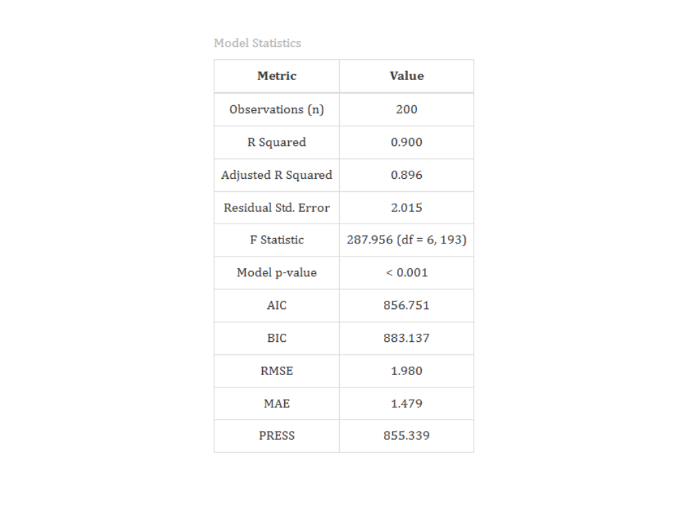
Interpretation of Figure 10
The model explains about 90% of the variation in crop yield (R² = 0.8995). The Adjusted R² is 0.8964, which is only slightly lower. This indicates that the fit is genuine, and not simply the result of adding more independent variables.
The residual standard error is 2.015 kg/plot, with 193 degrees of freedom. This is the typical size of a prediction error, and it is small compared with the mean yield of approximately 16.8 kg/plot.
A high R² indicates a good fit, but it does not confirm that the model is correct. The model assumptions must also be checked. In this example, those checks reveal an important issue.
8.4 Table 3: ANOVA Table
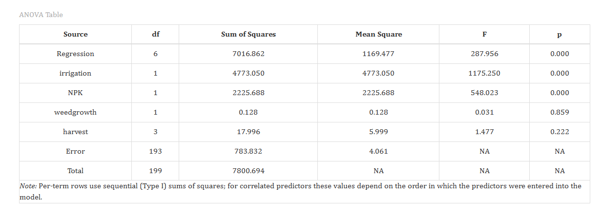
The ANOVA table divides the total variation in the dependent variable into the portion explained by the model and the unexplained residual portion. The overall F-test examines whether the model performs better than a model containing no independent variables.
A footnote below the table indicates that the individual rows use sequential (Type I) sums of squares. This means the contribution of each independent variable depends on the order in which it entered the model.
Sequential (Type I) sums of squares are appropriate when the order of entry is meaningful or specified in advance, as is often the case in a planned experiment. For unbalanced observational studies, where the independent variables are correlated and no natural entry order exists, researchers may instead prefer Type II or Type III sums of squares, which evaluate each independent variable’s contribution after accounting for all the others.
The F-statistic compares the variance explained by the model with the residual variance:
\[F = \frac{MS_{Regression}}{MS_{Residual}}\]
A large F-value, paired with a small p-value, indicates that the independent variables jointly explain a meaningful share of the variation in the dependent variable.
Interpretation of Figure 11
The overall model is highly significant (F₆,₁₉₃ = 287.96, p < 0.001). The four independent variables together explain a substantial share of the variation in yield.
Examined sequentially, irrigation accounts for the largest share (SS = 4773.05, F = 1175.25, p < 0.001), followed by NPK (SS = 2225.69, F = 548.02, p < 0.001).
Weedgrowth contributes very little once irrigation and NPK are included (SS = 0.13, F = 0.03, p = 0.859). Harvest is also not significant (SS = 18.00 with 3 df, F = 1.48, p = 0.222).
The residual mean square is 4.06 with 193 degrees of freedom. This is the baseline variance used in every standard error and F-ratio in the analysis.
These results agree with the coefficient table. Irrigation and fertilizer are associated with yield, while weed growth and harvest month are not.
Regression identifies statistical relationships between the independent variables and the dependent variable. It does not, by itself, establish that one causes the other.
In this example, plots that received more irrigation and fertilizer also tended to produce a higher yield. That is a strong association, well supported by the data. Concluding that irrigation and fertilizer cause higher yield additionally requires that the data come from a properly controlled experiment, or a study design that rules out other explanations. Treat regression results as evidence of association unless the study design specifically supports a causal claim.
9 Assumptions of Regression
Linear regression relies on several assumptions. Moderate violations may have little practical impact, whereas severe violations can affect estimation, hypothesis testing, or prediction. RAISINS provides a formal statistical test and a diagnostic plot for each assumption, so you can verify them directly rather than assuming they hold.
Formally, OLS assumes that the residuals (\(\varepsilon\)) satisfy:
\[E(\varepsilon) = 0\]
\[Var(\varepsilon) = \sigma^2\]
\[Cov(\varepsilon_i, \varepsilon_j) = 0 \quad \text{for } i \neq j\]
\[\varepsilon \sim N(0, \sigma^2)\]
In words: the residuals average to zero, their spread is constant across observations (homoscedasticity), they are uncorrelated with each other (independence), and they follow a normal distribution. The table below shows how each assumption is checked in RAISINS.
| Assumption | What it means | RAISINS check | What to do if it fails |
|---|---|---|---|
| Linearity | The relationship between the variables is linear | Residuals vs Fitted plot | Add polynomial or interaction terms, or apply a transformation |
| Independence | The residuals are not correlated with each other | Durbin-Watson test and ACF plot | Important for data ordered in time or space. Requires a change in study design |
| Homoscedasticity | The residual variance is constant across fitted values | Non-constant variance (Breusch-Pagan) test and Scale-Location plot | Transform the dependent variable, or use robust standard errors |
| Normality of residuals | The residuals are approximately normally distributed | Shapiro-Wilk test and Normal Q-Q plot | Most important in small samples. Try a transformation |
| No multicollinearity | The independent variables are not highly correlated | VIF / GVIF table | Remove or combine the redundant independent variables |
Heteroscedasticity and non-linearity are the most serious. They distort the standard errors and can bias the coefficients.
Normality matters mainly in small samples. In large samples, the Central Limit Theorem protects the tests.
Independence is critical only when the observations are ordered in time or space.
Multicollinearity does not affect prediction. It only makes the interpretation of individual coefficients less reliable.
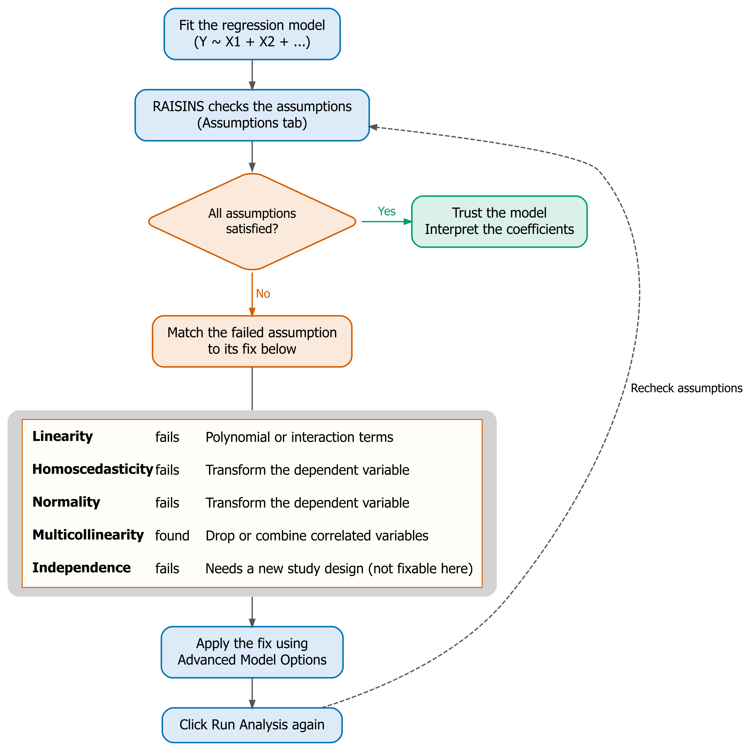
Figure 12 puts the whole cycle in one picture: fit the model, check the assumptions, and if one fails, match it to its fix in Advanced Model Options (Section 12) before re-running the analysis.
10 Checking Assumptions in RAISINS
The Assumptions sub-tab contains the formal statistical tests that validate your model. Each test is accompanied by a plain-language interpretation.
The matching diagnostic plots, which are Residuals vs Fitted, Normal Q-Q, Scale-Location, Residuals vs Leverage, and the ACF plot, are located in the Plots & Graphs tab (Section 11). There they share the same customization and export options as every other plot.
10.1 Multicollinearity (VIF / GVIF)
Multicollinearity occurs when independent variables are highly correlated with each other. RAISINS measures it using the Variance Inflation Factor (VIF). For an independent variable \(X_j\):
\[VIF_j = \frac{1}{1 - R_j^2},\]
where \(R_j^2\) is the R² obtained by regressing \(X_j\) on all the other independent variables. As a general rule, a VIF above 5 indicates a problem.
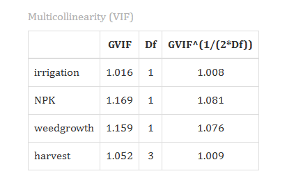
When a categorical independent variable is included in the model, RAISINS reports the generalized form, GVIF. The Assumptions tab then displays three columns:
- GVIF - the raw value.
- Df - the degrees of freedom of that variable.
- Standard GVIF - the value rescaled as GVIF^(1/(2·Df)), so that a single threshold applies regardless of the degrees of freedom.
Compare the Standard GVIF against approximately 2.24, or square it and compare it against the familiar value of 5.
The downloadable report displays only the Standard GVIF column. Its values are therefore the square roots of the raw GVIF values shown on screen. These are the same results expressed on two different scales.
Interpretation of Figure 13
In the example dataset, all values are close to 1. The raw GVIF values are 1.02 for irrigation, 1.17 for NPK, 1.16 for weedgrowth, and 1.05 for harvest with 3 df. The corresponding Standard GVIF values are 1.008, 1.081, 1.076 and 1.009.
Multicollinearity is therefore not a concern. The four independent variables provide distinct information, and their individual coefficients can be interpreted with confidence.
10.2 Homoscedasticity (Non-Constant Variance Test)
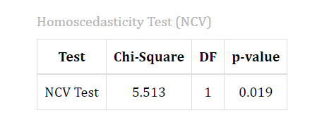
Regression assumes that the residuals have constant variance across all fitted values. The non-constant variance test, also known as the Breusch-Pagan test, checks this assumption.
A p-value below 0.05 indicates heteroscedasticity, which means the spread of the residuals changes across the range of fitted values. This distorts the standard errors, even though the coefficients themselves remain unbiased.
Interpretation of Figure 14
In the example dataset, the test returns χ²(1) = 5.51, p = 0.019. Since the p-value is below 0.05, this model does show heteroscedasticity.
The usual remedy is to apply a variance-stabilizing transformation to the dependent variable, such as a logarithm or a square root, using Advanced Model Options (Section 12). Re-run the analysis after applying the transformation, and check whether the test result improves.
10.3 Normality of Residuals (Shapiro-Wilk Test)
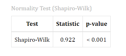
The Shapiro-Wilk test checks whether the residuals follow an approximately normal distribution. It is used for samples of 3 to 5000 observations. For larger samples, RAISINS automatically applies the Jarque-Bera test, which serves the same purpose.
Interpretation of Figure 15
In the example dataset, the test returns W = 0.922, p < 0.001. This indicates that the residuals depart from normality.
This is not a serious problem here. With 200 observations, the Central Limit Theorem protects the coefficient tests. Normality tests also become very sensitive at large sample sizes, and often detect departures that have little practical effect.
Review this result together with the Normal Q-Q plot in the Plots & Graphs tab, which gives a clearer visual assessment. The transformation used to correct heteroscedasticity will often improve normality as well.
10.4 Independence of Residuals (Durbin-Watson Test)
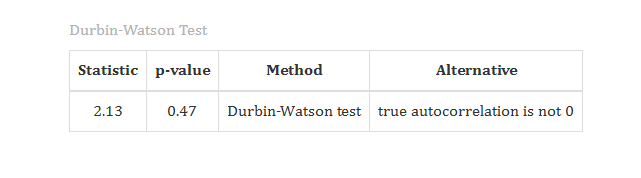
The Durbin-Watson test checks whether the residuals are correlated with each other, which is known as autocorrelation. The statistic ranges from 0 to 4:
- A value close to 2 indicates that the residuals are independent.
- A value below about 1.5 suggests positive autocorrelation.
- A value above about 2.5 suggests negative autocorrelation.
RAISINS reports a p-value along with the statistic, and its written conclusion is based on that p-value.
Interpretation of Figure 16
In the example dataset, DW = 2.13 with p = 0.472. The independence assumption is therefore satisfied.
For field data collected across separate plots, this test usually serves as a confirmatory check.
10.5 Influence and Outlier Diagnostics
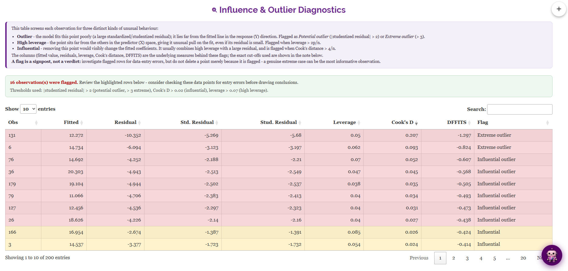
The Assumptions tab also reports an Influence and Outlier Diagnostics table (Figure 17). It identifies three different types of unusual observation:
- Outlier - an observation with a large residual. Its value of the dependent variable is unusual.
- High leverage point - an observation with an unusual combination of independent variable values.
- Influential point - an observation that noticeably changes the fitted model.
For each observation, the table reports the fitted value, the raw residual, the standardized and studentized residuals, the leverage (\(h_{ii}\)), Cook’s distance, and DFFITS. It also assigns a plain-language Flag, such as “Potential outlier”, “High leverage” or “Influential”.
The cutoff values used are shown in a note above the table: a leverage greater than 2p/n, and a Cook’s distance greater than 4/n. The complete table can be downloaded as a CSV file.
Interpretation of Figure 17
In the example dataset, n = 200 and p = 7. The cutoffs are therefore a leverage above 0.07 and a Cook’s distance above 0.02.
16 of the 200 plots are flagged: 7 influential outliers, 5 influential points, 2 extreme outliers and 2 high leverage points.
This number may appear large, but the 4/n rule is intentionally sensitive. The largest Cook’s distance is 0.21, which is far below the conventional threshold of 1. No single plot is controlling the model.
A flag indicates that an observation should be reviewed. It does not mean the observation is wrong.
A flagged point may be a data entry error, which should be corrected or removed. It may also be a genuine extreme value that should be retained. Never delete observations only because they are flagged. Where the result is affected, report the model both with and without the observation.
11 Plots and Graphs
The Plots & Graphs tab contains the complete set of visualizations. Select a plot using the row of icon buttons. The selected plot appears below, with a gear icon (Plot Settings) in the corner for customization.
Every plot can be customized. You can change the title, the axis labels, the colours, the point size and the theme. Every plot can also be downloaded in PNG, JPEG, TIFF, PDF or SVG format, at a resolution you choose.
The default settings are publication-ready and use a colourblind-safe palette (Okabe-Ito), so the figures are clear and accessible without any adjustment.
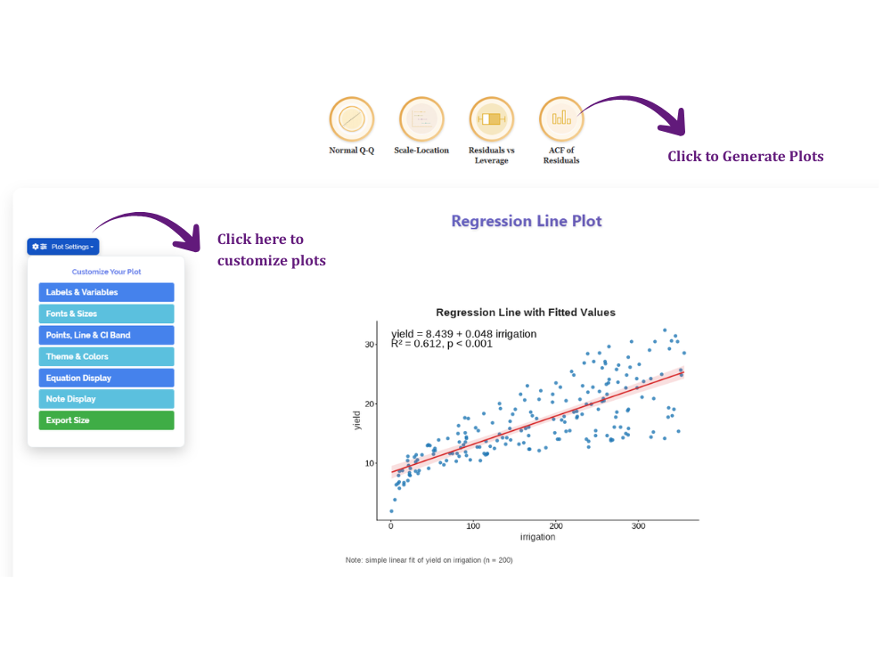
The tab contains two groups of plots. Model plots help you understand the fitted relationship. Diagnostic plots help you check the assumptions described in Section 10.
Hover over any thumbnail below to see what it displays.
No single diagnostic plot should be interpreted in isolation. Each one is sensitive to a different assumption, and a model can pass one check while failing another. Review Residuals vs Fitted, Normal Q-Q, Scale-Location and Residuals vs Leverage together, alongside the formal tests in the Assumptions tab, before deciding whether the model is adequate.
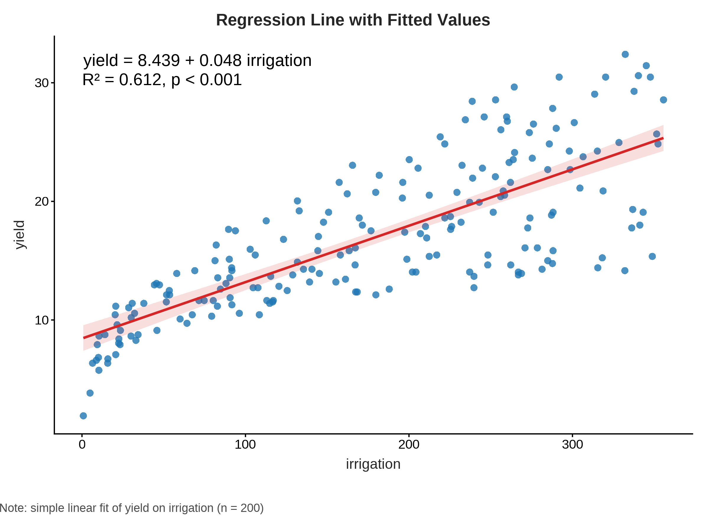
Regression line. A scatter plot of the dependent variable against a chosen independent variable, with the fitted line and confidence band. It shows the direction and strength of the relationship.
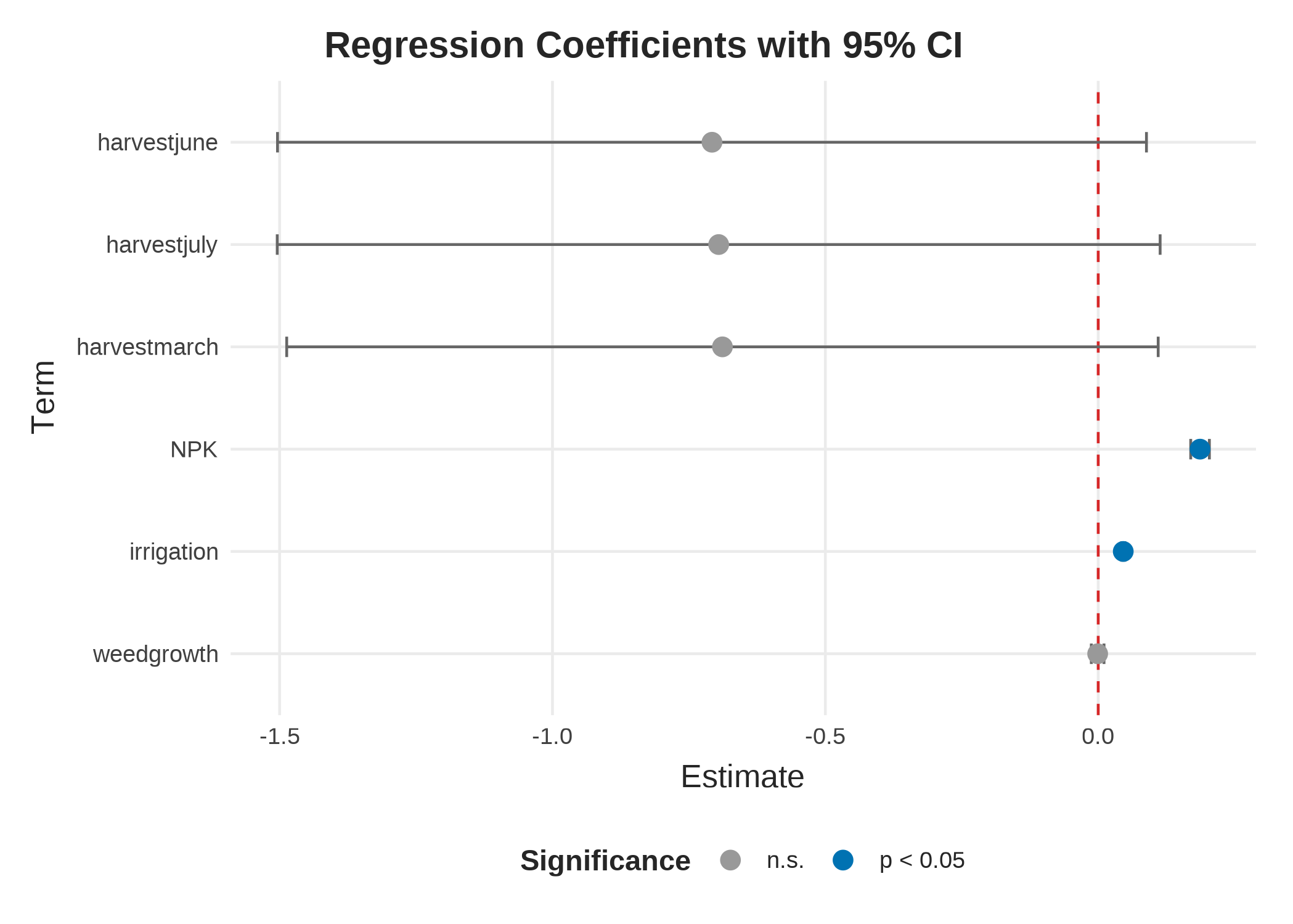
Coefficient plot. Each coefficient is shown as a point with its 95% confidence interval. Intervals that cross zero are not significant.
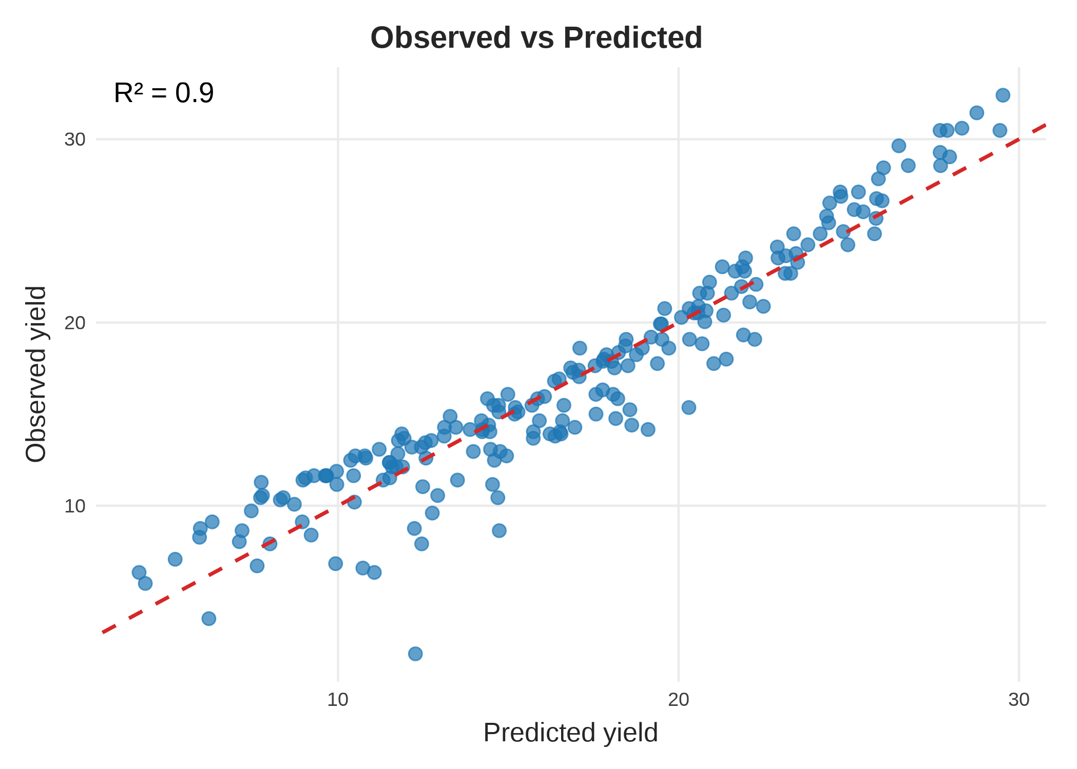
Observed vs Predicted. The actual values plotted against the predicted values. Points close to the 45° line indicate a good fit.
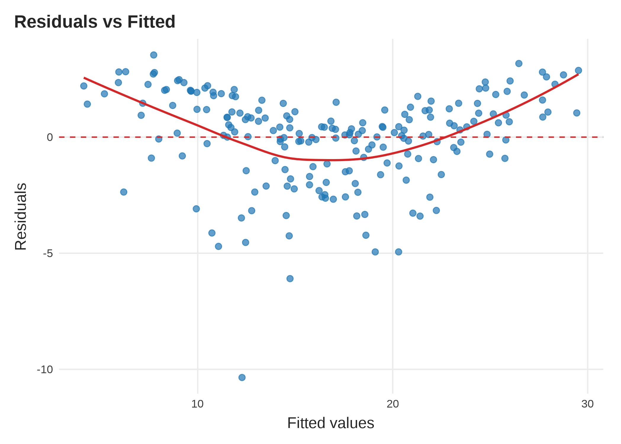
Residuals vs Fitted (diagnostic). Checks linearity and constant variance. The points should form a flat band around zero, with no clear pattern.
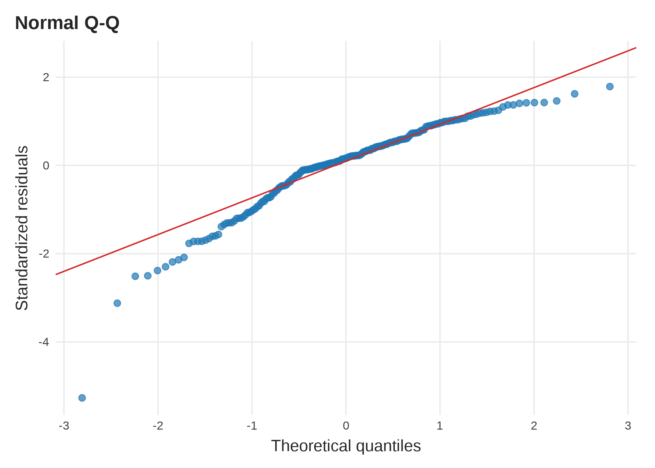
Normal Q-Q (diagnostic). Residual quantiles plotted against normal quantiles. Points close to the diagonal line support the normality assumption.
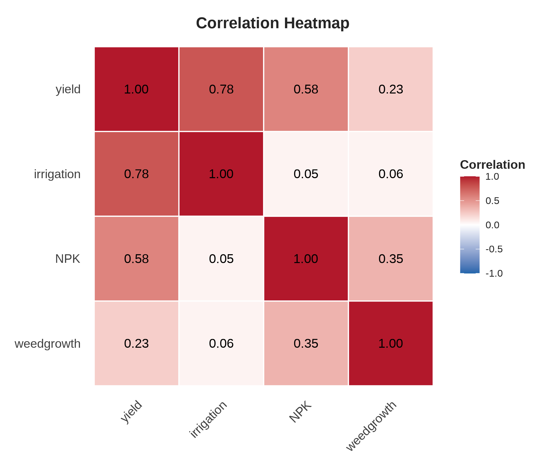
Correlation heatmap. Shows the pairwise correlations among the numeric variables. Useful for identifying independent variables that may be collinear.
Additional plots are also available:
- Facet plot - the dependent variable plotted against each independent variable in a separate panel.
- Pareto chart - ranks the independent variables by the size of their standardized effect.
- Added-variable plots - also known as partial-regression plots.
- Residual distribution - a histogram of the residuals.
- Pair plot - a scatter-plot matrix of the variables.
- Scale-Location, Residuals vs Leverage and ACF of residuals - the remaining diagnostic plots.
12 Advanced Model Options
A simple linear regression model is suitable for many datasets. However, some datasets require a more flexible model to accurately describe the relationship between the dependent variable and the independent variables, for example, when one of the assumptions from Section 9 did not hold.
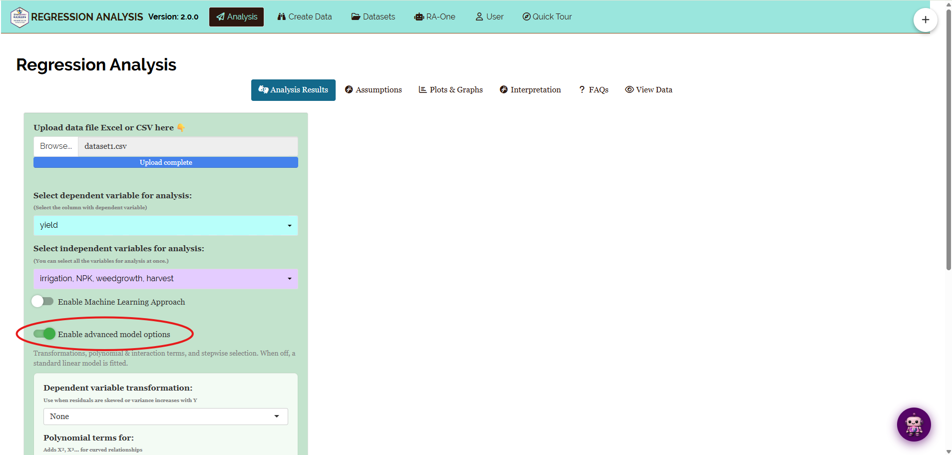
To support these situations, RAISINS provides an Enable Advanced Model Options setting in the Analysis tab (Figure 25). By default, this option is turned off, and a standard linear regression model is fitted.
When enabled, you can choose one or more advanced modelling options depending on your research objective and the characteristics of your data. The selected options are automatically reported in the analysis output, making it easy to document the model used in your study.
| Option | Purpose | When should you use it? |
|---|---|---|
| Dependent Variable Transformation | Applies a mathematical transformation to the dependent variable before fitting the model. | When the residuals are not normally distributed or the variance changes across fitted values. |
| Polynomial Terms | Adds squared or higher-order terms (degree 2–4) for selected numeric independent variables. | When the relationship between an independent variable and the dependent variable is curved rather than linear. |
| Two-way Interactions | Examines whether the effect of one independent variable depends on another. | When two independent variables may work together to influence the dependent variable. |
| Stepwise Selection (AIC) | Automatically selects the most suitable combination of independent variables. | When you have many candidate independent variables and want a simpler model. |
12.1 1. Dependent Variable Transformation
Regression assumes that the residuals are approximately normally distributed and have constant variance. When these assumptions are not satisfied, transforming the dependent variable may improve the performance of the model.
RAISINS provides several commonly used transformations, including:
- Logarithm (log)
- Logarithm base 10 (log10)
- Square root (√)
- Inverse (1/Y)
- Square (Y²)
Whenever a transformation is applied, RAISINS clearly reports it in the results. Where appropriate, predicted values are automatically back-transformed to the original scale, making the results easier to interpret.
For a logarithmic transformation, the back-transformed value represents the median prediction rather than the mean. RAISINS states this explicitly in the output.
Suppose crop yield increases rapidly at lower fertilizer levels but changes only slightly at higher levels. Applying a log transformation to the dependent variable may improve the model fit and stabilize the residual variance.
12.2 2. Polynomial Terms
Not every relationship is a straight line. Sometimes the dependent variable increases up to a certain point and then begins to decrease, or the rate of change varies across the range of an independent variable.
Polynomial regression allows the model to capture these curved relationships by adding squared, cubic, or higher-order terms for selected numeric independent variables.
RAISINS allows polynomial terms up to degree 4, helping you model nonlinear relationships while still using the familiar regression framework.
Crop yield may increase as fertilizer application increases, but after an optimum level is reached, additional fertilizer may reduce yield. A polynomial model can describe this curved relationship more accurately than a simple straight-line model.
12.3 3. Two-way Interaction Terms
Sometimes the effect of one independent variable depends on the value of another independent variable. This is known as an interaction.
By including interaction terms, the regression model can estimate the combined effect of two variables rather than assuming they act independently.
The effect of fertilizer on crop yield may depend on the amount of irrigation provided. Under low irrigation, fertilizer may have only a small effect, whereas under adequate irrigation, the same fertilizer dose may produce a much larger increase in yield.
An interaction term allows the model to capture this relationship.
12.4 4. Stepwise Selection (AIC)
When many independent variables are available, including all of them may produce a complex model that is difficult to interpret.
Stepwise selection automatically evaluates different combinations of independent variables and selects the model with the best balance between goodness of fit and model complexity using the Akaike Information Criterion (AIC).
RAISINS supports:
- Forward selection
- Backward elimination
- Bidirectional (both)
Stepwise selection is a useful tool for exploring models, but the final model should always be supported by scientific knowledge and the objectives of your study. Statistical selection alone should not replace subject-matter expertise.
13 Machine Learning Mode (Train-Test Validation)
In addition to the standard regression analysis, RAISINS provides an optional Machine Learning Mode for evaluating how well your model performs on new, unseen data.
When this option is enabled, RAISINS randomly divides the dataset into two parts:
- Training set – used to build the regression model.
- Test set – used to evaluate the model’s predictive performance.
By default, 80% of the observations are used for training and the remaining 20% are reserved for testing. You can adjust this proportion if required.
After fitting the model, RAISINS predicts the dependent variable for the test dataset and reports several prediction performance measures, including:
- Root Mean Square Error (RMSE)
- Mean Square Error (MSE)
- Sum of Squared Errors (SSE)
- Test-set R²
- Approximate Adjusted R²
An optional Actual vs Predicted table is also generated, allowing you to compare the observed and predicted values.
If you applied a transformation to the dependent variable, these measures are calculated on back-transformed predictions, on the original scale. They are therefore not directly comparable with the residual-based statistics reported on the transformed scale. RAISINS notes this in the output.
To ensure reproducibility, RAISINS uses a fixed random seed, so the same dataset produces the same train-test split each time the analysis is repeated.
Use the standard regression model when your primary goal is to understand the relationship between the dependent variable and the independent variables.
Use Machine Learning Mode when your primary goal is to evaluate how well the model predicts new observations that were not used to build the model.
In short: train-test validation estimates out-of-sample performance, how well the model predicts data it has never seen, while the ordinary R², Adjusted R² and residual statistics in the Model Statistics table describe in-sample fit, how well the model matches the data used to build it. A model can fit its training data closely and still predict new data poorly; Machine Learning Mode is how you check for that.
14 Interpretation
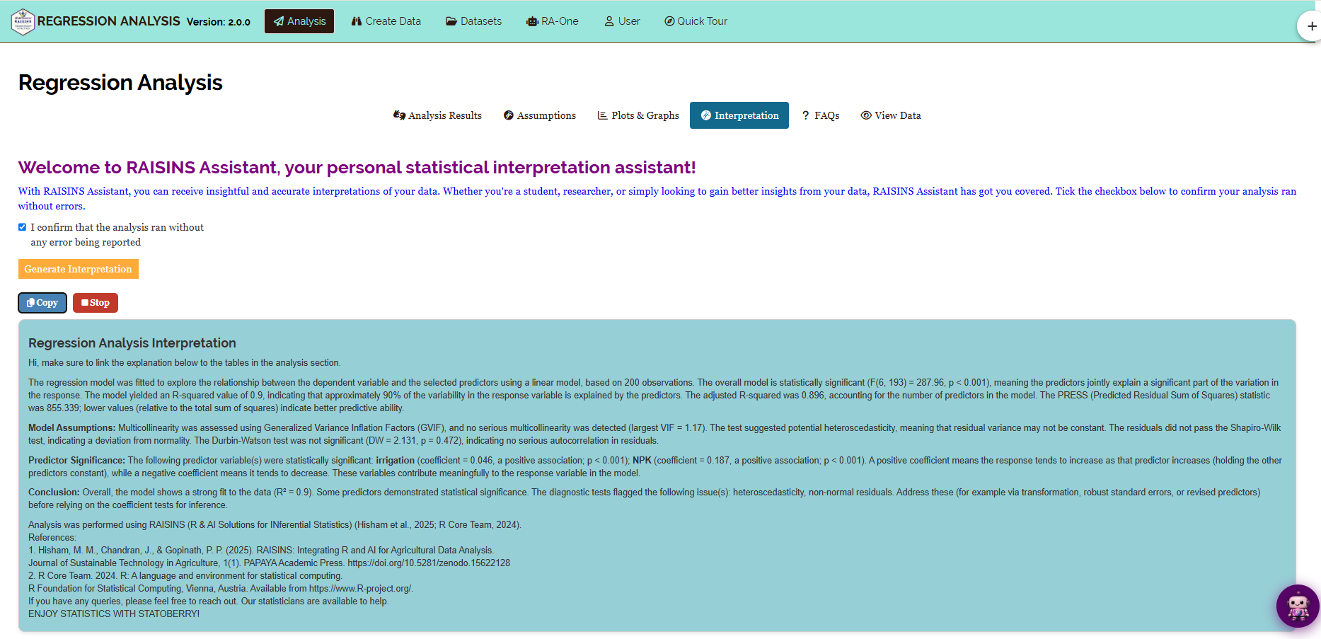
The Interpretation sub-tab provides a written summary of your results in plain language (Figure 26). It reports:
- Which independent variables are significant, along with the direction and size of each effect.
- The overall model fit, including R², adjusted R² and the F-test.
- Any assumption violations that were detected.
- Practical suggestions, such as applying a transformation or removing a redundant independent variable.
The summary also states which advanced options were used, and whether the standard mode or Machine Learning Mode was applied. This makes it suitable for adapting directly into the methods section of a report.
The text appears with a short typing animation. A Stop button displays the full summary immediately, and a Copy button copies the plain-text version to your clipboard.
15 RA-One Chat Assistant
RA-One is the built-in chat assistant. You can open it from its navigation tab or from the floating chat bubble.
Ask questions in plain language, and RA-One answers using your own analysis results. It does not give generic advice, and it does not invent values. If a value is not available, it says so. All replies are in plain English, with no code.
RA-One has access to the complete set of results produced by the app:
- The coefficient table, including confidence intervals and standardized coefficients.
- All model fit statistics: R², adjusted R², the F-test, AIC, BIC, RMSE, MAE and PRESS.
- The ANOVA table.
- All assumption test results.
- The influence and outlier diagnostics.
- The Machine Learning test-set measures, when that mode is enabled.
You can ask it to explain what a coefficient, a p-value, R² or a confidence interval means for your specific model. It can also explain why an assumption passed or failed, and answer general questions about concepts such as partial effects, multicollinearity, and when a transformation is appropriate.
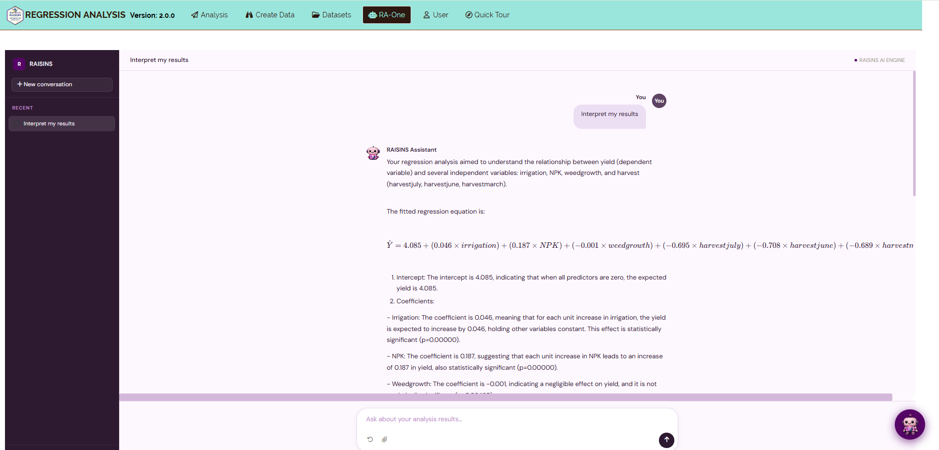
RA-One can also prepare data and generate plots.
It can build a correctly formatted data template (Section 6.4) or provide a model dataset (Section 6.3). It can also create plots on request. For example, you can ask for “residuals vs fitted”, “the coefficient plot”, “a scatter of yield vs irrigation”, or “a correlation heatmap”, and the figure is displayed directly in the chat.
Each plot created in the chat includes a plot-type toolbar for switching between graph types, a Plot Settings panel for selecting the independent variable and changing the appearance, and a one-click high-resolution download.
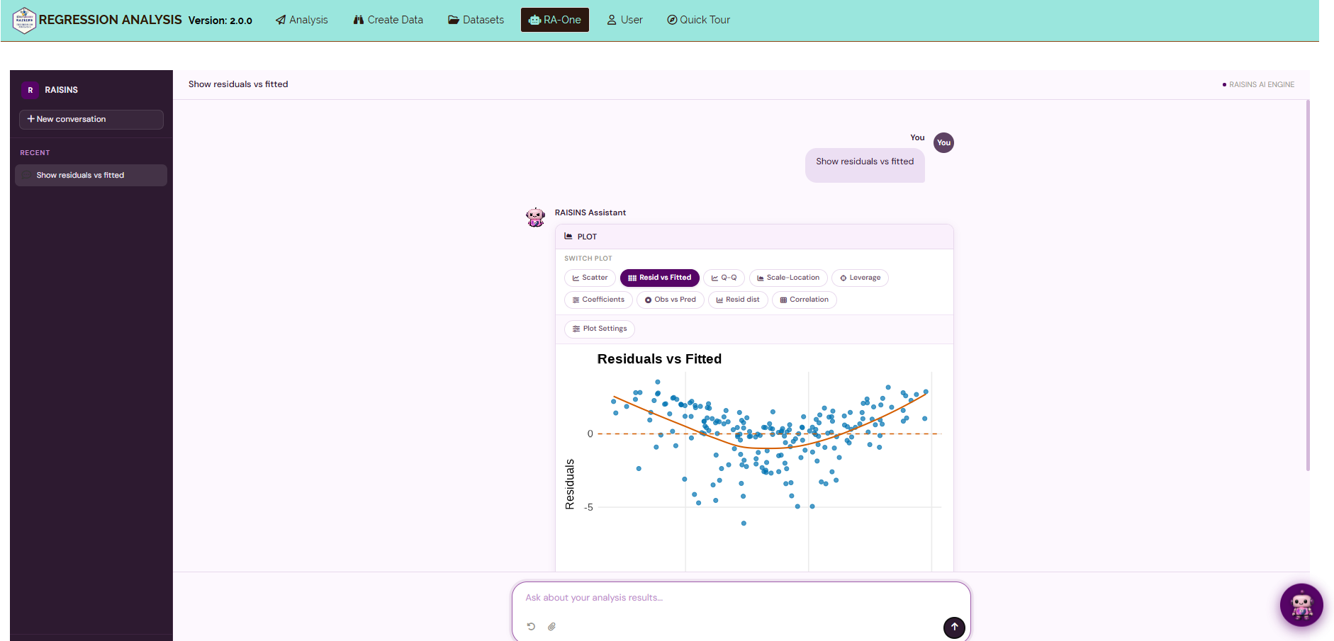
In a single conversation, RA-One can interpret your results, build a data template, provide a model dataset, and create customizable plots. Much of a routine regression session can be completed without leaving the chat.
16 FAQs
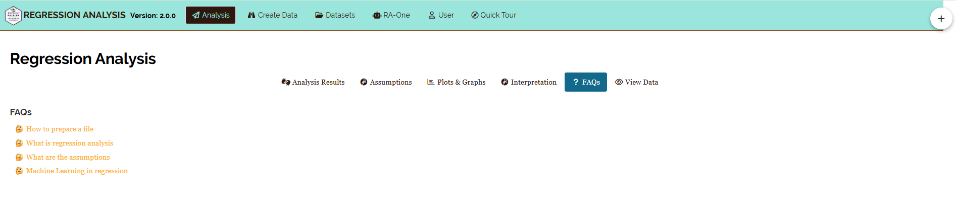
The FAQs tab answers common questions about regression analysis and about the module itself. It covers topics such as how to interpret R² correctly, what to do when an assumption is violated, how categorical independent variables are handled, and when multiple regression is preferable to simple regression.
If you are unsure how a feature works, start here.
17 View Data
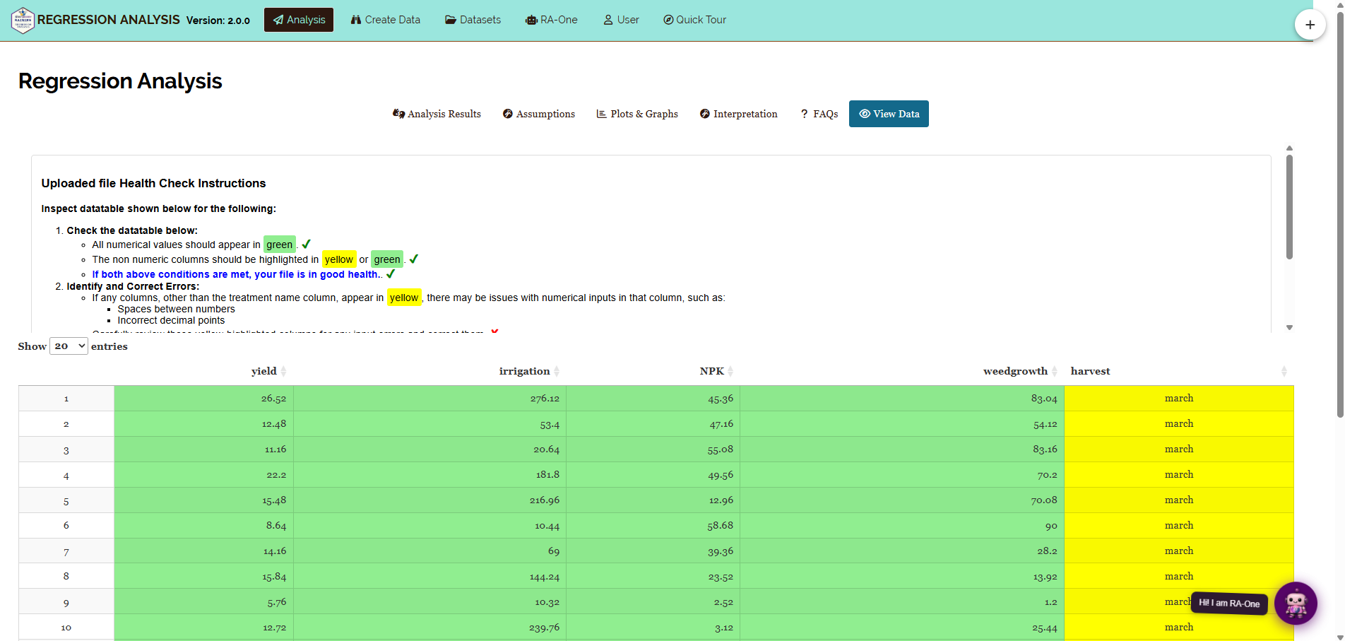
The View Data tab helps you confirm that your dataset is suitable for analysis.
When you upload a file, RAISINS runs an automated Health Check. It examines the column types and formatting, and flags any dependent or independent variable column that contains non-numeric values, missing entries, or inconsistent formatting.
Resolve any issues reported here before clicking Run Analysis, so that your results are based on clean and correctly formatted data.
18 Summary
Regression analysis answers a single question: after accounting for random variation, how much does each factor actually influence the outcome?
Everything else in the output exists to make sure that this question is answered correctly. This includes the F-test, the assumption checks, the influence diagnostics, and the available transformations. RAISINS performs all of these calculations automatically, so you can concentrate on interpreting what the results mean for your research.
If you need help at any stage, RA-One is available at all times. You can also write to us at [email protected].
19 Appendix: A Short History of Regression
The term regression comes from Sir Francis Galton. In the 1880s, he observed that the children of exceptionally tall parents were usually tall, but less tall than their parents. Their heights moved, or “regressed”, toward the population average.
Karl Pearson later developed Galton’s observation into the mathematics of correlation and the least-squares line that is still used today. The least-squares principle itself dates back to Legendre and Gauss in the early nineteenth century.
Ronald A. Fisher then combined regression with the analysis of variance. This produced the F-test and the ANOVA table that appear in modern regression output.
From these origins, regression became a standard tool in agriculture, medicine, economics and engineering, used both for prediction and for isolating the effect of individual factors.
One point of terminology often surprises researchers: “linear” regression refers to linearity in the coefficients, not necessarily in the independent variables themselves. This is why the polynomial models described in Section 12, which include terms like X² and X³, are still fitted with ordinary linear regression; the equation remains linear in the β’s, even though the curve it draws is not a straight line.