ANCOVA in CRD
A covariate is something you measured but did not assign: seedling height at transplanting, initial body weight, baseline soil nitrogen. ANCOVA removes its effect from the error term so that treatment comparisons become sharper and fairer. Read more …
Analysis of Covariance in a Completely Randomised Design (ANCOVA CRD) combines analysis of variance with regression. It adjusts treatment means for a continuous covariate that was measured alongside the response but was never under the experimenter’s control, so that treatments are compared as though every experimental unit had started from the same baseline. In RAISINS you can run a One Way ANCOVA without writing a line of code, and obtain the ANCOVA table, adjusted (estimated marginal) means with letter groupings, publication-ready plots and a PCA-based multivariate index. This tutorial walks you through the whole module, screen by screen.
1 What is ANCOVA?
Imagine you want to compare three study methods, Method A, B and C — on how well students perform in a final exam. But some students already knew more about the subject before enroling into the study method test, and you captured this with a pre-test score. Prior knowledge clearly affects the exam, so if Group B simply happened to contain the stronger students, it would post the highest exam average — and you might wrongly credit Method B for a gap that was already there before any teaching took place.
This is exactly the situation ANCOVA is built for. You reach for an ANCOVA whenever you want to compare groups but know that another continuous variable, a covariate which influences the outcome. ANCOVA estimates the relationship between the covariate and the response, uses it to place every student on the same starting point. The question it answers is:
If every student had started from exactly the same baseline, would the study methods still differ?
There is a bonus. When the covariate is strongly related to the outcome, ANCOVA has greater statistical power than a plain ANOVA: the variation the covariate explains is pulled out of the error term before the group comparison is made, so genuine differences are easier to detect. In effect, ANCOVA is analysis of variance and regression working together — it borrows the group comparison from ANOVA and the covariate adjustment from regression.
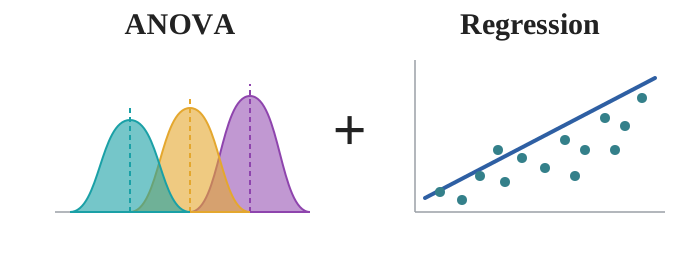
1.1 ANOVA vs. ANCOVA
So what separates the two?
- ANOVA compares the group means of a dependent variable (the exam score) on their own. It assumes any difference in the outcome is due solely to the categorical factor (the study method) and makes no allowance for other influencing variables.
- ANCOVA additionally adjusts for one or more covariates (the pre-test score). By statistically holding the covariate constant, it shifts the group means to a common baseline, reduces the error variance, and delivers a fairer comparison of the groups.
- Independence - each observation is unrelated to the others (settled by randomisation at the design stage).
- Normality of errors - the residuals are approximately normally distributed.
- Homogeneity of variance - the groups vary by similar amounts around their means.
- Linearity — the response is linearly related to the covariate, so a straight-line adjustment is appropriate.
- Homogeneity of regression slopes - the covariate–response slope is the same in each group. This assumption is unique to ANCOVA.
- Plus one logical check: the covariate must be unaffected by the treatments — measured before the groups act, so that adjusting for it does not remove real treatment effect.
With the idea in place, the rest of this tutorial makes it concrete with a real experiment. Suppose you are comparing ten mango varieties in a greenhouse, three pots each. At harvest you record fruit yield per plant. Alphonso averages about 1424 g, Safeda about 1061 g. Alphonso looks better. But there is a complication you noticed on the day of transplanting: the seedlings were not the same size, some where more healthy thab the other ones. Length of the seedling differed, and if we assume that longer seedlings are more healthier and can influence the yield. Seedling length can be considered as a covariate here.
So the gap between Alphonso and Safeda is now made of two things mixed together, and a plain one-way ANOVA cannot separate them:
- A genuine varietal difference.
- Difference in seed length.
You could try to design the problem away, by blocking on seedling size or by discarding the odd-sized seedlings. Both are wasteful, and neither is available once the trial is already in the ground. ANCOVA takes the third route: it measures the head start and subtracts it arithmetically.
The measured head start is called the covariate (X). ANCOVA fits a straight line relating the response to the covariate, uses that line to slide every observation to what it would have been had its pot started at the average seedling height, and only then compares the varieties. The question it answers is:
If every experimental unit had started from exactly the same baseline, would the treatments still differ?
Two things happen as a result. The variation the covariate explains is pulled out of the error term, so the error mean square shrinks and the F-test for treatments gets sharper. And the treatment means you report are no longer raw averages but adjusted means — the fair comparison.
ANCOVA compares treatment means after statistically removing the effect of a continuous variable you measured but did not control, giving a smaller error term and a fairer comparison.
1.2 Properties of Covariate
Not every measured continous variable can be a covariate. A variable earns the role only if it satisfies three conditions:
- It is continuous and measured on every experimental unit, with no missing values.
- It is correlated with the response. If it explains nothing, adjusting for it costs you a degree of freedom and buys nothing.
- It is unaffected by the treatments. This is the one people break. The covariate must be measured before the treatments act, or must be something the treatments cannot touch.
A little history: Fisher, Rothamsted, and the problem of unequal starts
-
Analysis of covariance was set out by Ronald A. Fisher in the early 1930s, working at Rothamsted Experimental Station on agricultural field trials. Fisher’s difficulty was ordinary and universal: experimental units are never identical. Plots differ in fertility, animals differ in starting weight, plants differ in vigour before anything is applied to them. Randomisation makes those differences unbiased, but it does not make them small, and they land in the error term where they blunt every comparison. Fisher’s insight was that a concomitant variable — one measured alongside the experiment but outside the experimenter’s control — could be brought into the linear model, its contribution to the response estimated by regression, and that contribution then removed from the residual. The result was a technique that recovered much of the precision blocking would have given, without requiring the physical blocking to have been done. It spread quickly through animal nutrition, agronomy, psychology and clinical research, and remains one of the few methods that can rescue precision from a trial after the trial has started. In a Completely Randomised Design, where there is no blocking at all, this is particularly valuable: ANCOVA is often the only route to the precision a blocked design would have delivered.
2 ANCOVA in a Completely Randomised Design
A Completely Randomised Design (CRD) is the simplest experimental layout there is. Treatments are allotted to experimental units entirely at random, with no blocking and no restriction, and each treatment is repeated across a number of replications. It suits situations where the experimental material is reasonably homogeneous and easy to handle - pot culture, laboratory work, controlled environments - precisely the situations in which physical blocking is either impossible or pointless.
ANCOVA changes nothing about that randomisation or replication. What it adds is a second measurement on every unit. Figure 2 shows the layout: treatments T1 … Tt are randomly assigned to units with r replications each, and for every unit two numbers are recorded - the covariate (X), measured before or independently of the treatment, and the response (Y), measured afterwards. A single common regression slope (b) is estimated from the within-treatment relationship between X and Y, every Y is adjusted to the value it would have taken had X equalled the grand mean of the covariate, and the adjusted values go through the usual F-test.
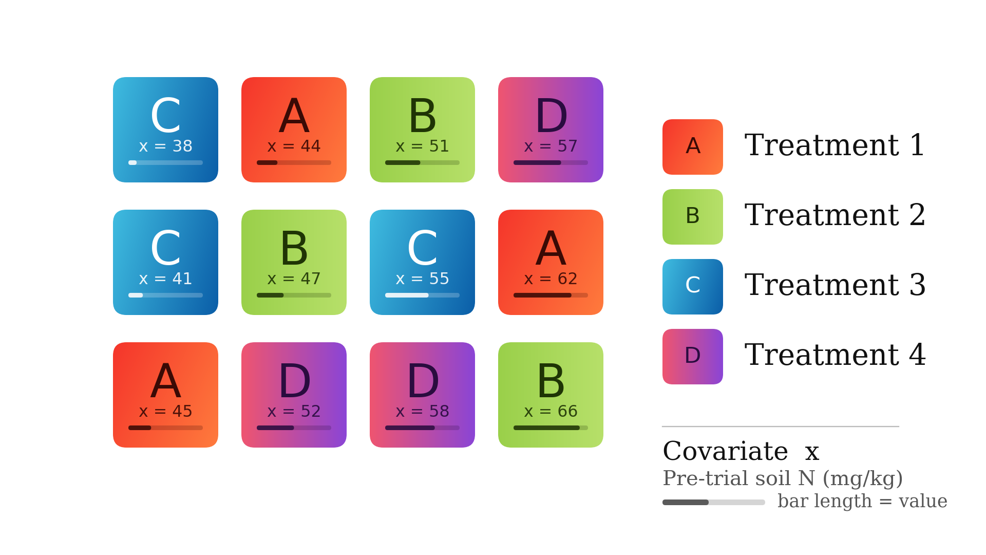
In CRD with t treatments and N observations, the error carries N − t degrees of freedom. In ANCOVA, one of those is spent estimating the slope b, leaving N − t − 1. One degrees of freedom is lost for estimating the slope of the regression line.
| Source of variation | Degrees of freedom | What it measures |
|---|---|---|
| Treatment (adjusted) | t − 1 | Differences among treatment means after covariate adjustment |
| Covariate | 1 | Variation in the response explained by the linear regression on X |
| Error (adjusted) | N − t − 1 | What remains once treatments and the covariate are accounted for |
| Total | N − 1 | Total variation in the response |
The adjusted error mean square is what every F-test, every critical difference and every standard error in the output is built from. Removing the covariate’s contribution makes it smaller, which makes the F-ratio for treatments larger and the critical differences narrower. That is the entire gain from ANCOVA, and it is why a trial that shows nothing under ANOVA can show a clear treatment effect under ANCOVA on the same data.
3 Assumptions of ANCOVA
ANCOVA inherits every assumption of ANOVA and adds two of its own, both concerning the covariate.
| Assumption | What it means | What if it fails? |
|---|---|---|
| Independence | Each observation is unrelated to the others | Serious, and not fixable at the analysis stage. It is settled by randomisation when you design the trial |
| Normality of errors | Residuals are approximately normally distributed | Try a transformation (Section 9); if it persists, consider a non-parametric approach |
| Homogeneity of variance | Treatments vary by similar amounts around their means | A transformation usually helps; ANCOVA is fairly robust when replication is balanced |
| Linearity | The response is linearly related to the covariate | Adjusting with a straight line when the truth is curved leaves the bias in place. Inspect a scatter of Y against X before trusting the adjustment |
| Covariate independent of treatment | Treatments did not influence the covariate | The adjustment removes genuine treatment effect. The covariate must be measured before the treatments act |
| Homogeneity of slopes | The regression of Y on X has the same slope in every treatment group | A single common adjustment is no longer appropriate; treatment differences depend on where you look along X, and that interaction is itself the finding |
Homogeneity of slopes is the assumption unique to ANCOVA, and it has a clear meaning: the covariate must help every treatment group by the same amount. If seedling height predicts yield steeply for one variety and hardly at all for another, then there is no single “adjusted difference” to report — the difference between the varieties depends on which seedling size you ask about. When you suspect this, plot the response against the covariate with a separate line per treatment and look at whether the lines run parallel.
4 Getting to the module
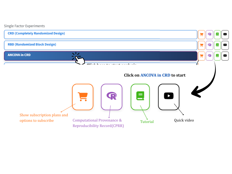
Now Lets see how to perform the analysis. Visit the RAISINS home page at www.raisins.live and go to Data Analysis. Under Single Factor Experiments you will find ANCOVA in CRD, shown in Figure 3. Click it to open the module.
Beside each design in the list there are two small buttons: a cart icon leading to the subscription plan for that module, and a video icon linking to the YouTube walkthrough. The module itself is titled One Way ANCOVA and opens on the Analysis tab.
4.1 Computational Provenance & Reproducibility Record
CPRR (Computational Provenance & Reproducibility Record) provides a transparent and comprehensive record of what the module actually did. It states the R version and the exact version of every package used, names the specific function behind each reported result, lists every default parameter and decision rule applied, and provides fully runnable R code that reproduces each analytical step. You can execute that code in R to independently reproduce and verify the results. It carries its own DOI.
To cite the platform itself in a paper, thesis, or report, use the RAISINS citation, available in APA, Harvard, and BibTeX formats at www.raisins.live/citation.html. That is the primary reference, and for most manuscripts it is all you need.
The CPRR for ANCOVA in CRD is at www.raisins.live/module_record/ancova_crd.html.
Cite the RAISINS paper as your primary reference for the platform. Add the CPRR as supporting documentation when a journal asks for details of the computing environment, or when you want your methods section to be precise about versions and functions rather than saying “analysis was carried out using an online tool.” The CPRR supports the citation and ensures computational reproducibility.
5 Preview mode and demo datasets
You do not need your own file to explore the module. In the Analysis sidebar, immediately below the upload box, there is a Choose a demo dataset dropdown (visible in Figure 10). Pick dataset1.csv, choose the treatment column, the covariate and the response variables, and click Run Analysis — every tab of the module fills with real output. This is the fastest way to see what ANCOVA produces before committing your own data to it, and it is also the safest way to check that a feature does what you expect.
The same datasets are documented and downloadable from the Datasets tab (Section 7.3), so you can open them in Excel and see exactly how the columns are laid out.
6 A working example
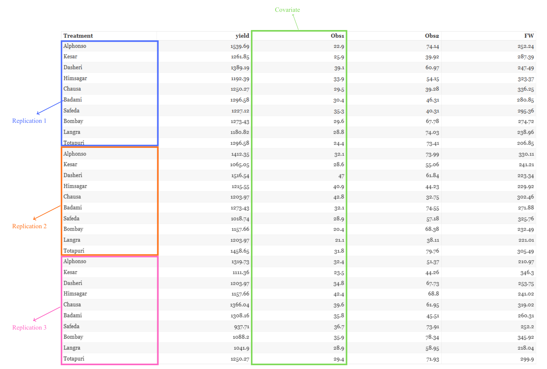
The example used throughout this tutorial is the Mango Variety Data shipped with the module. It is a greenhouse experiment on 10 treatments, each a distinct mango variety — Alphonso, Kesar, Dasheri, Himsagar, Chausa, Badami, Safeda, Bombay, Langra and Totapuri — laid out as a CRD with 3 replications per variety, giving 10 × 3 = 30 pots.
Because the seedlings available were not of uniform size, initial plant height at transplanting (Obs1, in cm) was recorded for every pot and is used as the covariate. Three traits were then measured at harvest and serve as response variables: yield (fruit yield per plant), Obs2 (number of fruits per plant) and FW (fresh fruit weight). Figure 4 shows the file as it is uploaded.
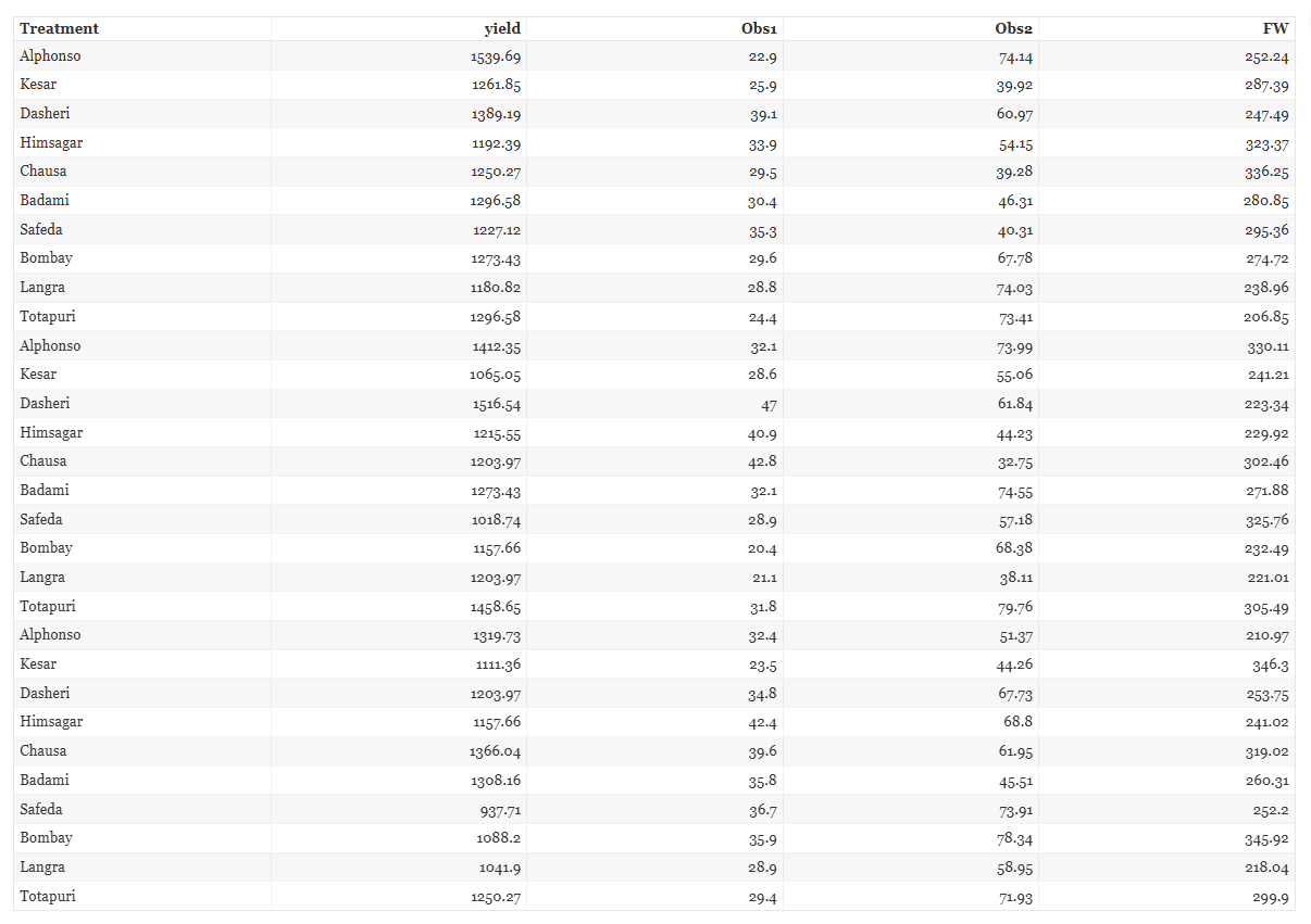
Figure 5 shows the same file annotated. The column marked in green, Obs1, is the covariate — it was measured on the day of transplanting, before any variety could have influenced it, which is exactly what Section 1 requires of a covariate.
7 How to prepare your data
Your analysis is only as good as your data. Feed RAISINS high-quality data and it will deliver powerful insights; feed it messy data and the results will not be trustworthy. You have three routes:
- Create your dataset in MS Excel
- Build your dataset directly within the RAISINS app, using Create Data
- Use a model dataset from the Datasets tab as your reference
7.1 Preparing data in MS Excel
Open a new blank workbook containing only one sheet and avoid adding any unnecessary content. An ANCOVA CRD file needs at minimum three kinds of column:
- a Treatment column holding the treatment label for each experimental unit, with the label repeated once per replication;
- a covariate column holding the continuous pre-treatment measurement, one value per unit, with no missing entries — ANCOVA cannot adjust a row whose covariate is blank;
- one column per response variable measured after treatment.
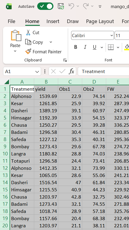
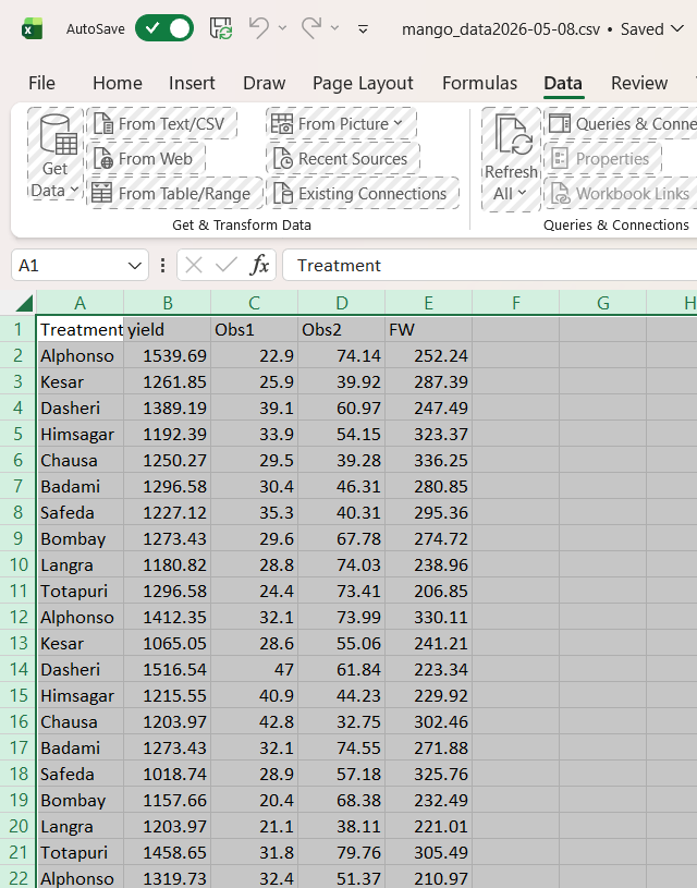
Every experimental unit is one row. The file can be saved as CSV, XLS or XLSX, but CSV is recommended as it is lighter and loads faster. Ensure there are no unwanted spaces in column names or treatment labels. Figure 6 shows the prepared workbook in Excel; Figure 7 shows the same data saved as CSV, which is the form we recommend uploading.
Dataset creation rules
- Column naming convention
- No spaces allowed in column names.
- Use underscores (
_) or full stops (.) for separation. - Avoid symbols and special characters such as %, #.
- Data arrangement
- Start the data towards the upper-left corner.
- Ensure the row above the data is not blank.
- Cell management
- Avoid typing or deleting in cells without data.
- If needed, select the affected cells, right-click, and choose Clear Contents.
- Column relevance
- Name all columns meaningfully.
- Exclude unnecessary columns not required for the analysis.
- Treatment labels
- Keep spelling and capitalisation of treatment labels identical throughout the column;
Alphonsoandalphonsoare read as two different treatments.
- Keep spelling and capitalisation of treatment labels identical throughout the column;
- The covariate column
- Must be numeric throughout, with no blanks, no text and no placeholder codes such as
NAor-. - Must be a measurement the treatments could not have influenced.
- Must be numeric throughout, with no blanks, no text and no placeholder codes such as
How to save as CSV in MS Excel
Open your workbook. Ensure your data is arranged properly with only one sheet.
Click the ‘File’ menu. Go to the top-left corner and click File.
Choose ‘Save As’ or ‘Save a Copy’. Select the location where you want to save your file.
Set file type to CSV. In the ‘Save as type’ dropdown, choose CSV (Comma delimited) (*.csv).
Name your file. Enter a relevant file name without spaces (use underscores if needed).
Click ‘Save’. Click Save to export the file.
💡 Tip: Before saving, double-check that your data is on the first sheet and follows the required format: no empty rows above the data, meaningful column names, and a complete numeric covariate column.
7.2 Prepare using Create Data in RAISINS
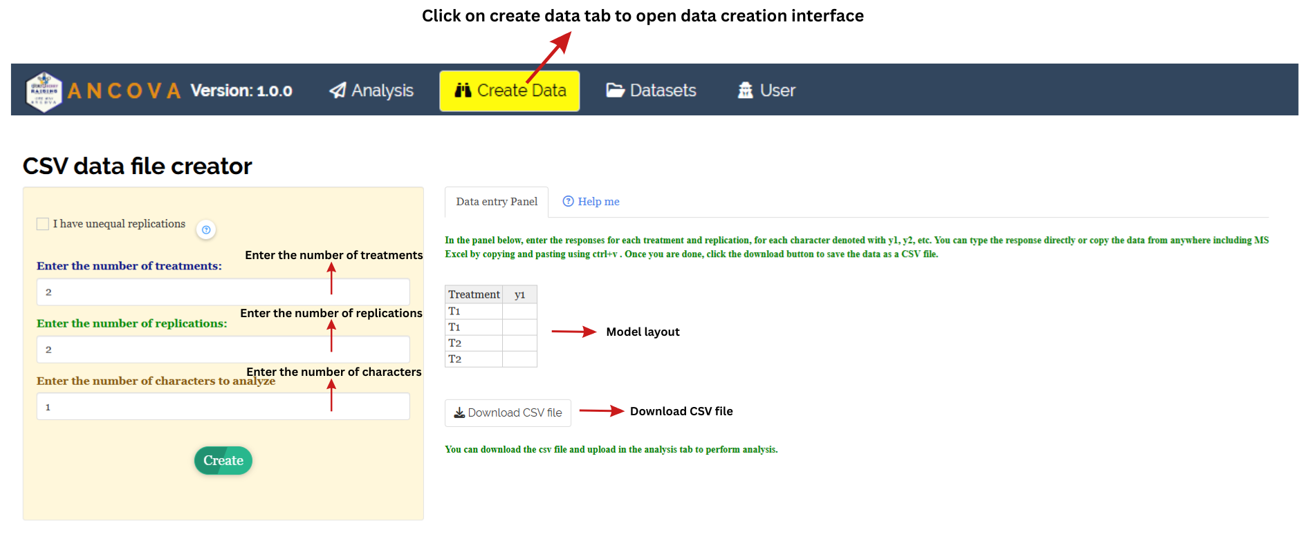
If you are unsure about the correct format, RAISINS can build the layout for you. Open the Create Data tab, which presents the CSV data file creator shown in Figure 8, and then:
- tick I have unequal replications if your treatments are not equally replicated
- enter the number of treatments
- enter the number of replications
- enter the number of characters to analyze
- click Create
A model layout appears in the Data entry Panel on the right, with a Treatment column and one column per character (y1, y2, …). You can type responses directly into the panel or paste a block copied from Excel with Ctrl+V. When the layout is filled, click Download CSV file and upload the result under Analysis.
7.3 Download Model Datasets
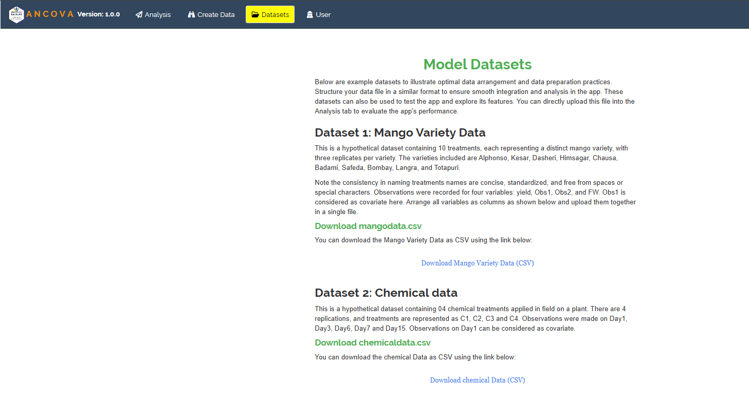
If you would like to see a correctly formatted file before preparing your own, the Datasets tab (Figure 9) offers two documented examples that can be downloaded as CSV and uploaded straight into Analysis:
- Dataset 1: Mango Variety Data — the example used in this tutorial. Ten mango varieties, three replicates each, four measured variables (
yield,Obs1,Obs2,FW), withObs1intended as the covariate. - Dataset 2: Chemical data — four chemical treatments (C1–C4) applied in the field with four replications, observed on Day1, Day3, Day6, Day7 and Day15, where the Day1 observation serves as the covariate.
The second dataset is a good illustration of a repeated-measurement covariate: the reading taken on the first day, before the chemicals had time to act, is the baseline against which the later days are adjusted.
8 The Analysis tab
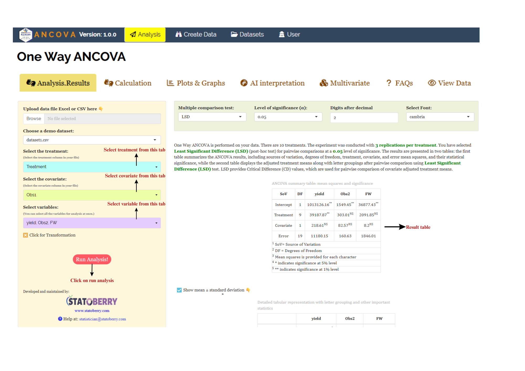
Figure 10 shows the Analysis tab in detail, with each control explained. Upload your prepared file by clicking Browse in the sidebar, or pick one of the demo datasets. Three selectors then appear, and they must be filled in this order:
- Select the treatment — the column holding your treatment labels (
Treatmentin the example). - Select the covariate — the single continuous column to adjust for (
Obs1in the example). - Select variables — the response variables. You can select all of them at once; the module runs a separate ANCOVA for each and reports them side by side in one table.
Below these is a Click for Transformation checkbox (Section 9), and then the Run Analysis! button. Click it and every sub-tab fills at once: Analysis.Results, Calculation, Plots & Graphs, AI interpretation, Multivariate, FAQs and View Data.
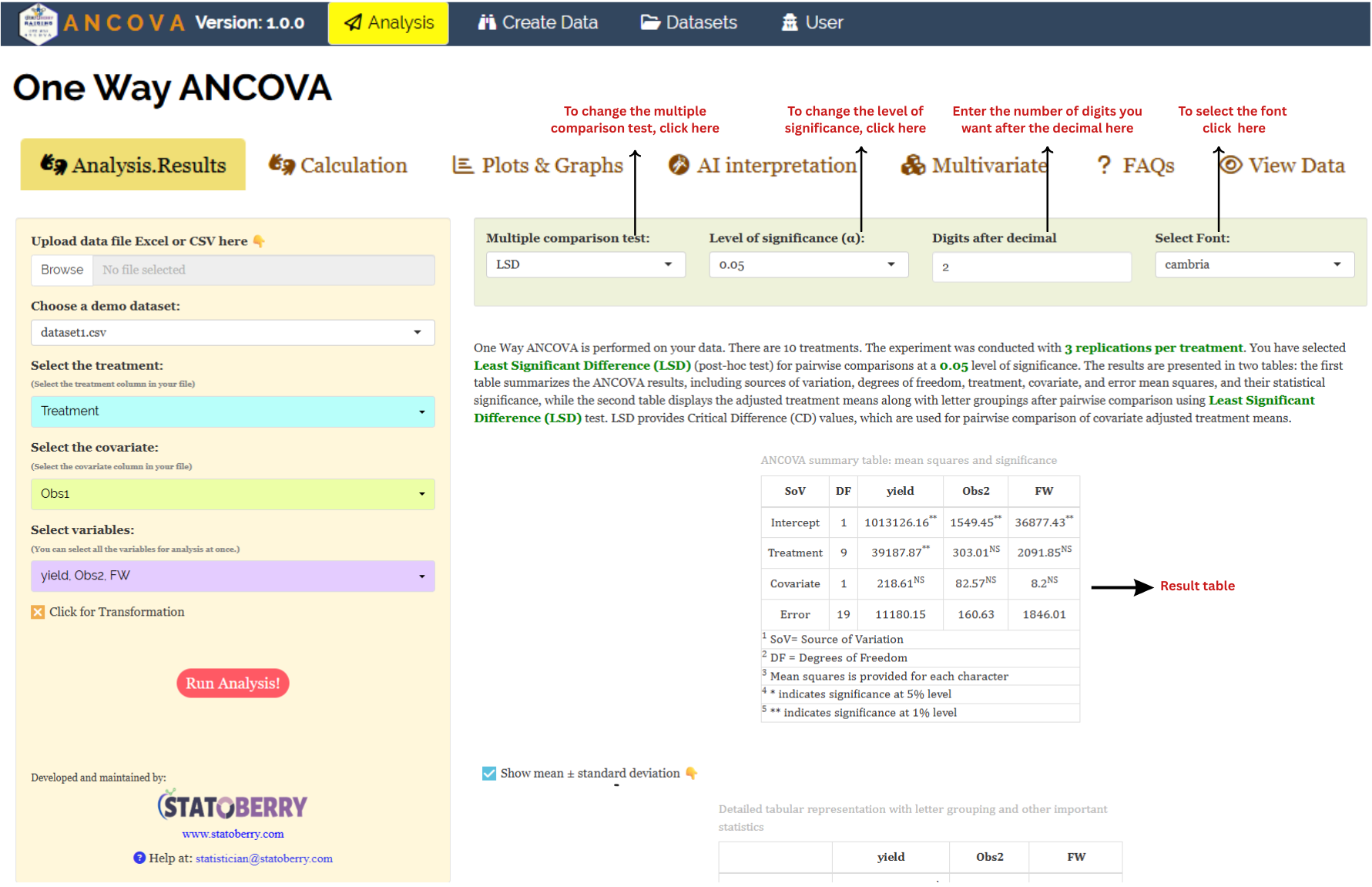
Along the top of the results panel sit four output controls that you can change at any time without re-running the analysis: the Multiple comparison test (Section 11), the Level of significance (α), the number of Digits after decimal, and the Select Font used in the result tables. Directly beneath the ANCOVA table there is also a Show mean ± standard deviation checkbox that switches the second table between standard error and standard deviation.
9 Transformation
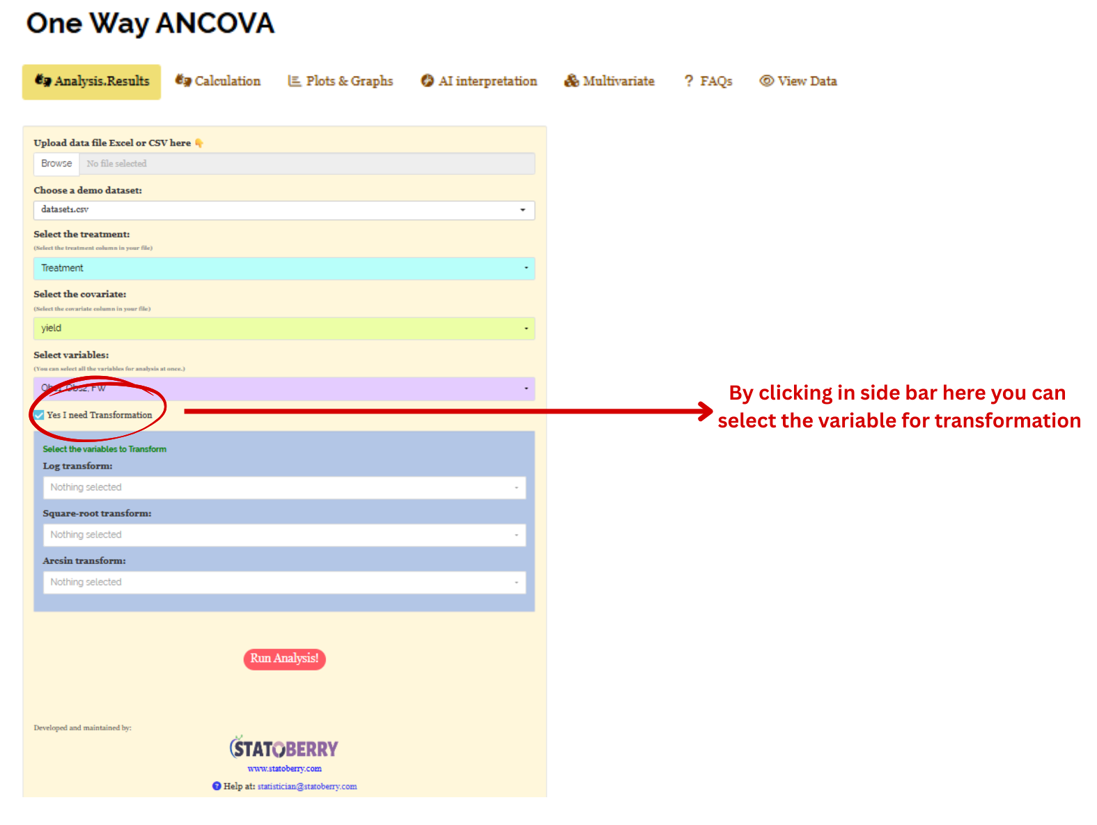
When a response has many zeros, is a count rather than a measurement, or is plainly non-normal, a transformation applied before the covariance adjustment will often fix it. Tick Yes I need Transformation in the sidebar and a panel opens with three dropdowns — Log transform, Square-root transform and Arcsin transform — each listing your selected variables. Choose the variables that need each transformation and run the analysis as usual; transformed means are reported in parentheses alongside the originals. Figure 11 shows the panel.
Logarithmic transformation converts a skewed distribution into a more symmetrical one by replacing each data point (x) with its logarithm. It is applied to positive, continuous data where the variance grows in proportion to the mean, a pattern common in phenomena that grow multiplicatively or exponentially.
Square root transformation stabilises variance and reduces right-skewness by replacing each data point (x) with its square root. It is primarily used for non-negative count data, such as those following a Poisson distribution, where variance increases with the mean. By compressing the upper end of the scale more than the lower end, it brings the data closer to normality.
Arcsine transformation (the angular transformation) is designed for proportions or percentages bounded between 0 and 1. By taking the inverse sine of the square root of the proportion, it stretches the ends of the distribution near 0 and 1, where variance is naturally small. It is chiefly used to achieve homoscedasticity in binomial data.
Transformation is offered for the variables under study. Transforming the covariate changes the shape of the X–Y relationship you are relying on for the adjustment, and a relationship that was linear on the original scale may not stay linear after transformation. If the response needs a transformation, apply it to the response and leave the covariate alone unless you have a specific reason and have checked the linearity afterwards.
After choosing the appropriate transformation, proceed to Section 10 for the analysis.
10 Analysis results
Click Run Analysis and the Analysis.Results sub-tab opens with a short narrative paragraph followed by two tables. There will be a short description about the analysis at the top. The two tables are the ANCOVA summary table and the detailed table of adjusted means with letter groupings, and they are read in that order: the first tells you whether the treatments differ, the second tells you which ones.
Table 1: ANCOVA summary table
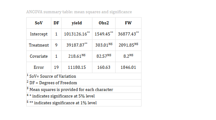
The summary table lists the sources of variation down the rows and the response variables across the columns, giving one ANCOVA per character in a single view. For the mango data the sources are Intercept (1 df), Treatment (9 df, being t − 1 = 10 − 1), Covariate (1 df) and Error (19 df, being N − t − 1 = 30 − 10 − 1). Each cell is a mean square, and significance is flagged as a superscript: one asterisk at the 5% level, two at the 1% level, and NS for non-significant.
How the ANCOVA table is built
The total variation in the response is partitioned into a part explained by the linear regression on the covariate, a part explained by differences among treatments after that regression has been accounted for, and a residual. Each sum of squares is divided by its degrees of freedom to give a mean square. The F-ratio for Treatment is the adjusted treatment mean square divided by the adjusted error mean square, and is referred to an F distribution on (t − 1, N − t − 1) degrees of freedom. The F-ratio for Covariate is formed the same way and tests whether the regression slope b differs from zero — in other words, whether the covariate was worth including at all.
Note the order of the two effects. The treatment mean square reported here is the variation among treatments that remains after the covariate has taken its share, which is what makes the comparison fair. The covariate line, conversely, is the variation the covariate explains after treatments have been fitted. Because the error degrees of freedom are one fewer than in a plain CRD ANOVA (the degree of freedom spent estimating b), a covariate that explains nothing leaves you slightly worse off than if you had never measured it.
10.1 Interpretation from Figure 10
Read the Treatment row first. For yield the adjusted treatment mean square is 39187.87, marked with two asterisks, against an adjusted error mean square of 11180.15 — a ratio of about 3.51 on 9 and 19 degrees of freedom, significant at the 1% level. The ten mango varieties therefore differ genuinely in fruit yield per plant once initial seedling height has been allowed for. For Obs2 (303.01 against an error of 160.63) and FW (2091.85 against 1846.01) the treatment mean squares are marked NS: the varieties cannot be separated on number of fruits or fresh fruit weight in this trial.
The covariate mean squares are 218.61 for yield, 82.57 for Obs2 and 8.2 for FW, all marked NS. For yield, 218.61 divided by the error of 11180.15 gives an F of about 0.02 — initial seedling height explained essentially none of the variation in final yield. The honest conclusion is that in this particular dataset the covariate was not doing useful work, and a plain CRD ANOVA would have reached much the same verdict with one extra degree of freedom in the error.
Table 2: Adjusted means with letter groupings
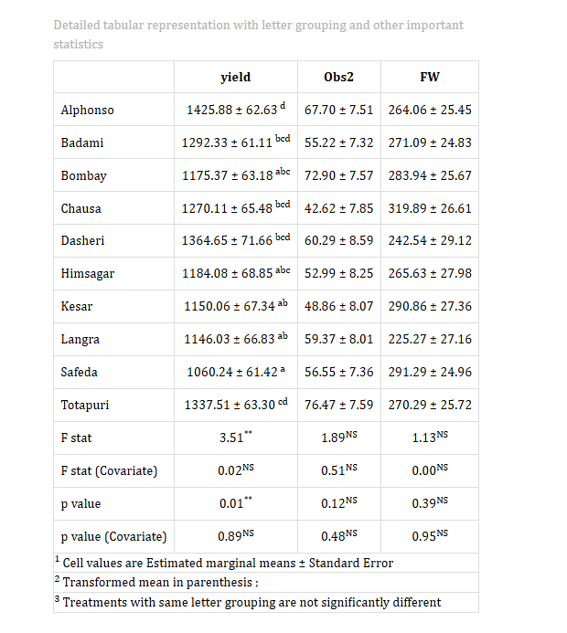
The second table lists one row per treatment and one column per character. Each cell holds the estimated marginal mean (EMM), the adjusted mean, followed by its standard error, with letter groupings as a superscript. Beneath the treatment rows come summary rows: the F stat and p value for the treatment effect, and the F stat (Covariate) and p value (Covariate) for the covariate. If a transformation was applied, the transformed mean appears in parentheses. In the mango example the highest adjusted yield belongs to Alphonso (1425.88 ± 62.63) and the lowest to Safeda (1060.24 ± 61.42).
11 Multiple comparison tests
What is a post-hoc test?
-
A post-hoc test is a follow-up analysis run after an overall test has come back significant. The F-test in the ANCOVA table tells you only that not all treatments are alike; it does not say which ones differ. Post-hoc tests make the pairwise comparisons and report the answer as letter groupings. In ANCOVA they operate on the adjusted means, using the adjusted error mean square and the adjusted error degrees of freedom, so every comparison is made on the covariate-corrected scale.
The post-hoc test is chosen from the Multiple comparison test dropdown at the top of the results panel, alongside the significance level, decimal places and font (Figure 14). Changing it re-labels the letter groupings immediately — you do not need to re-run the analysis.
The three tests
LSD (Least Significant Difference)
Fisher’s protected LSD compares each pair of adjusted means against a critical difference built from the adjusted error mean square:
\[\text{LSD} = t_{\alpha/2,\, df_{\text{adj. error}}} \times \text{SE}(d)\]
where \(t_{\alpha/2}\) is the critical t-value on the adjusted error degrees of freedom and SE(d) is the standard error of the difference between the two adjusted means. In ANCOVA, SE(d) is not the same for every pair: it grows slightly as the two treatments’ covariate means move further apart, because the adjustment for that pair is being extrapolated further. This is why the Calculation tab reports a separate SE(d) for every pair rather than one number for the whole table.
Tukey’s Honestly Significant Difference (HSD)
Tukey’s test compares all pairs while holding the family-wise error rate at α across the whole set of comparisons. It is the conservative choice, and the appropriate one when the number of treatments is large and every pairwise comparison genuinely interests you.
Duncan’s Multiple Range Test (DMRT)
DMRT ranks the adjusted means and applies a stepwise sequence of critical values, so the threshold depends on how far apart two means sit in the ranking. It declares more differences significant than Tukey’s HSD and is widely used in agricultural reporting.
Which post-hoc test to use?
The choice is the researcher’s, and it should be made before looking at the results rather than after.
LSD is the most sensitive of the three and the most commonly used in agricultural and biological work. It suits a small number of treatments and pre-planned comparisons. With many treatments it inflates the Type I error rate, because it makes no allowance for the number of comparisons being run.
Tukey’s HSD is preferred when there are four or more treatments and all pairwise comparisons matter, since it controls the error rate across the whole family of comparisons.
DMRT is common in agricultural experiments with several treatment groups and detects more differences than Tukey’s HSD, at a correspondingly higher risk of false positives.
In the mango example, the pairwise comparison of adjusted treatment means was performed with the Least Significant Difference (LSD) test at α = 0.05.
12 The Calculation tab
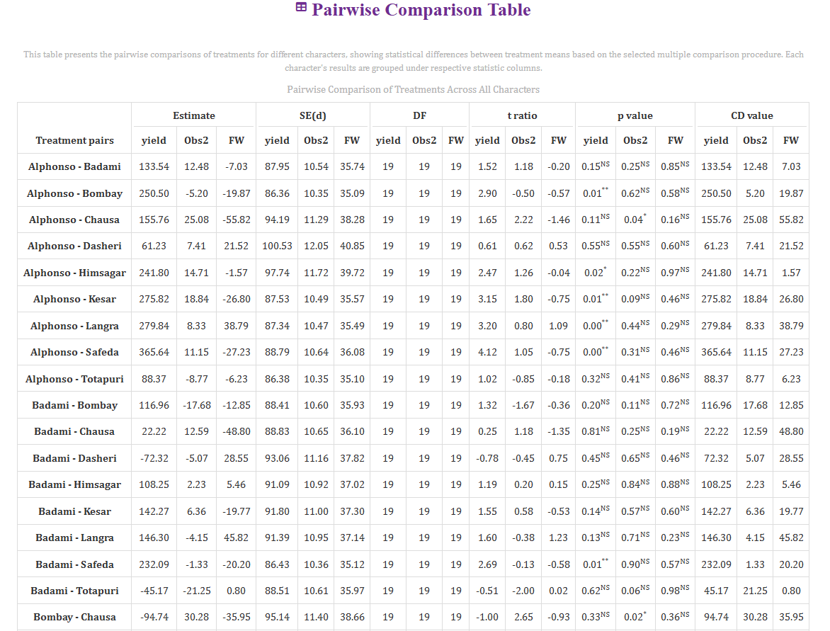
The letter groupings in the results table are a summary. The Calculation tab shows the comparisons they were derived from, one row per treatment pair, with the characters grouped under each statistic (Figure 15). For every pair you get the Estimate (the difference between the two adjusted means), the standard error of that difference SE(d), the DF, the t ratio, the p value with its significance flag, and the CD value.
This is where you go when a grouping looks surprising, or when a journal wants the actual difference and its standard error rather than a letter. In the mango data, for instance, the Alphonso–Safeda contrast on yield shows an estimate of 365.64 with an SE(d) of 88.79 on 19 degrees of freedom, giving t = 4.12 and a p-value flagged significant at the 1% level — the pair that the letter groupings separated most clearly. The Alphonso–Badami contrast, by comparison, gives an estimate of 133.54 with t = 1.52 and p = 0.15, comfortably non-significant, which is why those two share a letter.
Notice that DF is 19 in every row, the adjusted error degrees of freedom from the ANCOVA table, and that SE(d) varies slightly from pair to pair for the reason explained in Section 11.
13 Plots and graphs
The Plots & Graphs sub-tab draws every plot the module offers, for every selected character at once, as soon as the analysis has run. One point deserves emphasis and is stated at the top of the tab: the plots are built from the adjusted means (EMM), not the raw data, and where error bars are shown they are standard errors from the adjusted error term. A bar chart from this tab is therefore not the same picture as a bar chart of your raw column, and it is the one that belongs in a paper reporting ANCOVA.
Each plot carries a gear icon at its top-left corner. Clicking it opens a settings panel with Title & Labels, Colors & Patterns, Show/Hide Options, Line & Theme Settings, Size & Spacing and Text & Label Settings (Figure 16). Every plot can be downloaded at 300 dpi as PNG, JPEG or TIFF, or as PDF or SVG for a vector-quality figure.
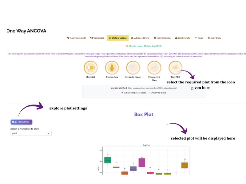
From Figure 17 to Figure 22 you can see the plots available in the module, each drawn for all three characters side by side in the mango example.
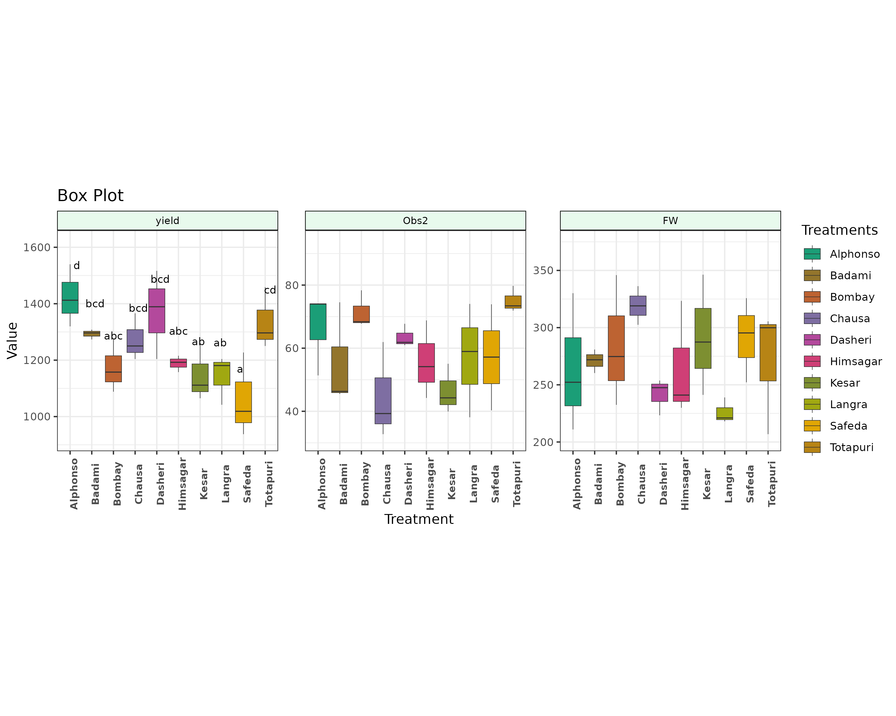
yield panel carries letters (Alphonso d at the top, Safeda a at the bottom) because the treatment effect was significant, while the Obs2 and FW panels carry none.
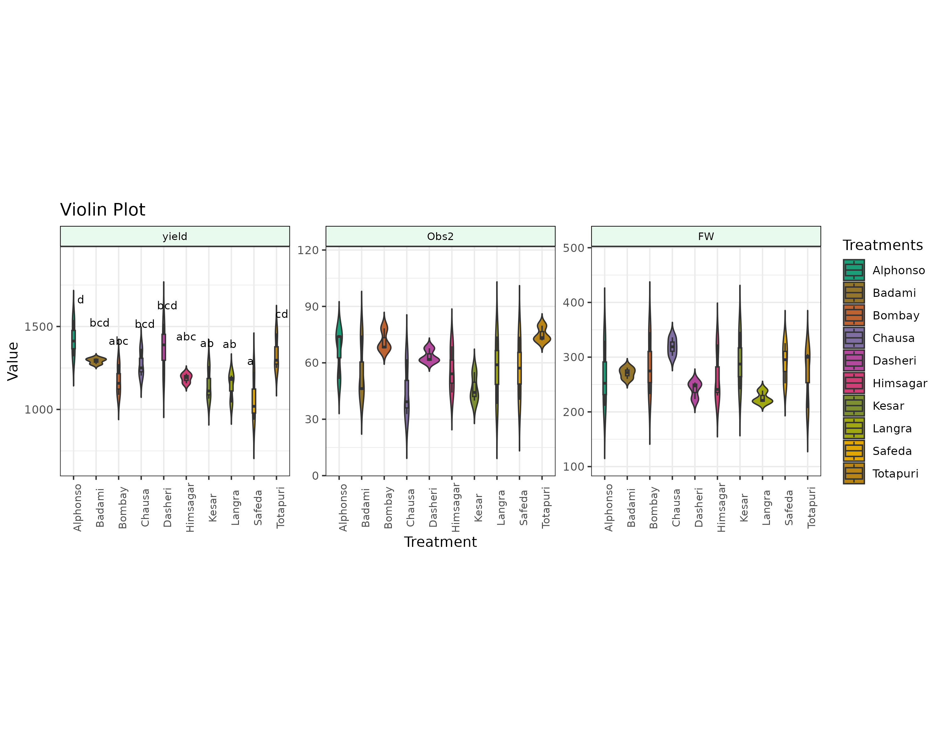
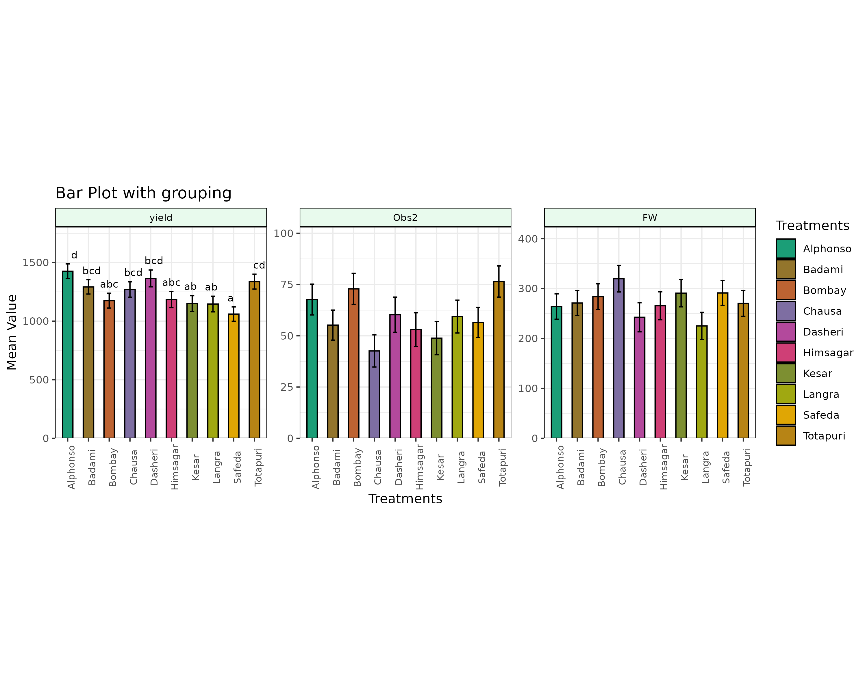
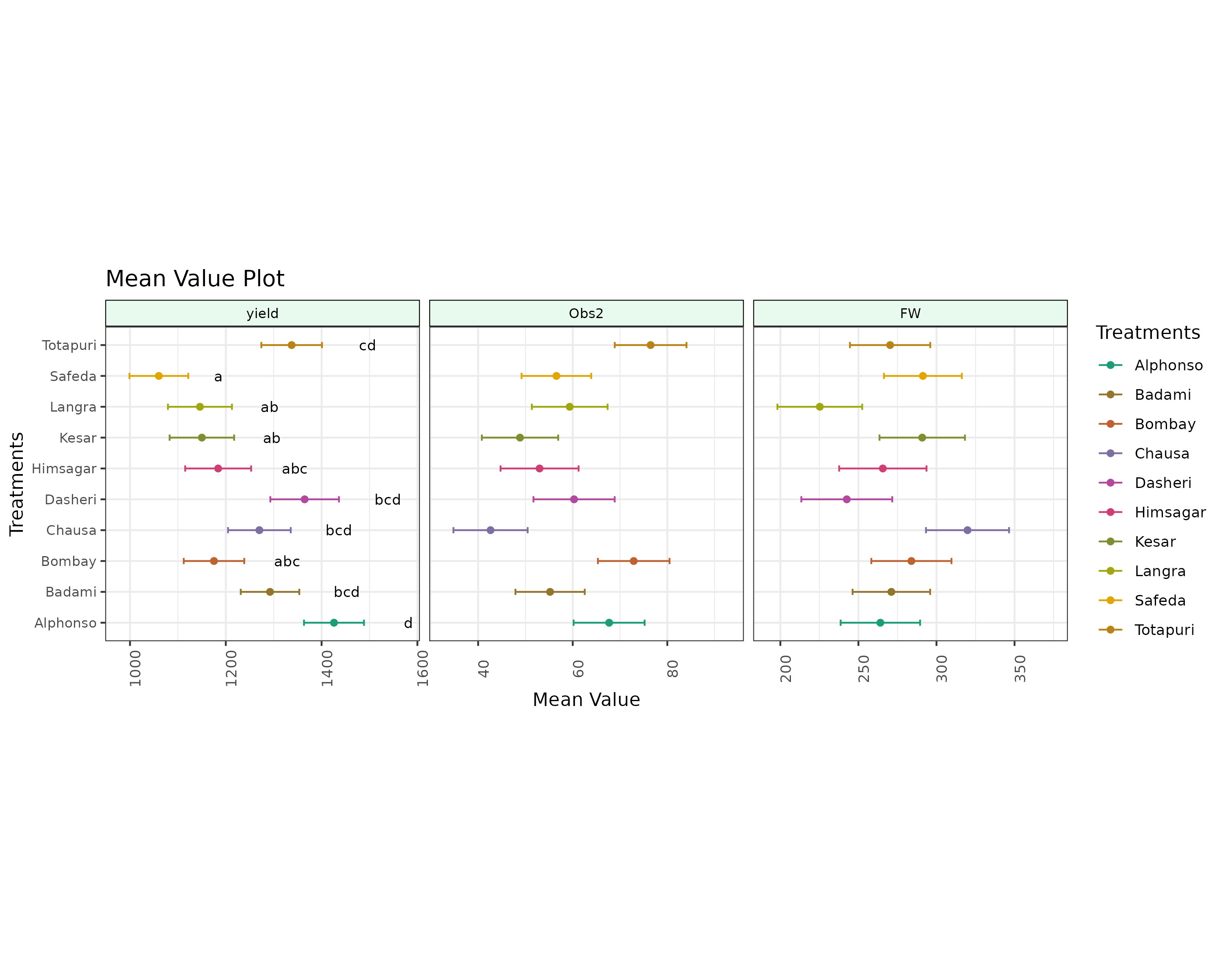
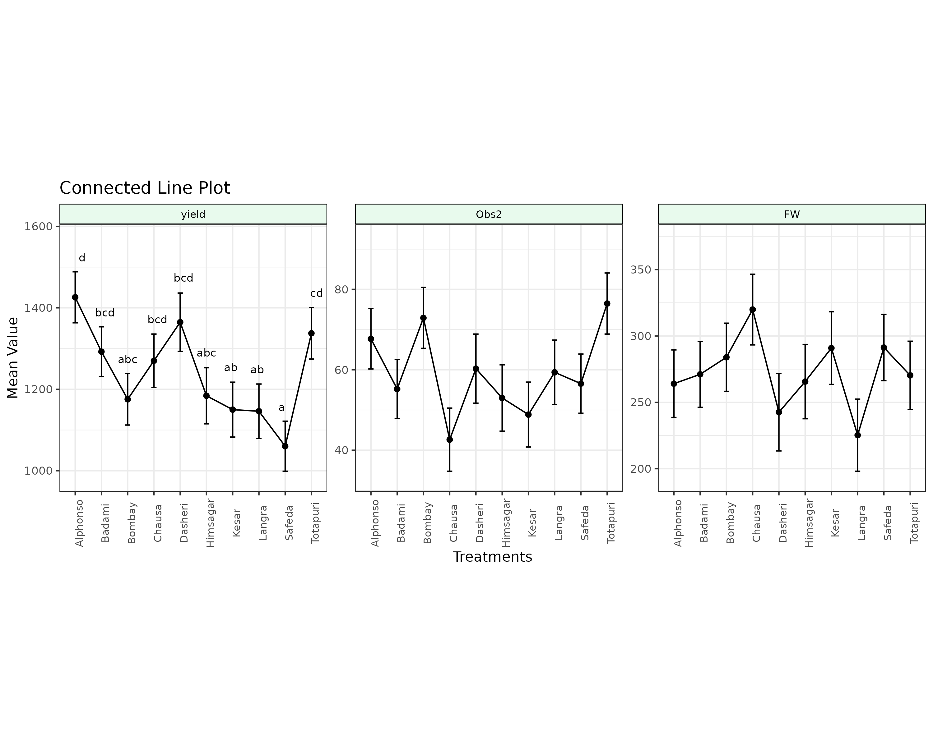
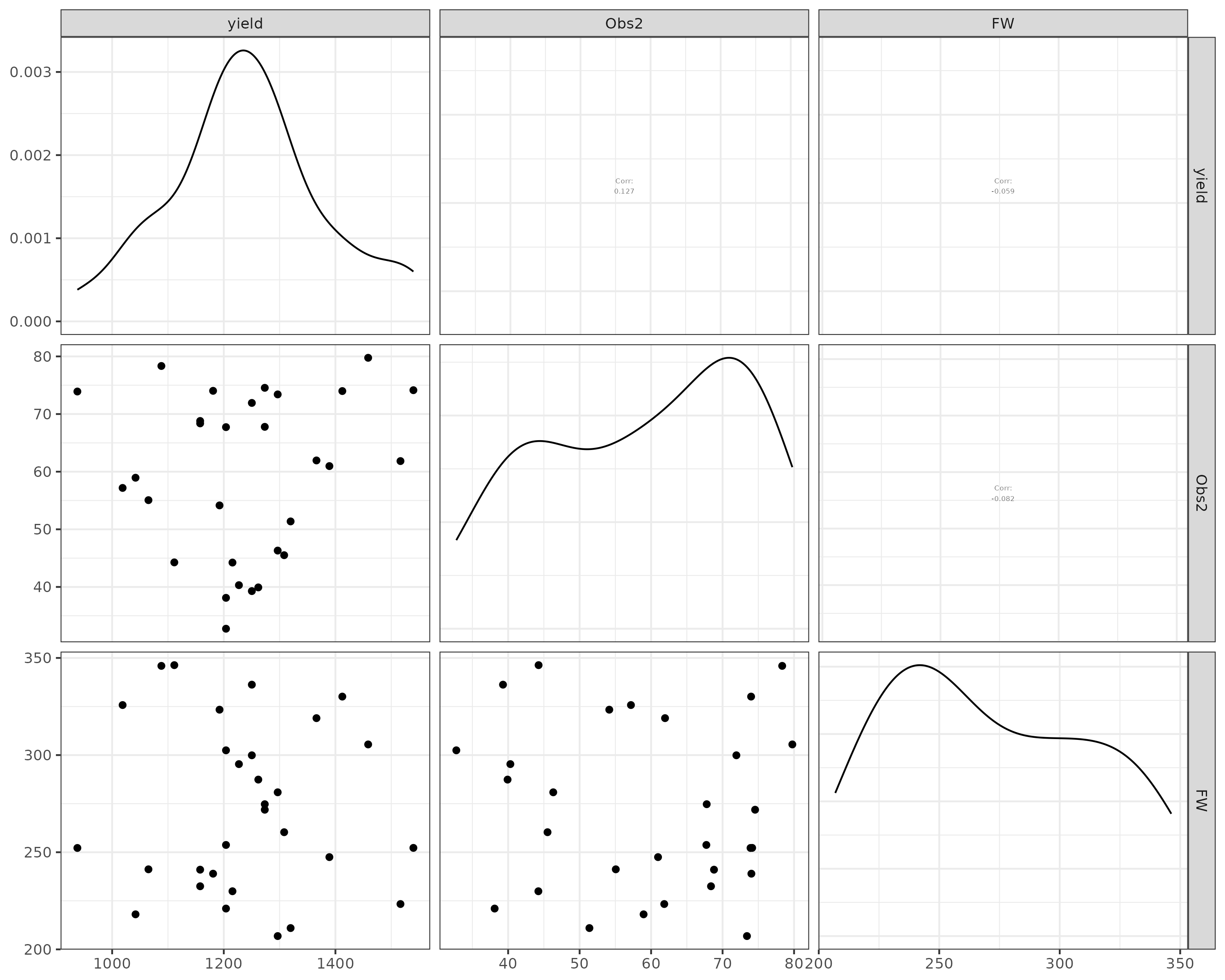
The module labels a panel with grouping letters only when the treatment F-test for that character was significant. A panel without letters is not a rendering failure — it is the plot telling you that the treatments could not be separated for that character, exactly as the ANCOVA table said.
14 Interpretation tab
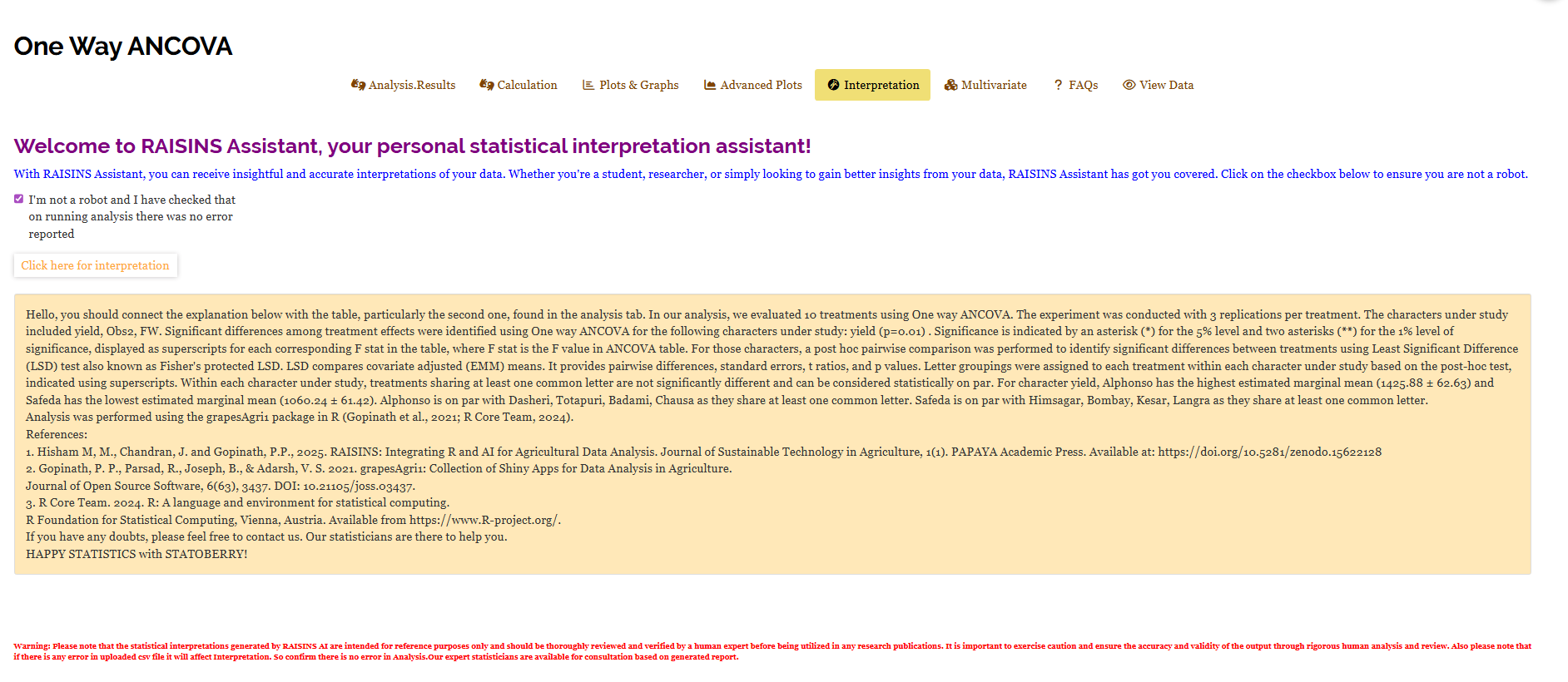
The AI interpretation give a quick summary of the entire analysis. Tick the confirmation box (it is to ensure you have run the analysis and seen your results) and click Click here for interpretation. Figure 23 shows the output for the mango example.
What it produces is a methods-and-results paragraph you could adapt for a manuscript: how many treatments and replications were analysed, which characters were studied, which of them showed significant treatment effects and at what level, which post-hoc test was applied and what the letter groupings mean, and which treatments came out highest and lowest with their estimated marginal means. For the mango data it identifies yield as the only significant character (p = 0.01), names Alphonso as the highest adjusted mean at 1425.88 ± 62.63 and Safeda as the lowest at 1060.24 ± 61.42, and lists the treatments each is on par with. It closes with the package and software citations.
15 Multivariate analysis
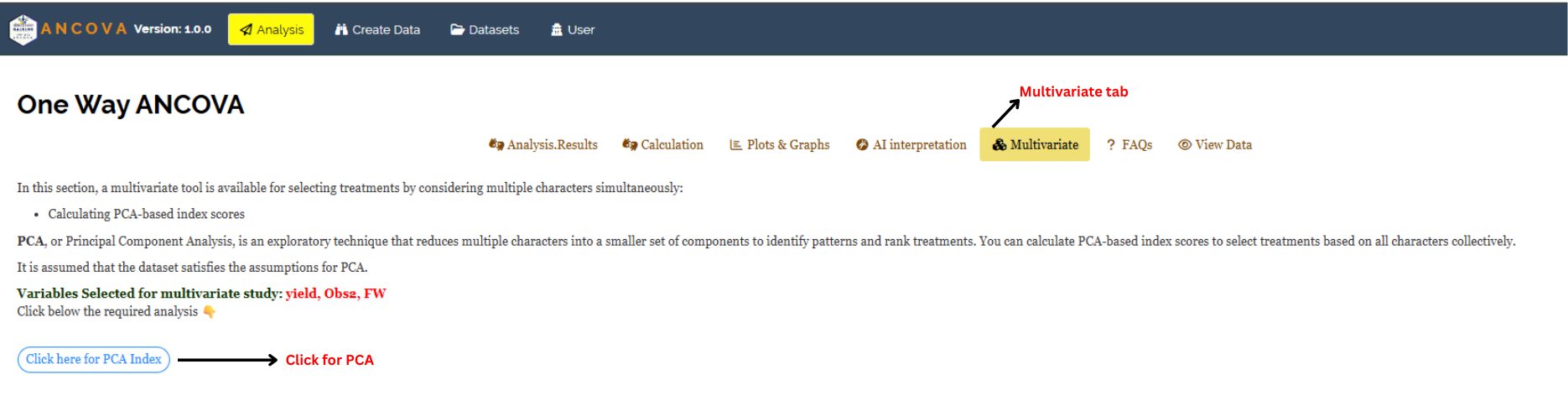
The ANCOVA table treats each character separately. But a variety that is best for yield and mediocre for fruit weight is not obviously better or worse than one with the reverse profile, and choosing between them means weighing several traits at once. The Multivariate sub-tab (Figure 24) does this with a PCA-based index score: it reduces the selected characters to a small set of uncorrelated components and ranks the treatments on the first of them.
Open the tab, check that the Variables Selected for multivariate study line lists the characters you expect (yield, Obs2, FW in the example), and click Click here for PCA Index.
Principal Component Analysis produces no p-values and tests no hypothesis. It is a way of summarising several correlated traits into one ranking, and it is legitimate as a selection aid. It cannot be used to claim that one treatment is significantly better than another — that claim comes from the ANCOVA table and its post-hoc test, and from nowhere else.
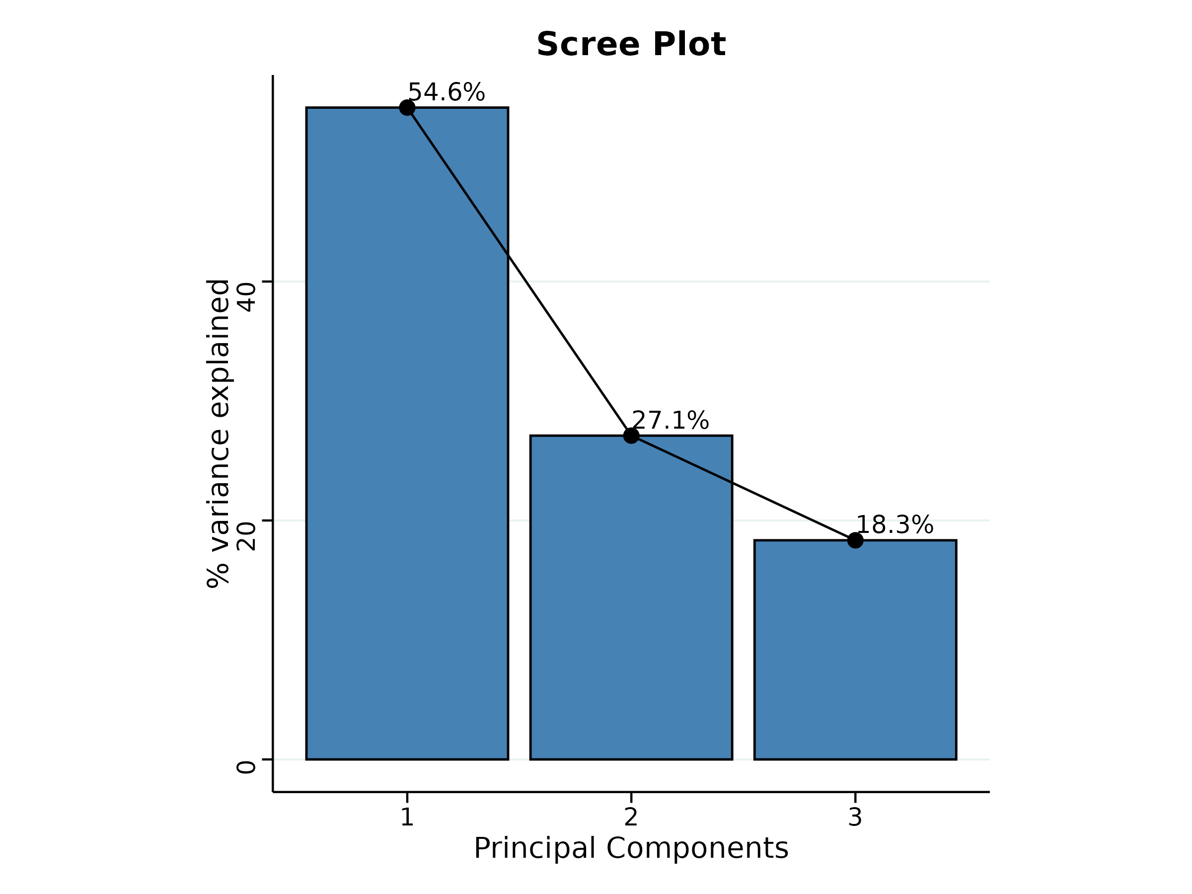
The first output is the eigenvalue table (Figure 25). For the mango example, PC1 has an eigenvalue of 1.64 and accounts for 54.56% of the variation among the three characters, PC2 accounts for 27.10%, and PC3 for the remaining 18.34%. Cumulatively PC1 and PC2 carry 81.66% of the information in the three traits.

The scree plot (Figure 26) shows the same information as bars. The decline from 54.6% to 27.1% to 18.3% is gradual rather than sharp, which is what you expect from only three characters that are not strongly correlated with one another — there is no dramatic elbow, and PC1 carries a majority of the variation but not an overwhelming one.
The loadings table (Figure 27) is where the index acquires its meaning. It shows how much each character contributes to each component, and in which direction. On PC1, Obs2 loads +0.64 and yield +0.54, while FW loads −0.55. The sign matters: a treatment scores highly on PC1 by combining a high fruit count and a high yield with a low fresh fruit weight — which is exactly the trade-off you would expect between the number of fruits a plant carries and how large each one grows. On PC2, yield (−0.72) and FW (−0.69) move together against a near-zero loading for Obs2 (+0.01), so PC2 separates overall productivity from fruit count.
Read the loadings before you accept the index. A PC1 index is only a sensible selection criterion if the direction it rewards is the direction you actually want. Here, if your breeding objective were large individual fruits, a high PC1 score would be pointing you the wrong way.

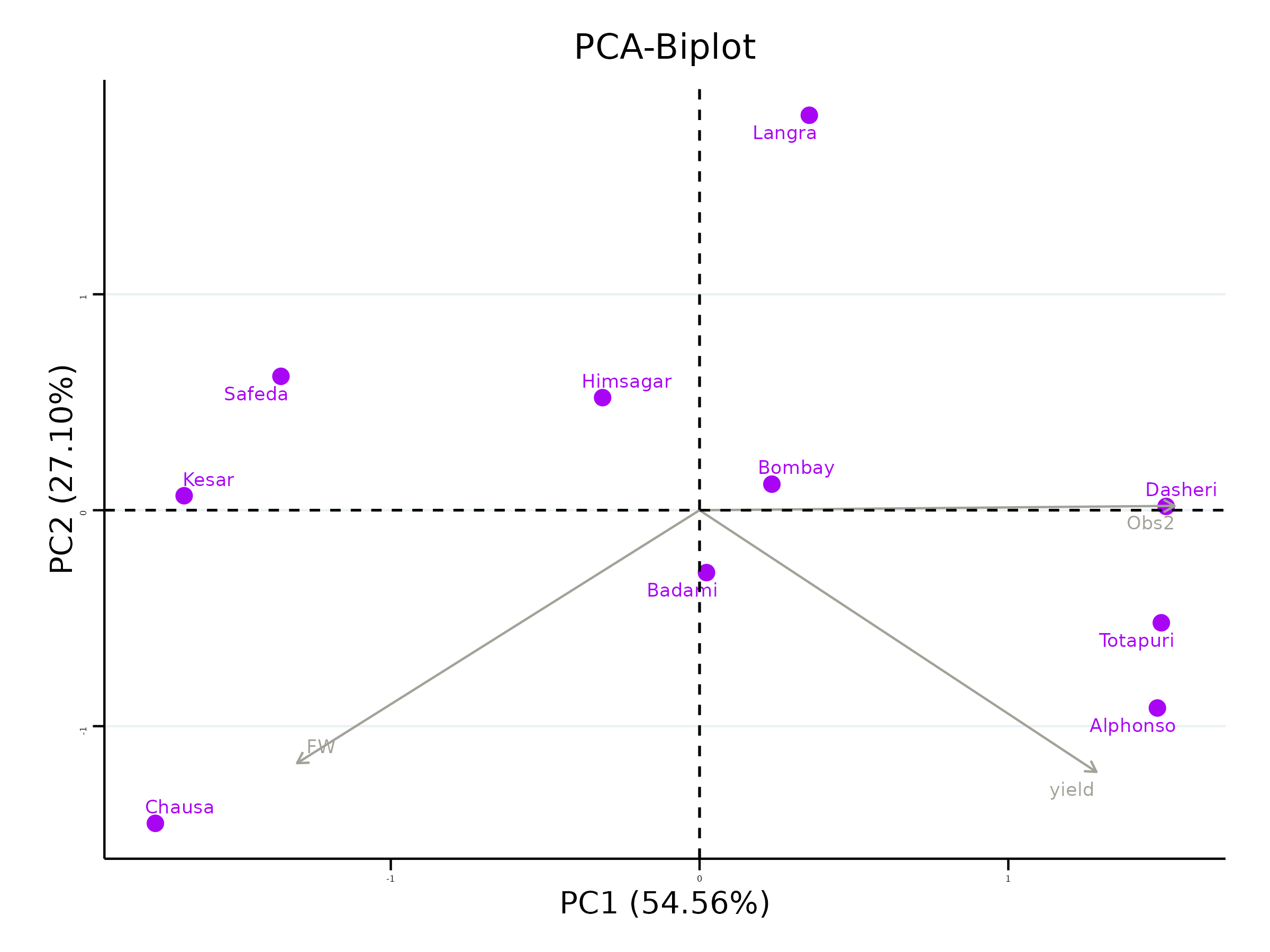
The biplot (Figure 28) puts treatments and variables on the same axes. Treatments sit where their trait values place them; the grey arrows are the variables. The angle between two arrows indicates their correlation — a small angle means the traits move together, a wide angle means they do not, and arrows pointing in opposite directions indicate a negative association. In the mango data the yield and Obs2 arrows both point to the right along PC1 while FW points left and down, confirming the trade-off seen in the loadings. Dasheri, Totapuri and Alphonso sit far out on the right, in the direction of the yield and Obs2 arrows; Chausa and Kesar sit on the left, near the FW direction.
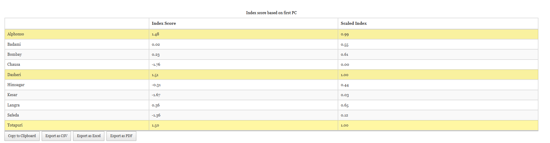
Finally, the index score table (Figure 29) ranks the treatments. It gives each treatment a raw Index Score on PC1 and a Scaled Index rescaled to run from 0 to 1, which is easier to compare and to report. Use the cutoff for Scaled Index Score control to set the percentage threshold — the default is 75% — and the up- and down-arrow buttons beneath it to select the top or the bottom group. Selected treatments are highlighted in yellow.
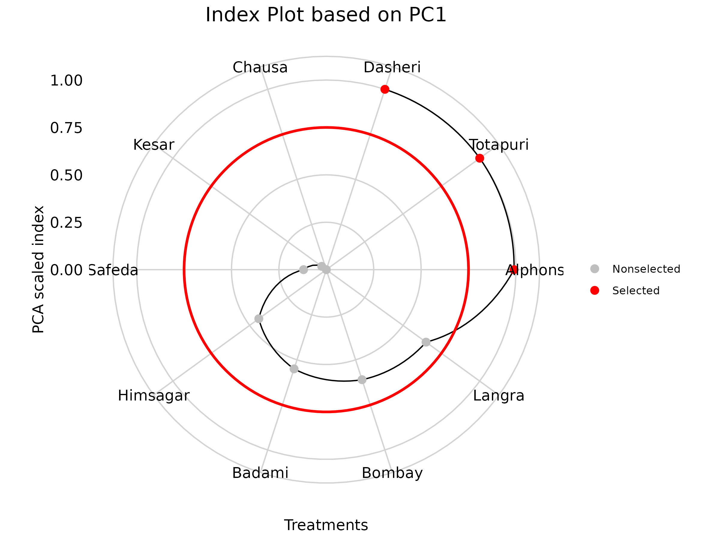
At the default 75% cutoff, three varieties are selected: Dasheri (index 1.51, scaled 1.00), Totapuri (1.50, scaled 1.00) and Alphonso (1.48, scaled 0.99). At the other end, Chausa (−1.76, scaled 0.00), Kesar (−1.67) and Safeda (−1.36) rank lowest.
The same selection is drawn as a radial index plot (Figure 30). Each spoke is a treatment, the distance from the centre is its scaled index, and the red ring marks the cutoff. Selected treatments appear as red points, the rest in grey — a quick visual check that the cutoff has caught the group you intended.
Putting the two halves together is the point of the exercise. The ANCOVA said the varieties differ in yield and that Alphonso leads it; the PCA index says Dasheri, Totapuri and Alphonso are the strongest across the three traits taken together. Alphonso appears in both lists, which makes it the defensible recommendation: significantly superior on the trait that separated the varieties, and among the best on the multi-trait index. Dasheri and Totapuri are worth carrying forward as candidates, but on the evidence of this trial they cannot be claimed to differ significantly from the rest.
16 FAQs
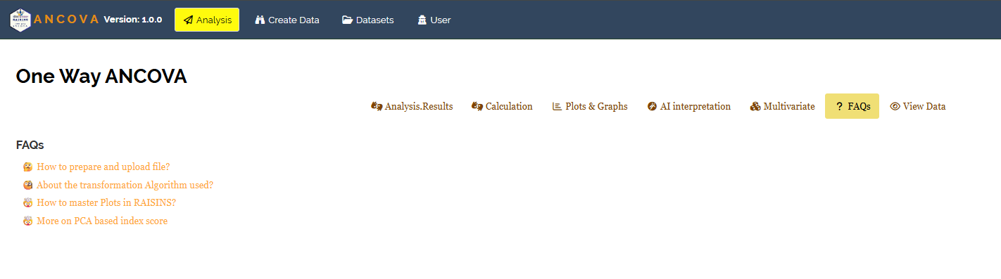
The FAQs sub-tab collects short answers to the questions that come up most often (Figure 31): how to prepare and upload a file, what the transformation algorithm actually does, how to master the plots in RAISINS, and more on the PCA-based index score. Each opens in place. If something in the module is not behaving as you expect, this is the quickest place to look before writing to support.
17 View data
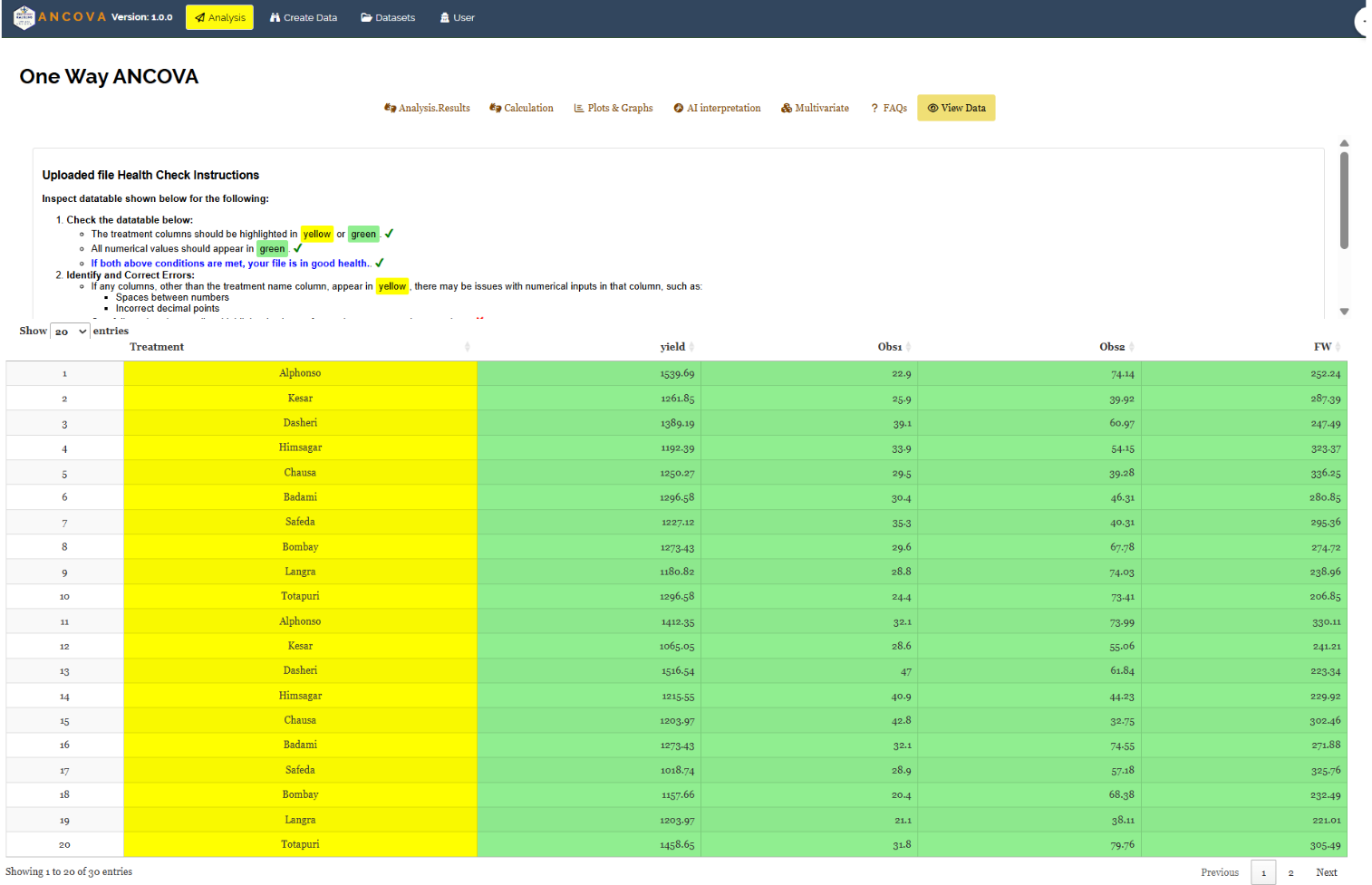
View Data is the diagnostic tool for checking data integrity before you trust any result. When a file is uploaded, the module runs an automated Health Check and colours the table it displays: treatment columns should appear in yellow and all numeric columns in green. If both conditions hold, your file is in good health.
A column that ought to be numeric but shows up yellow is the warning sign. It means the module is reading that column as text, usually because of a stray space between digits, a decimal point entered as a comma, or a placeholder character in a cell that looked empty. For ANCOVA this check matters more than usual: the covariate column must be fully numeric with no gaps, because a row whose covariate cannot be read cannot be adjusted, and the analysis will either drop it or refuse to run. The footer confirms how many rows were read — 30 in the mango example — which is worth comparing against what you expected.
18 Wrapping up
ANCOVA in a CRD rests on one honest question: if every experimental unit had started from the same baseline, would the treatments still differ? The regression on the covariate, the adjusted error term, the estimated marginal means and the letter groupings all exist to answer that question fairly. RAISINS runs the machinery so you can concentrate on the two decisions it cannot make for you — whether your covariate was measured before the treatments could touch it, and whether the relationship it has with your response is one a straight line can describe.
If your design does not match this one, the companion modules are next door: CRD and RBD when you have no covariate to adjust for, ANCOVA in RBD when your trial is blocked, and Repeated Measures ANOVA when the same units are measured on several occasions. And if you get stuck at any point, the FAQs are in the module, and you can write to us at [email protected].