AutoML
Automated Machine Learning trains and compares many candidate models on your data, then ranks them so you can pick the best performer without hand-tuning a single algorithm. Read more …
Machine learning finds patterns in data that are too complex or too tangled for a single equation to capture, and uses them to predict what has not been observed yet. Building such a model normally means choosing an algorithm, tuning it, and comparing it against rivals, which is slow and demands specialist knowledge. Automated Machine Learning (AutoML) does that search for you: it trains many candidate models, ranks them honestly, and hands you the winner. In RAISINS, the entire pipeline, from cleaning and engineering your features to fitting, comparing, explaining, and finally deploying a model, can be carried out without writing any code. This tutorial will guide you step-by-step.
1 Introduction to machine learning
A telecom company has 7,043 customers on its books. Last quarter, 1,869 of them left, which is roughly one in four. The company would dearly like to know which customers are about to leave, because a retention offer sent to the right person is worth a great deal and the same offer sent to a contented customer is money thrown away.
You could try to answer this with a rule. “Customers who pay more than ₹80 a month leave.” Write that rule down, test it, and it fails: plenty of expensive customers stay for years, and plenty of cheap ones vanish in month two. So you add another clause. “Customers who pay more than ₹80 a month and are on a month-to-month contract and have been with us less than a year.” Better, but still wrong often enough to be useless, and you now have three conditions interacting in ways you cannot hold in your head. Add a fourth and you are guessing.
This is the point at which machine learning earns its keep. Rather than you writing the rule, you hand the computer the historical data (all 7,043 customers, everything you know about them, and crucially whether each one actually left) and ask it to find the rule itself. The algorithm searches for the combination of conditions that best separates the leavers from the stayers, including combinations no analyst would think to try.
Machine learning is the practice of letting an algorithm discover the pattern that connects your input columns to an outcome you care about, so that it can predict that outcome for new cases where the answer is not yet known.
1.1 Learning from labelled examples
The kind of learning used throughout this module is supervised learning, and the name describes it well. You supply examples where the answer is already known, and the algorithm is supervised by those answers as it learns. Two ingredients are required:
- The target (also called the dependent variable, response, or label). This is the column you want to predict,
Churnin our example. - The predictors (also called independent variables or features). These are the columns you will use to make the prediction: contract type, tenure, monthly charges, and so on.
The algorithm studies the relationship between predictors and target across every row it is given, and distils that relationship into a model. Feed a new customer’s predictors into that model and it returns a predicted target.
The nature of the target decides the nature of the problem, and RAISINS detects this for you:
- When the target is a category (“Yes” or “No”, “Resistant” or “Susceptible”), the task is classification.
- When the target is a number (yield in kg, protein content, price), the task is regression.
| Problem type | Target looks like | Example question | What the model returns |
|---|---|---|---|
| Binary classification | Two categories | Will this customer leave? | A probability, plus a Yes/No verdict |
| Multiclass classification | Three or more categories | Which of five diseases is this plant showing? | A probability for each class |
| Regression | A continuous number | What yield will this plot produce? | A predicted number |
A model that has memorised the data it was trained on will score brilliantly on that data and fail completely on anything new. This is called overfitting, and it is the central hazard of the whole discipline. The defence is simple and non-negotiable: hold some data back, never let the model see it during training, and judge the model only on that held-back portion. Everything in Section 11 exists to enforce this discipline, and every honest number in Section 14 comes from data the model was never shown.
1.2 Why “automated” machine learning?
Knowing that you want a model is one thing; producing a good one is another. A conventional workflow asks you to pick an algorithm from a crowded field, choose sensible values for its settings, train it, measure it, adjust, and repeat, then start again with a different algorithm to check whether your first choice was even reasonable. Each algorithm has its own settings, its own failure modes, and its own idea of what a good default looks like.
AutoML automates that loop. You state the target and the predictors; the software trains a whole population of models, tunes them, evaluates every one of them on data they have not seen, and presents them to you in rank order. The work that used to fill a week of a specialist’s time is compressed into a few minutes, and the comparison is fairer than most people manage by hand because every candidate is judged on exactly the same held-out data.
RAISINS builds this on H2O AutoML, an open-source engine that is used in production across industry and research. Section 10 covers the algorithms it searches over, and Section 13 explains how to read the resulting ranking.
Where AutoML fits, and where it does not
-
AutoML automates model selection and tuning. It does not automate thinking. It cannot tell you whether your data were collected sensibly, whether a column leaks the answer, whether your target means what you believe it means, or whether the pattern it has found will still hold next season. It also does not replace classical inference: if your question is “did this treatment cause a difference in yield?”, you want a designed experiment and a t-test or ANOVA, not a predictive model. AutoML answers a different question, namely “given what I know about a new case, what is the most likely outcome?”. Use the right tool for the question you actually have.
2 Getting to the module
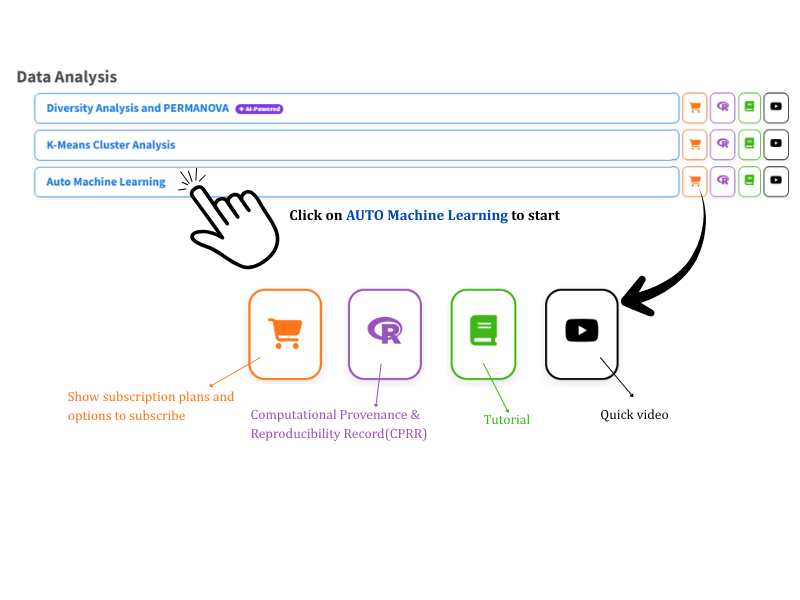
Now that the idea is clear, let us build a model. Visit the RAISINS home page at www.raisins.live and go to Data Analysis. In this tutorial we use the AutoML module, shown in Figure 1.
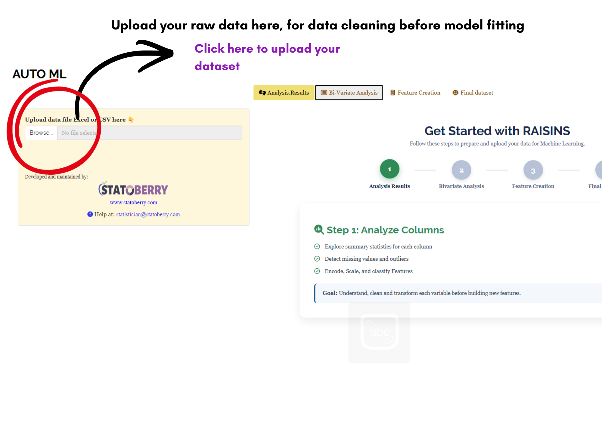
The module opens on the screen shown in Figure 2. Two things are worth noticing straight away. On the left is the upload panel, which is where every session begins. This is the feature creation tab which allows user to explore data, find missingness in the data and apply encoding this allows user to fit better models rather than moving straight to model fitting.
2.1 Computational Provenance & Reproducibility Record
CPRR (Computational Provenance & Reproducibility Record) provides a transparent and comprehensive record. Click on the icon shown in Figure 1 to access CPRR and know about the computational workflow performed during the analysis. The record for this module states the R version and the exact version of every package used, names the specific function behind each reported result. CPRR lists every default parameter and decision rule applied by the module and provides fully runnable R code that reproduces each analytical step. Users can execute the code in R to independently reproduce and verify the results. It carries its own DOI.
To cite the platform itself in a paper, thesis, or report, use the RAISINS citation, available in APA, Harvard, and BibTeX formats at www.raisins.live/citation.html. That is the primary reference, and for most manuscripts it is all you need.
The CPRR for the AutoML module is at www.raisins.live/module_record/automl.html.
Cite the RAISINS paper as your primary reference for the platform. Add the CPRR as supporting documentation when a journal asks for details of the computing environment, or when you want your methods section to be precise about versions and functions rather than saying “analysis was carried out using an online tool.” The CPRR supports the citation and ensures computational reproducibility.
3 Preview mode and Quick Tour
Before subscribing, you can explore the entire module using Preview mode, accessible from the Welcome page. Preview mode loads built-in datasets so you can try every feature (column summaries, scaling, encoding, binning, correlation plots, feature creation, the AutoML search itself, the leaderboard, the model visualisations, and the RA-One assistant) without uploading your own data. Because an AutoML run takes minutes rather than seconds, Preview mode is genuinely useful here: it lets you watch a complete search finish and inspect a real leaderboard before committing your own data to the module. First-time users are also offered a Quick Tour, an interactive, step-by-step walkthrough that highlights each control and explains what it does. You can retake the tour at any time from the Quick Tour tab.
4 A working example
The example carried through this tutorial is a customer churn dataset: 7,043 customers, each described by nine predictor columns and one outcome column, Churn, recording whether that customer left. It is a binary classification problem. A short description of each column in the dataset is given below (Figure 15):
| Column | Type | Range or levels | Notes |
|---|---|---|---|
customerID |
string | 7,043 unique values | An identifier, not a predictor — see the warning below |
gender |
enum | 2 levels (Male 3,555 / Female 3,488) | Nearly balanced |
SeniorCitizen |
int | 0 to 1 | An indicator coded as a number |
tenure |
int | 0 to 72 months, mean 32.37 | How long the customer has stayed |
ServiceCount |
int | 1 to 9, mean 5.45 | A created feature — see Section 8 |
Contract |
enum | 3 levels | Month-to-month, one year, two year |
PaperlessBilling |
enum | 2 levels | 59.2% on paperless billing |
MonthlyCharges |
real | 18.25 to 118.75, mean 64.76 | Current monthly bill |
TotalCharges |
real | 18.80 to 8,684.80, mean 2,282.59 | 27 missing values |
Churn |
enum | 2 levels, 26.5% “Yes” | The target |
customerID has 7,043 unique values across 7,043 rows, which is to say it identifies each customer perfectly and tells you nothing whatsoever about behaviour. Columns like this must be excluded from the predictor list. Left in, they invite the model to memorise individual rows instead of learning a pattern, which is overfitting in its purest form. The same applies to serial numbers, plot codes, accession numbers, and dates used as bare labels. Section 6 shows how the module makes such columns easy to spot.
5 How to prepare your data
Preparing the data for machine learning is the most important part, as the models learn from the given data, a data with high number of missing values or a a biased sample data forces the model to learn wrong patterns.
The module accepts CSV, XLS, or XLSX, and CSV is recommended as it is lighter and loads faster. Prepare the file in MS Excel following the layout below, then upload it through the Browse control shown in Figure 2.
5.1 Preparing data in MS Excel
Open a new blank sheet in MS Excel containing only one sheet, and avoid adding any unnecessary content. The dataset must follow a column-based format in which every column is a variable and every row is one observation. One of those columns is the outcome you want to predict; the rest are the predictors.
Ensure there are no unwanted spaces in column names or category labels, and make sure each column contains only one kind of thing. A numeric column holding the occasional text entry such as “NA” or “not measured” will be read as text and quietly excluded from the numeric analyses.
Dataset creation rules
- Column naming convention
- No spaces allowed in column names.
- Use underscores (
_) or full stops (.) for separation. - Avoid symbols and special characters such as %, #.
- Data arrangement
- Start the data towards the upper-left corner.
- Ensure the row above the data is not blank.
- One row per observation, one column per variable.
- Cell management
- Avoid typing or deleting in cells without data.
- If needed, select the affected cells, right-click, and choose Clear Contents.
- Column relevance
- Name all columns meaningfully.
- Exclude identifier columns (customer IDs, serial numbers) from the analysis, or at least never select them as predictors.
- The target column
- Include the outcome you want to predict as an ordinary column.
- For classification, keep the category labels spelled consistently — “Yes”, “yes”, and “YES” will be read as three different classes.
- Rows where the target itself is missing cannot be used for training; remove them or fill them in.
How to save as CSV in MS Excel
Open your workbook. Ensure your data is arranged properly with only one sheet.
Click the ‘File’ menu. Go to the top-left corner and click File.
Choose ‘Save As’ or ‘Save a Copy’. Select the location where you want to save your file.
Set file type to CSV. In the ‘Save as type’ dropdown, choose CSV (Comma delimited) (*.csv).
Name your file. Enter a relevant file name without spaces (use underscores if needed).
Click ‘Save’. Click Save to export the file.
💡 Tip: Before saving, double-check that your data is on the first sheet and follows the required format: no empty rows above the data, meaningful column names, and one row per observation.
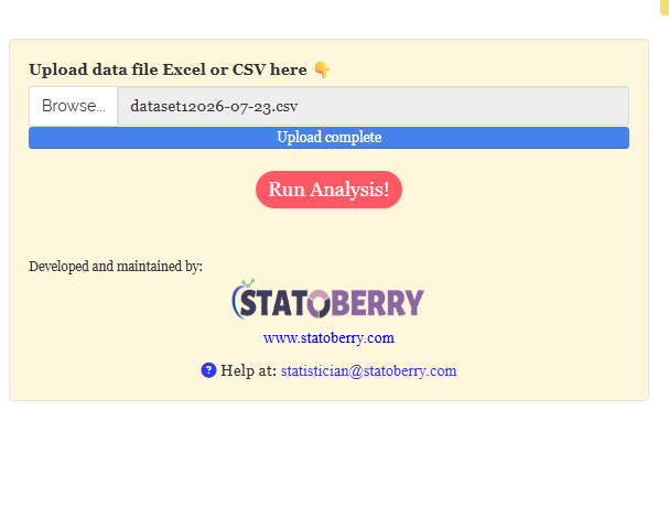
Once the file is chosen the upload bar completes and a Run Analysis! button appears (Figure 3). Clicking it loads the data and opens the four preparation tabs described in Section 6.
6 Importance of feature engineering
Feature engineering is the work of turning raw columns into columns a model can actually learn from. Four kinds of problem are common, and the module gives you a tool for each:
- Columns measured on wildly different scales, so that one dominates by sheer magnitude. Fixed by scaling (Section 6.1).
- Columns holding text categories, which most algorithms cannot consume at all. Fixed by encoding (Section 6.2).
- Continuous columns whose relationship with the target is a matter of broad bands rather than exact values. Fixed by binning (Section 6.3).
- Information that exists in your data only implicitly, spread across several columns. Fixed by feature creation (Section 8).
All of this happens on the Analysis.Results tab, which presents your dataset one column at a time. Select a column and the module reports its type, its row count, its unique values, its missing values, its most frequent levels, and offers a Summarize button along with imputation and visualisation options. Figure 4 shows this for customerID.
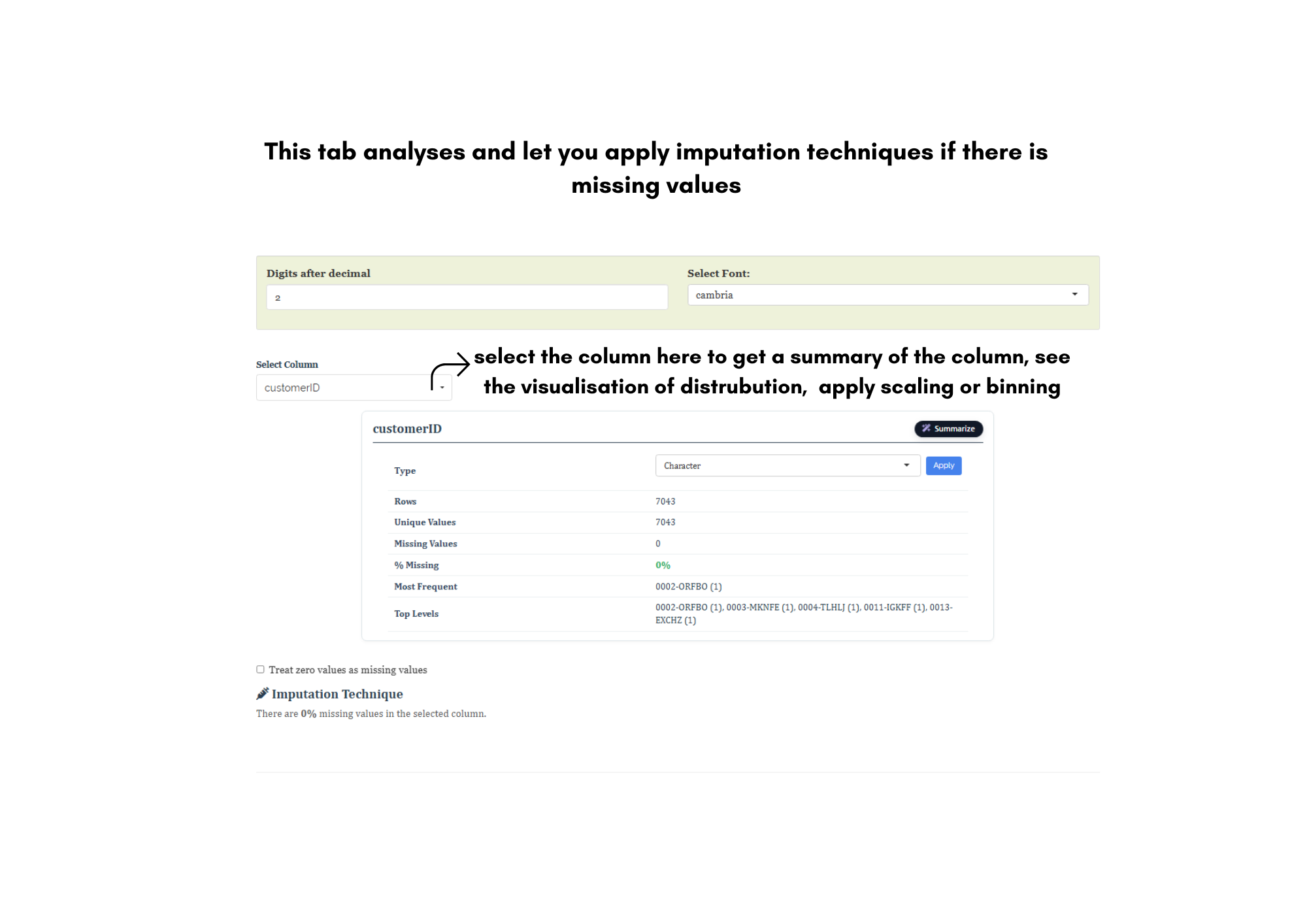
Read Figure 4 carefully and it makes the point of Section 4 concrete without any statistics at all: customerID has 7,043 rows and 7,043 unique values. A column with as many distinct values as it has rows cannot generalise to a new customer, because no new customer will ever share a value with a training row. That is the signature of an identifier, and this panel is where you catch it.
Contrast that with gender in Figure 5: 7,043 rows, 2 unique values, no missing data, Male 3,555 and Female 3,488. Here the panel also reveals the column’s Type, which the module has set to Factor, and offers a dropdown to change it. Getting these types right matters, and Section 10 returns to it.
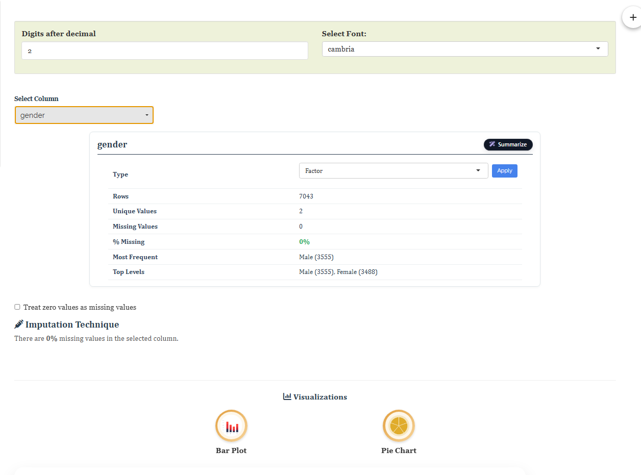
Both panels report % Missing and, when a column has gaps, offer an Imputation Technique. In our dataset TotalCharges is the only affected column, with 27 missing values out of 7,043. You have a genuine choice here: fill the gaps by imputation, or leave them, since the tree-based algorithms that dominate the H2O leaderboard handle missing values natively. The one option that is never right is to pretend the gaps are zeros. Note also the Treat zero values as missing values checkbox, which is there for the opposite situation, where a zero in your file actually means “not recorded”.
6.1 Scaling
Scaling rescales a numeric column to a common range so that variables measured on different scales contribute fairly to the algorithm. Consider two predictors in our data: tenure runs from 0 to 72, while TotalCharges runs from 18.80 to 8,684.80. To any algorithm that measures distance between rows, TotalCharges is more than a hundred times louder than tenure, purely because of the units it happens to be recorded in. Scaling removes that accident.
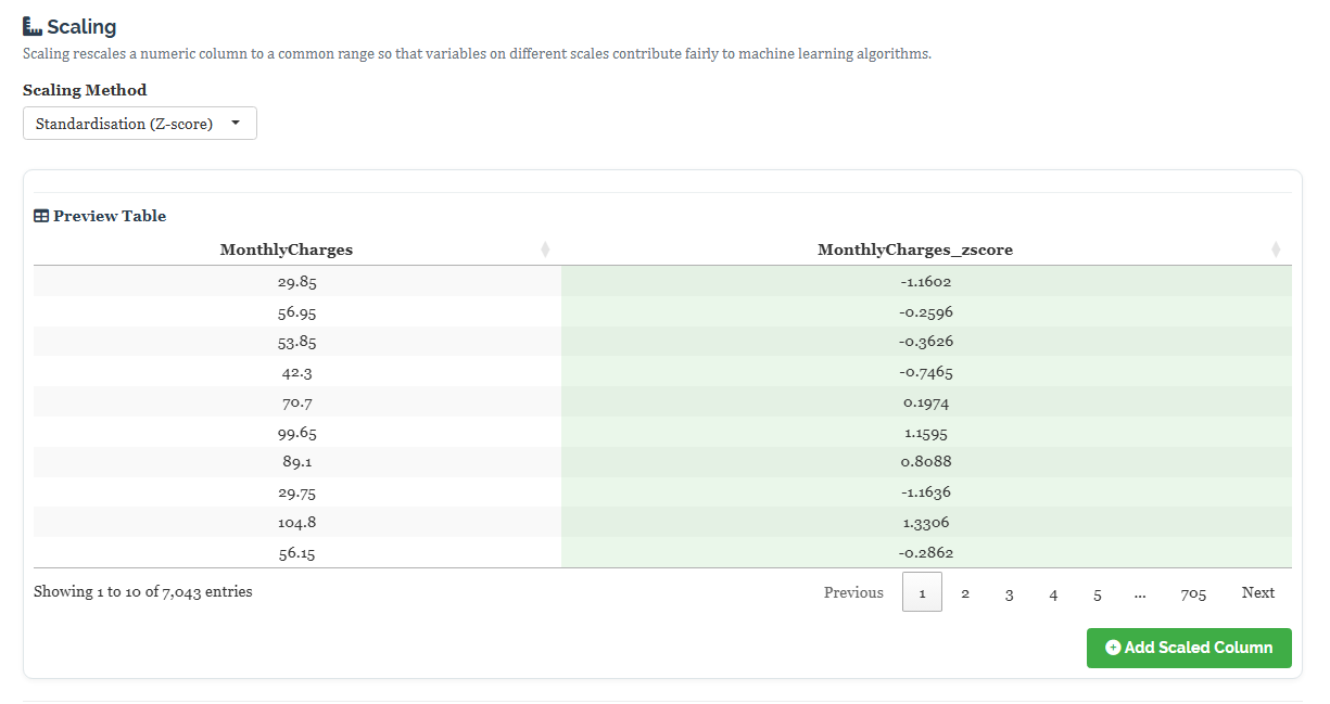
Select a numeric column, choose a Scaling Method, and the module shows a live preview of the original column beside its transformed version before you commit. Figure 6 shows Standardisation applied to MonthlyCharges: the first customer’s ₹29.85 becomes −1.1602, meaning that customer sits about 1.16 standard deviations below the average bill of ₹64.76. Press Add Scaled Column and a new column, MonthlyCharges_zscore, is appended to the dataset. The original is never overwritten.
| Method | What it does | When to reach for it |
|---|---|---|
| Standardisation (Z-score) | Subtracts the mean and divides by the standard deviation, giving a column centred on 0 | The sensible default for roughly symmetric data |
| Min-Max Normalisation | Rescales linearly into a fixed range, [0, 1] by default |
When you need a guaranteed bounded range |
| Robust Scaling | Uses the median and IQR instead of the mean and SD | When the column has outliers that would distort the mean |
| Max-Abs Scaling | Divides by the largest absolute value, preserving zeros | Sparse data where zero means “absent” |
| Log Transform | Replaces each value with its logarithm | Strongly right-skewed columns such as TotalCharges |
Honestly, no. The gradient boosting machines and random forests that dominate most H2O leaderboards split on one variable at a time and are completely indifferent to scale. Scaling matters for the distance-based and coefficient-based algorithms in the search, chiefly Deep Learning and GLM. Since AutoML trains all of them, scaling can only help the ones that need it and costs the others nothing. It also makes your own inspection of the data easier, which is reason enough.
6.2 Encoding
Encoding converts categorical values into numerical representations. A column containing “Male” and “Female” carries real information, but most algorithms need that information expressed as numbers before they can use it.
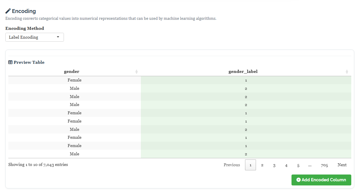
The workflow mirrors scaling: select a categorical column, choose an Encoding Method, inspect the preview, and click Add Encoded Column. Figure 7 shows Label Encoding applied to gender, where Female becomes 1 and Male becomes 2 (levels are numbered alphabetically), producing a new gender_label column.
| Method | What it produces | Best suited to |
|---|---|---|
| Label | One integer per level, assigned alphabetically | Tree models, which do not read the integers as quantities |
| Frequency | The count of each category | When how common a category is carries signal |
| Ordinal | Integers in an order you specify by drag-and-drop | Genuinely ordered categories: Low / Medium / High |
| Binary | The level code split across several bit columns | Many levels, when one-hot would create too many columns |
| One-Hot | One 0/1 indicator column per level | Unordered categories with few levels; safest for GLM and Deep Learning |
| Target | The mean target value for each category, smoothed | High-cardinality columns, used with care |
Encoding Contract as Month-to-month = 1, One year = 2, Two year = 3 is harmless for a tree, which only ever asks “is this value above or below a cut point?”. But a linear model reads those numbers literally and concludes that a two-year contract is exactly twice a one-year contract and three times a monthly one, which is meaningless. For genuinely unordered categories, prefer One-Hot. For genuinely ordered ones, use Ordinal and set the order yourself rather than letting the alphabet decide it. And be wary of Target encoding, which uses the target to build a predictor and can leak the answer into your features if applied carelessly.
6.3 Classification (binning)
Binning, labelled Classification in the module, converts a continuous numeric column into a set of ordered categories. This is deliberately throwing away detail, and it is worth being clear about why you would ever want to.
Sometimes the relationship you care about is banded rather than smooth. A tariff of ₹68 and one of ₹69 almost certainly behave identically, whereas “low bill” and “high bill” customers behave very differently. Binning encodes that belief directly. It also makes results far easier to explain to a non-technical audience, and it gives you a way to turn a continuous column into a categorical target if you want to model bands rather than exact values.
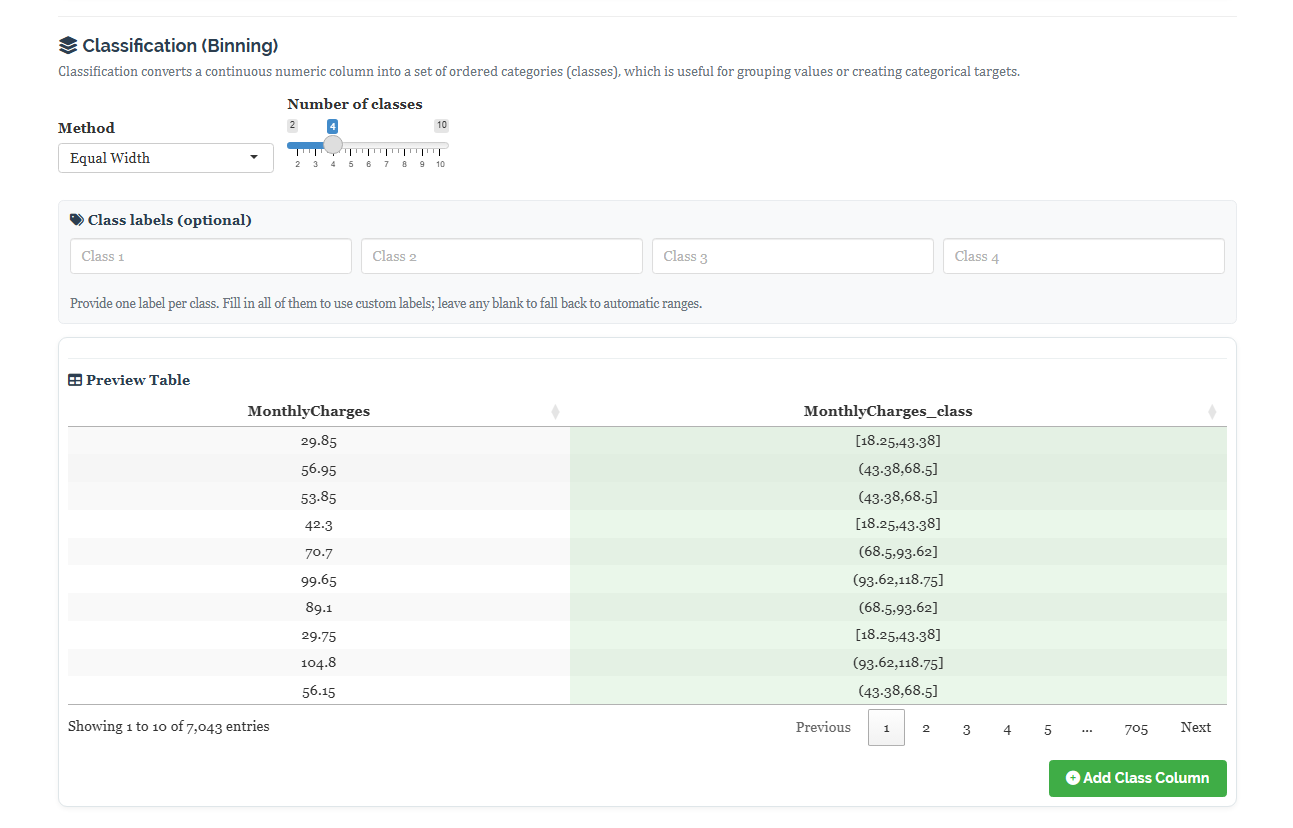
Figure 8 shows Equal Width binning applied to MonthlyCharges with four classes. The column spans ₹18.25 to ₹118.75, so the module cuts it into four equal intervals: [18.25, 43.38], (43.38, 68.5], (68.5, 93.62], and (93.62, 118.75]. The first customer at ₹29.85 falls into the lowest band. You may name the classes yourself using the optional Class labels boxes, or leave them blank to keep the numeric ranges.
| Method | How the cut points are chosen | Consequence |
|---|---|---|
| Equal Width | The range is divided into intervals of equal size | Simple to explain, but classes may hold very unequal counts |
| Equal Frequency | Cut points are quantiles, so each class holds a similar number of rows | Balanced classes, but the intervals are of uneven width |
| K-Means Clustering | Cut points are found by clustering the values themselves | Follows the natural grouping in the data; uses a fixed seed so results repeat |
| Custom Break Points | You supply the cut points | When domain knowledge or a published standard dictates the bands |
Every value inside a band becomes indistinguishable from every other value in that band. If the true relationship really is smooth, binning will make your model slightly worse, not better. The number of classes is the dial that controls this: too few and you erase real structure, too many and you have merely made the column awkward without simplifying anything. The default of four is a reasonable starting point. If in doubt, keep the original column as well and let the leaderboard tell you which one the models actually use.
7 How correlation helps in removing unwanted features
More predictors is not better. Columns that carry no relationship to the target add noise and slow the search; columns that duplicate each other add nothing while making the model harder to interpret. The Bi-Variate Analysis tab exists to find both kinds before you fit anything, and it offers two instruments because numeric and categorical columns need different treatment.
7.1 Pearson correlation, for numeric columns
For numeric columns the module computes a correlation matrix, displayed as a grid of circles in which size indicates strength and colour indicates direction (red for positive, blue for negative). The settings panel on the left, shown in Figure 9, lets you switch between Pearson (linear) and Spearman (rank), display the coefficients as numbers, control significance shading, and export the plot in any of six formats.
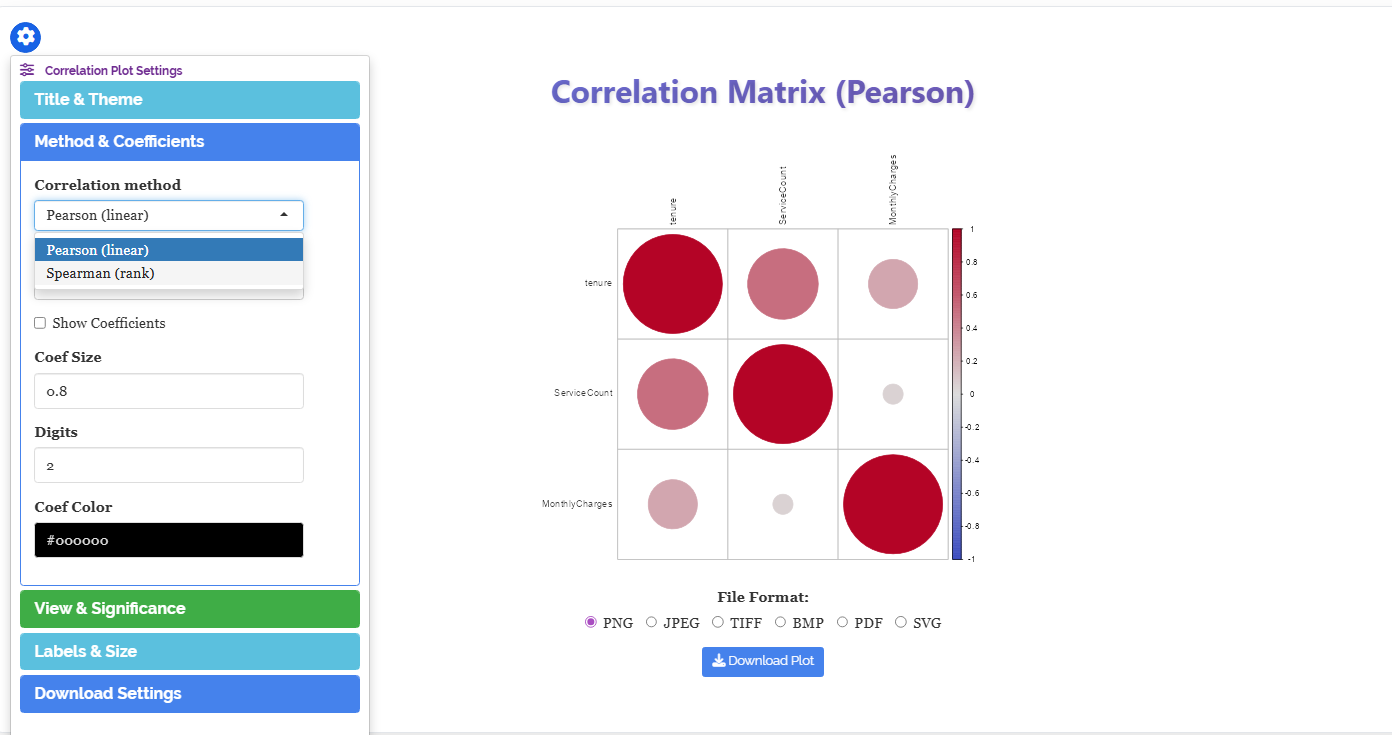
Pearson measures the strength of a straight-line relationship between two numeric columns, on a scale from −1 to +1. Spearman does the same for the ranks rather than the raw values, which makes it the better choice when a relationship is consistently increasing but not in a straight line, or when outliers would otherwise dominate.
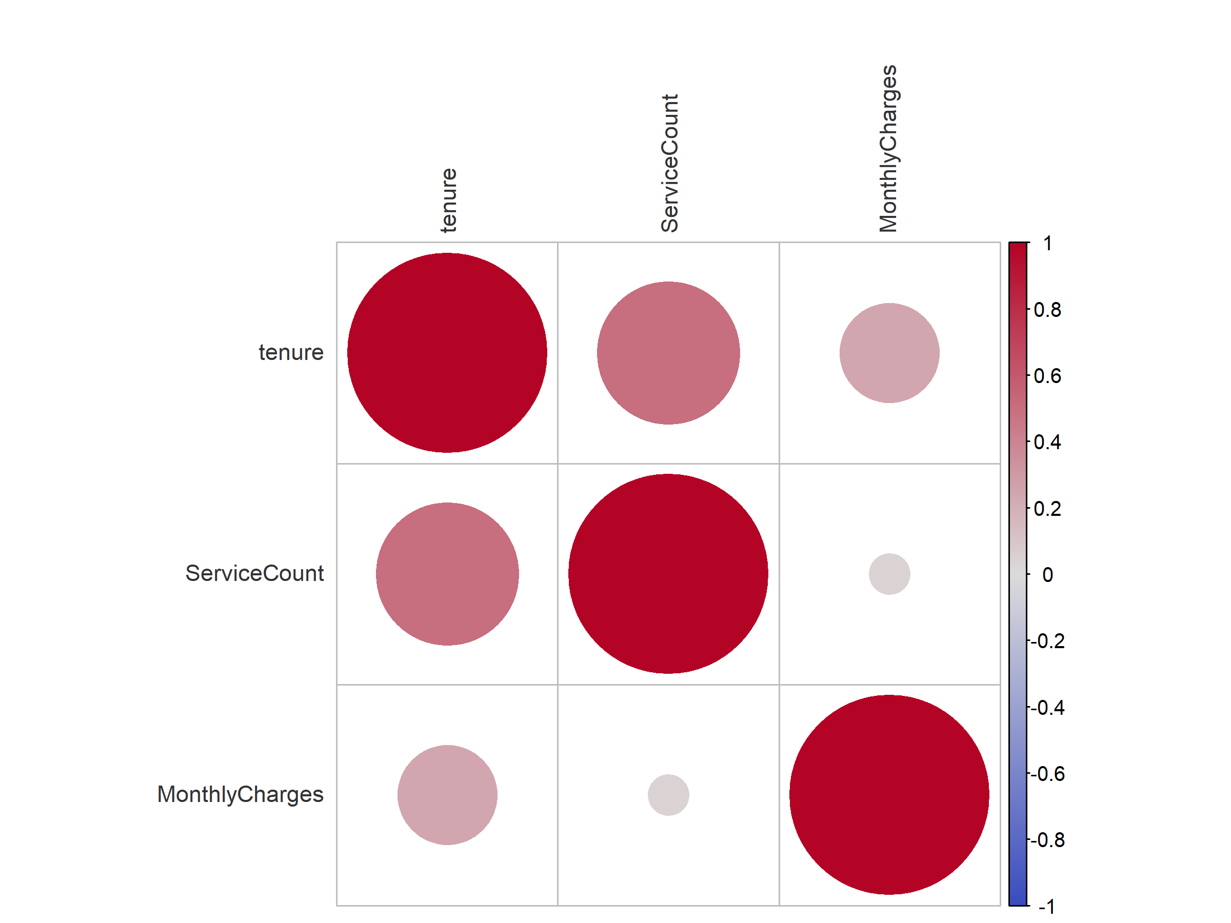
Figure 10 shows the Pearson matrix for the three unbinned numeric columns in our data. The diagonal is solid red by construction, since every column correlates perfectly with itself. Off the diagonal, tenure and ServiceCount show a clear positive association, tenure and MonthlyCharges a weaker positive one, and ServiceCount and MonthlyCharges almost none at all.
Two different things, and it is worth keeping them apart.
Redundancy shows up as a very large circle between two predictors, say above 0.9. The pair are telling you the same story twice, and you can usually drop one. TotalCharges is the classic case in our dataset: it is close to tenure multiplied by MonthlyCharges, so it carries little that those two do not already say.
Irrelevance shows up as a near-empty cell between a predictor and the target. That predictor may be a candidate for removal — but only a candidate. Correlation measures linear association only, and a predictor can be worthless to Pearson yet valuable to a tree that finds it useful in combination with something else.
7.2 Cramér’s V, for categorical columns
Pearson correlation is undefined for text categories, so the module uses Cramér’s V for those. It is built on the chi-squared test of association and runs from 0 to 1, where 0 means the two columns are entirely unrelated and 1 means knowing one tells you the other exactly. Because it has no sign, the colour scale runs from purple at 0 through white to green at 1, rather than the red-blue scale used for Pearson.
Figure 11 shows the result for our categorical columns, and it delivers the single most useful finding in this section.
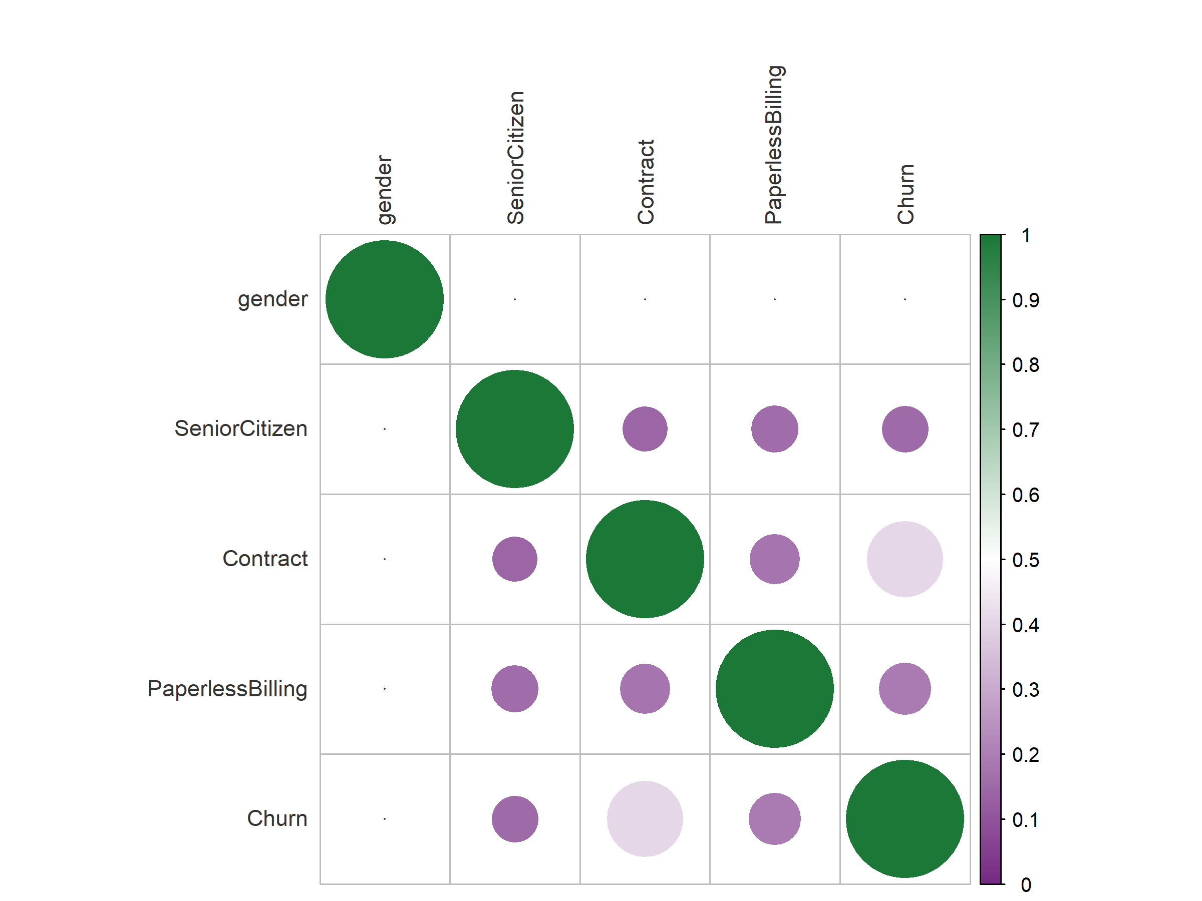
Look along the gender row. Every cell is a barely visible dot: gender has essentially zero association with Churn, and zero association with every other predictor too. In this dataset, men and women churn at indistinguishable rates. That is a real finding, and it is exactly the kind of column you can drop with confidence.
Now look at the Churn column. Contract gives the largest circle by a wide margin, which says that contract type is by far the strongest categorical signal for churn. PaperlessBilling and SeniorCitizen show small but real associations. This ordering is worth remembering, because Section 15 shows the fitted model arriving at precisely the same conclusion by a completely different route.
Dropping a genuinely dead column such as gender speeds up the search and simplifies the final model. But resist the urge to prune aggressively on the strength of these plots alone. Cramér’s V, like Pearson, looks at one pair of columns at a time and is blind to interactions. A column that looks useless in isolation can matter a great deal in combination with another. If you are unsure, keep the column and let the variable importance plot in Section 15 settle it, since that measure is computed by the model itself and does account for interactions.
8 Feature creation
Scaling, encoding, and binning reshape information you already have. Feature creation adds information that was previously present only implicitly, and it is the part of this module where domain knowledge pays off most directly. No search over algorithms can invent a column; only you can do that.
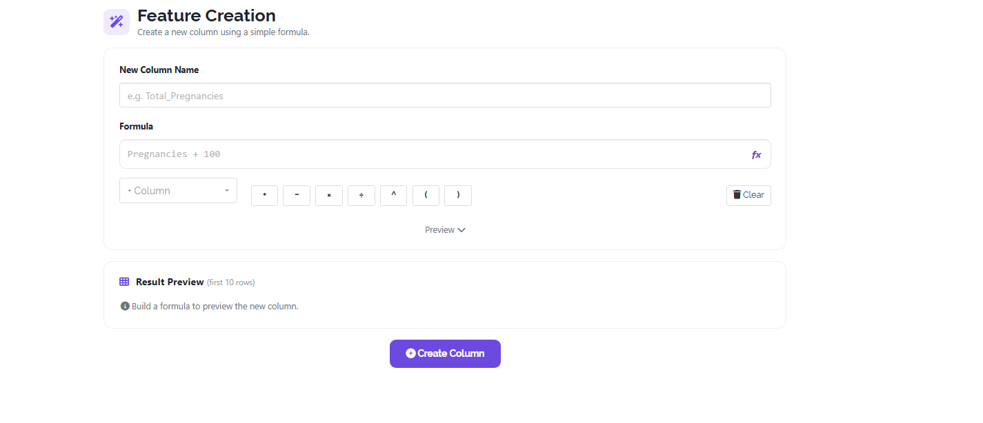
The Feature Creation tab, shown in Figure 12, provides a formula builder. Name the new column, then compose an expression from your existing columns using the + Column dropdown and the arithmetic buttons for addition, subtraction, multiplication, division, exponentiation, and brackets. A Preview shows the first ten rows of the result before you commit, and Create Column appends it to your dataset.
8.1 A worked example, and what it bought us
The ServiceCount column in our working example is not original to the data. The raw dataset recorded each service a customer subscribed to as its own yes/no column: phone service, multiple lines, internet, online security, online backup, device protection, technical support, streaming television, streaming films. Nine columns, each nearly useless on its own, and collectively an invitation to overfit.
Adding them together produces a single integer from 1 to 9 measuring how deeply the customer is invested in the company. That quantity is real, it is intuitive, and it was nowhere in the original file. Its mean of 5.45 tells you the typical customer takes about five services.
The payoff appears in Section 15. When the model ranks its predictors by importance, ServiceCount places fourth out of eight, above TotalCharges, above PaperlessBilling, and far above gender. A column that did not exist in the source data ends up mattering more than most of the columns that did.
| Pattern | Formula shape | Why it helps |
|---|---|---|
| Counting | A + B + C + … over indicator columns |
Collapses many weak binary columns into one meaningful intensity |
| Ratio | A ÷ B |
Puts a quantity on a per-unit basis: yield per plant, cost per month |
| Difference | A − B |
Captures change or gap directly, rather than making the model infer it |
| Interaction | A × B |
Hands a combined effect to algorithms that would struggle to find it |
| Intensity | A ÷ (B + 1) |
A rate that stays defined when the denominator can be zero |
If you take one habit away from this section, make it this: whenever you have a total and a size, create the ratio. Total charges and tenure give you an average monthly spend. Total yield and plot area give you yield per hectare. Total cost and units produced give you unit cost. Totals confound magnitude with duration or size, and the ratio separates them. It is the single most reliable feature-creation move in practice, and it takes about ten seconds in Figure 12.
A new column computed from the target, or from anything only knowable after the outcome occurred, will produce a model with a spectacular score that collapses the moment it meets real data. This is leakage. If you were predicting yield, a column such as “total revenue from this plot” would be leakage, because revenue is a consequence of yield, not a cause of it. Ask of every new feature: would I actually know this value at the moment I need to make the prediction? If the answer is no, do not create it.
9 Export of the cleaned file
Everything done in Section 6, Section 7, and Section 8 appends new columns to a working copy of your data while leaving the originals intact. The Final dataset tab, shown in Figure 13, is where that working copy becomes a file you can keep.
Exporting matters for three practical reasons. It gives you a reproducible artefact: the exact table the model was fitted to, which is what a reviewer or a collaborator will ask for. It saves you repeating the preparation work, since a cleaned file can be uploaded straight back into the module, or into any other RAISINS module, in a single step. And it gives you the template your predictions must match, because as Section 16 explains, new data submitted for prediction must carry the same predictor columns, with the same names, as the data the model was trained on. If you engineered ServiceCount before fitting, then any future file you want predictions for must contain ServiceCount too.
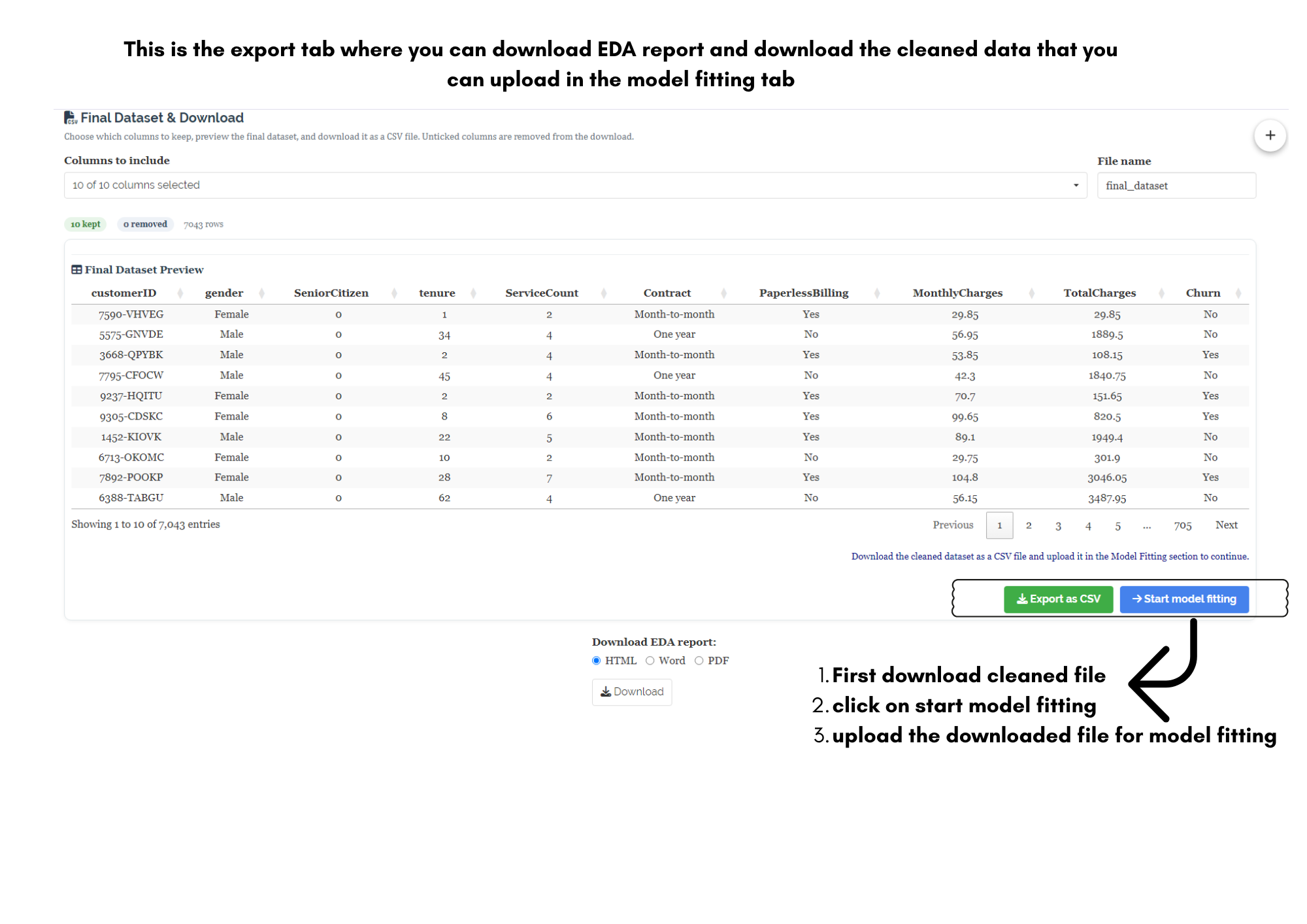
The search in Section 10 uses fixed random seeds, so the same data will give you the same leaderboard tomorrow. That guarantee is only worth something if you still have the same data. Download the final dataset before starting the search and store it beside your results.
With the data prepared and exported, proceed to Section 10 to fit the models.
10 Model fitting
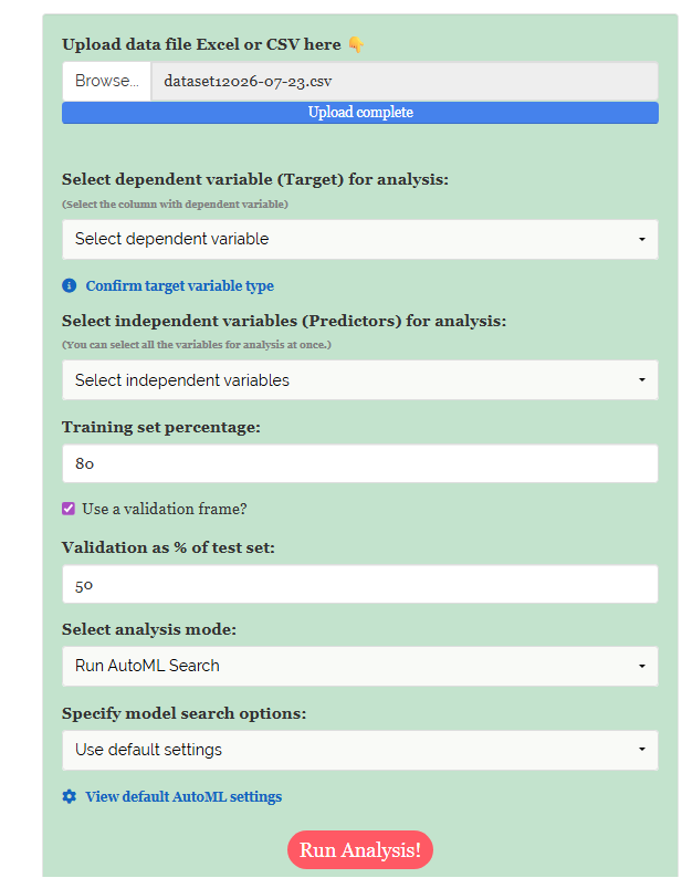
Model fitting begins with the cleaned file from Section 9. Upload it and the sidebar fills with the controls shown in Figure 14: a target selector, a predictor selector, the split settings, an analysis mode, and the model search options.
10.1 Confirm the column types first
Before selecting anything, open the Column Summary table shown in Figure 15. This is the module’s account of how it has read every column in your file, and it is the last point at which a misreading is cheap to fix.
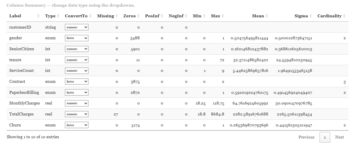
The table reports each column’s Label, its detected Type, a ConvertTo dropdown for changing that type, and then the diagnostics that matter: missing values, zeros, minimum, maximum, mean, sigma, and cardinality. Our dataset shows TotalCharges with 27 missing values and every other column complete, tenure running 0 to 72 with a mean of 32.37, and Churn recorded as an enum with cardinality 2 and a mean of 0.2654, confirming that 26.5% of customers churned.
This is the single most common mistake in the module and it is silent. If your target is a category but happens to be coded as numbers — 0 and 1, or 1, 2, 3 — H2O will read it as int and fit a regression model. It will not fail. It will return predictions like 0.37 and a leaderboard sorted by RMSE, and nothing will look obviously wrong until you notice there is no AUC anywhere.
Check the Type column for your target. It must read enum for classification. If it reads int or real, use the ConvertTo dropdown to set it to factor and apply the change before running the analysis. In Figure 15, Churn correctly shows enum with the dropdown set to factor. The Confirm target variable type link in the sidebar (Figure 16) takes you to the same place.
10.2 Selecting the target and the predictors
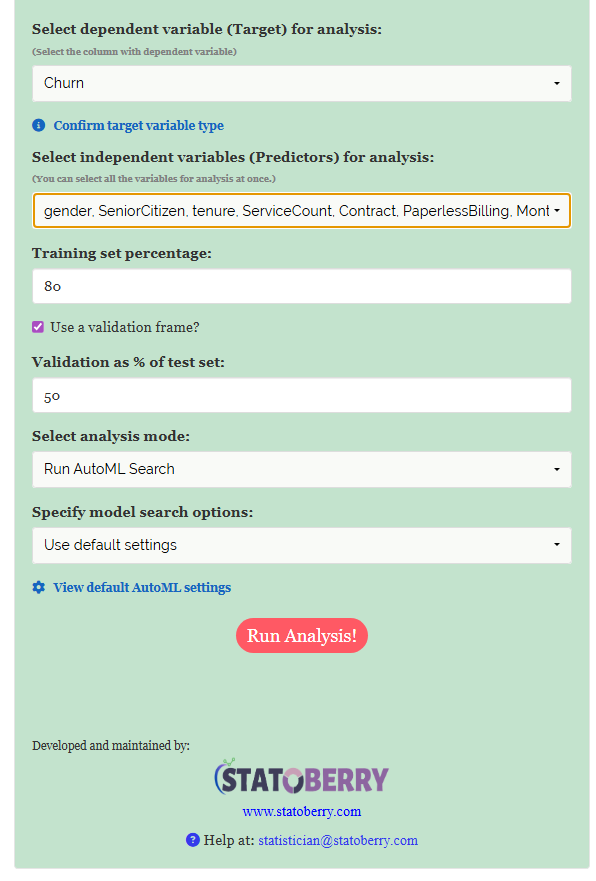
With the types confirmed, set up the run as shown in Figure 16. Choose the dependent variable (Target) — here Churn — then choose the independent variables (Predictors). You may select all of them at once, but this is the moment to apply what Section 7 told you: leave out customerID, which is an identifier, and consider leaving out gender, whose Cramér’s V against Churn was effectively zero.
Below the variable selectors sit the split controls, covered in Section 11, then Select analysis mode, which is set to Run AutoML Search for a fresh search, and Specify model search options, which is where Section 12 begins.
10.3 Models available in H2O AutoML
Clicking Run Analysis! hands your data to the H2O AutoML engine, which trains and tunes candidates drawn from six algorithm families and then attempts to combine them. You do not choose among these; the point of AutoML is that all of them compete on equal terms and the leaderboard settles the matter.
| Algorithm | What it is | Character |
|---|---|---|
| GLM | Generalised Linear Model | Fast, linear, and highly interpretable. Often the baseline the others must beat |
| DRF | Distributed Random Forest | Many decision trees on random subsets, averaged. Robust and hard to overfit |
| XRT | Extremely Randomised Trees | A random forest that also randomises its split points. More variance in each tree, less overall |
| GBM | Gradient Boosting Machine | Trees built in sequence, each correcting the last. Usually the strongest single family on tabular data |
| XGBoost | Extreme Gradient Boosting | A heavily optimised boosting implementation. Powerful but slow to train |
| Deep Learning | Multi-layer feedforward neural network | Excels at complex interactions, but wants a lot of data and time |
| Stacked Ensemble | A model trained on the predictions of the others | Built automatically at the end. Frequently tops the leaderboard |
Why stacked ensembles usually win, and why they sometimes should not
Two ensembles are built automatically once the individual models have finished: All Models, which stacks every candidate trained during the run, and Best of Family, which stacks only the strongest representative of each algorithm family. Both work by training a second-level model whose inputs are the predictions of the first-level models, learning where each base model tends to be right and weighting them accordingly. Because the errors of a neural network and the errors of a boosted tree are different in character, combining them cancels out more error than either can manage alone.
The catch is that a stacked ensemble is a committee, not a model. You cannot read a coefficient from it, its variable importance is a derived approximation, and it must keep every base model in memory to make a single prediction. When the ensemble beats the best single model by a hair — 0.831 against 0.827, say — the simpler model is often the better choice in practice. In our own run, no ensemble appears in the top ten at all: the leaderboard in Section 13 is led by a plain GBM.
11 The validation frame
This section is short, and it is the most important one in the tutorial. Everything you will read off the leaderboard in Section 13 and the metrics table in Section 14 is trustworthy only because of the split described here.
Recall the hazard from Section 1: a model that has memorised its training data will score beautifully on that data and fail on anything new. The only defence is to keep data back. RAISINS therefore divides your file into three parts.
| Split | Default share | What it is for | Does the model see it? |
|---|---|---|---|
| Training | 80% | Fitting the models — where the patterns are actually learned | Yes, directly |
| Validation | 10% | Comparing candidates and deciding when to stop training | Indirectly — it guides the search |
| Test | 10% | The final, honest estimate of performance | No, never |
Two controls in Figure 16 set this. Training set percentage defaults to 80. The Use a validation frame? checkbox is ticked by default, and Validation as % of test set defaults to 50, which splits the remaining 20% evenly into a 10% validation set and a 10% test set. In our run that gives roughly 690 customers in the validation frame, which is the number you will see totalled in the confusion matrix in Section 15.
The distinction between validation and test is the subtle part, and it is where most people’s intuition fails. The validation set is used during the search: it decides which model is winning and when training has stopped helping. That makes it useful, but it also means the search has been steered by it, and a score measured on it is therefore mildly optimistic. The test set is touched only once, after every decision has been made. It is the only number you should quote.
If you untick Use a validation frame?, the module falls back to k-fold cross-validation instead. The training data are divided into k parts (5 by default); each part takes a turn as the held-out fold while the model trains on the other four, and the k scores are averaged. This uses your data more efficiently and gives a more stable estimate, which makes it the better choice for small datasets.
The two mechanisms are alternatives, not additions. When a validation frame is supplied, RAISINS sets the number of cross-validation folds to zero automatically. Doing both would mean holding out data twice over and paying the training cost k times for no benefit. So: small dataset, use cross-validation; large dataset, use a validation frame and enjoy the much shorter runtime. With 7,043 rows we are comfortably in the second case.
The split is drawn with a fixed random seed, so re-running the same file with the same settings puts exactly the same rows in exactly the same partitions and reproduces the leaderboard. This is what makes the CPRR claim of reproducibility real rather than aspirational, and it is why Section 9 advised you to keep the exported file.
12 Custom settings
The Specify model search options dropdown offers Use default settings, which searches up to 50 models within a five-minute budget and needs no further input, and Custom settings, which opens the panel shown in Figure 17. The defaults are well chosen and you should feel no obligation to touch them. But three situations make custom settings worth the trouble: when the default run is taking longer than you want, when you need the search to finish inside a fixed time, and when you want a model you can explain rather than merely a model that scores well.
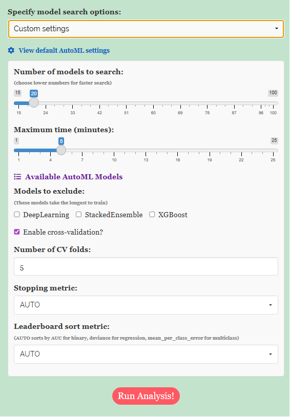
| Setting | Range | What it controls |
|---|---|---|
| Number of models to search | 15 to 100 | How many candidates the search will train before stopping |
| Maximum time (minutes) | 1 to 25 | A hard wall-clock ceiling on the whole search |
| Models to exclude | DeepLearning, StackedEnsemble, XGBoost | Removes the slowest families from the search |
| Enable cross-validation | On or off | The alternative to a validation frame (Section 11) |
| Number of CV folds | 2 to 10 | How many folds, when cross-validation is used |
| Stopping metric | AUTO or a named metric | What the search watches to decide training has stopped helping |
| Leaderboard sort metric | AUTO or a named metric | What the leaderboard is ranked by |
The two budgets work together, and the tighter one wins. Setting 100 models and 5 minutes does not give you 100 models; it gives you as many as fit in 5 minutes. Setting 20 models and 25 minutes stops at 20. The run shown in Figure 17 asks for 20 models within 5 minutes, and the leaderboard in Section 13 confirms 20 models were trained, so the model count was the binding constraint.
Excluding algorithms is the fastest way to speed up a search. The three offered are the three that take longest to train. Excluding DeepLearning and XGBoost can cut a run to a fraction of its time at a modest cost in accuracy, which is exactly the trade you want while exploring. Excluding StackedEnsemble has a different motive: it guarantees the winner will be a single interpretable model rather than a committee, which matters when you have to justify a prediction to someone.
The stopping metric watches performance on held-out data during training and halts a model once it stops improving, which prevents overfitting and saves time. The leaderboard sort metric decides only how the finished models are ranked. Both default to AUTO, which resolves sensibly: AUC for binary classification, deviance for regression, and mean per-class error for multiclass. Change the sort metric when the default does not match what you care about — for a rare-event problem, AUCPR is often a better guide than AUC.
Explore with a short run: 15 to 20 models, 3 to 5 minutes, DeepLearning and XGBoost excluded. That takes a couple of minutes and tells you very quickly whether your features carry any signal at all. Once the features are settled, spend the time on a long run: 50 to 100 models, 15 to 25 minutes, nothing excluded. The gain from a longer search is usually small; the gain from better features, as Section 8 showed, is usually large. Spend your effort accordingly.
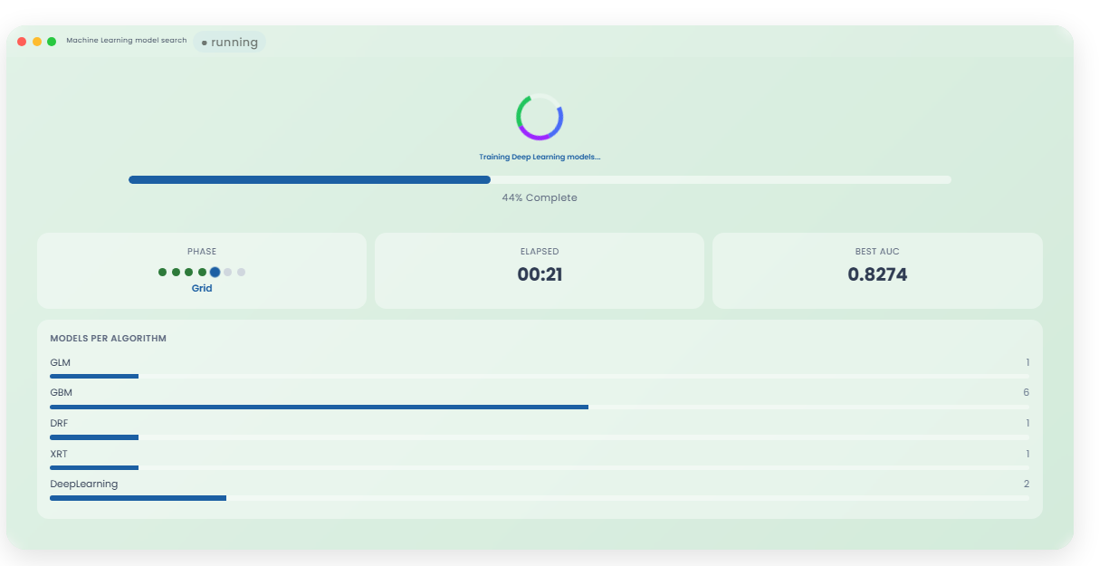
While the search runs, the module displays a progress indicator (Figure 18). A default five-minute run is genuinely five minutes of computation, so this is the point at which to leave it alone.
13 Interpreting the leaderboard
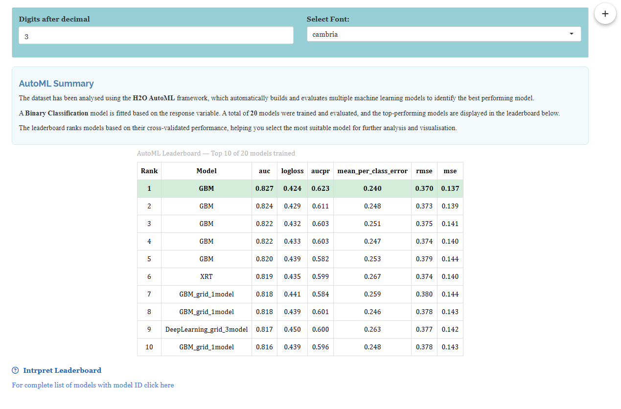
When the search finishes, the Analysis Results tab presents an AutoML Summary followed by the leaderboard, shown in Figure 19. This is the payoff of the whole module: every model that was trained, ranked from best to worst, each judged on data it was not trained on.
The summary above the table confirms what was run: a Binary Classification model was fitted, 20 models were trained and evaluated, and the leaderboard ranks them by cross-validated performance. The Digits after decimal and Select Font controls at the top adjust the display without re-running anything.
13.1 Interpretation from Figure 19
The winner is a GBM with an AUC of 0.827, a LogLoss of 0.424, an AUCPR of 0.623, a mean per-class error of 0.240, and an RMSE of 0.370. Ranks 2 to 5 are also GBMs, at 0.824, 0.822, 0.822 and 0.820. An XRT appears at rank 6 with 0.819, and a Deep Learning model at rank 9 with 0.817.
Two things in that ranking are worth dwelling on.
The spread is tiny. From first place to tenth, AUC falls only from 0.827 to 0.816, a difference of about one percent. This is the normal shape of a leaderboard, and it carries a practical lesson: the top several models are, for all serious purposes, equally good. If the model at rank 6 trains in a tenth of the time, or is easier to explain, choosing it over the nominal winner costs you almost nothing. The leaderboard ranks models; it does not tell you they are meaningfully different.
Gradient boosting dominates, which is entirely expected. On tabular data of this size, GBMs usually win, and a leaderboard led by GBMs with a random-forest variant close behind is the typical result. Note also that no Stacked Ensemble reached the top ten in this run, so the winner is a single, interpretable model.
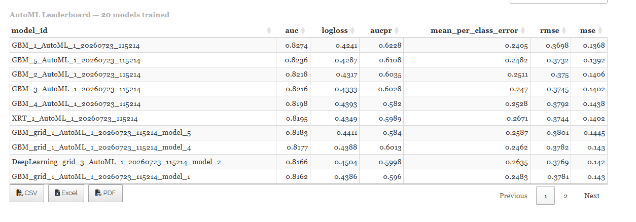
The Interpret Leaderboard link expands guidance on the metric columns, and For complete list of models with model ID click here opens the full table shown in Figure 20, where each model appears under its full H2O identifier — GBM_1_AutoML_1_20260723_115214 and so on — with the results exportable as CSV, Excel, or PDF. Those identifiers are what you record in a methods section, since they pin down the exact model out of the twenty.
| Metric | Direction | What it means |
|---|---|---|
| AUC | Higher is better | The chance that a randomly chosen churner is scored above a randomly chosen non-churner. 0.5 is a coin flip; 1.0 is perfect |
| LogLoss | Lower is better | Penalises confident wrong answers heavily. Rewards well-calibrated probabilities |
| AUCPR | Higher is better | Like AUC but focused on the positive class. The better guide when that class is rare |
| Mean per-class error | Lower is better | Average error rate across classes, so a small class counts as much as a large one |
| RMSE / MSE | Lower is better | Distance between predicted probability and actual outcome |
The leaderboard ranks models on the validation data, which the search itself used to make decisions. That makes it the right basis for choosing between models and a slightly optimistic basis for reporting performance. The number you quote in a paper comes from the test set, and Section 14 is where you find it. In our run the two happen to agree closely — 0.827 on validation, 0.826 on test — and that agreement is itself reassuring. When they diverge sharply, trust the test figure and be suspicious of the search.
14 The Model Metrics tab
The Model Metrics tab, shown in Figure 21, takes one model and reports it honestly. The top model is pre-selected, but the dropdown lets you evaluate any model from the leaderboard, which is how you check whether that faster model at rank 6 really costs you anything.
Two tables appear. Model Performance gives the metrics computed separately on Train, Validation, and Test. Model Summary describes the fitted model’s structure.
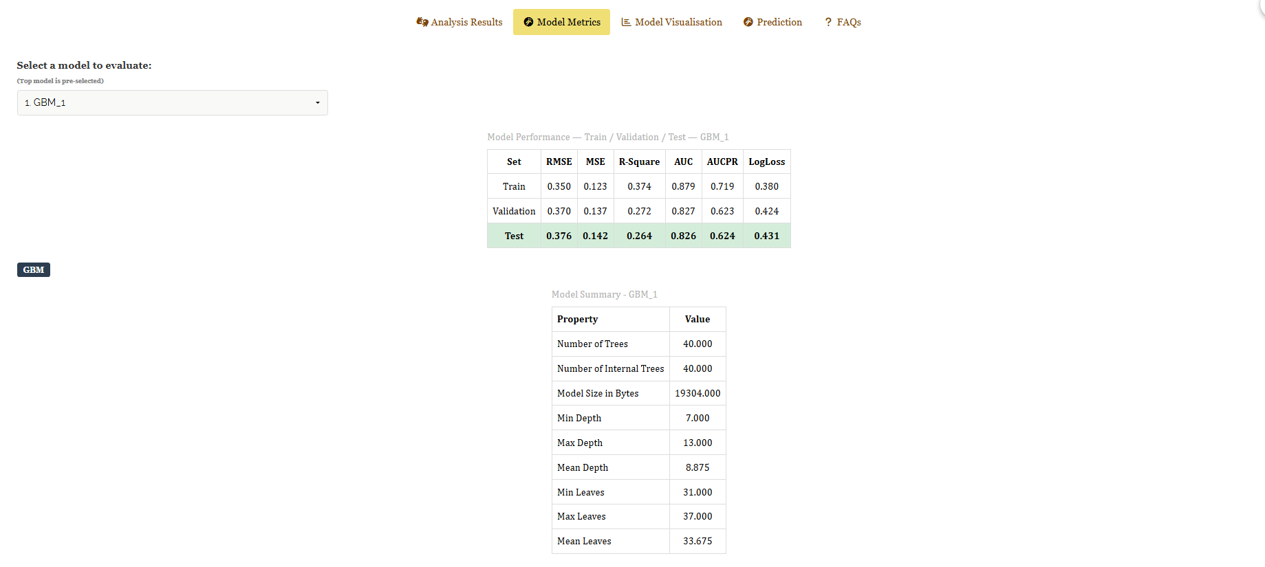
14.1 Interpretation from Figure 21
| Set | RMSE | MSE | R-Square | AUC | AUCPR | LogLoss |
|---|---|---|---|---|---|---|
| Train | 0.350 | 0.123 | 0.374 | 0.879 | 0.719 | 0.380 |
| Validation | 0.370 | 0.137 | 0.272 | 0.827 | 0.623 | 0.424 |
| Test | 0.376 | 0.142 | 0.264 | 0.826 | 0.624 | 0.431 |
Read this table across the rows, not down the columns, because the pattern from Train to Test is the diagnosis.
Performance degrades gently and evenly: AUC falls from 0.879 on training data to 0.827 on validation and 0.826 on test. That gap of about 0.05 between train and test is the model’s optimism about data it has seen, and a gap of this size is healthy. It says the model learned a genuine pattern and generalises. A gap of 0.20 or more would say it had memorised the training rows.
More convincing still is the near-identity of the validation and test figures: 0.827 against 0.826 for AUC, 0.623 against 0.624 for AUCPR. The search chose this model using validation data, and completely untouched test data agrees with that choice almost exactly. The headline result of this analysis is therefore a test AUC of 0.826, and that is the number to report.
The Model Summary explains what won. The GBM uses 40 trees, with depths from 7 to 13 (mean 8.875) and between 31 and 37 leaves per tree (mean 33.675), occupying 19,304 bytes. That is a small, quick model, not an elaborate one, which is worth knowing before you deploy it.
Two traps sit in this table.
R-Square is reported for every model, but it is a regression measure and means little for classification. The value of 0.264 on test is not a cause for concern; use AUC, AUCPR and LogLoss instead.
Accuracy is the more dangerous one, and it is why the module leads with AUC. Only 26.5% of our customers churned, so a model that stubbornly predicted “nobody churns” would score 73.5% accuracy while being of no use to anyone. AUC has no such blind spot: it asks whether churners are ranked above non-churners, which is what you actually need. On an imbalanced problem, always read AUC and AUCPR, and then look at the confusion matrix in Section 15 to see what the model does in practice.
15 Plots and visuals
A score tells you how well the model performs. The Model Visualisation tab tells you what it learned and where it goes wrong, which is usually the part your readers care about. Every plot can be downloaded, and each answers a distinct question.
15.1 Variable importance: what the model relies on
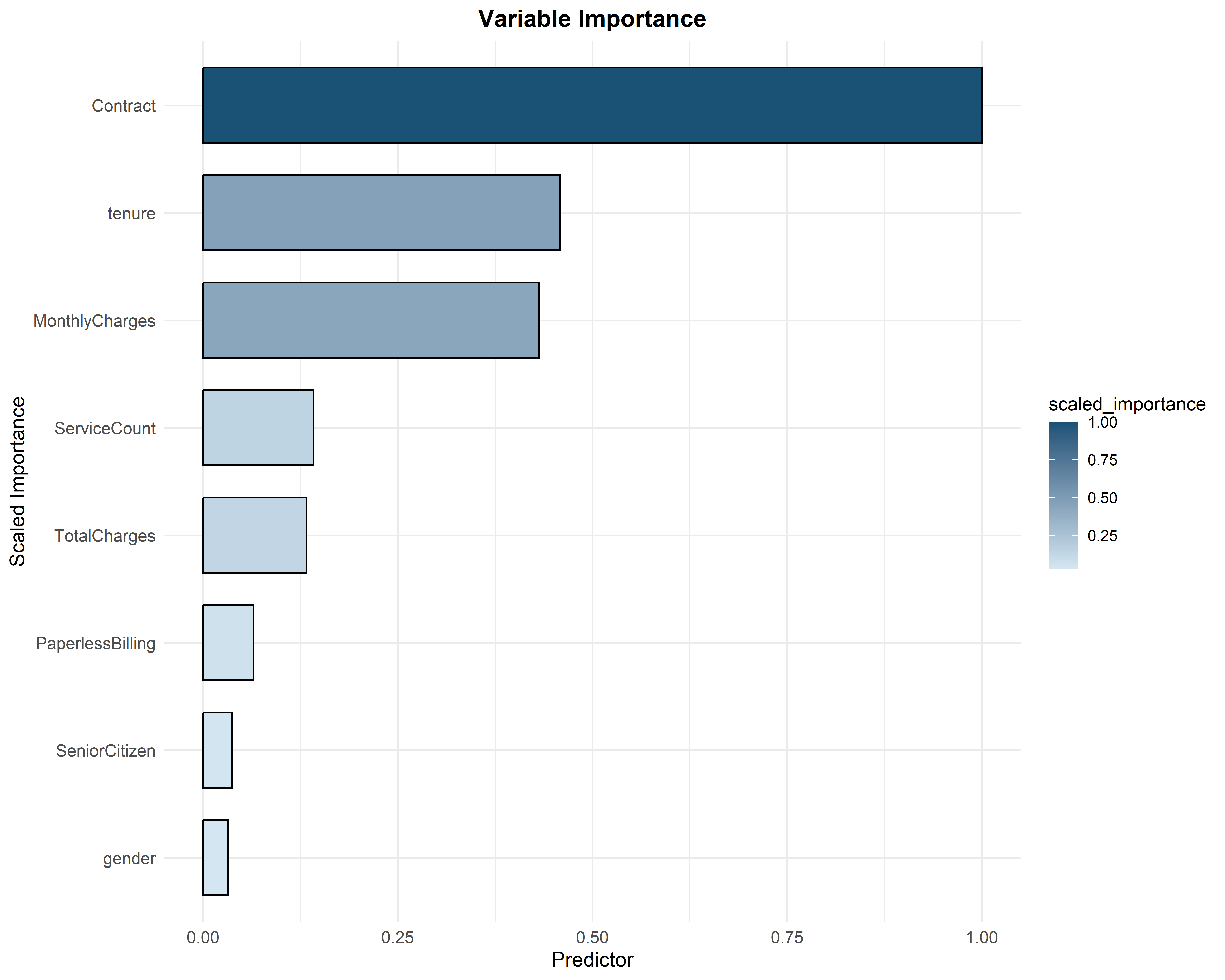
Figure 22 ranks the predictors by how much the model actually used them, scaled so the most important is 1.00. Contract dominates completely at 1.00. tenure (about 0.46) and MonthlyCharges (about 0.43) form a clear second tier. Then come ServiceCount (about 0.14) and TotalCharges (about 0.13), followed by PaperlessBilling, SeniorCitizen and finally gender, all below 0.10.
This chart independently confirms two earlier findings. The Cramér’s V plot in Figure 11 identified Contract as the strongest categorical signal and gender as worthless, and the model, working from the data alone by an entirely different route, agrees on both counts. And the engineered ServiceCount from Section 8 places fourth of eight, ahead of TotalCharges, PaperlessBilling, SeniorCitizen and gender — a column that was not in the original file outranks four that were.
15.2 SHAP: the direction of each effect
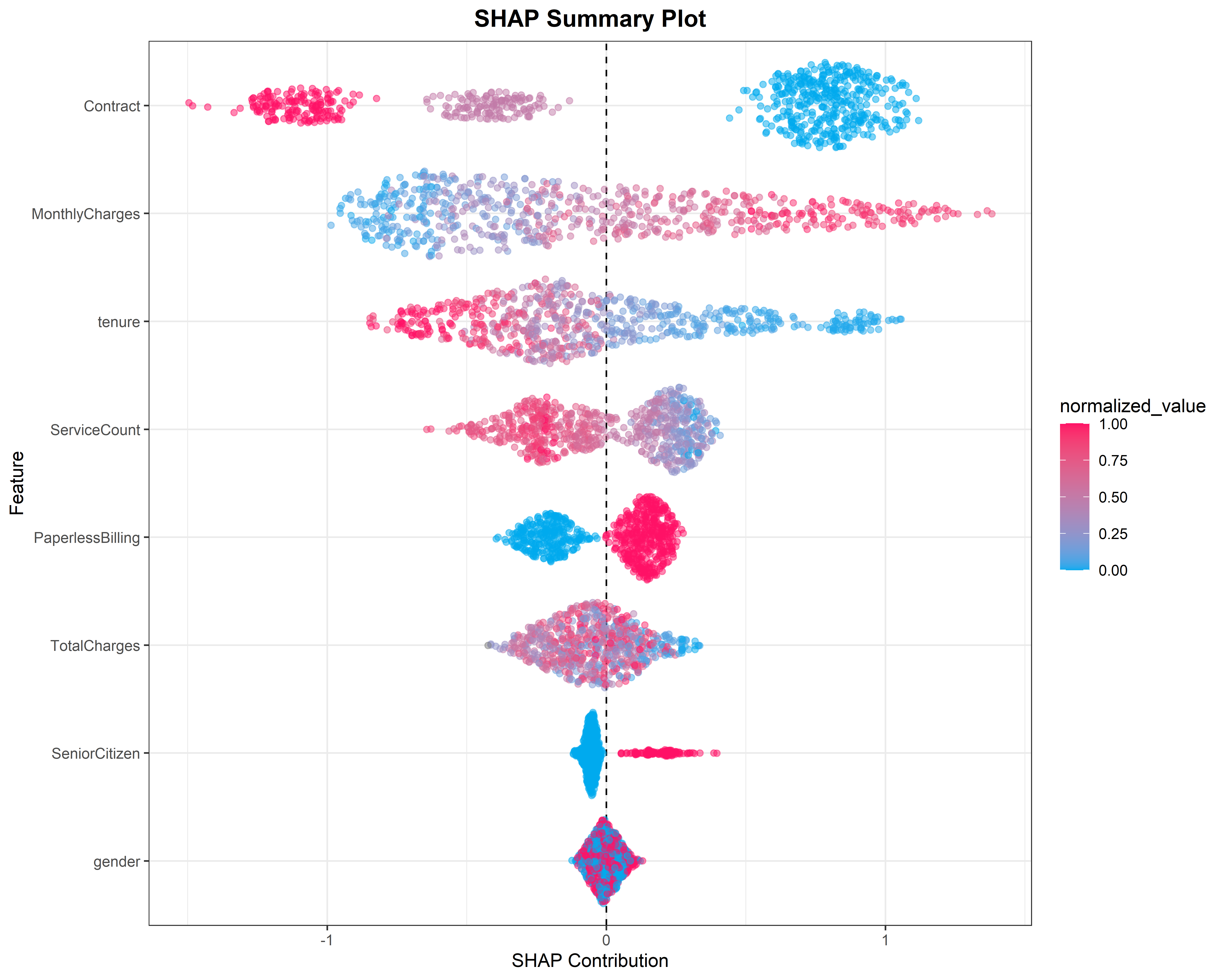
Variable importance says how much a predictor matters but not which way it pushes. The SHAP summary plot in Figure 23 fills that gap. Every point is one customer. Its horizontal position is that predictor’s contribution to that customer’s prediction — right of the dashed line pushes towards churn, left pushes away — and its colour is the predictor’s value, blue for low and pink for high.
Read the top row. Contract splits into three distinct clouds: the blue cloud (month-to-month, the lowest level) sits far to the right at about +1, while the pink cloud (two-year contracts) sits far to the left at about −1. Month-to-month contracts push strongly towards churn; long contracts push strongly against it.
MonthlyCharges shows a clean gradient from blue on the left to pink on the right: higher bills push towards churn. tenure shows the reverse, pink on the left and blue on the right: longer-standing customers are pushed away from churn. PaperlessBilling splits cleanly into two clouds either side of zero.
Now look at the bottom row. gender is a single narrow cloud sitting on the zero line with blue and pink thoroughly mixed. It contributes nothing, in either direction, for any customer. That is what a useless predictor looks like, and it is the third independent confirmation of the same finding.
15.3 Partial dependence: the shape of one effect
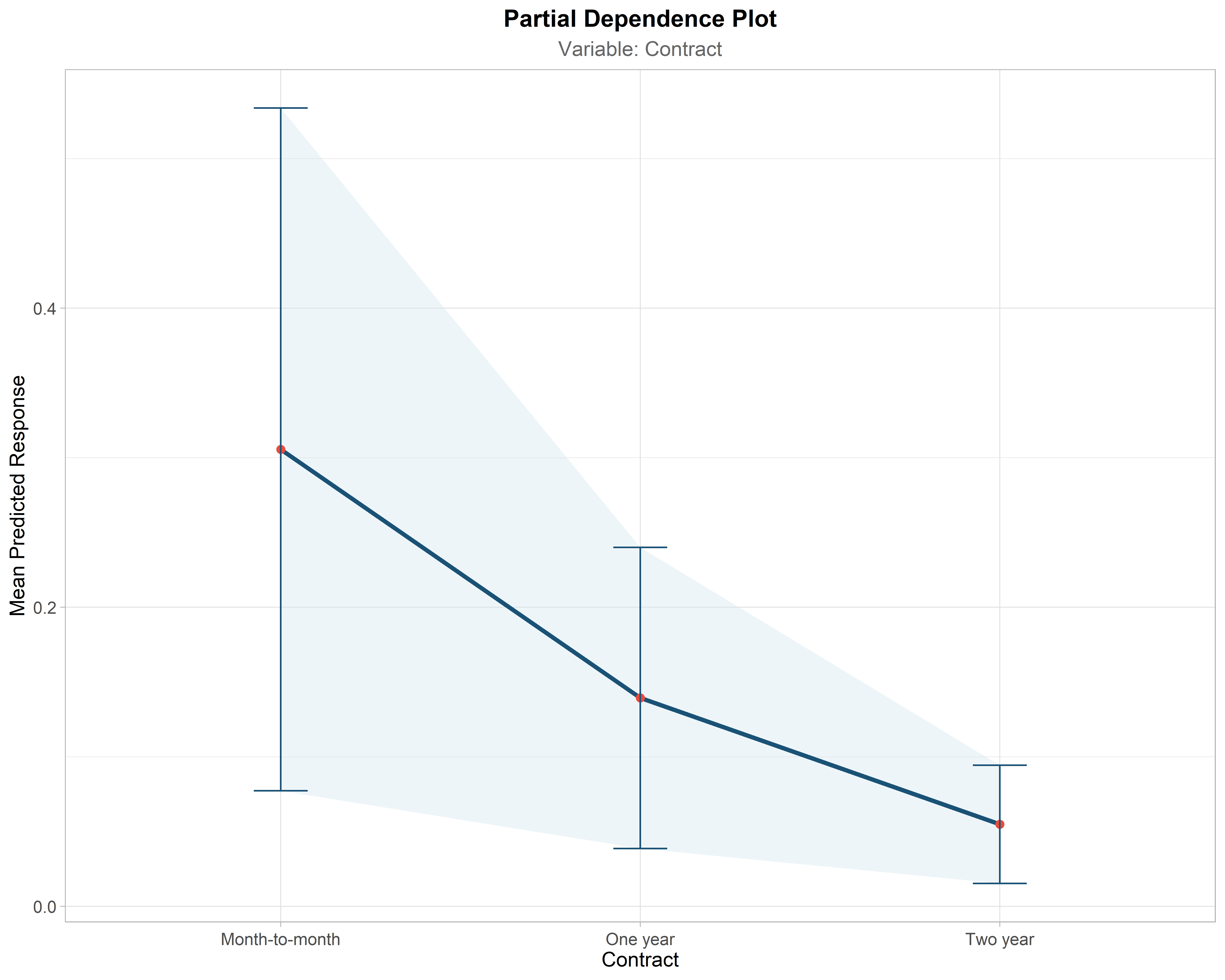
A partial dependence plot isolates a single predictor and traces the model’s average prediction as that predictor varies, holding everything else fixed. Figure 24 does this for Contract and turns the SHAP pattern into a number you can quote: the mean predicted churn probability is about 0.30 for month-to-month customers, about 0.13 for one-year contracts, and about 0.07 for two-year contracts. Roughly a fourfold difference between the extremes.
The shaded band and error bars show the uncertainty around each estimate. Note that the band is widest for month-to-month customers, meaning that group is the most variable as well as the most likely to leave. This is the single most actionable chart in the analysis: it says that moving a customer from a monthly to an annual contract is associated with a large drop in predicted churn.
15.4 Learning curve: did the model train for the right length of time?
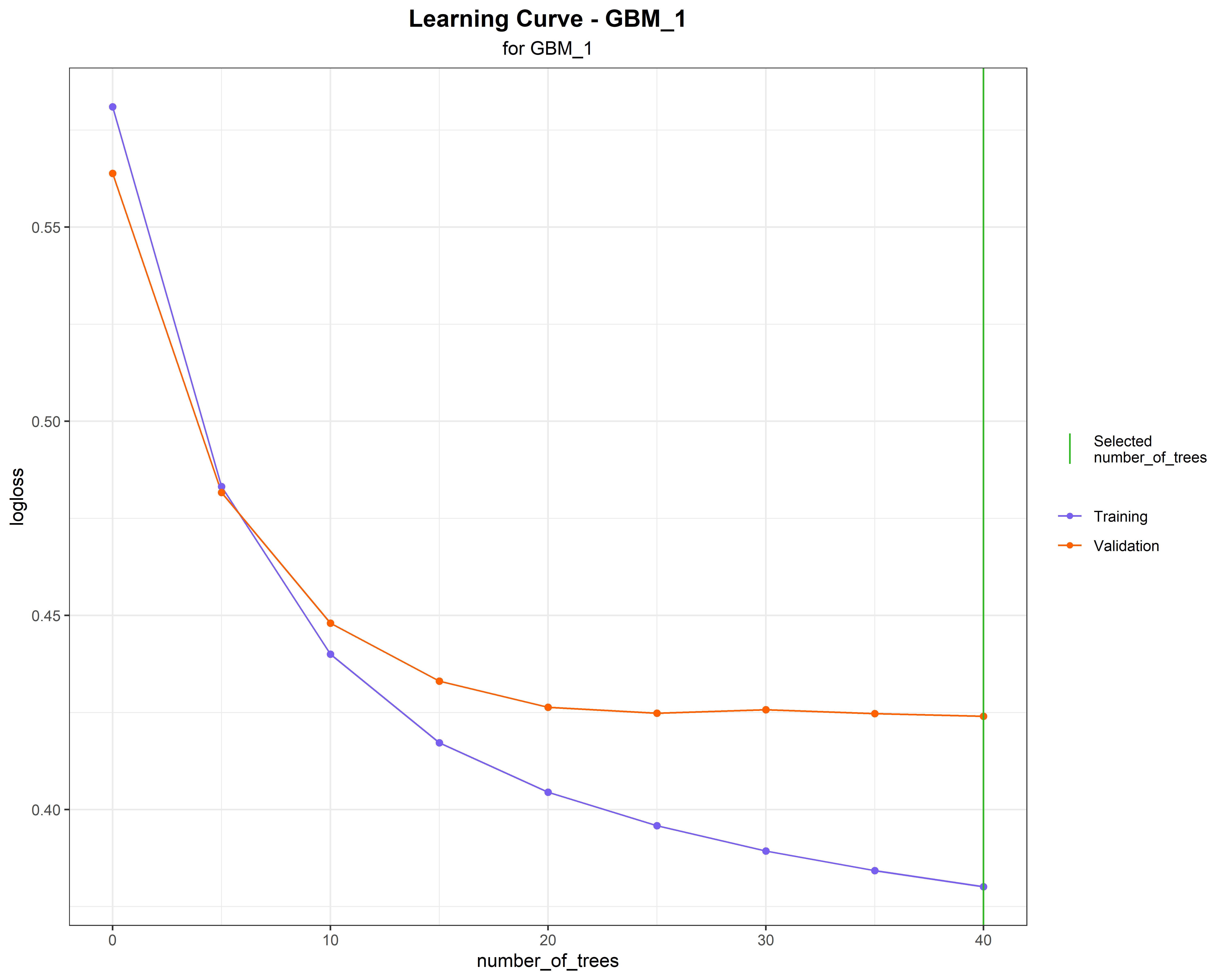
Figure 25 plots LogLoss against the number of trees, once for the training data (purple) and once for the validation data (orange), with a green line marking the 40 trees the model settled on.
Both curves fall steeply for the first ten trees or so. After roughly twenty trees the orange validation curve flattens at about 0.424 and stops improving, while the purple training curve carries on falling to about 0.38. That divergence is overfitting happening in front of you: from tree twenty onward, the extra trees are fitting noise peculiar to the training rows rather than pattern.
The gap here is small and the validation curve is flat rather than rising, so this model is fine. A validation curve that turned clearly upward would mean the model had been trained well past its useful point, and the fix would be to set a stopping metric in Section 12 to halt it earlier.
15.5 Model correlation: how much genuine variety was in the search?
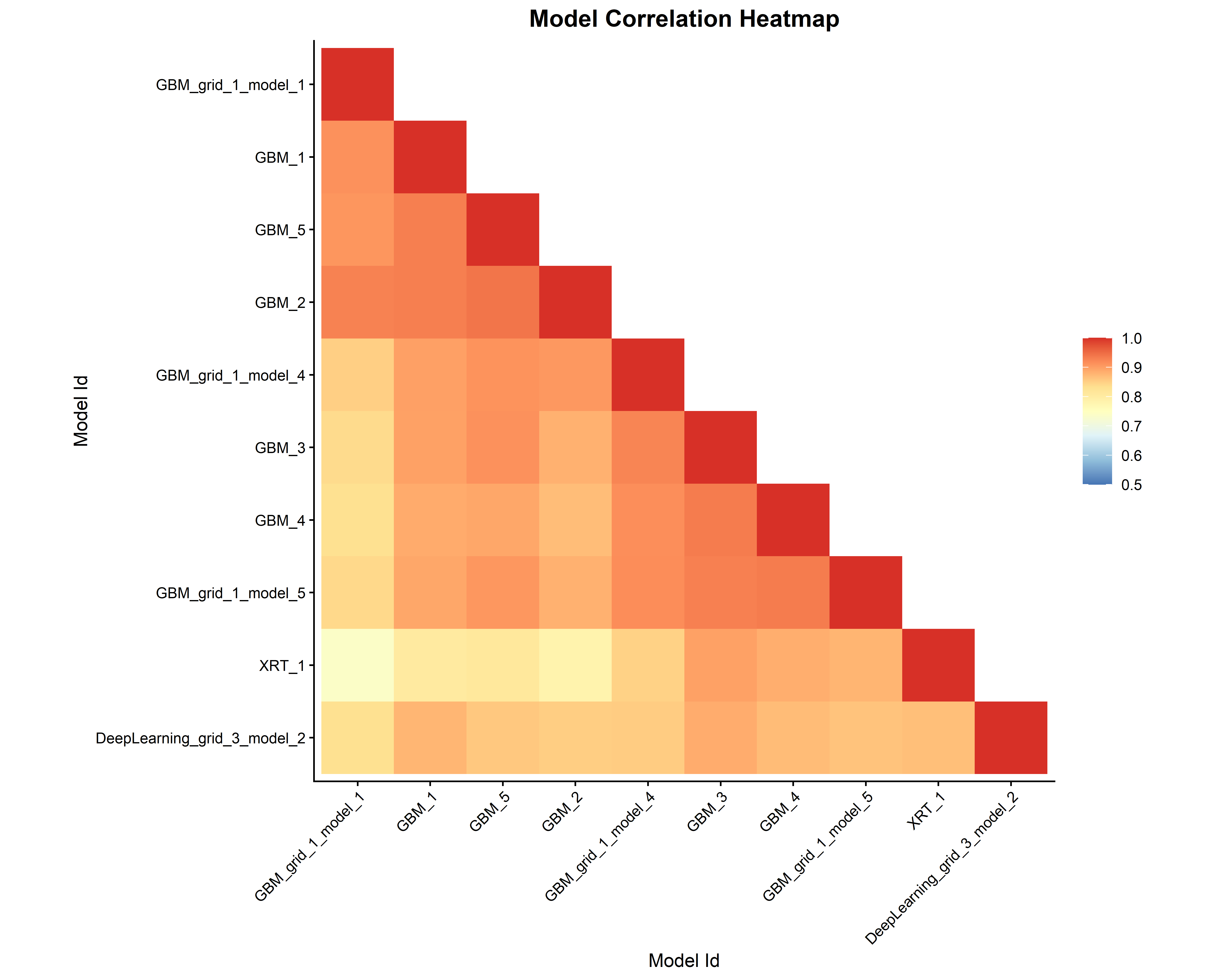
Figure 26 compares the top models by how similarly they predict, rather than by how well they score. Almost every pair is above 0.85 and much of the grid sits near 0.95, which says the top ten models are largely making the same predictions on the same customers by slightly different routes. That is unsurprising when nine of them are gradient boosting machines.
The palest cells belong to XRT_1, which is the least correlated with the GBM cluster, and the Deep Learning model is also somewhat distinct. This is directly useful information: a stacked ensemble gains most by combining models that make different mistakes, so if you wanted a stronger ensemble, XRT and Deep Learning are the members that would contribute something new. It also warns you that if the GBM family shares a blind spot, running twenty of them will not reveal it.
15.6 Confusion matrix: what the model does in practice
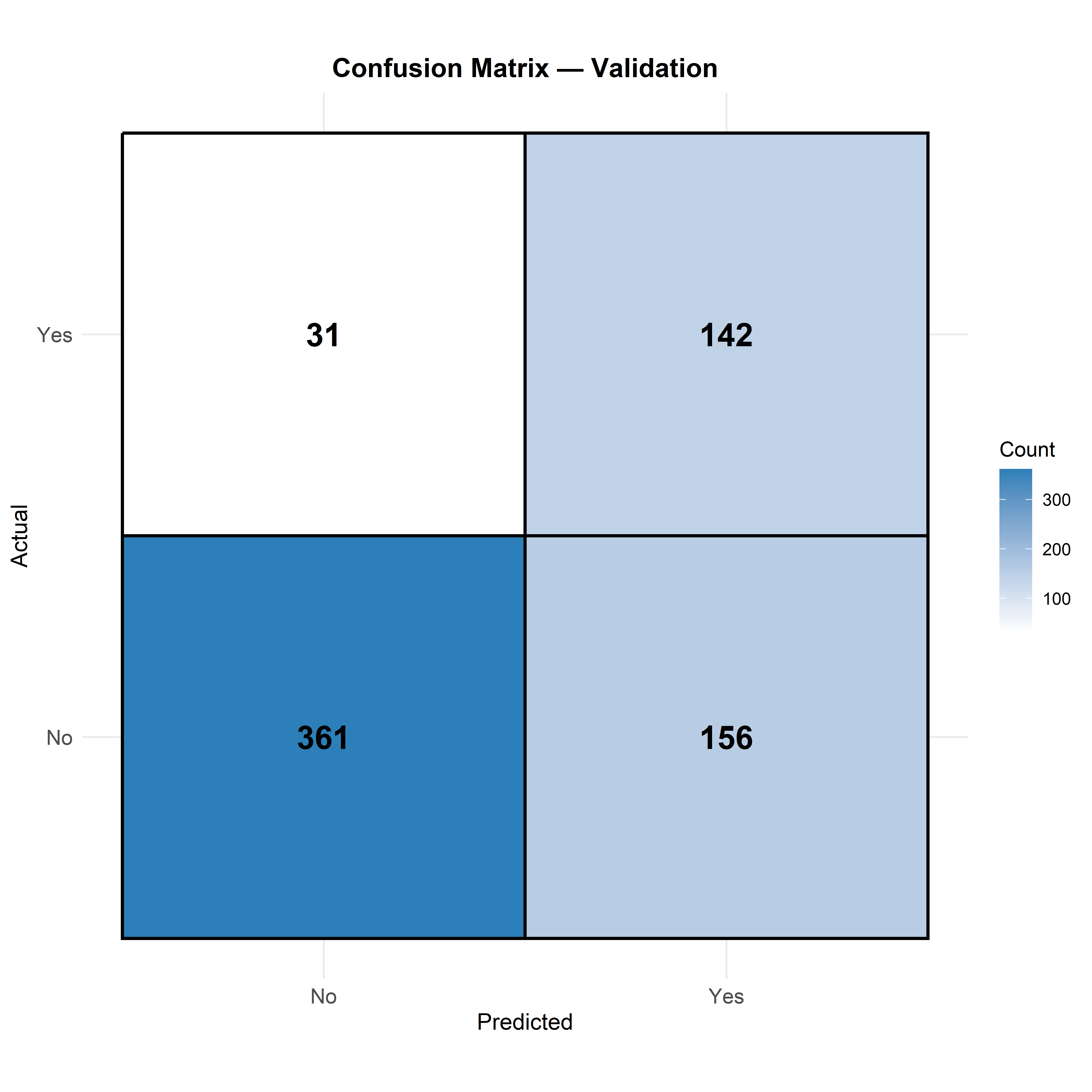
Everything so far has been a probability. The confusion matrix in Figure 27 applies a decision threshold and counts what actually happens across the 690 validation customers.
| Predicted No | Predicted Yes | Row total | |
|---|---|---|---|
| Actually Yes (churned) | 31 | 142 | 173 |
| Actually No (stayed) | 361 | 156 | 517 |
Of the 173 customers who genuinely churned, the model caught 142, missing only 31. That is a recall of about 82%, which is strong: four out of five departures are flagged before they happen.
The cost of that sensitivity is visible in the other error. Of the 517 customers who stayed, 156 were wrongly flagged as likely to leave. So of the 298 customers the model flags in total, only 142 actually churn — a precision of about 48%.
Now the uncomfortable arithmetic. Overall accuracy is (142 + 361) / 690, or about 73% — which is lower than the 75% you would get by lazily predicting that nobody ever churns. Yet this model is obviously far more useful than that one, because it identifies 142 real departures the lazy model would miss entirely. This is precisely the trap Section 14 warned about, and it is the clearest possible demonstration of why accuracy is the wrong metric for an imbalanced problem.
The default threshold maximises a balanced criterion, which is why this model leans towards catching churners at the price of false alarms. Whether that is the right lean depends entirely on the relative costs, and only you know those. If a retention offer is cheap and a lost customer is expensive, this trade is excellent: 156 unnecessary offers to save 142 customers. If the intervention were costly or intrusive, you would want a higher threshold, fewer flags, and better precision. The model gives you a probability for every customer; where you draw the line is your call, and it should be made deliberately rather than inherited from a default.
16 The Prediction tab
A model that only describes the data it was trained on has no practical value. The Prediction tab, shown in Figure 28, is where the model is finally put to work on customers whose outcome is not yet known.
Choose a model from the Select model to predict dropdown, which again pre-selects the top performer but lets you use any model from the leaderboard. Then upload a new data file through Browse, in CSV, XLS or XLSX. Click Download Predictions and the module returns your file with the model’s predictions appended.
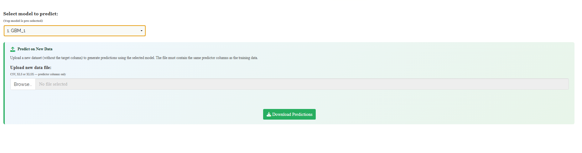
The requirement stated on the tab is strict and worth restating: the file must contain the same predictor columns as the training data, and it must not contain the target column. Same names, same spelling, same categories.
This is where Section 9 pays off. If you engineered ServiceCount before fitting, then ServiceCount must be present in the prediction file too, computed the same way. A model trained on engineered features cannot score raw data, because the columns it expects simply are not there. The reliable procedure is to run new data through the same preparation steps in Section 6 and Section 8 before bringing it here, and the exported dataset from Section 9 is your reference for exactly which columns those are.
For a classification model the downloaded file contains the predicted class together with the probability of each class. Those probabilities are the more useful output. A customer at 0.91 and a customer at 0.52 both get flagged as likely to churn, but they are not remotely the same case, and if your retention budget covers a hundred offers, the probabilities tell you which hundred customers to spend it on. For a regression model, the file contains the predicted numeric value.
The model learned the pattern that held in the data you gave it. Behaviour drifts, markets change, and a growing season is not the previous one. Performance decays quietly — nothing errors, the predictions simply become less true. Re-check the model against fresh outcomes periodically, and re-run the search when the gap widens. This is why Section 9 asked you to keep the exported dataset: retraining is a five-minute job when you still have the file that produced the original model.
17 FAQs
The module includes a dedicated FAQs tab to clarify common doubts and guide you through the features. It offers detailed answers, additional information, and helpful tips for a smooth experience. If you are ever unsure how something works, say why your target must be an Enum for classification, why cross-validation switches itself off when you supply a validation frame, or how to read the difference between the validation and test columns in Section 14, the FAQs are a good place to start.

18 Wrapping up
Automated machine learning rests on one honest question: given what I know about a new case, what is the most likely outcome? The leaderboard, the validation frame, the metrics table and the visualisations all exist to make sure that question is answered without self-deception, on data the model was never allowed to see.
The lasting lesson of this tutorial, though, is not about the search. Our winning model scored an AUC of 0.826, and the model ranked tenth scored 0.816 — a difference of one percent, arrived at after twenty models and five minutes of computation. Meanwhile a single engineered column, ServiceCount, built by hand in Section 8 from information already sitting in the data, finished as the fourth most important predictor in the model. The algorithm is automated; the thinking is not. Time spent understanding your columns, removing the ones that carry nothing, and creating the ones that were never there will almost always beat time spent waiting for a longer search. if you get stuck at any point, RA-One is available 24 × 7, or write to us at [email protected].