Binary Logistic Regression
Binary logistic regression models the probability of a two-category outcome from one or more predictors. This tutorial explains what an odds ratio means, how RAISINS reports fit and significance, how to check every assumption, and how to run the whole analysis code-free… Read more …
Binary logistic regression is the workhorse of applied statistics for a two-category outcome: it models the probability that an observation falls in the event category, letting you both predict outcomes and isolate the unique effect of each predictor. This tutorial starts from first principles, what an odds ratio really estimates, how to read a coefficient on the log-odds scale, and what the likelihood-ratio test and p-values are actually telling you. It then walks through the complete workflow in RAISINS: preparing data, choosing the binary outcome and predictors, the Simple and Stepwise model-building methods, the odds-ratio/model-fit tables, the full battery of assumption checks and influence diagnostics, hold-out validation with the ROC curve and confusion matrix, publication-ready plots, automatic interpretation, and the RA-One AI assistant, all without writing a single line of code.
1 What is binary logistic regression?
Suppose you monitor 150 field plots and record, for each, whether a pest outbreak occurred (1 = outbreak, 0 = no outbreak), and alongside it the canopy density, humidity, rainfall, temperature, fertiliser programme, soil moisture and how many pests a scout counted on a visit. You suspect these factors drive outbreak risk, but by how much, and which ones actually matter once the others are accounted for?
A binary logistic regression answers exactly this. It fits the S-shaped curve (the logistic, or sigmoid, curve) that best describes how the probability of an outbreak changes with your predictors, and from that fitted curve it hands you two things at once:
- Prediction, given a plot’s humidity, rainfall and so on, what is the probability it has a pest outbreak?
- Effect estimation, how much do the odds of an outbreak change for a one-unit change in each predictor, holding the others fixed?
The curve is chosen by Maximum Likelihood Estimation (MLE): of all possible curves, RAISINS picks the coefficient values that make your actually-observed pattern of outbreak and no-outbreak plots the most probable outcome. There is no leftover “residual” to minimise the way OLS minimises squared distances; instead, every fitted probability is judged by how well it explains what was actually observed.
Binary logistic regression fits the probability of a two-category outcome and reports, for each predictor, how strongly it moves the odds of that outcome, and whether that movement is larger than what random noise alone would produce.
1.1 Reading an odds ratio
Every predictor gets a number, its coefficient (β), but that coefficient lives on the log-odds scale, which is not intuitive to read directly. Exponentiating it gives the odds ratio (OR = eβ), the number RAISINS reports and the one you should quote. In a multiple logistic regression this is a partial effect: the multiplicative change in the odds of the event for a one-unit increase in that predictor while every other predictor is held constant. An OR above 1 means the odds rise with the predictor; an OR below 1 means they fall; an OR of exactly 1 means no association. The intercept (β₀) is the model’s baseline, the log-odds of the event when all predictors sit at zero (or, for categories, at their reference level).
\[\log\!\left(\frac{p}{1-p}\right) = \beta_0 + \beta_1 X_1 + \beta_2 X_2 + \cdots + \beta_k X_k\]
1.2 The p-value, in plain language
For each coefficient RAISINS runs a test of the claim “this predictor has no effect” (β = 0, equivalently OR = 1) and reports a p-value, which answers:
If this predictor truly had no effect, how often would I see an odds ratio this far from 1 purely by chance?
A p-value of 0.40 means “quite often, nothing to see here.” A p-value below 0.001 means “almost never, this predictor is doing real work.” Researchers conventionally treat p < 0.05 as evidence that a predictor genuinely matters.
A p-value is not the probability that the odds ratio is correct, nor the size of the effect. A predictor can be highly significant yet have an odds ratio barely different from 1, or have a large odds ratio yet be non-significant in a small dataset. Always read the odds ratio (the size) and its confidence interval next to the p-value, not the p-value alone.
1.3 The null and alternative hypotheses
Logistic regression tests each coefficient against a starting assumption that nothing is happening:
- H₀ : βⱼ = 0, predictor j has no effect on the odds of the event.
- H₁ : βⱼ ≠ 0, predictor j does affect the odds of the event.
A small p-value makes H₀ hard to believe, so you reject it and call the predictor significant. A large p-value means the data are compatible with “no effect,” so you fail to reject H₀, which is not the same as proving the predictor is useless, only that this dataset did not show its effect.
A little history: from the linear probability problem to Cox's logistic model
-
The word logistic comes from the S-shaped logistic curve, first used by Pierre-François Verhulst in the 1830s to describe population growth. Its statistical use for binary outcomes was formalised over a century later by Sir David Cox, who in 1958 published “The Regression Analysis of Binary Sequences” in the Journal of the Royal Statistical Society. Before Cox, researchers modelled binary outcomes with an ordinary regression line, a linear probability model which happily produced predicted probabilities below 0 or above 1, nonsense for a quantity that must stay between them. Cox resolved this by linking the linear predictor to the outcome probability through the logistic function, guaranteeing every prediction remained bounded, while Joseph Berkson had already been championing the closely related “logit” transform in bioassay work through the 1940s. From these roots, binary logistic regression spread into medicine, epidemiology, agriculture and the social sciences as the standard tool for classification problems, prized for its interpretability and the natural meaning of its coefficients as odds ratios.
2 Simple or multiple logistic regression?
RAISINS fits both, and the only thing that changes is how many predictors you select.
| Model | Predictors | Typical question |
|---|---|---|
| Simple logistic regression | One predictor (X) | How do the odds of a pest outbreak change with rainfall alone? |
| Multiple logistic regression | Two or more predictors | What is the effect of rainfall after accounting for humidity, temperature and soil moisture? |
The power of the multiple model is that each odds ratio is a partial effect: it separates the contribution of one predictor from all the others. But that power comes with one predictor-specific hazard: multicollinearity. When two predictors carry nearly the same information (say, two highly correlated weather measures), the model cannot decide which deserves the credit, and their individual odds ratios become unstable, even though the model’s overall predictions stay fine. RAISINS flags this automatically with the Variance Inflation Factor (VIF) in the Assumptions tab.
A predictor need not be numeric. A factor such as FertilizerDosage (X₅ in the working example, coded high/medium/low) is entered as plain text labels; RAISINS automatically dummy-codes it, choosing one level as the reference (alphabetically first by default, here “high”) and reporting each remaining level as an odds ratio against it. The odds ratio for “low” then reads as how much the odds of an outbreak differ for a low fertiliser dose compared with the high-dose reference, holding everything else constant. After you run the analysis, a Factor Settings panel appears above the results where you can change the reference level of any categorical predictor.
3 Beyond the plain model: Simple vs Stepwise
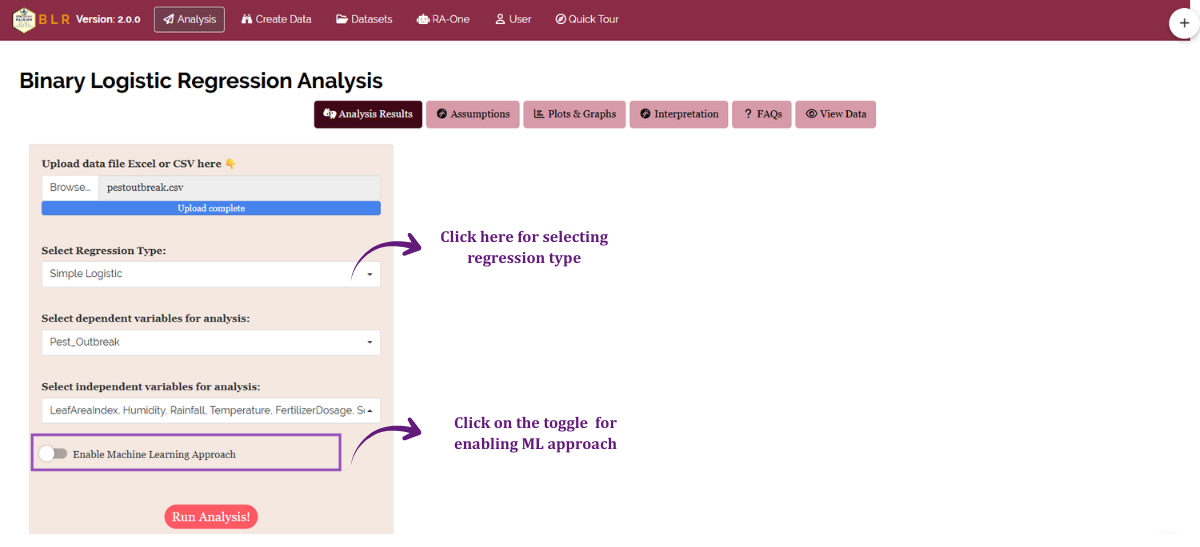
A single default fit is not always the right model. RAISINS keeps the default simple, but offers two ways to build it, chosen under Select Regression Type on the Analysis sidebar (Figure 1). The results page always states which method was actually used, so your write-up stays honest.
| Option | What it does | When to reach for it |
|---|---|---|
| Simple Logistic (Enter) | Fits the model with every predictor you selected | You chose the predictors on scientific grounds and want them all reported |
| Step Wise Logistic (AIC) | Starts from the full model and removes terms to minimise AIC (backward elimination) | You have many candidate predictors and want a parsimonious model |
When the stepwise method is used, RAISINS reports the AIC trace (which terms were dropped at each step and how AIC improved) and states the final selected model, and every downstream table refers to that final model. p-values computed after automatic selection are optimistic, because the selection itself is not accounted for; treat them as descriptive.
3.1 Machine-learning mode (train/test validation)
Separate from the method choice, the Analysis sidebar carries an Enable Machine Learning Approach switch. Turn it on and RAISINS randomly splits your data into a training set (default 80%, adjustable) and a held-out test set, fits the logistic model on the training portion, then evaluates how well it classifies the unseen test rows at the standard 0.5 probability threshold. The Analysis Results tab then adds a full classification report: a confusion matrix, accuracy, sensitivity (recall), specificity, precision and F1 score, and the Plots tab unlocks the ROC curve with AUC, the calibration plot and the predicted-probability distribution. The split uses a fixed random seed so the result is reproducible. Leave the switch off to fit the model on the entire dataset in the usual way.
The AIC, deviance and pseudo R² statistics in the Model Fit Statistics table describe fit on the data used to build the model; the machine-learning metrics describe classification of rows the model never saw. A model can fit its training data beautifully and still classify new plots poorly, the test-set metrics are the honest check against that overfitting.
4 Assumptions of binary logistic regression
Maximum likelihood gives reliable estimates only when a set of assumptions hold. RAISINS provides a formal check for each, so you never have to take the model on faith.
| Assumption | What it means | RAISINS check | What if it fails? |
|---|---|---|---|
| Binary outcome | The response has exactly two categories | View Data health check | Use a multinomial/ordinal model for 3+ categories |
| Independence | Observations are unrelated to one another | Design-level question | Clustered/repeated data need mixed or GEE models |
| No multicollinearity (MLR) | Predictors are not near-duplicates | VIF table | Drop or combine redundant predictors |
| Linearity of the logit | Each continuous predictor is linearly related to the log-odds | Box-Tidwell test | Transform, add a polynomial term, or categorise |
| Adequate calibration | Predicted probabilities match observed outcomes | Hosmer-Lemeshow test | Add predictors, interactions, or transform |
Separation is the dramatic one: if a predictor perfectly divides events from non-events, its coefficient explodes and its standard error becomes enormous, the model cannot estimate it at all. Non-linearity of the logit biases the odds ratio of the affected predictor. Multicollinearity never harms prediction; it only muddies the interpretation of individual odds ratios, which matters when your goal is to understand each predictor’s unique effect. Too few events per predictor (fewer than about 10) makes everything unstable, no software can rescue an under-powered dataset.
5 Getting to the module
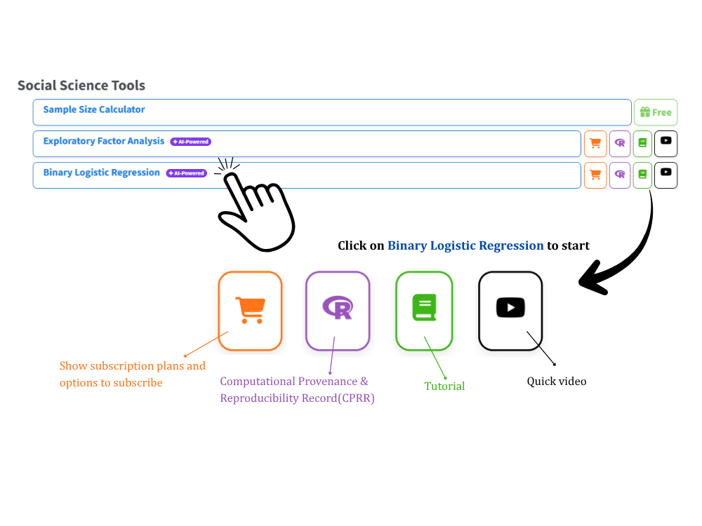
Visit the RAISINS home page at www.raisins.live and open Data Analysis. Select the Binary Logistic Regression module (Figure 2). No programming is required: upload your data, choose the binary outcome and predictor columns, and RAISINS handles everything from computation to publication-ready output.
5.1 Citing RAISINS, and the record behind this module
To cite the platform in a paper, thesis or report, use the RAISINS citation (APA, Harvard and BibTeX) at www.raisins.live/citation.html. That is the primary reference.
Alongside it, each module has a CPRR, a Computational Provenance & Reproducibility Record, which answers the reviewer’s fair question, what exactly did the software do to my data? It states the R version and the exact version of every package, names the specific function behind each result (stats::glm() with binomial(link = "logit") for the model fit, car::vif() for multicollinearity, a native Hosmer-Lemeshow construction for goodness of fit, a Box-Tidwell refit for linearity of the logit, broom::augment() for the influence diagnostics, pROC::roc() for the ROC curve and AUC, and MASS::stepAIC() when stepwise selection is used), lists every default and decision rule, and includes runnable R code reproducing each step on a public dataset. It carries its own DOI.
The CPRR for the Binary Logistic Regression module is at www.raisins.live/module_record/blr.html.
Cite the RAISINS paper as your primary reference for the platform, and add the CPRR as supporting documentation when a journal asks for computing details or when you want a precise methods section. The record supports the citation; it does not replace it.
6 Preview mode and Quick Tour
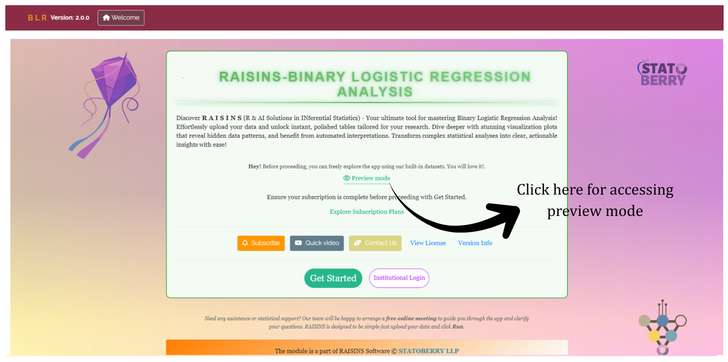
Before subscribing, explore the whole module using Preview mode from the Welcome page. It loads built-in datasets so you can try every feature, the analysis, assumption checks, plots and the RA-One assistant, without uploading your own data. First-time users are greeted with a Quick Tour: an interactive, step-by-step walkthrough that highlights each tab and control and explains what it does. You can replay it any time from the Quick Tour tab in the top navigation.
7 A working example
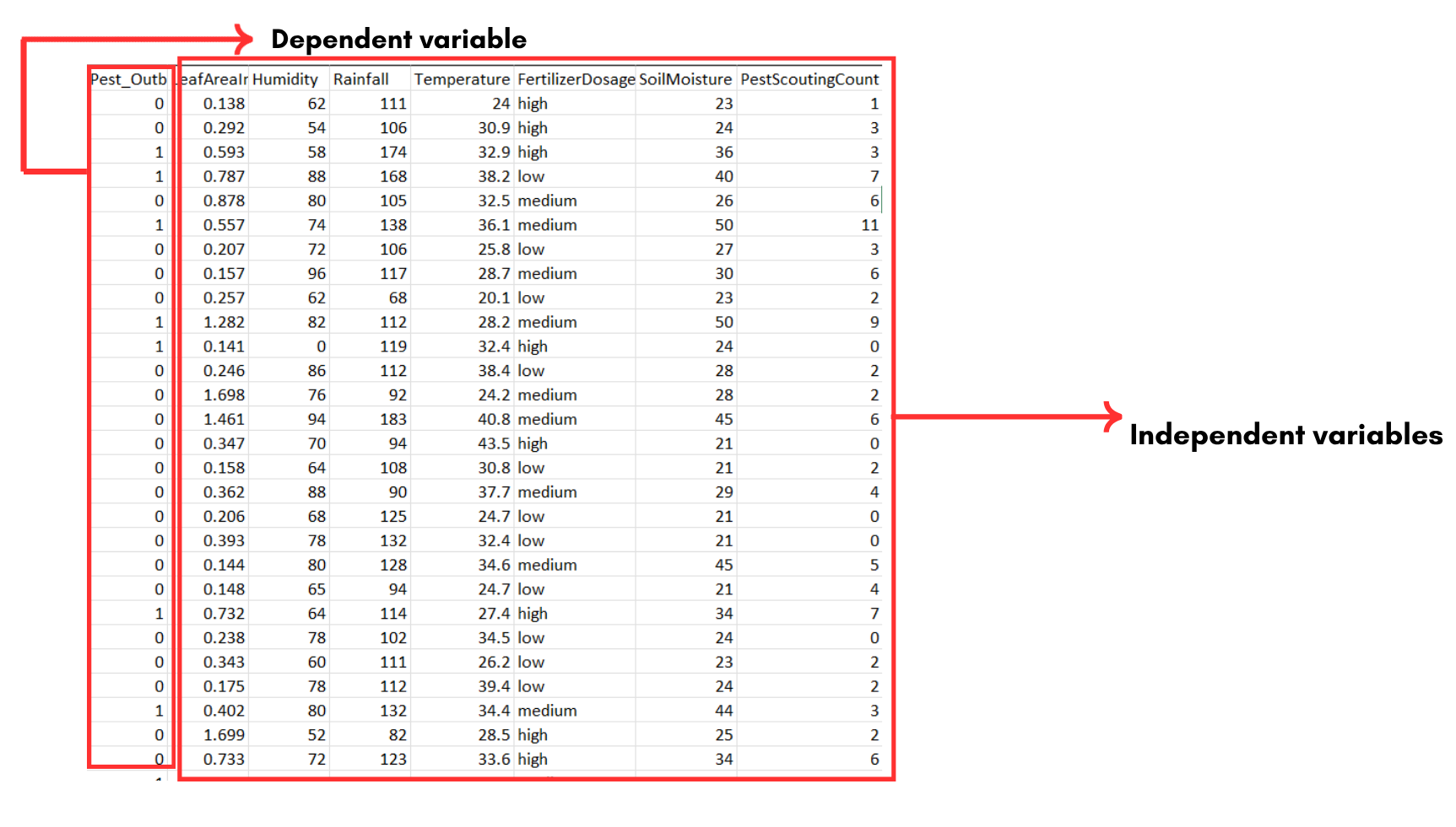
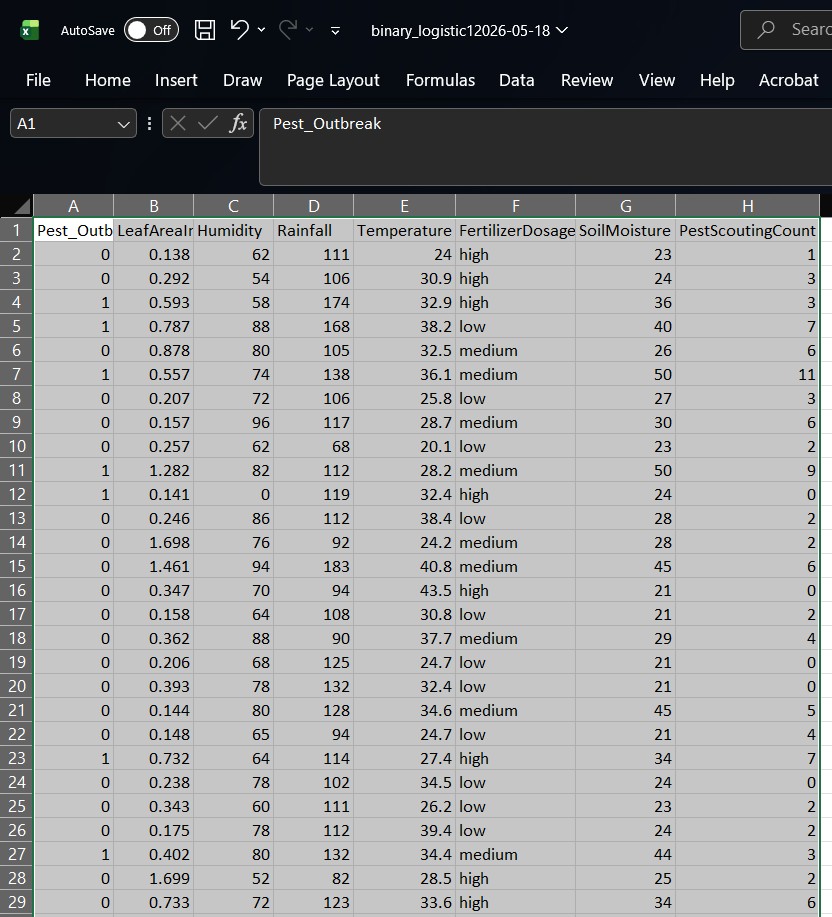
Throughout this tutorial we use pestoutbreak.csv, one of the built-in model datasets available from the Datasets tab (Section 11), so you can follow along with the exact same file. It records 150 field observations. The response variable (Y) is Pest_Outbreak (0 = no outbreak, 1 = outbreak), and the seven predictors are LeafAreaIndex (X₁, canopy density), Humidity (X₂, %), Rainfall (X₃, mm), Temperature (X₄, °C), FertilizerDosage (X₅, categorical: high, medium, low), SoilMoisture (X₆, %) and PestScoutingCount (X₇, pests counted on a scouting visit). The goal is to learn which of these field-management and weather factors drive pest outbreaks, and by how much the odds change with each. The data layout is shown in Figure 4.
8 How to prepare your data
Your analysis is only as good as your data. Feed RAISINS clean data and it delivers powerful insight; feed it messy data and the results cannot be trusted. You have four routes:
- Create your dataset in MS Excel
- Build it directly within the RAISINS app (Create Data)
- Use a built-in Model dataset as a reference
- Create it through the RA-One chat assistant
9 Preparing data in MS Excel
Open a new blank Excel workbook with a single sheet and no stray content. Use a column-based layout: one column for the binary response variable (Y) and one column for each predictor (X), with one row per observation. The response column must contain exactly two distinct values, coded 0/1 or as two clearly named categories (e.g., “Healthy” and “Diseased”) with consistent spelling and capitalisation. Numeric predictors must be purely numeric; categorical predictors are entered as consistent text labels and RAISINS dummy-codes them automatically. Save as CSV, XLS or XLSX; CSV is recommended as it is lighter and loads faster. Avoid blank rows above the data and stray spaces in column names. For reference, see Figure 5.
Dataset creation rules
- Column naming, no spaces; use underscores (
_) or dots (.); avoid symbols such as %, #. Always start a column name with a letter. - Data arrangement, start at the upper-left corner; the row above the data must not be blank.
- Cell management, do not type or delete in empty cells; if needed, select them, right-click and choose Clear Contents.
- Column relevance, name every column meaningfully and drop columns you will not analyse.
- Numeric vs categorical, the response column must be purely binary (exactly two distinct values, e.g. 0/1); numeric predictors must be purely numeric, entries like “NA” or “–” cause errors; categorical predictors should use consistent text labels (e.g., “Healthy”, “Diseased”) with no trailing spaces.
How to save as CSV in MS Excel
- Open your workbook, data on a single sheet, correctly arranged.
- File → Save As / Save a Copy, choose a location.
- Save as type → CSV (Comma delimited) (*.csv).
- Name the file without spaces (use underscores).
- Save.
💡 Tip: before saving, confirm the response column has exactly two distinct values, numeric columns are clean, and categorical labels are consistent.
10 Prepare using Create Data in RAISINS
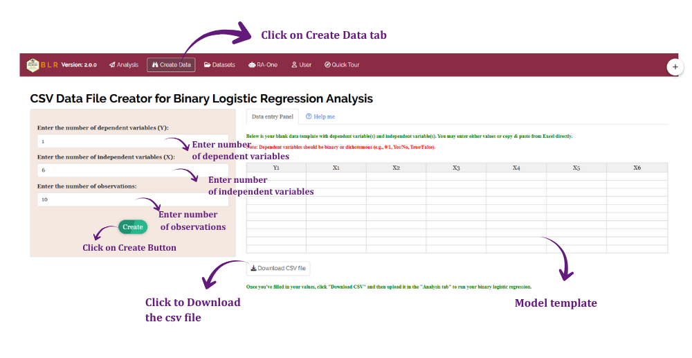
Unsure about the format? RAISINS can build the template for you:
- Navigate to the Create Data tab
- Select the number of dependent and independent variables
- Select the number of Observations (rows)
- Click Create
The layout appears as in Figure 6. Enter your values straight into the template, or download the blank CSV and fill it in Excel; either way, remember the response column must carry exactly two categories, then upload it under Analysis.
11 Download Model Datasets
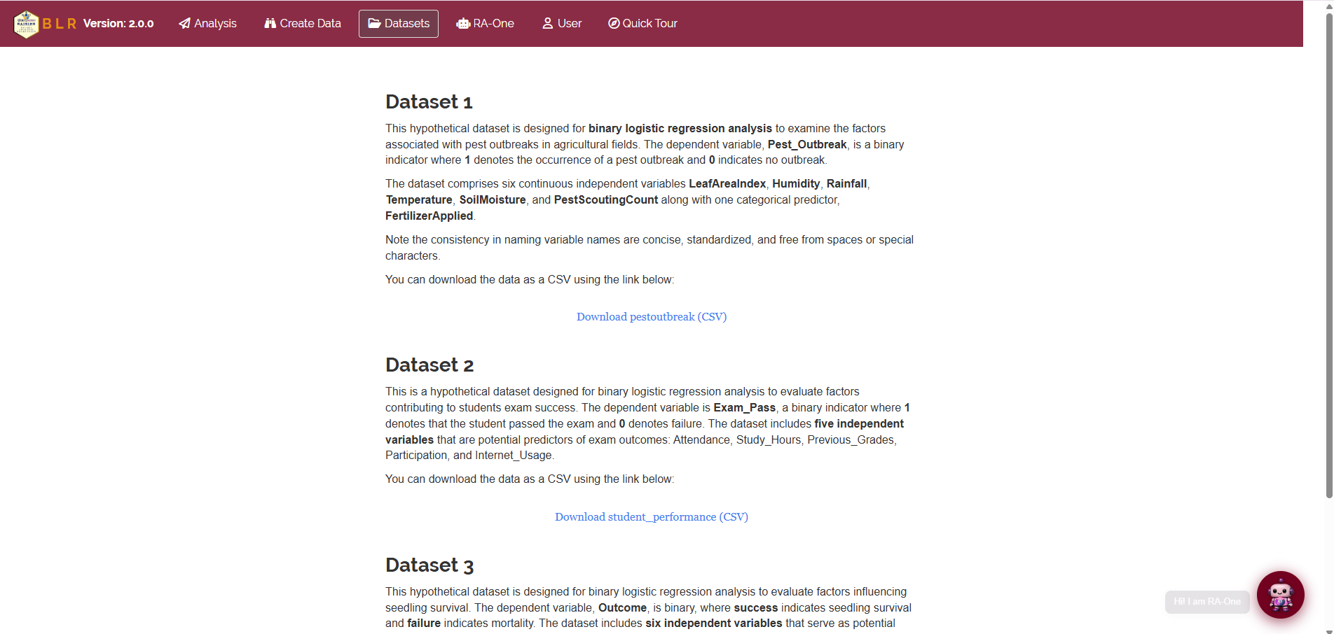
To explore the module before using your own data, download a ready-made example:
- Navigate to the Datasets tab
- Click the Download CSV link for the dataset you want
- Use it as a formatting reference, or upload it directly to try the analysis
12 Creating a dataset using RA-One chat
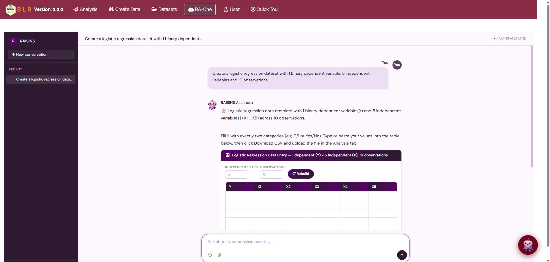
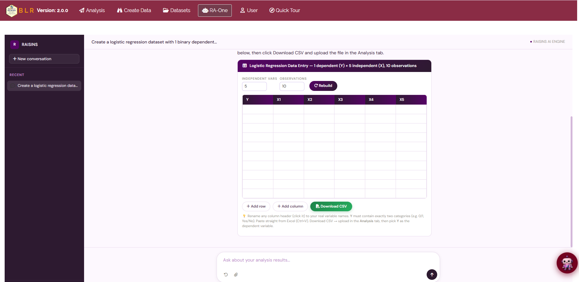
RA-One, the built-in chat assistant, can create a correctly formatted dataset through a simple conversation. Open RA-One from its navigation tab or the floating chat bubble, tell it how many observations and how many predictors you need, and it generates an editable template in the required format, with a binary Y column ready for your 0/1 entries. Review it in the chat, download the CSV, and upload it under Analysis (Figure 8).
13 The Analysis tab
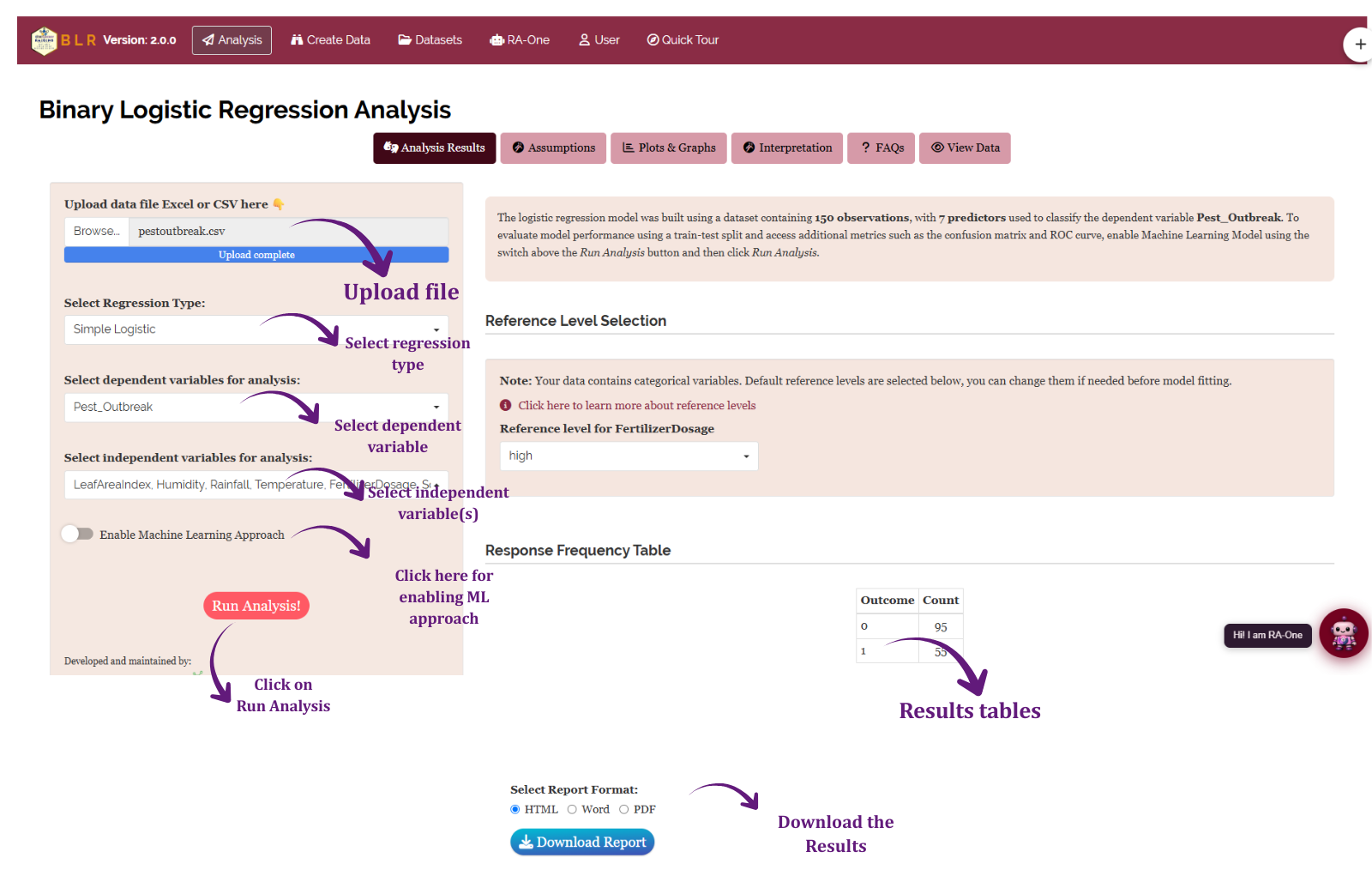
Figure 9 shows the Analysis tab. Click Browse in the sidebar to upload your CSV or Excel file. Selectors then appear: use Select Regression Type to choose Simple Logistic or Step Wise Logistic (Section 3), Dependent variable to pick the binary outcome column, and Independent variable(s) to choose one predictor or several. Optionally enable Machine Learning Approach and set the training percentage. Click Run Analysis! and every output appears instantly across the sub-tabs: Analysis Results, Assumptions, Plots & Graphs, Interpretation, FAQs and View Data. On the results panel you can also set the number of decimal digits used in the tables, and adjust the reference level of any categorical predictor through the Factor Settings panel.
14 Analysis results
The Analysis Results sub-tab presents three tables that together describe the fitted model: the Model Coefficients and Odds Ratios, the Model Fit Statistics, and the Pseudo R-Squared and Goodness of Fit table.
Table 1: Model Coefficients and Odds Ratios
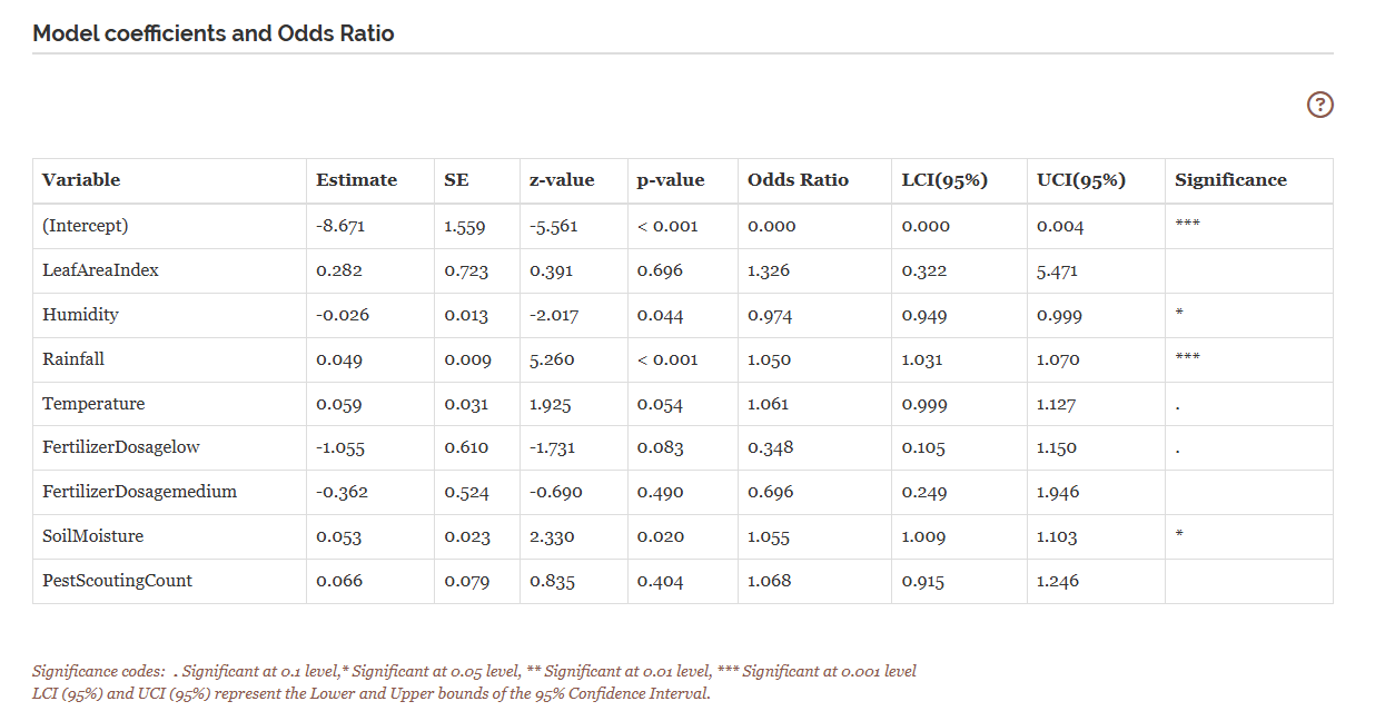
For every term this table reports the estimated coefficient (β) on the log-odds scale, its Std. Error, the z-value, and the p-value for the test that the true coefficient is zero. The Odds Ratio (eβ) and its 95% confidence interval sit alongside, they are the numbers you should quote. Significance stars appear beside each estimate.
Understanding the coefficients table
| Column | Meaning |
|---|---|
| Estimate (β) | Change in the log-odds of the event per one-unit rise in the predictor, holding the others fixed |
| Std. Error | Precision of the estimate; smaller is better |
| z Value | Estimate ÷ Std. Error, tests whether β differs from zero (the Wald statistic) |
| P Value | Probability of a z this extreme if β were truly zero |
| Odds Ratio (eβ) | Multiplicative change in the odds per unit of the predictor, the number to report |
| 95% CI for OR | Range for the true odds ratio; if it contains 1, the predictor is not significant at the 5% level |
| Significance | *** p < 0.001 · ** p < 0.01 · * p < 0.05 · (blank) not significant |
Interpretation from Figure 10
In the working example, Rainfall is the dominant predictor: each extra millimetre is associated with a highly significant 5% rise in the odds of an outbreak (OR = 1.050, p < 0.001). SoilMoisture (OR = 1.055, p < 0.05) also carries a significant positive odds ratio. Humidity, by contrast, is a significant protective factor once the other variables are held constant (OR = 0.974, p < 0.05), each extra percentage point of humidity is associated with a small decrease in outbreak odds, a reminder that a partial effect can run opposite to what a simple, one-variable summary might suggest. Temperature shows a positive trend that falls just short of the 5% threshold (OR = 1.061, p ≈ 0.054). LeafAreaIndex, the FertilizerDosage contrasts against the high-dose reference, and PestScoutingCount are not statistically significant here. Each odds ratio is a partial effect: read it as “the change in the odds for a one-unit change in this predictor, with the others held constant.”
An odds ratio of 1.5 does not mean the outbreak is “50% more likely” in the probability sense, it means the odds are 50% higher. When the event is rare the two are close; when it is common the odds ratio exaggerates the change in risk. Report it as an odds ratio, which is exactly what it is.
Table 2: Model Fit Statistics
Understanding model fit statistics
| Statistic | Meaning |
|---|---|
| AIC | Deviance penalised for the number of parameters; lower is better, and it is the criterion the Stepwise method minimises |
| Deviance | −2 × log-likelihood of the fitted model; lower means a better fit |
| Likelihood Ratio Statistic | Tests the full model against an intercept-only model; a large value with a small p means the predictors jointly matter |
| P Value | Significance of the likelihood-ratio test |
| Degrees of Freedom | Number of predictor terms compared between the two models |
Interpretation from Figure 11
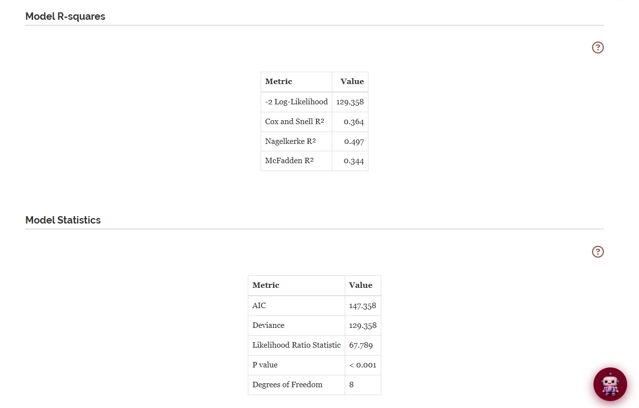
Here the likelihood-ratio test is highly significant (chi-squared ≈ 67.8 on 8 degrees of freedom, p < 0.001), so the predictors jointly explain a meaningful share of the variation in outbreak status. A low AIC relative to competing models would favour this model in a formal comparison. Good fit statistics are encouraging, but they never certify that the model is correct. That is what the Assumptions tab is for.
Table 3: Pseudo R-Squared and Goodness of Fit
Ordinary R² has no exact equivalent in logistic regression, so RAISINS reports three pseudo R-squared measures side by side, shown in the same Model R-squares table as Figure 11 above: Cox & Snell (bounded below 1, hard to read in absolute terms), Nagelkerke (rescaled to reach 1, the most commonly quoted), and McFadden (a likelihood-based index where 0.2–0.4 already indicates an excellent fit). In the working example the Nagelkerke R² is roughly 0.50 and the McFadden R² roughly 0.34, together marking a moderate-to-strong model, in agreement with the significant likelihood-ratio test above.
15 Assumptions
The Assumptions sub-tab gathers the formal statistical tests that validate your model, each with a plain-language interpretation, alongside a “How do I read this tab?” guide at the top.
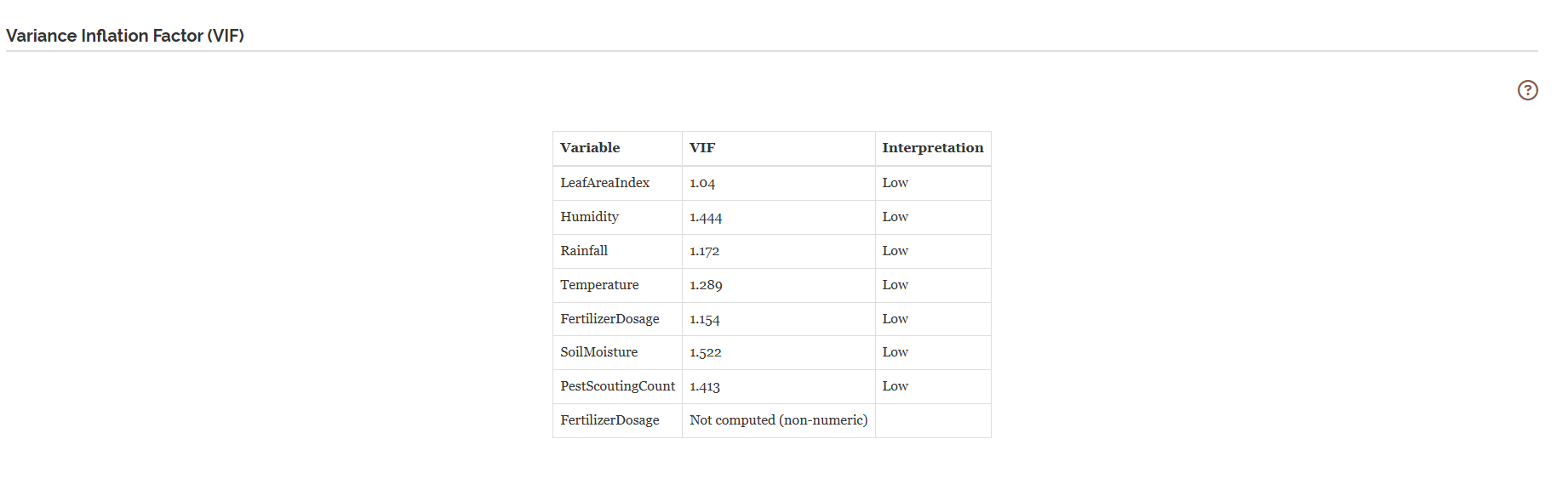
Multicollinearity, VIF
RAISINS reports the Variance Inflation Factor for each predictor. For a predictor \(X_j\),
\[VIF_j = \frac{1}{1 - R_j^2},\]
where \(R_j^2\) is the R² from regressing \(X_j\) on all other predictors. As a rule of thumb, VIF > 5 signals troublesome collinearity and VIF > 10 a serious problem. In the working example all values sit near 1, so multicollinearity is not a concern.
Goodness of fit, Hosmer-Lemeshow
The Hosmer-Lemeshow test groups observations into (about ten) risk groups by predicted probability and compares observed with expected event counts in each. A p-value below 0.05 indicates poor calibration, the model’s predicted probabilities do not match the observed outcomes well, and the usual remedy is to add predictors, interactions, or transform a continuous predictor. With very large samples the test can flag even trivial misfit, so read it alongside the calibration plot.

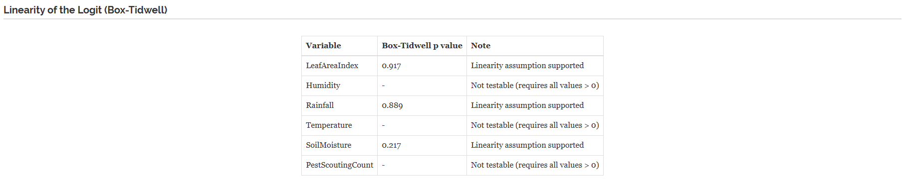
Linearity of the logit, Box-Tidwell
For each continuous predictor, RAISINS refits the model with an added \(x \cdot \log(x)\) term (the Box-Tidwell construction). A significant added term (p < 0.05) says that predictor’s relationship with the log-odds is probably not linear; the remedies are a transformation, a polynomial term, or sensible categorisation. Predictors containing zeros or negative values are reported as “not testable”, the check requires strictly positive values.
Influence & Outlier Diagnostics
The Assumptions tab also reports an Influence & Outlier Diagnostics table (Figure 15). It separates three distinct kinds of unusual observation: an outlier (poorly predicted, unusual in the response), a high-leverage point (unusual in the predictor space), and an influential point (one that actually moves the fitted odds ratios). For each observation it lists the predicted probability, the standardized deviance residual, leverage (\(h_{ii}\)), and Cook’s distance, and adds a plain-language Flag (e.g., “Potential outlier”, “High leverage”, “Influential”). The cut-offs used are shown in a note above the table (leverage > 2p/n; Cook’s D > 4/n; |standardized deviance residual| > 2 potential, > 3 extreme). The whole table is downloadable as CSV.
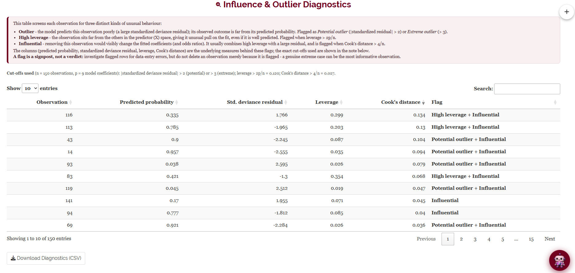
A flagged point may be a data-entry error (fix or remove it) or a genuine, important extreme case (keep it). Never delete points just because they are flagged; investigate, and where it matters, report the model with and without the point.
16 Plots & Graphs
The Plots & Graphs tab holds the full visualisation suite. Plots are selected from a row of icon buttons; the active plot appears below with a gear (Plot Settings) button in its corner. Every plot is fully customizable, title, axis labels, colours, point size, theme and more, and every plot can be downloaded in PNG, JPEG, TIFF, PDF and SVG at a chosen size and resolution.
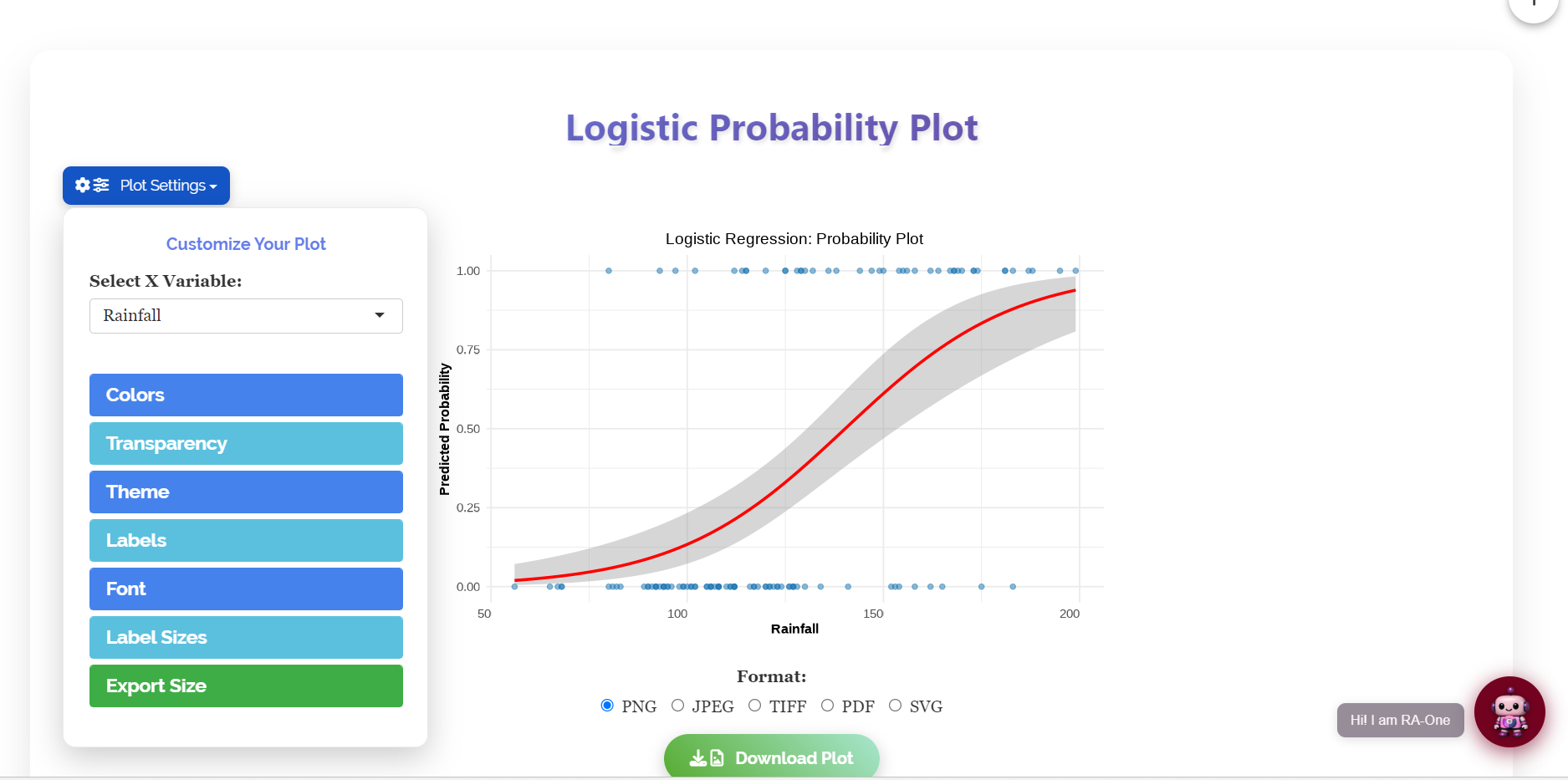
Three families of plots live here. The classification plots (probability curve, odds ratio, importance) help you understand the fitted model; the diagnostic plots (residuals, deviance histogram) help you check the fit from Section 15; and, when machine-learning mode is on, a further family (ROC, calibration, probability distribution, confusion matrix) evaluates predictive performance. Hover over any thumbnail below to read what it shows.
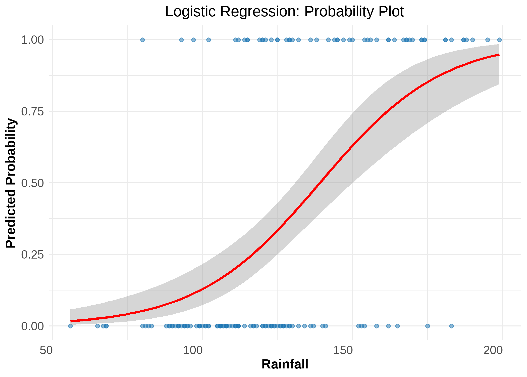
Logistic probability curve, the S-shaped fit of event probability against a chosen predictor; the quickest read on the direction and strength of a relationship.
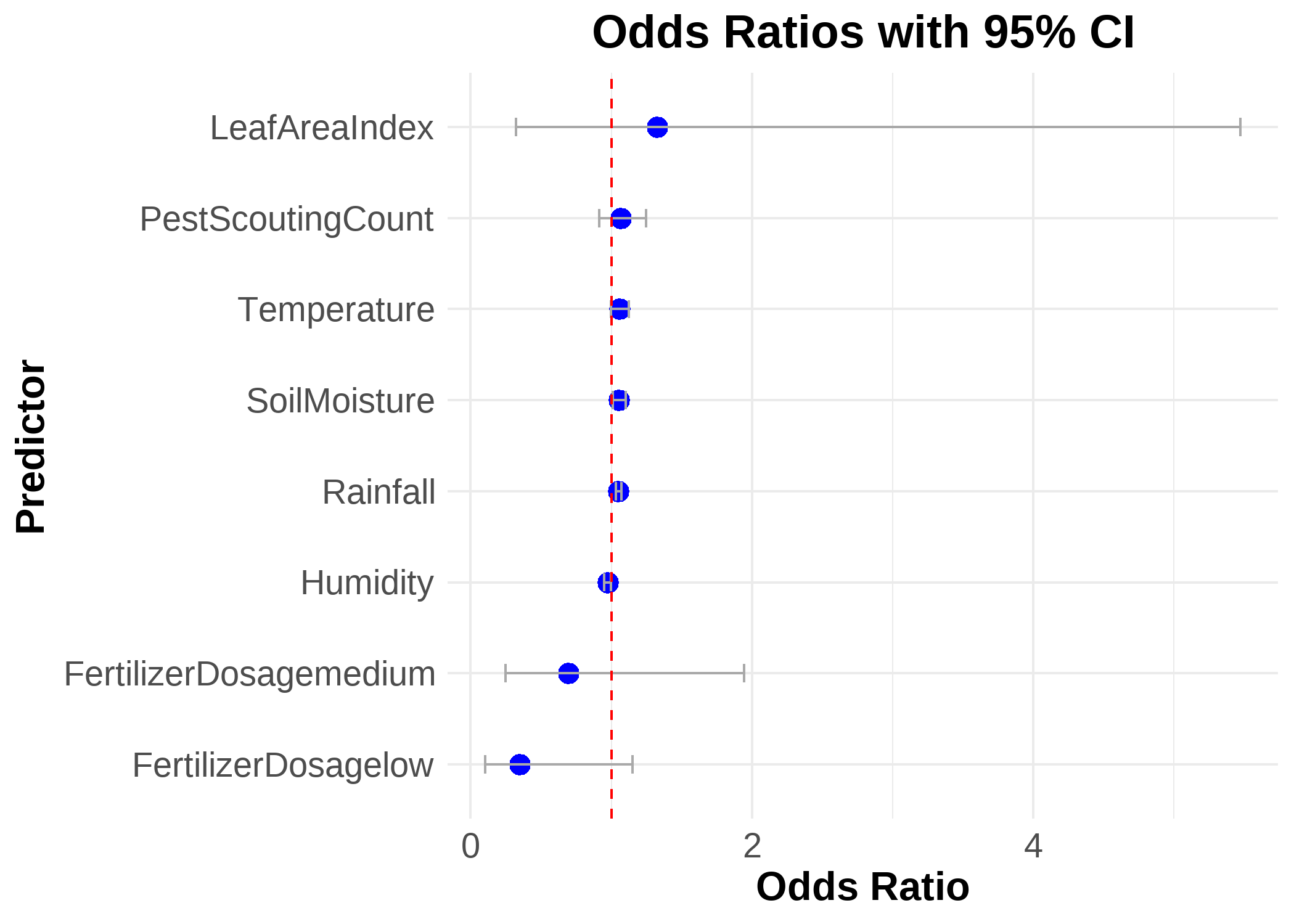
Odds ratio plot, each predictor’s odds ratio as a point with its 95% confidence interval around the reference line at 1; bars crossing 1 are non-significant. A compact summary of effect sizes and significance.
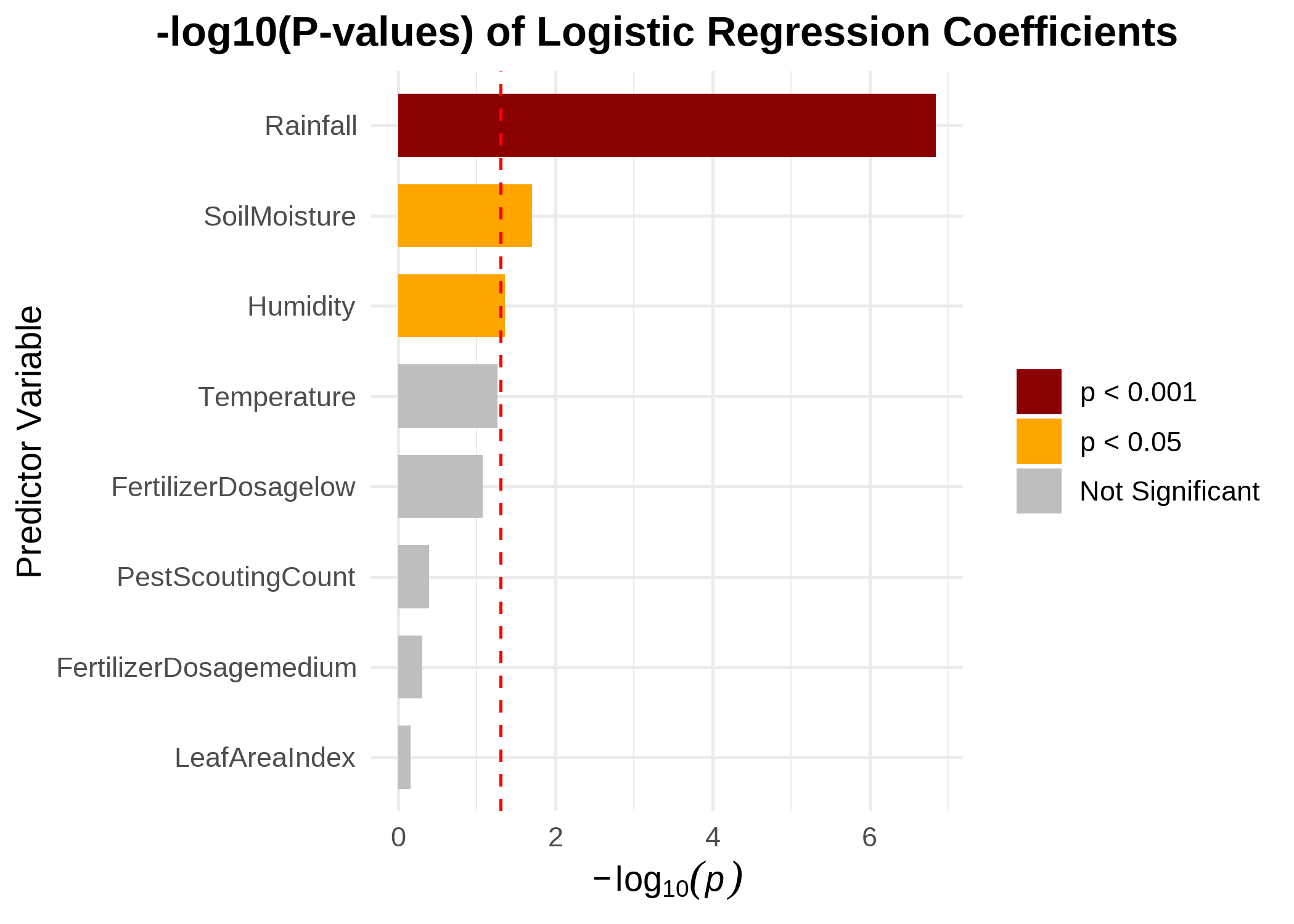
Importance plot, predictors ranked by the strength of their statistical evidence; the taller the bar, the stronger that predictor’s contribution to the model.
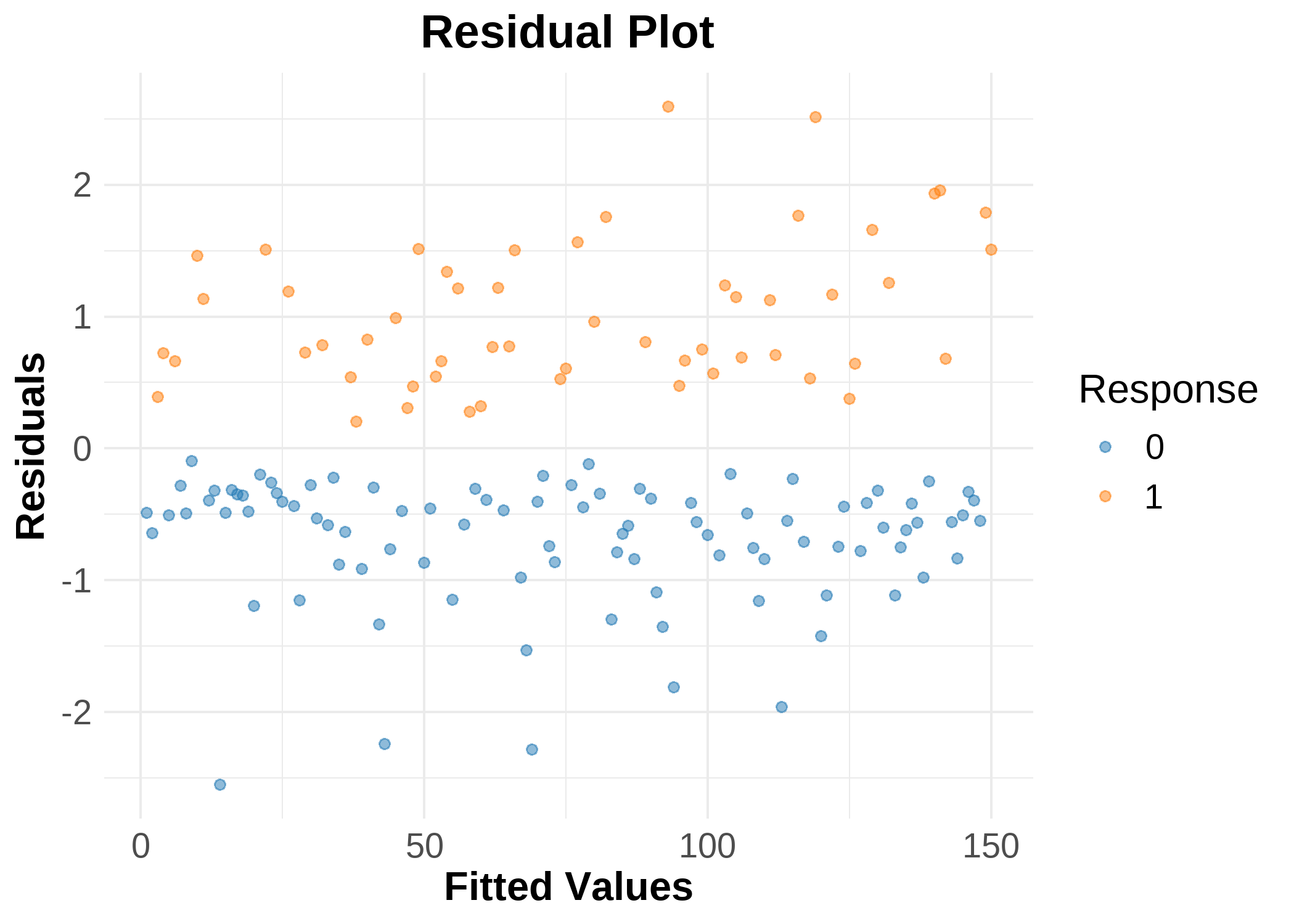
Residual plot (diagnostic), standardized residuals by observation, coloured by outcome; look for a patternless band, isolated extreme points deserve a check in the influence table.
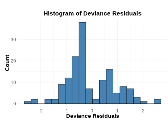
Deviance residual histogram (diagnostic), the distribution of deviance residuals; a roughly symmetric shape around zero supports the fit, long tails point at poorly explained observations.
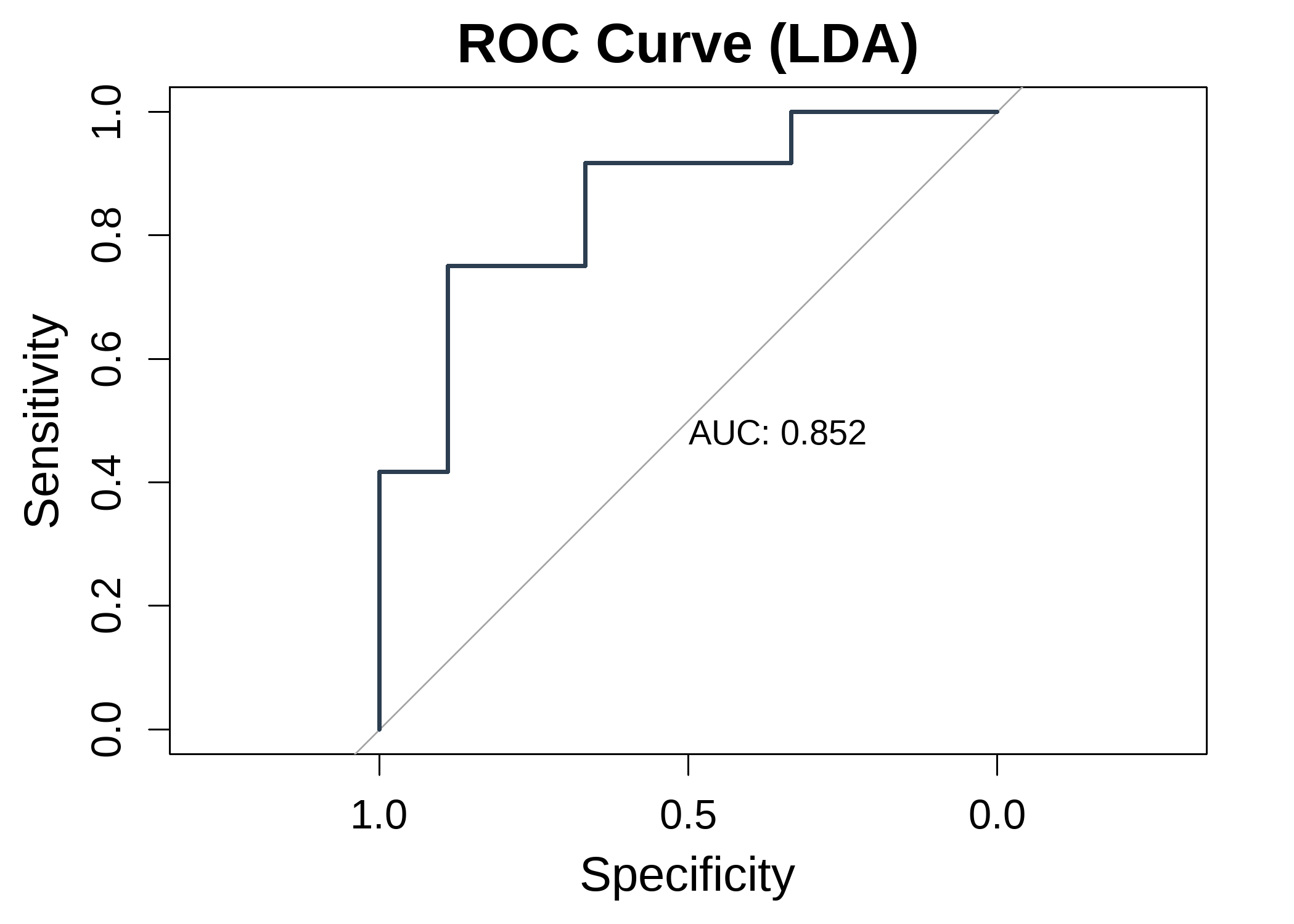
ROC curve (machine-learning mode), sensitivity against 1 − specificity across all thresholds, with the AUC printed on the plot; the further the curve bows above the diagonal, the better the discrimination.
The tab also offers, when machine-learning mode is on, the calibration plot (binned predicted vs observed proportions hugging the 45° line for a well-calibrated model), the predicted-probability distribution (how cleanly the two classes separate around the 0.5 threshold), and the confusion-matrix heatmap.
17 Interpretation
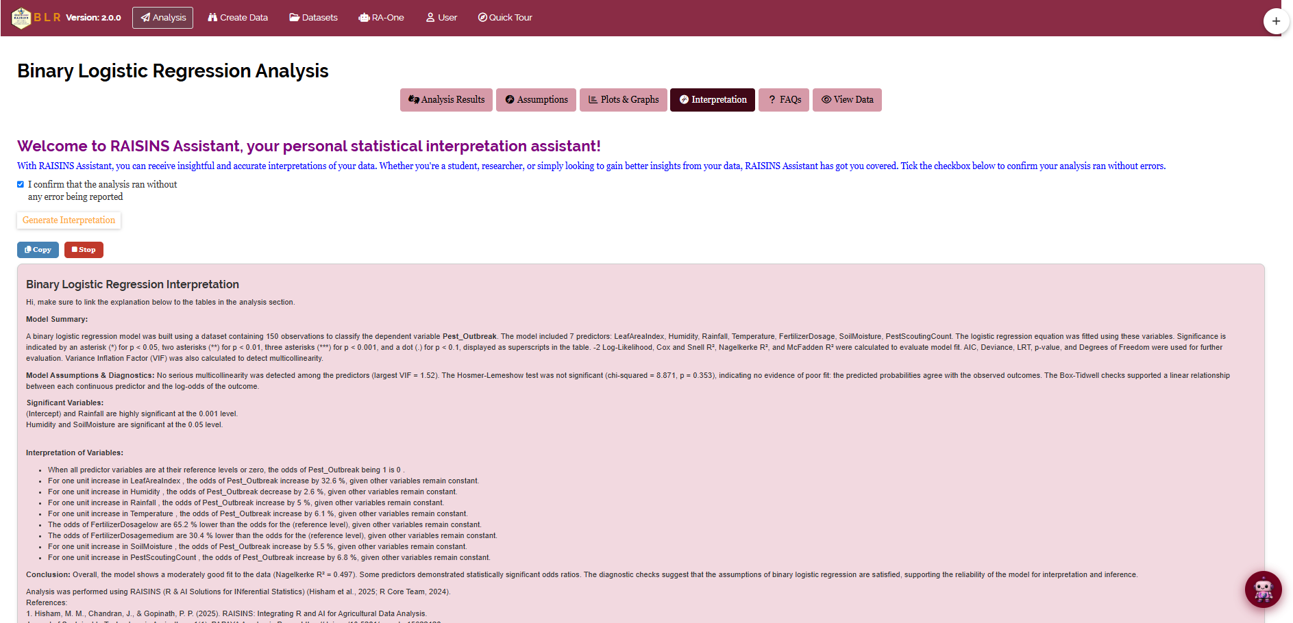
The Interpretation sub-tab gives a clear, plain-language write-up of your results (Figure 23): which predictors are significant and in which direction (with the size of each odds ratio), the overall model fit (the pseudo R² measures and the likelihood-ratio test), any assumption violations detected, and practical suggestions (a transformation, dropping a redundant predictor, and so on). The narrative also states which model-building method and which mode (standard vs machine-learning split) were used, so it reads like a ready-to-adapt methods paragraph. The text is revealed with a short typing animation; a Stop button reveals the full write-up at once, and a Copy button places the plain-text version on your clipboard for pasting into a manuscript.
18 RA-One Chat
RA-One is the built-in conversational assistant, reachable from its own navigation tab or the floating chat bubble. Ask questions in plain language and it answers using your analysis, never generic advice and never invented numbers; if a value is not available it says so. Every reply is in plain English, with no code.
RA-One draws on your Analysis Results, Assumptions and Interpretation outputs. It can explain what an odds ratio, p-value, pseudo R² or confidence interval means for your specific model, walk you through why an assumption passed or failed, and answer general concept questions (odds vs probability, reference levels, separation, when to use Stepwise) so you build understanding alongside your results.
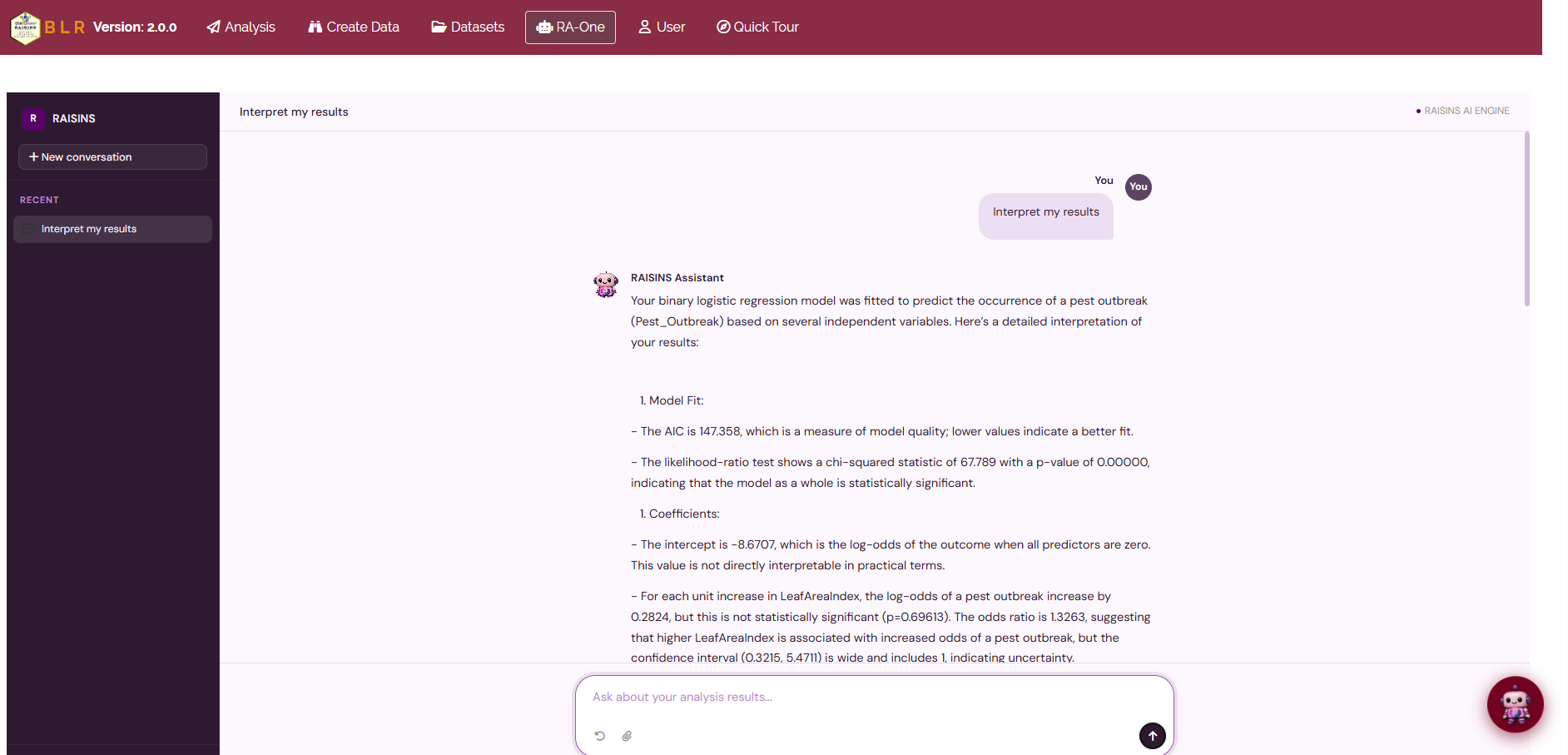
The same chat window can also prepare your data, build a correctly formatted template (Section 12) or fetch a model dataset (Section 11), and, most usefully, generate plots on request. Ask for “the probability curve”, “the odds ratio plot”, “the ROC curve” or a “correlation heatmap” and RA-One renders the figure directly in the chat. Each chat plot comes with a plot-type toolbar to switch graphics and a Plot Settings panel to pick the predictor and restyle it, and a one-click high-resolution download.
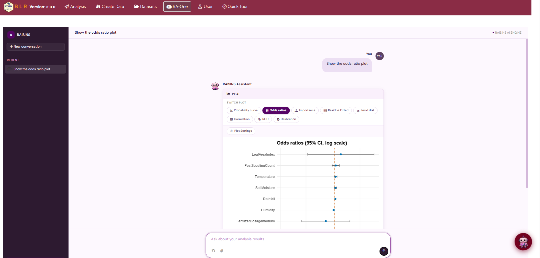
In a single conversation RA-One can interpret your results, build a data template, fetch a model dataset, and draw customizable plots; so much of a routine logistic-regression session can happen without ever leaving the chat.
19 FAQs
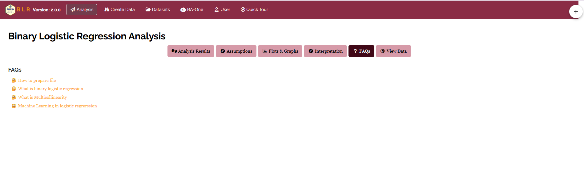
A dedicated FAQs tab answers common questions, how to read an odds ratio correctly, what to do when an assumption is violated, how categorical predictors and reference levels are handled, and when to prefer a multiple over a simple logistic model, with clear explanations and practical tips. If you are ever unsure how something works, start here.
20 View data
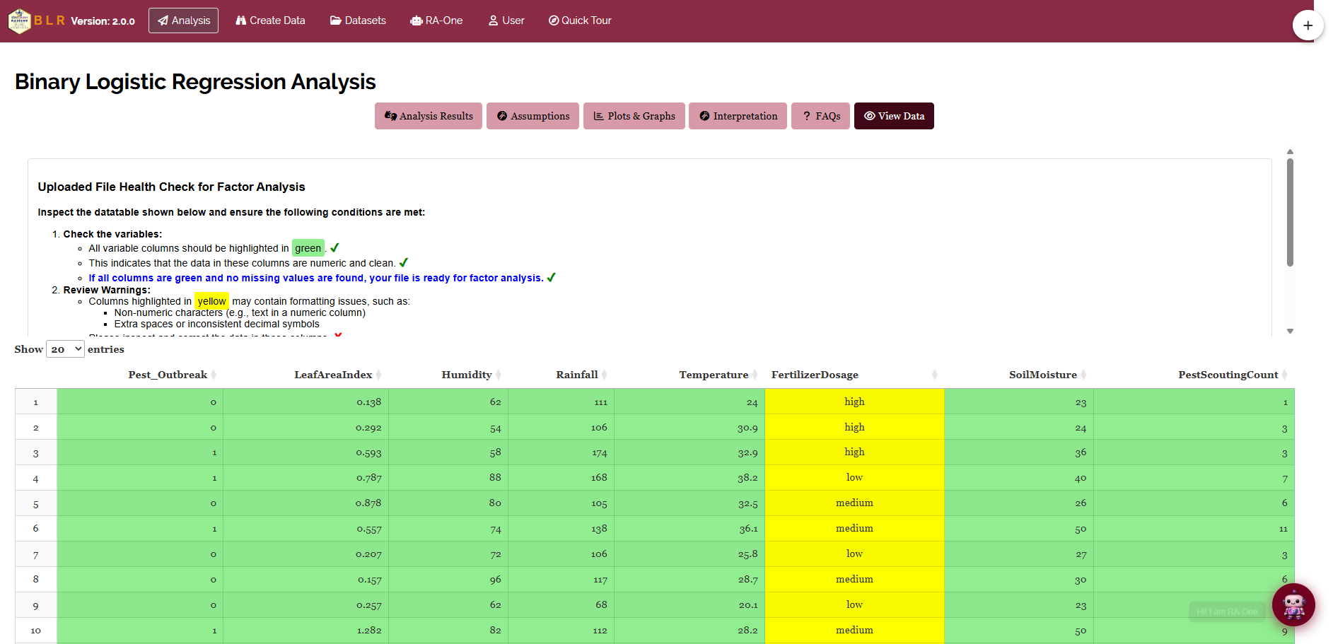
View Data is the first line of defence for data integrity. On upload, RAISINS runs an automated Health Check that validates column types and formatting: it verifies the response column carries exactly two distinct values, flags any predictor column containing non-numeric values, missing entries or formatting inconsistencies that would compromise the fit. Resolving these before you click Run Analysis! ensures every output rests on clean, correctly typed data.
21 Wrapping up
Binary logistic regression rests on one honest question: once the noise is accounted for, how much does each factor really move the odds of the event? Everything else, the likelihood-ratio test, the goodness-of-fit and linearity checks, the influence diagnostics, the ROC curve, exists to make sure that question is answered fairly. RAISINS automates the machinery so you can concentrate on what the answer means for your research.
If you get stuck at any point, RA-One is available 24 × 7, or write to us at [email protected].