Descriptive Statistics
Descriptive Statistics summarizes your data using key statistical measures. This tutorial shows how to generate and interpret tables and plots in RAISINS…. Read more …
Descriptive Statistics is the foundation of every data analysis, providing a clear summary of the main characteristics of a dataset. It helps researchers understand the central tendency, variability, distribution, and overall structure of their data before applying inferential statistical methods. Widely used across agricultural, biological, medical, and social science research, descriptive statistics include measures such as mean, median, standard deviation, variance, range, quartiles, skewness, and kurtosis. This tutorial introduces the concepts from first principles and demonstrates how to perform descriptive statistical analysis in RAISINS. It covers data summarization, distribution assessment, publication-ready tables and visualizations, and Interpretation - all without writing a single line of code
1 What are descriptive statistics?
Imagine you have completed a field experiment and collected the yields from 100 rice plots. Before presenting the results in your research paper or thesis, you need to summarize the data. Listing all 100 yield values in a table is neither practical nor informative. Instead, you want to answer simple questions such as: What was the average yield? How much did the yields vary from plot to plot? Were there any unusually high or low values? Descriptive statistics provide concise numerical summaries that answer these questions and give a clear overview of the dataset before proceeding to further analyses
- What is the typical yield?
- How much do the plots vary from one another?
- Are there any unusually high or low values?
- Are most plots clustered together, or spread across the whole range?
Instead of examining every individual observation, descriptive statistics condense the data into a small set of summary measures, allowing researchers to quickly understand and communicate the overall characteristics of the dataset.
The important thing to be clear about from the start is what descriptive statistics do not do. They make no claim about any population beyond the plots you actually measured. They test no hypothesis. They produce no p-value. They describe exactly what is in front of you, no more.
Descriptive statistics summarise a dataset into a few meaningful measures, so you can see its centre, its spread, and its shape at a glance, without claiming anything beyond the data you actually collected.
1.1 The three questions every summary answers
Every measure in the RAISINS output exists to answer one of three questions, and it helps enormously to know which question you are asking before you read a number.
| The question | The measures | What it tells you |
|---|---|---|
| Where is the centre? | Mean, Median, Mode | The typical or representative value |
| How spread out is it? | Min, Max, Range, Variance, SD, SE, CV% | How much the observations disagree with each other |
| What shape is it? | Skewness, Kurtosis | Whether the distribution is symmetric, and how heavy its tails are |
1.2 Where is the centre?
The mean is the arithmetic average, and it is the measure everyone reaches for first. Its weakness is that it listens to every value equally, including the absurd ones: a single mistyped yield of 9000 kg will drag the mean of your 100 plots somewhere useless.
The median is the middle value once the data are sorted. It does not care how extreme the extremes are, only how many there are, which makes it robust. When the mean and the median disagree noticeably, that gap is itself information: it tells you the distribution is lopsided, or that something odd is sitting in the tail.
The mode is the most frequently occurring value. It is the only one of the three that works for categories, and it is most useful when values repeat meaningfully.
If the mean and median are close, the distribution is roughly symmetric. If the mean is well above the median, something is pulling the average up: a long right tail, or an outlier. If the mean is well below the median, the same is happening on the left.
1.3 How spread out is it?
The centre alone is a half-told story. Two groups can share an identical mean and be nothing alike, one tightly clustered, the other scattered across the whole range. Spread is what distinguishes them.
The minimum and maximum give the observed range, the crudest measure of spread. It is entirely determined by the two most extreme observations, which is exactly why it is fragile.
The variance and its square root, the standard deviation (SD), measure the average distance of observations from the mean. The SD is the more useful of the pair in practice because it is expressed in the same units as your data: an SD of 0.35 cm is directly comparable to a mean of 5.01 cm.
The standard error (SE) is a different concept, and the two are confused constantly. The SD describes how much your data vary. The SE, computed as SD divided by the square root of the sample size, indicates how precisely the sample mean estimates the true population mean. Collect more data and the SD stays roughly where it is, because the underlying variability is real; the SE shrinks, because your estimate of the mean gets sharper.
The coefficient of variation (CV%) expresses the SD as a percentage of the mean. Because it is unitless, it is the one measure that lets you compare variability across quantities measured on different scales, asking whether petal width (in cm) is more variable, relative to its own size, than yield (in kg).
If you want to say how variable your observations are, report the SD. If you want to say how confident you are in the mean, report the SE. Reporting SE because it is the smaller number, and therefore makes your error bars look tidier, is a well-known way of misleading a reader, including yourself.
1.4 What shape is it?
Skewness measures asymmetry. A value near zero means the distribution is balanced around its centre. A positive value means a long tail to the right, common in yield, income, and anything that cannot go below zero but has no ceiling. A negative value means the tail runs left.
Kurtosis measures tailedness, how much of the distribution lives out in the extremes. RAISINS reports it against the normal reference value of 3: values noticeably above 3 mean heavier tails and more outliers than a normal distribution would produce; values below 3 mean lighter tails.
Together these two tell you whether the neat, symmetric, bell-shaped picture that so many later tests quietly assume is anywhere close to true for your data.
Why the summary is never enough on its own: Anscombe's warning
-
In 1973 the statistician Francis Anscombe constructed four small datasets that are now famous. All four share, to two decimal places, the same mean of x, the same mean of y, the same variance, the same correlation, and the same fitted regression line. By every number in the summary table they are indistinguishable. Plot them and they could not be more different: one is a clean linear relationship, one is a perfect curve, one is a straight line dragged off course by a single outlier, and one is a vertical stack of points plus one far-away observation that invents a correlation out of nothing. Anscombe’s quartet is the reason this module gives you thirteen plots alongside the table rather than the table alone. The numbers tell you what the data are on average; the pictures tell you whether the average is a fair description at all. Read them together, always.
2 Getting to the module
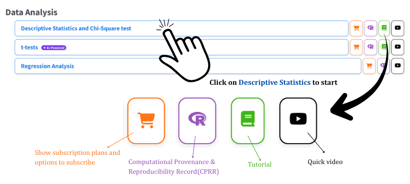
Now that the theory is clear, let us run the analysis. Visit the RAISINS home page at www.raisins.live and go to Data Analysis. In this tutorial we use the Descriptive Statistics and Chi-Square test module, shown in Figure 1.
2.1 Computational Provenance & Reproducibility Record
CPRR (Computational Provenance & Reproducibility Record) provides a transparent and comprehensive record. Click on the icon shown in Figure 1 to access CPRR and know about the computational workflow performed during the analysis. The record for this module states the R version and the exact version of every package used, and names the specific function behind each reported result. CPRR lists every default parameter and decision rule applied by the module and provides fully runnable R code that reproduces each analytical step. Users can execute the code in R to independently reproduce and verify the results. It carries its own DOI.
To cite the platform itself in a paper, thesis, or report, use the RAISINS citation, available in APA, Harvard, and BibTeX formats at www.raisins.live/citation.html. That is the primary reference, and for most manuscripts it is all you need.
The CPRR for descriptive statistics is at www.raisins.live/module_record/descriptive.html.
Cite the RAISINS paper as your primary reference for the platform. Add the CPRR as supporting documentation when a journal asks for details of the computing environment, or when you want your methods section to be precise about versions and functions rather than saying “analysis was carried out using an online tool.” The CPRR supports the citation and ensures computational reproducibility.
3 Preview mode and Quick Tour
Before subscribing, you can explore the entire module using Preview mode, accessible from the Welcome page. Preview mode loads built-in datasets so you can try every feature (the descriptive statistics table, normality tests, all thirteen plots, classification, chi-square analysis, and the RA-One assistant) without uploading your own data. First-time users are also offered a Quick Tour, an interactive, step-by-step walkthrough that highlights each control and explains what it does. You can retake the tour at any time from the Quick Tour tab.
4 A working example
To make things concrete we use the celebrated Iris dataset, one of the most widely studied datasets in statistics. It contains measurements of 150 iris flowers drawn from three species, Iris setosa, Iris versicolor, and Iris virginica, with 50 flowers per species, making it perfectly balanced. For each flower, four morphological measurements were recorded in centimetres: Sepal.Length, Sepal.Width, Petal.Length, and Petal.Width.
The three species serve as the groups, and the four floral measurements serve as the variables whose distributional properties we want to characterise and compare. Our aim is to describe how the four traits vary within and across the three species, to detect differences in their centre and spread, and to assess the shape of each distribution, all achieved through descriptive methods without a formal hypothesis test. The arrangement of the data is shown in Figure 2.
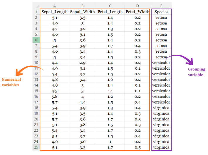
Two terms recur throughout this tutorial. The Group is the column that labels which category each observation belongs to (here, Species). The Variables are the numeric columns being described (here, the four floral traits).
5 How to prepare your data
Your analysis is only as good as your data. Feed RAISINS high-quality data and it will deliver powerful insights; feed it messy data and the results will not be trustworthy. You have four routes:
- Create your dataset in MS Excel Section 5.1
- Build your dataset directly within the RAISINS app Section 5.2
- Use the model datasets in RAISINS as a reference Section 5.3
- Create your dataset using the RA-One chat assistant Section 5.4
5.1 Preparing data in MS Excel
Open a new blank sheet in MS Excel containing only one sheet, and avoid adding any unnecessary content. The dataset should follow a column-based format, where one column holds the group label (e.g. “Species”) and every variable under study (e.g. Sepal.Length, Sepal.Width, Petal.Length, Petal.Width) occupies its own column, with each observation on a single row. The group label repeats for every observation belonging to that group (50 per species in this example).
The file can be saved as CSV, XLS, or XLSX, but CSV is recommended as it is lighter and loads faster. Ensure there are no unwanted spaces in column names or group labels. For reference, see Figure 3.
Descriptive statistics do not require a grouping variable. If you upload numeric columns with no group column, RAISINS will describe each variable across the whole dataset. The group column simply lets you compare the same variable between categories, which is usually the more interesting question.
Dataset creation rules
- Column naming convention
- No spaces allowed in column names.
- Use underscores (
_) or full stops (.) for separation. - Avoid symbols and special characters such as %, #.
- Data arrangement
- Start the data towards the upper-left corner.
- Ensure the row above the data is not blank.
- Cell management
- Avoid typing or deleting in cells without data.
- If needed, select the affected cells, right-click, and choose Clear Contents.
- Column relevance
- Name all columns meaningfully.
- Exclude unnecessary columns not required for the analysis.
- Group labels
- Keep spelling and capitalisation of group labels consistent throughout the column.
How to save as CSV in MS Excel
Open your workbook. Ensure your data is arranged properly with only one sheet.
Click the ‘File’ menu. Go to the top-left corner and click File.
Choose ‘Save As’ or ‘Save a Copy’. Select the location where you want to save your file.
Set file type to CSV. In the ‘Save as type’ dropdown, choose CSV (Comma delimited) (*.csv).
Name your file. Enter a relevant file name without spaces (use underscores if needed).
Click ‘Save’. Click Save to export the file.
💡 Tip: Before saving, double-check that your data is on the first sheet and follows the required format: no empty rows above the data and meaningful column names.
5.2 Prepare using Create Data in RAISINS
If you are unsure about the correct format, do not worry, RAISINS can create the data layout for you using the prescribed template. Here is how:
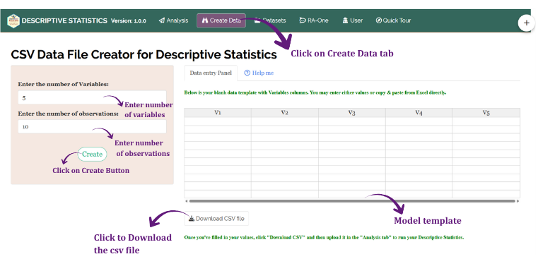
- Navigate to the Create Data tab
- Enter the number of Variables
- Enter the number of Observations
- Click the Create button
A blank table appears with one column per variable, named V1, V2, … Vn, and one row per observation. You may type observations straight into the table or paste them in from Excel. Once the observations are entered, click Download CSV file and upload the result under Analysis. The model layout appears as shown in Figure 4.
The Create Data tab builds the numeric variable columns only. If your analysis needs a grouping variable, add a group column to the downloaded CSV in Excel, and rename V1, V2 … to something meaningful, before uploading it.
5.3 Download Model Datasets
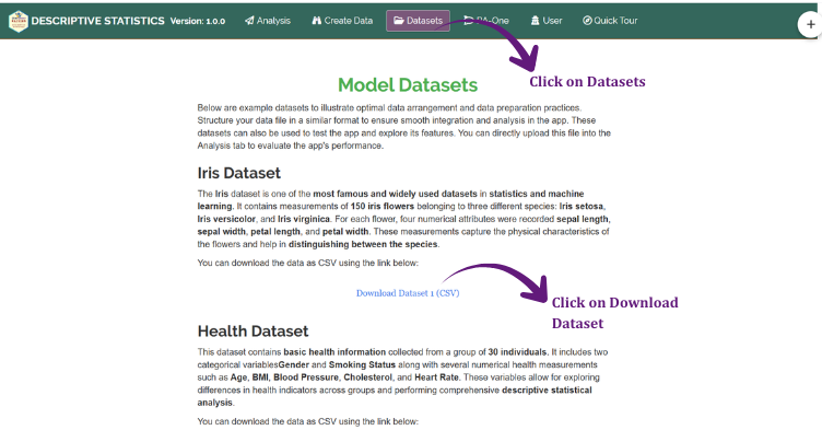
If you are unsure about the required data format, or would like to explore the module before using your own data, RAISINS provides model datasets for reference. To download them:
- Navigate to the Datasets tab
- Click the Download CSV link corresponding to the required dataset
- Save the file to your computer
- Use the model dataset as a reference for preparing your own data, or upload it directly to explore the analysis
5.4 Creating a dataset using RA-One chat
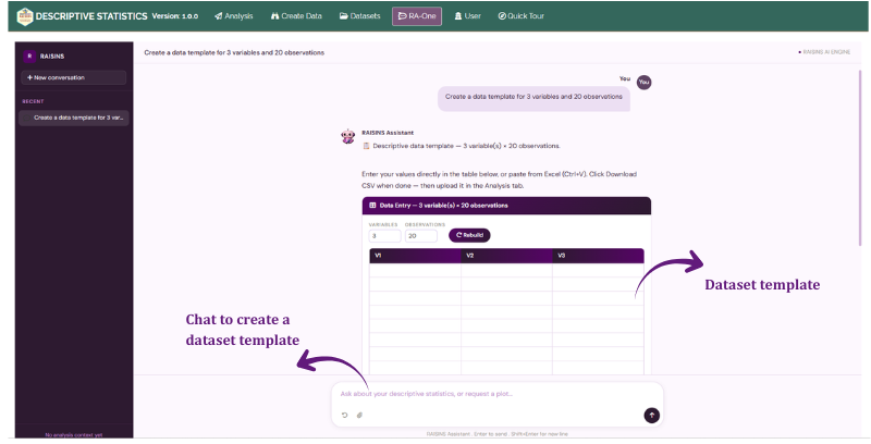
RA-One, the built-in chat assistant, can create a properly formatted dataset through a simple conversation. Open the RA-One chat by clicking the chat icon within the app or by heading to the RA-One tab, then simply ask, for example, “Create a data template for 4 variables and 50 observations”.
RA-One builds an editable table right inside the chat. You can type values into any cell, paste a block straight from Excel with Ctrl+V, and use Add row or Add column if you need more space than you asked for. The Variables and Observations boxes above the table let you rebuild it at a different size without retyping your request. When you are finished, click Download CSV and upload the file under the Analysis tab. The full workflow is illustrated in Figure 6.
6 The Analysis tab
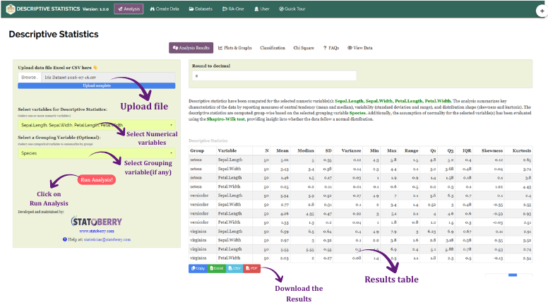
Figure 7 shows the Analysis tab in detail, with each option explained. Upload your prepared file by clicking Browse in the sidebar. Once uploaded, selectors for the Group column and the response Variables appear. Choose the appropriate column under Group, then select the variables you wish to describe.
Click Run Analysis and all outputs appear instantly across the sub-tabs: Analysis Results, Normality Test, Plots & Graphs, Classification, Chi-Square, Interpretation, FAQs, and View Data.
For seven of the plots (violin, density, box, ridgeline, beeswarm, strip chart, and bar plot) a Scaled variables / Not Scaled variables toggle appears beside the plot selector. Switching it on applies Min–Max scaling, rescaling every variable to lie between 0 and 1 so they can all be compared on one axis and large-valued variables do not visually overpower small ones.
This scaling affects the plot only. Your uploaded data are not modified, and the descriptive statistics table always reports values on the original scale. The How are variables scaled? link beside the toggle explains this inside the app.
7 Analysis results
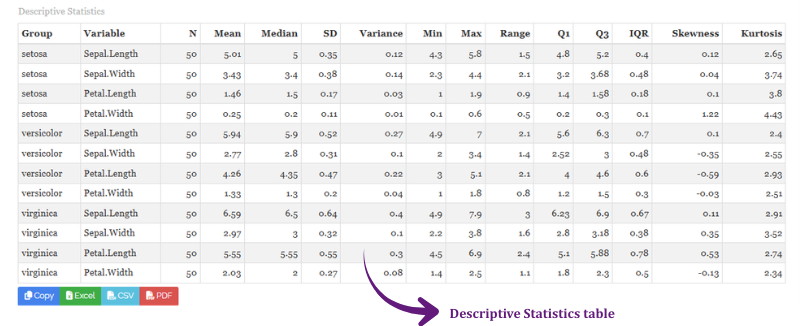
Once your dataset is uploaded and you click Run Analysis, descriptive statistics are computed for every selected variable within every group. The primary output is a comprehensive Descriptive Statistics table reporting, for each species–variable combination, the mean, standard deviation, standard error, minimum, maximum, coefficient of variation, skewness, and kurtosis. See Figure 8.
7.1 Table 1 - Descriptive statistics
A glossary of the table columns
Each row corresponds to a group–variable combination, and the columns report the following. The Mean is the arithmetic average of all observations within the group for that variable, representing the central location of the data. The Standard Deviation (SD) measures the average deviation from the mean; a large SD relative to the mean indicates high variability. The Standard Error (SE) is the estimated precision of the group mean, computed as SD divided by the square root of the group sample size. The Minimum (Min) and Maximum (Max) are the smallest and largest observed values, together defining the observed range of the variable in that group. The Coefficient of Variation (CV%) expresses the SD as a percentage of the mean, enabling comparison of relative variability across variables measured on different scales. Skewness quantifies asymmetry: a value near zero indicates approximate symmetry, positive values indicate a right-skewed distribution with a long upper tail, and negative values indicate left skew. Kurtosis measures the tailedness of the distribution relative to a normal curve; values substantially above 3 indicate heavier tails and a sharper peak, while values below 3 indicate a flatter, lighter-tailed distribution.
7.2 Interpretation from Figure 8
The descriptive statistics reveal clear morphological differences among the three species. For Sepal.Length, virginica shows the highest mean (≈ 6.59 cm) along with the largest range (3.0 cm), indicating greater variability in flower size, whereas setosa records the smallest mean (≈ 5.01 cm) with comparatively low dispersion (SD ≈ 0.35 cm). Versicolor occupies an intermediate position at approximately 5.94 cm. For Sepal.Width, setosa exhibits the highest average width (≈ 3.43 cm) while versicolor has the lowest (≈ 2.77 cm).
Petal characteristics provide the most distinct separation. Setosa possesses the smallest Petal.Length (≈ 1.46 cm) and Petal.Width (≈ 0.25 cm) with very low standard deviations, indicating high uniformity within the species. Versicolor displays intermediate petal dimensions (≈ 4.26 cm and ≈ 1.33 cm respectively). Virginica exhibits the largest petals overall (≈ 5.55 cm and ≈ 2.03 cm), accompanied by relatively higher variability.
The skewness values for most variables remain close to zero, indicating approximately symmetric distributions, although slight positive and negative skewness appear in certain petal and sepal measurements. Kurtosis values are generally near the normal reference value of 3, implying moderate distribution shapes without extreme peakedness or flatness. Overall, the petal-related variables are the most effective features for distinguishing among the three species, which is exactly why they dominate the classification and chi-square results later in this tutorial.
When comparing groups, report both a measure of central tendency (mean or median) and a measure of dispersion (SD or CV%). The mean alone does not tell your reader whether the groups are internally consistent or wildly variable, and those two situations warrant very different conclusions.
A low CV% (below roughly 10–15%) within a group indicates high measurement precision and internal homogeneity. A high CV% may signal genuine biological variability, measurement error, or the presence of outliers, and each of those deserves a different response. A high CV% is an invitation to look at the plots, not a result in itself.
8 Normality test
Why test for normality in a descriptive analysis?
-
Descriptive statistics themselves assume nothing, you can compute a mean and an SD for any set of numbers at all. Normality matters because of what comes next. Most of the tests you are likely to run afterwards (t-tests, ANOVA, and the rest of the parametric family) assume approximate normality within each group. Checking it here, at the descriptive stage, tells you in advance whether those tests are appropriate or whether you should be reaching for a transformation or a non-parametric alternative. It is also a data-quality check: a wildly non-normal variable is sometimes a genuine biological finding and sometimes a data-entry error, and it is worth knowing which before you build an analysis on top of it. For large samples (n > 30 per group) the Central Limit Theorem generally ensures the sampling distribution of the mean is approximately normal even when the raw data are not.
Under the Normality Test sub-tab, RAISINS reports two formal normality tests for each selected variable: the Shapiro–Wilk test and the Anderson–Darling test. Use the variable selector to switch between variables.
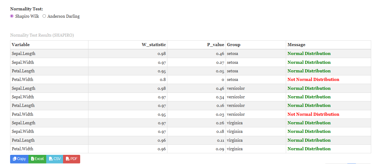
The Shapiro–Wilk test is the most widely used, being one of the most powerful tests for small to moderate samples; its statistic W ranges from 0 to 1, with values close to 1 indicating normality. A significant result (p < 0.05) indicates a departure from normality. See Figure 9.
8.1 Table 2 - Normality test
Normality test details
Shapiro–Wilk test
The Shapiro–Wilk test evaluates whether a sample comes from a normally distributed population. It computes a statistic W by comparing the observed data quantiles with the expected quantiles of a normal distribution. The null hypothesis is that the data are normally distributed; a significant p-value (p < 0.05) leads to rejection. It requires a sample size between 3 and 5000, and is considered more powerful than alternatives such as Kolmogorov–Smirnov for small samples.
\[W = \frac{\left(\sum_{i=1}^{n} a_i x_{(i)}\right)^2}{\sum_{i=1}^{n}(x_i - \bar{x})^2}\]
where \(x_{(i)}\) are the order statistics (sorted values) and \(a_i\) are constants derived from the expected values of normal order statistics.
Anderson–Darling test
A goodness-of-fit test that gives extra weight to the tails of the distribution, making it especially sensitive to departures from normality in the extremes. It requires a sample size greater than 7.
8.2 Interpretation from Figure 9
For Iris setosa, Sepal.Length (W = 0.98, p = 0.46) and Sepal.Width (W = 0.97, p = 0.27) both satisfy the normality assumption comfortably, with high p-values indicating no significant departure from a normal distribution. Petal.Length (W = 0.95, p = 0.05) sits exactly at the conventional threshold, marginally satisfying normality and warranting mild caution. Petal.Width (W = 0.80, p = 0.00) is the sole exception, showing a statistically significant deviation; the low W reflects the highly concentrated, nearly discrete nature of petal width measurements in this species, where most values cluster tightly around 0.25 cm.
For Iris versicolor, Sepal.Length (W = 0.98, p = 0.46), Sepal.Width (W = 0.97, p = 0.34), and Petal.Length (W = 0.97, p = 0.16) all display high W-statistics and p-values well above 0.05, confirming approximate normality. Petal.Width (W = 0.95, p = 0.03) fails at the 5% level, indicating a mild but statistically significant departure.
For Iris virginica, all four variables pass without exception: Sepal.Length (W = 0.97, p = 0.26), Sepal.Width (W = 0.97, p = 0.18), Petal.Length (W = 0.96, p = 0.11), and Petal.Width (W = 0.96, p = 0.09).
Across all three species, 10 of the 12 variable–group combinations satisfy the normality assumption, with only Petal.Width in setosa and versicolor showing significant non-normality. This suggests parametric methods are generally appropriate for the Iris dataset, with the exception of Petal.Width analyses involving those two species, where non-parametric alternatives or a transformation should be considered before formal inferential testing.
Test normality within each group, not on the pooled variable. A genuine difference between group means can make the pooled data look non-normal, often visibly bimodal, even when every individual group is perfectly normal. That is a finding about the group difference, not about normality, and reading it the wrong way round is a common mistake.
9 Plots
This is where the summary table gets its reality check. RAISINS makes every plot relevant to descriptive statistics available the moment you click Run Analysis, see Figure 10. You can download any of them in high-quality PNG (300 dpi), JPEG, TIFF, PDF, or SVG for use in reports or presentations.
9.1 Customising plots
Each plot carries a gear icon for customisation. Clicking it opens a settings panel with collapsible sections covering titles, appearance, fonts, axes, facets, theme, and download settings, letting you adjust colours, palettes, fonts, transparency, labels, and dimensions to suit your manuscript. Click on Figure 10 for a clear view of the customising features.
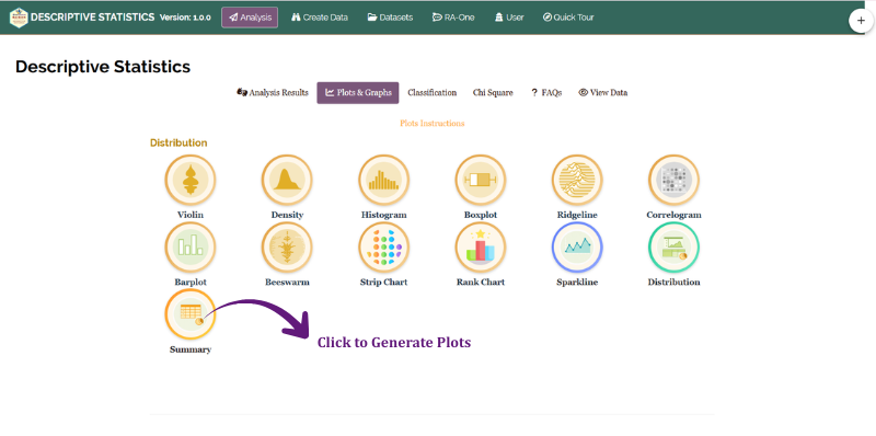
From Figure 11 to Figure 23 you can see the different types of plots available in RAISINS. Hover over any thumbnail for a description of what that plot shows and when to use it.
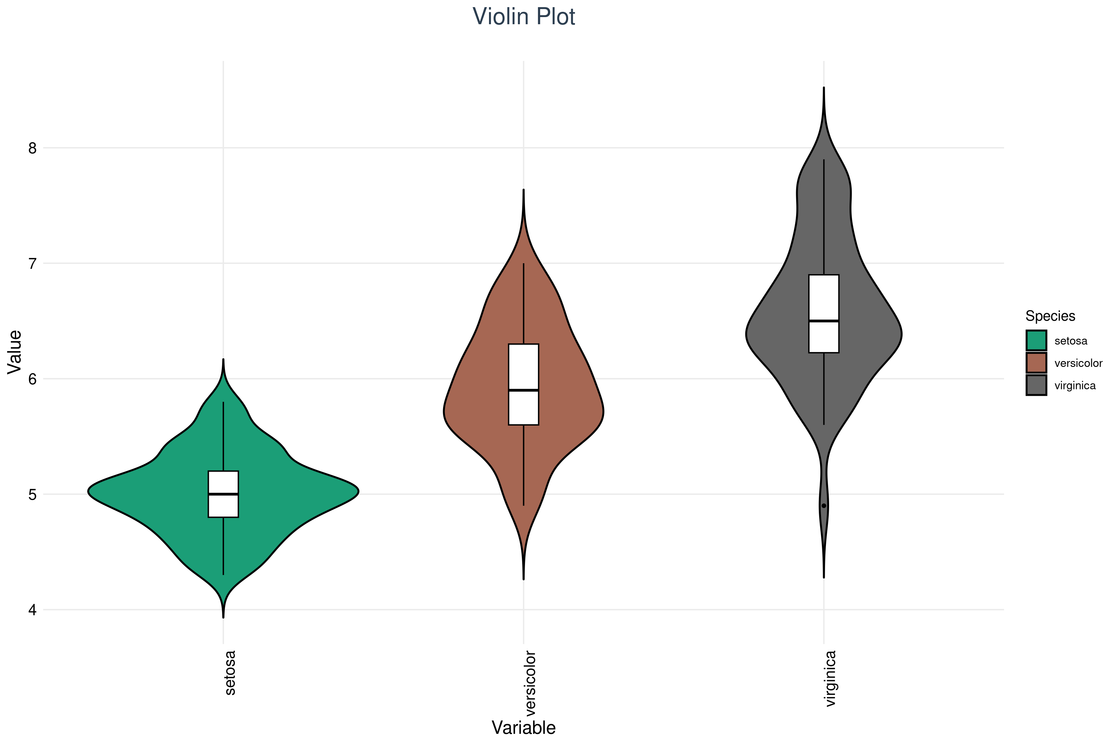
A violin plot compares the distribution of each variable across the three species. Each violin’s width reflects how the data are spread, wider sections mean more observations at that value. Inside each violin is a box plot showing the median and interquartile range. The narrow violin for setosa on petal length directly reflects the very low within-species variability that its low CV% reported in the table.
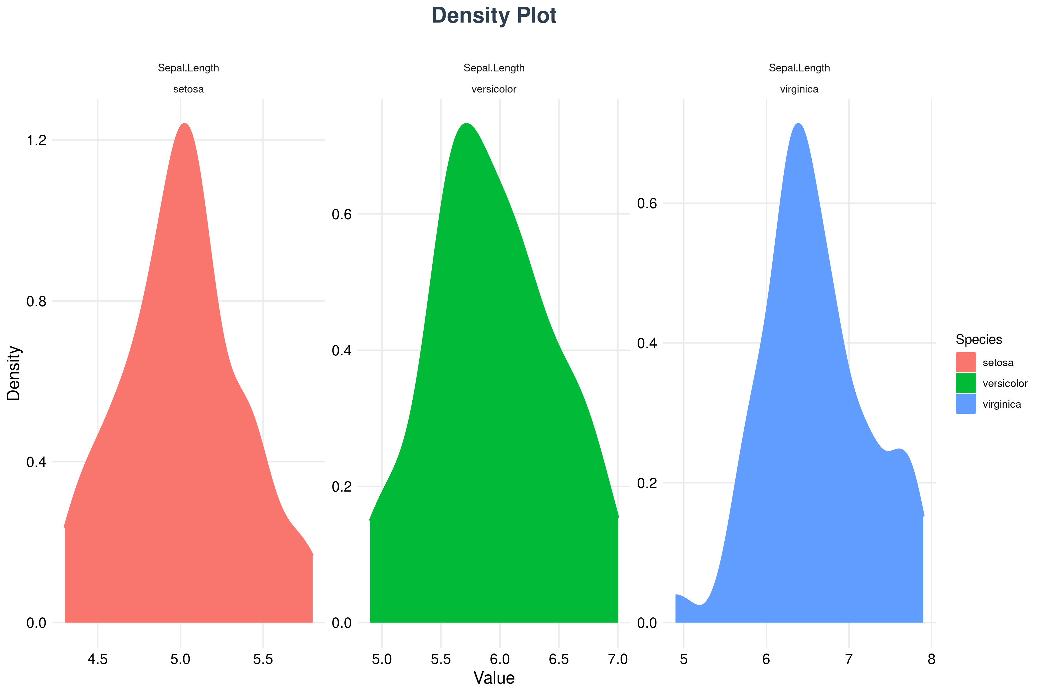
A density plot draws a smooth curve estimating the probability density of a continuous variable. It reveals skewness, peaks, spread, and multi-modality more clearly than a histogram because it does not depend on an arbitrary choice of bin width. Two distinct humps in a pooled density curve almost always mean two groups hiding in one variable.
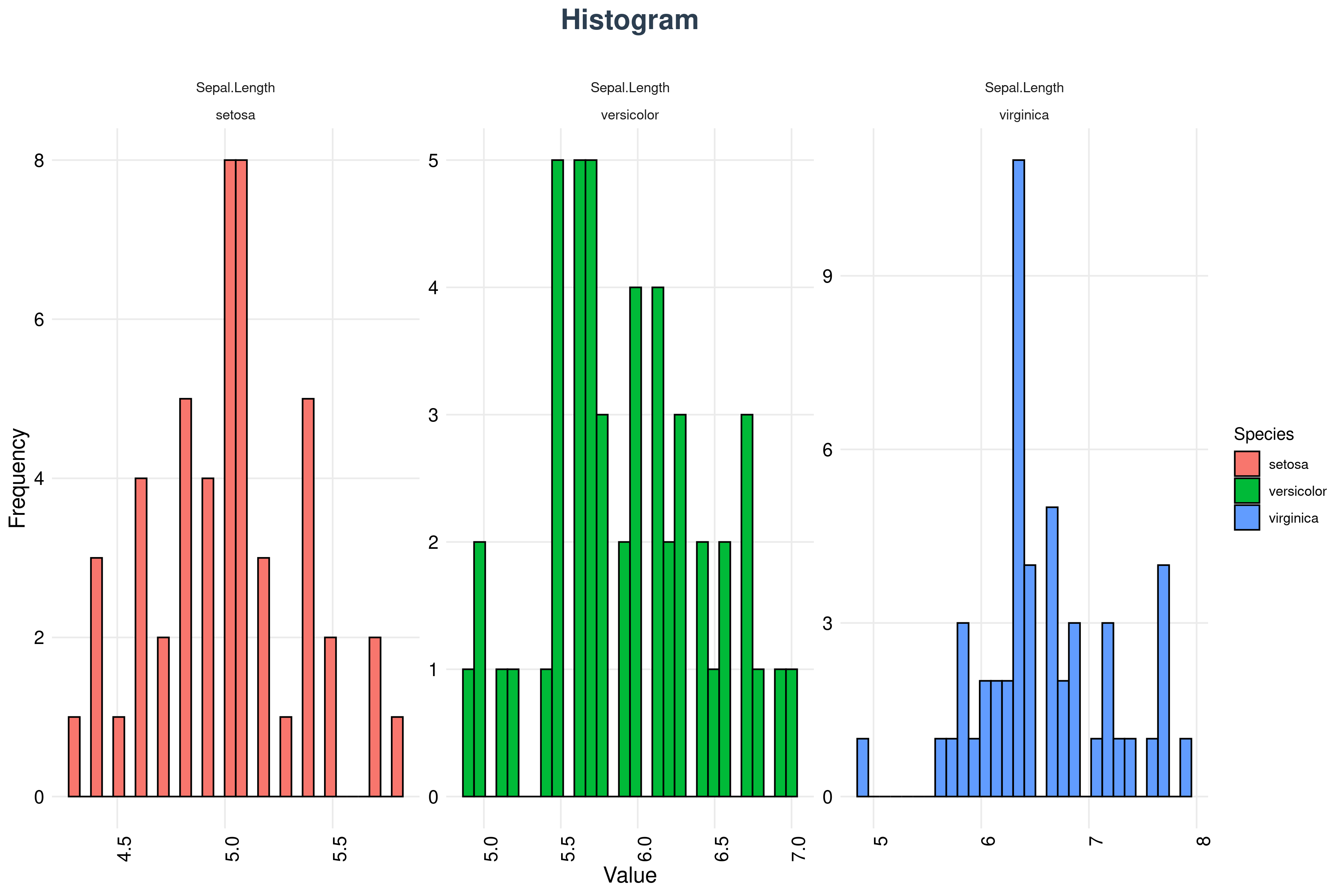
A histogram groups data into continuous intervals called bins and uses adjacent bars to show how often values fall in each. It is the most direct picture of a distribution’s shape, central tendency, and spread. Adjust the number of bins in the settings panel: too few hides structure, too many turns the picture into noise.
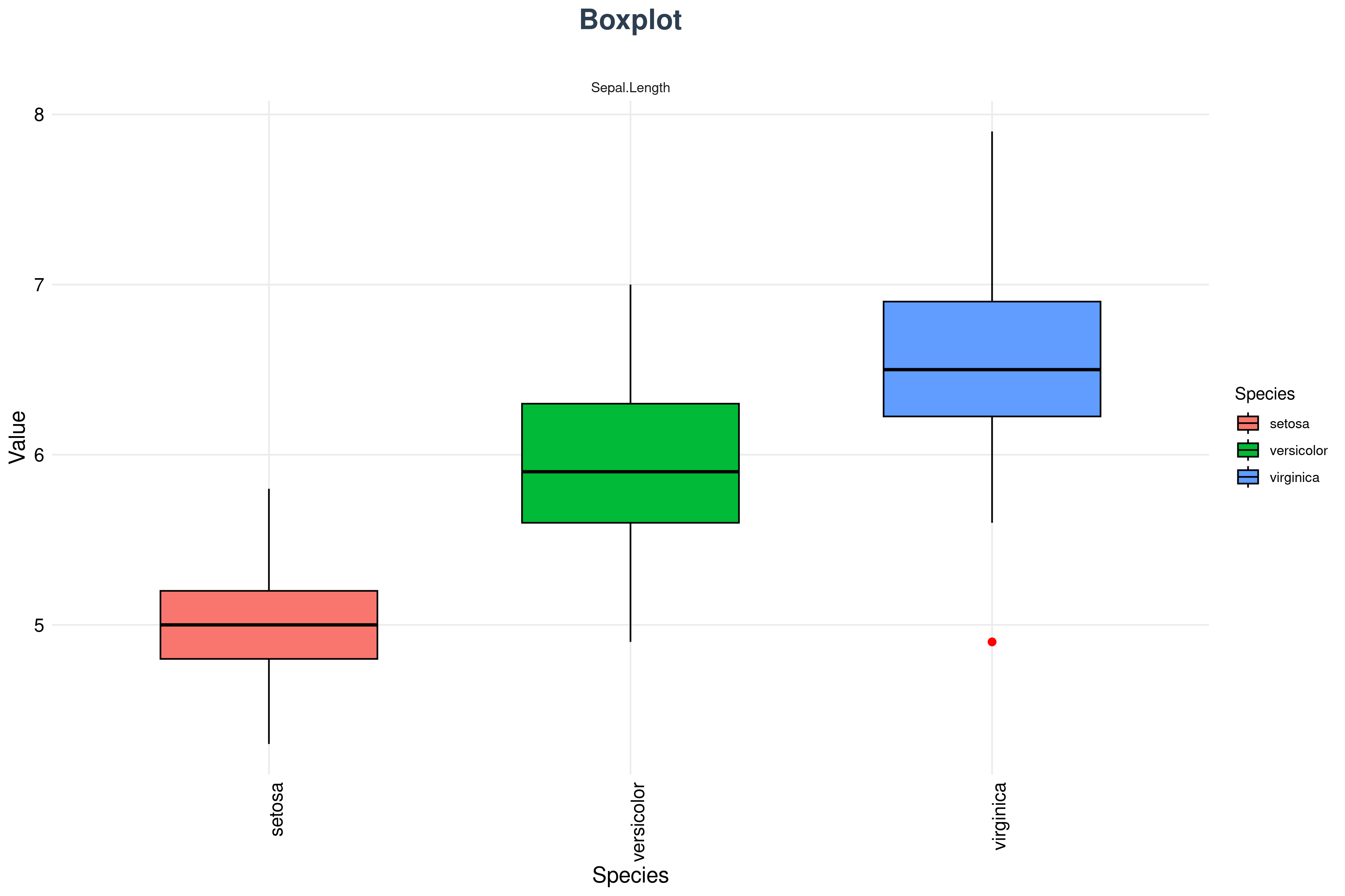
A box plot shows the median (middle line), the interquartile range (the box), and potential outliers (points beyond the whiskers). Species separation is immediately visible for the petal variables, where the three boxes barely overlap, while the sepal variables show substantial overlap between versicolor and virginica.
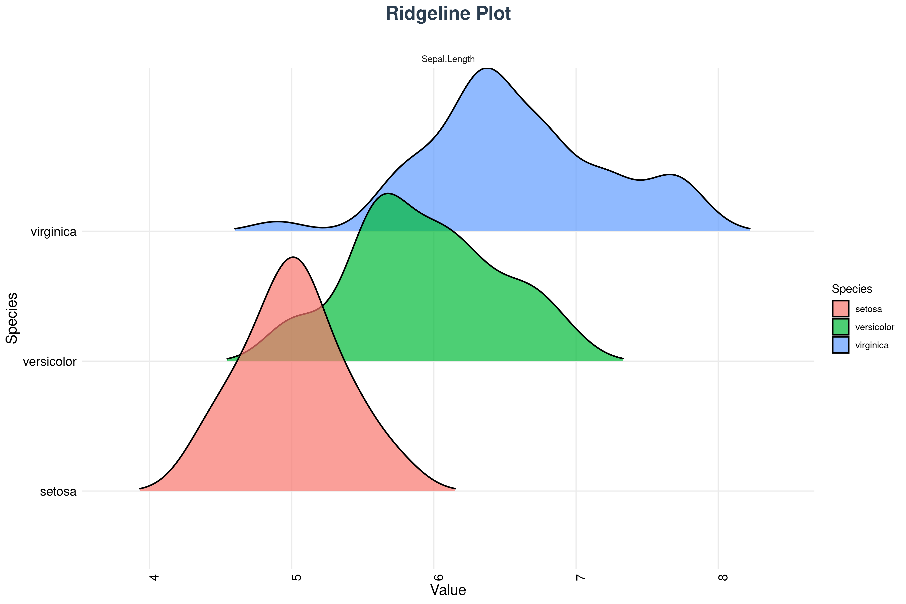
A ridgeline plot stacks density curves for each group one above another. It is the best choice when you have several groups and want to compare the whole shape of their distributions at once rather than just their centres, and it makes shifts in location across groups very easy to read.
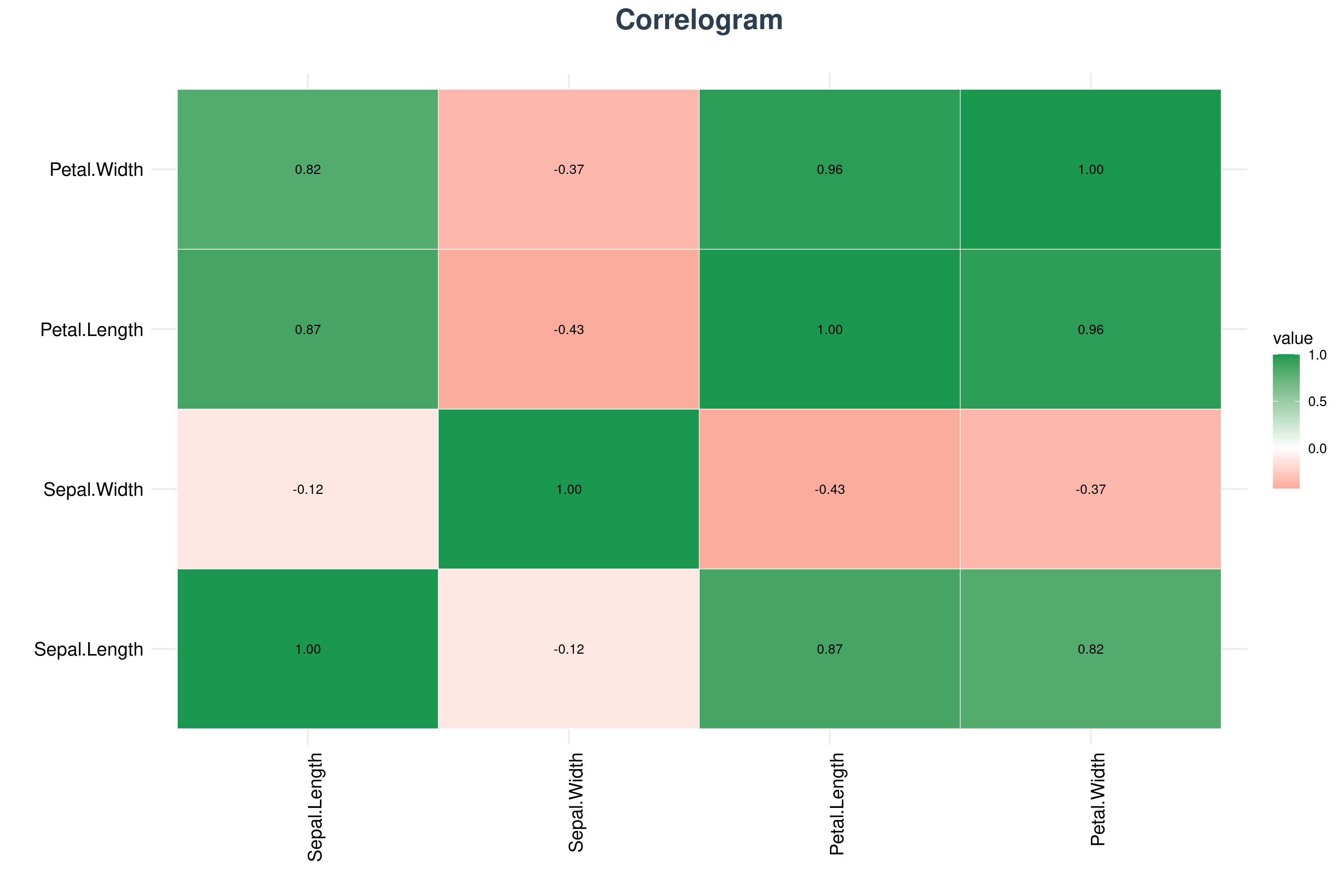
A correlogram displays the correlation matrix between variables using colour and size to encode the strength and direction of each relationship. It is the fastest way to spot which variables move together, and to catch redundancy before building any model on top of them.
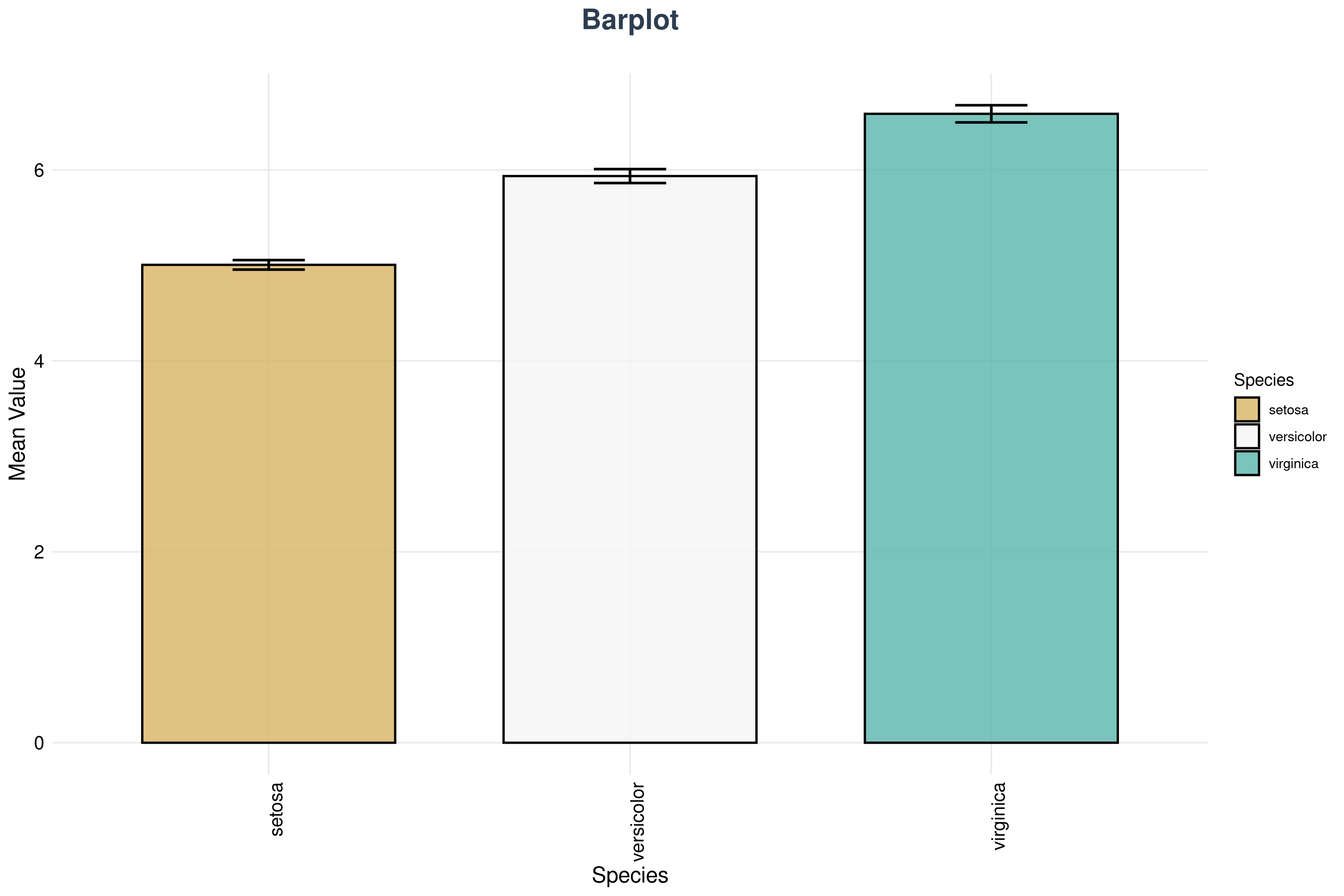
A bar plot compares group means using rectangular bars, with optional error bars showing SD or SE. It is the most familiar comparison plot, but also the most reductive: it shows only the summary, so read it alongside a box or beeswarm plot that shows the underlying spread.
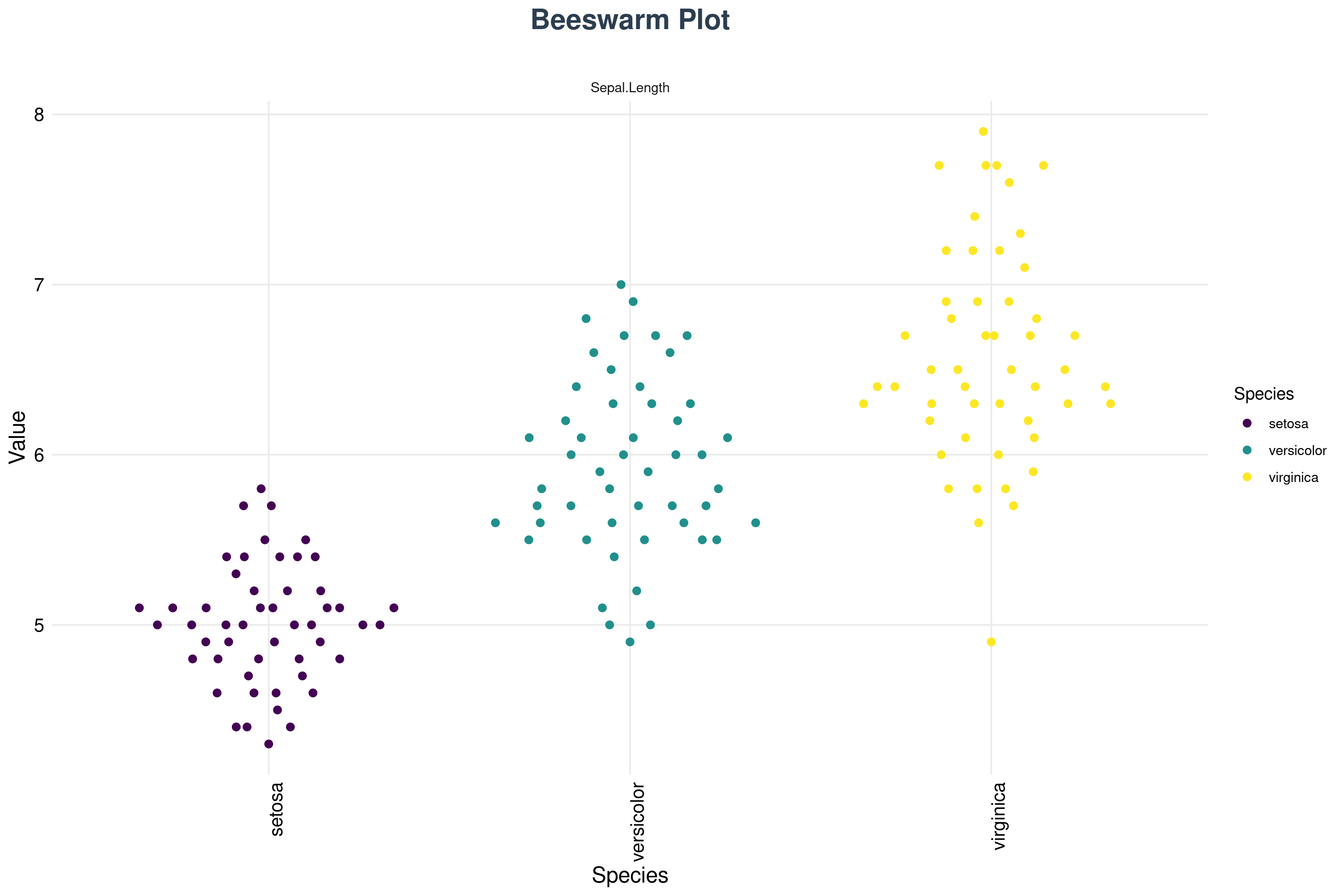
A beeswarm plot shows every individual observation, nudged sideways so that no two points overlap. It gives you the density information of a violin plot while never hiding a single data point, which makes it excellent for spotting clusters, gaps, and outliers in modest datasets.
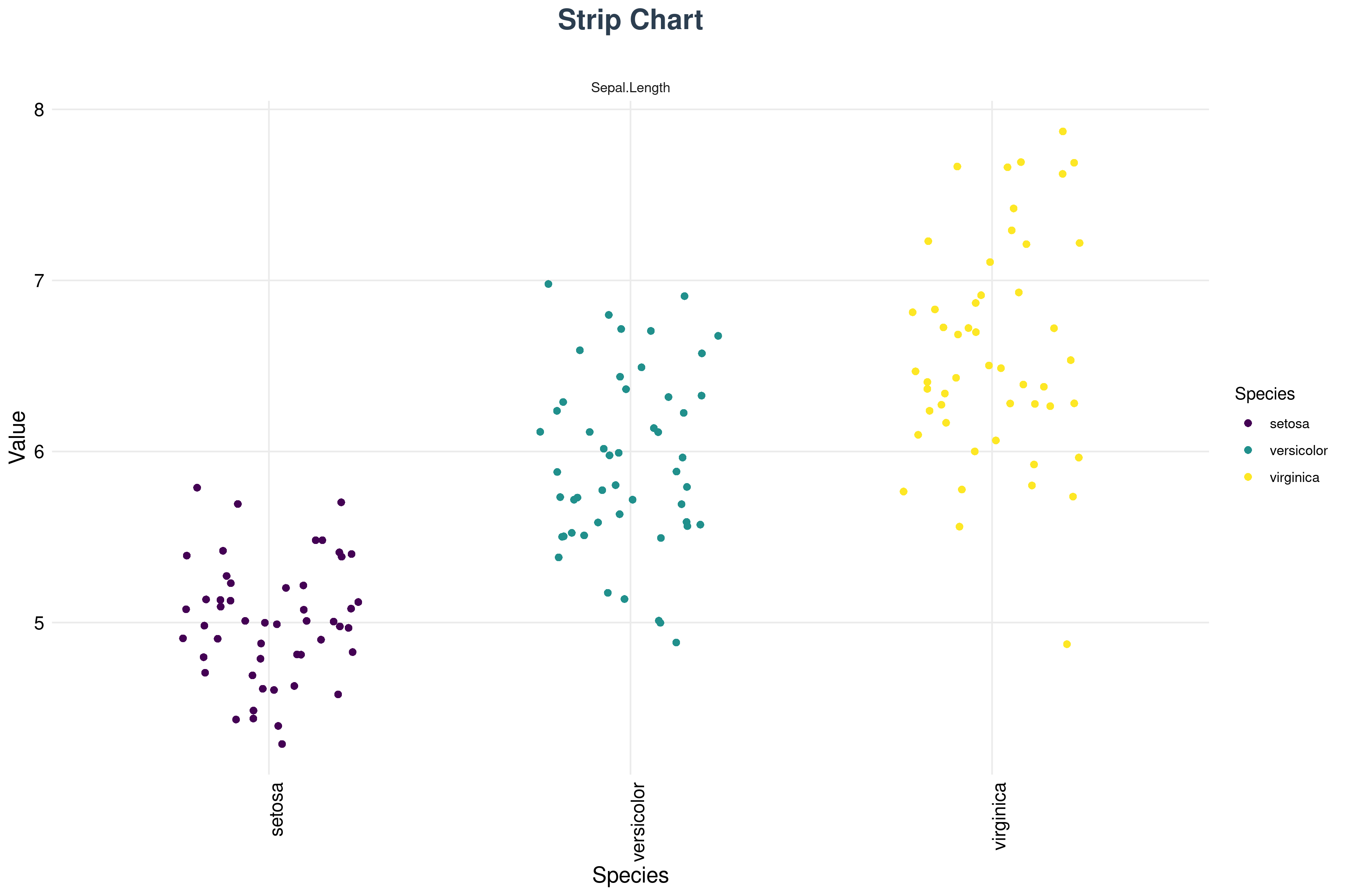
A strip chart plots each observation as a mark along a single axis. It is the simplest possible view of raw data and is especially useful for small datasets, where a box plot would summarise away most of what you have.
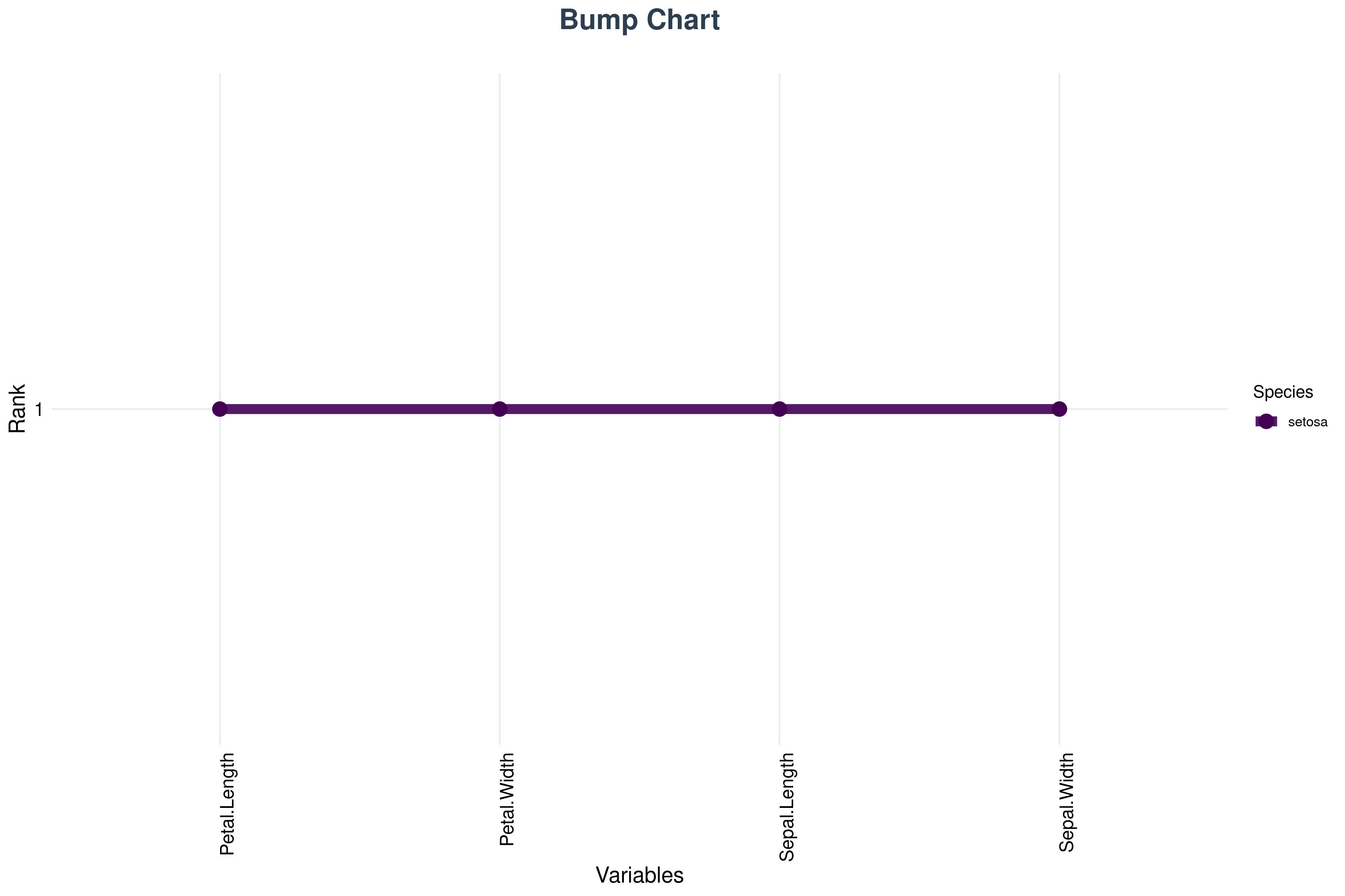
A rank chart (bump chart) displays the ranking of groups across several variables, with lines connecting each group’s position. It answers “does the same group come out on top for every trait?” at a glance, and crossing lines immediately reveal where the ordering changes.
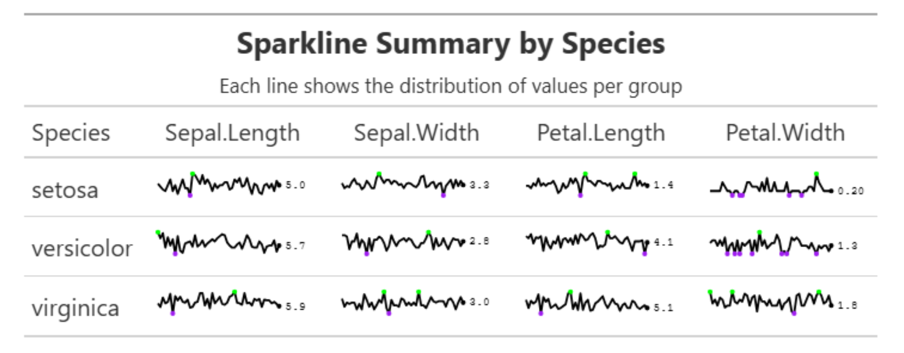
A sparkline is a small, axis-free line chart that conveys the shape of a distribution or trend in a very compact space. Sparklines are designed to sit inside tables, letting a reader take in the pattern for every row without leaving the table to consult a full-size figure.
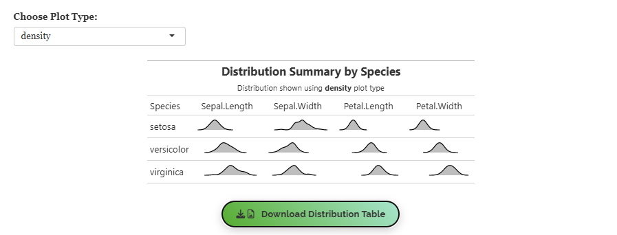
A distribution plot combines the frequency and density views of a variable in one figure, making it straightforward to judge skewness, peaks, gaps, and outliers together. It is a good single figure to reach for when you want one honest picture of a variable.
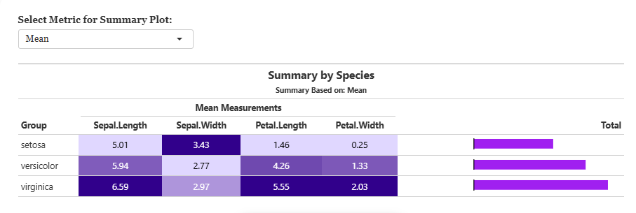
A summary plot gathers the key statistical measures and patterns of the dataset into a single overview, combining distribution, variability, and between-variable relationships. It is the fastest way to orient yourself in an unfamiliar dataset before deciding what to look at properly.
10 Classification
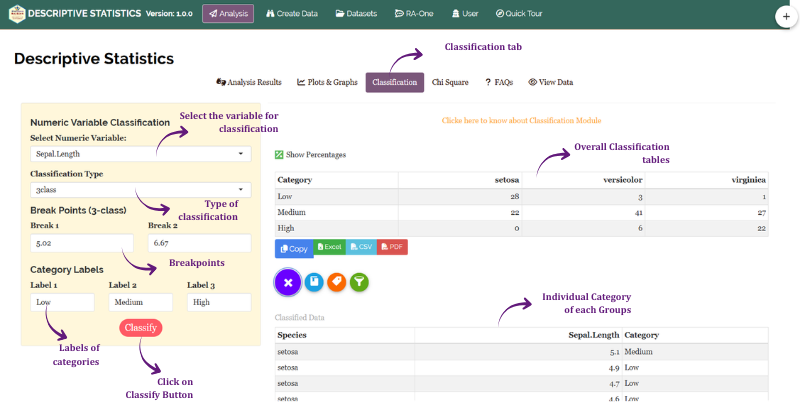
The Classification tab converts a continuous variable into ordered categories, so that a measurement can be treated as a grouping. Each numeric variable is binned into ordinal classes (for example Low, Medium, and High), and the resulting classified data can be examined against the group column.
This serves two purposes. It is useful in its own right when you want to report how many observations fall into each class, and it is the step that makes the chi-square analysis in Section 11 possible, since chi-square requires categorical variables on both axes. Figure 24 shows the tab.
11 Chi-square analysis
The Chi-square Analysis tab examines whether two categorical variables are associated. Note the change of gear here: everything up to this point has described the data without testing anything, whereas chi-square is a genuine hypothesis test, with a null hypothesis and a p-value.
In the Iris analysis, the four measurements were evaluated across the three species. The module builds a contingency table from the selected categorical and comparison variables to summarise observed frequencies, then reports the chi-square statistic, degrees of freedom, and p-value. See Figure 25.
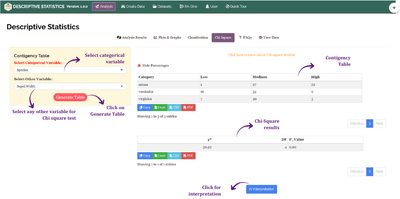
Chi-square analysis - table and test explained
Contingency table cross-tabulates the selected categorical variable (Species) against another variable (Petal Length), where the continuous variable is automatically binned into ordinal categories, Low, Medium, and High, to enable frequency-based association testing. Each cell shows the observed count of observations falling into that species–category combination, with an optional percentage display toggled via the Hide/Show Percentages button.
Chi-square statistic (χ²) measures the overall discrepancy between the observed cell frequencies and the frequencies expected if the two variables were completely independent. Larger values indicate greater divergence from independence.
Degrees of freedom (DF) for a contingency table is (number of rows − 1) × (number of columns − 1). With 3 species rows and 3 petal length category columns, DF = (3 − 1) × (3 − 1) = 4.
P-value is the probability of observing a chi-square statistic as large as or larger than the computed value under the null hypothesis of independence. A p-value below 0.05 indicates a statistically significant association.
11.1 Interpretation from Figure 25
Contingency table. The table cross-tabulates Species against Petal Length classified into Low, Medium, and High. Iris setosa falls entirely in the Low category (50 of 50), with zero counts in Medium and High, confirming its distinctively small petals. Iris versicolor is completely concentrated in Medium (50 of 50), with no overlap into Low or High. Iris virginica splits between Medium and High (25 each), indicating that while some virginica specimens have moderately long petals, the other half possess the longest in the dataset.
Chi-square test result. The statistic is 200 on 4 degrees of freedom with a p-value of 0.00, providing overwhelming evidence to reject the null hypothesis of independence between Species and Petal Length category. The extremely large χ² reflects the near-perfect species-wise segregation visible in the table: each species occupies almost exclusively one or two categories with no cross-species mixing, which is precisely the pattern that maximises chi-square.
Overall. Petal Length is not randomly distributed across the three species; species membership is a strong and statistically significant determinant of petal length category. This reinforces, with a formal test, what the descriptive statistics already suggested: petal length is the single most discriminating morphological variable in this dataset.
A significant chi-square test indicates an association between the variables, but not causation or the strength of the association. Always interpret the contingency table along with the p-value.
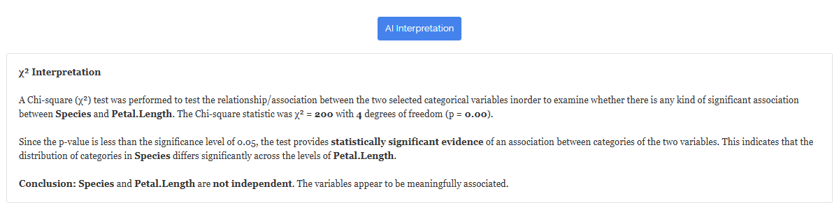
12 Interpretation
RAISINS provides a clear and concise interpretation of your descriptive results to help you understand the findings with ease. It summarises the key results, identifies the variables with the greatest between-group discrimination, comments on the shape metrics (skewness and kurtosis) across groups, and offers informed suggestions for next steps, including whether the data are suitable for parametric inference, which variables are most informative for group separation, and whether transformation or a closer look at outliers is advisable before proceeding. You can access this from the Interpretation sub-tab (Figure 26).
13 Chat with your data using RA-One
RA-One is the built-in conversational assistant for the Descriptive Statistics module, available from the RA-One tab. You ask questions in plain language and it answers using your own analysis rather than generic statistical advice. Every result it discusses is drawn from what the module actually computed; it never invents numbers, and if a value isn’t available it says so instead of guessing. All answers are in plain English, with no code or software commands.
RA-One works directly with your descriptive statistics, normality test, classification, and chi-square outputs. It can explain what a CV% of 16% means for your particular variable, why a skewness of 0.9 matters, how to read your Shapiro–Wilk result, and which of your variables separate the groups most cleanly. It also handles general concept questions, the difference between SD and SE, what kurtosis is actually measuring, when the median beats the mean, so you can build understanding alongside your results. See Figure 27.
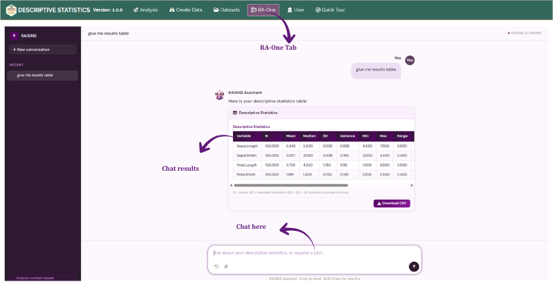
The same chat window can also prepare your data. It can build a correctly formatted dataset template (Section 5.4) for you to fill in, or fetch a model dataset (Section 5.3) so you can try the module straight away, so you never need to leave the tab to get a file ready. If you are unsure how your data should be arranged, simply asking how to format your columns will get you an explanation.
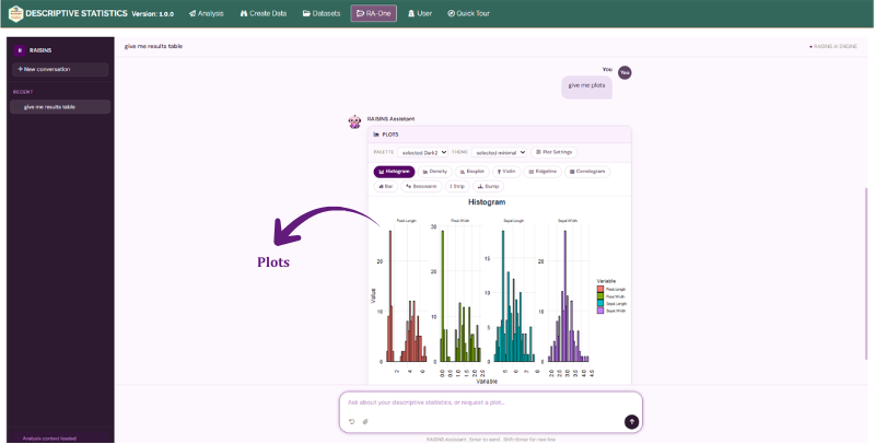
RA-One can also generate plots on request. Ask for a box plot comparing the species, a density plot for a variable, or a correlogram, and the app renders the graphic directly in the chat, where you can view it and refine it by asking for changes (Figure 28).
Within a single conversation, RA-One can interpret your results, build a data template, fetch a model dataset, and produce plots, so most of a routine descriptive session can be conducted without ever leaving the chat window.
14 FAQs
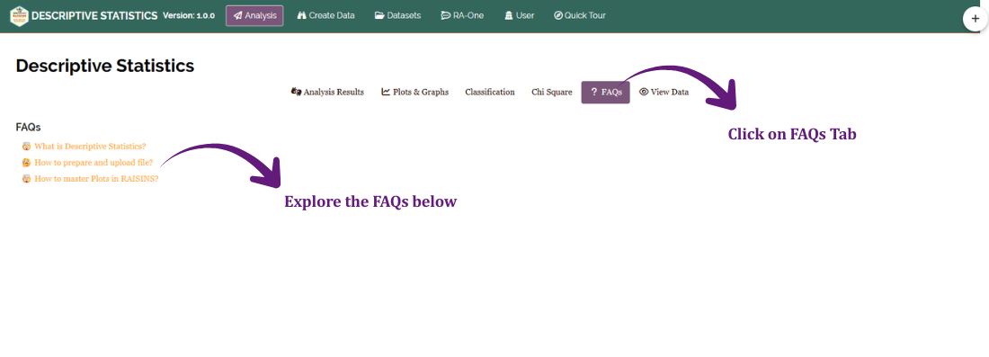
The module includes a dedicated FAQs section to clarify common doubts and guide you through the features. It offers detailed answers, additional information, and helpful tips for a smooth experience. If you are ever unsure how something works, say when to report the median instead of the mean, or what to do about a variable that fails the normality test, the FAQs are a good place to start.
15 View data
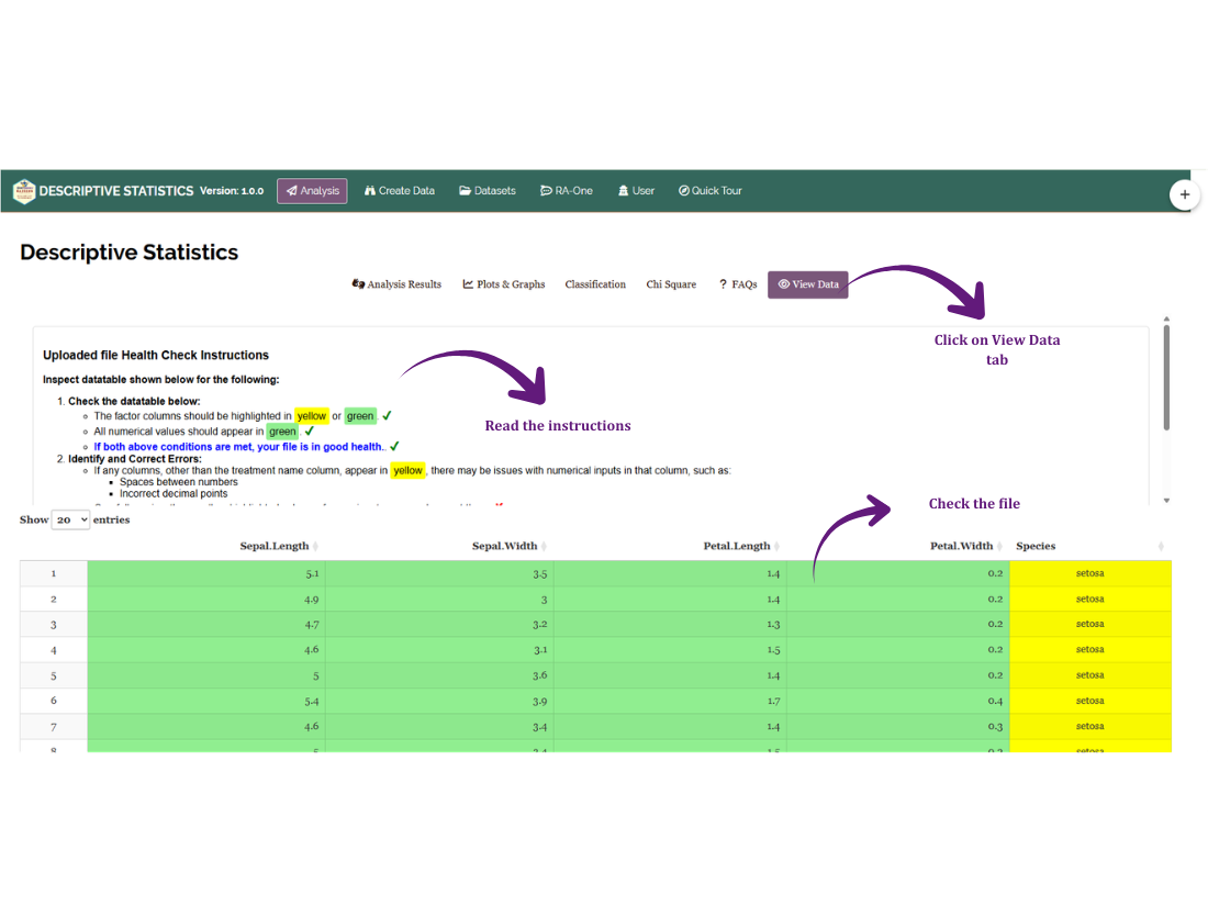
View Data is the primary diagnostic tool for ensuring data integrity before analysis. When you upload your dataset, the system performs an automated Health Check to validate column types and formatting, confirming that your variable columns are genuinely numeric and that there are no missing or badly formatted entries that could distort the summaries.
This step matters more for descriptive statistics than people expect. A single non-numeric character in a numeric column can turn the entire column into text, and a mean computed on a column that has been quietly reformatted is wrong in a way that no amount of downstream analysis will reveal.
16 Wrapping up
Descriptive statistics answer one honest question: what do these data actually look like? Everything in this module, the summary table, the normality tests, the thirteen plots, exists to answer that question from a different angle, because no single angle is sufficient. The table tells you the centre and the spread; the plots tell you whether those numbers are a fair description or a comfortable fiction; the normality tests tell you what you are allowed to do next.
Resist the temptation to skip this stage on the way to a p-value. Nearly every serious analytical mistake, the outlier that was a typo, the two populations hiding inside one variable, the skew that invalidated the test, is visible here, and only here, before it has had a chance to do any damage.
When you are ready to test rather than describe, the companion modules are waiting: the t-test for comparing two groups, the ANOVA designs for more than two, and correlation for relationships between variables. And if you get stuck at any point, RA-One is available 24 × 7, or write to us at [email protected].