flowchart TD
A([Community abundance data]) --> B["Construct Bray Curtis dissimilarity matrix"]
B --> C["PERMANOVA analysis
(adonis test)"]
C --> D["Test homogeneity of multivariate dispersion
(Betadisper)"]
D -->|"p ≥ 0.05  Dispersion homogeneous"| E
D -->|"p < 0.05  Dispersion heterogeneous"| G["Apply Hellinger transformation"]
G --> H["Compute Euclidean distance matrix"]
H --> R["Re-run PERMANOVA analysis
(adonis test on transformed data)"]
R --> E["Interpret PERMANOVA results
(p value and R² effect size)"]
E --> V["Cross validation using ANOSIM"]
V --> I{Statistical significance}
I -->|"p < 0.05"| J([Community composition differs among groups])
I -->|"p ≥ 0.05"| K([No evidence of compositional differences])
style A fill:#2d6a4f,color:#fff,stroke:none
style B fill:#1e3a5f,color:#fff,stroke:none
style C fill:#1e3a5f,color:#fff,stroke:none
style D fill:#6b4c11,color:#fff,stroke:none
style G fill:#7b2d2d,color:#fff,stroke:none
style H fill:#7b2d2d,color:#fff,stroke:none
style R fill:#1e3a5f,color:#fff,stroke:none
style E fill:#1e3a5f,color:#fff,stroke:none
style V fill:#4a3570,color:#fff,stroke:none
style I fill:#333,color:#fff,stroke:none
style J fill:#2d6a4f,color:#fff,stroke:none
style K fill:#7b2d2d,color:#fff,stroke:none
Diversity Analysis
Data Analysis
Diversity is a measure quantifying the number of different states in a system. In the case of ecological communities, these states are usually species, but could also be genera, families, OTUs or functional types. Read more …
Abstract
Diversity Analysis is widely used in ecological and agricultural research to understand variation in species composition across different locations or treatments. It helps quantify richness, evenness, and differences between communities using statistical measures such as alpha and beta diversity indices. In RAISINS, diversity analysis can be performed easily without writing any code. This tutorial will guide you step-by-step.
1 Getting Started
RAISINS (R and AI Solutions in INferential Statistics) is a cloud-based platform that allows you to perform statistical analyses in R and Python without writing a single line of code. It runs entirely online which needs no downloads or installations and seamlessly integrates the capabilities of R, Python, and AI to deliver powerful yet user-friendly analytic tools.
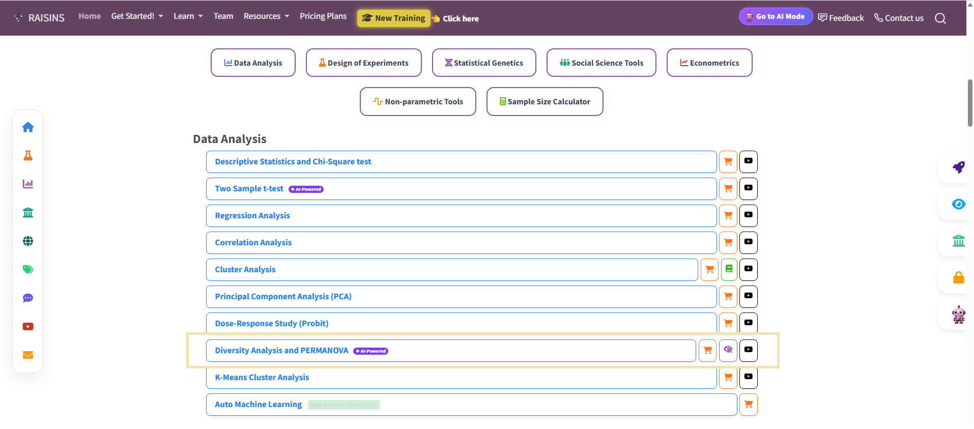
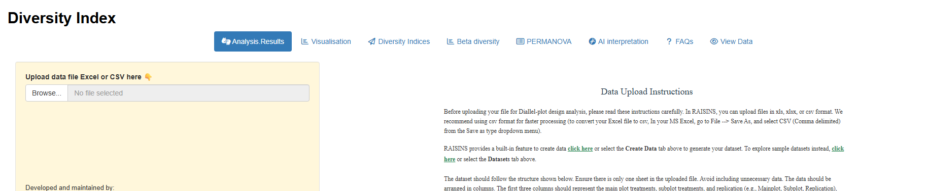
Learn more about RAISINS here. To get started with diversity analysis, visit RAISINS, navigate to diversity analysis as shown below Figure 1
2 Diversity Analysis
The main purpose of diversity analysis is to understand how communities differ based on the composition and distribution of organisms within them. Ecological diversity has two fundamental components: species richness and species evenness.
- Richness refers to the total number of species present in a community.
- Evenness describes how evenly individuals are distributed among those species.
A community may have high richness but low evenness if most individuals belong to only a few species. Conversely, a community with moderate richness but high evenness often appears more diverse because species are more equally represented.
Key Concept
Diversity is not just about how many species exist, but also about how balanced their abundances are.
2.1 Example: Even vs. Uneven Communities
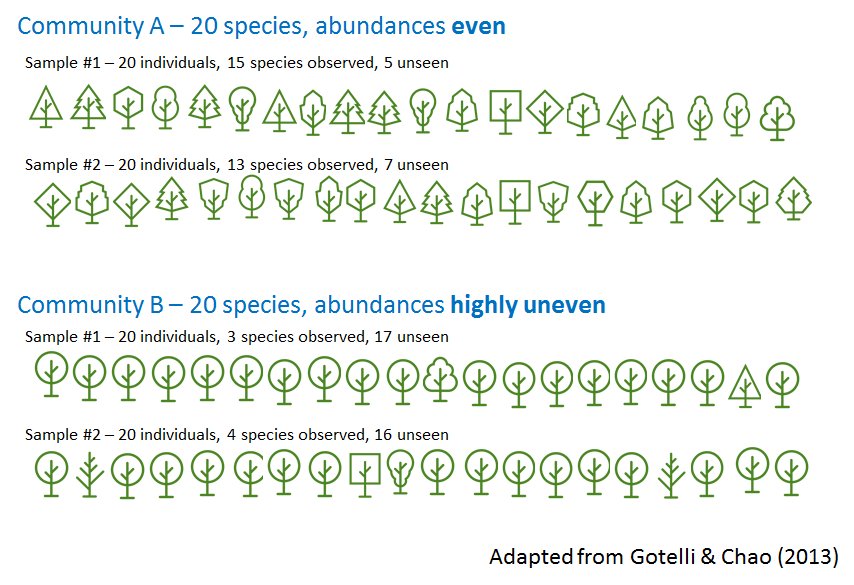
As illustrated in Figure 2, both Community A and Community B contain 20 species. However, their abundance distributions differ significantly.
Community A has relatively even abundances.
Community B has highly uneven abundances, with a few dominant species.
2.2 Alpha and Beta diversity
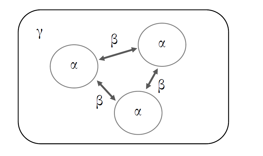
In ecological research, biodiversity is commonly described at multiple spatial scales using the concepts of alpha (α) and beta (β) diversity. These measures provide complementary information about species distribution patterns within and among communities.
2.2.1 Alpha Diversity (α)
Alpha diversity refers to the diversity observed within a single sampling unit, habitat, or community. It represents the local species composition and gives an estimate of how complex or heterogeneous a particular site is.
2.2.2 Beta Diversity (β)
Beta diversity describes the variation in species composition between communities or sampling units. It measures the degree of species turnover or compositional change across space.
Beta diversity addresses the question:
To what extent do two or more communities differ in their species composition?
If communities share most of their species, beta diversity is low. If species composition differs substantially among communities, beta diversity is high.
Beta diversity is commonly quantified using dissimilarity or distance measures such as:
- Bray–Curtis dissimilarity
- Jaccard index
- Sorensen index
- Euclidean distance (after appropriate transformation)
These measures form the basis for multivariate analyses including ordination, clustering, and permutational multivariate analysis of variance (PERMANOVA).
Conceptual Summary
- Alpha diversity (α): Diversity within a single community
- Beta diversity (β): Compositional differences among communities
- Gamma diversity (γ): Total diversity across all communities in a region
3 Getting Started with Diversity Analysis
Lets dive into diversity analysis through an example.
About the Example Dataset
This tutorial uses a abundance dataset of agriculturally important insect orders collected across 5 locations . Within each location, insects were sampled from 7 sites, giving a total of 35 sample sites. The dataset records the number of times each species was observed at each site — a format known as abundance data.
3.1 How to Arrange Your Data
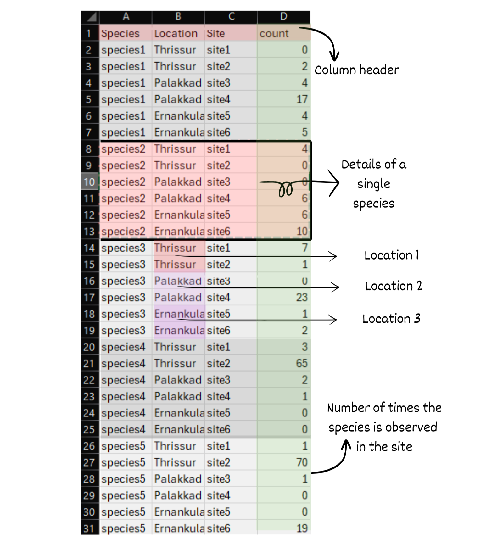
RAISIN expects abundance data organized in long format — one row per species-site combination. Each row records how many times a species was observed at a given site.
Your dataset should contain the following columns:
| Column | Description |
|---|---|
Species |
The name or code of the species |
Location |
The broader ecological region of sampling |
Site |
The specific sampling site within that location |
count |
Number of times the species was observed |
it is to be noted here that RAISINS allows analysis with Location (Grouping Variable) and without a grouping variable.
See Figure 4 for a visual example of the expected layout.
Tip
Don’t have a dataset yet?
You can generate a template using the built-in Create Dataset option in RAISIN.
4 Running the Analysis
4.1 Step 1: Upload Your Dataset
Navigate to the Diversity Index module and click Browse to upload your dataset. RAISIN accepts both .xlsx (Excel) and .csv formats. Once uploaded, a confirmation bar reading “Upload complete” will appear (Figure 5).
Tip
Recommended: Convert your Excel file to CSV before uploading for faster processing. In MS Excel, go to File → Save As and select CSV (Comma delimited) from the Save as type dropdown.
4.2 Step 2: Map Your Columns
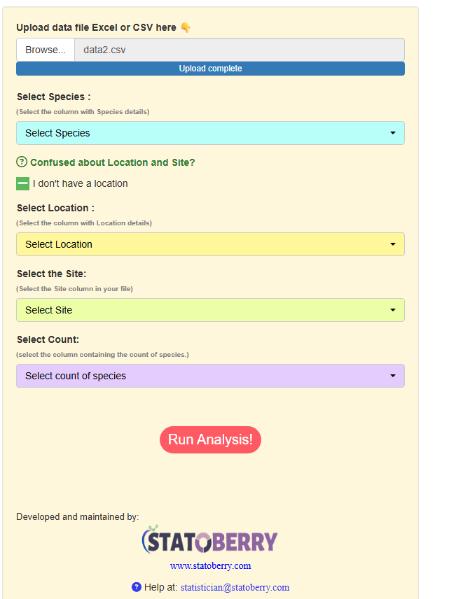
After uploading, use the dropdown menus to map each column in your dataset to the correct variable. RAISIN offers two modes depending on your data structure:
Select your Species, Location, Site, and Count columns from the respective dropdowns (Figure 6). Use this mode when your data includes a broader geographical grouping (Location) alongside individual sampling sites.
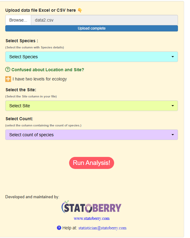
If your dataset only has sites with no broader location grouping, toggle the “I don’t have a location” option. The Location dropdown will be hidden, and you only need to map Species, Site, and Count (Figure 7).
4.3 Step 3: Run the Analysis
Once all columns are mapped, click the Run Analysis! button to start the computation.
4.4 The Analysis Results Tab
Once you click the run analysis button, the Analysis Results tab displays:
- A summary statement identifying the number of species, sites, and locations detected in your dataset
- A site-level alpha diversity table listing nine diversity indices for each site, grouped by location (Figure 8)
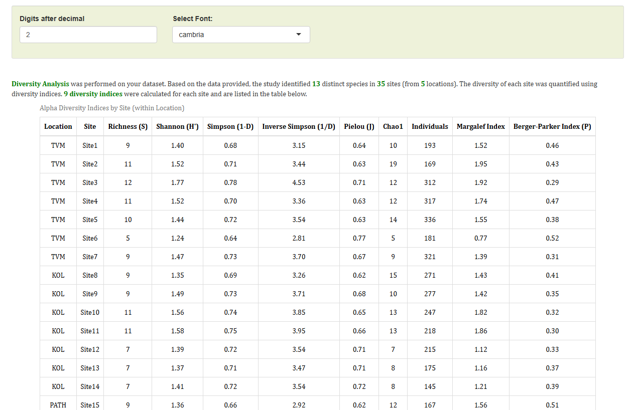
The indices reported are:
| Index | Description |
|---|---|
| Richness (S) | Total number of species observed |
| Shannon (H’) | Accounts for both abundance and evenness |
| Simpson (1-D) | Probability that two random individuals differ |
| Inverse Simpson (1/D) | Higher values indicate greater diversity |
| Pielou (J) | Evenness of species distribution (0–1) |
| Chao1 | Estimated true species richness |
| Individuals | Total count of all individuals observed |
| Margalef Index | Species richness adjusted for sample size |
| Berger-Parker (P) | Dominance index; lower = more even |
Downloading the Results Table
The diversity table can be exported in three formats directly from the interface:
- 📄 HTML — for sharing or embedding in reports
- 📑 PDF — for print-ready outputs
- 📝 Word (.docx) — for further editing
5 Visualisation Tab
The Visualisation tab provides graphical tools to explore species composition across your sampling sites. Two complementary plot types are available.
5.1 Stacked Bar Graph
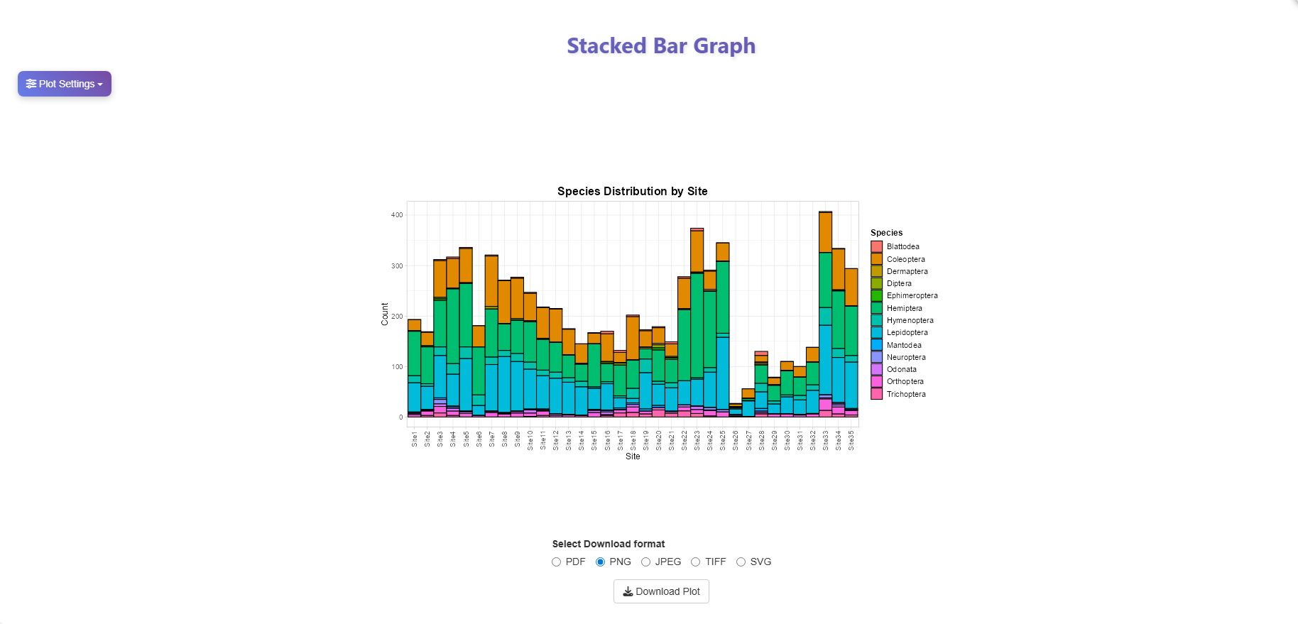
The stacked bar graph displays the absolute abundance of each species at every site, with each species represented by a distinct colour (Figure 9). This plot helps you quickly identify:
- Which species dominate at a given site
- How total abundance varies across sites
- Broad patterns in community composition
Faceted View by Location
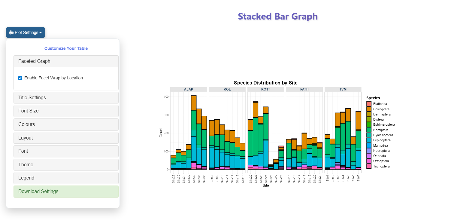
To compare species composition within each location separately, open Plot Settings and enable Facet Wrap by Location. The graph will split into panels — one per location — making cross-location comparisons much easier (Figure 10).
5.2 Relative Stacked Bar Graph
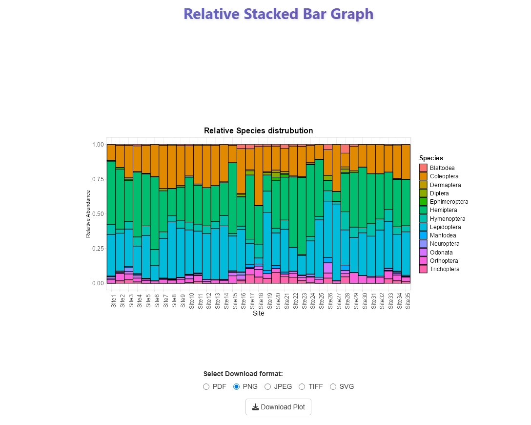
The relative stacked bar graph rescales each bar to 100% (or 1.0), showing the proportional contribution of each species at every site rather than raw counts (Figure 11). This is particularly useful for:
- Comparing community composition between sites with very different total abundances
- Identifying shifts in species dominance across the sampling gradient
Downloading Plot Data
The relative abundance values used to generate this plot can be exported as a CSV file for use in further analyses. Use the download button to the right of the plot to save the data.
6 Diversity Indices Tab
The Diversity Indices tab provides a suite of plots to visually explore how alpha diversity varies across sites and locations.
6.1 Index Bar / Line Plot
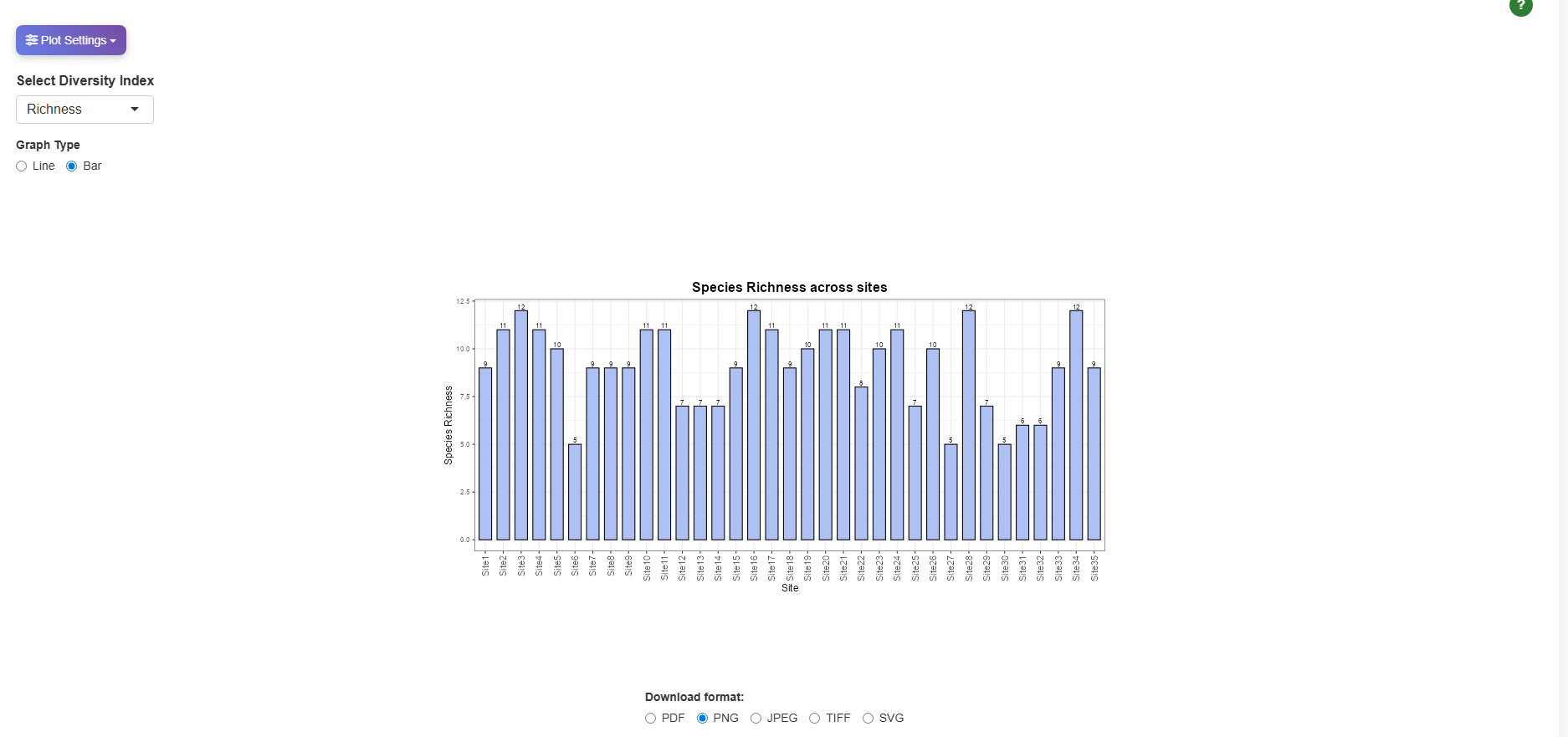
Select any diversity index from the dropdown and toggle between Bar or Line graph types to visualise how that index varies across all sampling sites (Figure 12).
6.2 Standardised Alpha Index Plot
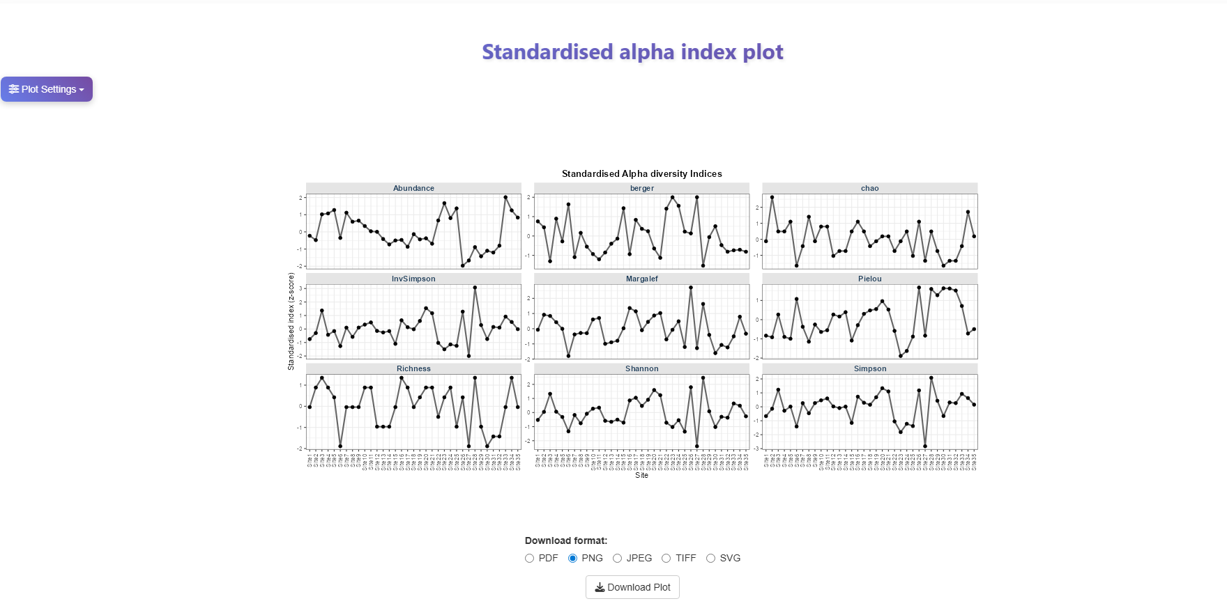
This faceted plot displays all nine diversity indices simultaneously, each in its own panel, with values expressed as Z-scores (Figure 13). This allows you to compare patterns across indices at a glance and identify sites that consistently score high or low across multiple measures.
Note
Z-score standardisation rescales each index to have a mean of 0 and a standard deviation of 1, making indices measured on different scales directly comparable.
6.3 Heatmap
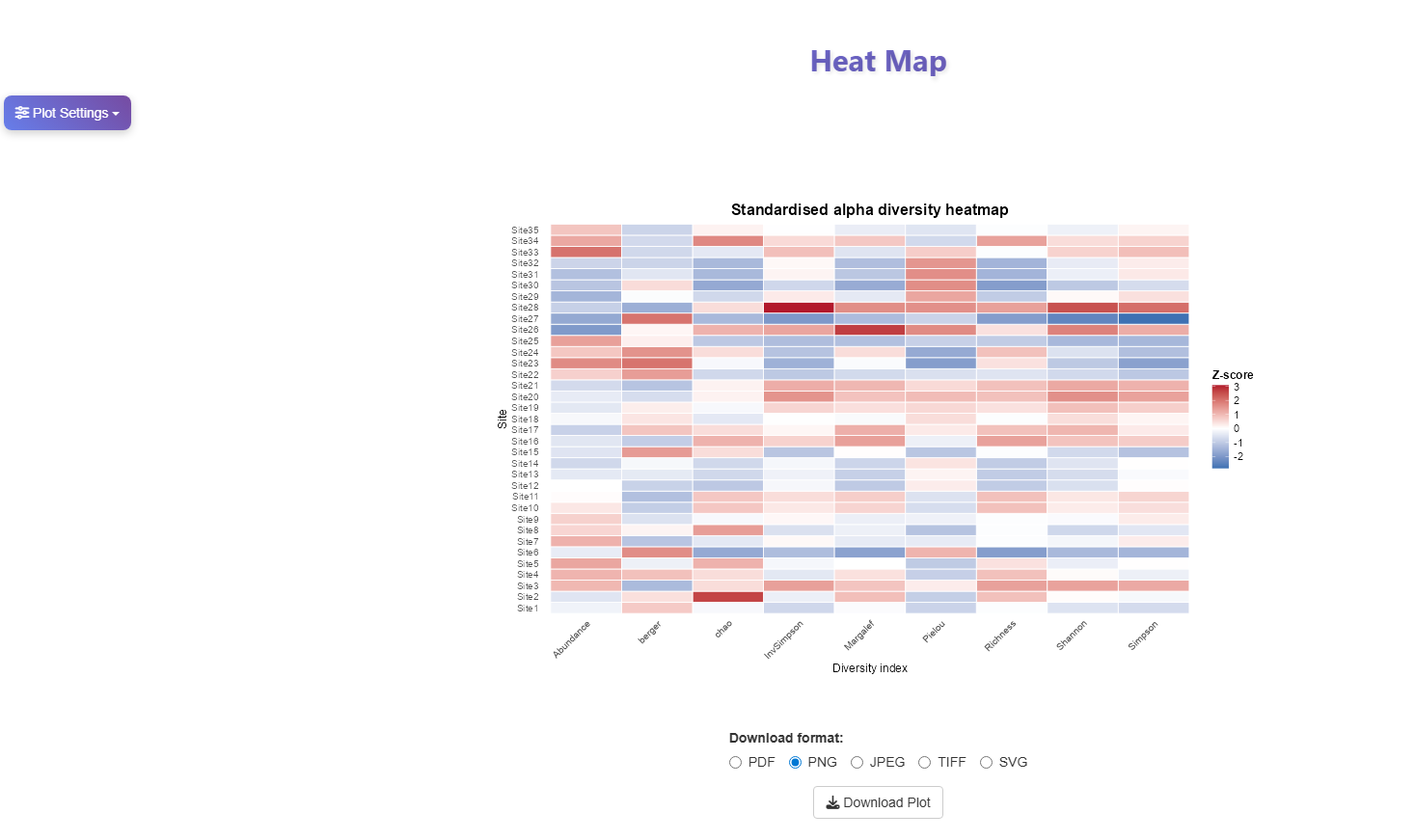
The heatmap displays standardised diversity index values for every site across all indices in a single colour-coded grid (Figure 14). Red cells indicate above-average values; blue cells indicate below-average values. This makes it easy to spot which sites are hotspots or low-diversity zones across multiple measures simultaneously.
6.4 PCA Plot
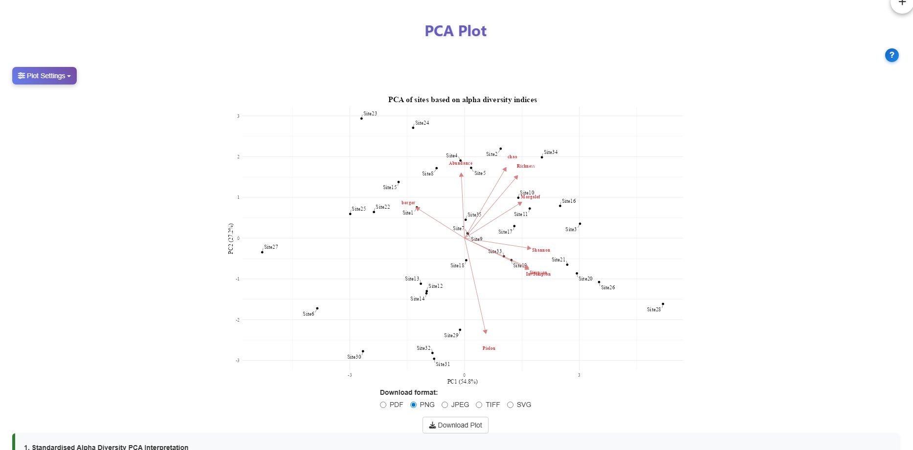
Principal Component Analysis (PCA) reduces all nine diversity indices into two axes (PC1 and PC2), allowing sites to be compared in a single 2D plot (Figure 15). Each point represents a site; the arrows (loadings) show how each index contributes to the axes.
Tip
Click the ? button to the right of the plot for a guided interpretation. An automated text interpretation is also displayed directly below the plot, explaining the meaning of each axis and highlighting notable sites.
How to read the PCA plot
- Sites close together have similar diversity profiles across all indices.
- Sites far apart differ substantially in their community diversity.
- Arrow direction indicates which indices drive separation along each axis. Sites positioned in the direction an arrow points tend to score high for that index.
- PC1 and PC2 together explain the majority of total variation — check the axis labels for the exact percentage.
6.5 Correlation Plot
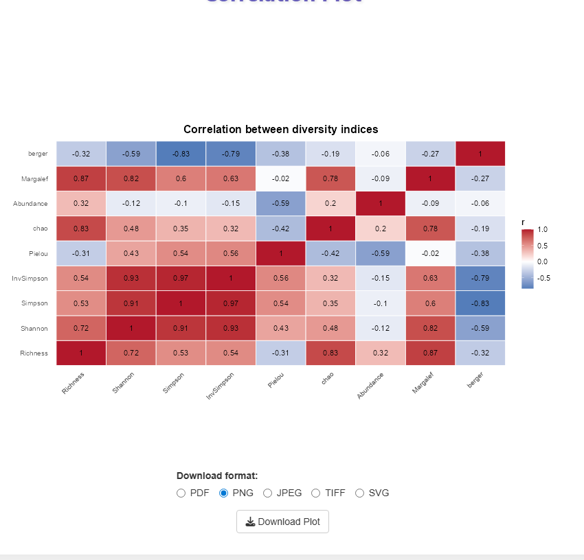
The correlation plot shows pairwise Pearson correlations between all nine diversity indices (Figure 16). Red cells indicate strong positive correlations; blue cells indicate strong negative correlations. This helps identify which indices capture similar information and which are measuring distinct aspects of diversity.
6.6 Box Plot by Location
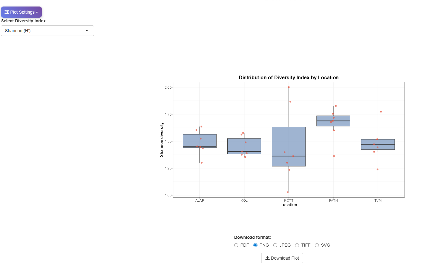
The box plot compares the distribution of a selected diversity index across all sites within each location (Figure 17). Use the dropdown to switch between indices. Individual site values are overlaid as dots, giving a clear picture of within-location variability alongside the median and spread.
This plot is particularly useful for identifying whether diversity is consistent within a location or varies substantially between its sampling sites.
7 Beta Diversity Tab
While alpha diversity measures diversity within a single site, beta diversity quantifies how much community composition differs between sites. The Beta Diversity tab provides a set of complementary visualisations, all based on pairwise distance matrices. Unless otherwise noted, Bray-Curtis dissimilarity is used for all calculations.
7.1 Dendrogram
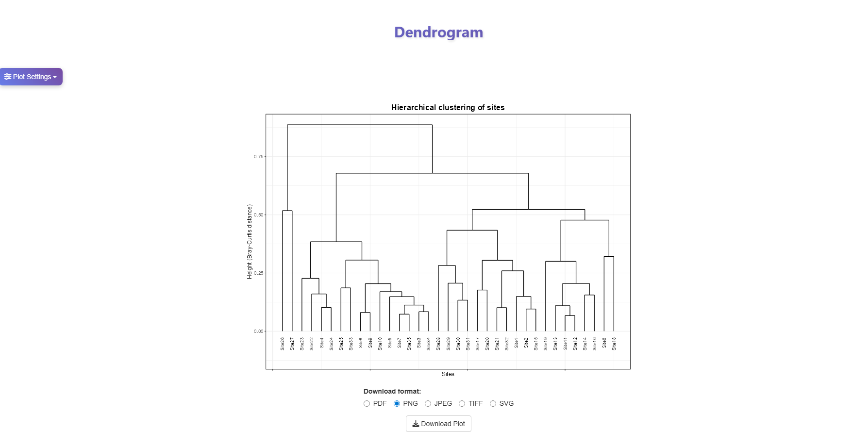
The dendrogram groups sites by hierarchical clustering based on their Bray-Curtis dissimilarity (Figure 18). Sites that merge low on the tree (at a small height) are compositionally similar; sites that only merge near the top are highly dissimilar. Clustering is performed using the complete linkage method.
7.2 Beta Diversity Box Plot
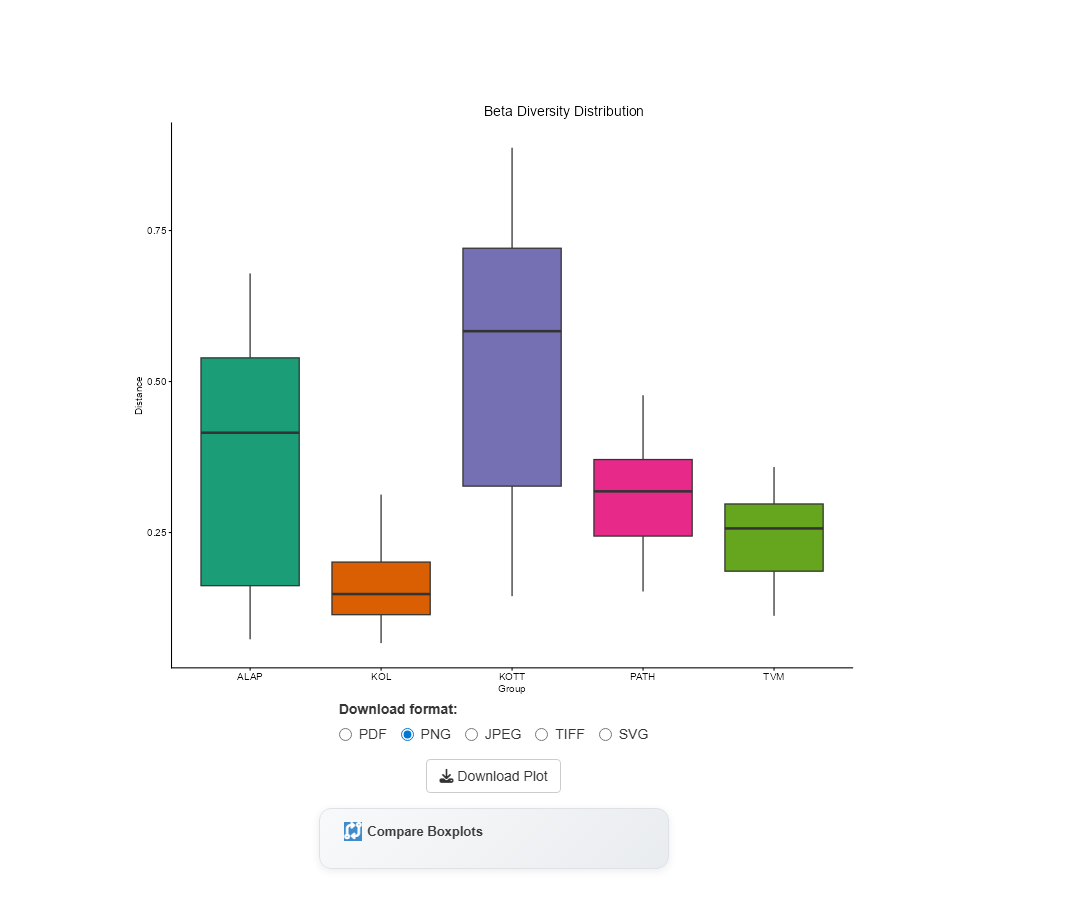
Rather than plotting raw species counts, this box plot is derived from the pairwise distance matrix (Figure 19). Each box represents the spread of Bray-Curtis distances between all sites within a location — a wider box indicates greater compositional turnover among sites in that location.
Comparing Locations Statistically
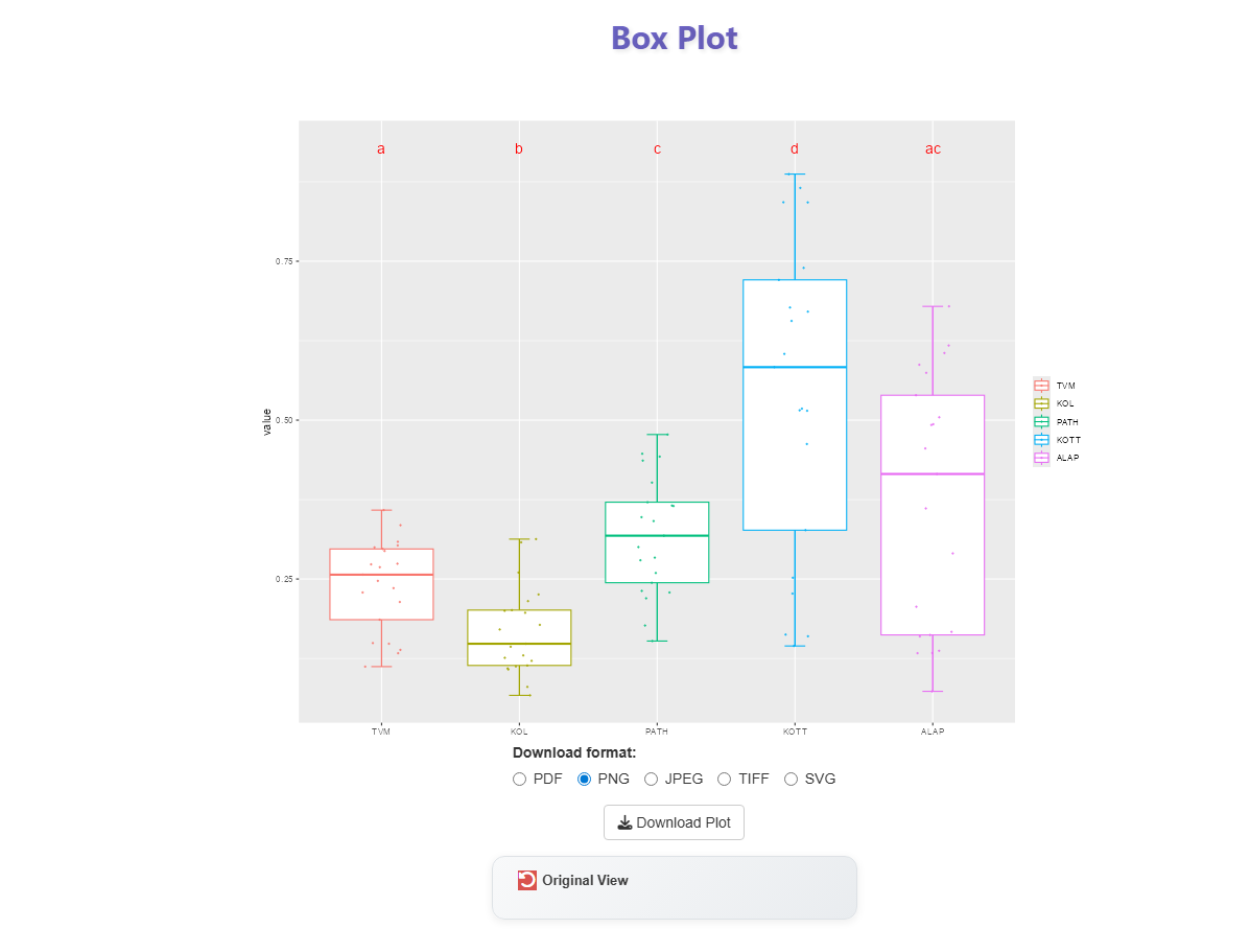
Click Compare Boxplots to run a Wilcoxon signed-rank test between locations. Locations sharing the same letter label are not significantly different from each other; different labels indicate a statistically significant difference in beta diversity (Figure 20).
7.3 PCoA — Species Composition Ordination
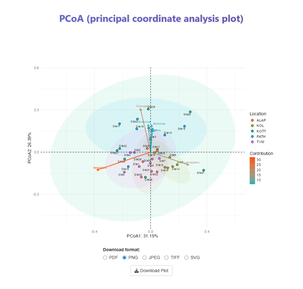
Principal Coordinate Analysis (PCoA) reduces the full Bray-Curtis dissimilarity matrix into two axes so that all sites can be compared in a single 2D plot (Figure 21). Unlike PCA, which operates on raw variables, PCoA works directly on a dissimilarity matrix, making it better suited for community composition data.
Sites that appear close together have similar species composition; sites far apart differ substantially. Enabling the ellipse option in Plot Settings draws a confidence ellipse around each location — a larger ellipse indicates greater compositional heterogeneity among sites within that location.
PCA vs PCoA — What is the difference?
| PCA | PCoA | |
|---|---|---|
| Input | Raw variables (e.g. index values) | Pairwise dissimilarity matrix |
| Distance metric | Implicit Euclidean distance (via covariance/correlation) | Any distance (Bray–Curtis, Jaccard, etc.) |
| Best for | Continuous, normally distributed data | Species abundance / community data |
| Axes | Linear combinations maximizing variance | Coordinates preserving pairwise distances |
PCoA is the preferred method for visualising beta diversity because it respects the non-linear nature of species composition data.
7.4 PCoA — Homogeneity of Dispersion
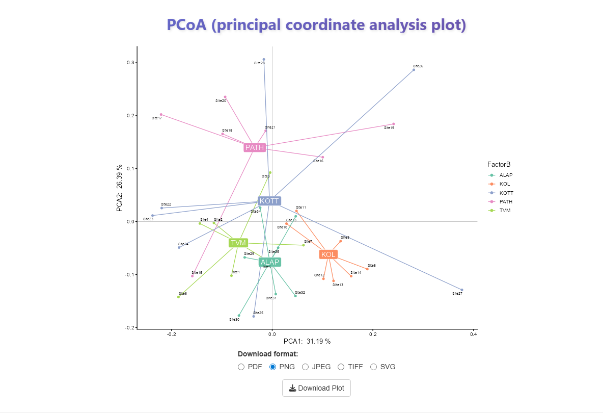
This second PCoA view visualises how evenly sites are spread around their location centroid (Figure 22). Each site is connected to its location centroid by a line; longer or more variable line lengths indicate that sites within that location are not homogeneously distributed in compositional space.
Why does this matter?
Homogeneity of multivariate dispersion is a key assumption of PERMANOVA (see the PERMANOVA tab). If dispersion differs substantially between locations, a significant PERMANOVA result may reflect differences in spread rather than differences in mean composition. Always check this plot before interpreting PERMANOVA results.
7.5 Sørensen Dissimilarity Heatmap
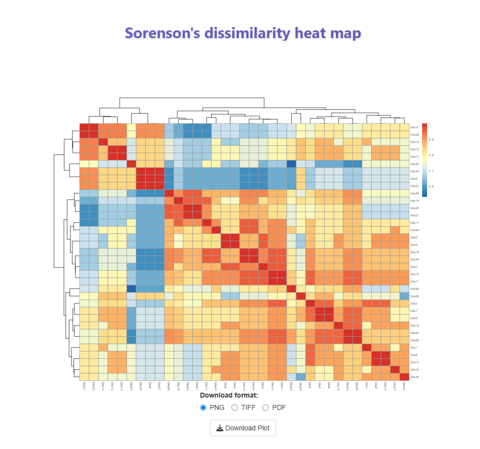
The Sørensen heatmap shows how similar any two sites are in terms of which species are present (Figure 23). Each cell is the intersection of two sites — the value and colour tell you how much they have in common.
- Red/warm cells → the two sites share many of the same species (high similarity)
- Blue/cool cells → the two sites share fewer species (lower similarity)
- Diagonal (value = 1.0) → a site compared with itself — always perfectly similar
Sites are rearranged by hierarchical clustering so that similar sites end up next to each other. The distinct red blocks you see along the diagonal are clusters of sites with very similar species composition. A site that appears mostly blue across a row or column is compositionally different from most other sites.
Sørensen vs Bray-Curtis — What is the difference?
| Bray-Curtis | Sørensen | |
|---|---|---|
| Uses abundance? | Yes — weighted by counts | No — presence/absence only |
| Sensitive to dominant species? | Yes | No |
| Best for | Quantitative abundance data | Detecting shared/absent species |
Sørensen dissimilarity treats all species equally regardless of how many individuals were recorded, making it complementary to the abundance-weighted Bray-Curtis metric used elsewhere in this tab.
7.6 Distribution Graph
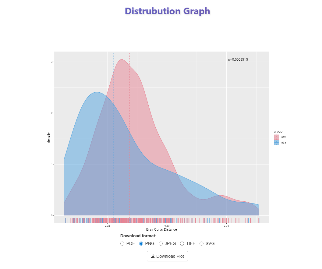
The density plot compares the distribution of intra-location (within-location) versus inter-location (between-location) Bray-Curtis distances (Figure 24). A clear separation between the two curves, combined with a significant p-value, confirms that sites within the same location are more compositionally similar to each other than to sites in different locations.
8 PERMANOVA
PERMANOVA (Permutational Multivariate Analysis of Variance) tests whether the species composition of communities differs significantly between groups (here, Locations). It is the standard statistical test for beta diversity because it works directly on a dissimilarity matrix rather than on raw species counts.
8.1 What does PERMANOVA actually do?
Think of each site as a point in multivariate space — its position is determined by the species it contains and their abundances. Each location has a centroid, which is simply the average position of all its sites in that space.
PERMANOVA asks: “Are the centroids of different locations further apart than we would expect by chance?”
It does this by calculating a pseudo-F statistic — the ratio of between-group distances (centroid to centroid) to within-group distances (each site to its own location centroid). A large pseudo-F means groups are well separated relative to their internal spread.
Why permutation? Why not a standard ANOVA?
Standard ANOVA requires the data to follow a normal distribution. Species community data almost never do — there are too many zeros, skewed counts, and non-linear relationships between species.
Instead of assuming a known distribution, PERMANOVA generates its own null distribution by randomly reshuffling site labels hundreds of times (typically 999 permutations). Each shuffle breaks the real group structure and produces a pseudo-F value for a world where location has no effect. The observed pseudo-F is then compared against this null distribution.
The p-value is simply the proportion of permuted pseudo-F values that are as large or larger than the one observed in the real data. If only 5 out of 999 permutations exceeded the observed value, p = 0.005 — strong evidence that the groups really do differ.
8.2 Why use PERMANOVA for beta diversity?
Beta diversity is measured as a dissimilarity matrix — a table of pairwise distances between all sites. PERMANOVA is specifically designed to work on distance matrices, making it the natural choice for testing whether locations differ in community composition. The Bray-Curtis dissimilarity used here captures both the identity and relative abundance of species.
8.3 Key Assumptions
PERMANOVA has two main assumptions that must be checked before interpreting results:
1. Independence of samples — sites must be independently sampled. This is satisfied by the field design used here (separate sampling sites within each location).
2. Homogeneity of multivariate dispersion — the spread of sites around their location centroid should be roughly equal across all locations. If one location has much more variable sites than another, a significant PERMANOVA result could reflect a difference in spread rather than a difference in mean composition.
Always check dispersion before interpreting PERMANOVA
This is why the PCoA Dispersion plot (Beta Diversity tab) is examined first. If dispersion is unequal between locations, the PERMANOVA result must be interpreted with caution — significance may be driven by heterogeneity rather than a true shift in community composition.
The formal test for this is PERMDISP (test of homogeneity of multivariate dispersions), whose result is reported alongside the PERMANOVA output.
8.4 Why transform data before analysis?
Raw abundance counts are dominated by the most common species. A single abundant species can swamp the signal from many rare ones. Transformations (such as square root or Hellinger transformation) reduce the influence of dominant species, giving more balanced weight to the full community. This generally improves the ecological interpretability of the dissimilarity matrix and the PERMANOVA result.
8.5 What does R² mean?
The R² value reported by PERMANOVA is the proportion of total variation in community composition that is explained by Location. For example, R² = 0.35 means that 35% of the difference in species composition between any two sites can be attributed to which location they belong to, with the remaining 65% due to variation between sites within the same location.
Note
R² in PERMANOVA is analogous to R² in ordinary regression — it is a measure of effect size, not significance. A result can be statistically significant with a low R² (location matters, but many other factors also drive composition) or non-significant with a moderate R² (a real pattern that the test lacked power to confirm).
9 ANOSIM
Analysis of Similarities (ANOSIM) is a non-parametric permutation-based test used to evaluate whether community composition differs significantly between two or more groups [@clarke1993]. It operates on a ranked dissimilarity matrix (e.g., Bray-Curtis) rather than raw abundance data, making it robust to skewed distributions typical of ecological count data.
ANOSIM is used here as a cross-validation step to corroborate PERMANOVA results.
9.1 The R Statistic
The ANOSIM test statistic R is calculated as:
\[R = \frac{\bar{r}_B - \bar{r}_W}{M/2}\]
Where \(\bar{r}_B\) is the mean rank dissimilarity between groups, \(\bar{r}_W\) is the mean rank dissimilarity within groups, and \(M = n(n-1)/2\) for \(n\) total samples.
R ranges from −1 to +1:
| R value | Interpretation |
|---|---|
| R ≈ 1 | Strong separation — dissimilarities between groups far exceed those within |
| R ≈ 0.5 | Moderate separation between groups |
| R ≈ 0 | No difference — high and low ranks distributed randomly within and between groups |
| R < 0 | Within-group dissimilarities exceed between-group (rare in practice) |