Principal Component Analysis
Principal Component Analysis compresses many correlated traits into a few interpretable components. This tutorial explains what PCA is, how many components to keep, and how to run the whole analysis in RAISINS… Read more …
Principal Component Analysis is one of the most widely used multivariate methods for making sense of datasets in which many correlated variables have been measured on the same set of observations. It is applied throughout plant breeding, agronomy, ecology, genomics, and the social sciences to summarise complex measurements, reveal hidden structure, and rank entries on overall performance. This tutorial begins from first principles: what PCA actually does, how eigenvalues, loadings and scores relate to one another, and why RAISINS standardises your variables before extracting components. It then walks through the complete analysis in RAISINS, including the eigenvalue table, loadings, contribution, biplots, the PCA based selection index, hierarchical clustering on principal components, correlation analysis, and AI-assisted interpretation, all without writing a single line of code.
1 What is Principal Component Analysis?
Suppose you test twenty rice genotypes and measure five things on each one: grain yield, plant height, days to flowering, thousand grain weight, and chalkiness. That is a hundred numbers sitting in front of you. Now answer a simple question: which genotype is the best?
You cannot just pick the highest yielder, because that genotype might also flower late and produce chalky grain. You cannot weigh up all five traits at once either, because nobody can hold a twenty-by-five table in their head.
There is something else going on as well. Those five traits are not really five separate pieces of news. Genotypes with high yield usually have heavy grain too. Genotypes that flower late are usually chalky too. So the table is partly repeating itself.
Principal Component Analysis takes advantage of exactly that repetition. It asks one simple question:
If I had to describe every genotype using two numbers instead of five, which two numbers would tell me the most?
Those two numbers are called principal components, and each one is simply a blend of your original traits, mixed in fixed proportions:
\[\text{PC}_1 = a_1(\text{GY}) + a_2(\text{PH}) + a_3(\text{DTF}) + a_4(\text{TGW}) + a_5(\text{CL})\]
Think of a school report card. A student has marks in six subjects, but the school still prints one total at the bottom, because that single number is usually enough to rank the class. PCA works out the fairest way to build such a total from your traits, and it does so by noticing which traits already move together.
PCA takes many traits that overlap with one another and boils them down to a few new numbers, arranged so that the first one carries the most information.
1.1 How much does each component tell you?
Not every component is worth keeping. For each one RAISINS reports an eigenvalue, which is just a way of asking:
How much of the story does this component carry?
Here is the easy way to read it. RAISINS first puts every trait on the same footing, so each of your original traits is worth exactly 1. An eigenvalue then tells you how many traits’ worth of information a component holds:
- Eigenvalue 2.1 → this single component is doing the work of about two traits. Worth keeping.
- Eigenvalue 0.6 → this component is worth less than one ordinary trait. Not worth keeping.
That is all the well-known Kaiser criterion says: keep the components whose eigenvalue is above 1.
Two more numbers sit beside the eigenvalue. The variance explained (%) is the eigenvalue written as a percentage of the total, and the cumulative variance is those percentages added up as you go down the list. Most researchers keep adding components until the cumulative variance reaches about 70%, meaning the components now carry roughly seven-tenths of everything the original traits contained.
PCA is not a test. There are no p-values, no F-tests, no CD values, and no significance stars anywhere in its output. A component is never “significant”; it simply carries a certain amount of information. PCA describes the pattern that is already in your data. It does not decide whether a difference is real.
1.2 Loadings and scores
Two words do most of the work in PCA, and mixing them up is the commonest mistake.
Go back to the blend. There are two natural things to ask about any blend: what went into it, and what did each genotype get out of it.
- A loading answers the first. It belongs to a trait, and it is that trait’s share in the blend. Loadings carry a plus or a minus sign. Plus means the trait goes up as the component goes up; minus means it goes down.
- A score answers the second. It belongs to a genotype, and it is the number that genotype ends up with once its own trait values have been put through the blend.
In short: loadings tell you what a component means, and scores tell you where each genotype stands on it.
You will meet one more number, the contribution. It is the loading squared and then rescaled so the contributions within a component add up to 100%. Because it has been squared, it is always positive, so it tells you which traits built this component but not in which direction. Use loadings when direction matters, and contributions when you only want to know which traits mattered most.
A little history: fitting a line through a cloud of points
-
PCA was born from a geometry problem. In 1901, Karl Pearson asked what it would mean to fit a line through a swarm of points in several dimensions at once, in the same way that regression fits a line through points in two. His answer, published as “On lines and planes of closest fit to systems of points in space”, described the axis along which a data cloud is most elongated, which is exactly the first principal component. Pearson had no computer and worked the arithmetic by hand, so the method remained largely theoretical for three decades. Harold Hotelling independently rediscovered and formalised it in 1933 while studying correlations among mental test scores, giving it the name “principal components” and the eigenvalue framework we still use. The method only became practical with the arrival of electronic computing in the 1960s, and it has since spread from psychometrics into plant breeding, ecology, remote sensing, genomics, finance, and machine learning, where it remains one of the most heavily used techniques in all of applied statistics.
2 PCA, clustering, or correlation?
The RAISINS PCA module gives you three related tools, and picking the right one matters more than anything else in this tutorial. All three look at the very same table of numbers. What changes is what you want to get out of it: are you trying to simplify the traits, to group the genotypes, or just to see which traits go together? Figure 1 lays them side by side.
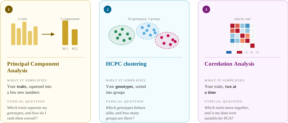
| Tool | What it simplifies | Typical question |
|---|---|---|
| Principal Component Analysis | Your traits, squeezed into a few new numbers | Which traits separate my genotypes, and how do I rank them overall? |
| HCPC clustering | Your genotypes, sorted into groups | Which genotypes behave alike, and how many groups are there? |
| Correlation Analysis | Your traits, two at a time | Which traits move together, and is my data even suitable for PCA? |
Do not run PCA on traits that have nothing to do with each other. PCA only earns its keep by removing repetition, so if your traits are already unrelated there is nothing to squeeze out: every component ends up worth about one trait, and none of them mean anything. The rule of thumb: look at the correlation matrix first (Section 15). If most of the correlations sit near zero, PCA will not help you.
The rest of this tutorial deals mainly with PCA itself, returning to clustering in Section 14 and to correlation in Section 15.
3 How RAISINS builds your components
Only one idea in this section really matters, and it is easy once you see the problem it solves.
Plant height is measured in centimetres and might swing by 40 units between the shortest and the tallest genotype. Chalkiness is a percentage and might swing by only 5. If those raw numbers went straight into PCA, plant height would take over the first component completely, not because height matters more, but simply because centimetres are bigger numbers than percentage points.
So RAISINS levels the playing field first. This is called standardisation, and it is two easy steps: subtract each trait’s own average, then divide by its own spread. Afterwards every trait, whatever its unit, arrives with exactly the same amount to contribute. Nothing wins just by being measured on a larger scale.
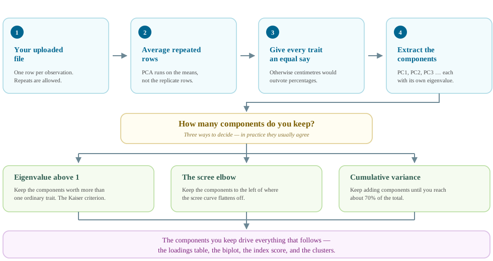
Two smaller things happen as well. If the same genotype appears in more than one row, RAISINS averages those rows first, so the analysis runs on genotype means. And once the components are ready, you decide how many to keep, using the eigenvalues from Section 1.
After standardisation each of your traits is worth exactly one unit. So a component with an eigenvalue of 1 is doing precisely as much work as one ordinary trait, and no more. If a component cannot beat a single trait, there is no reason to prefer it to simply reporting that trait directly.
To turn an eigenvalue into a percentage, just divide it by how many traits you have:
\[\text{Variance explained (\%)} = \frac{\text{eigenvalue}}{\text{number of traits}} \times 100\]
The cut-off of 1 is a sensible habit rather than a law. A component sitting at 0.95 is not meaningfully worse than one at 1.05.
Putting it together: RAISINS averages repeated rows, puts every trait on the same footing, works out the components, reports their eigenvalues, and then lets you keep as many as you judge useful. Figure 2 shows the whole sequence as a single picture.
Reading the eigenvalues: a worked mental example
You have five traits, so the five eigenvalues always add up to 5. Only their pattern changes.
- A good result: 2.13, 1.34, 0.78, 0.48, 0.27. PC1 is worth just over two traits (2.13 / 5 = 42.5%) and PC2 is worth about one and a third (1.34 / 5 = 26.8%), giving 69.3% between them. Two components beat the cut-off of 1, and together they carry about seven-tenths of the data. Keep two, and you have gone from five numbers per genotype to two.
- A poor result: 1.15, 1.05, 0.98, 0.92, 0.90. Every component is worth about one trait and nothing more. That means the traits were not repeating each other in the first place, so there was nothing for PCA to compress. Go back and look at the correlation matrix.
One point catches almost everyone out. A steep drop from one eigenvalue to the next is the good outcome, because it means the early components did most of the work. A flat list is the bad outcome. The scree plot is nothing more than this list drawn as a picture, and the “elbow” is the point where the steep part flattens off.
RAISINS standardises the data, extracts every component, computes the eigenvalues, and draws the scree plot automatically. The flowchart is there so you understand why the software did what it did, not because you must do it yourself.
4 Assumptions of PCA
PCA is easy-going compared with most statistical methods, but it does ask for five things before it can give you a sensible answer:
| What PCA needs | In plain words | What happens if you ignore it |
|---|---|---|
| Traits that go together | Your traits should overlap, so there is something to squeeze out | PCA still runs, but tells you nothing useful. Check Section 15 first |
| Proper numbers | Every trait is measured, not a category or a rank | Use Multiple Correspondence Analysis for categories instead |
| Straight-line relationships | When one trait rises, the other rises or falls steadily | Curved patterns get under-represented. Try a log or square-root version of that trait |
| More rows than traits | You have more genotypes than you have traits | Results become unstable and would change if you repeated the trial. Add rows or drop traits |
| No blank cells | Every cell in the number block is filled in | PCA will not run at all. Fill or remove those rows before uploading |
Only two of these are really yours to worry about, and both are settled before you upload anything. Blank cells are a file-cleaning job, and RAISINS will point them out for you in View Data (Section 19). Whether your traits go together is decided when you choose what to measure, and you can check it in one glance from the heatmap. Everything else the app handles on its own. As a working target, aim for about three genotypes for every trait you measure, and the rest takes care of itself.
5 Getting to the module
Now that the theory is clear, let us run the analysis. Visit the RAISINS home page at www.raisins.live and go to Data Analysis. In this tutorial we use the Principal Component Analysis module, shown in Figure 3.
.png)
5.1 Computational Provenance & Reproducibility Record
CPRR (Computational Provenance & Reproducibility Record) provides a transparent and comprehensive record. Click on the icon shown in Figure 3 to access CPRR and know about the computational workflow performed during the analysis. The record for this module states the R version and the exact version of every package used, names the specific function behind each reported result. CPRR lists every default parameter and decision rule applied by the module and provides fully runnable R code that reproduces each analytical step. Users can execute the code in R to independently reproduce and verify the results. It carries its own DOI.
To cite the platform itself in a paper, thesis, or report, use the RAISINS citation, available in APA, Harvard, and BibTeX formats at www.raisins.live/citation.html. That is the primary reference, and for most manuscripts it is all you need.
The CPRR for principal component analysis is at www.raisins.live/module_record/pca.html.
Cite the RAISINS paper as your primary reference for the platform. Add the CPRR as supporting documentation when a journal asks for details of the computing environment, or when you want your methods section to be precise about versions and functions rather than saying “analysis was carried out using an online tool.” The CPRR supports the citation and ensures computational reproducibility.
6 Preview mode and Quick Tour
Before subscribing, you can explore the entire module using Preview mode, accessible from the Welcome page. Preview mode loads built-in datasets so you can try every feature (the eigenvalue table, biplots, index scores, HCPC clustering, and the RA-One assistant) without uploading your own data. First-time users are also offered a Quick Tour, an interactive, step-by-step walkthrough that highlights each control and explains what it does. You can retake the tour at any time from the Quick Tour tab.
7 A working example
This example evaluates twenty rice genotypes, named G1 through G20, on five agro-morphological and quality traits: GY (grain yield in g/plant), PH (plant height in cm), DTF (days to flowering), TGW (thousand grain weight in g), and CL (chalkiness percentage). Every genotype contributes one row, and every trait one column, illustrating the layout PCA expects. The traits are deliberately a mixture: two of them are yield-related and expected to move together, two are duration-related and expected to move together, and one sits in between. The task now is to find out how many genuinely distinct patterns of variation exist among these five traits, and to rank the twenty genotypes on the patterns that matter.
.png)
Two terms recur throughout the rest of this tutorial. The observations are the twenty rice genotypes, one per row; the variables are the five traits, one per column.
8 How to prepare your data
Your analysis is only as good as your data. Feed RAISINS high-quality data and it will deliver powerful insights; feed it messy data and the results will not be trustworthy. You have four routes:
- Create your dataset in MS Excel
- Build your dataset directly within the RAISINS app
- Using the Model datasets in RAISINS as a reference
- Create your dataset using the RA-One chat assistant
8.1 Preparing data in MS Excel
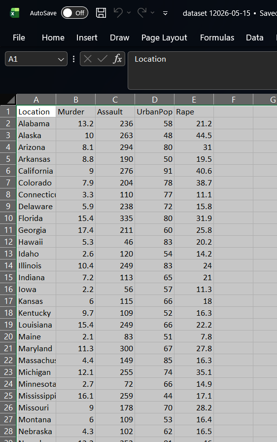
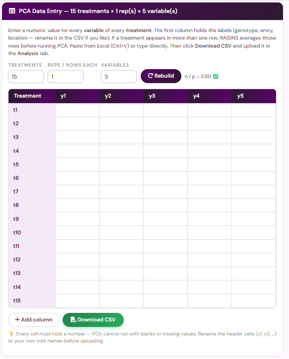
Open a new blank sheet in MS Excel containing only one sheet, and avoid adding any unnecessary content. The dataset should follow a column-based format, where the first column holds the observation label (genotype, entry, variety, location, or any identifier) and every subsequent column holds one numeric variable. Each observation occupies one row. If a genotype was replicated and you prefer to upload the replicate rows rather than the means, simply repeat the label in the first column, RAISINS will average them before running PCA. The file can be saved as CSV, XLS, or XLSX, but CSV is recommended as it is lighter and loads faster. Ensure there are no unwanted spaces in column names or observation labels, and no blank cells anywhere in the numeric block. For reference, see the structure in Figure 5.
Dataset creation rules
- Column naming convention
- No spaces allowed in column names.
- Use underscores (
_) or full stops (.) for separation. - Avoid symbols and special characters such as %, #.
- Data arrangement
- Start the data towards the upper-left corner.
- Ensure the row above the data is not blank.
- Cell management
- Avoid typing or deleting in cells without data.
- If needed, select the affected cells, right-click, and choose Clear Contents.
- Column relevance
- Name all columns meaningfully.
- Exclude unnecessary columns not required for the analysis.
- Select at least three numeric variables; PCA cannot run on fewer.
- Observation labels
- The first column must contain the observation labels.
- Keep spelling and capitalisation consistent throughout the column.
- Avoid labels that are bare numbers, as they may be read as data.
How to save as CSV in MS Excel
Open your workbook. Ensure your data is arranged properly with only one sheet.
Click the ‘File’ menu. Go to the top-left corner and click File.
Choose ‘Save As’ or ‘Save a Copy’. Select the location where you want to save your file.
Set file type to CSV. In the ‘Save as type’ dropdown, choose CSV (Comma delimited) (*.csv).
Name your file. Enter a relevant file name without spaces (use underscores if needed).
Click ‘Save’. Click Save to export the file.
💡 Tip: Before saving, double-check that your data is on the first sheet and follows the required format: no empty rows above the data, meaningful column names, a label in every row of the first column, and a number in every cell of the numeric block.
8.2 Prepare using Create Data in RAISINS
If you are unsure about the correct format, do not worry, RAISINS can create the data layout for you using the prescribed template. Here is how:
- Navigate to the Create Data tab
- Select the number of Observations (genotypes, entries, or treatments)
- Select the number of Variables
- Click the Create button
The model layout appears as shown in Figure 6. You may enter the observations manually into the CSV file once downloaded, or paste them straight into the file provided. Once the observations are entered, download the CSV and upload it under Analysis.
.webp)
8.3 Download Model Datasets
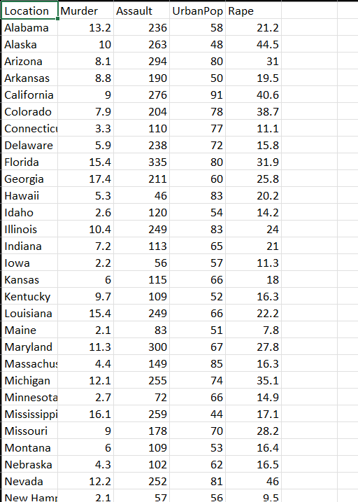
If you are unsure about the required data format or would like to explore the module before using your own data, RAISINS provides model datasets for reference. To download them:
- Navigate to the Datasets tab
- Click the Download CSV link corresponding to the required dataset
- Save the file to your computer
- Use the model dataset as a reference for preparing your own data or upload it directly to explore the analysis
8.4 Creating a dataset using RA-One chat
RA-One, the built-in chat assistant, can help you create a properly formatted dataset through a simple conversation. To get started, open the RA-One chat by clicking the chat icon available within the app or by heading over to the RA-One tab. Now you can enter the number of observations and variables, and RA-One will generate a dataset in the required format, checking as it goes that you have enough observations for the number of variables you asked for. You can review the generated dataset in the chat, download it as a CSV file, and upload it directly under the Analysis tab. The full workflow is illustrated in Figure 8 below.

9 The Analysis tab
Figure 9 shows the Analysis tab in detail, with each option explained. Upload your prepared file by clicking Browse in the sidebar. Once uploaded, selectors for the Treatment (observation label) column and the Variables appear. Choose the column that holds your genotype or entry names under Treatment, then select the numeric traits you wish to analyse. At least three variables are required.
Click Submit and all outputs appear instantly across the sub-tabs: Analysis Results, Plots, Index, HCPC, Correlation Analysis, AI interpretation, FAQs, and View Data. On the Analysis Results panel you can further adjust the number of decimal digits and the font used in the tables.
.webp)
How many variables should I select? Decide before you look at the loadings
Select the traits that are meaningfully related to one another and to your research question, and select them before you see any output. PCA is happy to accept any number of columns you give it, which makes it easy to fish: add traits until PC1 looks interpretable, drop the ones that spoil the story, and you can manufacture almost any conclusion you like.
There is also an arithmetic limit. The number of components PCA can extract is the smaller of (number of variables) and (number of observations − 1), and the stability of the loadings depends on having comfortably more rows than columns. With five traits, twenty genotypes is generous. With fifteen traits, twenty genotypes is thin, and the loadings you obtain would very likely change if you repeated the trial.
When in doubt, choose fewer traits that you can defend on subject-matter grounds rather than more traits that happen to be in the spreadsheet.
10 Standardisation
Unlike the ANOVA modules, the PCA module does not ask you to choose a transformation, because the single most important rescaling is applied for you automatically. Every variable you select is centred and scaled before the components are extracted.
Centring subtracts each variable’s own mean, so that every trait is expressed as a departure from its average rather than as an absolute value. This moves the origin of the coordinate system to the middle of the data cloud, which is what allows the components to be interpreted as directions of spread.
Scaling divides each centred value by that variable’s own standard deviation, so that every trait arrives carrying exactly one unit of variance. Without this step a trait measured in large units, such as plant height in centimetres, would dominate the first component purely through the accident of its scale, while a trait measured in small units, such as chalkiness percentage, would be crowded out.
The consequence is that RAISINS decomposes the correlation matrix rather than the covariance matrix. This is the right default for agricultural data, where traits are almost always measured in different units. It also means the eigenvalues have a convenient interpretation: they sum to the number of variables, and an eigenvalue of 1 marks the point at which a component is worth exactly one original trait.
If a variable is severely skewed, a log or square root transformation applied in your spreadsheet before upload will usually improve the linearity that PCA assumes. Then proceed to Section 11 for the analysis.
11 Analysis results
Once your dataset is uploaded and you click Submit, PCA is performed on the standardised treatment means. Four tables appear in the Analysis Results sub-tab: the Eigen values, the Loadings, the percentage Contribution, and the Correlation of variables with the PCs. They should be read in that order, exactly following the flowchart in Figure 2.
Table 1: Eigen values and variance explained
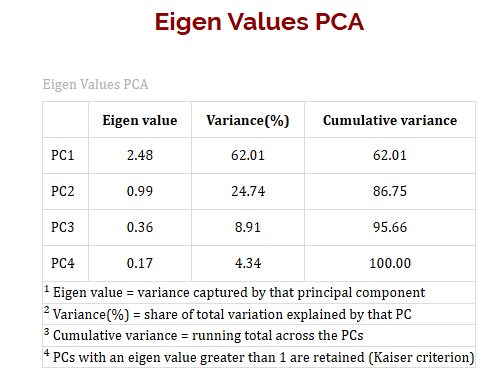
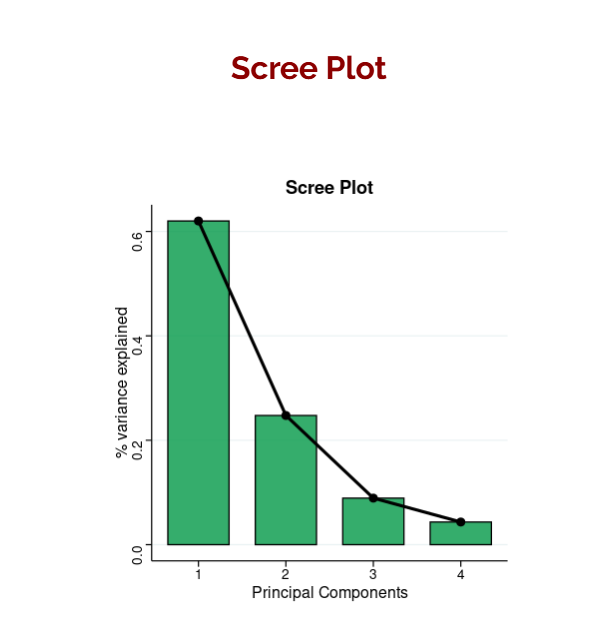
For each component RAISINS reports the Eigen value, the Variance (%) it explains, and the Cumulative variance. This table answers the first question of any PCA: how many components do I need to keep? The scree plot beside it (Figure 14) draws the same information as a curve, so the elbow is visible at a glance.
Table 2: Loadings
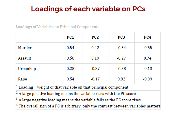
The loadings table gives each variable’s weight on each component, complete with sign. This is the table that tells you what a component means.
Table 3: Percentage contribution
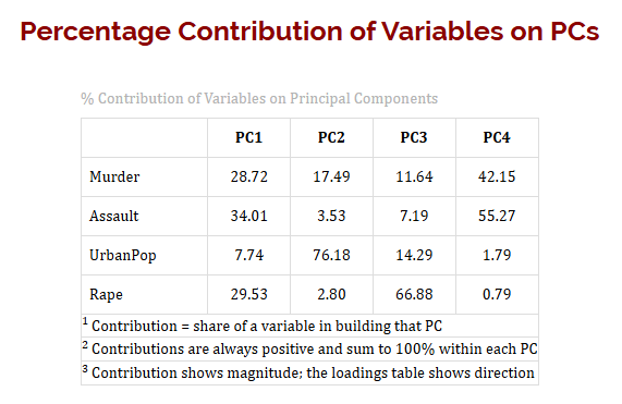
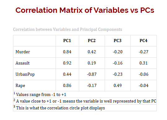
Table 4: Correlation of variables with the principal components
How the four tables fit together
All four tables are read off the same decomposition, but each answers a different question, and using the wrong one is the commonest error in reporting PCA.
The eigenvalue of a component is its variance on the standardised scale. Because the standardised variables each carry one unit of variance, the eigenvalues sum to the number of variables, and dividing an eigenvalue by that number gives the percentage of variance explained.
The loading of a variable on a component is its weight in the linear combination, and it carries a sign. Positive and negative loadings on the same component identify traits that move in opposite directions along that axis. The overall sign of a whole component is arbitrary: if every loading on PC1 were flipped, the analysis would be mathematically identical and only the direction of the axis would reverse. What matters is which traits share a sign and which oppose each other.
The contribution is the squared correlation of a variable with a component, rescaled so that the contributions within each component sum to 100%. It is always positive. Use it to answer “which traits built this component”, and use the loading to answer “in which direction”.
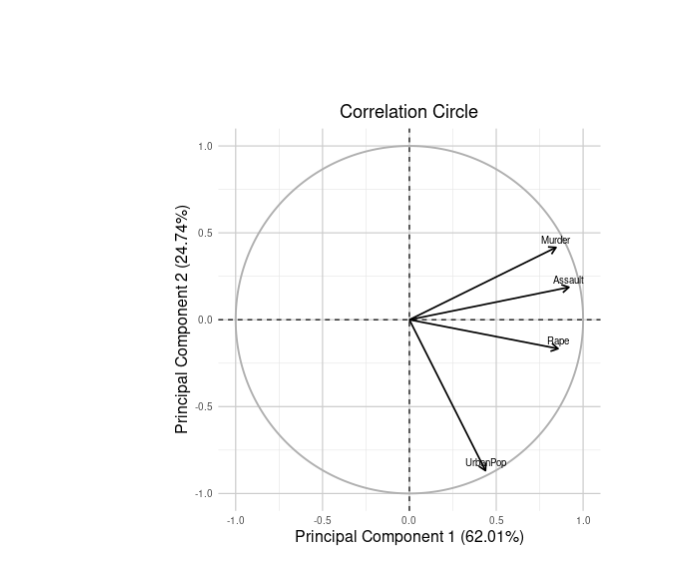
The correlation of a variable with a component ranges from −1 to +1 and measures how well that component represents the variable. A value close to either extreme means the component captures that trait almost completely; a value near zero means the trait lives somewhere else. This is precisely the quantity plotted as arrow length in the correlation circle.
Note that no significance is reported anywhere in these four tables, because PCA does not test hypotheses. The only significance stars in the whole module appear in the variable correlation matrix under Section 15.
11.1 Interpretation from Figure 10
In the working example, PC1 has an eigenvalue of 2.13 and accounts for approximately 42.5% of the total variation, while PC2 has an eigenvalue of 1.34 and accounts for about 26.8%. Together the first two components explain roughly 69.3% of everything in the dataset. Both clear the eigenvalue-1 threshold, so both are retained; PC3 onwards fall below 1 and are set aside.
Read that against Section 1: five traits have been compressed into two numbers with the loss of less than a third of the information. Because PC1 alone explains more than 40%, a PC1-based selection index is defensible on its own, and because the cumulative variance passes 60%, an index built on PC1 and PC2 together is also appropriate.
11.2 Interpretation from Figure 11
GY and TGW show strong positive loadings on PC1 (approximately +0.72 and +0.68), while DTF and CL show negative loadings (approximately −0.61 and −0.58). PC1 is therefore not a “yield axis” but a contrast: genotypes at the positive end are high-yielding with heavy grains, early flowering, and low chalkiness, while genotypes at the negative end are the reverse. PH loads moderately on both components and is captured by neither alone.
That single sentence is the payoff of the whole analysis. One number now orders the genotypes on a combination of four traits at once, in the direction a breeder actually wants.
A component that explains 42% of the variance is the largest pattern in your data, not necessarily the most useful one. If your breeding objective happens to be chalkiness alone, and chalkiness loads mainly on PC2, then PC2 is the component you should be selecting on, regardless of how much smaller its eigenvalue is. Always read the loadings before deciding which component to rank on.
A quick glossary of the result columns
Overview of PCA results and interpretation
- Components and Variables
Principal Component (PC): The sequential label for each derived component (PC1, PC2, PC3, …), ordered from the component capturing the most variance to the least.
Variable: The original trait measured on each observation (e.g. GY, PH, DTF, TGW, CL). RAISINS handles any number of variables from three upwards, reporting loadings for each on every component.
- Variance Quantities
Eigen value: The variance associated with a component on the standardised scale. An eigenvalue of 1 means the component explains as much variance as one original variable. The eigenvalues sum to the number of variables.
Variance (%): The eigenvalue expressed as a percentage of the total. PC1 always has the highest value.
Cumulative variance (%): The running total across successive components. Retain components until this reaches roughly 70–80%.
- Variable Quantities
Loading: The weight of a variable in a component’s linear combination, carrying a sign that shows direction.
Contribution (%): The share of a variable in building that component, always positive, summing to 100% within each component.
Correlation with PC: How well the component represents that variable, ranging from −1 to +1. This is what the correlation circle plots.
- Observation Quantities
Score: The value an observation takes on a component. Scores are what the biplot points and the index tables are built from, and they are the basis for all ranking and clustering that follows.
12 Plots and biplots
Why plot a PCA at all?
-
The tables tell you the numbers; the plots tell you the shape. A scree plot shows at a glance whether the eigenvalues fall away steeply, which is the single best indication of whether PCA has succeeded in compressing your data. A biplot places observations and variables on the same axes, so you can see simultaneously which genotypes resemble one another and which traits drive them apart, something no table can convey. And a correlation circle shows how well each trait is represented by the two components you have retained: a short arrow is a warning that the trait lives in a component you have discarded. In practice most researchers reach a conclusion from the biplot and then return to the tables to quote exact figures.
Under the Plots sub-tab, RAISINS produces the scree plot, the biplot, the correlation circle, a 3D scatter of the first three components, and a correlation heatmap. Every plot carries a gear icon for customisation of colours, labels, point size, and fonts, and can be downloaded as PNG (300 dpi), JPEG, TIFF, BMP, PDF, or SVG for use in publications.
The scree plot (Figure 14) draws the variance explained against the component number. The point at which the steep initial descent flattens into a shallow tail is the elbow, and components to the left of it are the ones worth keeping. Read it alongside the eigenvalue-1 rule rather than instead of it: when the two criteria agree, the choice is easy, and when they disagree, prefer the one that gives you components you can actually interpret.
The biplot (Figure 15) is the single most informative graphic in the whole module. Observations appear as points positioned by their PC1 and PC2 scores, while variables appear as arrows pointing in the direction in which that trait increases. Reading the two together lets you describe any genotype in one glance.
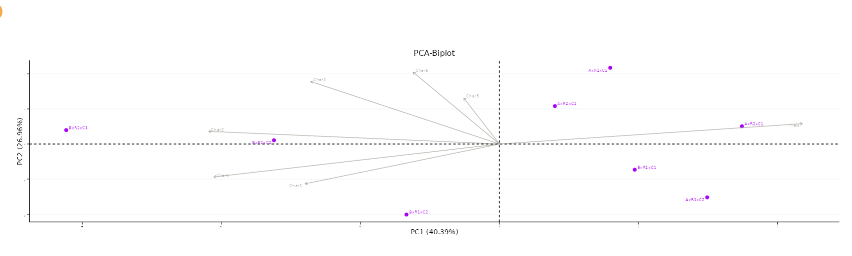
Three rules cover almost everything.
Angles between arrows measure correlation. A small angle means the two traits are strongly positively correlated; a right angle means they are uncorrelated; an angle approaching 180 degrees means they are negatively correlated.
Arrow length measures representation. A long arrow means the trait is well captured by the two components on display; a short arrow means most of that trait’s variation lives in a component you are not looking at, so do not draw conclusions about it from this picture.
Point position measures performance. A genotype lying far out in the direction of an arrow has high values for that trait; a genotype lying opposite the arrow has low values; a genotype near the origin is close to average on everything.
The correlation circle (Figure 16) plots the same arrows on a fixed scale from −1 to +1, with a unit circle drawn for reference. Because the scale is fixed, arrow length here has a precise meaning: an arrow reaching the circle is perfectly represented by the two components, while an arrow reaching only halfway is only moderately represented. It is the diagnostic companion to the biplot.
A 3D scatter plot (Figure 17) extends the biplot to a third component, which is worth inspecting whenever PC3 has an eigenvalue close to 1 and the two-dimensional picture leaves several genotypes bunched near the origin. The plot is interactive: drag to rotate and scroll to zoom.
Which plot to use for what?
Use the scree plot to decide how many components to retain, the biplot to describe and compare observations, the correlation circle to check that the traits you care about are actually well represented, and the 3D scatter when two components are not enough. If a trait’s arrow is short in the correlation circle, that is your signal to either retain a further component or accept that PCA cannot summarise that particular trait, exactly the situation anticipated in Section 4.
13 PCA based index
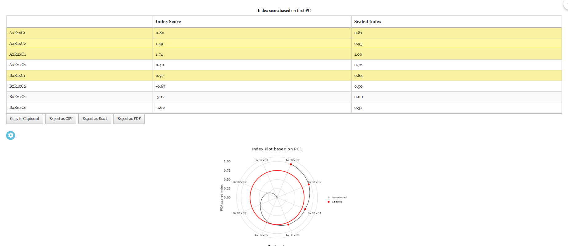
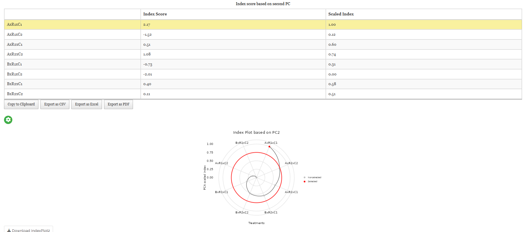
The Index sub-tab turns the analysis into a decision. A PCA based selection index is simply the score of each observation on a retained component, used as a single composite measure of overall performance. RAISINS reports the index for PC1 and for PC2 separately, so you can choose whichever component matches your objective.
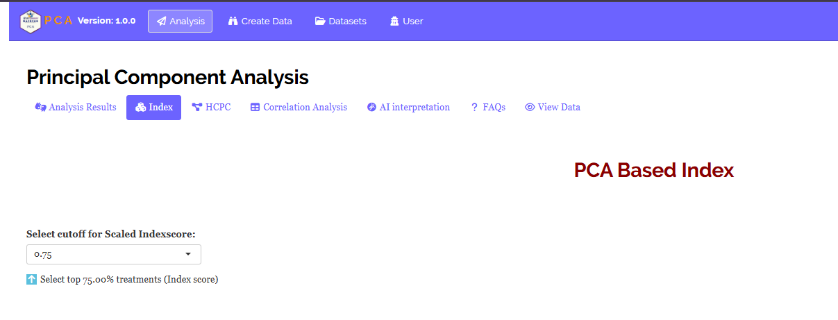
Alongside the raw Index Score, RAISINS reports a Scaled Index that rescales the score to a range of 0 to 1, so that the best-performing observation sits at 1 and the poorest at 0. The scaled version is dimensionless and directly comparable across datasets. Use the Select cutoff for Scaled Index Score control to set a threshold (the default is 0.75) and the up and down arrows to choose whether you want the top or the bottom fraction. Observations meeting the criterion are highlighted in yellow in the table, and a companion plot shows the ranking graphically.
13.1 Interpretation from Figure 19
Ranking the twenty genotypes on the PC1 index places G7 at the top (scaled index 0.91), followed by G3 (0.87) and G15 (0.84), while G19 sits at the bottom. Because PC1 was the contrast identified in Figure 11, those leading genotypes combine high grain yield and heavy grains with early flowering and low chalkiness. Applying the default 0.75 cutoff selects the top five as elite candidates for advancement.
The direction of a component is arbitrary, so a high index score is only desirable if the traits you want to increase carry positive loadings. In this example they do. Had chalkiness loaded positively on PC1, a high PC1 score would mean a chalkier genotype, and you would want to select the bottom of the ranking instead. Always read the loadings table before acting on an index.
14 HCPC clustering
HCPC (Hierarchical Clustering on Principal Components) groups your observations rather than your variables. It works in two steps: PCA is performed first, and Ward’s hierarchical clustering is then applied to the component scores rather than to the raw traits. Clustering on the components rather than the raw data is deliberate, since the components have already stripped out the redundancy and the noise, so the groups that emerge tend to be cleaner and more stable.
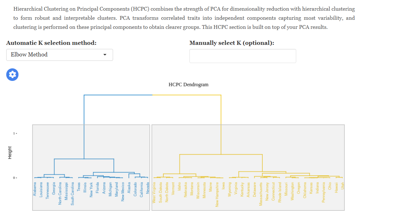
The dendrogram (Figure 21) shows the order in which observations were merged, with the height of each join indicating how dissimilar the two groups were. Cutting the tree horizontally at a chosen height fixes the number of clusters. RAISINS suggests an optimal number automatically using the elbow method, the silhouette method, or the gap statistic, whichever you select, and you may override it manually.
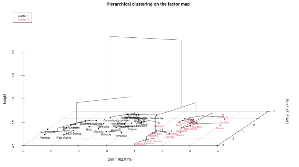
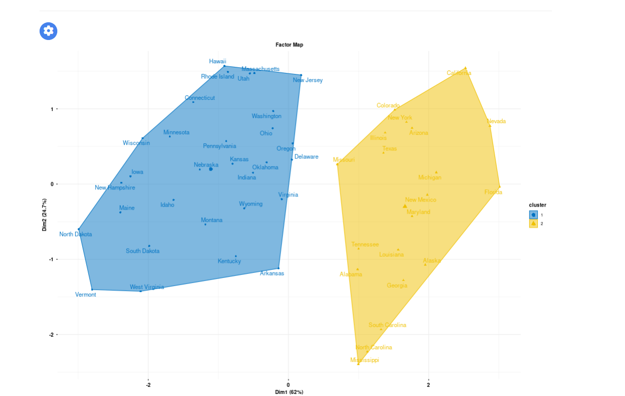
The cluster map (Figure 22) then overlays those groups on the component plane, colour-coded by membership, so you can see both which genotypes belong together and where each group sits relative to the traits.
14.1 Interpretation from Figure 22
HCPC resolves the twenty genotypes into three clusters. Cluster 1 (seven genotypes) is characterised by high GY and TGW and low CL, and occupies the positive end of PC1, which makes it the most desirable group. Cluster 2 (eight genotypes) sits near the origin and contains intermediate performers with no strong tendency in any direction. Cluster 3 (five genotypes) is late-flowering with high plant height and high chalkiness, at the negative end of PC1.
For a breeder the practical value is in the distance between clusters, not just their composition: crossing a Cluster 1 parent with a Cluster 3 parent maximises genetic divergence, which is exactly what you want when generating variability for selection.
Understanding the HCPC outputs
Dendrogram: A tree diagram displaying the hierarchical merging of observations. The height of each merge reflects the dissimilarity at which two groups were joined. A horizontal cut determines the number of clusters.
Cluster map: The component plane with observations colour-coded by cluster membership, giving a simultaneous view of grouping and of the traits that separate the groups.
Cluster means: A table of the mean of each variable within each cluster, reported on the standardised scale. A positive value means the cluster sits above the overall average for that trait, a negative value below it.
Cluster quality: The total, within-cluster, and between-cluster sums of squares, together with the Between/Total ratio. A ratio closer to 1 indicates better separated clusters.
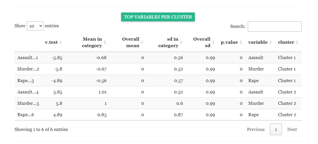
Top variables per cluster (v-test): A large positive v-test means the cluster has an unusually high mean for that trait; a large negative v-test means an unusually low one. This is the table to quote when describing what makes each cluster distinct.
15 Correlation analysis
The Correlation Analysis sub-tab reports the pairwise Pearson correlation among your selected variables. Although it appears late in the interface, it is logically the first thing to inspect, because it decides whether PCA was the right tool at all. PCA earns its keep by removing redundancy, and correlation is what redundancy looks like.
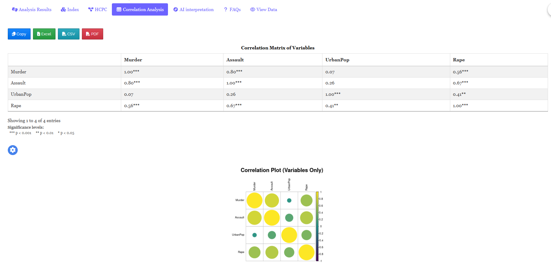
Significance is indicated by an asterisk (*) at the 5% level and two asterisks (**) at the 1% level. This is the only table in the entire PCA module that carries significance stars, precisely because it is the only part of the module that performs a hypothesis test. A correlation heatmap presents the same matrix visually, shaded from deep blue for strong negative correlation through white at zero to deep red for strong positive correlation, which makes blocks of mutually correlated traits jump out at a glance.
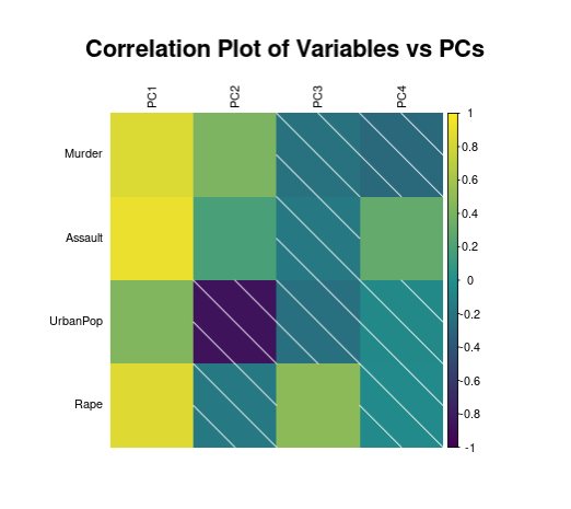
15.1 Interpretation from Figure 24
GY and TGW are strongly positively correlated (r = 0.74, p < 0.01), so high-yielding genotypes tend also to produce heavier grains. DTF correlates negatively with GY (r = −0.52, p < 0.05), so later-flowering genotypes tend to yield less under these conditions, and CL correlates positively with DTF (r = 0.61, p < 0.01), reflecting the known association between late maturity and chalkiness. PH correlates only weakly with everything else.
The heatmap therefore shows two blocks: {GY, TGW} and {DTF, CL}, moving in opposite directions, with PH standing apart. That is precisely the structure PC1 and PC2 recovered in Figure 11, which is the reassurance you want: the components are not an artefact of the arithmetic, they are the correlation structure of your data restated in a more compact form.
A strong correlation between two traits means they share underlying variation, not that one causes the other. PCA exploits that shared variation to build interpretable components, but it inherits every limitation of the correlations it was built from. Always interpret a component against subject-matter knowledge, never against the arithmetic alone.
16 Interpretation
RAISINS provides a clear and concise interpretation of your PCA results to help you understand the findings with ease. The interpretation summarises how many components were retained and why, states the cumulative variance they explain, identifies the traits driving each component and the direction in which they act, describes the cluster structure, and presents the findings in a publication-ready format. You can access this from the AI interpretation sub-tab of the Analysis tab (Figure 26).

17 Chat with your data using RA-One
RA-One is the built-in conversational assistant for the PCA module, available from the RA-One tab. You ask questions in plain language and it answers using your own analysis rather than generic statistical advice. Every result it discusses is drawn from what the module actually computed - it never invents numbers, and if a value isn’t available it says so instead of guessing. All answers are in plain English, with no code or software commands.
RA-One works directly with your Eigen values, Loadings, Contribution, Index and Cluster outputs. It can tell you how many components to retain and why, explain what PC1 means in terms of your own traits, distinguish a loading from a contribution when you are unsure which to quote, walk you through the index ranking and the cutoff, and describe which variables characterise each cluster. It also handles general concept questions - eigenvalues, standardisation, how to read a biplot, why PCA has no p-values - so you can build understanding alongside your results.

The same chat window can also prepare your data. It can build a correctly formatted dataset template (Section 8.4) for you to fill in, advise how many observations you need for the number of variables you plan to measure, or fetch a model dataset (Section 8.3) so you can try the module straight away - so you never need to leave the tab to get a file ready.
RA-One can also generate plots on request. Ask for a scree plot, a biplot, a correlation circle, a loadings or contribution chart, an index score plot, a cluster plot, or a correlation heatmap, and the app renders the graphic directly in the chat, where you can view it and refine it by asking for changes such as a different palette or a different pair of components on the axes.
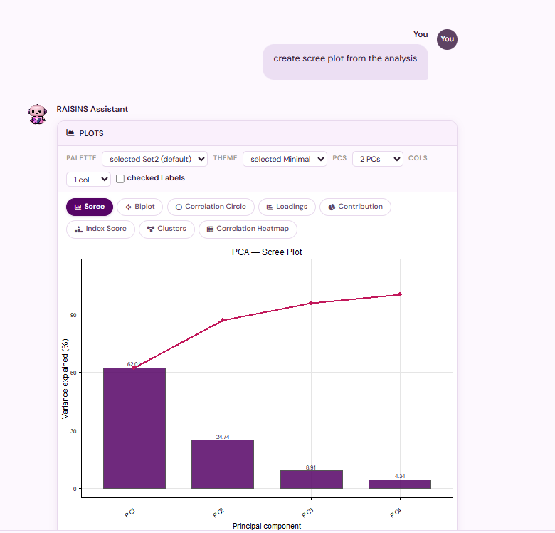
Within a single conversation, RA-One can interpret your results, build a data template, fetch a model dataset, and produce plots - so most of a routine PCA session can be conducted without ever leaving the chat window.
18 FAQs
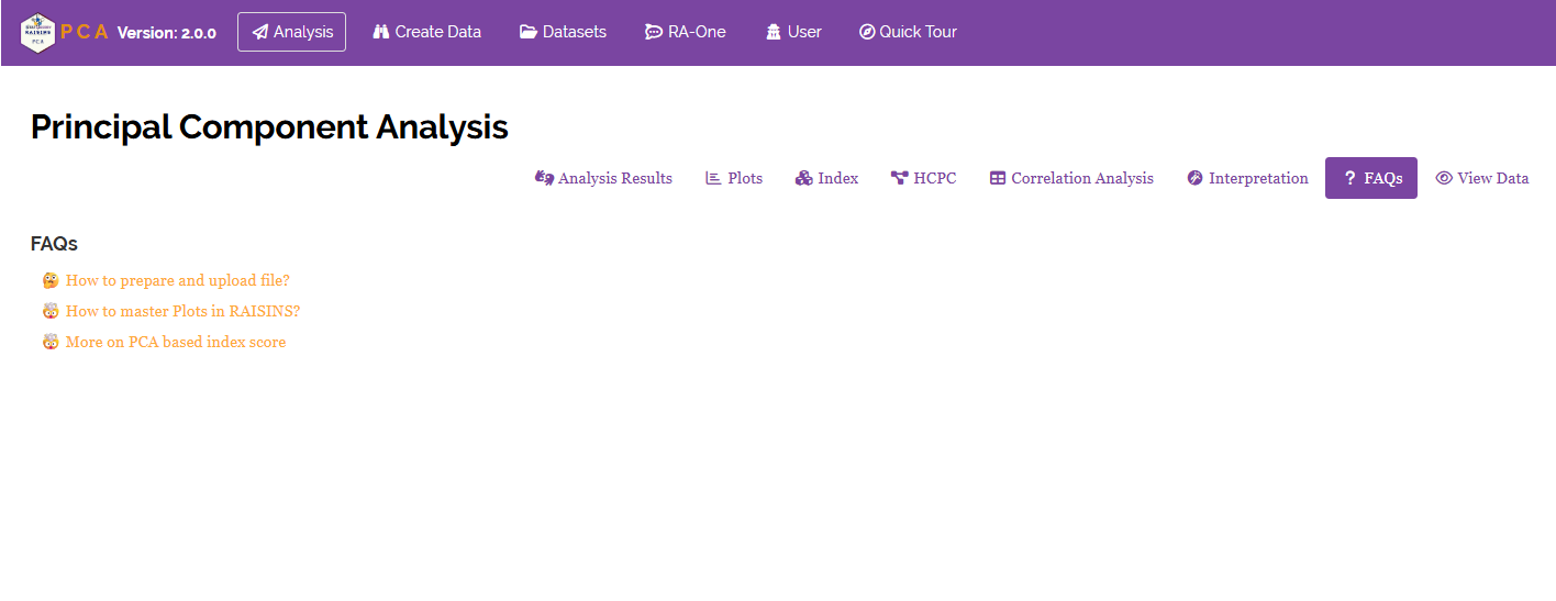
The module includes a dedicated FAQs section to clarify common doubts and guide you through the features. It offers detailed answers, additional information, and helpful tips for a smooth experience. If you are ever unsure how something works, say why a variable has a near-zero loading, or how to choose between a PC1-based and a PC1+PC2-based index, the FAQs are a good place to start.
19 View data
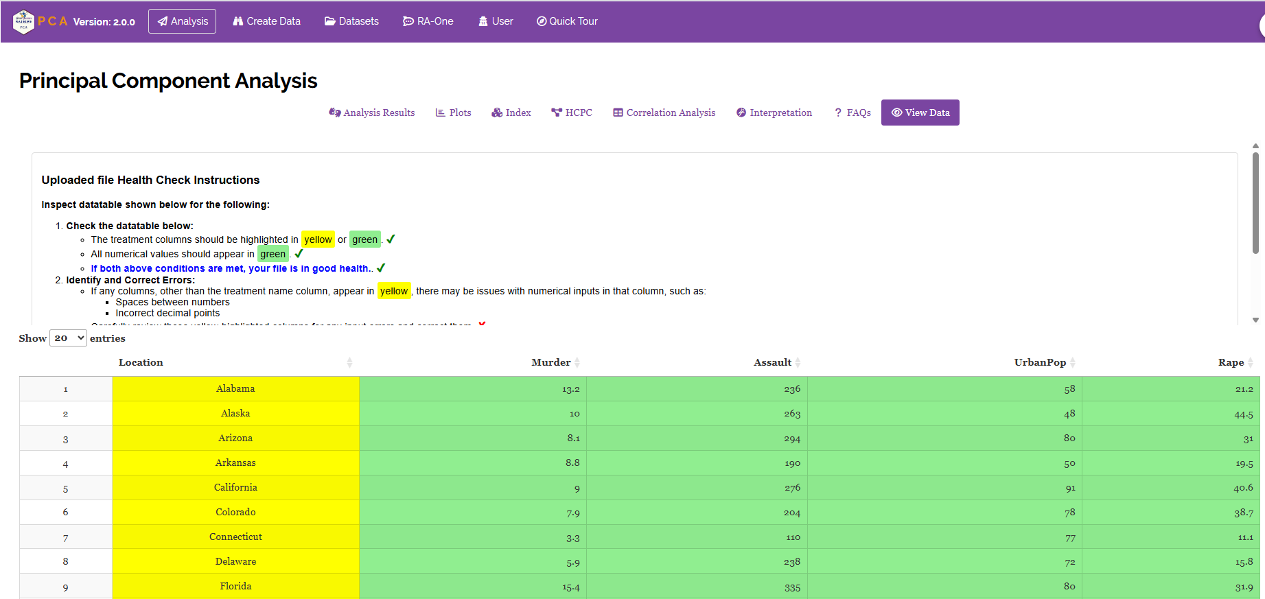
View Data is the primary diagnostic tool for ensuring data integrity before analysis. When you upload your dataset, the system performs an automated Health Check to validate column types and formatting. For PCA this step is especially important: it confirms that every variable column is recognised as numeric, that the label column is present, and that there are no missing or badly formatted entries. PCA cannot run on incomplete data, so a single blank cell will stop the analysis, and this is where you will find it.
20 Wrapping up
Principal Component Analysis rests on one honest question: if I had to describe every observation with fewer numbers, which numbers would I keep? Everything else, the standardisation, the eigenvalues, the loadings, the scree plot, exists only to answer that question fairly. RAISINS automates the machinery so you can concentrate on what the components mean for your research.
If PCA is not quite what your data need, the companion modules are there: Multiple Correspondence Analysis when your variables are categorical rather than continuous, Factor Analysis when you want to model latent constructs rather than summarise variance, and K-Means Cluster Analysis when grouping the observations is the whole point. And if you get stuck at any point, RA-One is available 24 × 7, or write to us at [email protected].