Propensity Score Matching
Propensity Score Matching compares treated and untreated units that were similar before treatment, so that the difference in outcomes can be credited to the treatment. This tutorial explains propensity scores, matching, balance and the treatment effect in plain language, and shows how to run the whole analysis code-free… Read more …
In many studies the treatment is not assigned at random. Farmers choose whether to adopt a new practice, patients choose whether to join a programme, and households choose whether to take a loan. The groups that receive the treatment are then often different from those that do not, even before the treatment has any effect. Propensity Score Matching (PSM) makes a fair comparison possible by pairing each treated unit with an untreated unit that looked similar before treatment.
This tutorial explains the idea of a propensity score, matching, covariate balance and the treatment effect in plain language. It then walks step by step through a complete analysis in the RAISINS platform: preparing the data, choosing the treatment, covariates and outcome, reading every results table, checking balance, estimating the treatment effect, creating plots and reports, and using the built-in RA-One AI assistant. No programming knowledge is required.
1 What is Propensity Score Matching?
Suppose you surveyed 300 farmers. Some of them adopted organic farming and some did not. You want to know: does adopting organic farming increase crop yield?
The simplest idea is to compare the average yield of adopters with the average yield of non-adopters. But this comparison can be misleading. Farmers were not assigned to organic farming at random; they chose it. Farmers who adopted may already have had larger farms, better access to credit, or more contact with extension officers. These same factors can also raise yield. So part of the difference in yield may come from these factors, and not from organic farming itself.
Factors like these, which influence both the choice of treatment and the outcome, are called confounders. In a randomised experiment, randomisation spreads them evenly across the groups. In an observational study, where people choose their own treatment, we have to deal with them ourselves.
Propensity Score Matching (PSM) does this in three steps:
- Estimate a propensity score for every unit: the probability that the unit receives the treatment, given its characteristics.
- Match each treated unit with an untreated unit that has a similar propensity score.
- Compare the outcome between the matched groups.
Because the matched groups look alike before treatment, a difference in their outcomes is much more likely to be caused by the treatment.
Propensity Score Matching compares each treated unit with a similar untreated unit, so that the difference in outcomes reflects the treatment and not the pre-existing differences between the groups.
1.1 What is a propensity score?
The propensity score is the probability that a unit receives the treatment, based on its characteristics before treatment. It is a number between 0 and 1.
RAISINS estimates it with a logistic regression, in which the treatment (for example, adopted = 1, not adopted = 0) is predicted from the chosen covariates (for example, farm size, education and credit access).
For example, a propensity score of 0.70 means that a farmer with those characteristics had a 70% chance of adopting organic farming.
The key idea is that two farmers with the same propensity score are comparable, even if one adopted and the other did not. Instead of matching on many characteristics at once, we only need to match on this single number.
Behind the scenes (optional): the propensity score model
Most users never need this. The propensity score \(e(X)\) is estimated by logistic regression:
\[e(X) = P(T = 1 \mid X) = \frac{1}{1 + e^{-(\beta_0 + \beta_1 X_1 + \cdots + \beta_k X_k)}}\]
where \(T\) is the treatment and \(X_1, \dots, X_k\) are the covariates. RAISINS computes this automatically; no manual calculation is required.
1.2 What is matching?
Matching pairs each treated unit with an untreated unit whose propensity score is close to its own. RAISINS uses 1:1 matching without replacement: each treated unit gets one control, and each control can be used only once.
Two matching methods are available:
- Nearest-neighbour matching (default) takes the treated units one by one and gives each the closest control that is still available.
- Optimal matching looks at all pairs together and chooses the set of pairs with the smallest total distance.
A caliper can be added to nearest-neighbour matching. It sets the largest allowed difference in propensity scores within a pair. If no control is close enough, the treated unit is left unmatched rather than paired with a poor match.
1.3 Checking balance: the standardised mean difference
After matching, we must check that the treated and control groups really look alike. This is called checking covariate balance.
Balance is measured with the standardised mean difference (SMD): the difference between the group means of a covariate, divided by its standard deviation. Because it is expressed in standard-deviation units, the SMD can be compared across covariates measured in different units.
| Absolute SMD | Balance |
|---|---|
| Below 0.10 | Well balanced |
| 0.10 to 0.25 | Borderline |
| Above 0.25 | Imbalanced |
Balance is judged with the SMD, not with a p-value.
A p-value depends on the sample size. In a small sample, a large difference between groups can still give a non-significant p-value. In a large sample, a tiny, unimportant difference can be significant. The SMD does not depend on sample size, so it is the correct measure of balance.
1.4 ATT and ATE
PSM can answer two slightly different questions:
- ATT (Average Treatment effect on the Treated): For the farmers who adopted organic farming, how much did adopting change their yield?
- ATE (Average Treatment Effect): If every farmer adopted organic farming, how much would yield change on average?
Matching treated units to controls naturally estimates the ATT, and this is the main result in RAISINS. The ATE is also reported by two additional methods, IPWRA and AIPW, which are described in Section 9.
2 Words You Will Meet
| Term | Meaning | In the example |
|---|---|---|
| Treatment | The binary exposure being studied. It must have exactly two levels | Adoption (1 = adopted, 0 = not adopted) |
| Covariates | Characteristics measured before treatment that may influence both treatment and outcome | Farm size, rainfall, age, education, extension contact, credit access |
| Study variable (outcome) | The result you want to compare | Yield (kg/ha) |
| Propensity score | The probability of receiving the treatment, given the covariates | Probability of adopting organic farming |
| Caliper | The largest allowed difference in propensity scores within a matched pair | 0.2 standard deviations of the propensity score |
| SMD | Standardised mean difference, the measure of balance | Below 0.10 is well balanced |
Covariates must be measured before the treatment. Variables that the treatment could change, such as yield or income after adoption, must never be used as covariates. Doing so removes part of the very effect you are trying to measure.
3 Getting to the Module
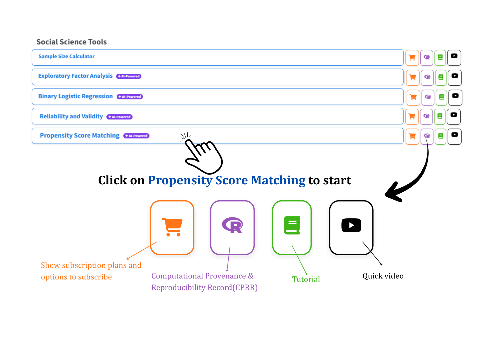
Open the RAISINS home page at www.raisins.live and go to the Social Science Tools section. Select the Propensity Score Matching module (Figure 1).
No programming knowledge is required. You upload your data, choose the treatment, covariates and outcome, and RAISINS performs the complete analysis and produces publication-ready output.
3.1 Computational Provenance & Reproducibility Record
CPRR (Computational Provenance & Reproducibility Record) provides a transparent and comprehensive record. Click on the icon shown in Figure 1 to access CPRR and know about the computational workflow performed during the analysis. The record for this module states the R version and the exact version of every package used, and names the specific function behind each reported result. CPRR lists every default parameter and decision rule applied by the module and provides fully runnable R code that reproduces each analytical step. Users can execute the code in R to independently reproduce and verify the results. It carries its own DOI.
To cite the platform itself in a paper, thesis, or report, use the RAISINS citation, available in APA, Harvard, and BibTeX formats at www.raisins.live/citation.html. That is the primary reference, and for most manuscripts it is all you need.
The CPRR for the propensity score matching module is at www.raisins.live/module_record/psm.html.
Cite the RAISINS paper as your primary reference for the platform. Add the CPRR as supporting documentation when a journal asks for details of the computing environment, or when you want your methods section to be precise about versions and functions rather than saying “analysis was carried out using an online tool.” The CPRR supports the citation and ensures computational reproducibility.
4 Preview Mode and Quick Tour
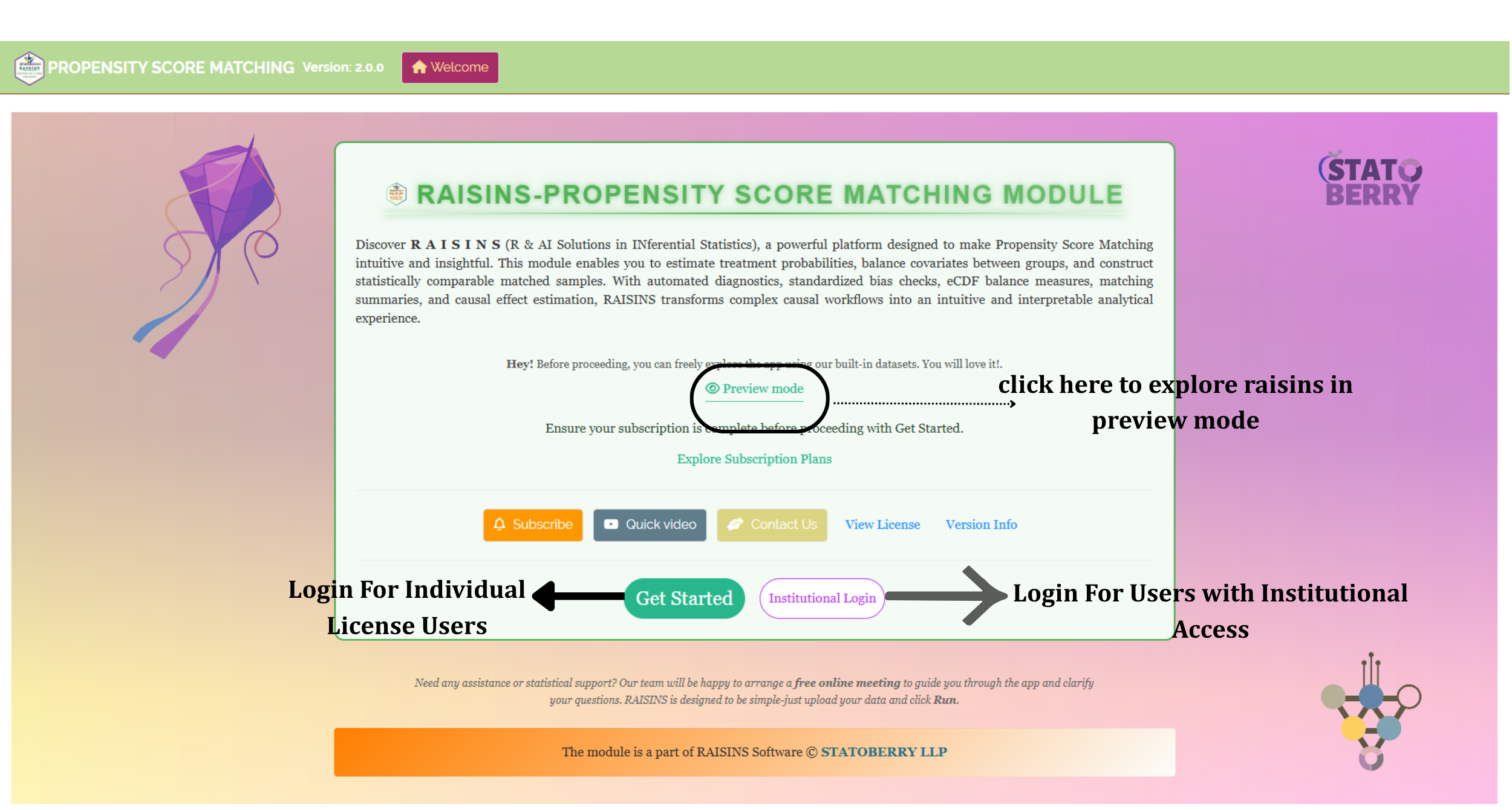
You can explore the entire module before subscribing by using Preview mode on the Welcome page. It loads built-in datasets, so you can try every feature, including the analysis, the treatment effects and the plots, without uploading your own data.
First-time users are also offered a Quick Tour after logging in. This is an interactive, step-by-step walkthrough that highlights each tab and control and explains what it does. You can replay it at any time from the Quick Tour tab in the top navigation.
5 The Example Dataset
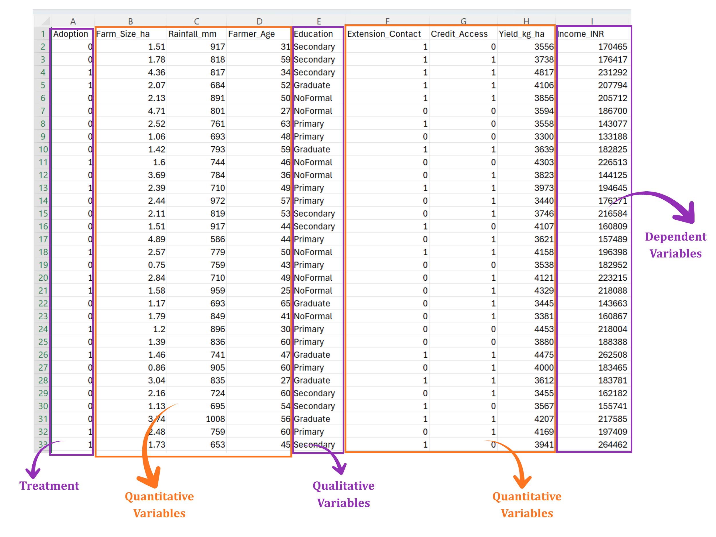
This tutorial uses the Organic Adoption dataset, which is built into the module and available from the Datasets tab. It contains 300 farmers, of whom 137 adopted organic farming and 163 did not.
- Treatment:
Adoption(1 = adopted, 0 = not adopted). - Quantitative covariates:
Farm_Size_ha(farm size in hectares),Rainfall_mm(annual rainfall) andFarmer_Age(years). - Qualitative covariates:
Education(NoFormal, Primary, Secondary, Graduate),Extension_Contact(1 = has contact with an extension officer) andCredit_Access(1 = has access to credit). - Study variable:
Yield_kg_ha(crop yield in kg/ha).
The dataset also contains Income_INR, which is not used here. The objective is to find out whether adopting organic farming increased yield, after making adopters and non-adopters comparable. The data layout is shown in Figure 3.
- Prepare your dataset.
- Upload the data.
- Select the treatment, covariates and study variable.
- Run the analysis.
- Check the propensity score model and the matching summary.
- Check covariate balance before and after matching.
- Read the treatment effect.
- Review the plots and the interpretation.
- Export the tables, figures and reports.
The sections below walk through each of these steps in detail.
6 Preparing Your Data
The quality of your analysis depends on the quality of your data. RAISINS provides four ways to prepare a correctly formatted dataset:
- Create it in MS Excel.
- Build it inside the app using Create Data.
- Download a built-in Model dataset and use it as a reference.
- Generate it through the RA-One chat assistant.
6.1 Preparing Data in MS Excel
Open a new Excel workbook containing a single sheet. Each row is one unit (for example, one farmer), and each column is one variable. You need:
- One treatment column with exactly two levels, such as 1/0 or Yes/No.
- One or more covariate columns measured before treatment.
- One study variable column containing the outcome.
Save the file in CSV, XLS or XLSX format. CSV is recommended because it is smaller and loads faster. Refer to Figure 3 for the required layout.
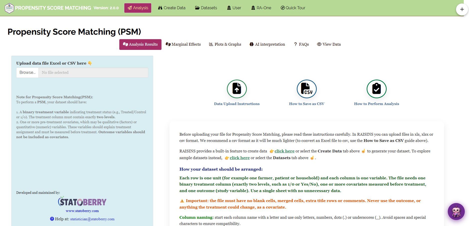
Before a file is uploaded, the Analysis tab shows three guides: Data Upload Instructions, How to Save as CSV and How to Perform Analysis (Figure 4). Click an icon to open the guide.
Dataset creation rules
- Column naming - do not use spaces. Use underscores (
_) or dots (.), and avoid symbols such as % and #. Always begin a column name with a letter. - Data arrangement - start at the upper-left corner of the sheet. The row above the data must not be blank.
- Cell management - do not type or delete in empty cells. If needed, select them, right-click, and choose Clear Contents.
- No blank cells - every cell must have a value. Remove or complete rows with missing values before uploading.
- Treatment column - exactly two levels. RAISINS treats the second level, in sorted order, as the treated group: 1 in 0/1 coding, Yes in No/Yes coding.
- Categorical columns - use consistent labels, such as “Primary” and “Secondary”, with no trailing spaces.
How to save as CSV in MS Excel
- Open your workbook, with the data on a single sheet and correctly arranged.
- File → Save As / Save a Copy, then choose a location.
- Save as type → CSV (Comma delimited) (*.csv).
- Name the file without spaces. Use underscores instead.
- Save.
💡 Tip: before saving, confirm that the data is on the first and only sheet and that there are no blank cells.
6.2 Creating Data Inside RAISINS
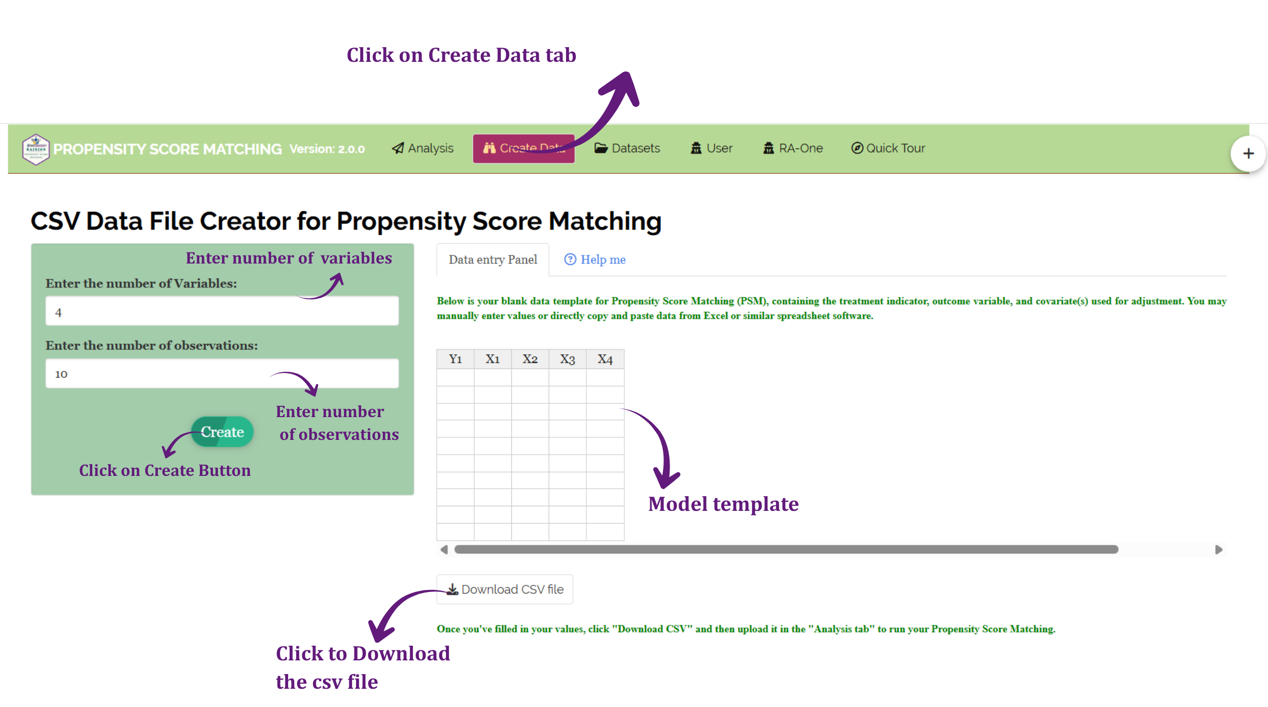
If you are unsure about the required format, RAISINS can generate a template for you:
- Go to the Create Data tab.
- Enter the number of variables, which is the number of columns.
- Enter the number of observations, which is the number of rows.
- Click Create.
The generated layout is shown in Figure 5. Enter your values in the template directly, or paste them from Excel, then download the template as a CSV file and upload it in the Analysis tab.
6.3 Downloading Model Datasets
To explore the module before using your own data, download a ready-made example from the Datasets tab. Three datasets are available:
- Lalonde - a classic dataset from the evaluation of a job-training programme.
- Birth Weight - maternal characteristics and infant birth weight.
- Organic Adoption - the farm dataset used in this tutorial.
Use them as a formatting reference, or upload them directly to run the analysis.
6.4 Creating a Dataset Using RA-One
RA-One, the built-in chat assistant, can create a correctly formatted dataset through a simple conversation.
Open RA-One from its navigation tab or from the floating chat bubble. Tell it how many covariates and observations you need, and it builds a template with a treatment column, covariate columns and an outcome column. Review the template in the chat, download the CSV file, and upload it in the Analysis tab (Figure 6).

7 The Analysis Tab
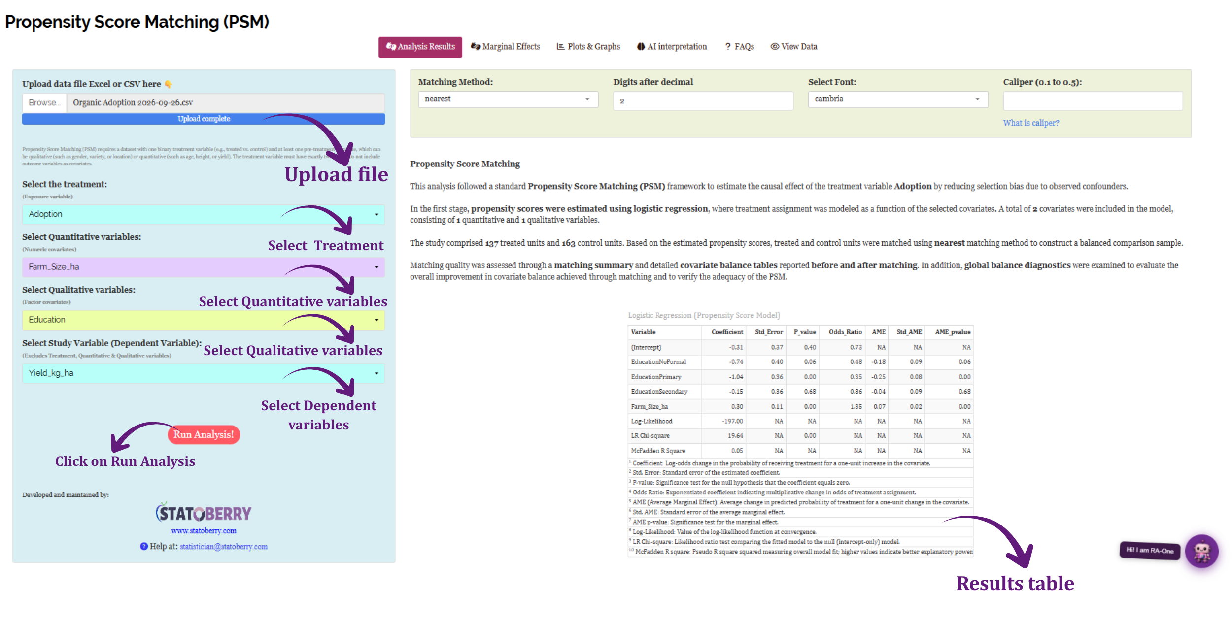
The Analysis tab is where the analysis is run (Figure 7).
Click Browse in the sidebar to upload your CSV or Excel file. RAISINS first checks the file and shows a message with the number of rows and columns it found. Click Got it, let’s go!, and a glowing outline then guides you through the selectors in order:
- Select the treatment - the binary exposure column.
- Select Quantitative variables - the numeric covariates.
- Select Qualitative variables - the categorical covariates. Columns coded 0/1, such as
Extension_Contact, are categories and belong here. - Select Study Variable - the outcome.
Click Run Analysis!. A settings bar then appears above the results, where you can choose:
- Matching Method - nearest-neighbour (default) or optimal.
- Digits after decimal and the font of the tables.
- Caliper - optional, between 0.1 and 0.5. Click What is caliper? for an explanation.
Changing any of these settings updates the results immediately.
For the example, select Adoption as the treatment, Farm_Size_ha, Rainfall_mm and Farmer_Age as quantitative variables, Education, Extension_Contact and Credit_Access as qualitative variables, and Yield_kg_ha as the study variable. Keep nearest matching and enter a caliper of 0.2.
In RAISINS the caliper is entered in standard deviations of the propensity score. A caliper of 0.2 means that the two farmers in a pair may differ in propensity score by at most 0.2 standard deviations. In the example this is 0.035, or 3.5 percentage points of probability.
The caliper is used with nearest-neighbour matching only. Optimal matching pairs all units at once, so a caliper is not applied; RAISINS shows a message if you enter one.
8 Analysis Results
The Analysis Results sub-tab shows how the propensity score was estimated, how many units were matched, and whether matching balanced the groups.
8.1 Table 1: Propensity Score Model
Understanding the propensity score model
| Column | Meaning |
|---|---|
| Coefficient | Change in the log-odds of receiving the treatment for a one-unit increase in the covariate |
| Std. Error | The precision of the coefficient |
| P-value | Tests whether the coefficient is zero |
| Odds Ratio | How many times the odds of treatment are multiplied for a one-unit increase in the covariate |
| AME | Average marginal effect: the change in the probability of treatment for a one-unit increase in the covariate |
| Log-Likelihood, LR Chi-square, McFadden R² | How well the covariates, together, predict who received the treatment |
For a categorical covariate, each level is compared with a reference level (for example, Extension_Contact1 is compared with Extension_Contact0).
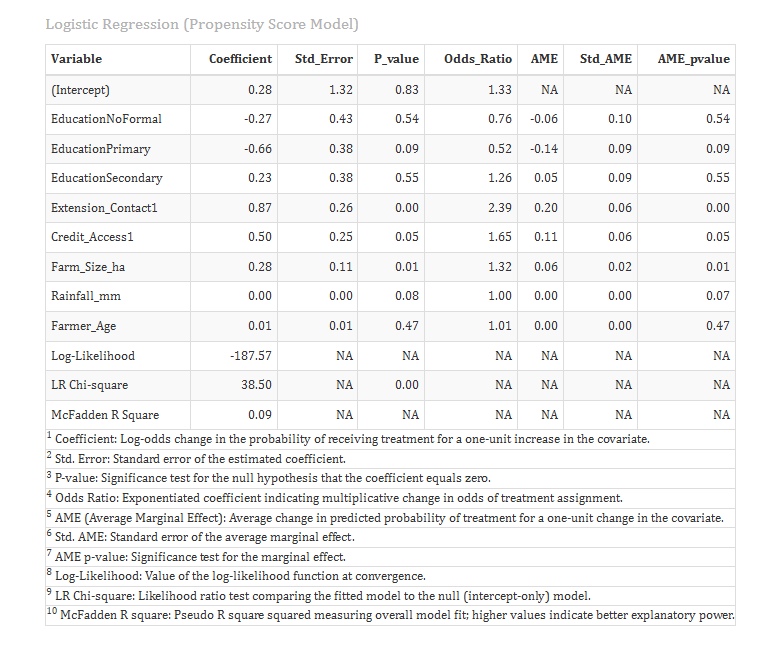
Interpretation of Figure 8
This table shows who chose to adopt organic farming.
Extension contact had the strongest link with adoption (odds ratio = 2.39, p < 0.001). Farmers in contact with an extension officer had about 2.4 times the odds of adopting. In terms of probability, their chance of adopting was about 20 percentage points higher (AME = 0.20).
Credit access (odds ratio = 1.65, p = 0.05) and farm size (odds ratio = 1.32 per hectare, p = 0.01) also raised the chance of adoption. Rainfall, age and education were not significantly linked to adoption.
The covariates together predicted adoption significantly (LR chi-square = 38.50, p < 0.001), with a McFadden R² of 0.09.
This confirms the problem described in Section 1: adopters and non-adopters were different before adoption. They had more extension contact, more credit and larger farms. A simple comparison of yields would mix these differences with the effect of organic farming.
In PSM, the aim of this model is not to predict treatment perfectly. A model that predicts treatment almost perfectly means that treated and untreated units hardly overlap, and good matches cannot be found. What matters is whether matching achieves balance, which is checked next.
8.2 Table 2: Matching Summary
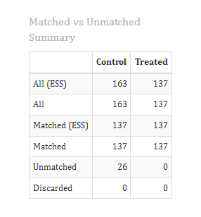
Interpretation of Figure 9
Of the 137 adopters and 163 non-adopters, 100 pairs were formed. 37 adopters and 63 non-adopters were left unmatched, and no units were discarded for other reasons.
The 37 adopters were left unmatched because no non-adopter had a propensity score within the caliper. These were mostly farmers who were very likely to adopt, for whom no similar non-adopter existed.
When treated units are left unmatched, the result describes the matched treated units, not every treated unit. Here, the treatment effect applies to the 100 adopters who could be matched. Always report how many treated units were matched.
8.3 Table 3: Covariate Balance Before and After Matching
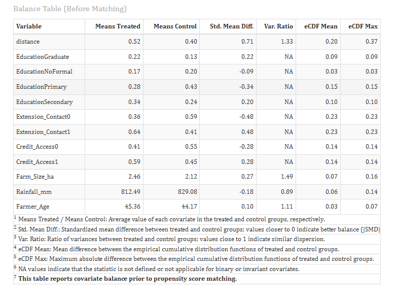
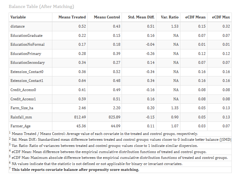
Understanding the balance tables
| Column | Meaning |
|---|---|
| Means Treated / Means Control | The average of the covariate in each group. For a categorical level, this is the proportion of units at that level |
| Std. Mean Diff. | The standardised mean difference. Below 0.10 is well balanced |
| Var. Ratio | The ratio of the variances in the two groups. Close to 1 is good |
| eCDF Mean / Max | How different the whole distributions are, not just the means. Close to 0 is good |
The first row, distance, is the propensity score itself.
Interpretation of Figure 10
Before matching, several covariates were imbalanced. The largest differences were in extension contact (SMD = 0.48), primary education (SMD = −0.34), credit access (SMD = 0.28) and farm size (SMD = 0.27). The propensity score itself differed by 0.71 standard deviations.
After matching, every covariate except one has an SMD below 0.10. Credit access became perfectly balanced (SMD = 0.00), farm size fell from 0.27 to 0.02, and the propensity score from 0.71 to 0.08. Extension contact improved from 0.48 to 0.15, which is in the borderline range.
Matching therefore removed nearly all of the pre-existing differences. The remaining borderline imbalance in extension contact is handled in Section 9, where the outcome model also adjusts for the covariates.
8.4 Table 4: Model Diagnostics Before and After Matching
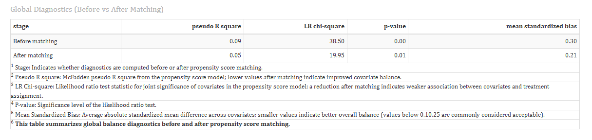
This table fits the same propensity score model twice: once on all the data, and once on the matched data. If matching worked, the covariates should no longer be able to predict who was treated.
The mean standardised bias is the average absolute SMD across all covariates.
Interpretation of Figure 11
Before matching, the covariates predicted adoption significantly (pseudo R² = 0.09, LR chi-square = 38.50, p < 0.001), and the mean standardised bias was 0.30.
After matching, the covariates no longer predict adoption (pseudo R² = 0.005, LR chi-square = 1.41, p = 0.99), and the mean standardised bias fell to 0.05.
In the matched sample, knowing a farmer’s characteristics no longer tells you whether they adopted. This is exactly what matching is meant to achieve.
9 Treatment Effect (Marginal Effects Tab)
The Marginal Effects sub-tab answers the main question: how much did the treatment change the outcome? It appears once a study variable has been selected. A short written summary is shown at the top, followed by the tables.
RAISINS estimates the effect in several ways. When they agree, you can be more confident in the result.
9.1 Table 5: Average Treatment Effect on the Treated (ATT)
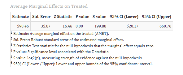
This is the main result. RAISINS fits a regression of the outcome on the treatment and the covariates in the matched sample, and computes the average effect for the treated units. The standard error accounts for the matched pairs.
Interpretation of Figure 12
Adopting organic farming increased yield by 567.48 kg/ha for the matched adopters (SE = 49.21, 95% CI 471.03 to 663.93, p < 0.001).
In practical terms, an adopter harvested about 567 kg more per hectare than a comparable non-adopter. The whole confidence interval is well above zero, so the effect is clearly positive.
9.2 Table 6: t-tests on the Matched Sample
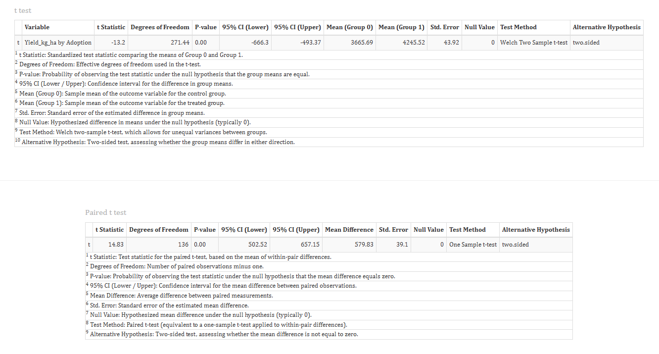
Two simple tests compare the outcome in the matched groups:
- The Welch two-sample t-test compares the average yield of the matched adopters and non-adopters.
- The paired t-test looks at the difference within each matched pair and tests whether the average difference is zero.
Interpretation of Figure 13
The matched non-adopters averaged 3661.43 kg/ha and the matched adopters 4235.46 kg/ha, a difference of 574.03 kg/ha (Welch t = −11.03, p < 0.001). The t value is negative only because RAISINS subtracts the adopters’ mean from the non-adopters’ mean.
The paired t-test gives the same average difference of 574.03 kg/ha (t = 10.84, df = 99, p < 0.001, 95% CI 468.92 to 679.14).
9.3 Table 7: IPWRA and AIPW
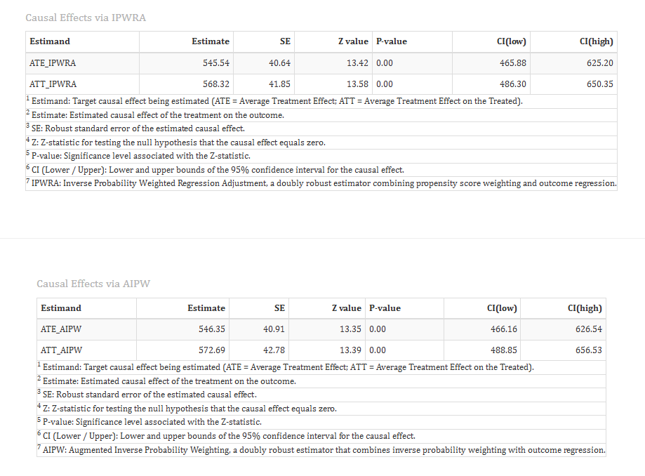
These two methods use all 300 farmers, not just the matched pairs. Instead of discarding unmatched units, they give each unit a weight based on its propensity score, and combine this with a regression of the outcome on the covariates.
- IPWRA - Inverse Probability Weighted Regression Adjustment.
- AIPW - Augmented Inverse Probability Weighting.
Both are called doubly robust: the estimate stays reliable if either the propensity score model or the outcome model is correct. They report both the ATT and the ATE, with standard errors from 500 bootstrap resamples.
Interpretation of Figure 14
IPWRA estimates the ATT at 568.32 kg/ha (95% CI 486.30 to 650.35), and AIPW at 572.69 kg/ha (95% CI 488.85 to 656.53). Both are almost identical to the matched estimate of 567.48 kg/ha.
The ATE is slightly lower: 545.54 kg/ha by IPWRA and 546.35 kg/ha by AIPW. This suggests that organic farming would raise yield a little less for the average farmer than for the farmers who actually chose to adopt.
Four different approaches give effects between 567 and 574 kg/ha for the adopters. This agreement makes the conclusion robust.
PSM balances only the covariates you include. If an important confounder was not measured, for example the farmer’s motivation or soil quality, it cannot be balanced, and the estimate may still be biased.
PSM results can be described as causal only when all important confounders are included as covariates. Always explain in your report why the chosen covariates are sufficient.
The raw difference in average yield between all adopters and all non-adopters was 569.64 kg/ha, very close to the matched estimate. Matching did not change the answer much here, but it proved that the difference is not explained by extension contact, credit access, farm size and the other covariates. In many datasets, the raw and matched differences are very different, and only the matched estimate can be trusted.
10 Plots and Graphs
The Plots & Graphs tab contains five plots. Select a plot using the row of icon buttons; the first plot opens automatically. Click Customize Plot to change the title, labels, fonts, sizes and colours (Figure 15).
Every plot can be downloaded in PNG, JPEG, TIFF, PDF or SVG format, at a size and resolution you choose.
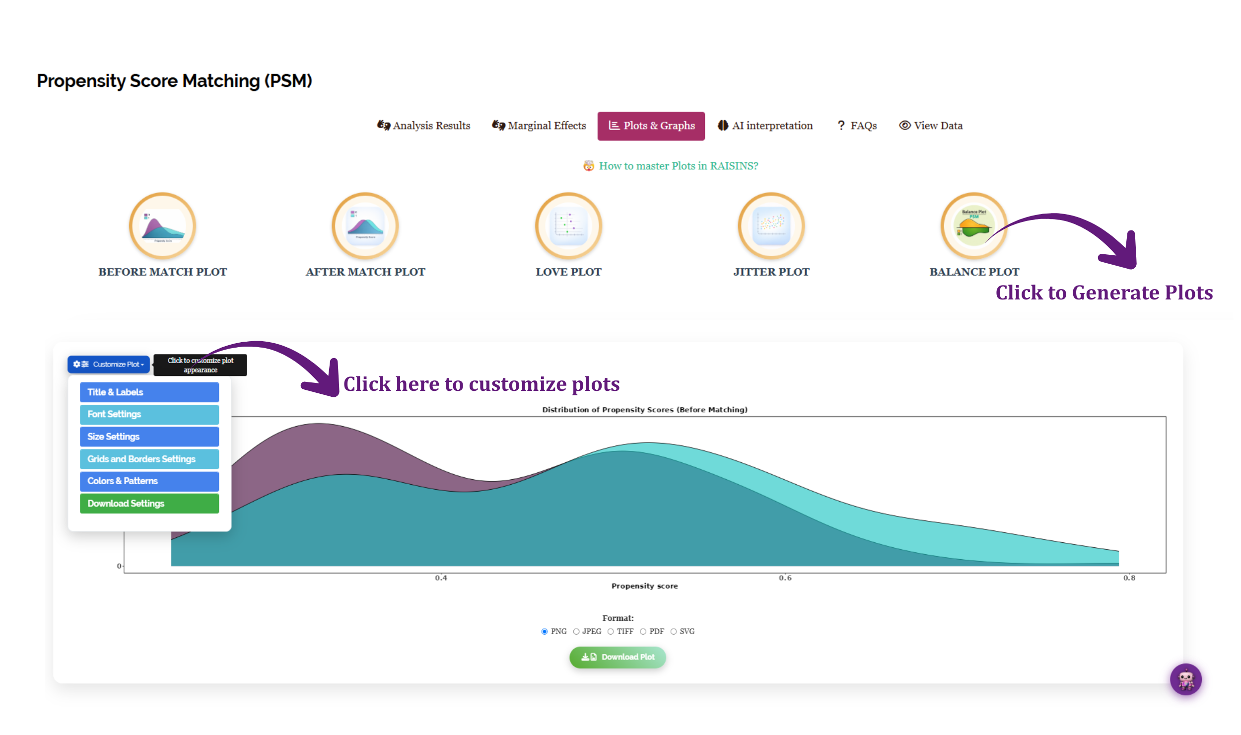
Hover over any thumbnail below to see what it displays.
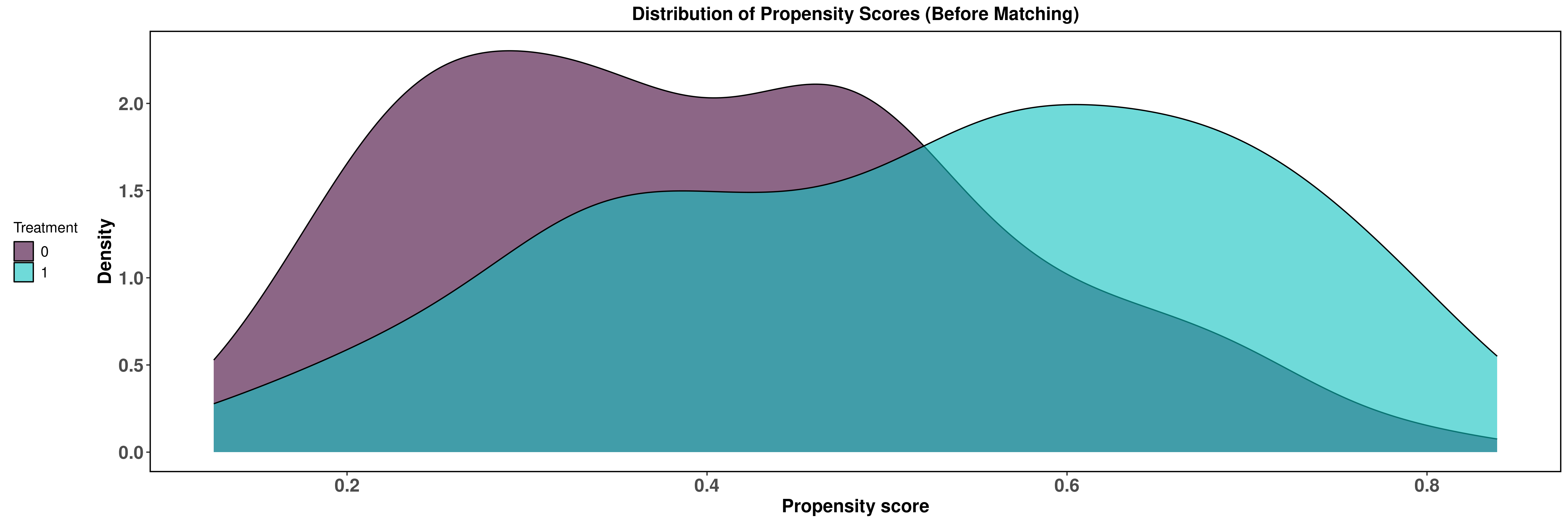
Before Match Plot. The distribution of propensity scores for treated and control units in the full sample. Little overlap means few good matches are available.
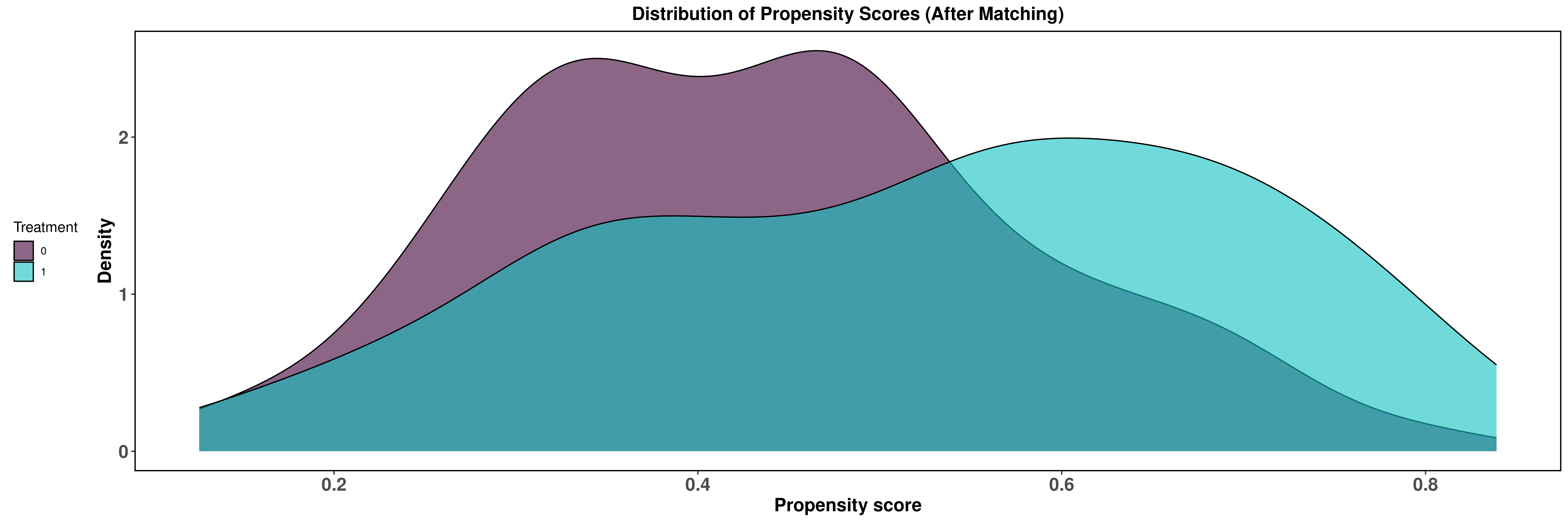
After Match Plot. The same distributions in the matched sample. After good matching, the two curves lie almost on top of each other.
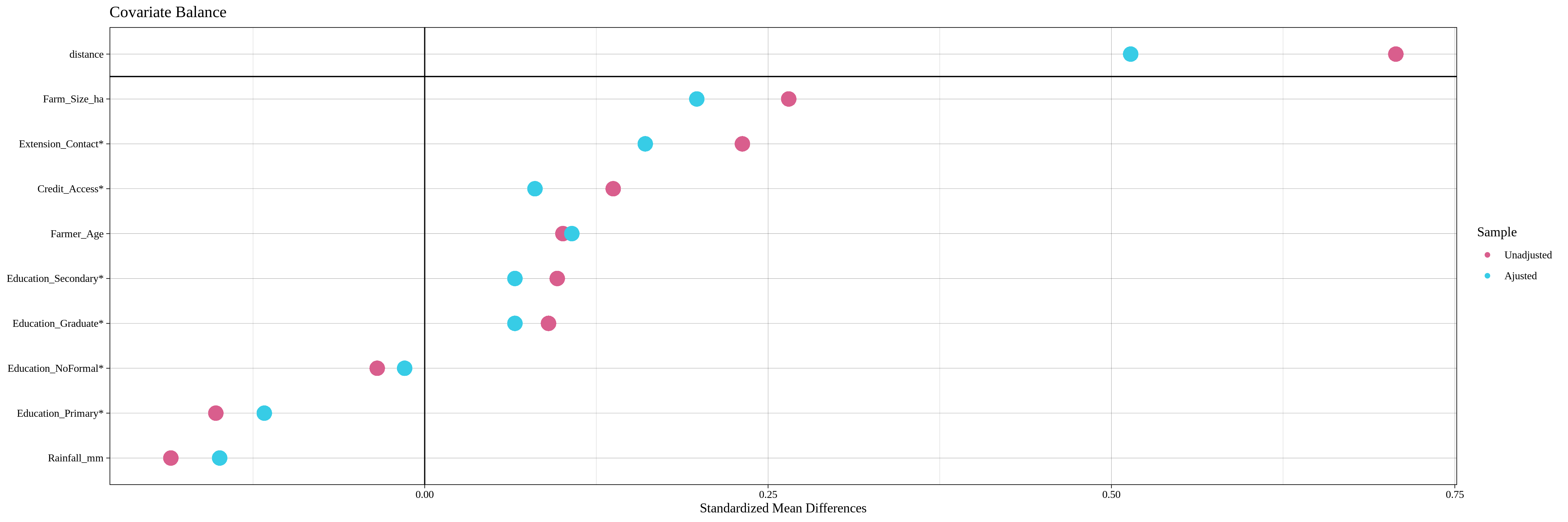
Love Plot. The SMD of every covariate before and after matching, in one chart. Points that move close to zero after matching show covariates that became balanced.
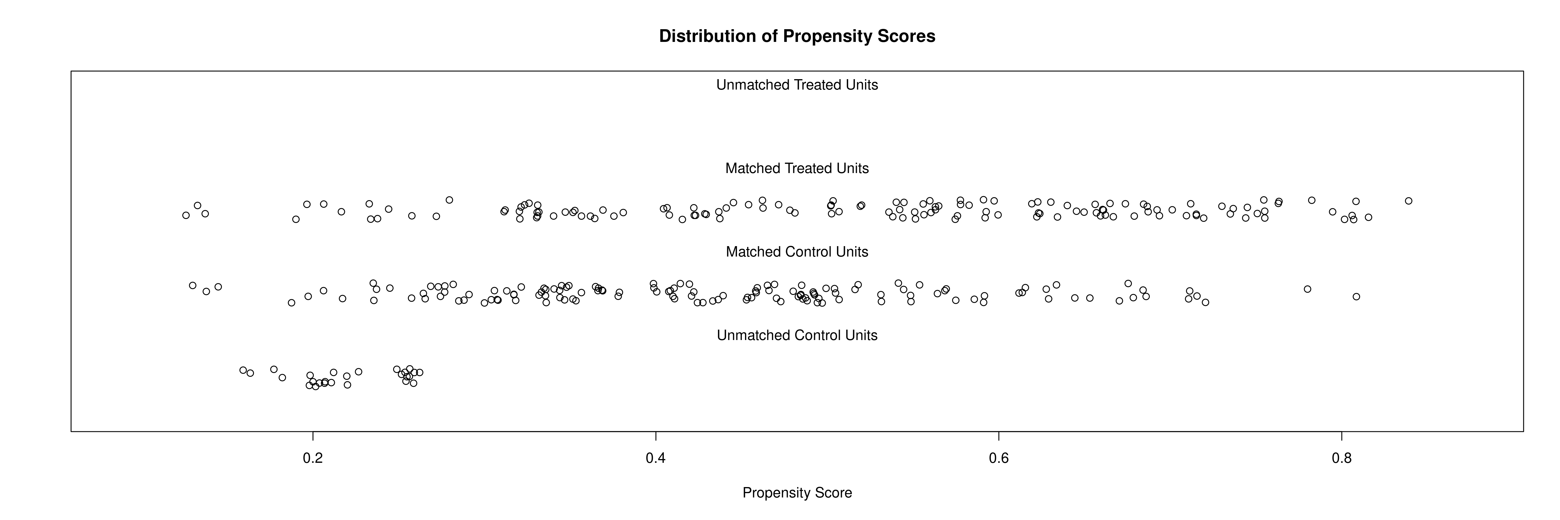
Jitter Plot. Each unit’s propensity score, grouped into matched and unmatched treated and control units. It shows which units were dropped and why.
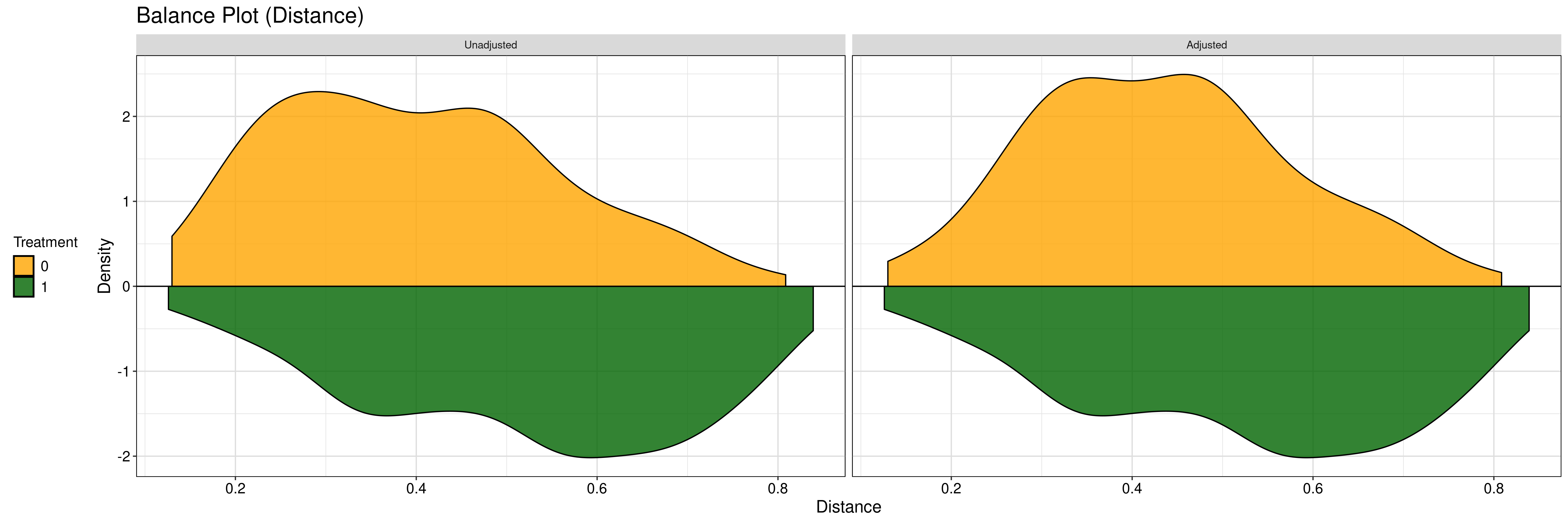
Balance Plot. The propensity score distributions of the two groups before and after matching, side by side.
The Love Plot is the plot most often included in publications, because it summarises the balance of every covariate in one figure.
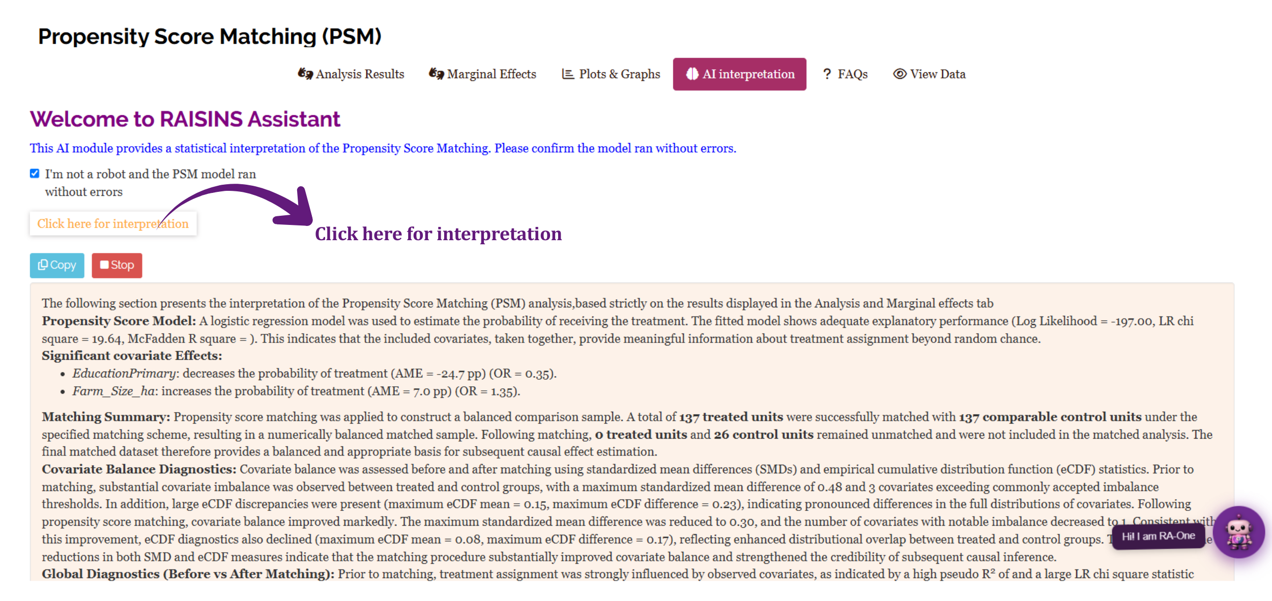
11 Interpretation
The AI interpretation sub-tab provides a written summary of your results in plain language (Figure 21). It describes the propensity score model, the matching, the balance achieved and the treatment effect, and it can be adapted for the methods and results sections of a report.
The text appears with a short typing animation. A Stop button displays the full summary immediately, and a Copy button copies the text to your clipboard.
12 RA-One Chat Assistant
RA-One is the built-in chat assistant. You can open it from its navigation tab or from the floating chat bubble.
Ask questions in plain language, and RA-One answers using your own analysis results. It does not give generic advice, and it does not invent values. If a value is not available, it says so. All replies are in plain English, with no code.
RA-One has access to the complete set of results produced by the app:
- The propensity score model, including odds ratios and marginal effects.
- The matching summary.
- The balance tables and diagnostics before and after matching.
- The treatment effects: the ATT, the t-tests, IPWRA and AIPW.
You can ask it, for example, “interpret my results”, “is my data balanced after matching?”, “what does the caliper do?” or “how should I report this in my paper?”.
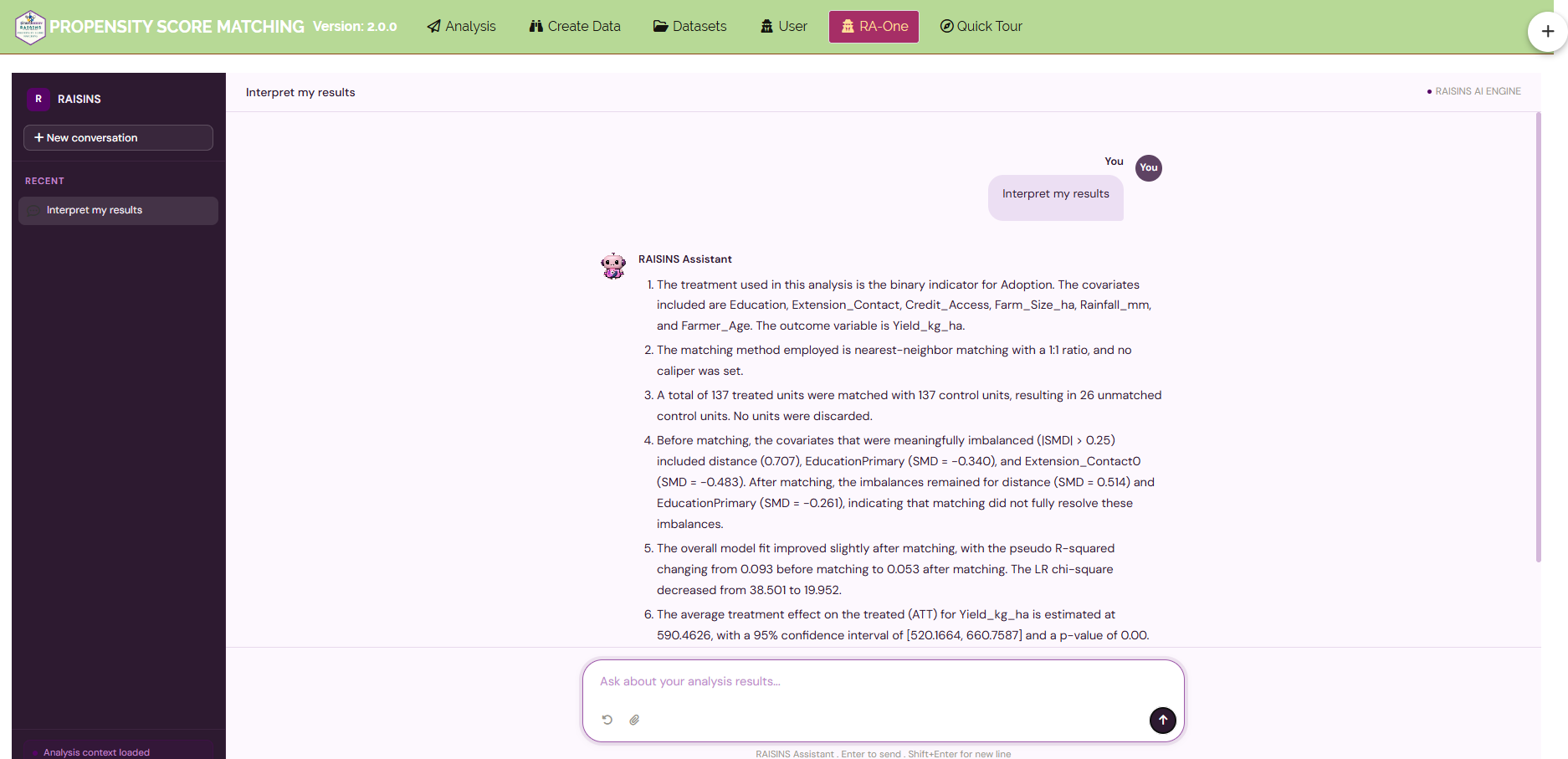
RA-One can also prepare data (Section 6.4) and draw any of the five plots directly in the chat. For example, ask “show the Love plot”. Each plot in the chat has a Plot Settings panel for changing its appearance and a one-click download.
In a single conversation, RA-One can interpret your results, build a data template and create customizable plots. Much of a routine PSM session can be completed without leaving the chat.
13 Downloadable Reports
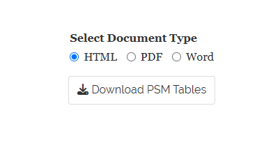
Two reports can be downloaded, each in HTML, PDF or Word format (Figure 23):
- Download PSM Tables, on the Analysis Results sub-tab: the propensity score model, balance tables, diagnostics and matching summary.
- Download PSM Marginal Effects Tables, on the Marginal Effects sub-tab: the ATT, the t-tests, IPWRA and AIPW.
Choose the document type, then click the download button.
14 FAQs
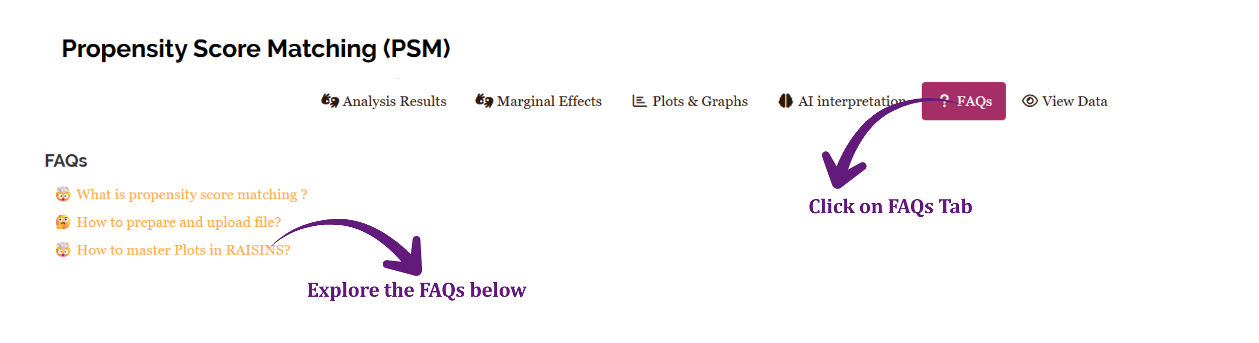
The FAQs tab answers common questions about the module, such as how to prepare and upload a file and how to use the plots.
If you are unsure how a feature works, start here.
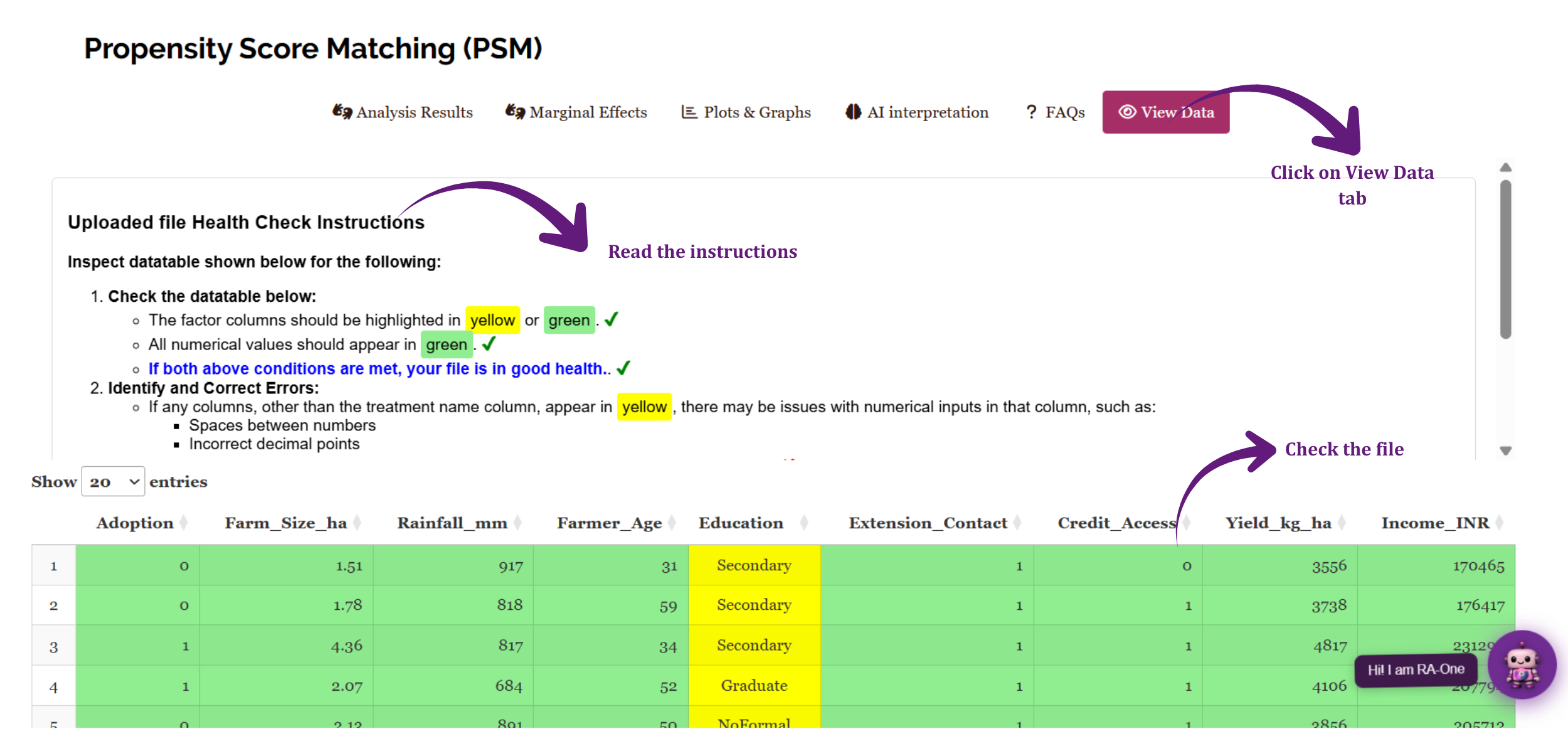
15 View Data
The View Data tab helps you confirm that your dataset is suitable for analysis.
When you upload a file, RAISINS runs an automated Health Check and highlights any column that contains blank cells, text in a numeric column, or other formatting problems.
Resolve any issues reported here before clicking Run Analysis!, so that your results are based on clean and correctly formatted data.
16 Summary
Propensity Score Matching answers one question: once the treated and untreated groups have been made comparable, how much does the treatment change the outcome?
The propensity score model, the matching summary, the balance tables and the diagnostics all exist to make sure that this comparison is fair. The treatment effect tables then give the answer, and the agreement between several estimators shows how robust it is. RAISINS performs all of these calculations automatically, so you can concentrate on interpreting what the results mean for your research.
If you need help at any stage, RA-One is available at all times. You can also write to us at [email protected].
A Results paragraph for the example might read:
Propensity scores for adopting organic farming were estimated by logistic regression on farm size, rainfall, farmer age, education, extension contact and credit access. Adopters were matched 1:1 to non-adopters by nearest-neighbour matching without replacement, with a caliper of 0.2 standard deviations of the propensity score, giving 100 matched pairs. Matching reduced the mean absolute standardised mean difference from 0.30 to 0.05, and all covariates except extension contact (SMD = 0.15) had absolute SMDs below 0.10. Among matched adopters, organic farming increased yield by 567.48 kg/ha (95% CI 471.03 to 663.93, p < 0.001). Doubly robust estimates were consistent (IPWRA ATT = 568.32 kg/ha; AIPW ATT = 572.69 kg/ha).
Always report the matching method, the caliper, the number of matched units, the balance before and after matching, and the treatment effect with its confidence interval.
17 Appendix: A Short History of Propensity Score Matching
The idea of comparing “like with like” is old, but the modern method began in 1983, when Paul Rosenbaum and Donald Rubin showed that the single propensity score is enough to balance all the observed covariates between two groups. Instead of matching on many characteristics at once, researchers could match on one number.
The method became widely known after 1986, when Robert LaLonde compared the results of a randomised job-training experiment with the results of standard non-experimental methods, and found that the non-experimental methods often gave the wrong answer. In 1999, Rajeev Dehejia and Sadek Wahba showed that propensity score matching recovered an answer close to the experimental one on the same data. The Lalonde dataset in the RAISINS Datasets tab comes from this line of work.
Since then, PSM has been used widely in medicine, economics, education and agriculture, wherever randomised experiments are impossible or unethical. Doubly robust methods such as AIPW, developed by James Robins and colleagues in the 1990s, added a further safeguard by combining the propensity score with a model of the outcome.