Two Sample t-test
Two Sample t-test is commonly used to compare the means of two groups… Read more …
Two Sample t-test is one of the most widely used statistical methods for comparing the means of two independent groups to determine whether they differ significantly. It is widely applied in agricultural, biological, medical, and social science research for evaluating treatment effects and group differences. In RAISINS, you can perform a Two Sample t-test effortlessly without writing a single line of code. This tutorial will guide you through the complete analysis, including summary statistics, variance homogeneity (F-test), Two Sample t-test results (Student’s or Welch’s), normality assessment, publication-ready tables and plots, and AI-assisted interpretation for accurate and meaningful conclusions.
ABSTRACT
The Two-Sample T-Test is one of the most widely used statistical procedures for comparing the means of two independent groups, enabling researchers to determine whether a statistically significant difference exists between them. By testing the null hypothesis that both group means are equal, the Two-Sample T-Test provides a rigorous framework for inference in biological, agricultural, clinical, and social science research. In RAISINS, this test can be performed effortlessly without writing a single line of code, making it accessible to researchers and students alike. This tutorial will guide you through the complete workflow — from data preparation and upload to result interpretation, normality assessment, and visualization — using RAISINS. You will obtain publication-ready tables and plots, formal normality testing (Shapiro–Wilk, Anderson–Darling, Lilliefors, and Jarque–Bera) with a Q–Q plot, and AI-assisted interpretation through the built-in RA-One assistant.
Hover or click each point to see more information.
Introduction Two-Sample T-Test
-
The two-sample t-test, also known as the independent samples t-test, was formalized in the early 20th century through the foundational work of William Sealy Gosset, an English statistician who published under the pseudonym “Student” while working at the Guinness Brewery in Dublin. In 1908, Gosset developed the t-distribution to address the problem of making reliable statistical inferences from small samples a practical necessity in quality control and brewing experiments where large datasets were not feasible. His work laid the groundwork for what later became the Student’s t-test, subsequently extended and formalized by Ronald A. Fisher. The two-sample form of the test allows researchers to compare means from two independent groups, becoming a cornerstone method in agricultural trials, medical research, and the life sciences for over a century.
1 Data Analysis
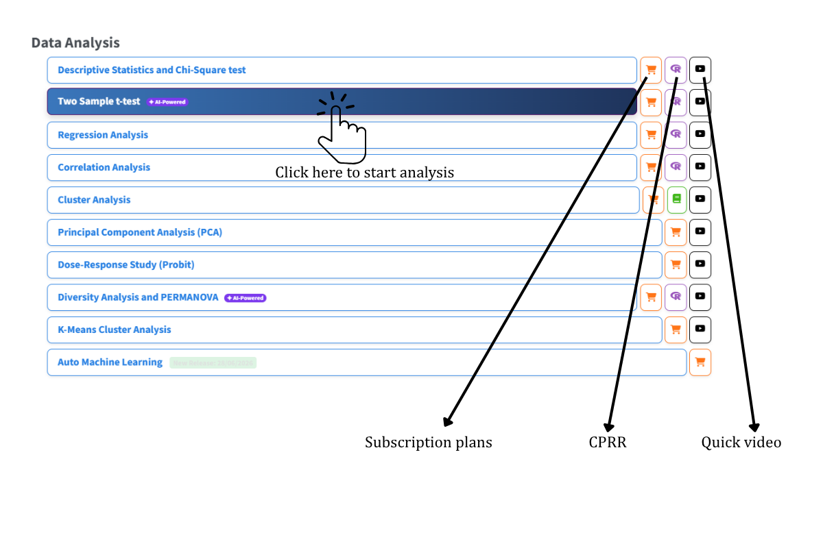
To get started, visit RAISINS www.raisins.live home page and go to Data Analysis. In this tutorial, we focus on the Two-Sample T-Test, as shown in Figure 1.
2 Preview mode and Quick Tour
Before subscribing, you can explore the entire app using Preview mode, accessible from the Welcome page. Preview mode loads built-in datasets so you can try every feature — analysis, normality tests, plots, and the RA-One assistant — without uploading your own data. First-time users are also offered a Quick Tour, an interactive, step-by-step guided walkthrough that highlights each control and explains what it does. You can retake the tour at any time from the Quick Tour tab.
3 Two-Sample T-Test
A Two-Sample T-Test is a parametric statistical procedure used to determine whether the means of two independent groups differ significantly from each other. It is appropriate when you have one continuous response variable measured under two distinct, non-overlapping groups for example, comparing the yield of two crop varieties, the blood pressure of a treatment group versus a control, or the germination rate under two irrigation regimes. The test assumes that the observations within each group are independent, that the response variable is approximately normally distributed within each group, and that the variances of the two groups are either equal (Student’s t-test) or unequal (Welch’s t-test). When the normality assumption is violated, a non-parametric alternative such as the Mann–Whitney U test is more appropriate. RAISINS supports both unpaired (independent) and paired two-sample t-tests, and automatically runs both the Student’s t-test and Welch’s correction, alongside formal normality testing, so you can make an informed choice based on your data.
4 A working example
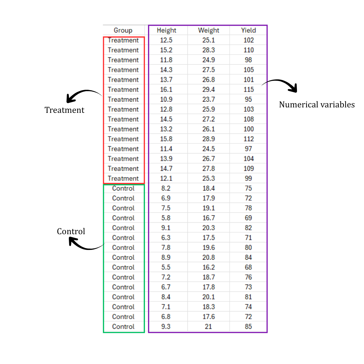
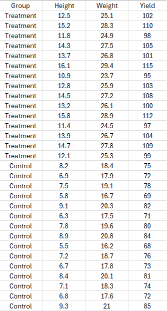
This working example presents data for a two-sample t-test comparing two independent groups: Treatment and Control, with 15 observations in each group. For every experimental unit, three response variables — Height, Weight, and Yield — were recorded, illustrating how RAISINS can analyse several variables in a single run. Each variable is compared between the two groups independently, producing its own t-test result. The Treatment group shows comparatively higher values than the Control group across all three variables, indicating a possible effect of the treatment. These data are used to compare the group means for each variable and determine whether the observed differences are statistically significant. The dataset can also be visualized using plots such as beeswarm plots, boxplots, or violin plots to better understand distribution, spread, and variability.
5 How to prepare your data?
Arranging data for uploading in RAISINS is very simple. Prepare your data exactly like the one shown in Figure 2, using a single-sheet Excel file. The first column should contain the group labels (e.g., “Treatment” and “Control”), and all response variables (here Height, Weight, and Yield) should follow in subsequent columns. Make sure no blank rows are left above the header, and all columns have proper names without spaces or special characters. That is it , your file is ready to upload. If you still have doubts, see Figure 3. To prepare your dataset for analysis in RAISINS, you have two options: creating your dataset in MS Excel, or building your dataset directly within the RAISINS app.
6 TWO SAMPLE T -TEST ANALYSE TAB
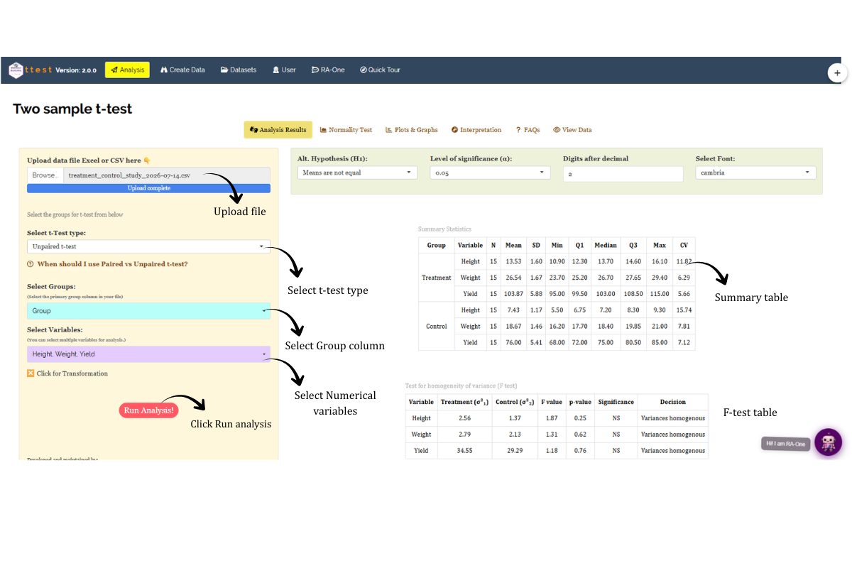
In Figure 4, you can see the detailed view of the Analysis tab for the Two-Sample T-Test, along with explanations of what each option does. This section helps you understand the purpose of every setting, so you can select the most appropriate ones for your data and analysis. Upload the prepared file by clicking Browse in the sidebar of the Analysis tab. When the file is uploaded, options to select the Group column and response Variables will appear. Select the appropriate column under Groups and choose the variables you wish to analyse. You can also choose between a Paired and an Unpaired (independent) t-test depending on your experimental design. Once you click the Run Analysis button, all relevant results and outputs appear instantly across the sub-tabs of the Analysis panel — Analysis Results, Normality Test, Plots & Graphs, Interpretation, FAQs, and View Data. On the Analysis Results panel you can further adjust the alternative hypothesis (two-tailed, or one-tailed with Mean 1 < Mean 2 or Mean 1 > Mean 2), the significance level (α), the number of decimal digits, and the font. For some data, when observed variables are not normally distributed, RAISINS provides a built-in transformation option (Section 7).
7 Transformation
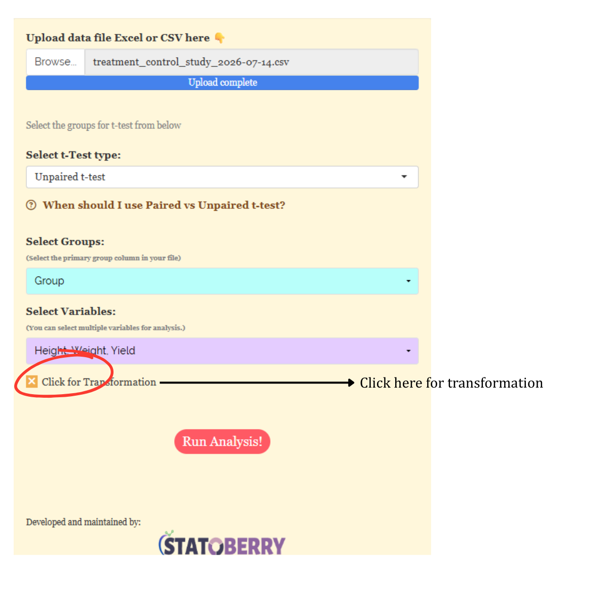
Log, square root, and arcsine transformations are often used in statistical analysis to make data more normal and reduce uneven variation. Researchers can apply these transformations when analysing data in RAISINS as shown in Figure 5.
Logarithmic transformation is a mathematical procedure used to convert a skewed distribution into a more symmetrical one by replacing each data point (x) with its logarithm. This technique is specifically applied to positive, continuous data where the variance is proportional to the mean, a relationship common in phenomena that exhibit multiplicative or exponential growth.
Square root transformation is a statistical method used to stabilize variance and reduce right-skewness by replacing each data point (x) with its square root. It is primarily applied to non-negative, discrete count data such as those following a Poisson distribution, where the variance of the data tends to increase in proportion to the mean. By compressing the upper end of the scale more significantly than the lower end, this transformation brings the data closer to a normal distribution, satisfying the homoscedasticity requirements of many parametric statistical tests.
Arcsine transformation (also known as the angular transformation) is a mathematical technique specifically designed for data expressed as proportions or percentages bounded between 0 and 1. By taking the inverse sine of the square root of the proportion, this transformation stretches the ends of the distribution near 0 and 1, where variance is naturally small. It is primarily used to achieve homoscedasticity in binomial data.
After choosing the appropriate transformation proceed to Section 8 for analysis.
8 Analysis results
Once your dataset is uploaded and you click Run Analysis, the Two-Sample T-Test is performed for every selected variable. The results appear in the Analysis Results sub-tab as three output tables — a Summary Statistics table, a Test for homogeneity of variance (F-test), and the t-test result table — each described below.
Table 1: Summary statistics
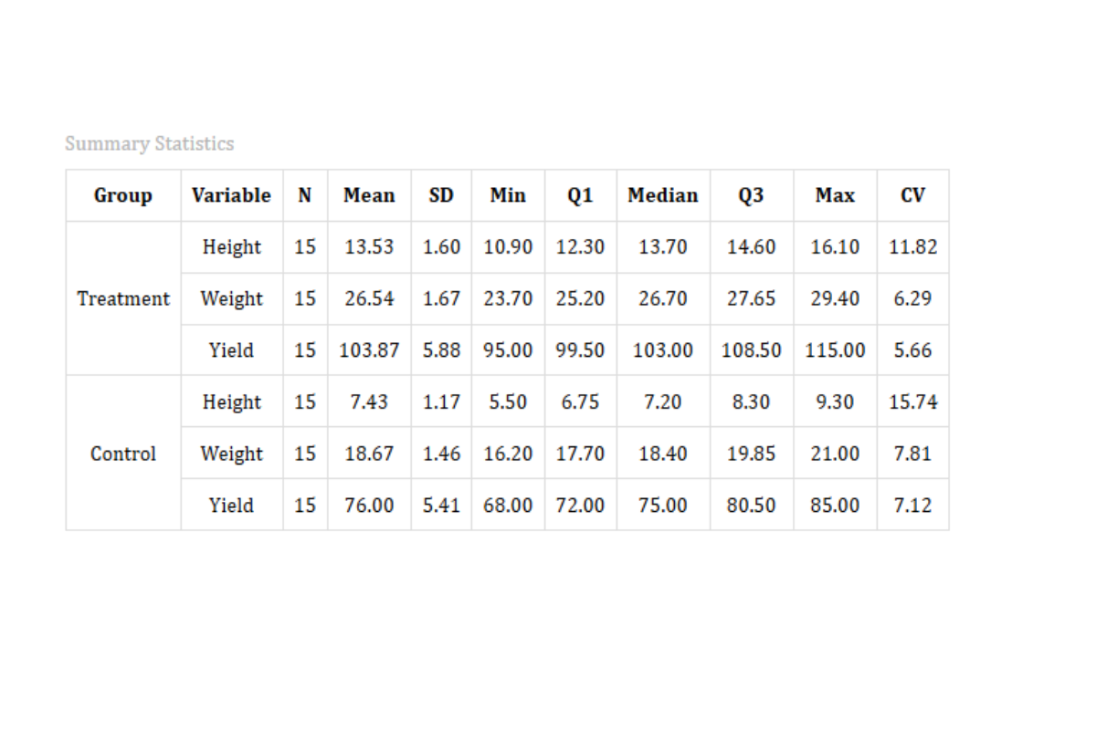
For each group and each selected variable, RAISINS reports the sample size (N), Mean, Standard Deviation (SD), the five-number summary (Minimum, Q1, Median, Q3, Maximum), and the Coefficient of Variation (CV %). In the working example, the Treatment group has a higher mean than the Control group for all three variables (Height 13.53 vs 7.43, Weight 26.54 vs 18.67, Yield 103.87 vs 76.00), while the low CV values (roughly 6–16%) show that variability within each group is modest.
Table 2: Test for homogeneity of variance (F-test)
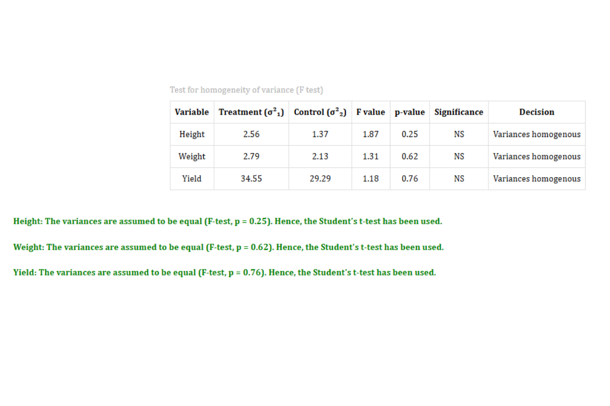
Before running the t-test, RAISINS performs an F-test to check whether the two groups have equal variances. If the F-test p-value is ≥ 0.05 the variances are treated as homogeneous and the pooled Student’s t-test is used; if p < 0.05 the variances differ and Welch’s t-test is applied automatically. A short note beneath the table states the decision for each variable. In the working example the variances are homogeneous for all three variables (Height F = 1.87, p = 0.25; Weight F = 1.31, p = 0.62; Yield F = 1.18, p = 0.76), so the Student’s t-test was used in every case.
Table 3: t-test result
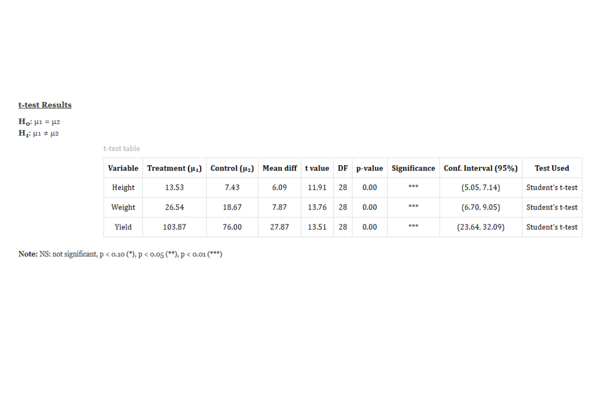
T-Test result table
In a Two-Sample T-Test, the null hypothesis states that the means of the two groups are equal (H₀: μ₁ = μ₂), and the alternative hypothesis states that they differ (H₁: μ₁ ≠ μ₂). The test statistic t is computed by dividing the difference between the two sample means by the standard error of that difference. Under the null hypothesis, this statistic follows a t-distribution with degrees of freedom determined either by the pooled method (when variances are equal) or by Welch’s approximation (when variances are unequal). The computed t-value is compared against a critical t-value at the chosen significance level (α = 0.05 or 0.01). If the absolute computed t-value exceeds the critical value, or equivalently if the p-value is less than α, the null hypothesis is rejected, indicating a statistically significant difference between the two group means.
Significance is indicated using asterisks: a single asterisk ( * ) for the 10% level, two asterisks ( ** ) for the 5% level, and three asterisks ( *** ) for the 1% level, while NS denotes a non-significant result. These markers are shown in the Significance column of the table.
RAISINS automatically performs both the standard Student’s t-test (assuming equal variances) and Welch’s t-test (not assuming equal variances), and presents both results so you can choose based on the outcome of the variance equality test.
8.1 Interpretation from Figure 8
The T-Test results show that the Treatment group differs significantly from the Control group for all three variables. For Height, the Treatment mean (13.53) is much higher than the Control mean (7.43), with a computed t-statistic of 11.91 on 28 degrees of freedom and a p-value below 0.001. For Weight, the Treatment mean (26.54) exceeds the Control mean (18.67), with t = 13.76, df = 28, and p < 0.001. For Yield, the Treatment mean (103.87) is well above the Control mean (76.00), with t = 13.51, df = 28, and p < 0.001. In every case the F-test found the variances homogeneous (p > 0.05), so the pooled Student’s t-test was applied, and all three p-values are significant at the 1% level (marked with three asterisks, ***). This provides strong evidence to reject the null hypothesis and conclude that the Treatment and Control groups differ significantly in Height, Weight, and Yield. In practical terms, these differences are highly unlikely to have arisen by chance, indicating a meaningful treatment effect on all three characters. For variables where the p-value exceeds 0.05, the null hypothesis cannot be rejected and the two group means are considered statistically similar.
A quick glossary of the result columns
Overview of T-Test Results and Interpretation
- Groups and Response Variables
Groups: The two independent categories (e.g., Treatment and Control) whose means are being compared.
Response Variable: The dependent variable or specific measurement (e.g., Height, Weight, Yield) recorded to evaluate the performance of the two groups. RAISINS can test several response variables at once, reporting a separate t-test for each.
- Test Statistics
t-statistic: The computed test value that quantifies the standardized difference between the two group means relative to the variability in the data.
Degrees of Freedom (df): Determines the shape of the t-distribution used to compute the p-value. In the pooled case, df = n₁ + n₂ − 2; in Welch’s approximation, df is adjusted based on the sample variances.
p-value: The probability that the observed difference in means (or a larger difference) would arise by chance if the null hypothesis were true. A p-value below 0.05 is conventionally considered statistically significant.
- Group Descriptive Statistics
For each group, RAISINS reports the sample size (N), Mean, Standard Deviation (SD), the five-number summary (Minimum, Q1, Median, Q3, Maximum), and the Coefficient of Variation (CV %), giving a complete picture of the central tendency, spread, and relative variability within each group.
- Mean Difference, Confidence Interval, and Test Used
Mean difference: The difference between the two group means. The t-test table also reports the confidence interval for this difference (at the selected confidence level) and a Test Used column indicating whether Student’s or Welch’s t-test was applied, based on the F-test for equality of variances.
9 Normality test and plots
Why test for normality?
-
The Two-Sample T-Test is a parametric test that assumes the response variable is approximately normally distributed within each group. When this assumption is violated particularly in small samples the t-test may produce unreliable p-values. Normality testing helps you decide whether the parametric t-test is appropriate, or whether a non-parametric alternative such as the Mann–Whitney U test should be used instead. For large samples (n > 30 per group), the Central Limit Theorem generally ensures that the sampling distribution of the mean is approximately normal even if the raw data are not, reducing the need for formal normality testing.
Under the Normality Test sub-tab, RAISINS reports four formal normality tests for each selected variable — the Shapiro–Wilk test, the Anderson–Darling test, the Lilliefors (Kolmogorov–Smirnov) test, and the Jarque–Bera test — together with an Overall decision that summarises them. Use the variable selector to switch between variables. The Shapiro–Wilk test is the most widely used, as it is regarded as one of the most powerful tests for small to moderate sample sizes; its statistic W ranges from 0 to 1, where values close to 1 indicate normality. A statistically significant result (p < 0.05) indicates a departure from normality. Alongside the table, a pair of fully customisable Q–Q plots — one for the Treatment group and one for the Control group — is shown so you can visually assess normality within each group (see Figure 9).
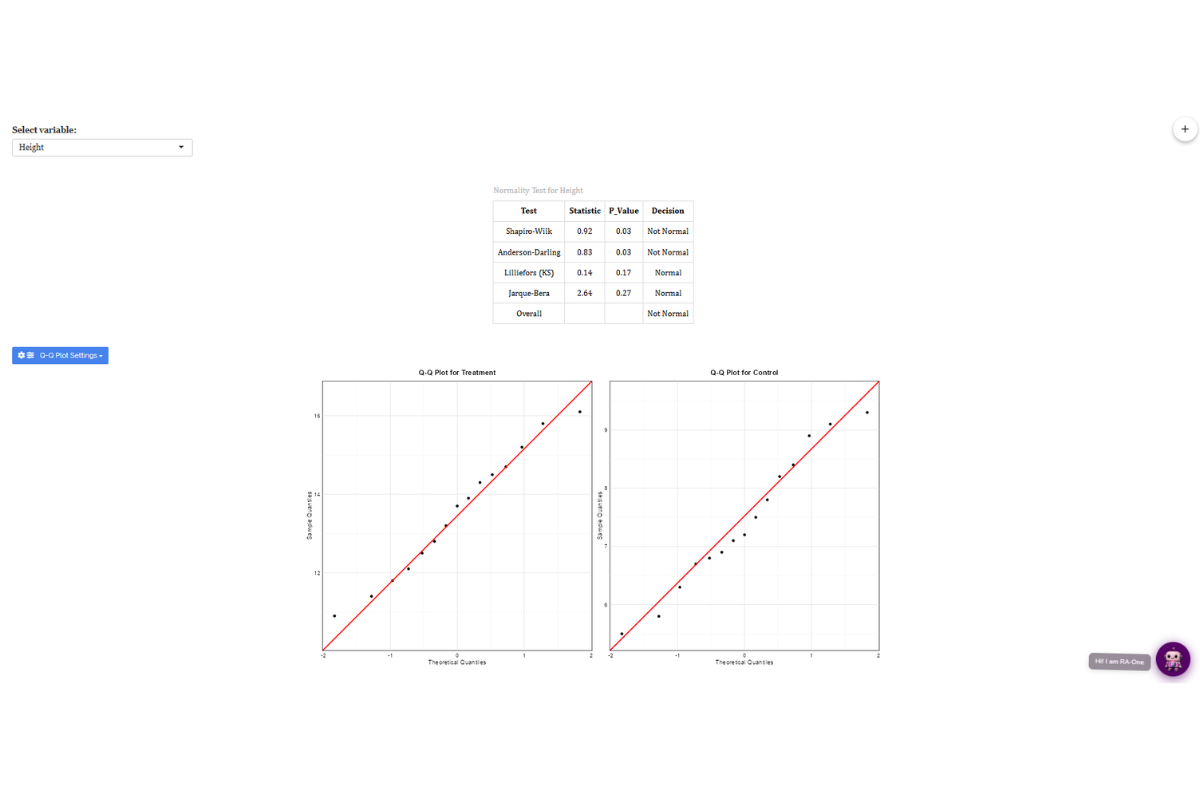
Normality test details
Shapiro–Wilk Test
The Shapiro–Wilk test evaluates whether a sample comes from a normally distributed population. It computes a test statistic W by comparing the observed data quantiles with the expected quantiles of a normal distribution. The null hypothesis of the test is that the data are normally distributed; a significant p-value (p < 0.05) leads to rejection of this null hypothesis. The Shapiro–Wilk test is most reliable for sample sizes between 3 and 50 and is considered more powerful than alternative tests such as Kolmogorov–Smirnov for small samples.
\[W = \frac{\left(\sum_{i=1}^{n} a_i x_{(i)}\right)^2}{\sum_{i=1}^{n}(x_i - \bar{x})^2}\]
where \(x_{(i)}\) are the order statistics (sorted values) and \(a_i\) are constants derived from the expected values of normal order statistics.
Anderson–Darling Test
A goodness-of-fit test that gives extra weight to the tails of the distribution, making it especially sensitive to departures from normality in the extremes.
Lilliefors (Kolmogorov–Smirnov) Test
An adaptation of the Kolmogorov–Smirnov test for the case where the mean and variance are estimated from the data. It compares the empirical cumulative distribution of the sample with that of a normal distribution.
Jarque–Bera Test
A test based on the sample skewness and kurtosis that assesses whether they match those expected under a normal distribution.
Overall decision
RAISINS combines the four tests into a single Overall verdict for the variable. Because this table is computed on the variable as a whole (both groups combined), a clear difference between the two group means can make the pooled data look non-normal even when each group is individually normal — which is why the per-group Q–Q plots are the more reliable visual check.
Which test to use based on normality?
The choice of the appropriate test depends on whether the normality assumption is satisfied. When the data are approximately normal within each group, the Two-Sample T-Test (Student’s or Welch’s, depending on variance equality) is appropriate. If a variable is genuinely non-normal within groups, a logarithmic or square root transformation (Section 7) should first be attempted to normalise the data; if it remains non-normal after transformation, the Mann–Whitney U test (a non-parametric alternative) is recommended.
In the working example, the pooled normality table flags a departure from normality for each variable — for Height, Shapiro–Wilk (W = 0.92, p = 0.03) and Anderson–Darling (p = 0.03) indicate non-normality, while Lilliefors (p = 0.17) and Jarque–Bera (p = 0.27) indicate normality, giving an Overall decision of Not Normal. This result largely reflects the fact that the table combines both groups, whose clearly different means produce a bimodal distribution. The per-group Q–Q plots show that the Treatment and Control groups each fall close to the reference line, so the within-group normality actually assumed by the t-test is reasonable. Given this, together with the robustness of the t-test in agricultural contexts, the Student’s t-test results for Height, Weight, and Yield remain valid.
10 Plots and Graphs
RAISINS is designed for a smooth and hassle-free experience. Once you click the Run Analysis button, all relevant results and outputs appear instantly leaving no room for confusion. We have ensured that every possible plot related to the Two-Sample T-Test is readily available. Simply click on the Plot and Graph tab to view them (see Figure 10). Each plot comes with a gear icon at the top-left corner, allowing you to customise its appearance. You can also download these plots in high-quality PNG format (300 dpi), JPEG, TIFF, PDF, and SVG for use in reports or presentations.
10.1 Customizing plots
RAISINS provides users with various customisation features for plots to enhance the visualisation according to the requirements of the user. Click on Figure 10 to get a clear idea of the customising features.
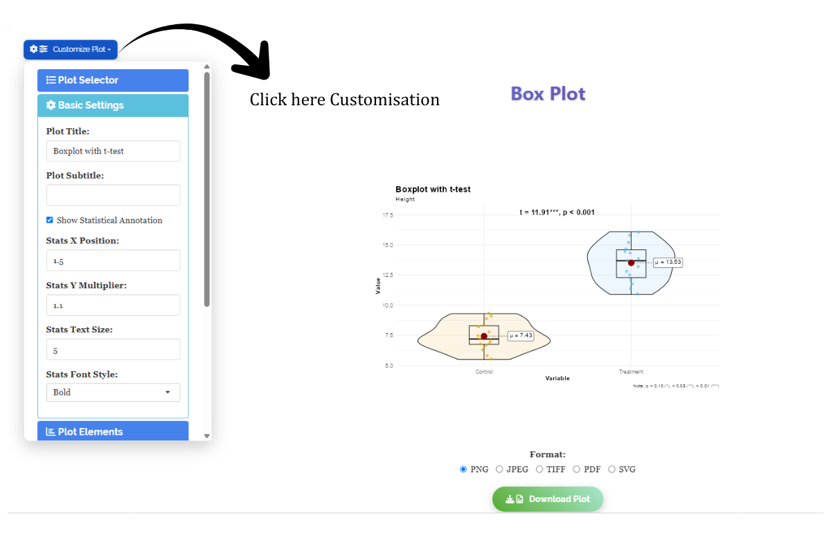
From Figure 11 to Figure 15, you can see the different types of plots available in RAISINS for the Two-Sample T-Test. Each plot is drawn for the selected variable and annotates the two groups directly with the t-statistic and significance stars (e.g. t = 11.91***, p < 0.001 for Height) and the group mean (μ) labels, making it easy to read the distribution, spread, and comparison of the two groups at a glance. Each one is accompanied by a clear, insightful description.
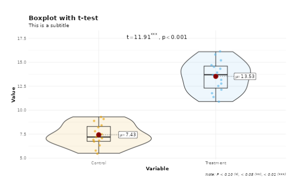
A Box plot with a t-test visually compares the distribution and median of two groups while the t-test statistically checks whether their mean difference is significant. The box plot displays spread, quartiles, and outliers, helping interpret group variation along with the t-test result.
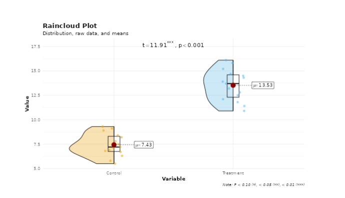
A Raincloud plot combines a violin plot, box plot, and scatter plot in a single visualization. It shows data distribution, median, spread, and individual observations together, making it useful for comparing groups and understanding variability clearly.
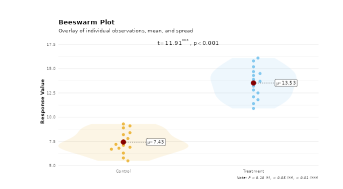
A Beeswarm plot in a two-sample t-test shows individual data points of two groups without overlap. It helps visualize group differences, spread, and outliers before comparing means statistically.
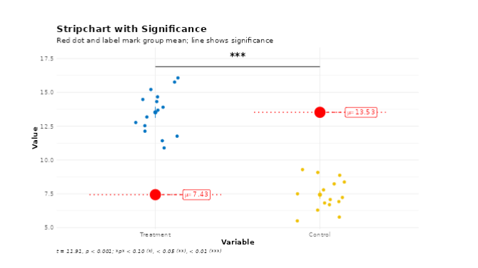
A Strip chart with significance displays individual data points of different groups along with statistical significance indicators (such as p-values or asterisks). It helps visualize group distribution and identify whether differences between groups are statistically significant.
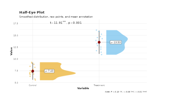
A Half-eye plot combines a density plot with interval estimates and individual data summaries. It shows the distribution, central tendency, and uncertainty of data in a compact form, making it useful for comparing groups and statistical results visually.
11 AI interpretation
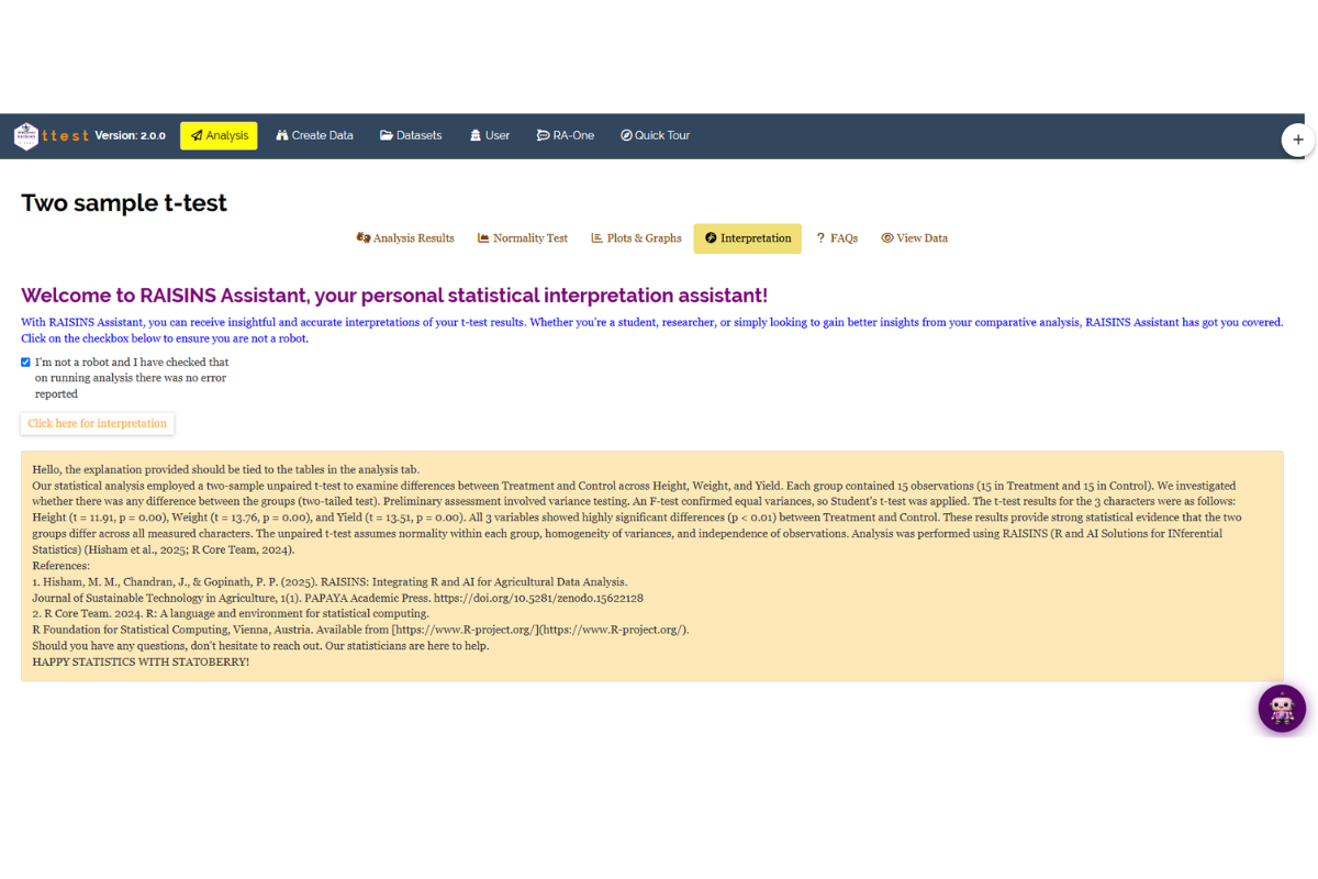
RAISINS is equipped with RA-One, an AI-powered RAISINS Assistant designed to help users comprehend the outcomes of the Two-Sample T-Test and associated analyses. Through a simple conversation, RA-One provides clear and concise summaries of results, identifies whether statistically significant differences exist between the two groups, explains the choice between Student’s and Welch’s t-test, and offers informed suggestions for potential next steps or further analyses. A ready-made AI interpretation of your results is available in the Interpretation sub-tab of the Analysis panel (as shown in Figure 16), and you can also chat with the assistant directly from the dedicated RA-One tab or the floating chat bubble available throughout the app.
12 Preparing your data
“Your analysis is only as good as your data! Feed RAISINS high-quality data, and it will deliver powerful insights feed it messy data, and the results won’t be trustworthy.”
Create your dataset in MS Excel
Build your dataset directly within the RAISINS app
13 Preparing data in MS Excel
Open a new blank sheet in MS Excel with only one sheet included, and avoid adding any unnecessary content. The dataset should follow a column-based format, where the first column represents the group label the two independent groups being compared (e.g., “Treatment” and “Control”). All response variables under study (e.g., Height, Weight, Yield) should be arranged in separate columns, and each group label should be repeated according to the number of observations in that group (15 per group in this example). The file can be saved in CSV, XLS, or XLSX format, but CSV is recommended as it is lighter and enables faster loading. Ensure that there are no unwanted spaces in column names or group labels. For reference, see the structure shown in Figure 17. As illustrated in Figure 2, group labels must appear repeatedly according to the number of replicates per group, and the data can also be arranged as shown in ?@fig-kk.
Dataset Creation Rules
1. Column Naming Convention - No spaces allowed in column names.
- Use underscores (_) or full stops (.) for separation. - Avoid symbols and special characters like %, # etc. 2. Data Arrangement - Start data arrangement towards the upper-left corner.
- Ensure the row above the data is not blank. 3. Cell Management - Avoid typing or deleting in cells without data.
- If needed, select affected cells, right-click, and select Clear Contents. 4. Column Relevance - Name all columns meaningfully.
- Exclude unnecessary columns not required for analysis. 5. Group Labels - The group column must contain exactly two distinct labels corresponding to the two groups being compared.
- Ensure consistent spelling and capitalisation of group labels throughout the column.
How to Save as CSV in MS Excel
1. Open Your Workbook
- Ensure your data is arranged properly with only one sheet.Click ‘File’ Menu
- Go to the top-left corner and click on File.
Choose ‘Save As’ or ‘Save a Copy’
- Select the location where you want to save your file.
Set File Type to CSV
- In the ‘Save as type’ dropdown menu, choose CSV (Comma delimited) (*.csv).
Name Your File
- Enter a relevant file name without spaces (use underscores if needed).
Click ‘Save’
- Click Save to export the file.
💡 Tip: Before saving, double-check that your data is on the first sheet and follows the required format (e.g., no empty rows above the data, meaningful column names, exactly two unique group labels in the group column).
14 Creating dataset in RAISINS
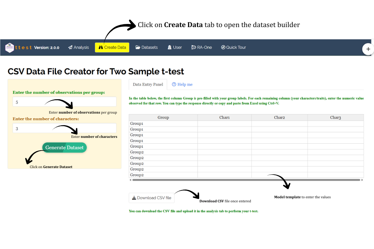
If you are unsure about the correct format for creating a dataset, do not worry RAISINS offers an option to create data directly within the app using the prescribed template. Here is how:
Navigate to the Create Data Tab
Select the number of Groups (set to 2 for a Two-Sample T-Test)
Select number of Replications per group
Select number of Characters (response variables)
Click on the Create button
The model layout will appear as shown in Figure 18. You may enter the observations manually into the CSV file once downloaded, or paste the observations straight into the file provided. Once you have entered the observations in the layout, download the CSV file and upload it in Analysis.
15 Model datasets
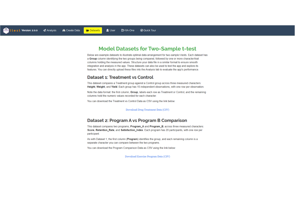
To test the app or better understand the data arrangement, we provide model datasets within the app. You can download them from the Dataset tab.
16 FAQ’s
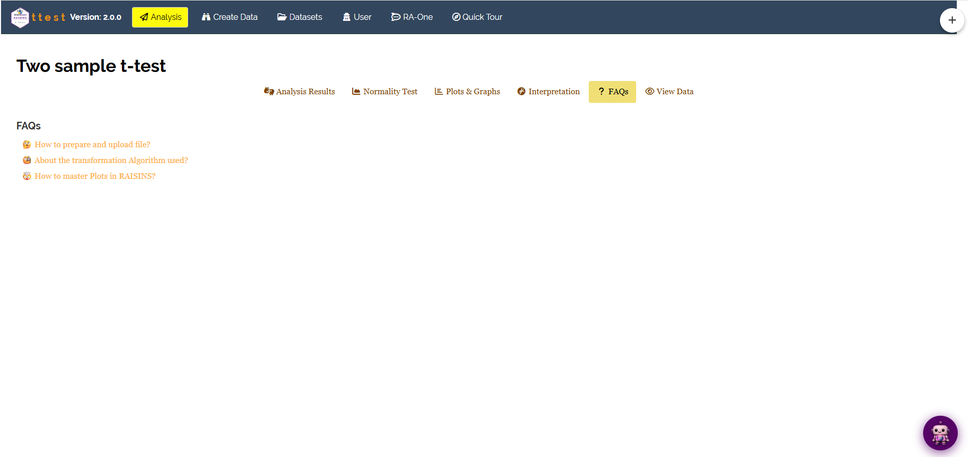
The app includes a dedicated FAQs section to help clarify common doubts and guide users through various features. This section provides detailed answers to frequently asked questions, offering additional information and helpful tips to ensure a smooth user experience. If you are ever unsure about how something works for example, which test to use when data are not normally distributed, or how to choose between Student’s and Welch’s t-test, the FAQs is a great place to start.
17 View data
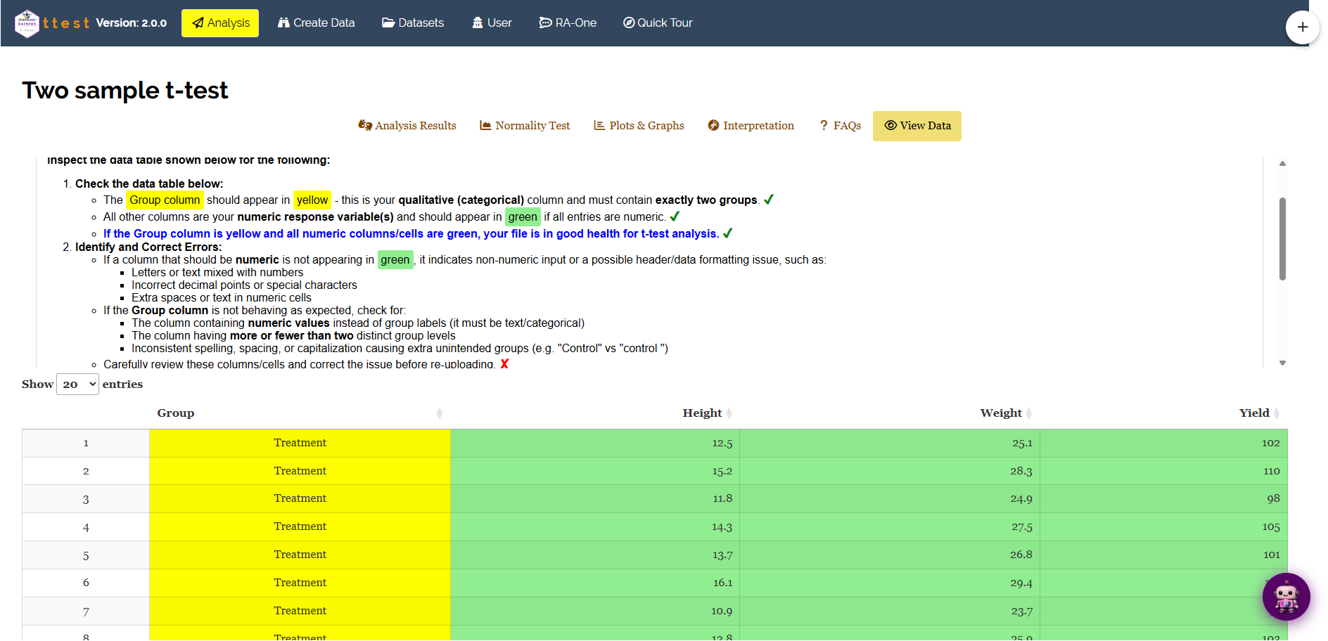
View Data serves as the primary diagnostic tool for ensuring data integrity before analysis. Upon uploading your dataset, the system performs an automated Health Check to validate column types and formatting. For the Two-Sample T-Test, this step is especially important to confirm that the group column contains exactly two unique labels, that all response variable columns contain numeric values, and that there are no missing or incorrectly formatted entries that could distort the test results.