ARIMA Modelling
ARIMA models a series measured over time and forecasts its future values from its own past. This tutorial explains the p, d and q orders, seasonality, the training/test split, the Box-Cox transformation, and how to run the whole analysis in RAISINS… Read more …
Time series analysis is used to study measurements collected over time and to understand how their past behaviour can help predict future values. ARIMA (AutoRegressive Integrated Moving Average) is one of the most widely used methods for modelling and forecasting a single time series. It uses the information contained in previous observations to capture patterns such as trends and seasonality to generate forecasts. This tutorial introduces the basic concepts of ARIMA modelling and demonstrates their application using RAISINS. The platform provides an integrated workflow for selecting model orders, fitting the model, checking its adequacy, comparing alternative models, and generating forecasts. The tutorial guides users through each step, from preparing the time series to interpreting the resulting forecasts, without requiring programming.
1 What is ARIMA?
Suppose a research station has recorded the yield of a crop every year for 74 years. The observed values vary from year to year: 1.92, 1.26, 3.00, 2.51, and so on. This variation means the yield changes each year. No additional information, such as rainfall or fertilizer application, has been recorded. To predict future yield, we need to explore the data and find trends in the time series recorded so far. A time series is a sequence of data points collected over time. By identifying patterns or trends in this series, we can make informed predictions about future yields. For example, if we notice that the yield tends to increase after a certain number of years, we can use this pattern to forecast future yields.
Given only the past values of a series, what is the most likely next value?
ARIMA stands for AutoRegressive (AR), Integrated (I), and Moving Average (MA). The AutoRegressive part uses past values to predict future ones. For example, if last year’s rainfall was high, this year’s might be too. The Integrated part deals with trends by differencing data to make it stable. The Moving Average part smooths out fluctuations by averaging past errors.
ARIMA predicts the next value of a series using its own past values (AR) and its own past errors (MA), after differencing the series enough times to make it stationary.
1.1 The three letters: p, d and q
An ARIMA model is represented as ARIMA(p, d, q). This model has three numbers, known as the orders. Each number corresponds to a letter in the model’s name. The p stands for the order of the autoregressive part, d represents the order of differencing, and q is the order of the moving average part. These orders help define the structure of the ARIMA model you are using.
- AR - AutoRegressive, order \(p\). Predict today from the last \(p\) values. With \(p = 3\), today’s value is built from yesterday’s, the day before’s, and the one before that.
- I - Integrated, order \(d\). Subtract each value from the one before it, \(d\) times. This is called differencing, and it is what removes a trend. With \(d = 0\) the series is used as it is; with \(d = 1\) the model works on the year-to-year changes instead of the levels.
- MA - Moving Average, order \(q\). Predict today using the last \(q\) forecast errors. If the model was too low last year, that mistake carries information about this year.
An ARIMA(3, 0, 0) model predicts future values by using the data from the past three periods. It does not apply differencing or account for past errors. For instance, if you want to predict crop yield, this model will use the yields from the last three years to make its prediction. On the other hand, an ARIMA(1, 1, 1) model uses one past value, applies differencing once, and includes one past error in its calculations. This model is helpful when analysing data like yield, which may have a trend over time. Differencing is a technique that helps to stabilize the data by removing trends or seasonality, making it easier to analyse. Figure 1 shows the same idea as a picture.
1.2 Why differencing matters: stationarity
Before you can proceed, the series must be stationary. A stationary series stays around a fixed level. This means its average and spread do not change much from the start to the end of the record. For example, if yearly rainfall stays around the same average, it is stationary. On the other hand, a steadily rising population is not stationary because its average keeps changing. This is important because ARIMA learns one fixed pattern and uses it to predict the future. If a series is still drifting, it does not have a single pattern for ARIMA to learn. You do not need to judge this by eye.
Differencing is a method you use to make the mean of a time series stable by removing changes in its level. This helps eliminate trends and seasonality. Imagine you are looking at crop yields over several years. Instead of focusing on the actual yield each year, you look at how much the yield changes from one year to the next. If the yield has been increasing steadily, differencing will turn this into a series where the change is more constant, removing the upward trend. This process is represented by the letter I in ARIMA, which stands for the number of times you apply differencing. \(d\) shows how many differencing steps are needed. To check if the series is stationary, meaning its statistical properties do not change over time, RAISINS uses the Augmented Dickey-Fuller (ADF) and Kwiatkowski-Phillips-Schmidt-Shin (KPSS) tests (Section 10). Auto ARIMA then automatically chooses the best differencing order \(d\) based on the results of these tests.
A value of \(d = 1\) does not mean the data were altered permanently. Differencing is a method used to stabilize data that changes over time. Think of it as a temporary adjustment. For example, if you are tracking monthly rainfall, differencing helps to remove seasonal patterns from the data. This allows the model to focus on the underlying trends without being distracted by regular seasonal changes. Once the model fits on these changes, the forecast is converted back to the original units before it is shown to you. This ensures that your forecast is always reported in the units you measured, such as millimeters of rainfall. So, when you see the forecast, it is in the same familiar units you started with.
2 When to use SARIMA model?
Up to this point, \(p\), \(d\), and \(q\) have focused on looking back one step at a time. This approach works well for data without a regular calendar pattern. However, many agricultural datasets do have such patterns. For example, rice production typically follows a cycle with the Kharif season and the Rabi season each year. Similarly, monthly rainfall often peaks during the same months annually, and milk yield tends to decrease in the same quarter every year. These repeating patterns are known as seasonality. The time it takes for one complete cycle of this pattern is called the period. For data collected every two years, the period is 2. For data collected quarterly, the period is 4. For monthly data, the period is 12.
An ARIMA model usually looks at the most recent observations, like lag 1, lag 2, and lag 3. This means it focuses on data points that are close in time. However, this method is not good for finding seasonal patterns. For example, if you have monthly data, the observation that best helps you understand this January’s value is not from last December, but from last January. This is because last January’s data is twelve steps back, capturing the seasonal effect.
SARIMA, which stands for Seasonal ARIMA, helps you model data with repeating patterns over specific periods, such as months or quarters. It does this by adding extra orders that work at the seasonal lag. This allows the model to better capture and analyse seasonal variations in your data.
\[ \text{SARIMA}(p, d, q)(P, D, Q)_{s} \]
Let’s start with the first bracket, which is the ordinary ARIMA component. This part of the model uses past values, differences, and past errors to make predictions. Now, let’s move to the second bracket. It also uses these three concepts, but with a twist: it applies them \(s\) steps apart. This means you look at \(P\) seasonal past values, like comparing this January’s data to last January’s. You also consider \(D\) seasonal differences, such as the change from this year’s January to last year’s January. Finally, you include \(Q\) seasonal past errors, which are the errors from the same period in previous years. Figure 2 shows how these two approaches differ in their application.
2.1 How RAISINS switches between the two
When you need to choose between ARIMA and SARIMA models, you do not have to change any formulas. Instead, go to the Analysis tab and look for the sidebar. In the sidebar, you will see a tick-box labelled “Click here if data is seasonal” (Figure 10). This tick-box allows you to switch between the ARIMA and SARIMA models. If your data shows seasonal patterns, you should tick the box to select the SARIMA model. If there is no seasonal pattern, leave it unchecked to use the ARIMA model.
- Left unticked (the default) - RAISINS fits a plain ARIMA. Only \(p\), \(d\) and \(q\) are searched.
- Ticked - RAISINS fits a SARIMA. The seasonal orders \(P\), \(D\) and \(Q\) are searched as well, at the period implied by the Datatype you selected (bi-annual 2, quarterly 4, monthly 12, and so on).
The Datatype dropdown helps you in two ways. First, it tells the application how to organise your observations by date. For example, if you have monthly data, it will arrange them month by month. Second, it gives you the season length needed for the tick-box. If you want to set the seasonal parameters yourself, use the Seasonal toggle on the Manual ARIMA tab (Section 10). This lets you specify \(P\), \(D\), and \(Q\) based on what you need.
A season is a pattern that repeats within a cycle. If you record one number each year, there is no chance for a pattern to repeat within that same year. This is because the period is 1, meaning there is no seasonal pattern to find. In this tutorial, you are working with a dataset that is recorded annually. Therefore, you do not need to check the seasonal box during the process.
3 Getting to the module
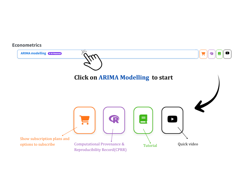
You have learned about the three orders and when a series requires a seasonal component. With this theory in mind, you can now focus on using the module itself. Start by visiting the RAISINS home page at www.raisins.live. Look for the Econometrics section and click on ARIMA modelling to access the module (Figure 3). On the right side of the module tile, you will notice four icons. These icons, from left to right, represent the subscription plans, the CPRR, this Tutorial, and a short Quick video.
3.1 Computational Provenance & Reproducibility Record
The CPRR (Computational Provenance & Reproducibility Record) gives you a detailed account of how the analysis was conducted. To see the computational workflow used in the analysis, click on the icon shown in Figure 3 to access CPRR. This record tells you which version of R was used and the exact version of every package involved. It also identifies the function responsible for each result: auto.arima() for the automatic model, Arima() for the manual model, adf.test() and kpss.test() for stationarity, and BoxCox.lambda() for the transformation. In CPRR, you will find a list of every default parameter and decision rule the module applied. The record includes fully runnable R code that replicates each analytical step. You can run this code in R to reproduce and verify the results on your own. The record is given its own DOI, ensuring it can be uniquely identified and referenced.
When you need to reference the platform in your paper, thesis, or report, use the RAISINS citation. You can find this citation in APA, Harvard, and BibTeX formats at www.raisins.live/citation.html. This citation acts as the main reference, and it is usually enough for your manuscript.
To locate the CPRR for the ARIMA module, go to www.raisins.live/module_record/ARIMA.html.
When you reference the platform in your work, use the RAISINS paper as your primary source. If a journal asks for details about the computing environment, or if you wish to be specific about the versions and functions in your methods section, include the CPRR as supporting documentation. This approach is more informative than merely stating “analysis was carried out using an online tool.” The CPRR complements your citation and helps ensure that others can accurately reproduce your computational work.
4 Preview mode and Quick Tour
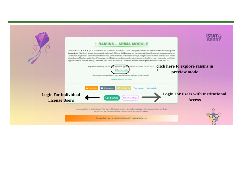
When you click the tile, it opens the module on its Welcome page (Figure 4). Take a moment to explore before uploading your own data. You can use Preview mode to look around without subscribing. Find the link in the middle of the card. In Preview mode, you can access built-in datasets. This allows you to try every feature, including the automatic model, the manual model, stationarity tests, all ten plots, and the RA-One assistant, without needing to upload your own data. If you have an individual licence, enter through Get Started. If you have institutional access, use Institutional Login.
When you use the application for the first time, you have access to a Quick Tour. This is an interactive guide that takes you through each control, explaining its function step by step. If you need a refresher, you can take the tour again by selecting the Quick Tour tab.
5 A working example
In preview mode, you can explore different data. However, from this point in the tutorial, we will focus on one specific dataset. This ensures that every number you see in the upcoming tables can be traced back to a single file (Figure 5). This dataset is an annual series with 74 observations, meaning there is one value recorded for each year. These values are listed in chronological order. The file contains two columns: time, which numbers the years from 1 to 74, and value, which contains the actual measurements. The values in the dataset range between approximately 1.0 and 3.5. There is no clear upward or downward trend; instead, the values fluctuate without a specific pattern.
In this analysis, you only use the value column. The time column is included for your reference. The application automatically creates the calendar based on the Datatype and Start Date you select. For this tutorial, the datatype is set to Annual and the start date is 1951-09-01. This means the 74 observations are distributed across the years 1951 to 2024.
The module helps you find out what the value is likely to be in the year 2025. It also estimates the value for each of the four years following 2025.
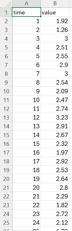
time (the row’s position in the sequence) and value (the measurement to be modelled)
6 How to prepare your data
When you want to analyse your own time series data, make sure your data file is organised correctly before you start. The quality of your analysis depends on the quality of your data. If you provide clean, well-structured data, you will get reliable insights. However, if your data is disorganised or contains errors, the results will not be reliable. Time series data has a specific requirement: the order of the rows is crucial. Each row represents a point in time, and changing the order will disrupt the sequence and make the analysis invalid. Always keep the rows in their original order to ensure meaningful results.
The ARIMA module does not have a Create Data tab. This is because you do not need to build a design template for ARIMA analysis. Instead, your data file should be a single column of numbers arranged in the correct sequence. To prepare your data for ARIMA, you have three options:
- Create your dataset in MS Excel
- Use the Model datasets in RAISINS as a reference
6.1 Preparing data in MS Excel
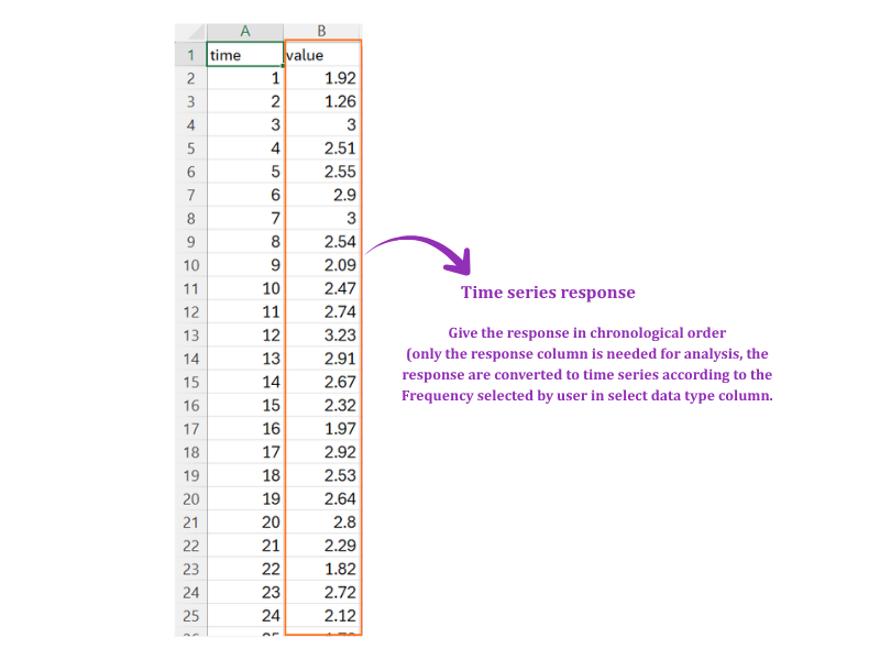
Arrange your file just like the example in Figure 6. Place your measurements in a single column, sorted by time, with the oldest data at the top and the newest at the bottom. Add a brief header like value in the first row. You can include a second column to number the observations (time), similar to the example, but this is optional since the app does not use it. Do not include dates in the column you plan to analyse; the app uses the Datatype and Start Date you select to determine the calendar.
Each row in your dataset should represent one time step, such as a month, and these steps should be evenly spaced without any missing periods. If you find that a month was not measured, do not just remove that row. Doing so would shorten your time series and cause all subsequent data to be misaligned with the wrong dates. Instead, ensure that each time step is accounted for, even if it means leaving some data cells empty for unmeasured months. Once your dataset is complete and correctly formatted, save it as a CSV file before you upload it.
Dataset creation rules
- Column naming convention
- No spaces allowed in column names.
- Use underscores (
_) or full stops (.) for separation. - Avoid symbols and special characters such as %, #.
- Data arrangement
- Start the data towards the upper-left corner.
- Ensure the row above the data is not blank.
- Cell management
- Avoid typing or deleting in cells without data.
- If needed, select the affected cells, right-click, and choose Clear Contents.
- Chronological order
- Rows must run oldest to newest, top to bottom. Never sort the file by value.
- Time steps must be evenly spaced: every year, every month, every quarter, with nothing skipped.
- The response column
- One numeric column holds the series to be modelled. Text, blanks and symbols such as
NAor-in that column will stop the analysis. - Any extra columns are ignored, so keep the file tidy but do not worry about them.
- One numeric column holds the series to be modelled. Text, blanks and symbols such as
How to save as CSV in MS Excel
Open your workbook. Ensure your data is arranged properly with only one sheet.
Click the ‘File’ menu. Go to the top-left corner and click File.
Choose ‘Save As’ or ‘Save a Copy’. Select the location where you want to save your file.
Set file type to CSV. In the ‘Save as type’ dropdown, choose CSV (Comma delimited) (*.csv).
Name your file. Enter a relevant file name without spaces (use underscores if needed).
Click ‘Save’. Click Save to export the file.
💡 Tip: Before saving, double-check that your data is on the first sheet and follows the required format.
In a regular experiment, if you miss an observation, you lose just one data point. However, in a time series, missing an observation affects more than just that point. It disrupts the entire sequence. Every observation after the missing one shifts to the wrong date. This misalignment makes the time lags that your model uses meaningless. To handle a missing observation in a time series, you have two options. You can fill the gap with a carefully considered estimate and clearly mention this in your methods section. Alternatively, you can start your analysis from the point after the gap. It is important not to leave the cell blank or delete the row, as this will further disrupt your data.
6.2 Download Model Datasets
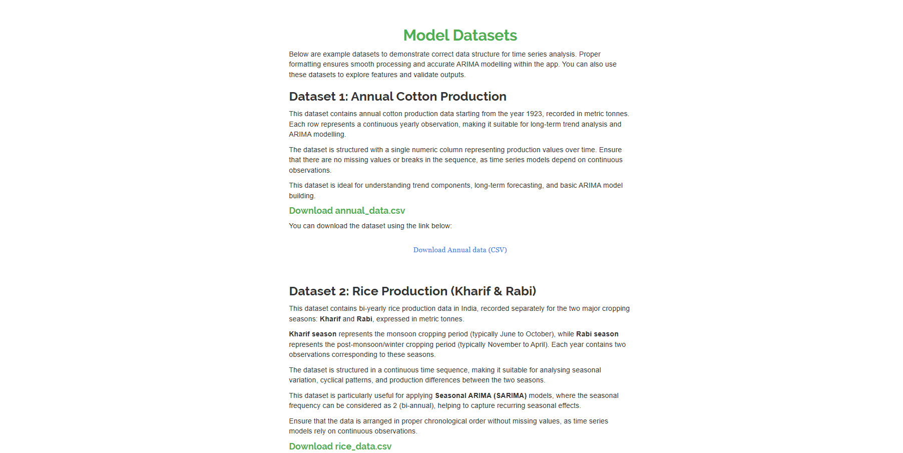
If you are unsure about the required format or want to explore the module before using your own data, you can use the model datasets provided under the Datasets tab (Figure 7). There are two model datasets available:
- Dataset 1: Annual Cotton Production - annual cotton production in metric tonnes, a single numeric column of yearly observations. Use it for trend analysis and plain ARIMA.
- Dataset 2: Rice Production (Kharif & Rabi) - bi-yearly rice production, with two observations per year for the two cropping seasons. Use it to try SARIMA with a seasonal period of 2.
To get started, click the Download CSV link located under the dataset you are interested in. Save the file to your computer. You can then open the file to study its layout and understand the data structure. Alternatively, you can upload the file directly under the Analysis section to begin your analysis.
7 The Analysis tab
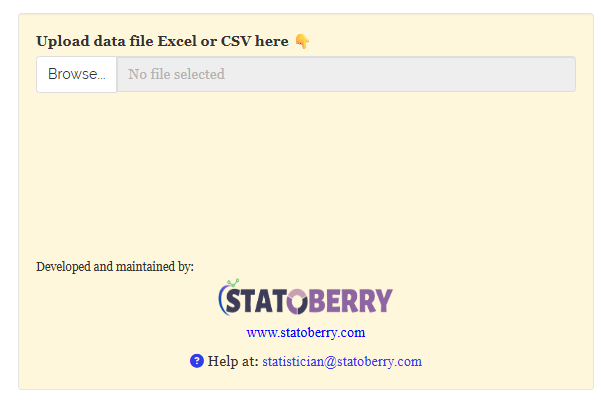
First, make sure your data file is saved in the correct format, either CSV or Excel. Once your file is ready, you can begin the analysis process. Start by opening the Analysis tab. On the left side of the screen, you will find a panel where you can upload your file (Figure 8). After you upload the file, look for a blue Upload complete bar. This bar confirms that the file has been successfully read by the system. Next, you will describe the calendar, select a few options for your analysis, and then run the analysis.
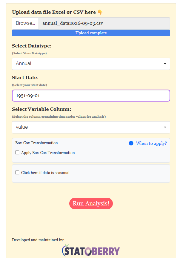
Three controls then appear (Figure 9). Fill them in from top to bottom:
- Select Datatype - how often the measurements were taken: Annual, Bi-annual, Quarterly, Monthly, Daily, and so on. This is the single most important choice on the page, because it fixes the frequency of the series and therefore the length of a season (Section 2). Our example is Annual.
- Start Date - the date of the first observation in the file. RAISINS counts forward from here at the frequency you chose, so every later observation lands on the right date without you typing any dates. Ours is 1951-09-01, which places the 74 annual values on 1951 to 2024.
- Select Variable Column - the column holding the time series value.
Then click Run Analysis!.
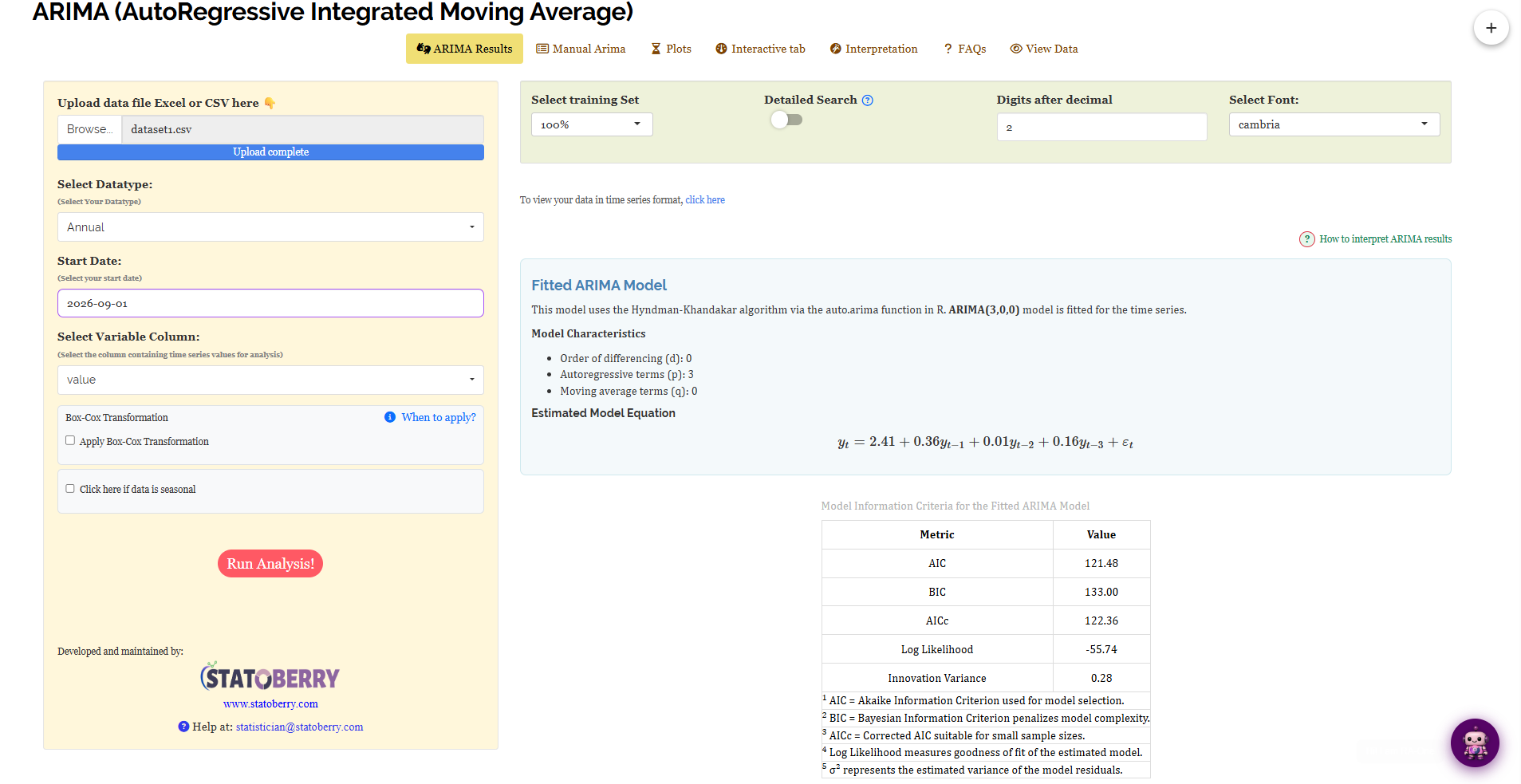
When you open the full tab shown in Figure 10, you will see a sidebar with two optional tick-boxes below the column selector. The first tick-box is Apply Box-Cox Transformation (Section 7.1). This option is useful if your data does not follow a normal distribution, as it helps to stabilise variance and make the data more normal. The second tick-box is Click here if data is seasonal (Section 2). Use this if your data shows patterns that repeat over time, such as monthly sales figures. At the top of the results panel, there are four more controls. The first is Select training Set (Section 7.3), which allows you to choose the portion of your data to train the model. The second is Detailed Search (Section 7.4), which lets you refine your search criteria for better results. The last two controls, Digits after decimal and Select Font, are for presentation purposes only. They allow you to change how many decimals are shown in the results and the typeface of the tables. These do not affect the model itself.
When you view the results, you will find them organised into seven sub-tabs. These sub-tabs are: ARIMA Results, where you see the outcomes of the ARIMA analysis; Manual Arima, which allows you to adjust ARIMA settings manually; Plots, showing visual representations of the data; Interactive tab, offering interactive features for deeper exploration; Interpretation, providing explanations of the results; FAQs, answering common questions; and View Data, where you can look at the raw data used in the analysis.
7.1 Option 1: the Box-Cox transformation
ARIMA models work best when the data series has a steady spread. This means that the fluctuations around the average should be similar at both the beginning and the end of the data record. However, in real-world data, this is often not the case. For example, in agricultural production data, you might notice that the fluctuations are larger when production levels are high. During a lean decade, the ups and downs are small, but in a bumper year, the swings are large. When you fit an ARIMA model to such data, it struggles. The model is influenced by the noisy periods with large fluctuations, which makes it fit poorly during the quieter periods with smaller fluctuations.
The Box-Cox transformation is a common technique used to make data more evenly spread out. It works by raising each value in your dataset to a specific power, represented by \(\lambda\) (lambda). This power is carefully chosen to ensure that the data is more evenly distributed across the entire dataset.
\[ y^{(\lambda)} = \begin{cases} \dfrac{y^{\lambda} - 1}{\lambda}, & \lambda \neq 0 \\[8pt] \log(y), & \lambda = 0 \end{cases} \]
You do not need to select \(\lambda\) yourself. When you tick Apply Box-Cox Transformation, the software estimates the best value for your data. It then fits the model using this transformed scale. After fitting the model, it converts the forecast back to your original units before displaying it. Figure 11 shows what the transformation is doing.
When you see the When to apply? link next to the tick-box, clicking it will show a brief explanation within the app. Here’s the basic idea: tick the box if the time series plot (Section 11) shows that the fluctuations are clearly getting larger or smaller over time. If the fluctuations remain about the same, do not tick the box. In this tutorial, you will leave the box unticked because the example series shows consistent fluctuations from 1951 to 2024.
The Box-Cox transformation involves raising your data to a power of \(y\). This means it only works for values greater than zero. If your dataset includes any zeros or negative numbers, you cannot apply the Box-Cox transformation. In such cases, make sure to leave the box for this transformation unticked.
7.2 Option 2: is the data seasonal?
When you see the second tick-box labelled “Click here if data is seasonal”, it is used to choose between ARIMA and SARIMA models. If your data does not have a seasonal pattern, leave this box unticked to use a plain ARIMA model. However, if your data shows seasonal patterns, tick this box. This will make the software search for seasonal orders \(P\), \(D\), and \(Q\), based on the period defined by your Datatype. For instance, if your data is annual, you would leave this box unticked, as there is no seasonal component to consider. This choice is important because it helps the software select the right model for your data, ensuring accurate analysis. For more details on this switch, refer to Section 2.
7.3 Option 3: the training set and the test set
When you create a model, it can always fit the data it was built from. However, the real test is whether the model can predict new values it has never encountered before. This is where the Select training Set dropdown comes into play. It allows you to choose a set of data to train your model, so you can later test its ability to predict unseen data.
When you choose a percentage, the series is split into two parts, in chronological order. The first part is called the training set. This is the earlier portion of the data, and you use it to fit the model. The second part is the test set, which is the later portion. This part is kept hidden from the model during training. After fitting the model with the training set, you forecast the values for the test period. You then compare these forecasts with the actual values in the test set that the model did not see. This process does not involve any shuffling of the data. In a time series, it is essential to train the model using past data and test it on future data. The cut point in the series is shown by Figure 12.
When you use the dropdown menu, you can choose how much of your data you want to use for training your model. The options are 100%, 95%, 90%, 85%, 80%, 75%, and 70%. If you select 100%, you use all your data to train the model, with no data set aside for testing. This helps you see how the model fits the entire dataset. In this tutorial, we first use the 100% setting. Then, we switch to 90% training. This means you use the first 66 years of data to train the model and keep the last 8 years as a test set. This test set helps you evaluate how well the model performs on data it hasn’t seen before.
When you use the default setting of 100%, there is no separate test set. This means that all error figures are calculated using the same data that the model was trained on. As a result, these error figures will always make the model appear better than it might actually be. If your data series is long enough, you should run the analysis again with a data split. This involves dividing your data into a training set and a test set. In your report, use the error figures from the test set. These figures provide a more accurate assessment of the model’s performance.
7.4 Option 4: Detailed Search
When you use Auto ARIMA, it needs to select certain parameters: \(p\), \(d\), and \(q\). If your data is seasonal, it also needs to choose \(P\), \(D\), and \(Q\). There are many possible combinations of these parameters. To find the best combination, Auto ARIMA uses a method called the stepwise algorithm. This algorithm begins with a few reasonable models. It then adjusts the parameters in the direction that improves the model’s fit to the data. The process continues until no further improvements can be made. This method is quick and usually finds a model that fits the data well.
The Detailed Search toggle allows you to control how the model searches for the best ARIMA orders. When you enable this option, the model will evaluate every possible combination of ARIMA orders within the allowed range. This means it will check all potential combinations rather than gradually moving towards a good one.
- The search becomes exhaustive rather than optimised.
- Computation time increases significantly.
When you are working with a large dataset, it is best to keep the Detailed Search option turned off initially. This is because enabling it can take a lot of time to process. Start by running your analysis without Detailed Search. This approach is usually faster and gives you a quick overview. You should enable Detailed Search when your dataset is small, or if the results from the stepwise method seem questionable. It is also useful when you need to confirm that every possible option has been examined. This ensures that you have thoroughly explored all possibilities in your analysis.
When you use stepwise and exhaustive searches to select a model, they usually give you the same result. This means that both methods often agree on which model is best. Detailed Search is not meant to find a completely new or better model. Instead, it helps you confirm that the model you have chosen is a good one. Think of the time spent on a Detailed Search as a way to double-check your choice, like an insurance policy, rather than expecting it to improve the model.
8 Analysis results
The ARIMA Results sub-tab displays the automatic model fitted on all 74 observations with no hold-out, as the training set is 100%. Section 9 then repeats the run with a 90% training set.
Table 1: the fitted model and its information criteria
The right-hand side of Figure 10 displays the automatic result, including the Fitted ARIMA Model panel with the chosen orders and the estimated equation, followed by the table of information criteria.
The Hyndman-Khandakar algorithm, via auto.arima(), selected ARIMA(3,0,0) for this series. According to Figure 1: \(p = 3\) autoregressive terms, \(d = 0\) differencing, \(q = 0\) moving-average terms. Since \(d = 0\), the series did not require differencing, indicating no trend to remove, consistent with the data.
The estimated equation is printed underneath:
\[ y_t = 2.41 + 0.36\,y_{t-1} + 0.01\,y_{t-2} + 0.16\,y_{t-3} + \varepsilon_t \]
This year’s value is calculated as a baseline of 2.41, plus 0.36 of last year’s value, 0.01 of the year before, 0.16 of the year before that, and an unpredictable shock \(\varepsilon_t\). The modest coefficients indicate the series has a short memory: last year has some influence, while three years ago has minimal impact.
The information criteria are as follows: AIC is 121.48, BIC is 133.00, AICc is 122.36, Log Likelihood is −55.74, and Innovation Variance is 0.28.
What the five criteria mean
- AIC (Akaike Information Criterion) - balances how well the model fits against how many terms it uses. Lower is better. Its only use is comparison: an AIC of 121.48 means nothing on its own, but it beats a rival model scoring 130.
- BIC (Bayesian Information Criterion) - the same idea with a harsher penalty on extra terms, so it tends to prefer simpler models.
- AICc - AIC corrected for small samples. With 74 observations it is the one to prefer over plain AIC.
- Log Likelihood - how probable your data are under the fitted model. Higher (less negative) is better; AIC, BIC and AICc are all built from it.
- Innovation variance (\(\sigma^2\)) - the estimated variance of the unpredictable shocks. It is the part of the series the model openly admits it cannot explain.
Table 2: the forecast
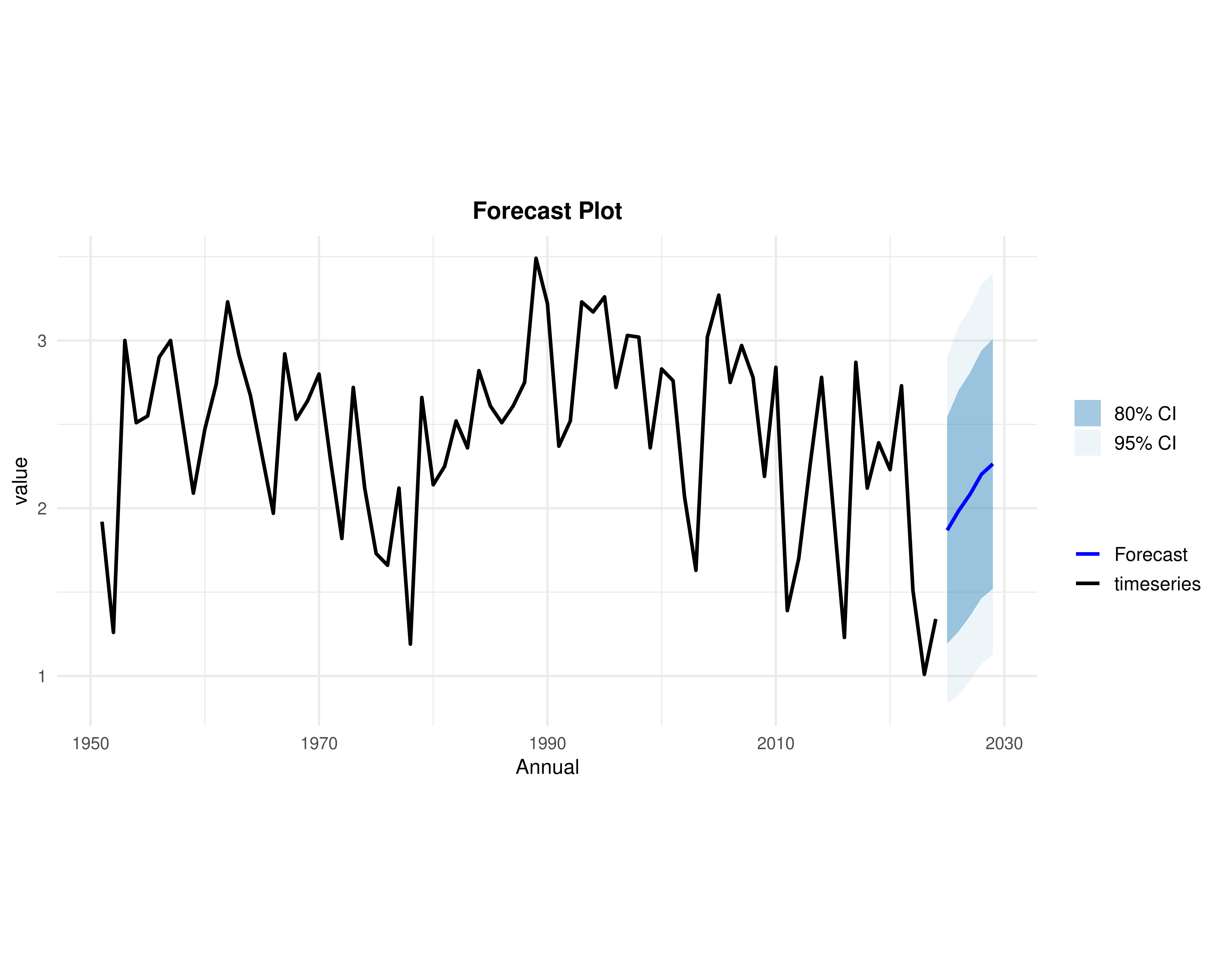
Below the model, Select the number of steps ahead to forecast sets the horizon from 1 to 100 steps, with 5 as the default. Figure 13 shows the five-year forecast for our series.
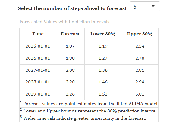
The record ends in 2024, so the forecast covers 2025 to 2029: 1.87, then 1.98, 2.08, 2.20 and 2.26. Each row also carries a prediction interval, the range the true value is expected to fall within. For 2025 the 80% interval runs from 1.19 to 2.54.
The forecast climbs back towards the middle of the series instead of continuing the recent fall, as a short-memory model with no trend drifts back to the average when real observations are exhausted. The intervals widen over time, from 1.19–2.54 in 2025 to 1.52–3.01 by 2029, indicating the model’s decreasing confidence.
When you see the value “1.87”, it represents the most likely outcome based on your data. However, it is not a guarantee. Alongside this point forecast, you should also consider the 80% interval, which ranges from 1.19 to 2.54. This interval is almost as wide as the entire historical range of the series. This indicates that there is significant uncertainty in predicting the next step in this series. Therefore, it is important to always report the interval together with the point forecast to give a fuller picture of the potential outcomes.
9 Checking the model on data it never saw
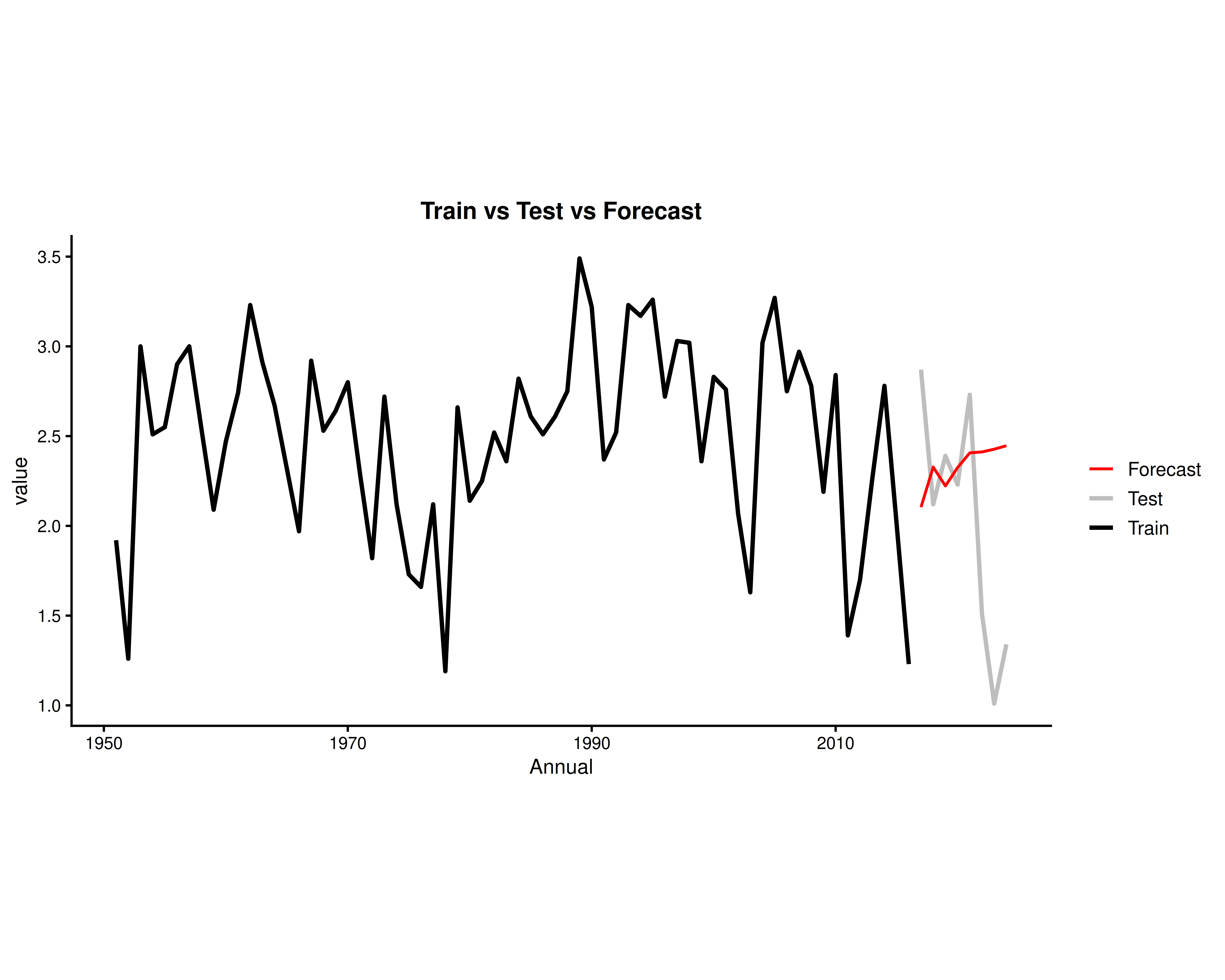
Change Select training Set from 100% to 90% and run the analysis again. This setting means the model uses the data from the first 66 years to fit the model and keeps the last 8 years aside for testing (Figure 12). In this run, the software again selects the ARIMA(3,0,0) model (auto.arima()). You will see a new set of error measures. There is one row of error measures for the training set and another row for the test set.
Table 3: training and test error measures
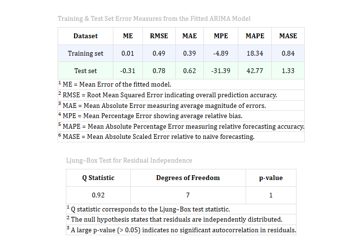
Each column in the table represents a different method to measure how inaccurate the forecast was. The two rows show results for different datasets. The training set row shows the following scores: ME 0.01, RMSE 0.49, MAE 0.39, MPE −4.89, MAPE 18.34, and MASE 0.84. These values indicate the forecast’s performance on the data used to create the model. The test set row shows scores of ME −0.31, RMSE 0.78, MAE 0.62, MPE −31.39, MAPE 42.77, and MASE 1.33. These scores reflect the forecast’s performance on new, unseen data, which helps assess how well the model generalises.
When you evaluate a model, you often find that test errors are larger than training errors. This is normal because a model performs better on data it has already seen. In this context, the Mean Absolute Scaled Error (MASE) is important. MASE compares your model’s performance to a simple naive forecast, which assumes “tomorrow will be the same as today.” If your model’s MASE is below 1, it performs better than the naive forecast. If it is above 1, it performs worse. In our case, the model has a MASE of 0.84 on the training data, indicating it performs well there. However, on the test set, the MASE is 1.33. This means that for the 8 held-out years, the model did not perform better than just carrying the last value forward.
This finding is valuable and not a problem with the software. When a data series shows no clear trend or seasonal pattern, it means there is not much structure for the ARIMA model to use, except for the average value. This is why the result may seem simple, but it accurately reflects the nature of the data.
Reading each error column
- ME - mean error. Near zero means the forecasts are not systematically too high or too low. Large errors in opposite directions cancel out here, so never judge accuracy on ME alone.
- RMSE - root mean squared error, in the units of your data. Penalises large misses heavily.
- MAE - mean absolute error, also in your units, and easier to explain: the average size of a miss.
- MPE - mean percentage error. Like ME, it shows bias: −31.39 on the test set means the forecasts sat well below the actual values on average.
- MAPE - mean absolute percentage error. Unit-free, so it compares across series: 42.77 means the typical test forecast was about 43% off.
- MASE - mean absolute scaled error, measured against the naive forecast. Below 1 is better than naive, above 1 is worse. The single most useful column on the table.
Table 4: the Ljung-Box test on the residuals
The lower table in Figure 14 shows the results of the Ljung-Box test. This test helps you determine if your ARIMA model is complete. It checks if there is any pattern remaining in the residuals. Residuals are the differences between the observed values and the values predicted by your model. If there is no pattern left in the residuals, it means your model has captured all the information in the data. If there is a pattern, you may need to adjust your model.
A residual is the difference between the actual value and the predicted value at each time step. It shows what the model got wrong. If these residuals still show a pattern, it means the model missed something important that it could have used to make better predictions. In this case, you should reconsider the model’s assumptions or the order of the variables. However, if the residuals do not show any pattern and appear random, it indicates that there is nothing more for the model to learn or improve upon.
In this test, you have a Q value of 0.92 with 7 degrees of freedom and a p-value of 1. This indicates that there is no significant autocorrelation in the residuals. Autocorrelation means that the residuals, or errors, are not independent of each other. When there is no significant autocorrelation, it suggests that the model has successfully captured the serial dependence in the data. As a result, the residuals behave like random noise, which is what you want in a well-fitting model. This outcome means that the model is doing a good job of explaining the patterns in your data without leaving any predictable patterns in the residuals. This is important because it confirms that the model is reliable for making predictions. \(p > 0.05\)
In the Ljung-Box test, you start by checking if the residuals from your model are independent. Residuals are the differences between observed and predicted values. The null hypothesis in this test assumes that these residuals are independent, meaning there is no leftover pattern in them. If you get a small p-value, it indicates bad news because it suggests there is a pattern left in the residuals. This means your model might not be capturing all the information. A p-value above 0.05 is good because it suggests the residuals are independent, and you can keep using your model.
10 Manual ARIMA: choosing the orders yourself
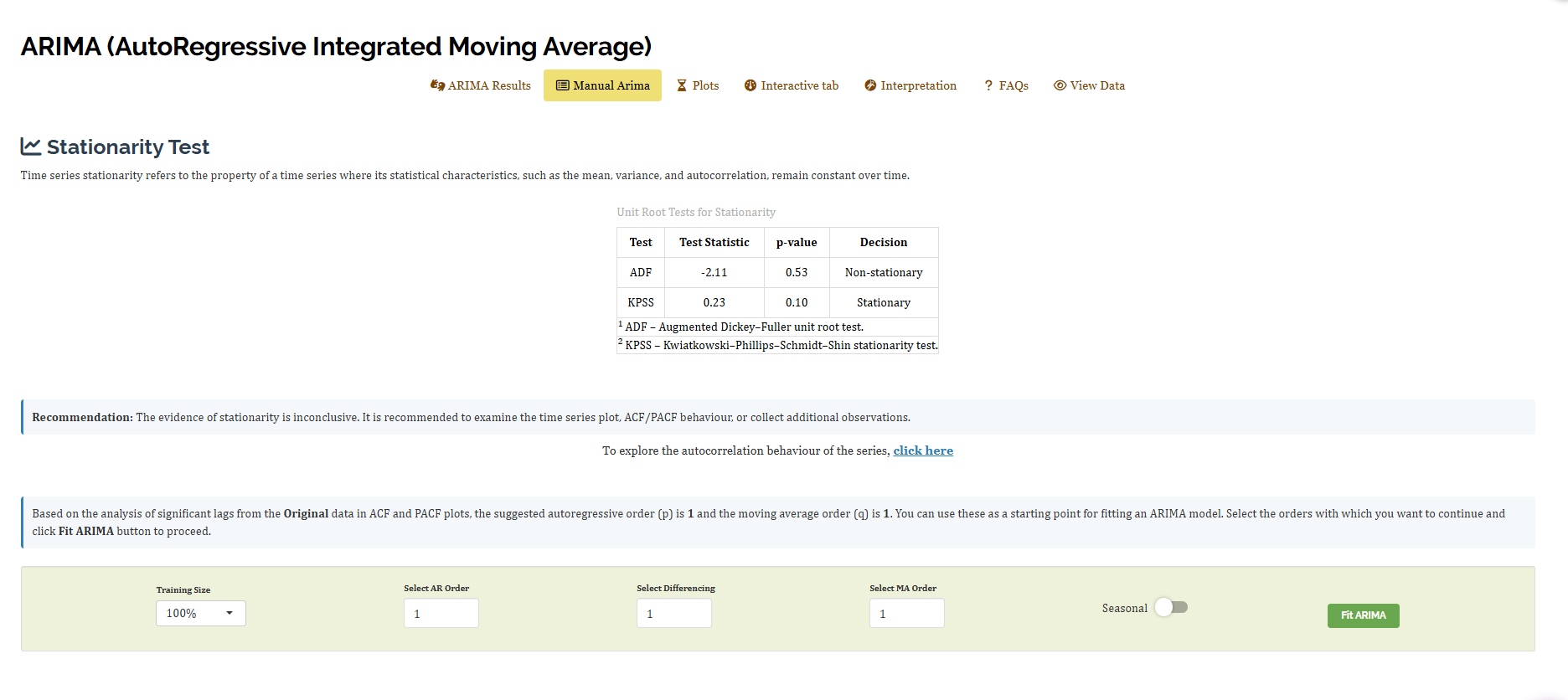
Up to this point, you have been using the orders that Auto ARIMA selected for your analysis. However, there are situations where you might want to choose these orders yourself. This is where the Manual Arima sub-tab becomes useful. You might want to set \(p\), \(d\), and \(q\) manually if you are following a model from a published study, testing a specific hypothesis about your data series, or comparing the automatic selection with your own judgement. Before you make these manual selections, the tab provides you with the necessary evidence (Figure 15) to inform your decisions.
10.1 The stationarity tests
Two unit root tests help you determine if a series is stationary (Section 1). They are designed to work as opposites.
- ADF (Augmented Dickey-Fuller) - its null hypothesis is non-stationary, so a small p-value means stationary. Ours reports a statistic of −2.11 with p = 0.53, so the decision is Non-stationary.
- KPSS (Kwiatkowski-Phillips-Schmidt-Shin) - its null hypothesis is stationary, so a small p-value means non-stationary. Ours reports 0.23 with p = 0.10, so the decision is Stationary.
When you analyse a time series, you want to know if it is stationary. Stationarity means that the statistical properties of the series, like the mean and variance, do not change over time. Sometimes, the evidence for stationarity is unclear. This can happen if the series has a lot of noise but no strong trend. In such cases, you should look at the time series plot or the ACF/PACF behaviour. You might also need to collect more data. This warning is helpful because it tells you that the results are not definitive, rather than indicating a mistake.
When you run both tests, you get three possible outcomes. First, if both tests say the series is stationary, you can proceed with \(d = 0\). Second, if both tests say the series is non-stationary, you should difference the series. Third, if the tests disagree, it means the evidence is not strong. In this case, you should examine the plots before making a decision. Using only one test might not reveal this uncertainty. Each test has strengths and weaknesses, so using both helps you get a clearer picture.
10.2 The suggested orders
After you run the tests, you will see the ACF (Autocorrelation Function) and PACF (Partial Autocorrelation Function) plots for the original series. These plots help you understand how the series correlates with itself at different time lags. The ACF plot shows the correlation between the series and its past values, while the PACF plot shows the correlation after removing the effects of shorter lags. The plots suggest a starting point for your analysis: the autoregressive order (p) is 1 and the moving average order (q) is 1. To determine these orders, look at the number of lags that stand out above the significance band in the plots. This is a traditional method for estimating the values of \(p\) and \(q\) by eye. You can find more details about these plots in Section 11.
Begin by setting the Training Size. Next, choose the Select AR Order (\(p\)) to determine the number of autoregressive terms. Then, choose Select Differencing (\(d\)) to specify the number of differences needed to make the data stationary. After that, set the Select MA Order (\(q\)) for the moving average terms. If you want to include seasonal components, flip the Seasonal toggle to enable \(P\), \(D\), and \(Q\). Finally, click Fit ARIMA to apply the model.
Table 5: the manually fitted model
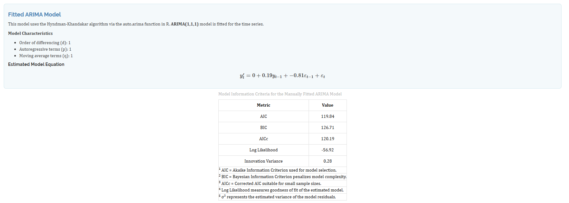
When you apply one round of differencing to your data, you use the ARIMA(1,1,1) model (Figure 16). This model works with the differenced data, not the original data. The differencing step helps to make the data more stable by removing trends or seasonality. In the equation for the ARIMA(1,1,1) model, you will see a prime symbol on \(y'_t\). This symbol indicates that the equation is based on the differenced data, not the original data.
\[ y'_t = 0 + 0.19\,y_{t-1} - 0.81\,\varepsilon_{t-1} + \varepsilon_t \]
The model’s performance is evaluated using several statistics. It has an AIC of 119.84 and a BIC of 126.71, which help compare models. The AICc is 120.19, adjusting for small sample sizes. The Log Likelihood is −56.92, indicating model fit. The Innovation Variance is 0.28, showing the spread of prediction errors.
Table 6: comparing the two models
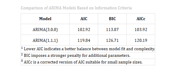
After you have created both models, you will see them displayed side by side on the screen (Figure 17). The ARIMA(3,0,0) model has scores of AIC 102.92, BIC 113.87, and AICc 103.92. Meanwhile, the ARIMA(1,1,1) model has scores of AIC 119.84, BIC 126.71, and AICc 120.19. For these criteria—AIC, BIC, and AICc—lower values indicate a better model. In this case, the ARIMA(3,0,0) model performs better on all three measures, making it the superior choice.
When you use the manual tab, the main benefit is not necessarily to create a model that outperforms the automatic one. Instead, it provides you with a specific number that you can use to justify your report. For example, the Hyndman-Khandakar search method tested many possible models and chose ARIMA(3,0,0) as the best option. By comparing this with a model you build manually, you can confirm whether your alternative model offers any improvement. In this case, the comparison shows that a reasonable manually-built model does not perform better than the automatic ARIMA(3,0,0) model.
When you compare models using AIC, BIC, or AICc, you must ensure that all models are fitted to the same set of observations. This means using the same data for each model. If you change the percentage of data used for training, the AIC, BIC, and AICc values will change because they depend on the sample size. As a result, you cannot directly compare these values to those from a different training set. To make valid comparisons, keep the training set the same for all models you are evaluating.
11 Visualising the series and the model
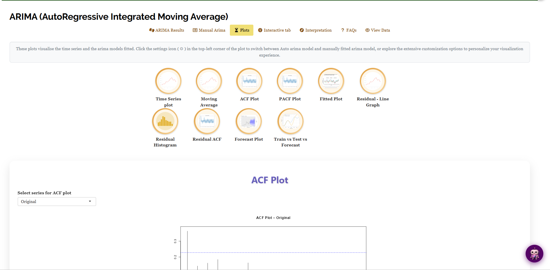
Two models now exist, the automatic one and the one you fitted by hand, and the tables have said all they can about them. The Plots sub-tab holds ten graphics, each behind its own icon (Figure 18): Time Series plot, Moving Average, ACF Plot, PACF Plot, Fitted Plot, Residual - Line Graph, Residual Histogram, Residual ACF, Forecast Plot and Train vs Test vs Forecast. Click an icon to draw its plot. The settings icon (⚙) in the top-left corner of each plot switches between the automatic and the manually fitted model, and opens the customisation options.
11.1 Looking at the series itself
Start with the Time Series plot, the raw series drawn against time. It is where you check the two things that decide your settings: is there a trend (which would call for differencing), and is there a repeating seasonal shape (which would call for the seasonal tick-box, Section 2)?
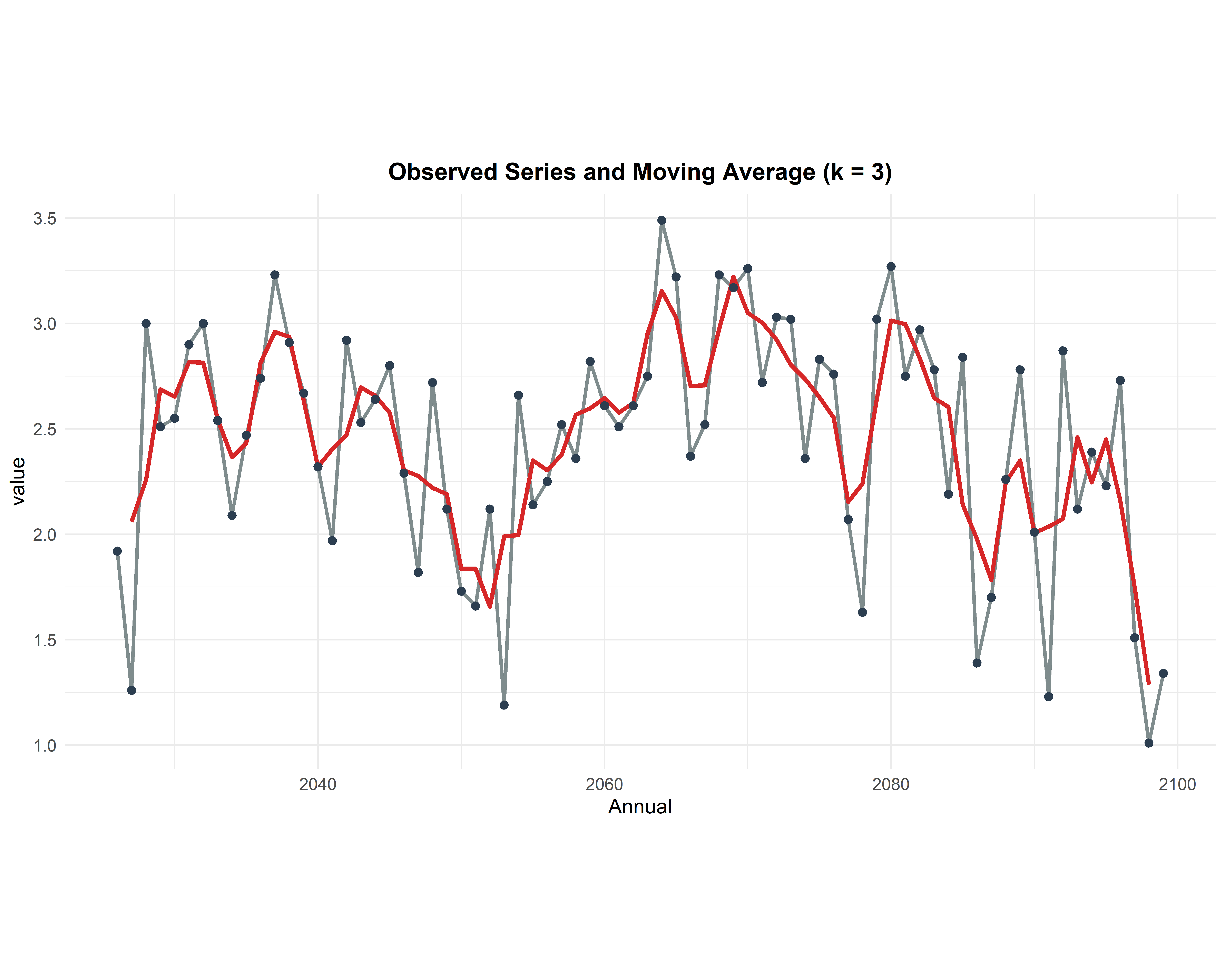
The Moving Average plot (Figure 19) makes that easier by drawing a smoothed line through the noise. Each point on the red line is the average of the observations around it, here with a window of \(k = 3\) years. The raw series jumps between roughly 1.0 and 3.5; the smoothed line stays between about 1.3 and 3.2 and drifts gently up and down with no overall climb or fall and no repeating cycle. That is the visual confirmation of what the model found: no trend to difference (\(d = 0\)) and no season to model.
11.2 ACF and PACF: where the orders come from
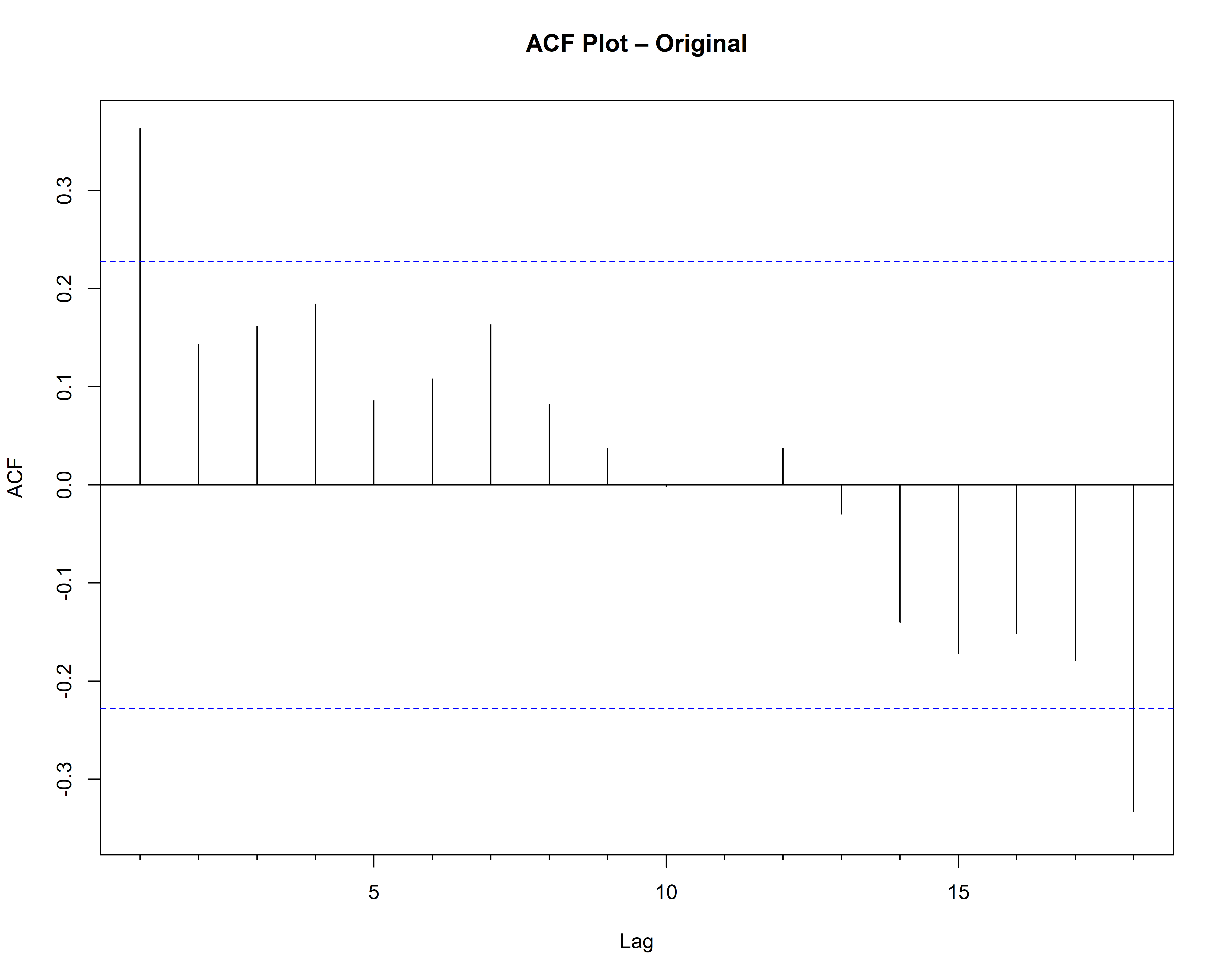
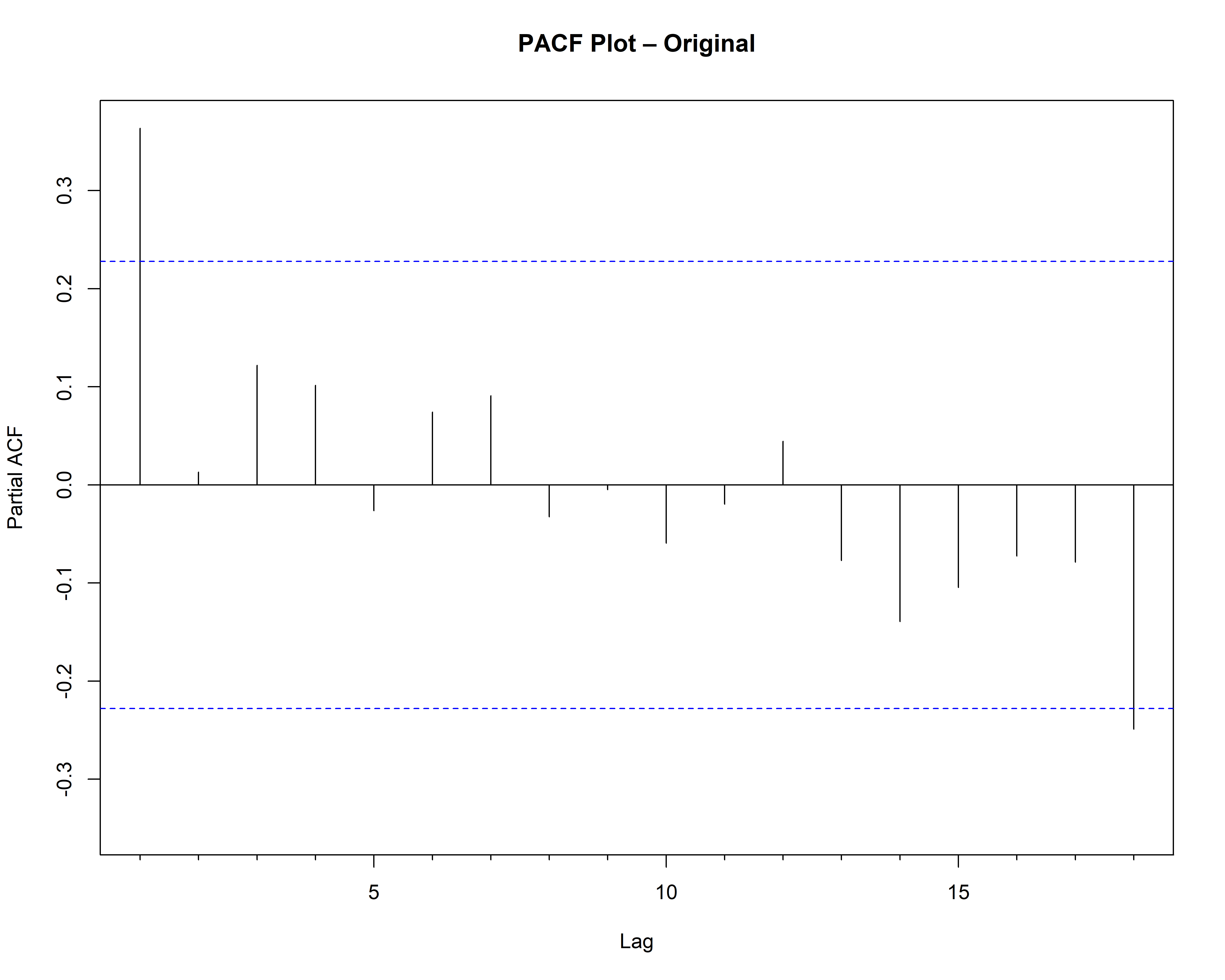
The ACF (autocorrelation) and PACF (partial autocorrelation) plots are the classic tools for guessing \(p\) and \(q\) by eye, and they are what RAISINS reads to produce the suggestion on the Manual Arima tab (Section 10). Both plot one bar per lag with a pair of dashed blue significance bands; a bar reaching past a band is a correlation worth taking seriously, and bars inside the bands are indistinguishable from noise.
In Figure 20 the ACF has one clear spike at lag 1 (about 0.36, above the band at roughly 0.23) and everything after it falls inside the bands. The PACF shows the same single spike at lag 1 and nothing else of note. Read together: the series remembers one step back and little beyond, which is exactly the suggestion of \(p = 1\), \(q = 1\) that the module offers.
The dropdown above each plot lets you redraw it for the Original series or for a differenced version, which is how you check whether differencing has cleaned up the correlation structure.
11.3 Checking the fit and the residuals
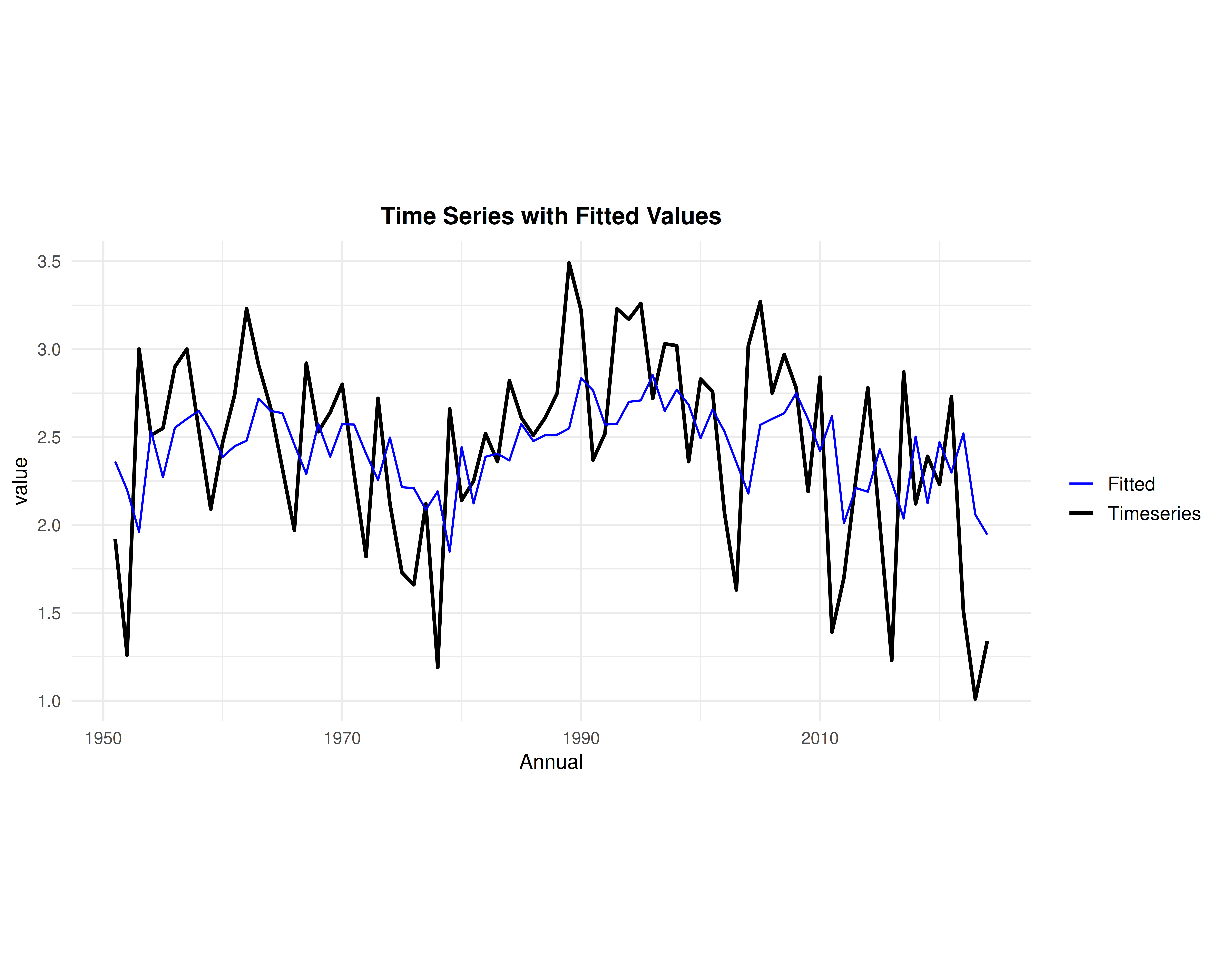
Three plots examine whether the fitted model is trustworthy. The Fitted Plot (Figure 21) draws the model’s fitted values in blue over the actual series in black. The blue line follows the same rises and falls but with much smaller swings, which is what a well-behaved forecast of a noisy series should look like, it predicts the signal and declines to chase the noise.
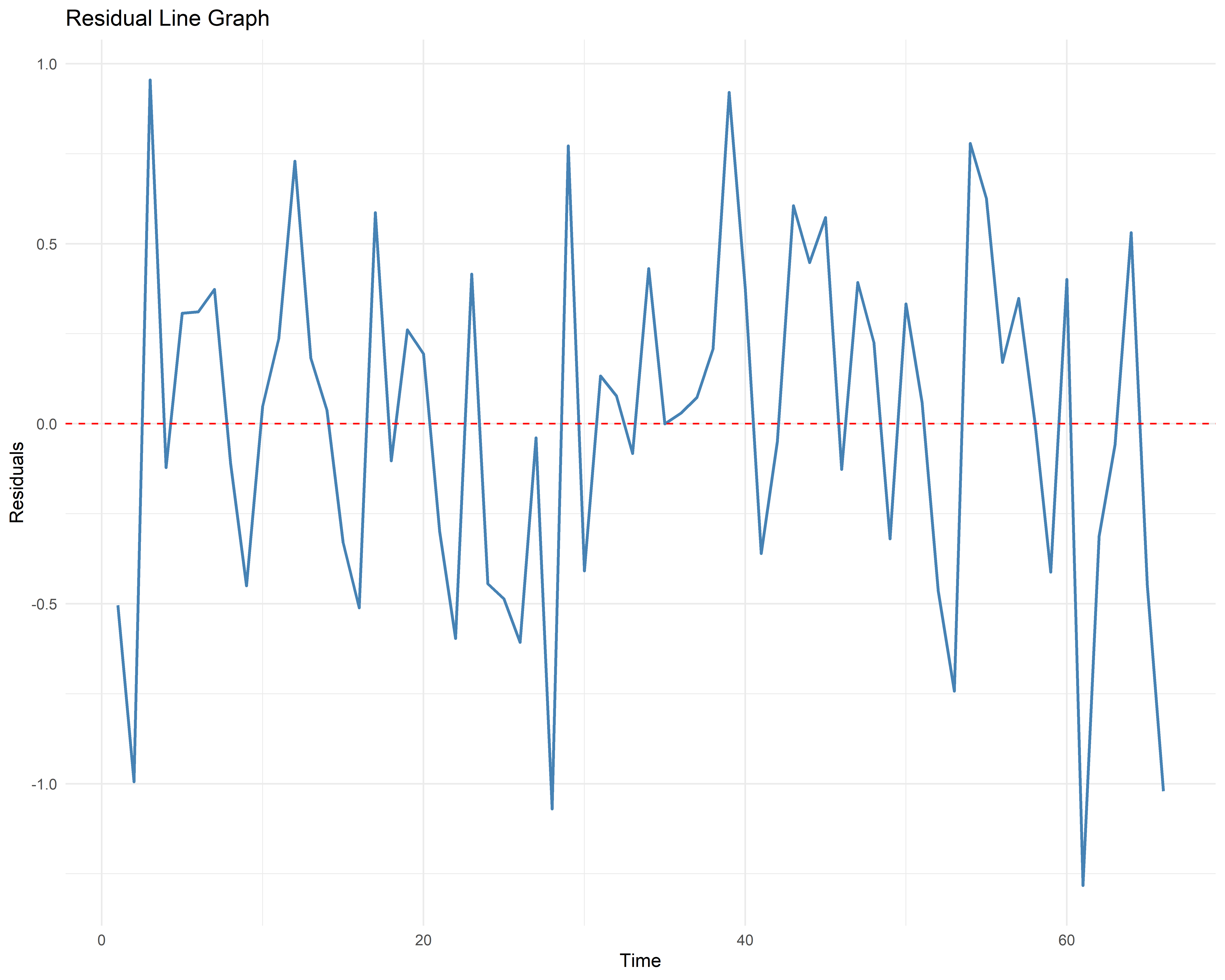
The Residual - Line Graph plots the leftover errors against time. What you want to see is what you do see: values scattered on both sides of the red zero line with no drift, no funnel shape and no repeating pattern. Any structure here would mean the model missed something.
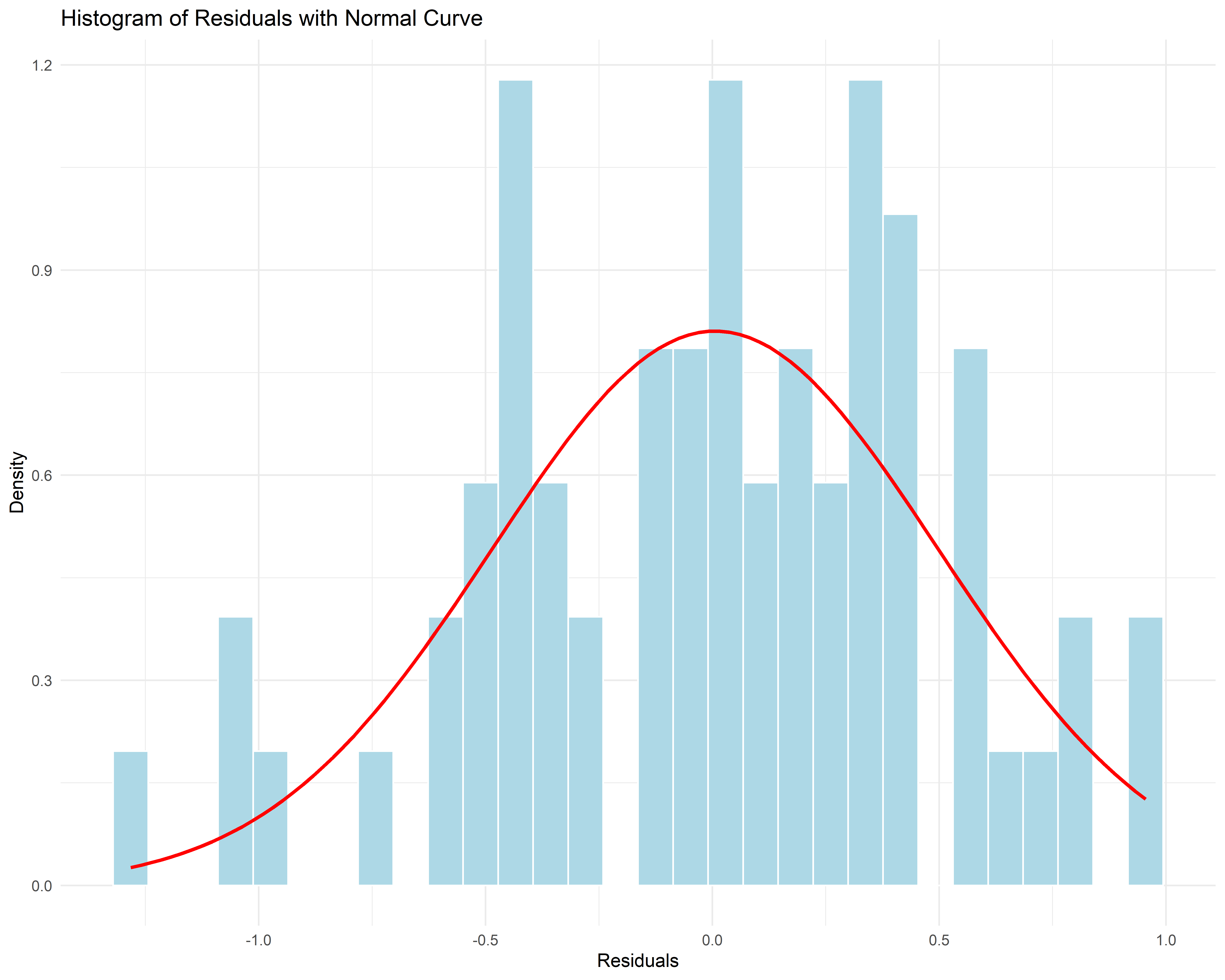
The Residual Histogram checks the shape of those errors against a normal curve. Ours is centred near zero and broadly follows the curve, which supports the prediction intervals in Figure 13, those intervals are calculated assuming normal errors. The Residual ACF is the picture version of the Ljung-Box test in Section 9: every bar should sit inside the significance bands.
11.4 The forecast plots
Two plots show the forecast. The Forecast Plot (Figure 22) continues the black historical line with the blue forecast and its shaded 80% and 95% prediction intervals, the picture of Figure 13. Notice how the shading fans out with distance: that is uncertainty growing, exactly as the table’s widening intervals said.
The Train vs Test vs Forecast plot is the picture of the hold-out check in Section 9. The black line is the 66-year training set, the grey line is the 8 years the model never saw, and the red line is what it predicted for them. The red forecast drifts gently upward from about 2.1 to 2.45 while the grey actuals swing between roughly 2.9 and 1.0, and that visible gap is precisely what the test MASE of 1.33 was reporting numerically. It is the most honest single picture in the module.
12 The Interactive tab
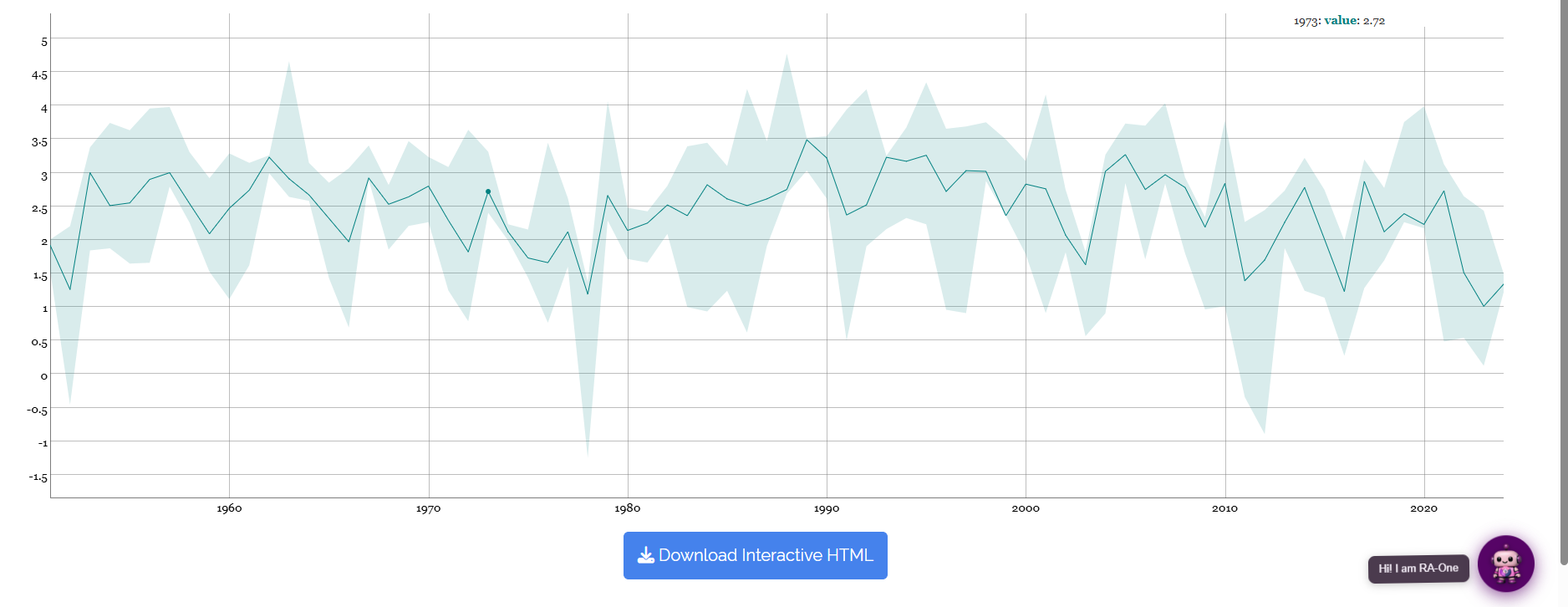
Those plots are fixed images, sized for a report. When you want to inspect the series rather than publish it, the Interactive tab (Figure 23) redraws the series and its intervals as a live chart. Hover anywhere on the line and the exact value at that time point appears in the corner, here 1954 reading 2.51. You can zoom into a stretch of years, pan along the record, and read individual observations without going back to the spreadsheet.
Download Interactive HTML saves the chart as a self-contained file that keeps its interactivity, useful for a presentation or for sharing with a colleague who does not have access to the module.
13 Interpretation
The tables and the plots are now complete, and what remains is to put the finding into words. RAISINS provides a clear, plain-language interpretation of your results so you do not have to decode the tables yourself. Open the Interpretation sub-tab, tick the box confirming that the analysis ran without error, and click Click here for interpretation (Figure 24).
For our series it reports the period covered (Annual data from 1951 to 2024), names the selected model (ARIMA(3,0,0) via the Hyndman-Khandakar algorithm), quotes its criteria (AIC 102.92, BIC 113.87, AICc 103.92), reads the Ljung-Box result (Q = 0.92, df = 7, p = 1, so no significant residual autocorrelation and the model is fit for forecasting), and then compares it with the manually fitted ARIMA(1,1,1) (AIC 119.84, BIC 126.71), concluding that the automatic model gives the better fit. It closes with the citations you need for a methods section. The text is written to be pasted almost directly into a report.
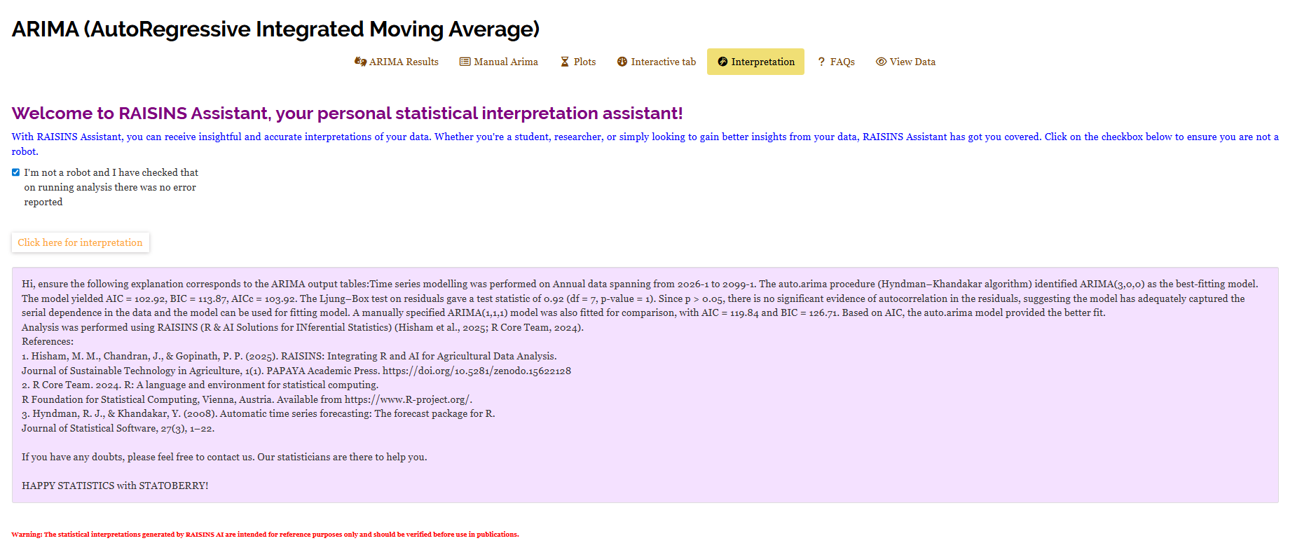
The interpretation is generated from the same computation as the tables, so use it as a guide rather than a substitute. Read it with Figure 14 and Figure 17 open beside it, the numbers in the prose should match the tables exactly, which is your quickest check that you selected the right column and datatype.
14 Chat with your data using RA-One
That interpretation is written for you in one pass. When you would rather ask your own questions, RA-One is the built-in conversational assistant for the ARIMA module, available from the RA-One tab. You ask questions in plain language and it answers using your own analysis rather than generic statistical advice. Every result it discusses is drawn from what the module actually computed, it never invents numbers, and if a value isn’t available it says so instead of guessing. All answers are in plain English, with no code or software commands.
It answers two kinds of question. The first is about method: “What is ARIMA and how does it work?” returns the explanation shown in Figure 25, walking through the AR, I and MA components and the meaning of the ARIMA(p,d,q) notation. The second is about your results: which model was selected, what the AIC comparison means, whether the residuals passed the Ljung-Box test, what the forecast says for the next five steps, and whether the test-set errors justify using the model.
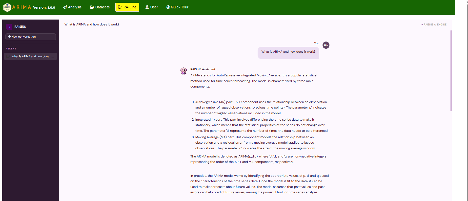
The same chat window can also prepare your data. It can explain the layout your file needs or fetch one of the model datasets (Section 6.2) so you can try the module straight away, so you never need to leave the tab to get a file ready.
Within a single conversation, RA-One can teach you the method, interpret your own results, and fetch a dataset to work on, so most of a routine ARIMA session can be conducted without ever leaving the chat window.
15 FAQs
The module includes a dedicated FAQs sub-tab to clear up common doubts, with detailed answers and practical tips. Typical questions for this module are “what should I choose as my Start Date?” and “why did Auto ARIMA pick d = 0 when the ADF test said non-stationary?”, the second being exactly the disagreement discussed in Section 10.
16 View data
When a result looks wrong, the cause is almost always in the file rather than in the model. View Data is the primary diagnostic tool for ensuring data integrity before analysis. When you upload your dataset, the system performs an automated Health Check to validate column types and formatting. For a time series it confirms that the selected column is numeric, that it contains no blanks or non-numeric entries, and that the series is long enough to fit the requested orders. The click here link on the ARIMA Results tab shows the same data converted into time series form, with the dates RAISINS assigned from your Datatype and Start Date, which is the quickest way to confirm that the calendar came out as you intended. Fix anything flagged here before trusting the results.
17 Wrapping up
ARIMA exists to answer one honest question: given only what this series has done in the past, what is it likely to do next, and how sure can we be? Everything in this module serves that question, the orders \(p\), \(d\) and \(q\) describe the memory, the seasonal tick-box extends that memory to the calendar, the Box-Cox transformation steadies the scale, the training/test split tests the answer against reality, and the Ljung-Box test confirms nothing was left behind.
It also tells you when the answer is weak. Our working series produced a clean model with well-behaved residuals, yet a test MASE of 1.33, meaning it did not beat the naive forecast over the held-out years. A method that only ever produced confident forecasts would be less useful than one that tells you when a series is mostly noise.
This module fits the case where you have one variable measured repeatedly over time and want to forecast it from its own history. If you want to predict one variable from other variables, use the Regression module instead; if you want to compare treatments in a designed experiment, use the ANOVA modules. And if you get stuck at any point, RA-One is available 24 × 7, or write to us at [email protected].