Correlation Analysis
Correlation Analysis quantifies how strongly and in which direction variables move together. This tutorial explains Pearson, Spearman and Kendall correlation, how to read the correlation and significance matrices, and how to run the whole analysis in RAISINS… Read more …
Correlation Analysis is a fundamental statistical technique used to quantify the strength and direction of the association between two or more numeric variables, enabling researchers to identify which traits move together and to what degree. RAISINS supports Pearson, Spearman, and Kendall correlation methods, allowing you to perform a complete correlation analysis and interpret the results without writing a single line of code. This tutorial walks through uploading your dataset, selecting variables and the appropriate method, reading the correlation matrix, and assessing the statistical significance of each pairwise relationship. In addition, you will obtain publication-ready correlation tables and plots including heatmaps, network plots, scatter matrices, and correlograms directly from RAISINS, and can lean on the built-in AI assistant for automated interpretation of your results.
A little history: measuring how two things move together
-
The formal study of association between variables was pioneered in the late nineteenth century by Sir Francis Galton, who observed that certain characteristics of parents and offspring tended to vary together, a relationship he described as “co-relation” in his landmark 1888 paper. Galton’s insight was primarily biological and intuitive, but it opened the door to a mathematically rigorous way of measuring how two quantities change in tandem. Karl Pearson formalised this idea in 1895 by deriving the product-moment correlation coefficient, now universally denoted r, which provides a single number between −1 and +1 that captures both the direction and strength of a linear relationship. Pearson’s coefficient became one of the most widely applied statistics in science, finding use in genetics, agronomy, medicine, economics, and the social sciences within a remarkably short time. In the early twentieth century, Charles Spearman introduced a rank-based version of Pearson’s coefficient (1904) that could handle ordinal data and non-normal distributions, while Maurice Kendall developed his tau statistic (1938) as a robust alternative better suited to small samples and tied ranks. Together, these three methods Pearson, Spearman, and Kendall form the complete correlation toolkit available in RAISINS today.
1 Correlation Analysis
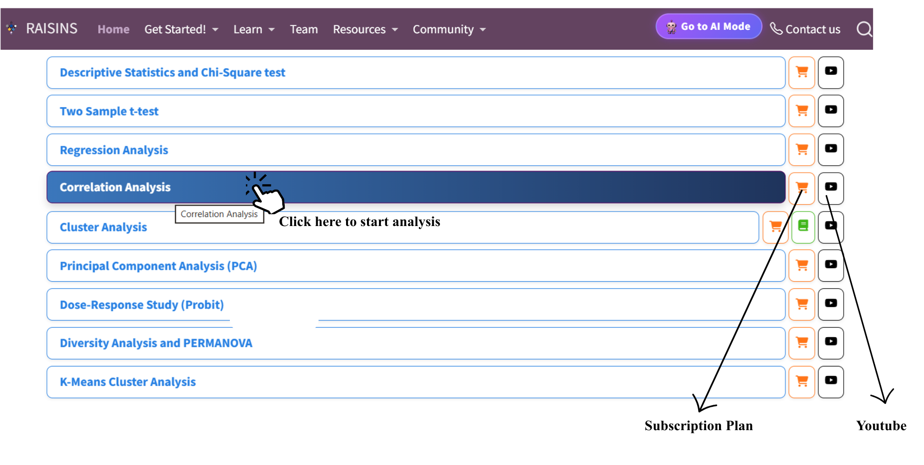
To get started, visit RAISINS www.raisins.live home page and navigate to the Data Analysis section. Here, you can access a range of analytical tools including Descriptive Statistics, Regression, and Cluster Analysis. In this tutorial, we focus on Correlation Analysis, as shown in Figure 1. No prior programming knowledge is required simply upload your data, select your variables and method, and RAISINS generates all results and plots instantly.
2 Pearson Correlation
The Pearson product-moment correlation coefficient is the most widely used measure of association and is the default method in RAISINS. It quantifies the degree of linear relationship between two continuous variables, assuming that both variables are approximately normally distributed and that the relationship between them is linear. The Pearson coefficient r is estimated from sample data as the ratio of the covariance of the two variables to the product of their standard deviations, producing a dimensionless index that lies strictly between −1 and +1. A value of +1 indicates a perfect positive linear relationship, −1 indicates a perfect negative linear relationship, and 0 indicates no linear association. Pearson correlation is sensitive to outliers - a single extreme value can substantially inflate or deflate r -so it is important to inspect scatter plots alongside the numeric coefficient. When either variable is non-normal, ordinal, or the dataset contains influential outliers, the Spearman or Kendall methods are more appropriate alternatives.
Pearson Formula and Key Terms
The Pearson correlation coefficient between variables X and Y is defined as:
\[r = \frac{\sum_{i=1}^{n}(X_i - \bar{X})(Y_i - \bar{Y})}{\sqrt{\sum_{i=1}^{n}(X_i - \bar{X})^2 \cdot \sum_{i=1}^{n}(Y_i - \bar{Y})^2}}\]
where \(\bar{X}\) and \(\bar{Y}\) are the sample means of X and Y respectively, and n is the number of paired observations. The numerator is the sample covariance a measure of how much the two variables co-vary around their respective means and the denominator standardises this to the [−1, +1] range. The significance of r is tested with a t-statistic:
\[t = \frac{r\sqrt{n-2}}{\sqrt{1-r^2}}, \quad df = n-2\]
Under the null hypothesis H₀: ρ = 0 (no population correlation), this t follows a Student’s t-distribution with n − 2 degrees of freedom. A large |t| relative to the critical value leads to rejection of H₀, and the correlation is declared statistically significant.
3 Spearman and Kendall Correlation
Spearman’s rank correlation coefficient (ρ, rho) is a non-parametric alternative to Pearson’s r that replaces raw data values with their ranks before computing the correlation. Because it operates on ranks rather than the actual measurements, it is robust to non-normality, unaffected by monotonic transformations of the data, and appropriate when variables are measured on an ordinal scale. Spearman’s ρ detects any monotonic relationship one in which the two variables consistently increase or decrease together, even if the relationship is not strictly linear. It is the recommended choice when Shapiro-Wilk or QQ plots indicate a departure from normality, or when the dataset contains outliers that would distort the Pearson coefficient. Kendall’s tau is also a rank-based non-parametric coefficient, but it is computed differently: rather than correlating ranks directly, it counts the number of concordant pairs (pairs of observations that rank in the same order on both variables) minus the number of discordant pairs, divided by the total possible pairs. Kendall’s tau is generally smaller in absolute value than Spearman’s ρ for the same data, but it is considered statistically more robust and is especially recommended when the sample size is small (n < 30) or when many tied ranks are present. In RAISINS, you can switch freely between Pearson, Spearman, and Kendall using the method selector panel to compare results and select the most defensible estimate for your data.
Choosing the Right Correlation Method
| Method | Data Type | Key Assumption | Handles Outliers? | Best Used When |
|---|---|---|---|---|
| Pearson | Continuous | Normal, linear relationship | No | Both variables continuous and approximately normal |
| Spearman | Continuous or Ordinal | Monotonic relationship; no normality required | Yes | Non-normal data, ordinal variables, presence of outliers |
| Kendall | Continuous or Ordinal | Monotonic relationship; no normality required | Yes | Small samples (n < 30), many tied ranks |
A general decision rule: start with Pearson. If the Shapiro-Wilk test (available in the Summary Stats tab) or QQ plots indicate non-normality for either variable, switch to Spearman. If the sample is small or contains many ties, prefer Kendall. When Pearson and Spearman give very similar results, the linear assumption is likely satisfied.
4 A working example
To make things clear and practical, we will demonstrate correlation analysis step by step, so you can follow the logic and interpret every output with confidence. Consider a dataset in which seven numeric variables, labelled Var1 through Var7, were recorded across a set of observations. The objective was to examine the pairwise associations among these seven variables to identify which pairs are positively or negatively correlated, assess the strength of each relationship, and determine which variables tend to move together. The arrangement of the data is shown in Figure 2.
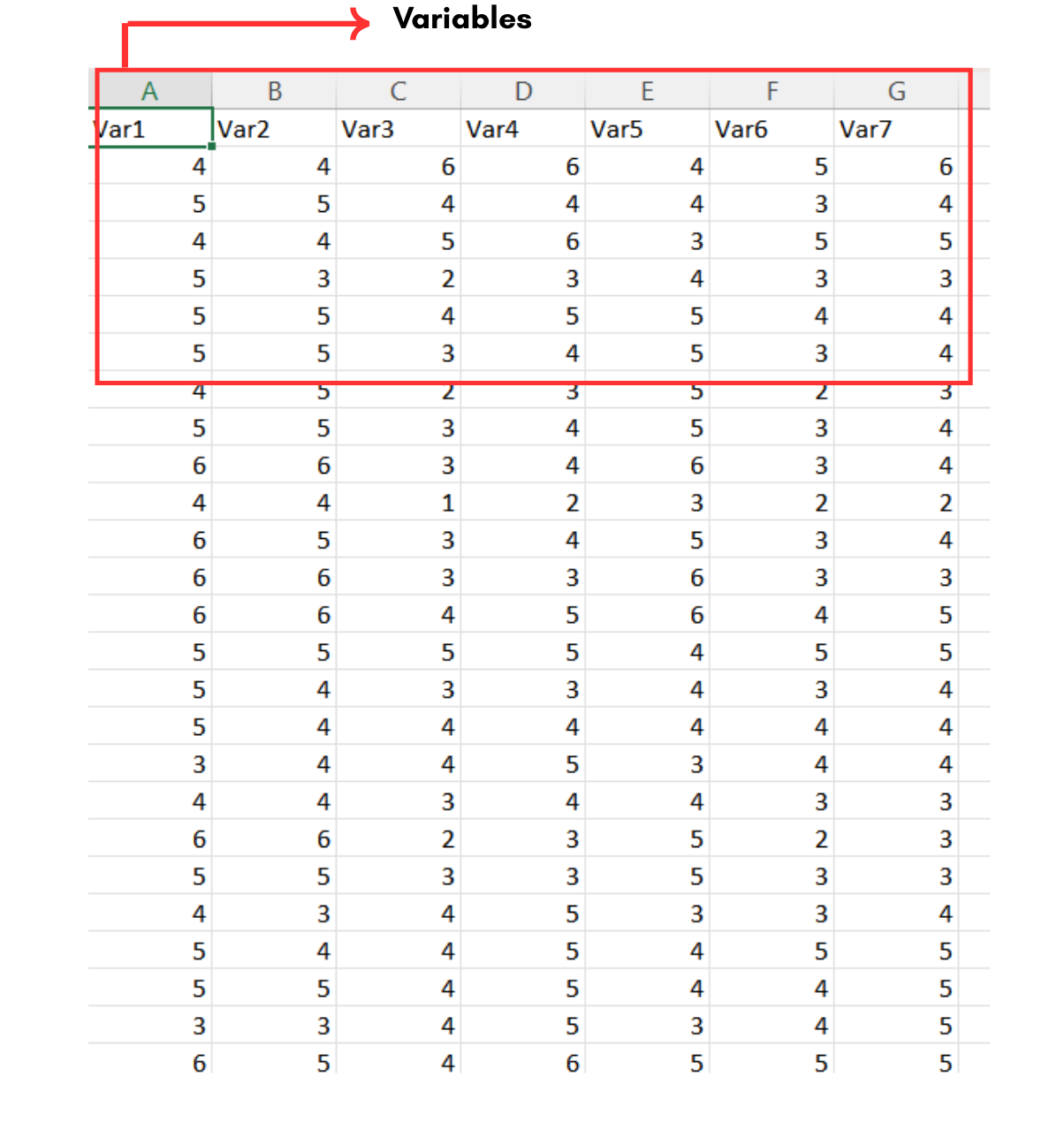
Data organised in MS Excel can be directly uploaded to RAISINS for analysis. For more details on data preparation see Section 5. The key term we will use throughout this tutorial is Variables referring to the numeric columns to be correlated. In our example, the Variables are the seven numeric columns Var1, Var2, Var3, Var4, Var5, Var6, and Var7. Unlike experimental design modules, Correlation Analysis does not require a treatment or block column every row simply represents one observation, and all columns selected for analysis must be numeric.
5 Preparing your data
“Your analysis is only as good as your data! Feed RAISINS high-quality data, and it will deliver powerful insights feed it messy data, and the results won’t be trustworthy.”
Create your dataset in MS Excel
Build your dataset directly within the RAISINS app
6 Preparing data in MS Excel
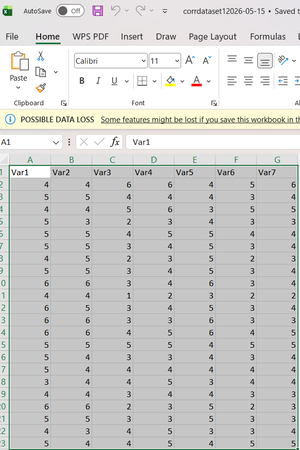
Open a new blank sheet in MS Excel with only one sheet included, and avoid adding any unnecessary content. The dataset for correlation analysis should follow a column-based format, where every column represents one numeric variable to be correlated and every row represents one observation (e.g., a genotype, plant, plot, or experimental unit). There is no requirement for a treatment, group, or block identifier column all columns should contain numeric measurements. The file can be saved in CSV, XLS, or XLSX format, but CSV is recommended as it is lighter and enables faster loading. Ensure that all measurement columns are purely numeric with no text, symbols, or missing-value placeholders, that column names contain no spaces or special characters, and that there are no blank rows above the data. For reference, see the structure shown in Figure 3.
Dataset Creation Rules
1. Column Naming Convention - No spaces allowed in column names.
- Use underscores (_) or full stops (.) for separation. - Avoid symbols and special characters like %,# etc 2. Data Arrangement - Start data arrangement towards the upper-left corner.
- Ensure the row above the data is not blank. 3. Cell Management - Avoid typing or deleting in cells without data.
- If needed, select affected cells, right-click, and select Clear Contents. 4. Column Relevance - All columns selected for Correlation Analysis must be numeric.
- Non-numeric or identifier columns can remain in the file RAISINS will automatically exclude non-numeric columns from the variable selector. 5. Missing Values - Avoid missing values wherever possible. If any are present, RAISINS uses pairwise complete observations by default, meaning each pair is correlated using only the rows where both variables have valid entries.
How to Save as CSV in MS Excel
1. Open Your Workbook
- Ensure your data is arranged properly with only one sheet.Click ‘File’ Menu
- Go to the top-left corner and click on File.
Choose ‘Save As’ or ‘Save a Copy’
- Select the location where you want to save your file.
Set File Type to CSV
- In the ‘Save as type’ dropdown menu, choose CSV (Comma delimited) (*.csv).
Name Your File
- Enter a relevant file name without spaces (use underscores if needed).
Click ‘Save’
- Click Save to export the file.
💡 Tip: Before saving, double-check that all measurement columns are numeric, there are no blank rows above the data, and column names follow the naming rules above.
7 Creating dataset in RAISINS
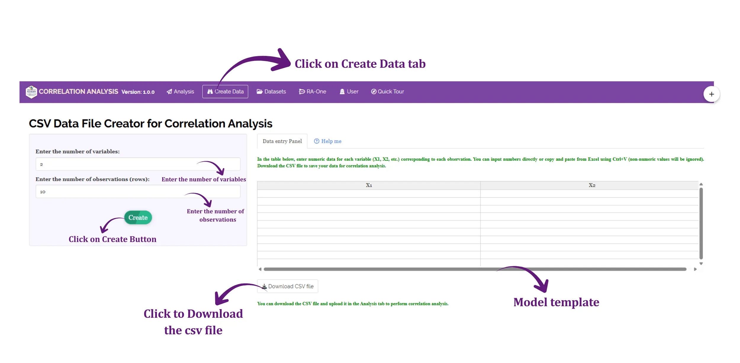
If you’re unsure about the correct format for creating a dataset, don’t worry RAISINS offers an option to create data directly within the app using a prescribed template. Here’s how:
Navigate to the Create Data Tab
Select the number of Variables (number of numeric columns to be correlated)
Select the number of Observations (number of rows plants, genotypes, plots, etc.)
Click on the Create button
The model layout will appear as shown in Figure 4. Enter your observations manually into the downloaded CSV file, or paste them directly. Once all values are entered, download the CSV file and upload it in the Correlation Analysis tab.
8 Creating your dataset using the RAONE

9 Model datasets
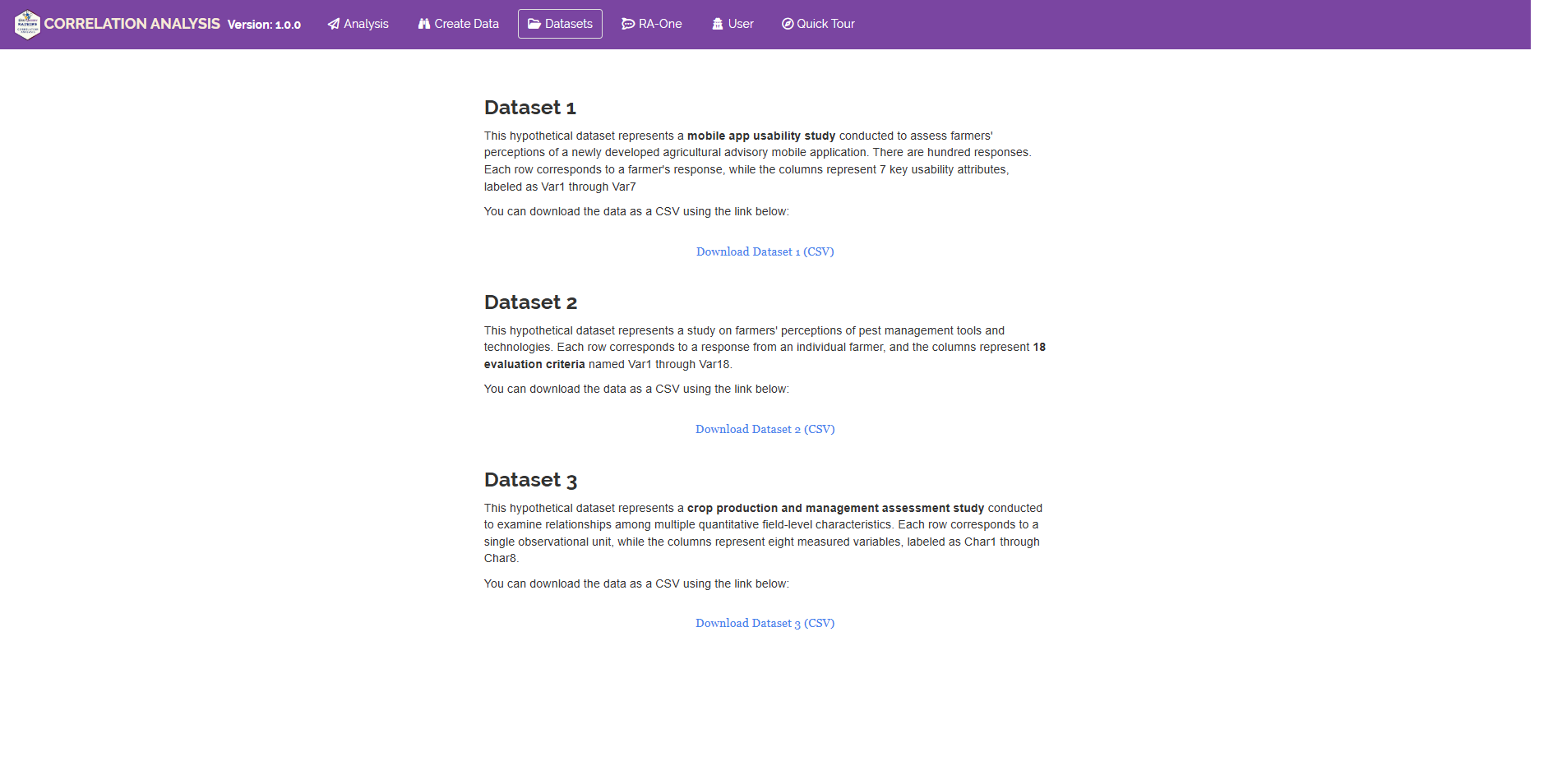
To test the app or better understand the expected data arrangement for correlation analysis, RAISINS provides model datasets within the app. You can download them from the Dataset tab and use them to explore the Correlation Analysis module before uploading your own data.
10 Correlation Analysis tab explained
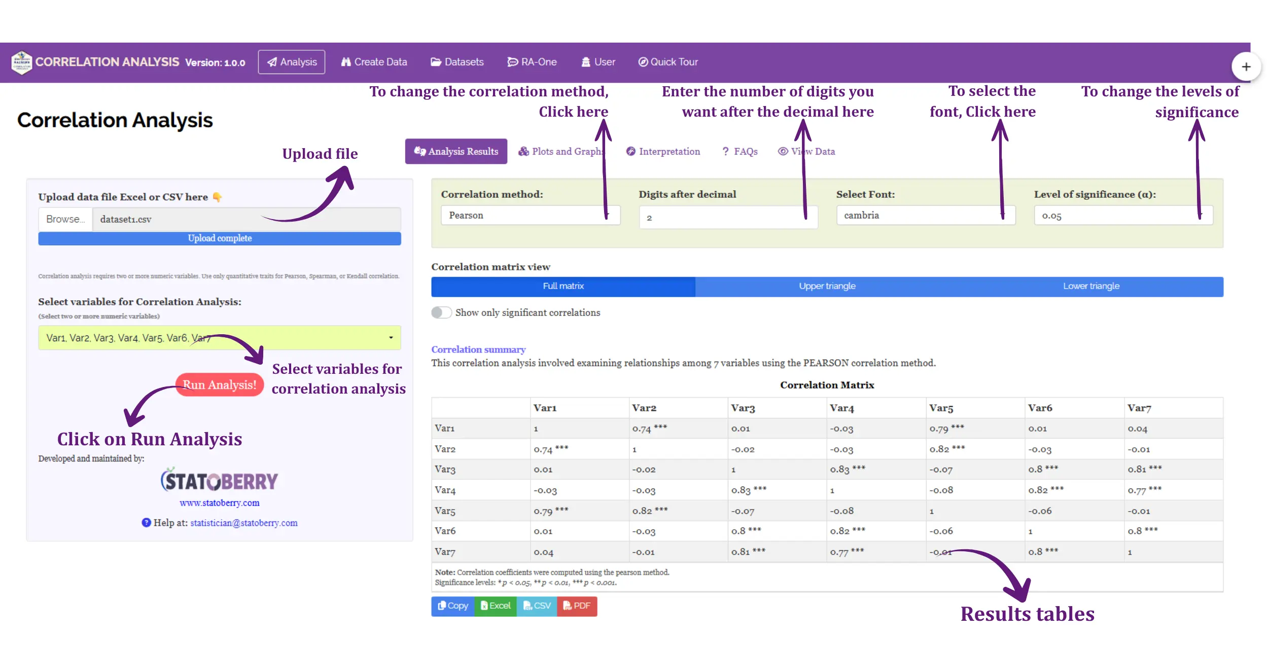
Once your dataset is ready, navigate to the Correlation Analysis tab in RAISINS. In Figure 7 you can see the detailed view of the Analysis tab, along with explanations of what each option does. Click the Browse button in the sidebar to upload your CSV or Excel file. After upload, use the Variables selector to choose two or more numeric columns for analysis. Use the Method selector to choose between Pearson, Spearman, and Kendall if you are unsure which to use, refer to Section 12 for guidance. When your selections are complete, click Run Analysis to generate the full correlation output. All tables and plots appear instantly. You may also access the Summary Stat sub-tab at any point after upload to review the distributional properties of your variables before drawing final conclusions.
11 Analysis results
Once you click Run Analysis, RAISINS produces two core output tables that together provide a complete picture of the pairwise relationships among all selected variables. The first is the Correlation Matrix, which reports the correlation coefficient r for every variable pair. The second is the Significance Matrix, which reports the exact p-value for the test of no correlation (H₀: ρ = 0) for each pair. Both tables should always be read together a large r is informative only when accompanied by a statistically significant p-value, and a significant p-value from a very large sample may correspond to a practically negligible r.
11.1 Correlation Matrix
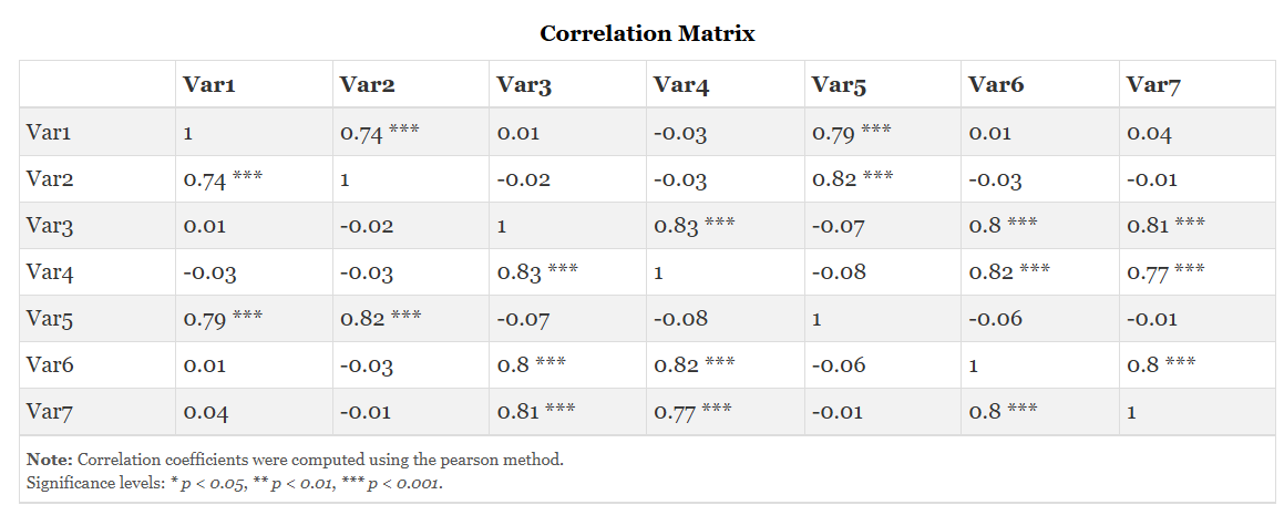
The Correlation Matrix shown in Figure 8 displays the pairwise correlation coefficient for every combination of selected variables. The main diagonal always contains 1.000, representing the perfect correlation of each variable with itself. The upper and lower triangles of the matrix are mirror images. Statistically significant correlations are automatically marked with asterisks: * for p < 0.05, ** for p < 0.01, and *** for p < 0.001.
Table 1: Correlation Matrix
Understanding the Correlation Matrix
| Element | Description |
|---|---|
| Diagonal (1.000) | Every variable is perfectly correlated with itself. These cells carry no information about pairwise relationships. |
| Off-diagonal cells | The correlation coefficient between the row variable and the column variable. Values range from −1 to +1. |
| Positive r | Both variables tend to increase together (direct relationship). |
| Negative r | One variable tends to increase as the other decreases (inverse relationship). |
| Significance stars | * p < 0.05 · ** p < 0.01 · *** p < 0.001. Absence of stars means the correlation is not statistically significant at the 5% level. |
| Magnitude guide | |r| < 0.3: weak · 0.3–0.6: moderate · 0.6–0.8: strong · > 0.8: very strong (context-dependent) |
11.1.1 Interpretation from Figure 8
In our example dataset, the correlation matrix reveals a clear two-group structure among the seven variables. Var1, Var2, and Var5 are strongly and positively correlated with one another: Var2–Var5 (r = 0.82***), Var1–Var5 (r = 0.79***), and Var1–Var2 (r = 0.74***), indicating that these three variables tend to increase together. A second, separate group is formed by Var3, Var4, Var6, and Var7, which are all strongly and positively inter-correlated: Var3–Var4 (r = 0.83***), Var4–Var6 (r = 0.82***), Var3–Var7 (r = 0.81***), Var3–Var6 (r = 0.80***), Var6–Var7 (r = 0.80***), and Var4–Var7 (r = 0.77***). In contrast, correlations between the two groups are all very close to zero and statistically non-significant for example, Var1–Var3 (r = 0.01), Var2–Var4 (r = −0.03), and Var5–Var6 (r = −0.06) showing that the two sets of variables vary essentially independently of each other. This pattern suggests that the seven variables capture two distinct, mutually uncorrelated underlying dimensions.
11.2 Significance Matrix
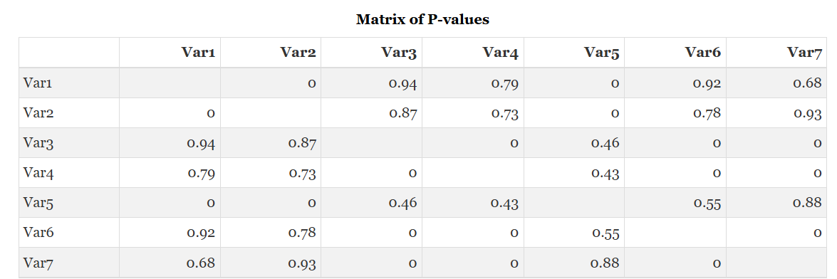
The Significance Matrix shown in Figure 9 presents the exact p-value for the hypothesis test H₀: ρ = 0 (no population correlation) for each variable pair. A p-value below 0.05 indicates that the observed correlation is statistically significant unlikely to have arisen by chance if the true population correlation were zero. This matrix complements the Correlation Matrix and must always be consulted alongside it.
Table 2: Significance (p-value) Matrix
Understanding Significance Stars and p-values
| Symbol | Threshold | Interpretation |
|---|---|---|
| *** | p < 0.001 | Highly significant — very strong evidence against H₀: ρ = 0 |
| ** | p < 0.01 | Significant at 1% level |
| * | p < 0.05 | Significant at conventional 5% level |
| (no star) | p ≥ 0.05 | Not statistically significant — insufficient evidence to conclude a population correlation exists |
The critical value of r for significance at α = 0.05 (two-tailed) depends on sample size. For n = 30 (df = 28), the critical |r| ≈ 0.361. Any correlation with magnitude below this threshold is not statistically significant regardless of its sign or direction. Larger samples have lower critical values with n = 100, any |r| > 0.197 is significant which is why statistical significance and practical importance must be considered separately.
11.2.1 Interpretation from Figure 9
The significance matrix confirms this two-group structure. Every within-group pair returns a p-value below 0.001 (displayed as 0 in the matrix), providing strong statistical evidence for a genuine population association Var1–Var2, Var1–Var5, and Var2–Var5 in the first group, and all six pairs among Var3, Var4, Var6, and Var7 in the second. In contrast, every between-group pair is statistically non-significant, with large p-values well above 0.05 (for example, Var1–Var3 p = 0.94, Var4–Var5 p = 0.43, Var5–Var6 p = 0.55, and Var1–Var7 p = 0.68), confirming that these weak coefficients cannot be distinguished from chance sampling variation. Researchers working with large correlation matrices should be aware that simultaneously testing many pairs increases the family-wise error rate consider applying a Bonferroni correction (dividing α by the number of tests) or a False Discovery Rate (FDR) adjustment when the number of variable pairs is large.
12 Choosing a correlation method
Before running the analysis, selecting the appropriate correlation method for your data is an important step that directly affects the reliability of your results. The Pearson coefficient is the correct choice when both variables are continuous and approximately normally distributed you can assess normality using the Shapiro-Wilk test and QQ plots available in the Summary stat tab of RAISINS. If either variable is ordinal, substantially skewed, or if the data contain outliers, Spearman’s rank correlation is the preferred alternative, as it replaces raw values with their ranks before computing r and thereby removes the influence of extreme observations and distributional asymmetry. Kendall’s tau is recommended over Spearman when the sample size is small (typically n < 30) or when the data contain a high proportion of tied ranks, since Kendall’s statistic has better sampling properties under these conditions and produces more interpretable significance tests. In RAISINS, switching between methods requires only a single click on the method selector, and all output tables and plots update instantly to reflect the chosen method making it straightforward to compare Pearson and Spearman results side by side as a sensitivity check on the robustness of your conclusions.
“When in doubt about the distributional properties of your data, use Spearman’s rank correlation it is robust, assumption-light, and appropriate for the vast majority of datasets encountered in agricultural and biological research.”
13 Plot Designs
RAISINS is designed for a smooth and hassle-free experience. Once you click the Run Analysis button, all relevant results and plots appear instantly leaving no room for confusion. Navigate to the Plot Design sub-tab to access the full suite of correlation visualisations for your dataset see Figure 10. Each plot comes with a gear icon at the top-left corner, allowing you to customise its appearance. You can also download these plots in high-quality PNG (300 dpi), JPEG, TIFF, PDF, and SVG formats for use in reports and publications.
13.1 Customizing plots
RAISINS provides a range of customisation features for each plot. Click the gear icon on any plot panel to open the settings shown in Figure 10, where you can modify the colour palette, font size, label size, colour scale direction, and plot dimensions. For the Correlation Heatmap, you can choose a diverging colour scale (e.g., blue–white–red) that intuitively represents negative, near-zero, and positive correlations respectively. Changes are reflected in real time and the updated plot can be downloaded immediately.
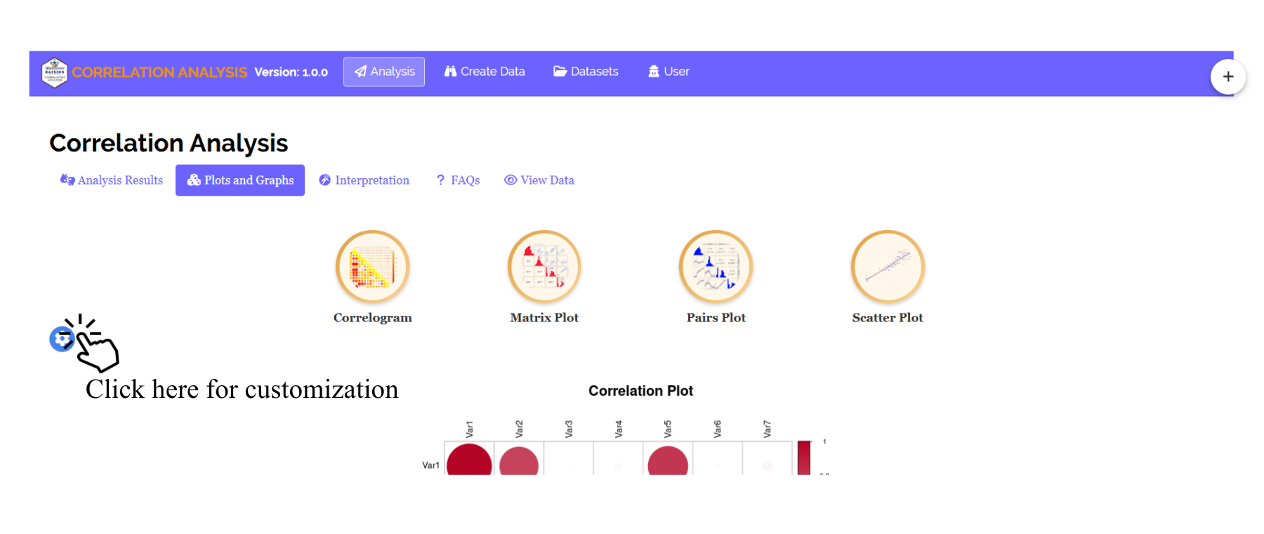
From Figure 11 to Figure 14, you can see the different types of plots available in the Plot Designs tab of the Correlation Analysis module in RAISINS. Each is visually illustrated and accompanied by a clear description below hover over any plot thumbnail to read it.
-01.png)
A matrix plot in correlation analysis is a graphical tool used to display the relationships between multiple variables simultaneously. It consists of a grid of scatter plots where each row and column represents a variable in the dataset. The plot helps in identifying positive, negative, or no correlation between variables. Diagonal sections often show variable names or histograms, while the off-diagonal sections display scatter plots illustrating pairwise relationships. Matrix plots are useful for detecting trends, patterns, clusters, and outliers in correlation studies.
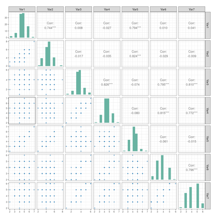
A pairs plot in correlation analysis is a graphical method used to visualize the relationship between multiple variables in a dataset. It displays scatter plots for every possible pair of variables in a matrix format. The diagonal section often shows variable names, histograms, or density plots, while the other sections show the pairwise relationships. Pairs plots help identify positive or negative correlations, trends, clusters, and outliers, making them useful for understanding the overall association among variables.
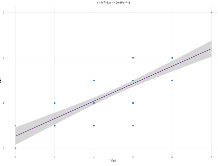
A scatter plot in correlation analysis is a graphical representation used to show the relationship between two variables. Each point on the graph represents a pair of data values. The pattern of points helps identify the direction and strength of correlation. If the points move upward from left to right, it indicates a positive correlation, while a downward pattern shows a negative correlation. Randomly scattered points indicate little or no correlation. Scatter plots are useful for detecting trends, patterns, and outliers in data.
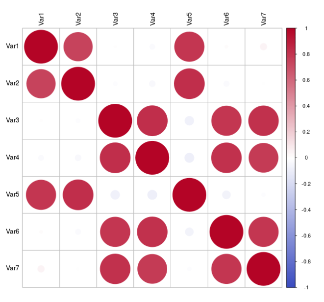
A correlogram in correlation analysis is a graphical representation used to display the correlation coefficients between multiple variables in a dataset. It is usually shown as a colored matrix where different colors and circle sizes represent the strength and direction of correlation. Positive correlations are often shown in one color and negative correlations in another. Correlograms help in quickly identifying strong, weak, or no relationships among variables and make complex correlation data easier to understand.
14 Interpretation
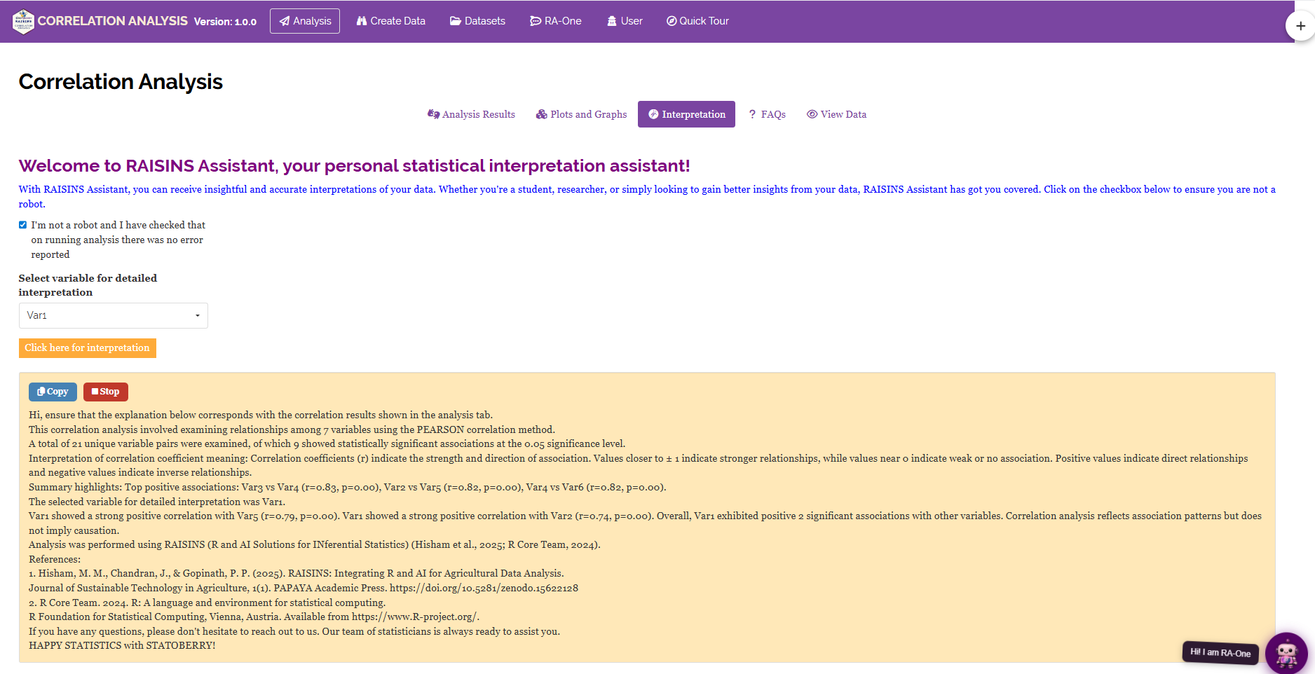
RAISINS is equipped with an AI-powered RAISINS Assistant designed to help users understand the outputs of correlation analysis clearly and confidently. As shown in Figure 15, the AI provides a plain-language summary of the full correlation matrix identifying the strongest and weakest pairwise associations, explaining the direction and practical meaning of each significant relationship in the context of your variables, and flagging pairs that may indicate multicollinearity if the data are to be used as inputs for a subsequent regression model. The assistant also draws attention to any variable pairs where the correlation is statistically non-significant despite an apparently large r (typically a consequence of a small sample size), and advises on whether Spearman or Kendall correlation may be more appropriate based on the distributional properties of the selected variables. Users can access this feature by opening the RA-One tab within the Correlation Analysis module (see Section 15).
15 RA-One AI Assistant
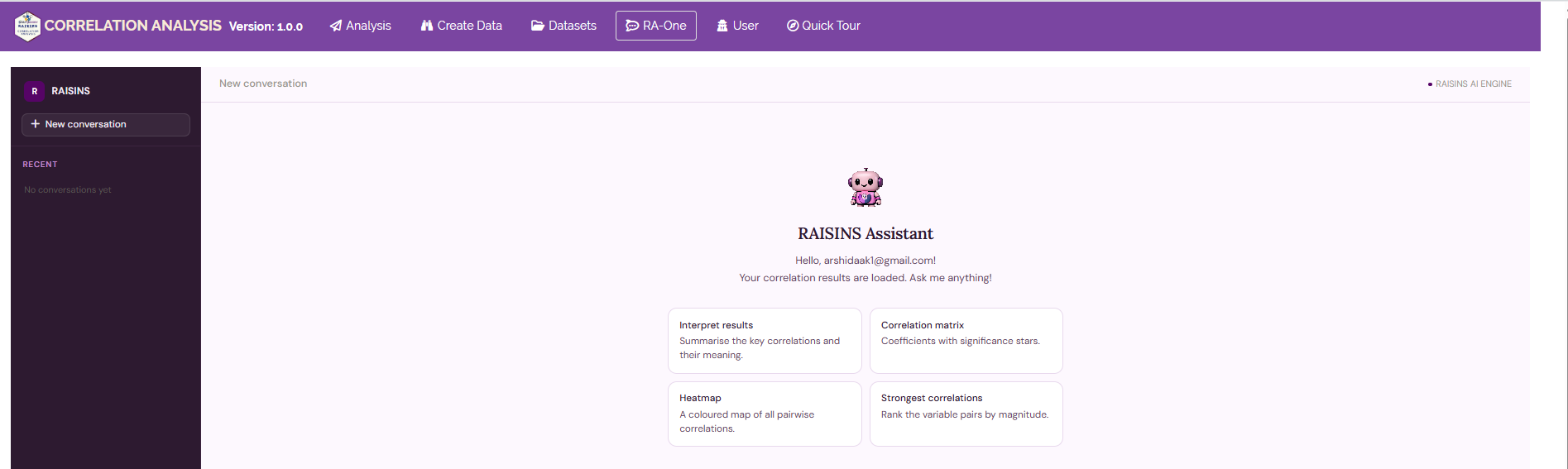
The AI assistant in RAISINS is called RA-One, and it lives in its own RA-One tab within the Correlation Analysis module. RA-One is a conversational assistant you simply type your question in plain language and it replies in plain language, with no coding required. Behind the scenes your data is analysed in real time using R and Python environments, while the AI helps interpret the results and answer your queries. When you first open the tab, a short welcome and privacy notice appears; RA-One does not store your data or your chat history, as all processing happens within your active session and is cleared permanently once the session ends. RA-One is built specifically for correlation work and can help you with data preparation, checking whether your sample size is adequate, fetching model datasets, explaining statistical concepts, displaying result tables and plots inside the chat, and interpreting your own results.
15.1 Preparing your data with RA-One
One of the most convenient features of RA-One is that it can build a ready-to-use data template for you. Just tell it, in ordinary words, how many variables and observations you need for example, “create a data template with 7 variables and 30 observations” and the app generates a downloadable CSV file laid out in exactly the structure RAISINS expects: one optional label column (e.g., Sample) followed by one column per numeric variable, with one row per observation. If you ask for too few rows, RA-One automatically applies the correlation sample-size rules (at least 2 variables, at least 3 observations, and ideally 30 or more for a stable estimate) and adjusts the template accordingly, letting you know what it changed. You then open the downloaded CSV, fill in or paste your measurements, and upload it back into the Correlation Analysis tab. You can also ask RA-One for a built-in model dataset to practise with, and it will provide one with a download button. This makes RA-One a fast, guided alternative to preparing the file manually in MS Excel (see Section 5).
15.2 Getting results and interpretations in the chat
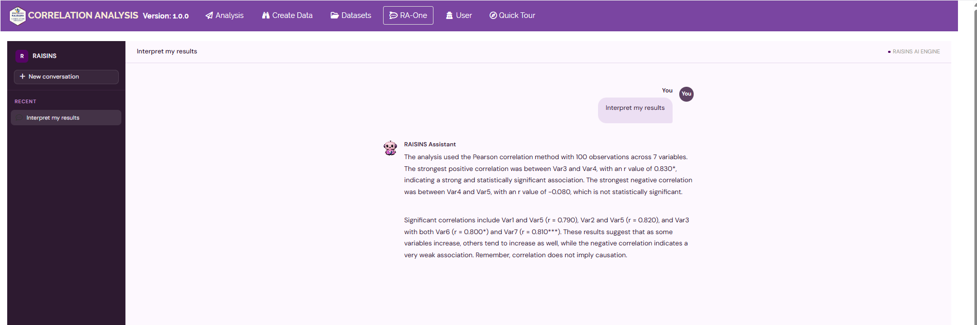
Once your dataset is uploaded and analysed, RA-One can display your results directly inside the chat there is no need to switch between tabs. You can ask it to show the Correlation matrix (with significance stars), the P-value matrix, the strongest correlation pairs ranked by magnitude, or the correlations of a single variable against all the others. RA-One can also render the main plots in the conversation, including the correlation heatmap/correlogram, scatter plot, scatterplot matrix, correlation bar chart, and correlation network. Beyond simply showing the numbers, it explains them in plain language identifying which variable pairs are strongly, weakly, or not meaningfully associated, distinguishing the direction (sign) of each relationship from its strength (magnitude), and reminding you that correlation does not imply causation. Importantly, when interpreting results RA-One uses only the values from your loaded analysis, so its explanations always reflect your actual data.
16 FAQ’s
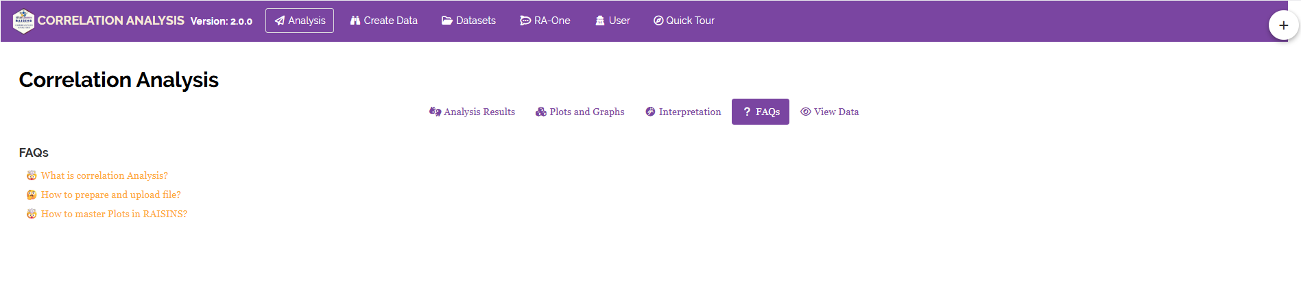
The app includes a dedicated FAQs tab to help clarify common doubts and guide users through all features of the Correlation Analysis module. This section provides detailed answers to frequently asked questions, covering topics such as how to choose between Pearson, Spearman, and Kendall, how to interpret asterisks in the correlation matrix, what to do when correlation is significant but r is small, and how to handle missing values in the dataset. If you’re ever unsure about how something works in RAISINS, the FAQstab is a great place to start.
17 View data
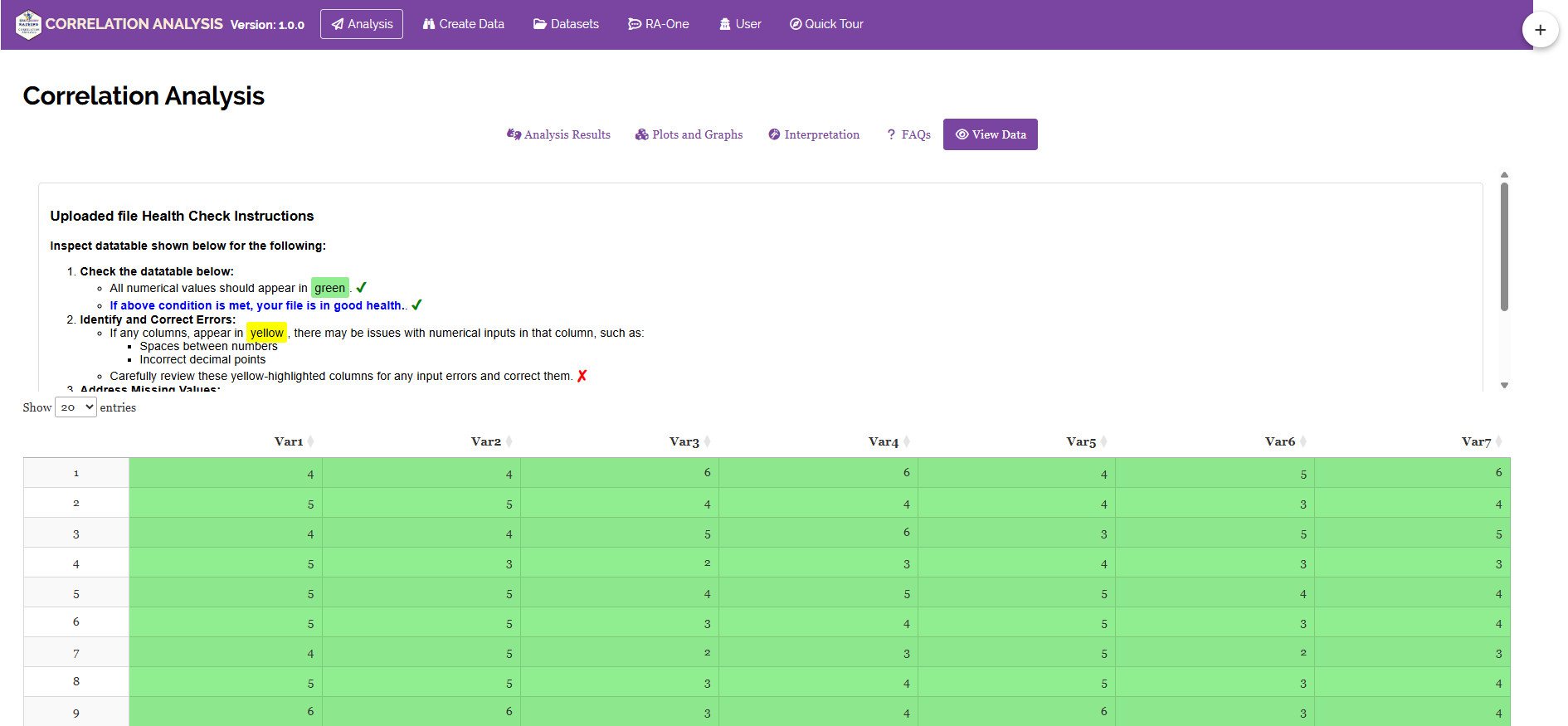
View Data serves as the primary diagnostic tool for ensuring data integrity before analysis. Upon uploading your dataset, the system performs an automated Health Check to validate column types and formatting. For correlation analysis, this step is particularly important RAISINS will flag any column that contains non-numeric values, missing entries, or formatting inconsistencies that could affect the correlation computation. Resolving these issues before clicking Run Analysis ensures that all outputs are based on clean, correctly typed data and that the correlation results are fully reliable.