K-Means Cluster Analysis
K-Means clustering groups observations into k clusters based on overall similarity across several numeric variables, with no predefined labels. This tutorial explains what K-Means is, how RAISINS helps you choose k, and how to run the whole analysis in RAISINS… Read more …
K-Means clustering is a widely used unsupervised machine learning technique for identifying natural groupings in multivariate data without predefined class labels. This tutorial introduces the fundamentals of K-Means clustering and demonstrates how to perform the analysis in RAISINS, including data scaling, selection of the optimal number of clusters using the Elbow and Silhouette methods, cluster statistics, visualization, validation measures, interpretation of results, and further exploration using RA-One Chat, all without writing any code.
1 What is K-Means clustering?
Imagine you visit a field containing 60 rice varieties. At first glance, they all look different, but some are naturally more alike than others. Instead of manually comparing every variety, you measure traits such as plant height, days to flowering, grain yield, and number of tillers. K-Means clustering examines these measurements and automatically places similar varieties into the same group, making it easier to understand the diversity among the varieties and select similar ones for future breeding
K-Means clustering helps group similar observations together based on their characteristics. It repeatedly asks a simple question:
Which observations are most similar to one another, and how can they be grouped into k clusters so that members of the same cluster are as similar as possible?
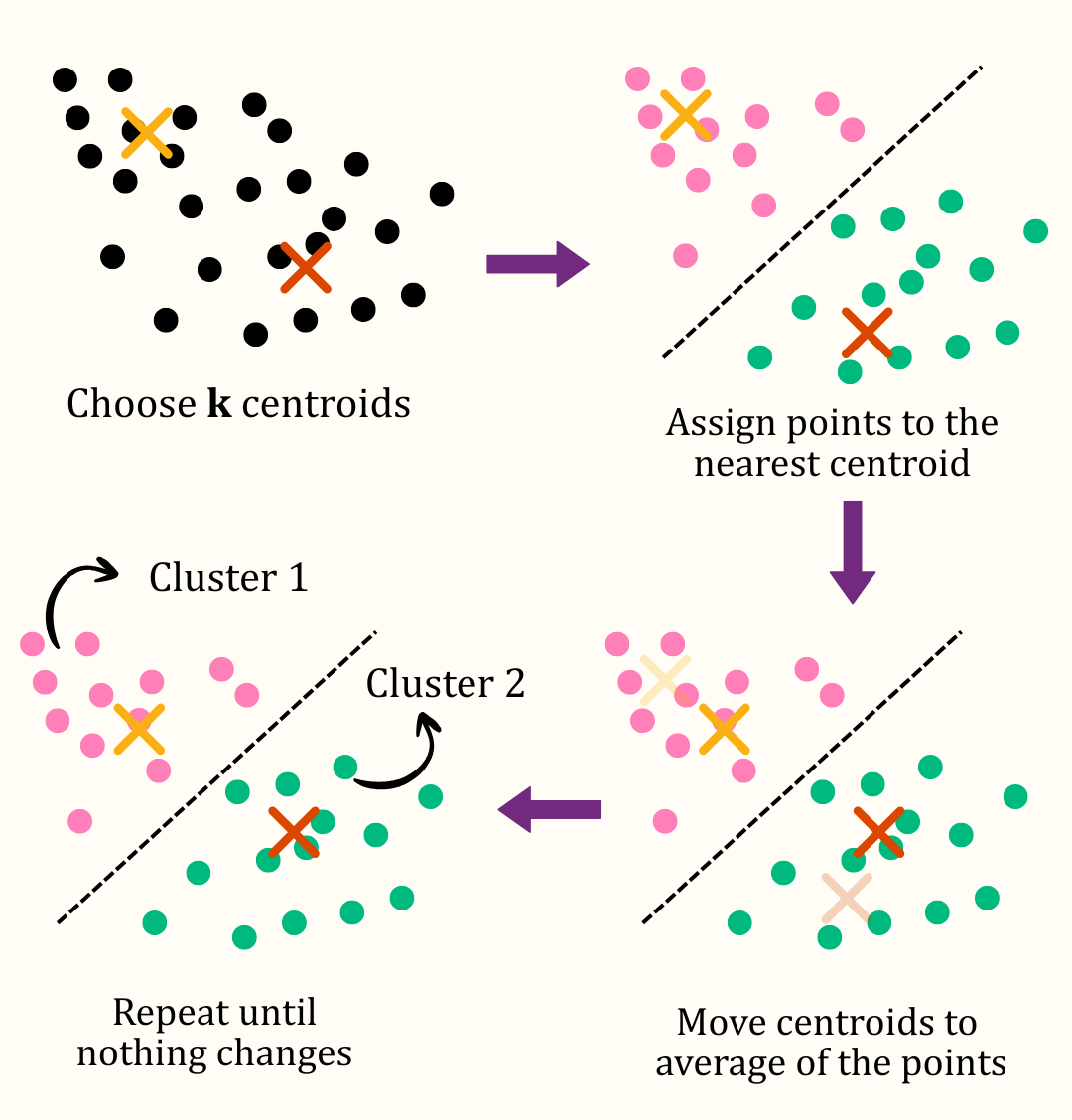
That is the whole idea. K-Means picks k points called centroids(average) (one per cluster), assigns every observation to its nearest centroid, then moves each centroid to the average position of the points now assigned to it, and repeats until nothing changes. The result is k clusters, where observations within the same cluster are as similar as possible, while observations in different clusters are as distinct as possible.
K-Means groups observations so that points within the same cluster are as similar as possible, and points in different clusters are as different as possible, using distance between the observations called as Distance Matrix.
Formally, K-Means minimises the total within-cluster sum of squares (WCSS):
\[\text{minimise} \sum_{k=1}^{K}\sum_{i \in C_k} \lVert x_i - \mu_k \rVert^2\]
where \(x_i\) is an observation, \(C_k\) is cluster \(k\), and \(\mu_k\) is the centroid (mean) of that cluster. A small WCSS means each observation sits close to its own cluster’s centroid; a large WCSS means the clusters are loose and poorly separated.
Unlike a hypothesis test, K-Means has no null hypothesis and produces no p-value. It will always produce k clusters if you ask for k clusters, even from data with no real structure at all. The plots and validation measures later in this tutorial (Section 3, Section 14) exist precisely to help you judge whether the grouping you got is meaningful, and whether k was a sensible choice.
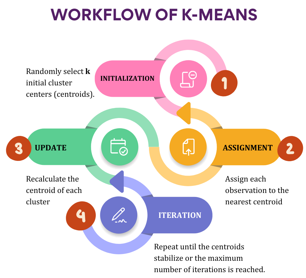
The final clusters are formed such that observations within the same cluster are as similar as possible, while observations in different clusters are as distinct as possible.
A little history: Lloyd, MacQueen, and the "k" in K-Means
-
The core algorithm was described independently by several researchers, most notably Stuart Lloyd at Bell Labs in 1957 (though his work was only published in 1982) as a method for pulse-code modulation, and by James MacQueen in 1967, who coined the name “k-means” in a paper on classification. The “k” simply refers to the number of clusters you choose, and “means” to the fact that each cluster is represented by the arithmetic mean (centroid) of its members. Despite being over sixty years old and remarkably simple to describe, K-Means remains one of the most widely used clustering algorithms today because it is fast, scales well to large datasets, and produces results that are easy to interpret.
2 Choosing how to scale your variables
K-Means measures similarity using distance, and distance is dominated by whichever variable happens to have the largest numbers. Imagine you want to group plants based on plant height (measured in centimeters) and seed weight (measured in grams). Plant height might range from 50 to 200 cm, while seed weight ranges from only 2 to 10 g. If these values are used directly, the much larger numbers for plant height will dominate the distance calculation, causing the clusters to be formed mainly according to height while largely ignoring seed weight. To ensure that every variable contributes fairly, RAISINS scales the variables before clustering, placing them on a common scale so that no single measurement dominates simply because it has larger numerical values.
| Method | What it does | When to use it |
|---|---|---|
| Z-score (default) | Centres each variable at mean 0 and rescales to standard deviation 1 | The safe general-purpose default for most datasets |
| Center | Subtracts the mean only, keeps the original spread | When the original units and relative variability should be preserved |
| Min-Max | Rescales every variable to the 0–1 range | When you want all variables to have exactly the same range |
| Unit length | Rescales each variable to length 1 | When only the pattern across variables matters, not magnitude |
| Robust | Centres on the median and scales by the IQR | When your data contain outliers that would distort a mean-based scaling |
| None | Uses the raw values as measured | Only when all variables already share the same meaningful unit and scale |
Leave the scaling method at the default, Z-score. It puts every variable on a common footing and is the standard choice in the clustering algorithm. Switch to Robust if a quick look at your data shows one or two extreme outliers, and only choose None if every variable you selected is already directly comparable (for example, all recorded as percentages).
See the exact formula, methodology, and a worked example for each scaling method
The table above summarises what each method does. If you want to see exactly how each one is calculated, the worked example below uses a single clustering variable measured on five observations: x = 10, 12, 14, 18, 26. Its mean is \(\mu = 16\), sample standard deviation \(\sigma = 6.3246\), median \(= 14\), first and third quartiles \(Q_1 = 12\) and \(Q_3 = 18\) (so \(IQR = 6\)), minimum \(= 10\), maximum \(= 26\), and Euclidean norm \(\lVert x \rVert_2 = \sqrt{1440} = 37.947\). Every value below is rounded to 3 decimal places.
2.0.1 None
No transformation is applied; the raw values are passed straight to the algorithm.
\[x' = x\]
Methodology: select the clustering variables and use them as-is. Only appropriate when every selected variable already shares the same unit and a comparable range.
Result: 10, 12, 14, 18, 26 (unchanged)
2.0.2 Center
Subtracts the column mean from every value; the spread (variance) is left untouched.
\[x' = x - \mu\]
Methodology: compute the mean \(\mu\) of the column, then subtract it from every observation.
Result: \(x - 16\) → −6.000, −4.000, −2.000, 2.000, 10.000
2.0.3 Z-score (default)
Centres the variable to mean 0 and rescales it so its standard deviation becomes 1 — the standard “standardization” used before K-Means.
\[x' = \frac{x - \mu}{\sigma}\]
Methodology: compute the mean \(\mu\) and sample standard deviation \(\sigma\) of the column, subtract \(\mu\) from every value, then divide by \(\sigma\).
Result: \((x - 16) / 6.3246\) → −0.949, −0.632, −0.316, 0.316, 1.581
2.0.4 Min-Max
Linearly rescales every value into the fixed range \([0, 1]\) based on the column’s observed minimum and maximum.
\[x' = \frac{x - \min(x)}{\max(x) - \min(x)}\]
Methodology: find the minimum and maximum of the column, subtract the minimum from every value, then divide by the range. If the column is constant (max = min), every value becomes 0 instead of dividing by zero.
Result: \((x - 10) / 16\) → 0.000, 0.125, 0.250, 0.500, 1.000
2.0.5 Unit length
Divides every value in the column by that column’s Euclidean (L2) norm, so the rescaled column’s sum of squares equals 1. Unlike the other methods, it does not re-centre the data — only magnitude is controlled.
\[x' = \frac{x}{\lVert x \rVert_2}, \qquad \lVert x \rVert_2 = \sqrt{\textstyle\sum_i x_i^2}\]
Methodology: compute the column’s L2 norm (square root of the sum of squared values), then divide every value by it. If the norm is 0, every value becomes 0 instead of dividing by zero.
Result: \(x / 37.947\) → 0.264, 0.316, 0.369, 0.474, 0.685
2.0.6 Robust
Follows the same idea as z-score, but replaces the mean and standard deviation with the median and interquartile range (IQR) — both far more resistant to outliers.
\[x' = \frac{x - \text{median}(x)}{IQR(x)}\]
Methodology: sort the column and compute its median, then compute \(Q_1\) and \(Q_3\) (the 25th and 75th percentiles) and \(IQR = Q_3 - Q_1\). Subtract the median from every value, then divide by the IQR. If the IQR is 0, every value becomes 0 instead of dividing by zero.
Result: \((x - 14) / 6\) → −0.667, −0.333, 0.000, 0.667, 2.000
Look at how the largest, most extreme observation (26) is treated differently by each method: it scales to 1.581 under z-score but only 2.000 under robust scaling relative to the tighter middle spread of the data — robust scaling is deliberately less “pulled” by that single extreme value, since it never uses the mean or standard deviation. This is exactly why robust scaling is the recommended choice when your clustering variables contain outliers.
3 How RAISINS helps you choose the number of clusters (k)
Here is where K-Means differs most from a hypothesis test: nothing in the data tells you, with certainty, the “correct” number of clusters. You must choose k, and the choice matters. RAISINS does not choose k for you, but it gives you several independent lines of evidence and lets you make an informed decision.
4 Choosing the Optimal Number of Clusters
K-Means needs you to say how many clusters you want before it starts, but in real data you rarely know that number in advance. The three methods below are simply different ways of trying values of k and asking, in different ways, “does this number of groups actually correct?”
4.1 The Elbow Method
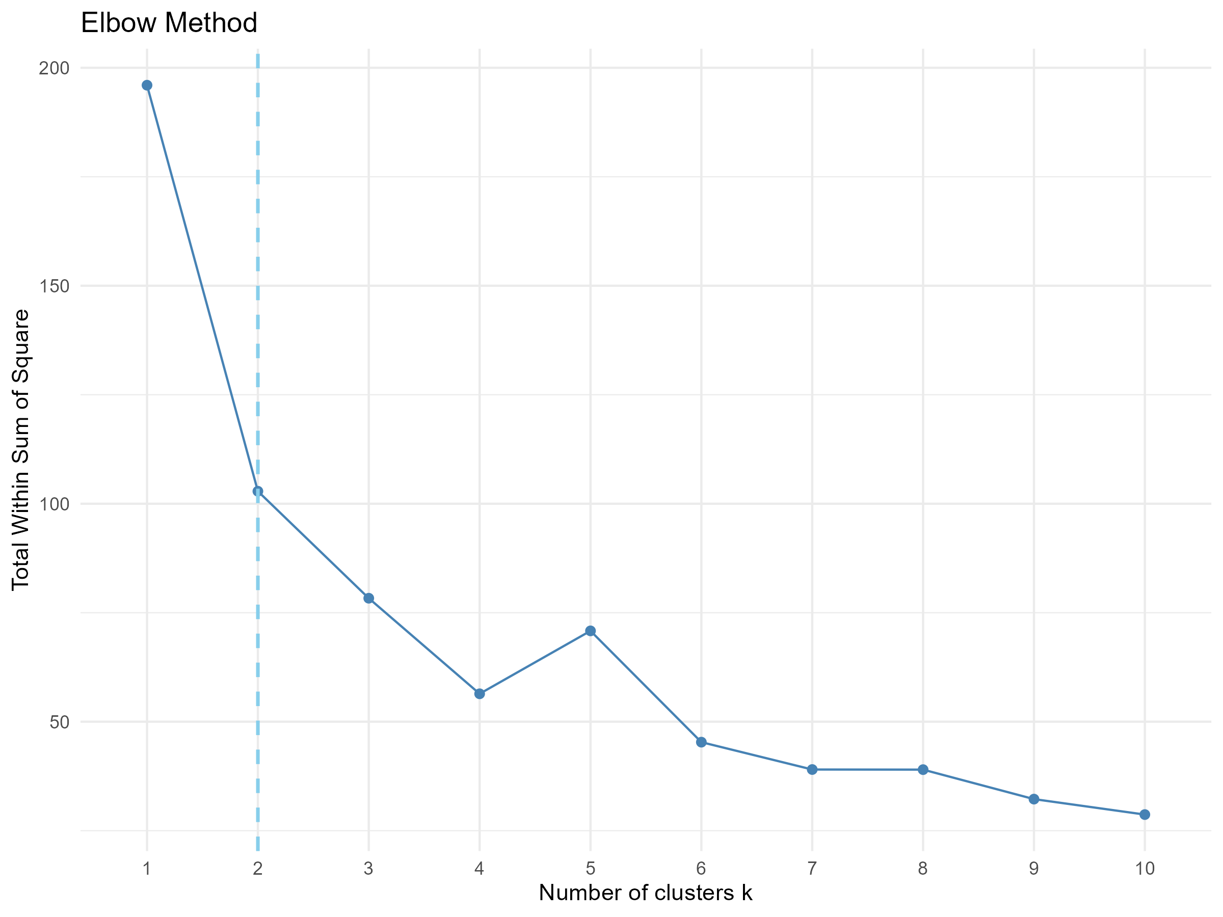
WCSS totals how spread out the points are inside each cluster, a single number for how tightly packed your clusters are. More clusters always shrink this number, but past a point the improvement barely matters. Plotting WCSS against k gives a curve that drops sharply, then flattens, bending like an elbow, that bend is the suggested k.
In RAISINS: The bend is detected automatically and pre-fills the suggested k, which you can always override.
4.2 The Silhouette Method
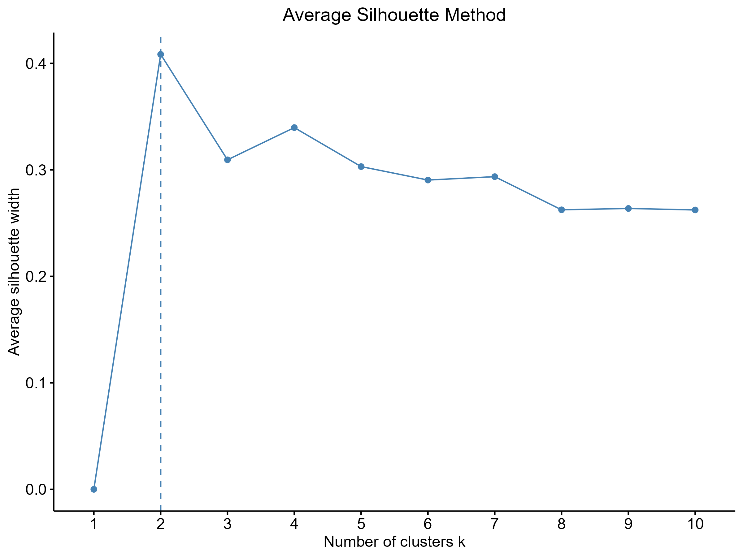
Instead of a bend, this method looks for a peak. For each observation, it compares how close that point sits to its own cluster against the nearest other cluster, then averages this into one score from −1 to 1, higher meaning tighter, more separated clusters. The k with the highest peak wins, favouring fewer, cleaner clusters than the elbow method, so the two will not always agree.
In RAISINS: The peak is identified automatically and presented as the recommended number of clusters.
4.3 The Gap Statistic
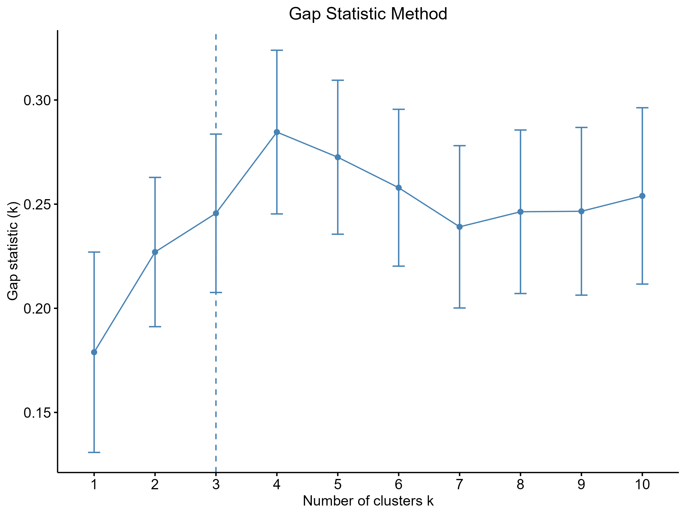
This method compares your clustering to what you’d get from data with no real structure at all, just randomly scattered points. RAISINS clusters your actual data and a set of random reference datasets the same way, then compares how tightly each packs together. A large “gap” means your data clusters far more convincingly than random noise would.
In RAISINS: The recommended k from the Gap Statistic is displayed alongside the other two to help you decide.
These three methods, together with the validation indices covered in Section 14, will sometimes agree and sometimes disagree. That is normal, and expected, not a bug. K-Means does not have a single automatic answer for k. Use the elbow plot as your starting point, cross-check it against the silhouette and gap plots, and let your subject-matter knowledge (how many meaningful groups do you actually expect?) make the final call.
RAISINS runs the elbow, silhouette, and gap-statistic calculations automatically the moment your data and variables are selected, and pre-fills a suggested Number of Clusters. The methods above are there so you understand why that number was suggested, not because you must compute it yourself.
5 Assumptions and things to check before clustering
K-Means is a geometric method, and it works best when a short list of conditions hold.
| Requirement | What it means | What if it fails? |
|---|---|---|
| Numeric variables | Every clustering variable must be a proper number, not text or a category | Recode categorical variables, or exclude them from the clustering variables |
| No missing values | K-Means cannot compute a distance to a missing value | Clean or impute the dataset before uploading |
| Comparable scales | Variables measured in very different units can dominate the distance calculation | RAISINS handles this for you through the scaling methods in Section 2 |
| Unique observation labels | Each row needs its own identifier so results can be traced back to it | Remove duplicate labels before uploading |
Scaling and missing-value checks are handled automatically once you select your label and variable columns, RAISINS validates both before it will let you run the analysis. If a look at the cluster plot (Section 13) suggests your data actually form long chains or wildly uneven groups, RAISINS’s hierarchical clustering module is a better-suited companion tool for that kind of structure.
6 Getting to the module
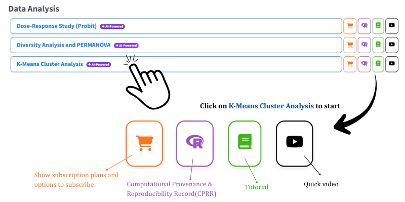
Now that the theory is clear, let us run the analysis. Visit the RAISINS home page at www.raisins.live and go to Data Analysis. In this tutorial we use the K-Means Cluster Analysis module, shown in Figure 1.
6.1 Computational Provenance & Reproducibility Record
CPRR (Computational Provenance & Reproducibility Record) provides a transparent and comprehensive record. Click on the icon shown in Figure 1 to access CPRR and know about the computational workflow performed during the analysis. The record for this module states the R version and the exact version of every package used, names the specific function behind each reported result. CPRR lists every default parameter and decision rule applied by the module and provides fully runnable R code that reproduces each analytical step. Users can execute the code in R to independently reproduce and verify the results. It carries its own DOI.
To cite the platform itself in a paper, thesis, or report, use the RAISINS citation, available in APA, Harvard, and BibTeX formats at www.raisins.live/citation.html. That is the primary reference, and for most manuscripts it is all you need.
The CPRR for K-Means Cluster Analysis is at www.raisins.live/module_record/kmeans.html.
7 Preview mode and Quick Tour
Before subscribing, you can explore the entire module using Preview mode, accessible from the Welcome page. Preview mode loads built-in datasets so you can try every feature (clustering, the elbow and silhouette methods, all the cluster plots, and the RA-One assistant) without uploading your own data. First-time users are also offered a Quick Tour, an interactive, step-by-step walkthrough that highlights each control and explains what it does. You can retake the tour at any time from the Quick Tour tab.
8 A working example
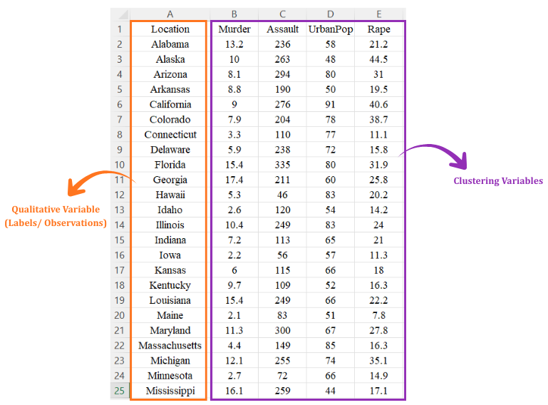
This example uses the USArrests dataset, which contains data for the 50 U.S. states. Each state is described using four variables: Murder, Assault, UrbanPop, and Rape. Since there are no predefined groups, K-Means clustering is used to discover which states have similar characteristics. The goal is to determine the appropriate number of clusters and understand what makes each cluster different
9 How to prepare your data
Your analysis is only as good as your data. Feed RAISINS high-quality data and it will deliver powerful insights; feed it messy data and the results will not be trustworthy. You have four routes:
- Create your dataset in MS Excel Section 9.1
- Build your dataset directly within the RAISINS app Section 9.2
- Use the Model datasets in RAISINS as a reference Section 9.3
- Create your dataset using the RA-One chat assistant Section 9.4
9.1 Preparing data in MS Excel
Open a new blank sheet in MS Excel containing only one sheet, and avoid adding any unnecessary content. The dataset should follow a column-based format, where the first column holds a unique label for every observation (for example, a state name, farm ID, or respondent number; this column should not repeat the same value across rows). All variables under study (for example, Murder, Assault, UrbanPop) should occupy separate numeric columns. The file can be saved as CSV, XLS, or XLSX, but CSV is recommended as it is lighter and loads faster. Ensure there are no unwanted spaces in column names or labels. For reference, see the structure in Figure 3.
Dataset creation rules
- Column naming convention
- No spaces allowed in column names.
- Use underscores (
_) or full stops (.) for separation. - Avoid symbols and special characters such as %, #.
- Data arrangement
- Start the data towards the upper-left corner.
- Ensure the row above the data is not blank.
- Cell management
- Avoid typing or deleting in cells without data.
- If needed, select the affected cells, right-click, and choose Clear Contents.
- Column relevance
- Name all columns meaningfully.
- Exclude unnecessary columns not required for the analysis.
- Labels and variables
- The label column must contain a unique value for every row, duplicate labels are rejected.
- All clustering variables must be numeric; K-Means cannot use text or category columns directly.
- Do not leave any cell in a clustering variable blank, K-Means cannot handle missing values.
How to save as CSV in MS Excel
Open your workbook. Ensure your data is arranged properly with only one sheet.
Click the ‘File’ menu. Go to the top-left corner and click File.
Choose ‘Save As’ or ‘Save a Copy’. Select the location where you want to save your file.
Set file type to CSV. In the ‘Save as type’ dropdown, choose CSV (Comma delimited) (*.csv).
Name your file. Enter a relevant file name without spaces (use underscores if needed).
Click ‘Save’. Click Save to export the file.
💡 Tip: Before saving, double-check that your data is on the first sheet and follows the required format: no empty rows above the data, meaningful column names, a unique label in every row, and no blank cells in the variable columns.
9.2 Prepare using Create Data in RAISINS
If you are unsure about the correct format, do not worry, RAISINS can create the data layout for you. Here is how:
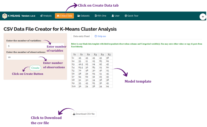
- Navigate to the Create Data tab
- Enter the number of Variables
- Enter the number of Observations
- Click the Create button
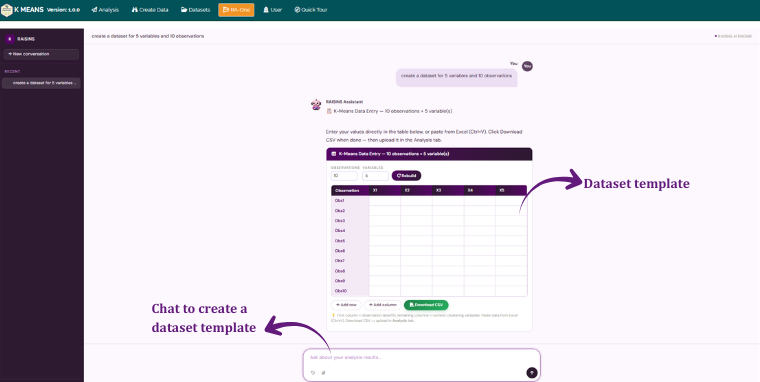
The model layout appears as shown in Figure 4, an editable table ready for you to fill in directly. Once the observations are entered, download the CSV and upload it under Analysis.
9.3 Download Model Datasets
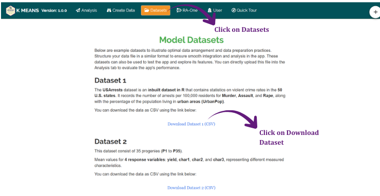
If you are unsure about the required data format or would like to explore the module before using your own data, RAISINS provides model datasets for reference. To download them:
- Navigate to the Datasets tab
- Click the Download CSV link corresponding to the required dataset
- Save the file to your computer
- Use the model dataset as a reference for preparing your own data or upload it directly to explore the analysis
9.4 Creating a dataset using RA-One chat
RA-One, the built-in chat assistant, can help you create a properly formatted dataset through a simple conversation. To get started, open the RA-One chat by clicking the chat icon available within the app or by heading over to the RA-One tab. Now you can enter the number of observations and clustering variables, and RA-One will generate a dataset in the required format. You can review the generated dataset in the chat, download it as a CSV file, and upload it directly under the Analysis tab. The full workflow is illustrated in Figure 6 below.
10 The Analysis tab
Figure 7 shows the Analysis tab in detail. Upload your prepared file by clicking Browse in the sidebar. Once uploaded, selectors for the Label column and the Clustering Variables appear (choose at least two numeric variables). Click Run Analysis.
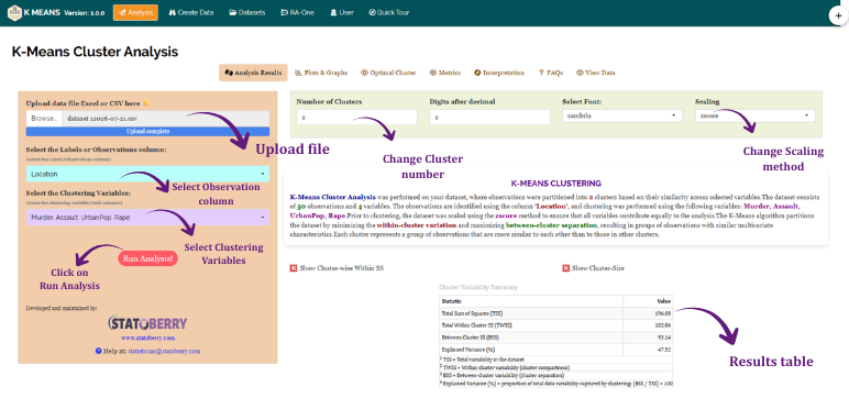
Once results appear, a control panel lets you fine-tune the run: the Number of Clusters (k) box (pre-filled with the elbow method’s suggestion, see Section 3), the number of Digits to display, the Font used in tables, and the Scaling method (Section 2). A short descriptive paragraph, generated automatically, restates in plain language what was done: how many observations and variables were used, which scaling method was applied, and how many clusters were formed. Two toggles let you optionally add cluster-wise Within Sum of Squares and cluster size rows to the statistics table. When you are ready, download a full report in HTML, Word, PDF, or Excel format.
11 Choosing k: the Optimal Cluster tab
The Optimal Cluster sub-tab displays the three diagnostic plots introduced in Section 3 side by side: the Elbow Plot, the Silhouette Plot, and the Gap Statistic plot, each downloadable in PNG, JPEG, TIFF, PDF, or SVG format.
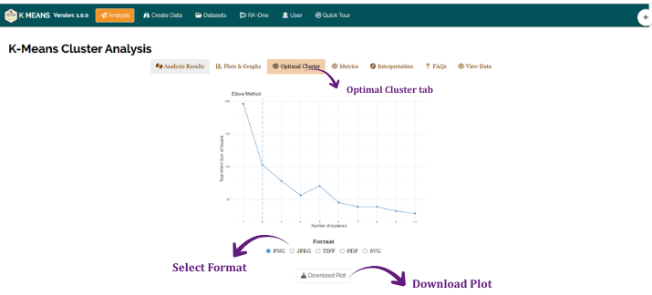
Read the elbow plot by looking for the point where the curve stops falling steeply and starts to flatten out, that bend is the suggested k, marked with a dashed line on the plot.
Silhouette Plot: Read the silhouette plot by looking for the highest peak. That value of k gives the best-separated, most internally consistent clusters.
Gap Statistic Plot: Read the gap statistic plot by looking for the smallest k whose gap value is within one standard error of the highest gap observed (the 1-SE rule). A larger gap indicates stronger clustering than would be expected by chance.
12 Analysis results
Back on the Analysis Results sub-tab, five tables summarise the clustering: Cluster Statistics, Cluster Centers, Cluster Membership, Raw Cluster Means, and Cluster Membership with Variables and Observations.
Table 1: Cluster statistics
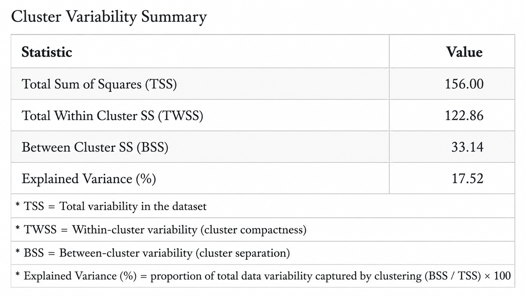
RAISINS reports the Total Sum of Squares (TSS), the Total Within-Cluster Sum of Squares (TWSS), the Between-Cluster Sum of Squares (BSS), and the Explained Variance (%), which is simply BSS divided by TSS. A higher explained variance means the clusters you formed capture more of the total spread in your data, in other words, the grouping is doing real work rather than splitting near-identical observations apart for no reason. Turning on the two toggles from Section 10 adds a per-cluster breakdown of Within Sum of Squares and cluster size to this same table.
Table 2: Cluster centers
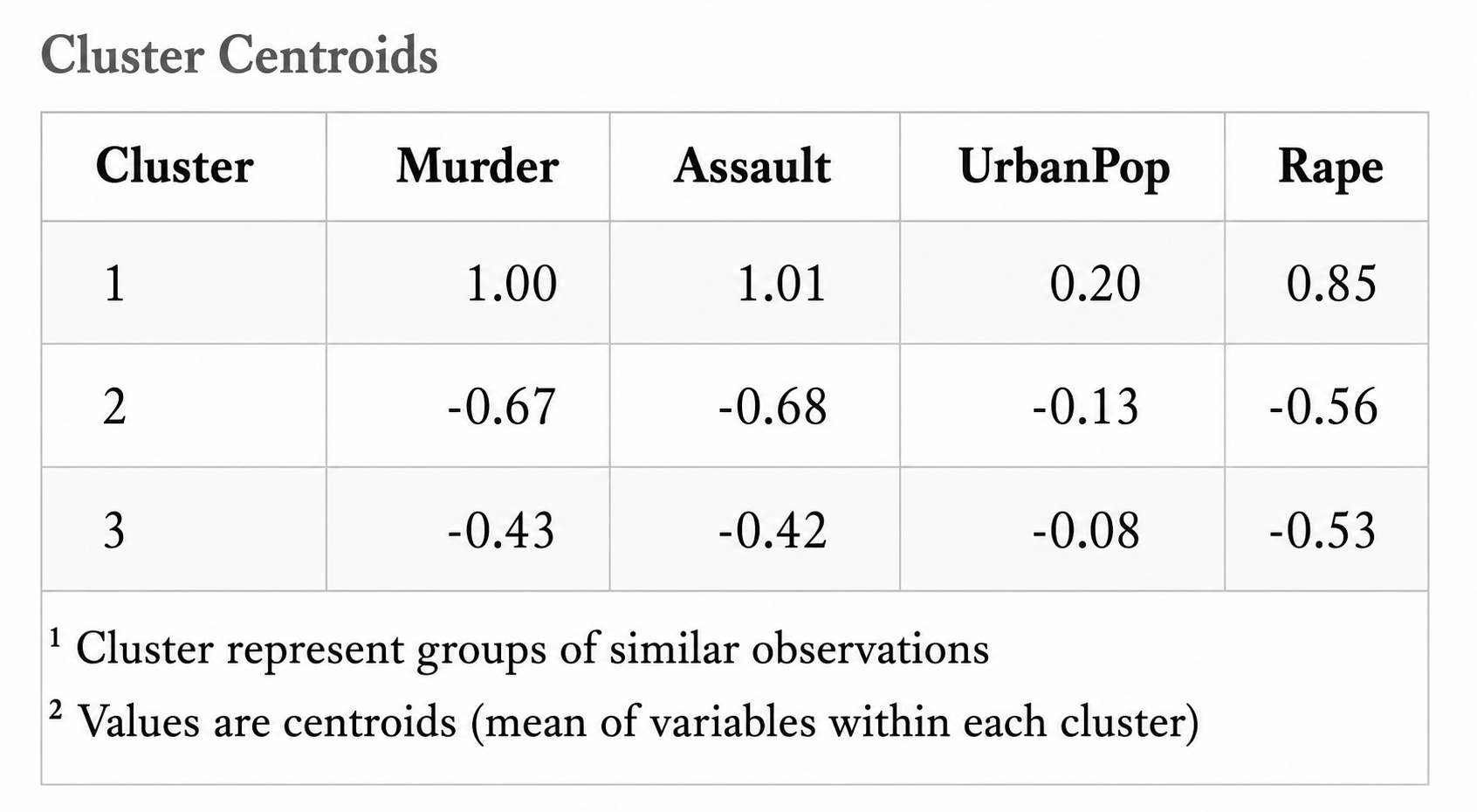
In this table each row is a cluster, each column a clustering variable, and each cell the centroid value, the average of that variable among observations in that cluster (on the scaled values from Section 2). Reading across a row tells you what makes that cluster distinctive: a cluster with a high Assault centroid and a low UrbanPop centroid, for instance, represents states with high violent crime but a largely rural population.
Table 3: Cluster membership
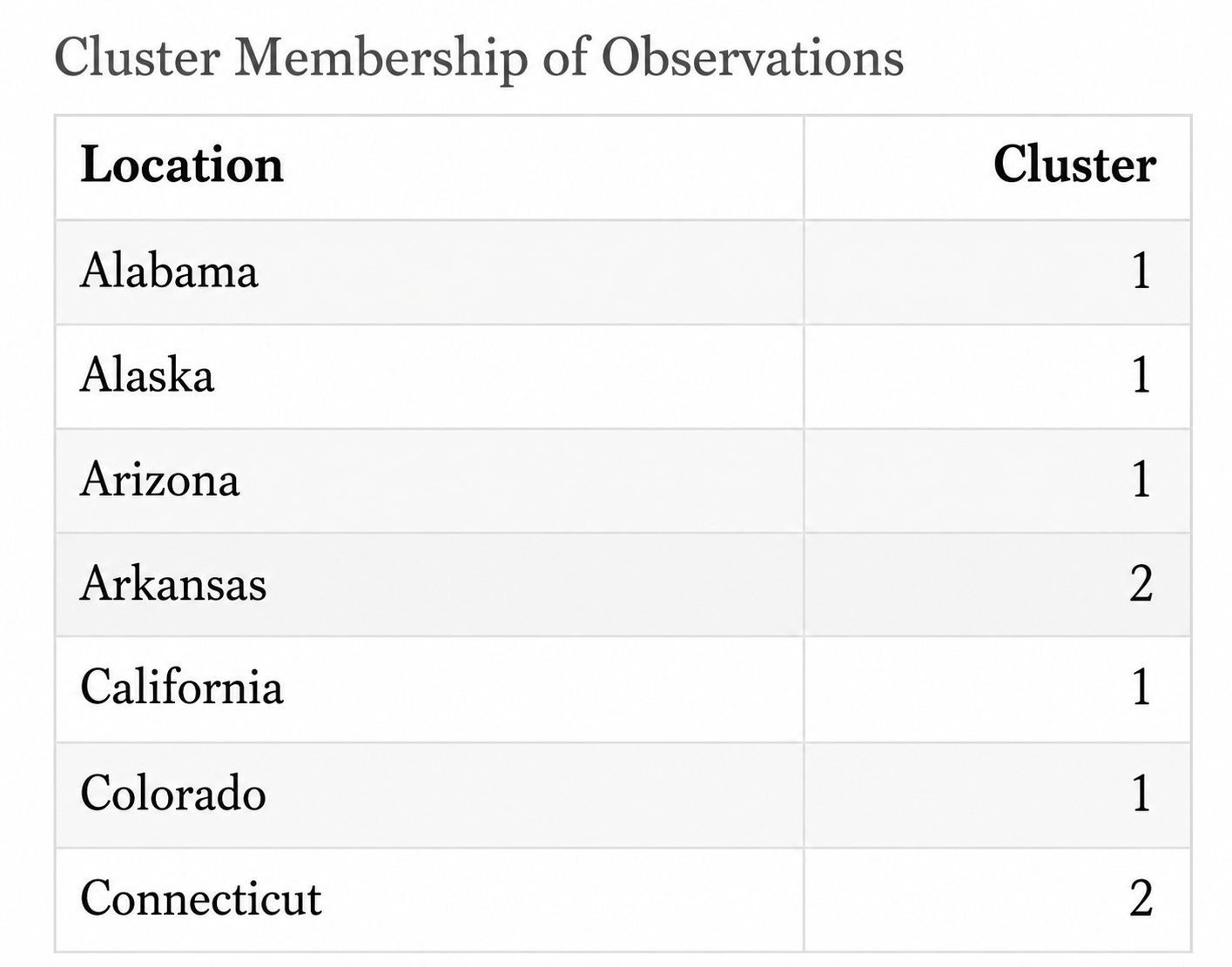
This table lists every observation alongside the cluster it was assigned to, letting you trace the grouping back to your original labels (states, accessions, or respondents).
Table 4: Raw cluster means
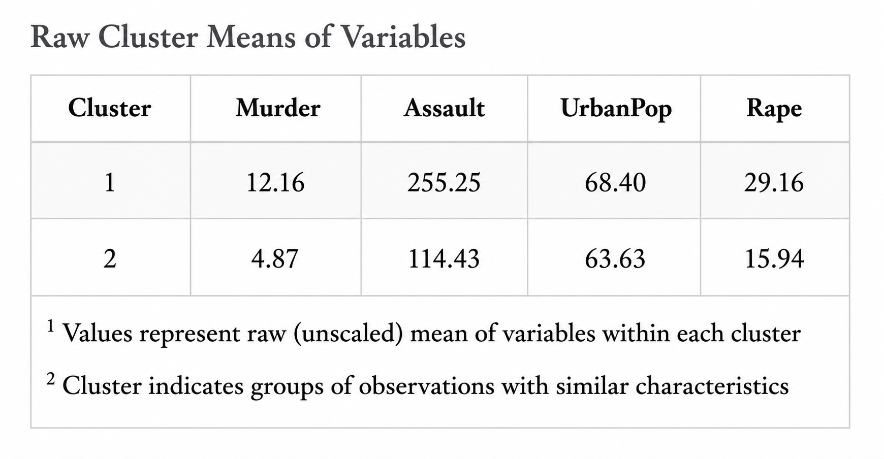
This table repeats the cluster centroids from Table 2, but expressed in the original units of your variables rather than the scaled values used internally by K-Means (Section 2).
Table 5: Cluster membership with variables and observations
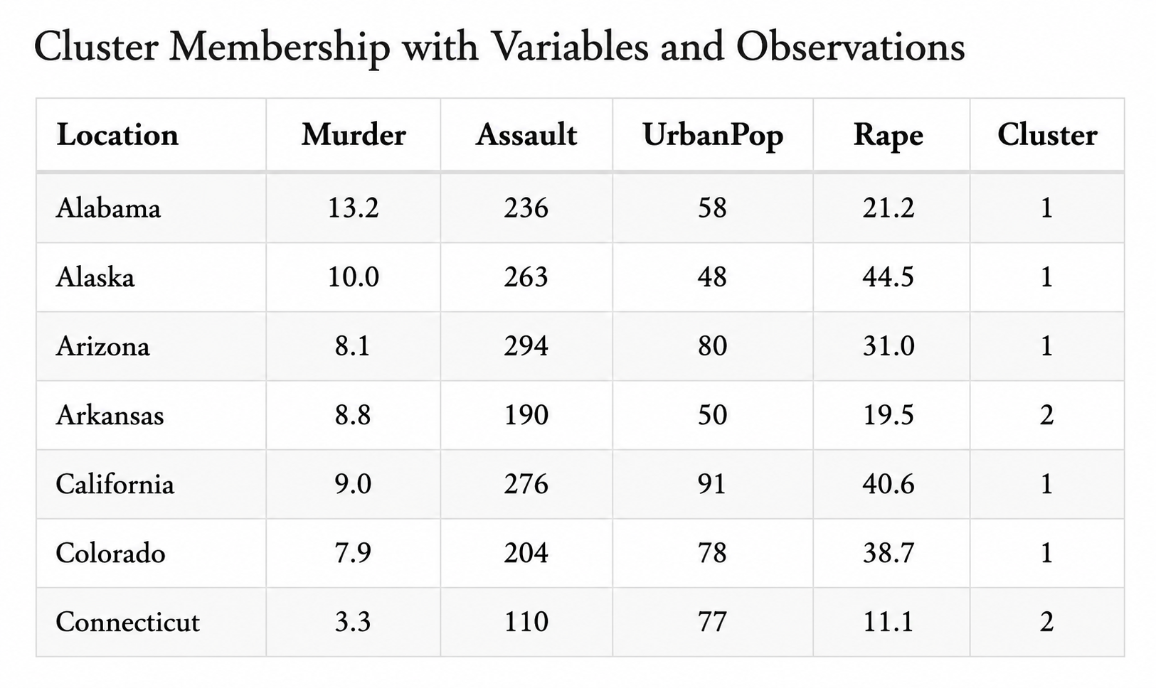
This table combines Table 3 with your original data, every observation, its original variable values, and its assigned cluster, all in one place.
A K-Means result carries no p-value and no test of statistical significance, there isn’t one to compute. What you have instead is a description of structure: how much of the variation in your data is organised into distinct groups (explained variance), and what characterises each group (cluster centers). Judge the clustering by whether it is useful and interpretable for your purpose, not by a threshold.
13 Cluster plots
The Plots & Graphs sub-tab offers several complementary views of the same clustering, each highlighting a different aspect of the result.
Cluster Plot
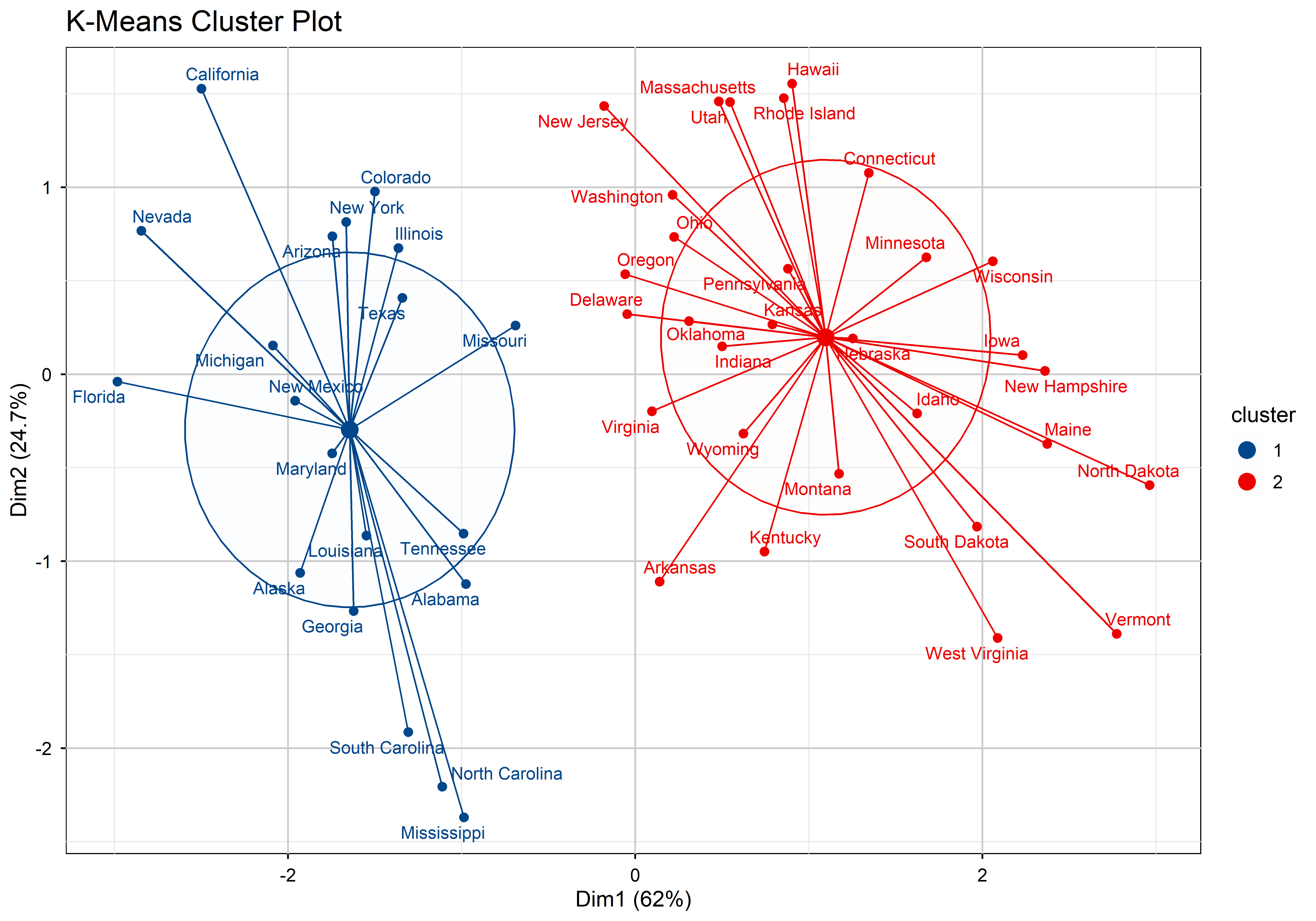
Because your data usually has more than two clustering variables, RAISINS projects every observation onto its first two principal components (the two directions of greatest variation, see Section 14) and colours each point by its assigned cluster, drawing an outline or ellipse around each group. Well-separated, non-overlapping regions like those in Figure 16 indicate a clean, convincing grouping; heavy overlap between regions suggests the clusters are not clearly distinct in the variables you selected.
Distance Plot
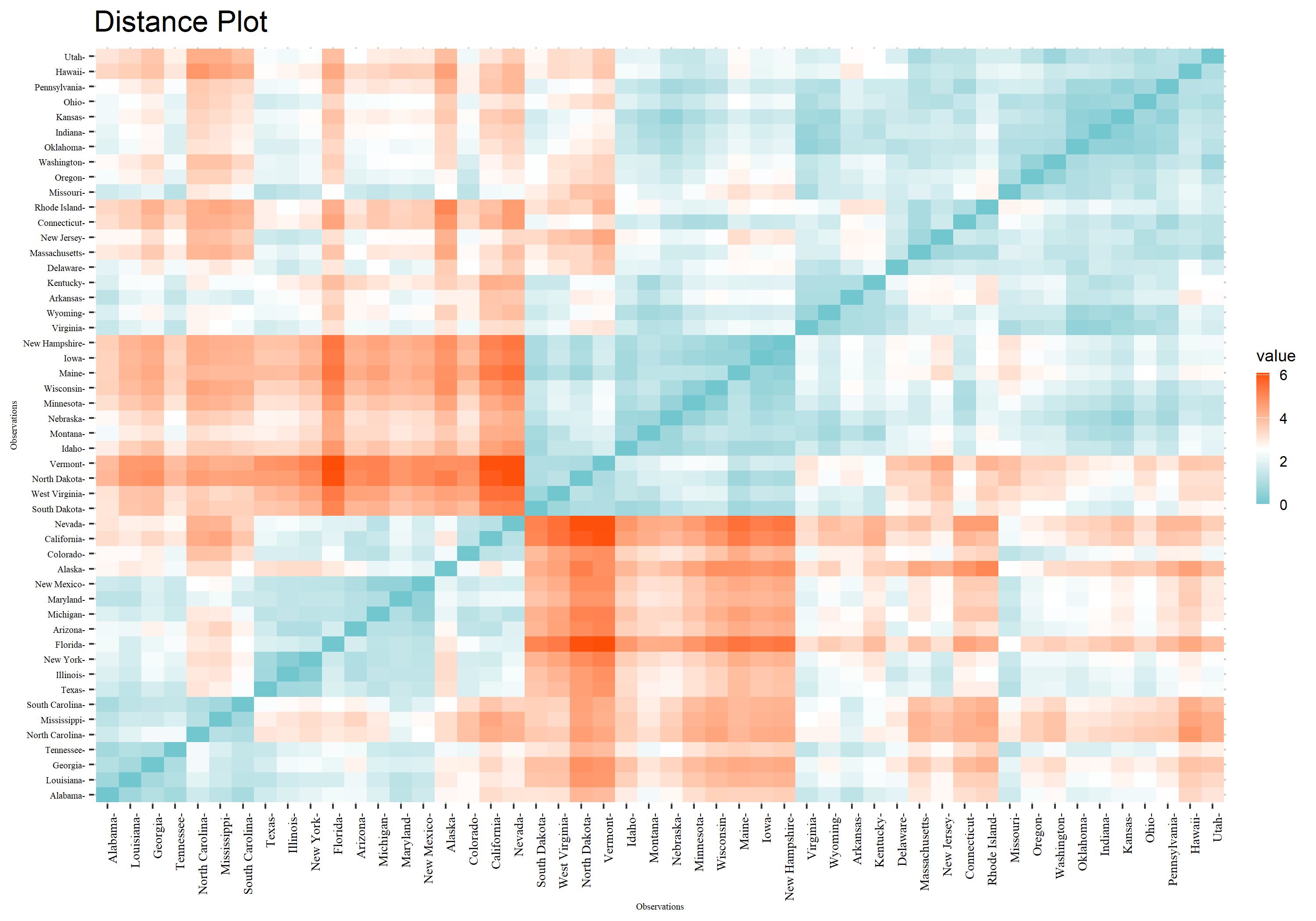
The distance plot visualises the full matrix of pairwise distances between every pair of observations as a heatmap, reordered so that similar observations sit next to each other. Dark, compact blocks along the diagonal, as in Figure 17, correspond to your clusters: tightly-packed, low-distance groups. Lighter regions between blocks show the separation between clusters.
Factor Map (PCA Plot), Parallel Plot, and Network Plot
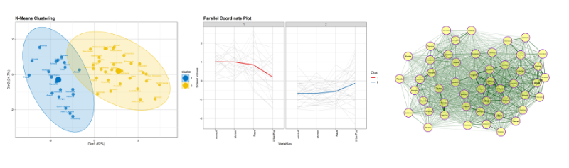
The Factor Map shows how strongly each original variable contributes to the first two principal components, useful for understanding which variables are driving the separation you see in the Cluster Plot. The Parallel Plot draws every observation as a line across all clustering variables at once, coloured by cluster, so you can see at a glance which variables pull each cluster’s profile up or down relative to the others. The Network Plot draws observations as nodes connected by edges whose strength reflects their similarity, a different way of visualising the same distance structure as Figure 17. All plots can be customised (palette, labels, point size, and more) and downloaded directly from the tab.
14 Cluster validation
The Metrics sub-tab reports the Distance Matrix, the full Validation Summary, and a table of the optimal k suggested by each validation measure, giving you the numerical backbone behind Section 3 and Section 13.
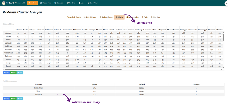
How to read the three validation measures
Connectivity measures the extent to which neighbouring observations were placed in the same cluster. Lower values indicate better clustering.
Dunn Index compares the smallest distance between clusters to the largest distance within a cluster. Higher values indicate better-separated, more compact clusters.
Silhouette Width (the same measure behind the silhouette plot in Section 11) averages, across all observations, how much closer each point is to its own cluster than to the next-nearest one. Higher values indicate better clustering.
RAISINS computes all three measures across a range of candidate k values (2 to 6) and reports which k each measure judged best. It is common for the three measures to disagree, they weigh different aspects of “good” clustering, and none is universally correct. Treat agreement across measures as strong evidence for a particular k, and treat disagreement as a signal to examine the cluster plot (Section 13) and use domain knowledge to break the tie.
15 Interpretation
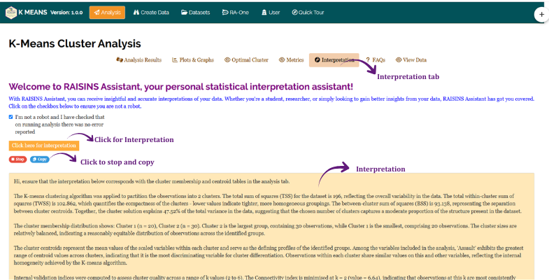
RAISINS provides a clear and concise interpretation of your clustering results to help you understand the findings with ease. The interpretation summarises cluster sizes, describes what distinguishes one cluster from another, and presents the findings in a publication-ready format. You can access this from the Interpretation sub-tab of the Analysis tab.
Click the Click here for Interpretation button to generate it. As the text streams in, a Stop button appears just below the Click here for Interpretation button, letting you halt generation early if needed. Once generation finishes, a Copy button appears in the same place, letting you copy the interpretation text in one click for use elsewhere.
16 Chat with your data using RA-One
RA-One is the built-in conversational assistant for the K-Means module, available from the RA-One tab. You ask questions in plain language and it answers using your own clustering results rather than generic statistical advice. Every result it discusses is drawn from what the module actually computed, cluster centers, cluster membership, validation scores, and PCA summaries, it never invents numbers, and if a value isn’t available it says so instead of guessing. All answers are in plain English, with no code or software commands.
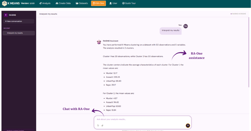
RA-One can explain what the explained variance means for your specific run, describe which variables distinguish one cluster from another, walk you through the Connectivity, Dunn Index, and Silhouette measures for your data, and tell you which observations belong to a given cluster. It also handles general concept questions, what a centroid is, how to choose k, when to change the scaling method, so you can build understanding alongside your results.
The same chat window can also prepare your data. It can build a correctly formatted dataset template (Section 9.4) for you to fill in, or fetch a model dataset (Section 9.3) so you can try the module straight away, so you never need to leave the tab to get a file ready.
RA-One can also generate plots on request, directly in the chat window. Ask for the Cluster Plot, the Elbow Plot, the Silhouette Plot, a Cluster Profile (parallel coordinates), a Cluster Centers Heatmap, a Cluster Size chart, the Distance Matrix, or the Validation Summary, and RA-One renders the graphic directly in the chat, where you can view it, download it, and refine it (palette, theme, labels, and more) by simply asking for changes.
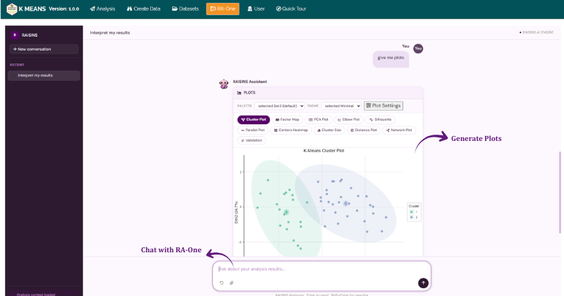
Within a single conversation, RA-One can interpret your clustering results, build a data template, fetch a model dataset, and produce any of the plots above, so most of a routine K-Means session can be conducted without ever leaving the chat window.
17 FAQs
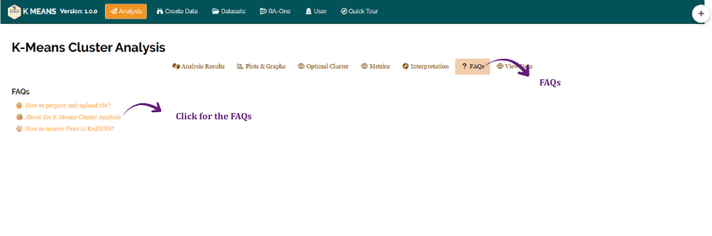
The module includes a dedicated FAQs section to clarify common doubts and guide you through the features. It offers detailed answers, additional information, and helpful tips for a smooth experience. If you are ever unsure how many clusters to choose, which scaling method fits your data, or how to interpret a low silhouette score, the FAQs are a good place to start.
18 View data
View Data is the primary diagnostic tool for ensuring data integrity before analysis. When you upload your dataset, the system performs an automated Health Check to validate column types and formatting. For K-Means clustering this step is especially important: it confirms that your chosen label column contains unique values with no duplicates, that all selected clustering variables are numeric, and that there are no missing values, since K-Means cannot compute a distance to a missing cell.

19 Wrapping up
K-Means clustering rests on one simple mechanism: assign each observation to its nearest centroid, move the centroid to the average of its members, and repeat until the groups stop changing. Everything else in this tutorial, scaling, the elbow and silhouette methods, the validation measures, exists to help you make the two judgment calls that the algorithm itself cannot make for you: how to make your variables comparable, and how many groups actually make sense.
If your data have a hierarchical or highly irregular structure that K-Means’s round, evenly-sized clusters cannot capture well, RAISINS’s hierarchical clustering module is a companion tool built for exactly that case. And if you get stuck at any point, RA-One is available 24 × 7, or write to us at [email protected].