MGIDI - Multi-Trait Genotype-Ideotype Distance Index
MGIDI ranks genotypes on many traits at once by measuring how far each one sits from an ideal genotype you define. This tutorial explains the method, then runs a complete 44-genotype, 14-trait analysis in RAISINS and interprets every result the module reports… Read more …
The Multi-Trait Genotype-Ideotype Distance Index (MGIDI) is a multivariate selection index used to identify and rank genotypes based on their overall performance across multiple traits. It measures the distance between each genotype and a user-defined ideotype-an ideal combination of desirable trait values. This tutorial provides a step-by-step explanation of the statistical procedures used in MGIDI, including the trait-wise mixed model, BLUP estimation and shrinkage, factor analysis, varimax rotation, ideotype rescaling, and calculation of the genotype–ideotype distance. The methodology is demonstrated using a complete worked example involving 44 rice genotypes evaluated for 14 traits under a Randomised Complete Block Design (RCBD). The tutorial also explains and interprets the outputs generated by the module, including the eigenvalue structure, factor loadings, communalities, selection differential, expected genetic gain, trait-wise variance components, likelihood ratio tests, and the strengths and weaknesses of the selected genotypes. By the end of the tutorial, users will understand both the statistical basis of MGIDI and how to interpret its results for multi-trait genotype selection.
1 What is MGIDI?
Consider a farmer evaluating four rice varieties for cultivation based on multiple traits. The key criteria include grain yield, days to maturity, disease resistance, and grain quality. Since these traits collectively influence the overall suitability of a variety, selecting the most desirable genotype requires simultaneous consideration of all relevant characteristics.
| Variety | Yield | Maturity | Disease resistance | Grain quality |
|---|---|---|---|---|
| A | High | Late | Poor | Good |
| B | Medium | Early | Good | Poor |
| C | Low | Early | Excellent | Good |
| D | Medium | Medium | Medium | Medium |
Selecting the best genotype is not always straightforward when several traits are considered simultaneously. Variety A may have the highest yield, but it may mature late and be highly susceptible to disease. Variety C may have excellent disease resistance, but its yield may be considerably lower. Variety D may show a balanced performance across all traits without being exceptional for any single trait.
This is the fundamental challenge in multi-trait selection: improving one trait may come at the expense of another. Therefore, rather than evaluating genotypes based on a single trait, we need a way to consider their overall performance across all the traits of interest.
One practical approach is to first define the ideal genotype - a genotype with the most desirable combination of trait values, such as high yield, early maturity, good disease resistance, and superior grain quality. This ideal genotype may not actually exist in the population, but it provides a useful reference point against which the observed genotypes can be evaluated.
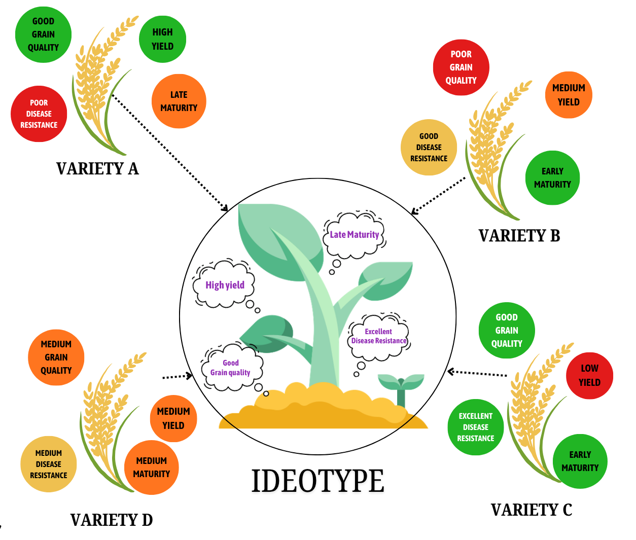
The key question then becomes:
Which genotype is closest to the ideal combination of traits?
This concept forms the basis of the Multi-Trait Genotype-Ideotype Distance Index (MGIDI).
In plant breeding, the ideal combination of desirable traits is referred to as an ideotype. MGIDI quantifies the distance between each genotype and this ideotype, allowing genotypes to be evaluated based on their overall performance across multiple traits.
You define the ideotype, and MGIDI quantifies the distance of each genotype from this ideal, considering all traits simultaneously.
1.1 Why not simply select on a single trait?
Genetic gain is pivotal in plant breeding, and it shapes the trajectory of an entire breeding programme. Selection based on one or a few traits is generally regarded as inadequate, since it neglects the gains that might have been achieved in other important traits. Breeders therefore seek to combine several desirable attributes within a single genotype in order to improve its overall performance, and it is for this reason that crop improvement programmes are commonly directed towards an ideotype: a genotype uniting the various attributes required for optimal performance.
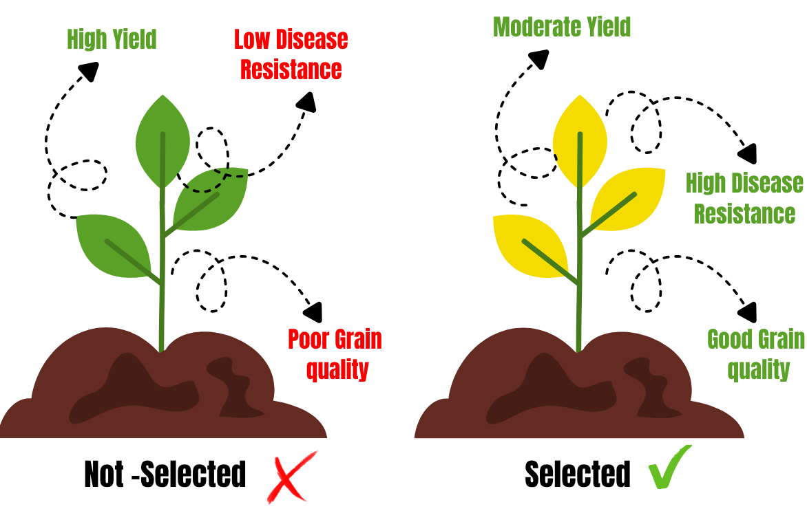
The limitation becomes clear as soon as the most direct approach is attempted. Selecting the genotype that performs best for the trait of greatest economic importance, which in most programmes is yield, identifies varieties A and D in the table above, and provides no basis for choosing between them.
The difficulty lies in what such a decision ignores. Variety A matures late and is highly susceptible to disease, yet selection on yield alone carries both of these weaknesses forward unnoticed, and three of the four recorded traits play no part in the decision at all.
This is the general situation in plant breeding rather than a peculiarity of the present example. A genotype that is superior for one trait is frequently inferior for others, and selection based on a single trait therefore risks advancing material that is unacceptable for characters the breeder also values, such as maturity duration, disease resistance or grain quality. Genetic gain secured in yield may in this way be accompanied by no gain, or even by a loss, elsewhere.
For selection to be meaningful, all traits of interest must therefore be evaluated together, and genotypes compared against the ideotype rather than against any single trait. This is precisely what MGIDI is designed to do.
A little history: from Smith and Hazel to the ideotype distance
The idea of combining several traits into one selection criterion is old. Smith (1936) and Hazel (1943) independently proposed the classical selection index, a weighted linear combination of traits whose weights are derived from the genetic and phenotypic covariance matrices together with economic values. It is statistically elegant, but in practice it needs quantities that are difficult to estimate reliably and economic weights that breeders rarely agree on. Pesek and Baker (1969) replaced economic weights with desired gains, which helped, but the multicollinearity problem remained: when traits are strongly correlated the covariance matrices become ill-conditioned and the index weights become unstable.
Olivoto and Nardino (2021) took a different route. Instead of estimating weights at all, they first strip out the redundancy among traits using exploratory factor analysis, then define an ideotype directly in the resulting factor space and simply measure distance to it. There is no matrix to invert, no economic weight to defend, and multicollinearity is handled by construction rather than assumed away. The method was published in Bioinformatics and implemented in the metan R package, which is the engine RAISINS uses.
2 Construction of the MGIDI Index
The Multi-Trait Genotype–Ideotype Distance Index (MGIDI) is constructed through a sequence of four analytical steps. These steps transform the original multi-trait data into a common scale, account for correlations among traits, define the desired multi-trait target, and quantify the deviation of each genotype from that target.
1 Rescaling of traits
The observed trait values are rescaled to a common 0–100 scale, while accounting for the desired direction of selection. Thus, a score closer to 100 represents a more desirable performance for each trait, regardless of its original measurement scale or whether the trait is classified as higher-is-better or lower-is-better.
2 Factor analysis
The rescaled traits are subjected to factor analysis to identify groups of correlated traits and summarize their shared variation into a smaller number of latent factors. This reduces redundancy among traits that provide overlapping information.
3 Definition of the ideotype
The ideotype represents the desired combination of trait values. After rescaling and factor analysis, the ideotype is represented by its corresponding scores across the extracted factors and serves as the reference point for evaluating the genotypes.
4 Calculation of the genotype–ideotype distance
For each genotype, the Euclidean distance between its factor scores and the corresponding ideotype scores is calculated. This distance constitutes the MGIDI value. A smaller MGIDI indicates a genotype that is closer to the predefined ideotype and therefore represents a more desirable overall multi-trait performance.
“ MGIDI integrates information from multiple traits into a single distance-based index, enabling genotypes to be ranked according to their overall proximity to the desired multi-trait ideotype.
2.1 Stepwise Computational Framework of the MGIDI Method
Each stage of the procedure produces a specific quantity, and those quantities are precisely what the analysis reports. Knowing which step yields which quantity is therefore what makes the results readable.
| Step | What happens | What it produces |
|---|---|---|
| 0. Model fitting (preliminary) | A randomised complete block model is fitted to each trait with genotype random and replication fixed | Variance components, heritabilities and a BLUP (Best Linear Unbiased Prediction) for every genotype on every trait |
| 1. Rescaling the traits | Every trait is rescaled onto a common 0 to 100 range, oriented so that the desired end of each trait always maps to 100. Traits to be maximised retain their direction; traits to be minimised are inverted, so that their smallest observed value becomes 100 | A rescaled genotype-by-trait matrix in which every column is directly comparable and every trait points the same way |
| 2. Factor analysis | The correlation matrix of the rescaled values is subjected to exploratory factor analysis. Factors with an eigenvalue of at least 1 are retained (Kaiser criterion) and the loadings are varimax-rotated so that each trait associates cleanly with a single factor | Eigenvalues and variance explained; factor loadings, communalities and uniquenesses; a score for every genotype on every retained factor |
| 3. Planning the ideotype | The ideotype is defined as a hypothetical genotype taking the maximum rescaled value, 100, for every trait, and is projected into the same factor space as the real genotypes | A set of ideotype factor scores, serving as the reference point for the final step |
| 4. Computing the distance | The Euclidean distance is calculated between each genotype’s factor scores and those of the ideotype, and the genotypes are ranked in ascending order | The MGIDI value of each genotype, the resulting ranking, and the contribution of each factor to every genotype’s distance |
2.2 Computation of the MGIDI index
Once the traits have been rescaled (step 1) and summarised into factors (step 2), the MGIDI value of a genotype is the Euclidean distance between its factor scores and those of the ideotype defined in step 3. The index is computed as follows:
\[MGIDI_i = \sqrt{\sum_{j=1}^{f}\left(F_{ij} - F_{j}\right)^{2}}\]
where \(MGIDI_i\) is the multi-trait genotype–ideotype distance index for the ith genotype; \(F_{ij}\) is the score of the ith genotype in the jth factor (\(i = 1, 2, \ldots, g\); \(j = 1, 2, \ldots, f\)), with \(g\) and \(f\) being the number of genotypes and factors respectively; and \(F_j\) is the jth score of the ideotype.
The genotype with the lowest MGIDI is therefore the one closest to the ideotype, and is expected to present desired values across all the analysed traits.
The rescaling formula applied in step 1 is set out separately in Section 4.
3 Choosing the index input: BLUP or phenotypic means
The Use Data selector on the Analysis Results tab has exactly two settings, and it decides which set of genotype values the index is built from.
| Setting | What it uses | When to use it |
|---|---|---|
| blup | The Best Linear Unbiased Predictions of the genotype effects from the mixed model. Each genotype’s deviation from the overall mean is shrunk toward that mean in proportion to the trait’s heritability | Replicated trials - which is to say, almost always. Traits measured with poor precision contribute correspondingly less to the index |
| pheno | The arithmetic genotype means, used exactly as observed with no shrinkage | When you deliberately want the index to reflect observed performance rather than predicted genetic worth, or when comparing against a published phenotypic index |
See exactly what "shrinkage" does, with a worked example from this tutorial's dataset
Shrinkage sounds abstract until you watch it happen to a real number. Take grain yield (GY) in our 44-genotype trial.
The overall trial mean is \(\bar{X} = 4379.69\). Genotype G3 has an arithmetic mean of \(5381.00\), so its raw deviation from the trial mean is
\[5381.00 - 4379.69 = +1001.31\]
The mixed model estimates the heritability of genotype means for grain yield as \(h^2_{mg} = 0.7192\). The BLUP of G3’s genotype effect is that deviation multiplied by the heritability:
\[BLUP_{G3} = 1001.31 \times 0.7192 = +720.17\]
and the module reports \(BLUPg = 720.16\) for G3. The predicted value is then \(4379.69 + 720.16 = 5099.85\), against a raw mean of \(5381.00\).
What just happened: the model pulled G3 back toward the trial mean by 28% of its apparent superiority, because grain yield in this trial is only about 72% reliable at the genotype-mean level. The remaining 28% of G3’s apparent advantage is judged more likely to be block effects and plot-to-plot noise than genuine genetic merit.
Now compare two traits from the same trial:
| Trait | \(h^2_{mg}\) | How much of the raw deviation survives |
|---|---|---|
| Days to flowering (FLO) | 0.9233 | 92% - almost none is shrunk away; the trait is measured very precisely |
| Grains per spikelet (NGSP) | 0.5157 | 52% - nearly half the apparent genotype difference is treated as noise |
Under blup, days to flowering therefore speaks with close to its full voice in the index, while grains per spikelet is heavily discounted. Under pheno, both would speak at full volume regardless of how reliably they were measured. That is the entire practical difference between the two settings.
Leave Use Data on blup. It is the default, it is what the method’s authors recommend for replicated trials, and it automatically protects the index from traits that were measured badly.
The BLUP Genetic Mean (GMD) table displayed in the module is always BLUP-based, whichever way you set Use Data. The setting governs only what the index computation itself consumes. If you switch to pheno, the MGIDI values change but the GMD table does not.
4 Defining your ideotype
The ideotype is specified by the analyst; it is not inferred from the data. For every trait included in the index, the direction of desired change must be declared explicitly, that is, whether a higher or a lower value constitutes superior performance. Since this declaration fixes the reference point against which all genotypes are subsequently measured, it is the most consequential decision in the entire analysis: if a direction is set incorrectly, the index does not become less accurate for that trait; it selects for the opposite of what was intended.
| Mode | What you specify | Meaning |
|---|---|---|
| Direction | Higher or Lower | Indicates whether a trait should be increased or decreased |
| Numeric | Trait weights | Indicates the relative importance of each trait |
How direction actually changes the arithmetic
Before the factor analysis, every trait is linearly rescaled onto a 0-100 range using the observed minimum and maximum across genotypes, but the orientation depends on the direction you chose.
For a trait where higher is better (\(h\)), genotype \(i\)’s rescaled value is
\[rX_{i} = \frac{\eta - \varphi}{\eta_{X} - \varphi_{X}} \times \left(X_{i} - \eta_{X}\right) + \eta\]
with \(\eta = 100\) and \(\varphi = 0\), so the best-performing genotype lands at 100 and the worst at 0.
For a trait where lower is better (\(l\)), the same formula is applied with \(\eta = 0\) and \(\varphi = 100\) - the scale is flipped, so the smallest observed value lands at 100.
The ideotype is then defined trivially: it scores 100 on every trait. This is why the direction setting is so powerful and so dangerous. It does not weight a trait; it decides which end of that trait’s range the word “ideal” points to.
A worked example. In our dataset the disease score DIS ranges from roughly 2 to 5 across genotype means, and lower is better. Declare it as l and a genotype scoring 2 is rescaled to 100 - close to ideal. Declare it as h instead, and that same genotype is rescaled to 0 - as far from ideal as it is possible to get. The genotype has not changed; only your definition of “good” has. In the analysis that follows, DIS and FLO are both set to Lower, and the other twelve traits to Higher.
5 Selection intensity
Selection Intensity (SI %) on the Mgidi Index tab decides how many genotypes are declared “selected”. It defaults to 15, is adjustable from 1 to 99, and simply retains the top SI per cent of genotypes by ascending MGIDI.
With 44 genotypes and SI = 15%, the module selects \(\lceil 0.15 \times 44 \rceil = 7\) genotypes. Raising SI to 25% would select 11; dropping it to 5% would select 3.
Selection intensity draws a line; it does not move anyone. The MGIDI values and the order of the genotypes are identical at SI = 5% and SI = 50%. All that changes is where the cut-off falls, which genotypes are coloured as “selected” on the rank plot, and - importantly - the selection differential and genetic gain reported for every trait, because those are computed from the mean of the selected group. A tighter SI gives larger gains from fewer genotypes.
6 Assumptions and things to check before you run
| Requirement | What it means | What happens if it fails |
|---|---|---|
| At least two numeric traits | MGIDI factor-analyses the correlation matrix among traits, which is undefined for a single variable | The module refuses to run and shows an explicit “Insufficient Traits” error |
| A genotype column of text labels | The genotype identifier must be categorical, not a number the model would try to fit as a covariate | The analysis is refused at the file-check stage |
| A numeric replication column | The block or replication identifier must be numeric | The analysis is refused at the file-check stage |
| At least 2 replications | With \(r = 1\) the residual degrees of freedom \((g-1)(r-1)\) collapse to zero, so genotypic variance, heritability and BLUPs cannot be estimated at all | The mixed model cannot be fitted. Aim for residual df of at least 12 |
| No missing values | Blank cells and wholly blank rows or columns are detected on upload. Internally the correlation matrix uses complete observations only, so a genotype missing any one trait contributes to none of the correlations | Upload is blocked until the file is corrected |
| More genotypes than traits | The trait correlation matrix must be estimated from the genotype values; too few genotypes makes it unstable and the factor solution unreliable | No error is raised, but the loadings and communalities become untrustworthy. Our example has 44 genotypes for 14 traits, a comfortable ratio |
| Traits that are genuinely correlated | Factor analysis has nothing to work with if every trait is independent of every other | The Kaiser criterion will retain almost as many factors as traits, and the index degenerates toward an unweighted sum |
There is no normality test and no residual diagnostic to pass here. MGIDI is a selection index, not a hypothesis test - it produces a ranking, not a p-value. The one significance test the module does report, the likelihood ratio test in the Gamem Results tab (Section 14.3), tests whether genotypes differ at all for a given trait; it does not test the index.
7 Getting to the module
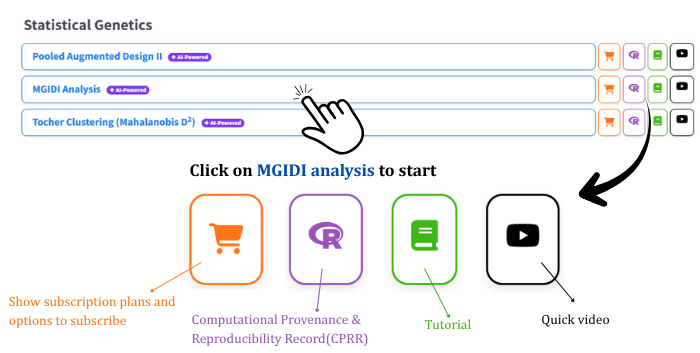
Visit the RAISINS home page at www.raisins.live and go to Data Analysis. This tutorial uses the MGIDI module, shown in Figure 1.
7.1 Computational Provenance & Reproducibility Record
The CPRR (Computational Provenance & Reproducibility Record) provides a transparent and comprehensive record of how the numbers on your screen were produced. Click the icon shown in Figure 1 to open it. The record for this module states the R version and the exact version of every package used, names the specific function behind each reported result, lists every default parameter and decision rule the module applies, and provides fully runnable R code that reproduces each analytical step so you can verify the results independently. It carries its own DOI.
To cite the platform itself in a paper, thesis, or report, use the RAISINS citation, available in APA, Harvard, and BibTeX formats at www.raisins.live/citation.html.
The CPRR for MGIDI is at www.raisins.live/module_record/mgidi.html.
8 Preview mode and Quick Tour
Before subscribing, you can explore the entire module using Preview mode, accessible from the Welcome page. Preview mode loads built-in datasets so you can try every feature - the full analysis, the index tab, all four plots, the AI interpretation - without uploading your own data. First-time users are also offered a Quick Tour, an interactive, step-by-step walkthrough that highlights each control and explains what it does. You can retake it at any time from the Quick Tour tab.
9 A working example
Everything from here on uses Dataset 1, one of the three model datasets bundled with the module and downloadable from the Datasets tab. It is a real randomised complete block trial of 44 rice genotypes (G1 to G44) grown in 3 blocks, giving 132 rows, with 14 traits recorded on every plot:
| Code | Trait | Direction we want |
|---|---|---|
FLO |
Days to flowering | Lower |
PH |
Plant height | Higher |
SH |
Shoot height | Higher |
FLH |
Flag leaf height | Higher |
DIS |
Disease score | Lower |
GY |
Grain yield | Higher |
HW |
Hundred-grain weight | Higher |
NSS |
Number of spikelets per spike | Higher |
NGSP |
Number of grains per spikelet | Higher |
SL |
Spike length | Higher |
SW |
Spike width | Higher |
NGS |
Number of grains per spike | Higher |
GMS |
Grain mass per spike | Higher |
HIS |
Harvest index | Higher |
Our analysis settings for the whole tutorial are: Use Data = blup, Input Type = Direction with FLO and DIS set to Lower and the other twelve to Higher, Selection Intensity = 15%, and Digits after decimal = 2. Keep these in mind - every number quoted from here onward comes from exactly this run.
10 How to prepare your data
Your analysis is only as good as your data. Feed RAISINS a clean, well-structured file and it will deliver a defensible ranking; feed it a messy one and no amount of statistics will rescue the result. You have four routes:
- Create your dataset in MS Excel
- Build your dataset directly within the RAISINS app
- Use the model datasets in RAISINS as a reference
- Create your dataset using the RA-One chat assistant
10.1 Preparing data in MS Excel
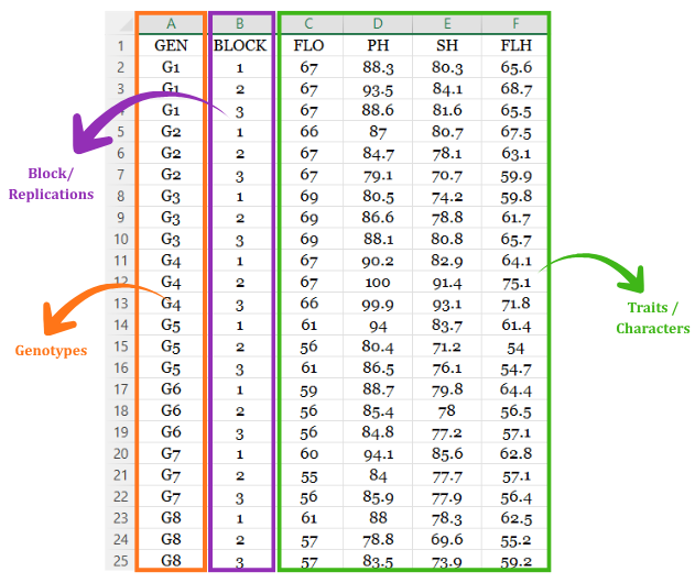
Open a new blank workbook containing only one sheet and avoid adding any unnecessary content. The file must be in long format: one row per genotype × replication combination. The first column holds the genotype label as text (G1, G2, …) and repeats once per replication. The second column holds the replication or block number as a plain number. Every remaining column is one numeric trait. You need at least two trait columns; a single trait cannot be factor-analysed and the module will refuse it.
The file can be saved as CSV, XLS, or XLSX, but CSV is recommended as it is lighter and loads faster. Ensure there are no unwanted spaces in column names or genotype labels. For reference, see the structure in Figure 2 shows the same arrangement with genotype labels repeated once per replication.
Dataset creation rules
- Column naming convention
- No spaces allowed in column names.
- Use underscores (
_) or full stops (.) for separation. - Avoid symbols and special characters such as %, #.
- Data arrangement
- Start the data towards the upper-left corner.
- Ensure the row above the data is not blank.
- One row per genotype × replication; do not pre-average the replications.
- Cell management
- Avoid typing or deleting in cells without data.
- If needed, select the affected cells, right-click, and choose Clear Contents.
- Column relevance
- Name all columns meaningfully; trait codes become the row labels in every results table.
- Exclude columns not required for the analysis.
- Genotype, replication and traits
- The genotype column must be text, and each genotype must appear once per replication.
- The replication column must be numeric.
- All trait columns must be numeric, and there must be at least two of them.
- Do not leave any cell blank; the module blocks the analysis until missing values are cleared.
How to save as CSV in MS Excel
Open your workbook. Ensure your data is arranged properly with only one sheet.
Click the ‘File’ menu. Go to the top-left corner and click File.
Choose ‘Save As’ or ‘Save a Copy’. Select the location where you want to save your file.
Set file type to CSV. In the ‘Save as type’ dropdown, choose CSV (Comma delimited) (*.csv).
Name your file. Enter a relevant file name without spaces (use underscores if needed).
Click ‘Save’. Click Save to export the file.
💡 Tip: Before saving, double-check that your data is on the first sheet and follows the required format: no empty rows above the data, meaningful column names, one row per genotype × replication, and no blank cells anywhere.
10.2 Prepare using Create Data in RAISINS
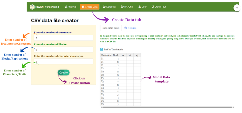
If you are unsure about the correct format, RAISINS can build the layout for you. Navigate to the Create Data tab, then:
- Enter the number of treatments (genotypes)
- Enter the number of Blocks (replications)
- Enter the number of characters to analyze (traits)
- Click Create
An editable table appears in the Data entry Panel on the right, already carrying the correct genotype and block structure. Fill in your measurements, download the CSV, and upload it under Analysis.
10.3 Download model datasets
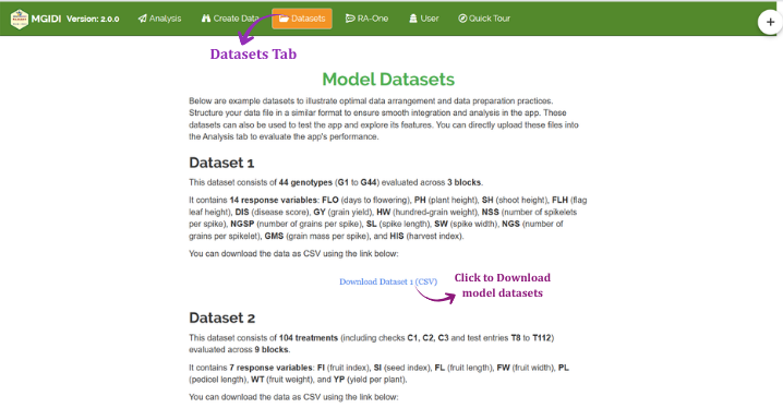
The Datasets tab carries three ready-made MGIDI datasets you can download and upload straight back into the Analysis tab:
- Dataset 1 - 44 genotypes (G1 to G44) × 3 blocks, 14 traits. This is the dataset used throughout this tutorial.
- Dataset 2 - 104 treatments (checks C1 to C3 and test entries T8 to T112) × 9 blocks, 7 traits
- Dataset 3 - 100 genotypes (G1 to G100) × 3 replications, 10 traits labelled V1 to V10
Click the Download CSV link under the dataset you want.
10.4 Creating a dataset using RA-One chat
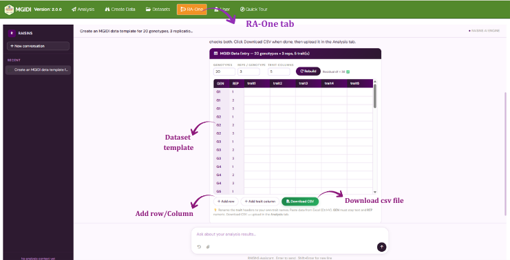
RA-One, the built-in chat assistant, can build a correctly formatted blank template through a plain-language conversation. Open it from the RA-One tab or the floating chat bubble, and tell it how many genotypes, how many replications and which traits you have. It generates the CSV in the required layout, offers it for download, and you upload it straight into the Analysis tab. RA-One can also advise on how many replications you need: it computes the residual degrees of freedom \((g-1)(r-1)\) from the module’s own model rather than quoting a rule of thumb.

11 The Analysis tab
Figure 7 shows the Analysis tab in detail, with each option explained. Upload your prepared file by clicking Browse in the sidebar. As soon as the file lands, RAISINS runs an automatic health check and reports back how many columns and rows it found, lists the column names it detected, and states which column looks like the treatment and how many numeric columns are available. Read that panel before going further, as it is the cheapest place to catch a mis-saved file, then click Got it, let’s go! to continue.
Three selectors then appear in the sidebar, glowing violet one at a time to walk you through them in order: the genotype column, the replication or block column, and the traits to be analysed. The three lists are linked, so a column you have already assigned disappears from the other two and cannot be used twice. Select two or more traits, since a single trait cannot be factor-analysed, and then click Run Analysis!
Results appear across the sub-tabs (Analysis Results, Mgidi Index, Gamem Results, Plots & Graphs, Interpretation, FAQs and View Data), and a control panel opens above them with three settings that apply to every table in the module: Use Data, which selects blup or pheno (Section 3); Digits after decimal, from 1 to 4 and defaulting to 2, which affects display only and never changes a computation; and Select Font, the typeface used in the rendered tables. Below the control panel, RAISINS writes a short plain-language paragraph restating what was done, including how many genotypes and traits were used, which columns supplied the genotype and replication information, which traits entered the index, whether BLUP or phenotypic values were used, and what selection intensity was applied. It is a paragraph you can lift almost verbatim into a methods section.
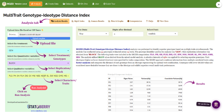
The three selectors are labelled, from top to bottom, “Select the treatment”, “Select the Quantitative variables” and “Select Qualitative variables”. Despite the wording of the last two, they take:
- Select the treatment → your genotype column (
GEN) - Select the Quantitative variables → your replication / block column (
BLOCK), one column only - Select Qualitative variables → your numeric trait columns (
FLO,PH,SH, …), two or more
The middle and bottom labels are inverted relative to what they actually accept. Go by the position and the helper text beneath each box, not by the words “quantitative” and “qualitative”.
Digits after decimal rounds the displayed values only, but it rounds everything, including p-values. At the default of 2, a likelihood ratio test p-value of \(5.7 \times 10^{-7}\) is displayed as 0.00. That is not a bug and it is not a zero - it is a very small number shown to two places. If you need to report an exact p-value, raise the setting to 4 or read it from the downloaded report.
12 Analysis results
The Analysis Results sub-tab reports five tables, in the order below. Together they document steps 2 and 4 of the pipeline in Section 2: how the traits were reduced to factors, and what that reduction cost. A Download Report control at the bottom exports all of them in HTML, Word, PDF or Excel.
12.1 Table 1: Principal Component Analysis
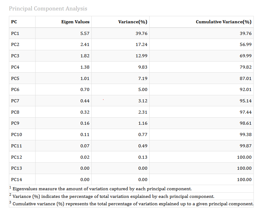
This table answers one question: how many independent dimensions of variation are really present among your 14 traits?
Each row is a principal component of the trait correlation matrix. The Eigen Value is the amount of variance that component captures, measured in units where each original trait contributes exactly 1. Variance (%) expresses that as a share of the total, and Cumulative Variance (%) accumulates down the table.
Reading our result. The first component has an eigenvalue of 5.57 and explains 39.76% of the total variation - by itself it carries as much information as five and a half individual traits. The second contributes 17.24%, the third 12.99%, the fourth 9.83% and the fifth 7.19%. From PC6 onward every eigenvalue falls below 1.
Factors are retained by the Kaiser criterion: keep every component whose eigenvalue is at least 1, on the logic that a component explaining less variance than a single original trait is not earning its place. Here that rule retains five factors, which together account for 87.01% of all the variation among the fourteen traits.
Fourteen measured traits contain only about five genuinely independent pieces of information, and those five capture 87% of everything the traits have to say. The remaining nine components together carry 13%, most of it noise. This is the redundancy MGIDI exists to remove, and the reason a simple sum of fourteen trait ranks would have been badly misleading for this trial.
The retention threshold is fixed at an eigenvalue of 1 and is not exposed as a user control. If you disagree with the number of factors retained, the lever available to you is the set of traits you select, not the threshold.
12.2 Table 2: Factor Analysis
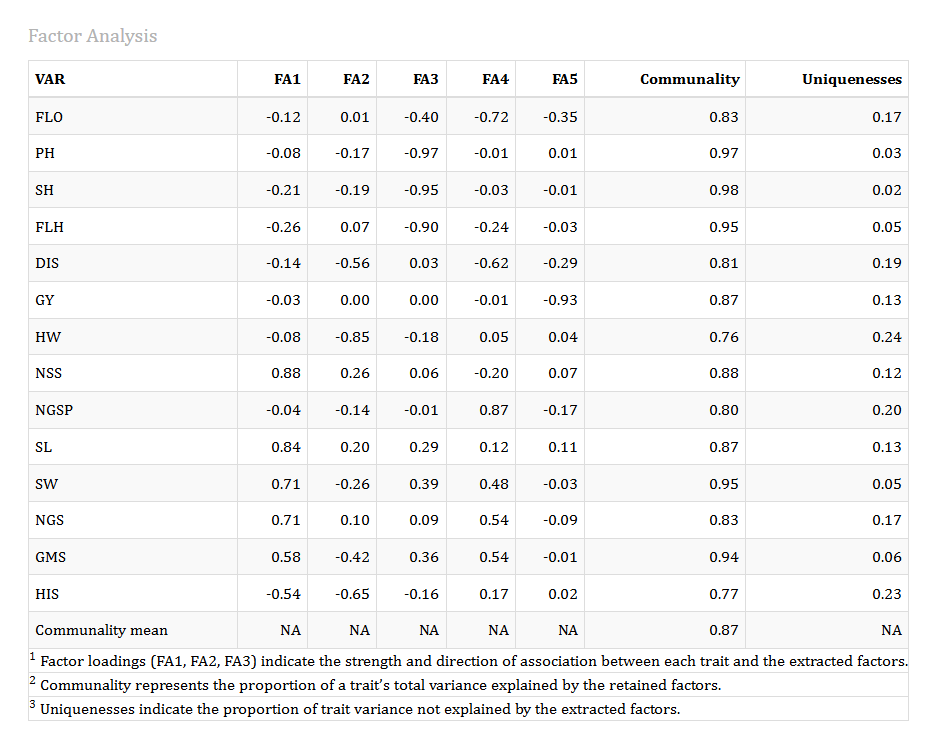
This is the interpretive heart of the analysis. Each row is a trait; the columns FA1 to FA5 are its loadings on each retained factor after varimax rotation. A loading is a correlation between the trait and the factor: values near ±1 mean the trait belongs strongly to that factor, values near 0 mean it does not. Varimax rotation deliberately pushes each trait toward a high loading on one factor and near-zero loadings on the rest, which is what makes the factors nameable.
Reading our result. Assigning each trait to the factor on which it loads most strongly produces five clean, biologically coherent groups:
| Factor | Traits | Highest loadings | Biological interpretation |
|---|---|---|---|
| FA1 | NSS, SL, SW, NGS, GMS | NSS 0.88, SL 0.84, SW 0.71, NGS 0.71, GMS 0.58 | Spike architecture and productivity - how big and how well-filled the spike is |
| FA2 | HW, HIS | HW −0.85, HIS −0.65 | Grain weight and partitioning - individual grain mass and harvest index |
| FA3 | PH, SH, FLH | PH −0.97, SH −0.95, FLH −0.90 | Plant stature - the three height measurements, which are near-duplicates of one another |
| FA4 | FLO, DIS, NGSP | NGSP −0.87, FLO −0.72, DIS −0.62 | Phenology and stress response - flowering time, disease and grain set |
| FA5 | GY | GY −0.93 | Grain yield, standing entirely alone |
The Communality column is the share of that trait’s variance the five factors jointly explain, and Uniquenesses is the remainder (\(1 - \text{communality}\)). Communalities here run from 0.76 for HW to 0.98 for SH, with a mean of 0.87 reported in the final row. Every trait is well represented; none is left stranded.
Three findings matter here.
First, plant stature is one trait wearing three hats. PH, SH and FLH load −0.97, −0.95 and −0.90 on FA3 and on nothing else. Had you averaged the fourteen traits, height would have voted three times. MGIDI gives it one vote.
Second, grain yield is genuinely independent of everything else. GY loads −0.93 on FA5 and below 0.04 in absolute value on all four other factors. Its highest correlation with any other trait in this trial is only −0.22. In this material, yield cannot be predicted from spike architecture, plant height or harvest index - it must be selected for directly, and MGIDI gives it its own dimension so that it is.
Third, the trait set is well chosen. A mean communality of 0.87 means the five-factor solution reproduces 87% of what the fourteen traits measured. A trait with a communality below about 0.5 would be one the factor structure could not accommodate and a candidate for removal from the analysis; there are none here.
The sign of a factor is arbitrary - a factor and its mirror image describe the same structure. What matters is the pattern: traits with the same sign on a factor move together, traits with opposite signs move against each other. On FA2, HW loads −0.85 and HIS −0.65 (same direction, so they rise together), while on FA1 the four spike traits are all positive and HIS is −0.54, which correctly reflects the observed −0.65 correlation between spike length and harvest index.
12.3 Table 3: Selection Differential
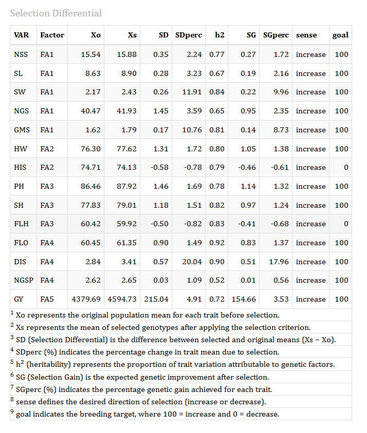
This table is the scorecard of the selection you just performed. It compares the seven selected genotypes against the whole population of 44, trait by trait.
- Xo - the mean of all 44 genotypes before selection
- Xs - the mean of the 7 selected genotypes
- SD - the selection differential, \(X_s - X_o\)
- SDperc - the same as a percentage of the original mean
- h2 - the heritability of genotype means for that trait
- SG - the expected genetic gain, \(SD \times h^2\): the part of the differential expected to be transmitted
- SGperc - that gain as a percentage
- sense - the direction you asked for (
increaseordecrease) - goal -
100if the differential moved in the direction you wanted,0if it moved against you
Reading our result, trait by trait:
| Trait | Factor | Xo | Xs | SDperc | SGperc | sense | goal | Verdict |
|---|---|---|---|---|---|---|---|---|
| GMS | FA1 | 1.62 | 1.92 | +18.38 | +14.91 | increase | 100 | Excellent |
| SW | FA1 | 2.17 | 2.55 | +17.55 | +14.67 | increase | 100 | Excellent |
| NGS | FA1 | 40.47 | 43.62 | +7.78 | +5.10 | increase | 100 | Good |
| NGSP | FA4 | 2.62 | 2.75 | +5.14 | +2.65 | increase | 100 | Good |
| SL | FA1 | 8.63 | 8.91 | +3.31 | +2.21 | increase | 100 | Modest |
| PH | FA3 | 86.46 | 87.91 | +1.68 | +1.32 | increase | 100 | Marginal |
| SH | FA3 | 77.83 | 79.00 | +1.50 | +1.23 | increase | 100 | Marginal |
| GY | FA5 | 4379.69 | 4427.87 | +1.10 | +0.79 | increase | 100 | Marginal |
| NSS | FA1 | 15.54 | 15.70 | +1.05 | +0.80 | increase | 100 | Marginal |
| HW | FA2 | 76.31 | 77.04 | +0.96 | +0.77 | increase | 100 | Marginal |
| HIS | FA2 | 74.71 | 75.43 | +0.96 | +0.75 | increase | 100 | Marginal |
| FLH | FA3 | 60.42 | 59.37 | −1.73 | −1.43 | increase | 0 | Went the wrong way |
| FLO | FA4 | 60.46 | 58.10 | −3.89 | −3.60 | decrease | 100 | Favourable |
| DIS | FA4 | 2.84 | 2.56 | −10.00 | −8.97 | decrease | 100 | Excellent |
DIS shows SDperc = −10.00 and FLO shows −3.89, and both carry goal = 100. That is exactly right: we asked for both to decrease, and a 10% reduction in disease score and a 3.89% reduction in days to flowering are precisely the outcome we wanted. Always read the sense and goal columns before judging the sign of a differential. The only genuinely unfavourable row in this table is FLH, which we asked to increase and which fell by 1.73% - and the module flags it with goal = 0.
Selecting the top seven genotypes at 15% intensity buys a large, coordinated improvement in spike productivity - grain mass per spike up 18.38%, spike width up 17.55%, grains per spike up 7.78% - together with a 10% reduction in disease score and flowering nearly four days earlier. Thirteen of the fourteen traits moved in the intended direction.
The one trade-off is flag leaf height, down 1.73%. This is not a failure of the method; it is the method telling you the truth. FLH sits on the stature factor FA3 alongside PH and SH, and it is negatively correlated with spike width (−0.66) and grain mass per spike (−0.62). You cannot have a large gain in spike size and simultaneously push flag leaf height up in this material. MGIDI made the trade automatically and reported it explicitly.
Note also how strongly the expected gain tracks the differential: because heritabilities in this trial are high (0.52 to 0.92), most of the observed superiority of the selected group is expected to be genetically transmitted. Grain mass per spike gains 18.38% now and is expected to retain 14.91% of it. Contrast this with a hypothetical trait of heritability 0.2, where four-fifths of any apparent gain would evaporate.
12.4 Table 4: Correlation Matrix
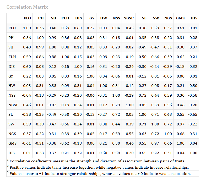
This is the raw material the factor analysis worked from: the Pearson correlation between every pair of traits, computed on the genotype values. Values near +1 mean the traits rise together, values near −1 mean one rises as the other falls, values near 0 mean they are unrelated.
Reading our result, the striking entries are:
- PH–SH = 0.99 and SH–FLH = 0.88, PH–FLH = 0.86. The three height traits are almost the same measurement
- SW–GMS = 0.97. Spike width and grain mass per spike are nearly interchangeable
- NSS–SL = 0.72, SW–NGS = 0.72, SL–SW = 0.71. The spike traits form a tight cluster
- SL–HIS = −0.65, NSS–HIS = −0.58, FLH–SW = −0.66. Real biological trade-offs: bigger spikes come with lower harvest index and shorter flag leaves
- FLO–DIS = 0.60. Later-flowering genotypes carry more disease
- GY correlates with nothing: its strongest association with any other trait is −0.22 with days to flowering
The high correlations are not a nuisance to be tolerated - they are the justification for using MGIDI at all. PH–SH at 0.99 and SW–GMS at 0.97 are exactly the multicollinearity that makes a classical Smith-Hazel index unstable, because the covariance matrix it needs to invert becomes ill-conditioned. MGIDI never inverts anything; it absorbs the redundancy into factors and proceeds.
The isolation of grain yield deserves emphasis. In this trial you cannot use spike architecture as a proxy for yield: the correlation between grain mass per spike and grain yield is essentially zero (−0.003). Any breeder tempted to select for yield indirectly through spike traits would, on this evidence, be selecting on noise. MGIDI’s five-factor structure protects against this by giving yield its own independent axis.
If two traits correlate above about 0.95 - as PH and SH do here - they contribute almost identical information. Keeping both is harmless for MGIDI, but dropping one makes the factor solution cleaner and the loadings easier to interpret, without materially changing the ranking.
12.5 Table 5: BLUP Genetic Mean (GMD)
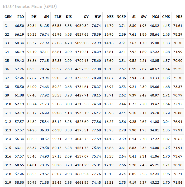
This table gives the predicted genetic value of every genotype for every trait - 44 rows by 14 trait columns, ordered naturally so that G2 precedes G10. These are the numbers the index actually consumes, and they are the shrunken BLUP values described in Section 3, not raw plot averages.
Use it whenever you want to answer “what does this genotype actually look like?” rather than “where does it rank?”. If G32 comes out first on MGIDI, this table tells you the trait profile that earned it that position.
Even if you set Use Data to pheno, this table continues to show BLUP genetic means. Only the index computation switches.
13 The Mgidi Index tab
This is where you define your ideotype and read off the ranking. Open the Trait Weights & Options panel at the top of the tab.
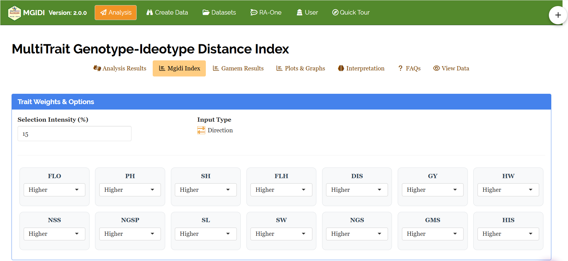
The panel carries:
- Selection Intensity (%) - default 15, adjustable from 1 to 99 (Section 5)
- Input Type - the Direction / Numeric toggle (Section 4), shipping in Direction mode
- One card per selected trait, below the divider. In Direction mode each card holds a dropdown set to Higher or Lower; in Numeric mode it holds a weight box defaulting to 1
For this tutorial, FLO and DIS are set to Lower and the remaining twelve traits are left at Higher. The results update as soon as you change a setting.
13.1 Selected Genotypes
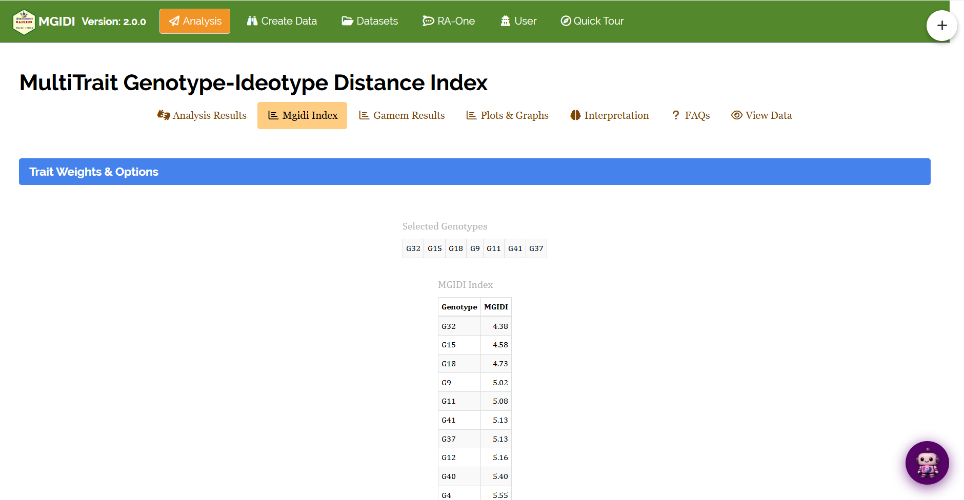
At SI = 15% with 44 genotypes, seven are retained. They are, in order of merit:
G32, G18, G7, G15, G37, G33, G36
They are listed best-first, so G32 is the single best genotype in the trial on the ideotype you defined.
13.2 MGIDI Index
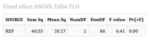
Every genotype with its distance from the ideotype, sorted from best to worst. The top of our table reads:
| Rank | Genotype | MGIDI |
|---|---|---|
| 1 | G32 | 2.94 |
| 2 | G18 | 3.69 |
| 3 | G7 | 4.06 |
| 4 | G15 | 4.17 |
| 5 | G37 | 4.24 |
| 6 | G33 | 4.31 |
| 7 | G36 | 4.45 |
| 8 | G9 | 4.64 |
| … | … | … |
| 44 | G20 | 7.81 |
Reading our result. G32 sits at a distance of 2.94 from the ideotype; the worst genotype, G20, sits at 7.81 - more than twice as far. The gap between the best genotype and the second-best (2.94 to 3.69, a jump of 0.75) is larger than the gap spanning ranks 2 through 7 (3.69 to 4.45, a spread of 0.76). G32 is not merely first; it is separated from the field.
The eighth genotype, G9, has an MGIDI of 4.64 against G36’s 4.45 in seventh place - a difference of 0.19, smaller than the gap between several adjacent selected genotypes. Genotypes sitting either side of the cut-off are statistically indistinguishable, and the line between them is a consequence of your chosen selection intensity, not a property of the material. If your programme has room for eight, take eight.
14 The Gamem Results tab
Everything so far has treated the mixed model as a black box. The Gamem Results tab opens it. Choose one trait from the selector at the top and the tab reports six tables for that trait alone. Work through your traits one at a time - this is where you find out whether a trait was worth including.
Below, all six tables are shown for grain yield (GY). A Download Report control at the bottom exports them in HTML, Word, PDF or Excel.
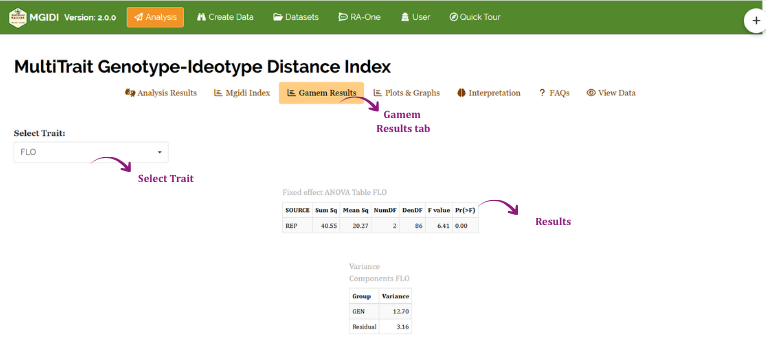
14.1 Table 1: Fixed effect ANOVA
The model fitted is \(Y \sim REP + (1\,|\,GEN)\) - replication fixed, genotype random. This table therefore tests only the fixed part: did the blocks differ?
Reading our result. For grain yield, REP has Sum Sq = 503,791, Mean Sq = 251,895, 2 numerator degrees of freedom, 86 denominator degrees of freedom, F = 1.36 and p = 0.26.
p = 0.26 is far above 0.05, so there is no evidence that the three blocks differed in grain yield. The blocking was not harmful, but on this trait it did not remove much variation either - the field was fairly uniform with respect to yield. Had this p-value been small, it would have told you that blocking was doing real work and that ignoring it would have inflated the error term.
Note that the denominator degrees of freedom (86) are Satterthwaite-approximated, which is why they are not a round number. This is normal for a REML-fitted mixed model and is not an error.
14.2 Table 2: Variance Components
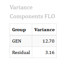
The two variance components estimated by REML.
Reading our result. For grain yield: GEN = 157,688 and Residual = 184,686. Their sum, 342,374, is the total phenotypic variance.
Genuine genotypic differences account for \(157{,}688 / 342{,}374 = 46.1\%\) of the total variation in grain yield; the remaining 53.9% is residual - environmental variation and measurement error. Slightly more than half of what you see in a single grain-yield plot is noise. That is precisely why the index is built on BLUPs rather than raw means, and why the shrinkage described in Section 3 is doing something important rather than being a statistical formality.
14.3 Table 3: Likelihood Ratio Test
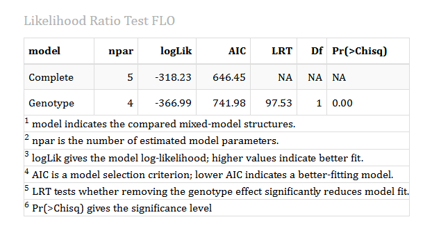
This is the only significance test in the whole module, and it asks: do the genotypes differ at all for this trait? It compares the complete model against a reduced model with the genotype variance removed, and reports whether removing genotype significantly worsened the fit.
Reading our result. For grain yield: the Complete model has 5 parameters, logLik = −998.18 and AIC = 2006.4; the reduced Genotype model has 4 parameters, logLik = −1010.69 and AIC = 2029.4. The test statistic is LRT = 25.01 on 1 degree of freedom, with \(p = 5.7 \times 10^{-7}\).
0.00
At the default Digits after decimal setting of 2, that p-value is rounded for display and appears as 0.00. It is not zero - it is 0.00000057. Raise the digits setting or open the downloaded report to see it properly.
The genotype effect is highly significant for grain yield: removing it costs 12.5 log-likelihood units and raises AIC by 23. There are real, repeatable differences among these 44 genotypes for yield, so including grain yield in the index is justified.
Run this check for every trait before you trust the index. A trait whose likelihood ratio test is non-significant has no detectable genotypic variation - the genotypes are effectively identical for it - and including such a trait contributes nothing but noise to the factor structure and dilutes the traits that do discriminate.
14.4 Table 4: Trait Details
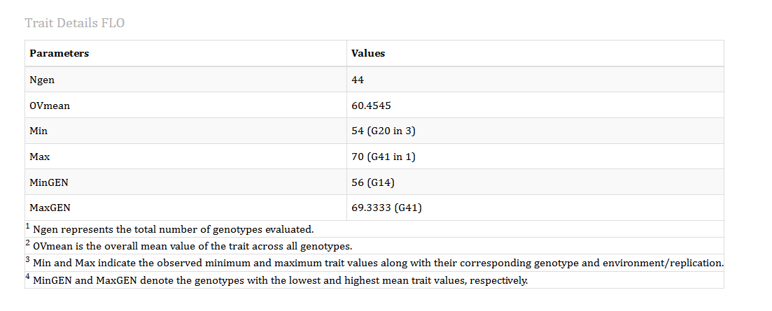
A plain descriptive summary, useful as a sanity check on data entry.
Reading our result. For grain yield: Ngen = 44 genotypes; OVmean = 4379.69 is the overall trial mean; the lowest single plot value was 3063.40, recorded for G44 in block 3, and the highest 5581.57, for G2 in block 3; averaging over blocks, the lowest genotype mean was 3456.24 (G38) and the highest 5381.00 (G3).
Two things are worth noticing. First, the plot extremes (3063 to 5582, a range of 2518) are considerably wider than the genotype-mean extremes (3456 to 5381, a range of 1925) - the difference is the plot-to-plot noise that averaging over blocks removes.
Second, and more instructively: G3 has the highest genotype mean for grain yield, yet it does not appear among the seven selected genotypes. Its MGIDI is 7.23, ranking 43rd of 44. This is MGIDI behaving exactly as intended. G3 is an outstanding yielder and an unremarkable genotype on the other thirteen traits, and a multi-trait index is not fooled by excellence on one axis. If your goal is yield alone, use the BLUP table; if your goal is a balanced genotype, use the index.
14.5 Table 5: Genetic Parameters
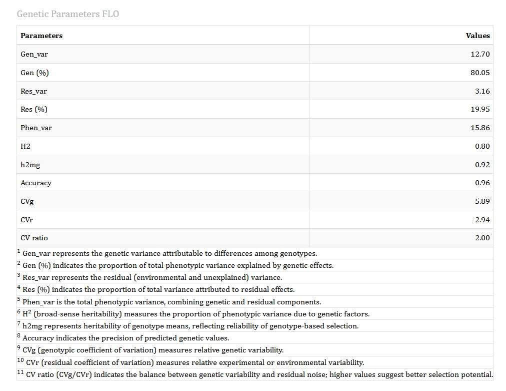
Everything in this table is derived from the two variance components in Section 14.2.
Reading our result for grain yield:
| Parameter | Value | What it means |
|---|---|---|
| Gen_var | 157,688 | Genotypic variance |
| Gen (%) | 46.06 | Share of phenotypic variance that is genotypic |
| Res_var | 184,686 | Residual variance |
| Res (%) | 53.94 | Share that is residual |
| Phen_var | 342,374 | Total phenotypic variance |
| H2 | 0.4606 | Broad-sense heritability, at the level of a single plot |
| h2mg | 0.7192 | Heritability of genotype means, averaged over 3 blocks |
| Accuracy | 0.8481 | \(\sqrt{h^2_{mg}}\) - correlation between predicted and true genetic values |
| CVg | 9.07 | Genotypic coefficient of variation (%) |
| CVr | 9.81 | Residual coefficient of variation (%) |
| CV ratio | 0.924 | CVg / CVr |
\(H^2 = 0.46\) says that if you looked at one plot of a genotype, less than half of what you saw would be genetic. \(h^2_{mg} = 0.72\) says that once you average over three blocks, nearly three-quarters of what you see is genetic. Replication is what closes that gap:
\[h^2_{mg} = \frac{\sigma^2_g}{\sigma^2_g + \sigma^2_e/r}\]
With \(r = 3\): \(157{,}688 / (157{,}688 + 184{,}686/3) = 0.719\). Add more replications and \(h^2_{mg}\) rises further. This is the single most useful argument in the module for why replication is worth the field space.
Grain yield in this trial is moderately heritable at the plot level but well determined at the genotype-mean level. An accuracy of 0.85 means the BLUP ranking of genotypes for yield is reliable; selection on it will mostly pick the genotypes you intended to pick.
The CV ratio of 0.92 is the number to watch. It compares genetic variability against experimental noise, and a value below 1 means the residual variation slightly exceeds the genotypic variation - the trial was adequately but not exceptionally precise for this trait. Ratios comfortably above 1 indicate a trait where selection will be easy; ratios far below 1 indicate a trait where you should either replicate more or reconsider including it.
Across the fourteen traits in this dataset, \(h^2_{mg}\) ranges from 0.52 (grains per spikelet) to 0.92 (days to flowering), which is why the BLUP setting matters: it lets days to flowering speak clearly while automatically discounting grains per spikelet.
14.6 Table 6: BLUP Genotype Values
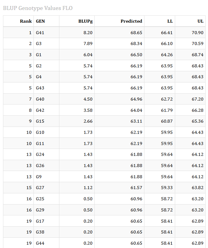
The per-genotype predictions for the chosen trait, ranked best-first.
- BLUPg - the genotype’s predicted genetic effect, expressed as a deviation from the overall mean
- Predicted - the overall mean plus BLUPg, in the trait’s original units
- LL and UL - the lower and upper confidence limits on that prediction
Reading our result for grain yield: G3 ranks first with BLUPg = +720.16 and a predicted value of 5099.85 with limits [4607.32, 5592.38]. G11 follows at +555.71, and G32 - our overall MGIDI winner - ranks third at BLUPg = +468.12, predicted 4847.81.
This table is where the tutorial’s thread ties itself together. G32 wins the multi-trait index and is also the third-highest yielder in the trial. Check its genetic means (Section 12.5) against the other genotypes and the pattern holds across the board: G32 ranks 3rd of 44 for grain yield, 4th for spike width and 5th for grain mass per spike, while sitting comfortably in the better half of the field for both flowering time and disease score. It is not a compromise candidate that reached the top by being mediocre everywhere; it is a genuinely high-yielding genotype that is also well balanced on the other thirteen traits.
Contrast that with G11, which yields second-highest and has fine spike architecture but flowers 34th of 44 and carries the 40th-worst disease score - and finishes 26th on MGIDI, outside the selection. That combination of strengths without corresponding weaknesses is exactly what a multi-trait index is built to find, and it is why G32’s separation from the field in Section 13.2 is worth taking seriously.
Note also the width of the confidence interval: G3’s predicted yield of 5099.85 carries limits of 4607 to 5592, a span of nearly 1000 units. Genotypes whose intervals overlap heavily cannot be reliably ranked against each other, which is a further reason not to over-interpret small differences near the selection cut-off.
15 Plots & Graphs
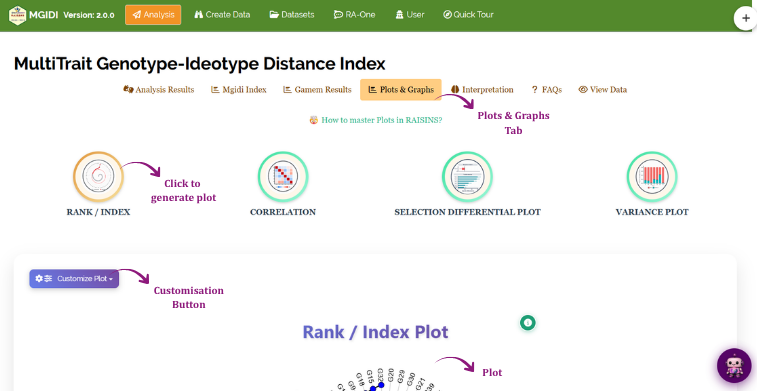
The Plots & Graphs tab offers four plots, chosen from four large circular buttons: RANK / INDEX, CORRELATION, SELECTION DIFFERENTIAL PLOT and VARIANCE PLOT. Click one and it draws below.
Two controls sit alongside every plot. Customize Plot opens a dropdown with collapsible panels - Plot Settings, Titles & Labels, Size & Colors, Theme Settings and Text Styling - letting you change colours, fonts, gridlines, axis labels, legend position and much else, with your choices preserved when you switch between plots. The small circular info button on the plot itself slides open a drawer explaining what the plot shows and how to read it. Every plot can be downloaded from the panel below it.
15.1 The Rank / Index plot
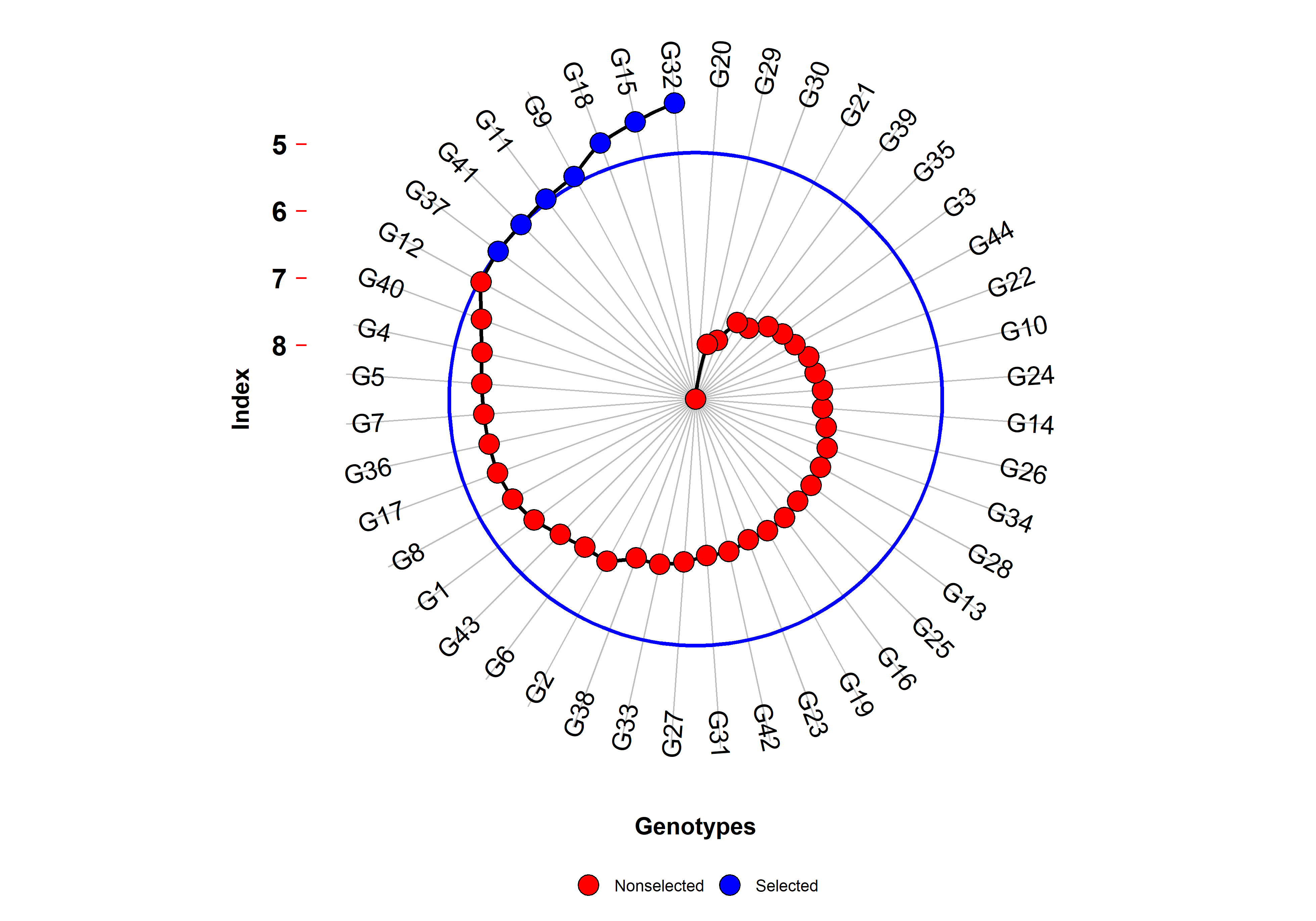
Every genotype is plotted at its MGIDI value, arranged around a circle when the Show Radar switch is on (the default) and as a conventional scatter when it is off. Genotypes below the selection cut-off are drawn in blue and labelled Selected; the rest are red and Nonselected. The circle marks the cut-off implied by your selection intensity.
Reading our result. The seven blue points sit outside the cut-off circle at the top of the spiral, starting with G32 at 2.94 and running through G18, G7, G15, G37, G33 and G36. Distance from the centre increases with MGIDI, so the tightly-packed red points near the centre are the genotypes furthest from the ideotype.
The plot makes the separation of G32 visible in a way the table does not: it sits noticeably clear of G18, while the seven selected genotypes as a group form a short, evenly-spaced arc that then merges smoothly into the unselected field. There is no natural break in the distribution at the seventh genotype, confirming what Section 13.2 warned: the cut-off is a decision you imposed, not a discontinuity in the material.
15.2 The Contribution view (strengths and weaknesses)
The same button also produces a second, quite different plot. Open Customize Plot → Plot Settings and change Plot Type from index to contribution. You can then choose whether to show selected genotypes only or all of them, and whether to draw the result as a radar.
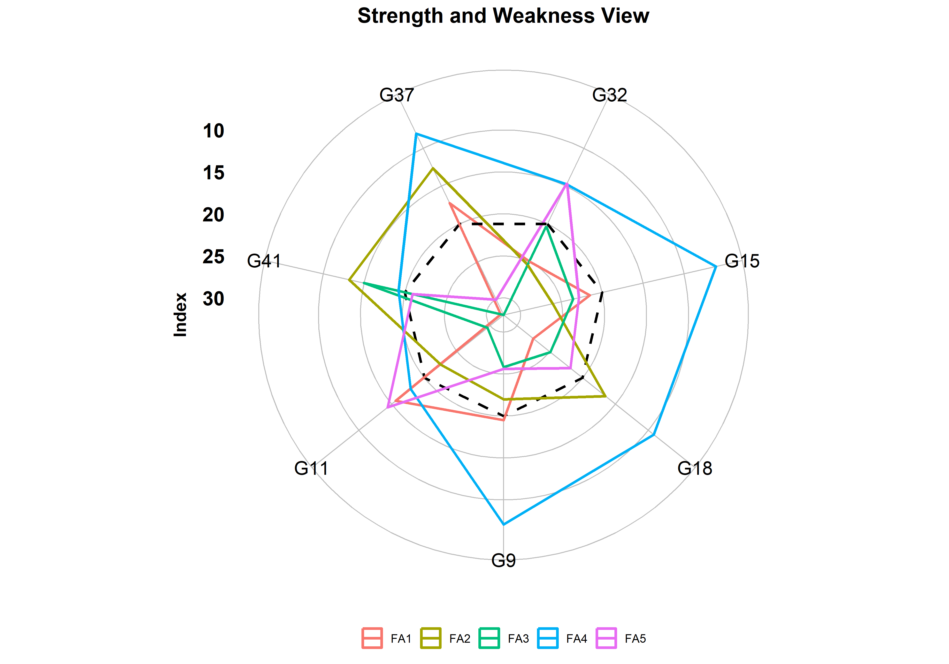
This is the most diagnostically useful plot in the module, and also the one most often misread. Each coloured line is one factor, and its radius at each genotype is the percentage of that genotype’s total distance from the ideotype contributed by that factor. The dashed black line is the average across genotypes.
The crucial rule: a small contribution is a strength, a large contribution is a weakness. Contribution measures distance, and distance from the ideal is what you want to be small.
Reading our result for the seven selected genotypes:
| Genotype | FA1 spike | FA2 grain wt | FA3 stature | FA4 phenology | FA5 yield |
|---|---|---|---|---|---|
| G32 | 29.2 | 15.6 | 37.5 | 15.7 | 2.1 |
| G18 | 29.5 | 1.6 | 39.0 | 19.9 | 10.0 |
| G7 | 41.5 | 11.1 | 37.4 | 6.0 | 4.0 |
| G15 | 16.0 | 11.6 | 29.4 | 34.7 | 8.3 |
| G37 | 13.4 | 3.1 | 44.6 | 18.5 | 20.4 |
| G33 | 22.9 | 10.5 | 20.8 | 10.5 | 35.3 |
| G36 | 12.4 | 11.4 | 35.3 | 19.3 | 21.5 |
Read across each row and the plot tells you a specific, actionable story about each genotype.
G32’s great strength is grain yield. FA5 contributes only 2.1% of its distance from the ideotype - the smallest contribution anywhere in the table - meaning G32 is essentially at the ideal for yield. This corroborates Section 14.6 exactly, where G32 ranked third of 44 for grain yield. Its weakness is plant stature: FA3 contributes 37.5%, so if G32 falls short of the ideotype anywhere, it is on height.
G18 is nearly perfect on grain weight and harvest index, with FA2 contributing just 1.6%, but shares G32’s stature weakness at 39.0%.
G33 is the mirror image of G32. It has the best-balanced stature (FA3 only 20.8%) but its yield is its weak point, FA5 contributing 35.3% of its distance. G33 and G32 are complementary parents: cross them and each supplies what the other lacks.
G7 has outstanding phenology - FA4 contributes just 6.0%, meaning early flowering and a clean disease score - but the weakest spike architecture of the selected group at 41.5%.
Notice, finally, that FA3 (stature) is the largest contributor for five of the seven selected genotypes. That is the population telling you where the whole selected group falls short of the ideotype, and it is a strong argument for bringing in a stature-donor parent from outside the current material.
The index tells you which genotypes to keep. This plot tells you which genotypes to cross. Pair a genotype whose weakness is a given factor with one whose strength is that same factor.
15.3 The Correlation plot
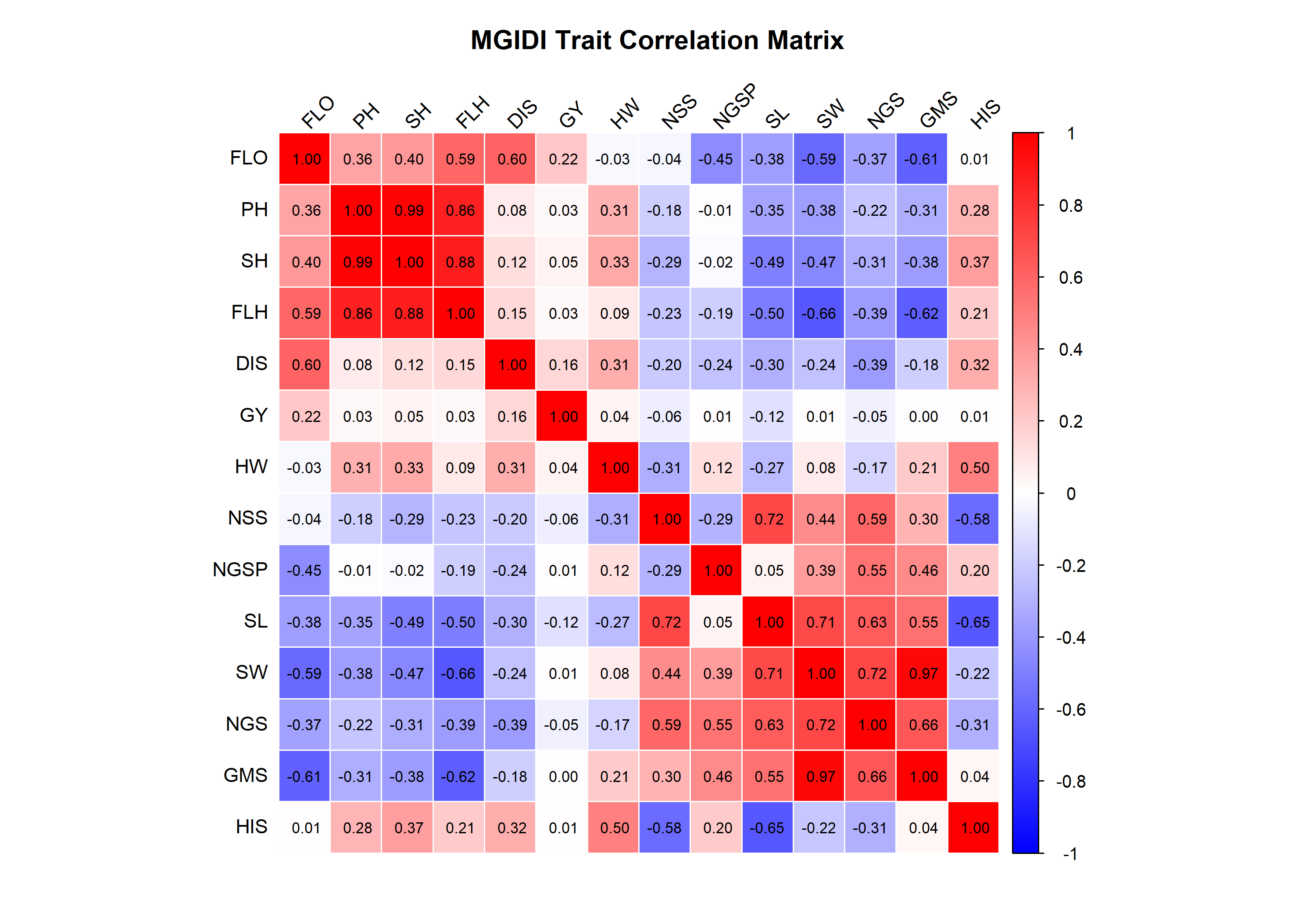
The same numbers as Section 12.4, rendered as a coloured grid: intense red for strong positive correlations, intense blue for strong negative, near-white for weak. The coefficient is printed in each cell. The Customize dropdown lets you switch the display method, the colour ramp, the number of digits, the label rotation and whether the coefficients are printed at all.
Reading our result. Two solid red blocks dominate: the PH–SH–FLH triangle in the upper left, and the NSS–SL–SW–NGS–GMS block in the lower right. Between them sits a field of blue, showing the trade-off between stature and spike size. The GY row and column are almost uniformly white.
The visual structure is the factor structure. The two red blocks are FA3 and FA1, and the blue between them is why varimax rotation was able to separate the two cleanly. The white GY row is the visual signature of a trait that carries information nothing else in the dataset carries - which is exactly why it earned a factor of its own.
15.4 The Selection Differential plot
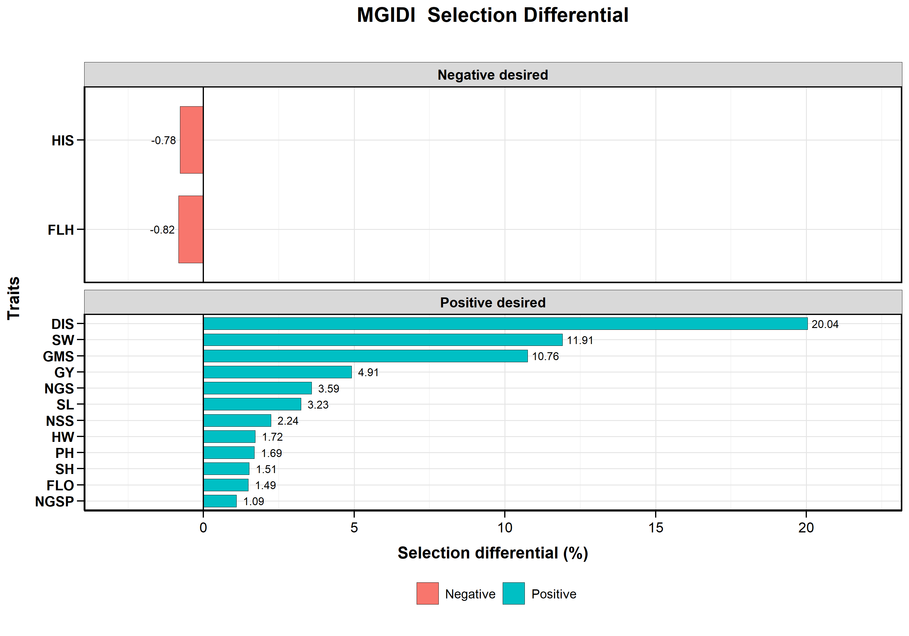
A bar chart of SDperc for each trait, teal for positive and red for negative, faceted into “Positive desired” and “Negative desired” panels according to the goal column of Section 12.3.
Reading our result. The Positive desired panel runs from GMS at +18.38 and SW at +17.55 down through the modest gains to DIS at −10.00 and FLO at −3.89 at the bottom. The Negative desired panel contains a single trait: FLH at −1.73.
The faceting is not cosmetic. Bars in the “Positive desired” panel are traits where the differential moved as intended, whatever its sign - which is why DIS at −10.00 and FLO at −3.89 sit there alongside GMS at +18.38. The “Negative desired” panel holds only traits that moved against you. A single glance at which traits fall into the second panel tells you the entire cost of your selection, and here that cost is one trait, flag leaf height, down 1.73%.
15.5 The Variance plot
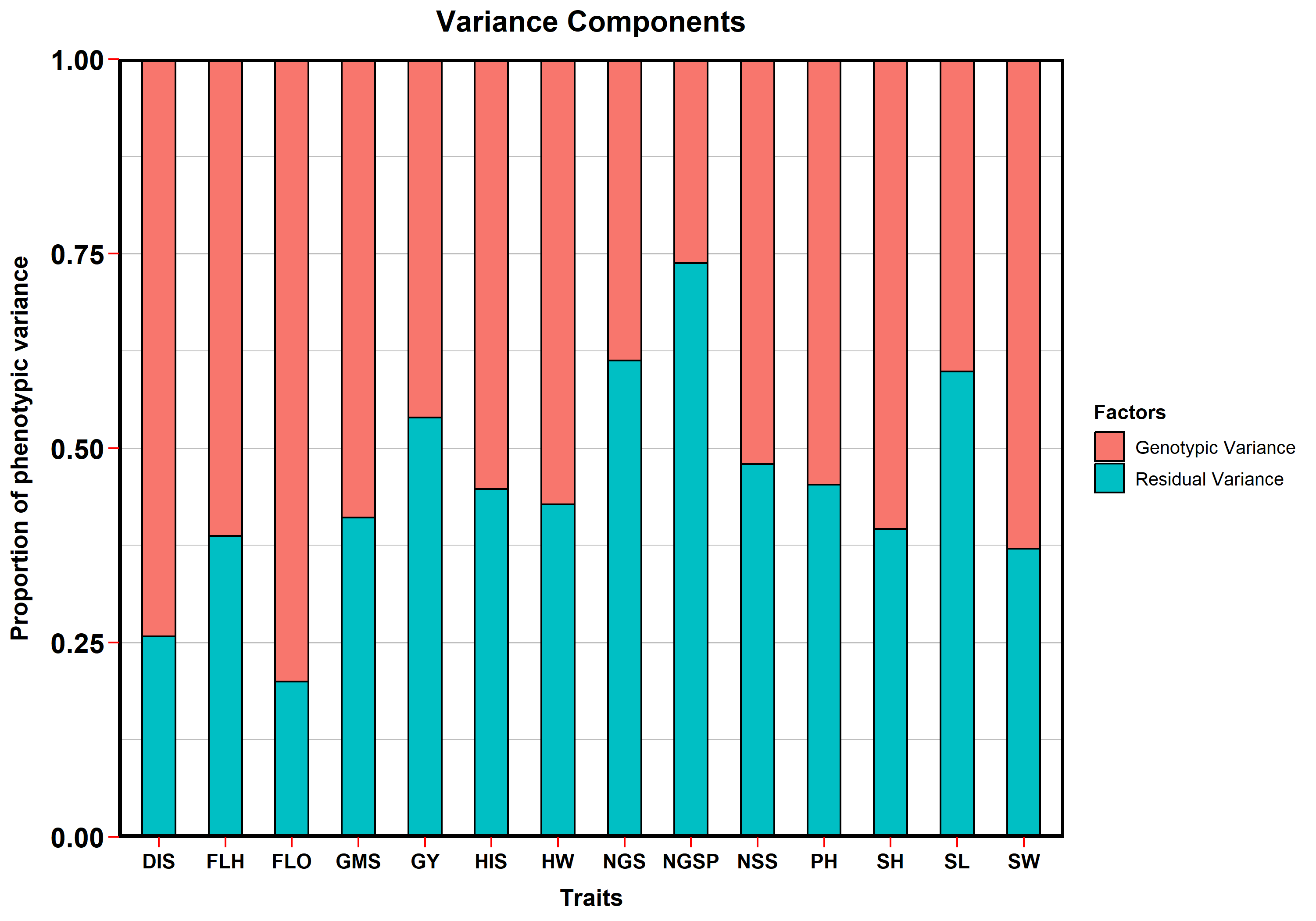
A stacked bar per trait showing what fraction of its phenotypic variance is genotypic (green) versus residual (orange). Because the bars are filled to 1.0, this is a direct, side-by-side visual of broad-sense heritability \(H^2\) across every trait at once.
Reading our result. The green fraction is largest for FLO (about 0.80 genotypic) and DIS (about 0.74), and smallest for NGSP (about 0.26), NGS (0.39) and SL (0.40). Grain yield sits in the middle at 0.46.
This single plot is the fastest quality check on your trait set. Days to flowering and disease score are measured with excellent precision in this trial - most of what varies between plots is genuine genotype. Grains per spikelet is the weakest trait, with roughly three-quarters of its variation attributable to residual noise, which is exactly why its \(h^2_{mg}\) of 0.52 is the lowest in the dataset and why the BLUP setting shrinks it so heavily.
If a trait’s bar were almost entirely orange, it would be a candidate for exclusion: it would contribute a nearly random column to the correlation matrix, degrading the factor solution. None of the fourteen traits here reaches that point, but NGSP is the one to watch.
16 Interpretation
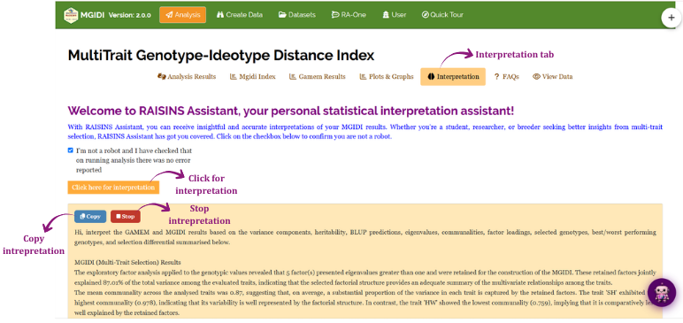
The Interpretation tab produces a written, publication-ready account of your results. Click the button to generate it and the text streams in a few characters at a time. While it is writing, a Stop button appears below the button, letting you halt generation early. Once it finishes, a Copy button appears in the same place so you can lift the text in a single click.
The write-up draws only on what your analysis actually produced - the factor structure, the selected genotypes, the selection differentials and the genetic parameters - and states the numbers to the same number of decimal places you set in the control panel.
17 Chat with your data using RA-One
RA-One is the module’s conversational assistant, available from the RA-One tab or the floating chat bubble. You ask questions in plain language and it answers using your analysis rather than generic statistical advice. It never invents numbers: every value it quotes comes from what the module computed, at the decimal precision you set, and if a value is not available it says so rather than guessing. Answers are plain English - no code, no function names, no software commands.

RA-One handles six kinds of request for this module:
- Data preparation and layout - what the CSV must look like, and it builds the template for you
- Replication advice - how many replications you need, computed from the module’s own residual degrees of freedom \((g-1)(r-1)\), not a rule of thumb
- Model datasets - fetching any of the three bundled datasets with a download button
- Statistical concepts - what a communality is, what selection intensity does, why lower MGIDI is better, what BLUP shrinkage means
- Your analysis results - interpreting your factor structure, your selected genotypes, your selection differentials
- Tables and plots on demand - rendered live in the chat window
On request it will display any of the module’s result tables in the chat, each with its own Download CSV button: MGIDI Index, Selected Genotypes, Factor Analysis, eigenvalues and variance explained, factor contribution per genotype, Selection Differential and Gain, the trait correlation matrix, the BLUP genotype means, and - for whichever trait you name - the fixed-effect ANOVA, variance components, likelihood ratio test, trait details, genetic parameters and BLUP genotype values.
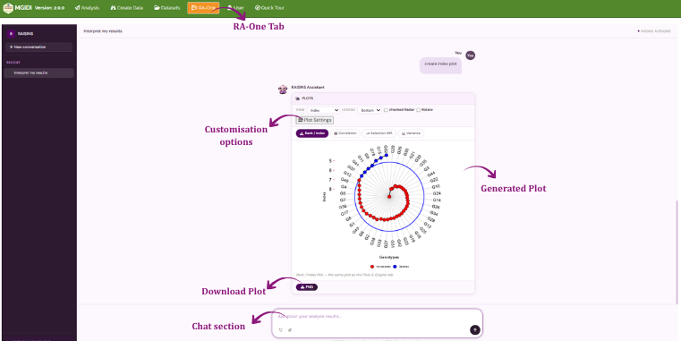
RA-One can also draw any of the module’s four plots directly in the chat - the rank/index plot (and its contribution view), the correlation plot, the selection differential plot and the variance plot - and every one of them is customisable by conversation. Ask it to change the colours, the title, the axis labels, the legend position, the font, the gridlines, whether the radar is drawn or whether the facets are split, and it redraws.
Within a single conversation RA-One can size your experiment, build your data template, fetch a model dataset, explain a concept, interpret your factor loadings and draw a customised plot - so most of a routine MGIDI session can be run without leaving the chat window.
RA-One is explicitly constrained never to describe a large MGIDI value as desirable. If you ever see an answer that appears to say otherwise, it is a misreading of the wording - lower is always better.
18 FAQs
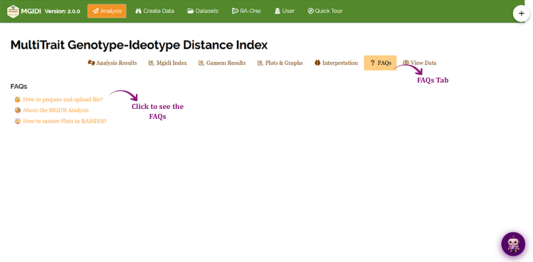
The FAQs tab carries three guided help topics that open in place:
- How to prepare and upload file?
- About the MGIDI Analysis
- How to master Plots in RAISINS?
The plotting guide is also reachable directly from the top of the Plots & Graphs tab.
19 View Data
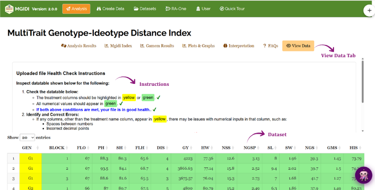
View Data is the diagnostic tab for data integrity. It shows the file exactly as RAISINS read it, alongside a health-check panel. For MGIDI this step matters more than for most modules, because the analysis rests on a mixed model that needs a complete, balanced structure. Use it to confirm that:
- the genotype column is text and each genotype appears once per replication
- the replication column is numeric
- all trait columns are numeric and there are at least two of them
- no cell is blank and no row or column is wholly empty
- your column names carry no stray spaces, which is the most common cause of a column that “disappears” from a selector
Internally the trait correlation matrix is computed on complete observations only. A genotype with a single blank cell in one trait therefore contributes to none of the correlations, not just that trait’s. In a trial with many scattered blanks this can quietly shrink the effective sample behind the factor analysis. The module blocks upload on blank cells for exactly this reason - do not work around it by filling blanks with zeros.
20 Wrapping up
Strip away the machinery and MGIDI rests on one idea: describe your perfect genotype, then measure how far each real genotype sits from it, after removing the redundancy among your traits. The mixed model, the BLUP shrinkage, the eigenvalues, the varimax rotation - all of it exists to make that distance a fair one.
Which means the analysis itself makes only two decisions that are genuinely yours, and neither is statistical:
First, the direction of every trait. This is your ideotype. Get a direction wrong and the index will faithfully and confidently select in the wrong direction for that trait - as our worked example showed, setting DIS to Higher instead of Lower would have selected the most diseased genotypes in the trial. Check every dropdown before you read a single result.
Second, which traits to include. A trait with no significant genotype effect (Section 14.3), or one whose variance plot bar is almost all orange (Section 15.5), adds noise to the correlation matrix and dilutes the traits that discriminate. The module reports everything you need to make that call, one trait at a time, in the Gamem Results tab.
Everything else - how many factors, how the loadings rotate, where each trait belongs - the method decides for you, and the tables tell you what it decided and why.
If your interest is in grouping genotypes by overall similarity rather than ranking them against an ideal, RAISINS’s K-Means and hierarchical clustering modules are the companion tools; if you want the underlying trait structure without a selection decision attached, the Factor Analysis and Principal Component Analysis modules cover that ground. And if you get stuck at any point, RA-One is available 24 × 7, or write to us at [email protected].