Pooled Split Plot (2,1) Design
Two main-plot factors, one sub-plot factor, several environments and two pooled error terms. This tutorial explains how they fit together and works a complete pooled split plot (2,1) analysis in RAISINS… Read more …
A pooled split plot (2,1) design takes a split-plot experiment in which two factors are applied together to the large main plots and one factor is applied to the smaller sub plots, and repeats it over several locations, seasons or years, analysing every environment together in one combined analysis of variance. Because the main plots and the sub plots differ in size, the analysis carries two error terms - a coarse one for everything measured on the main plots and a fine one for the sub-plot factor and its interactions - and each effect has to be tested against the right one. On top of that, the pooled analysis asks what no single-site trial can: does the result hold at every location? This tutorial explains the two error strata, the homogeneity check that licenses pooling and the Aitken correction applied when it fails, and then carries one dataset through the module from upload to conclusion - the pooled ANOVA, mean separation, transformation, plots, principal component analysis and AI-assisted interpretation - without writing a line of code. This tutorial will guide you step-by-step.
1 What is a pooled split plot (2,1) design?
Suppose you are comparing two irrigation methods, M1 and M2, and two bed systems, C1 and C2, and two varieties, S1 and S2. Neither the irrigation method nor the bed system can be changed from one small plot to the next - the channels, the pumps and the raised beds all need room - so both are laid out over large main plots. Each main plot is therefore defined by a combination of an irrigation method and a bed system: M1C1, M1C2, M2C1, M2C2. The varieties are easy to vary within a small area, so each main plot is split into sub plots and the two varieties are randomized inside it. That is a split plot (2,1) design: two factors on the main plots and one on the sub plots, the whole arrangement repeated in blocks.
Run it once at one farm and you have an answer for that farm. A recommendation, though, is a claim about farms you did not test. Will M2 still beat M1, and will the best bed system stay the best, at a second location with heavier soil and later rain? A single site cannot tell you. So you repeat the whole split-plot trial at a second location - and now you have two experiments and the question of how to combine them.
Analysing each location on its own and comparing the tables by eye does not work: two separate analyses cannot tell you whether a difference between the sites is real or just the noise you would expect from two independent trials. A pooled analysis puts every observation into one analysis of variance. In doing so it gives you terms that no single-site analysis contains - the effect of Location itself, and the interactions of each treatment factor with location.
Those interaction terms are what the extra site buys. A significant Location × Main plot says a main-plot effect is not the same at the two sites, and a single blanket recommendation would be wrong. A non-significant one says the opposite, and more usefully: the effect you measured is stable across the environments you sampled. With two main-plot factors there are more of these interactions to read - Location with each factor, and Location with their interaction - but the logic is unchanged.
Do the two main-plot factors, the sub-plot factor and their interactions matter - and do their effects stay the same from one location to the next?
A pooled split plot (2,1) design tests two main-plot factors and one sub-plot factor, each against its own error, and checks whether what they do stays the same when you move to a different location, season or year.
2 Two plot sizes, two error terms
The split in a split plot is not only a matter of layout. Main plots are large and few; sub plots are small and many. Large plots differ from one another more than small plots sitting side by side inside them, so the factors are measured with different precision. A fair test of each factor has to compare it with the variation among plots of its own size. That is why the ANOVA carries two error terms - and it does not matter that there are now two factors on the main plots rather than one: everything applied to the main plots shares the coarse error, and everything involving the sub-plot factor shares the fine one.
| Error term | What it measures | In the working example |
|---|---|---|
| Pooled Error (a) | Variation among main plots - the main-plot factor combinations - within blocks, pooled over locations | 6 df |
| Pooled Error (b) | Variation among sub plots within main plots, pooled over locations | 8 df |
Error (a) usually has fewer degrees of freedom and is usually larger. The price of putting a factor on the main plots is that it is tested less precisely; the reward is that the sub-plot factor, and every interaction involving it, is tested against the smaller Error (b). Because a (2,1) design puts two factors on the main plots, both of them - and their interaction - pay that price together. When you plan such a trial, put the factor you most need to measure precisely on the sub plots.
The module assigns every effect to one of the two errors. You do not have to choose - but you should know which is which, because it explains why two effects with similar mean squares can come out with very different p-values. Writing A and B for the two main-plot factors, C for the sub-plot factor and L for Location, the split falls out as follows.
| Tested against Pooled Error (a) | Tested against Pooled Error (b) |
|---|---|
| Main plot A | Location (L) |
| Main plot B | Sub plot C |
| A × B | L × C |
| L × A | A × C |
| L × B | B × C |
| L × A × B | L × A × C |
| L × B × C | |
| A × B × C | |
| L × A × B × C | |
| Pooled Error (a) itself |
The last row of the right-hand column is easy to miss. The module divides the Error (a) mean square by the Error (b) mean square and reports an F and a p-value for it. A significant result confirms that the main plots really did vary more than the sub plots - that is, that the split-plot structure was doing something and was worth modelling. A non-significant one says the two errors were of similar size in this trial.
Every degree of freedom should be accounted for. In the working example there are 32 observations, so 31 degrees of freedom to distribute. The fifteen treatment effects (L, A, B, C and their eleven interactions) take one each - fifteen in all - the blocks take two, and the two error terms take the rest: 6 for Pooled Error (a) and 8 for Pooled Error (b). They sum to 31, exactly as they should. If your own analysis does not add up this way, the file is unbalanced and the View Data tab (Section 18) is the place to find out why.
Why "(2,1)" - and how it differs from an ordinary split plot
-
The name records the shape of the design: two factors on the main plots and one on the sub plots. An ordinary split plot is a “(1,1)”: one main-plot factor, one sub-plot factor. Adding the second main-plot factor does two things. It creates a main-plot factorial - the main-plot treatments are now the A × B combinations, so you gain an A × B interaction and its interaction with Location - and it enlarges the sub-plot stratum with the A × C, B × C and A × B × C interactions. The two error terms are unchanged in kind; there are simply more effects to assign to each. If your trial has only one factor on the main plots, use the ordinary Pooled Split-plot analysis module instead.
3 How RAISINS decides whether your environments can be pooled
Pooling rests on an assumption that is easy to state and easy to violate: the experimental error must be about the same size at every location. If one site was uniform and the other was patchy, their errors are not comparable, and averaging them gives a pooled error that is too large for the good site and too small for the bad one. Every F test would then be wrong, in opposite directions at the two sites.
So the module checks first. For every response variable it fits the split-plot model separately at each location, collects the residuals, and runs Bartlett’s test to ask whether their variance differs between locations by more than chance would explain. The null hypothesis is that the error variances are homogeneous - so here, unusually, a non-significant result is the one you want.
An ordinary split plot has one experimental error to check. A (2,1) design has two, so the module runs Bartlett’s test separately on Error (a) and on Error (b) for every character. The Analysis Results tab shows this as four rows - chisq_Ea, pval_Ea, chisq_Eb, pval_Eb (Figure 7) - so you can see whether it is the main-plot error, the sub-plot error, or both, that differs between locations.
| Bartlett’s result | What it means | What the module does |
|---|---|---|
| p > 0.05 (non-significant) | Error variances are homogeneous across locations | Pools the data directly; the analysis proceeds unchanged |
| p ≤ 0.05 (significant) | Error variances differ between locations | Applies an Aitken transformation to that character before pooling |
The Aitken transformation divides every observation at a location by the square root of that location’s error mean square (MSE). After the division each location has an error variance of about one, so the locations are on a comparable footing and the pooled error is legitimate again. The module tells you which characters were transformed and prints the per-location MSE values it used - and because there are two error strata, it lists two MSE values for each location, MSEa and MSEb (Figure 7).
The Bartlett decision is always made at p ≤ 0.05, whatever level of significance you choose for the rest of the analysis. Setting α to 0.01 in the options strip changes the post-hoc tests and the CD values, not the pooling check.
The check is performed character by character. In the working example every character clears the homogeneity check for both error terms: the p-values run from 0.14 to 0.90, with the single exception of Char6, whose Error (a) statistic sits right on the 0.05 line and whose Error (b) value is 0.06 - close, but still on the safe side (Section 9). Where a character does cross the line, the module applies the Aitken correction to it before pooling and says so; the other characters are pooled directly.
4 Assumptions of the pooled split plot (2,1) analysis
The pooled split plot (2,1) analysis inherits the assumptions of an ordinary split plot in randomized blocks, and adds one of its own. On its analysis page, the module states that locations/seasons are treated as random and the treatments as fixed: the treatments are the ones you chose to compare, while the locations stand in for the wider range of environments you want to generalise to.
| Assumption | What it means | What to do if it fails |
|---|---|---|
| Homogeneity of error variance across locations | Each location contributes error of comparable size, for both error strata | Handled automatically - see Section 3 |
| Normality of residuals | The residuals follow an approximately normal distribution | Inspect the QQ plot in Advanced Plots (Section 13); consider a transformation (Section 10) |
| Homogeneity of variance across treatments | Spread is similar for every treatment combination | A log or square-root transformation usually helps (Section 10) |
| Correct randomization at both levels | Main-plot combinations randomized to main plots within each block, sub-plot treatments randomized within each main plot | Decided in the field; no post-hoc fix |
| Independence | Observations do not influence one another | Decided by the design and its execution; no post-hoc fix |
| Complete, balanced layout | Every A × B × C combination appears once in every block, at every location | Check the file in View Data (Section 18) |
Every other assumption on this list has a remedy after the data are in. These two do not. If the main-plot combinations were not randomized within blocks, or the same sub plot was measured twice and entered as two rows, no transformation will fix it. That is decided when you lay out the trial, not when you analyse it.
With the theory settled, let us open the module and run an analysis - continue to Section 5.
5 Getting to the module
Now that the theory is clear, let us run the analysis. Visit the RAISINS home page at www.raisins.live and go to Data Analysis. The pooled designs are grouped together under Pooled Analysis; in this tutorial we use Pooled Split-plot (2,1) analysis, the last row shown in Figure 1.
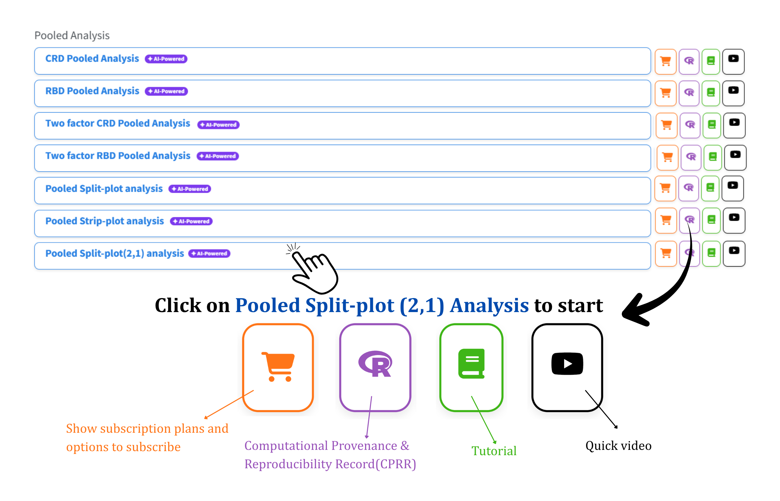
Each module row carries four icons. The cart shows the subscription plans and the options to subscribe; the R icon opens the CPRR described below; the book opens this tutorial; and the play button starts a quick video of the module in use.
5.1 Computational Provenance & Reproducibility Record
CPRR (Computational Provenance & Reproducibility Record) provides a transparent and comprehensive record. Click on the R icon shown in Figure 1 to access CPRR and know about the computational workflow performed during the analysis. The record for this module states the R version and the exact version of every package used, and names the specific function behind each reported result. CPRR lists every default parameter and decision rule applied by the module and provides fully runnable R code that reproduces each analytical step. Users can execute the code in R to independently reproduce and verify the results. It carries its own DOI.
To cite the platform itself in a paper, thesis, or report, use the RAISINS citation, available in APA, Harvard, and BibTeX formats at www.raisins.live/citation.html. That is the primary reference, and for most manuscripts it is all you need.
The CPRR for the Pooled Split Plot (2,1) module is at www.raisins.live/module_record/pooledsplit21.html.
Cite the RAISINS paper as your primary reference for the platform. Add the CPRR as supporting documentation when a journal asks for details of the computing environment, or when you want your methods section to be precise about versions and functions rather than saying “analysis was carried out using an online tool.” For this module the CPRR is particularly worth citing, because it states exactly which error term each effect is tested against and how the Bartlett check and the Aitken correction are implemented - the steps most likely to differ between software packages, and the ones a reviewer is most likely to query.
6 Preview mode and Quick Tour
Before subscribing, you can explore the entire module using Preview mode, reached from the module’s Welcome page (Figure 2). In this mode the upload control is withdrawn - your own data cannot be submitted - and a Choose a demo dataset selector appears in its place, offering the model datasets described in Section 8.3. Everything else stays available: the pooled ANOVA, the twin Bartlett checks, the basic and advanced plots, the multivariate PCA index and the RA-One assistant can all be tried on the demonstration data before you commit to anything.
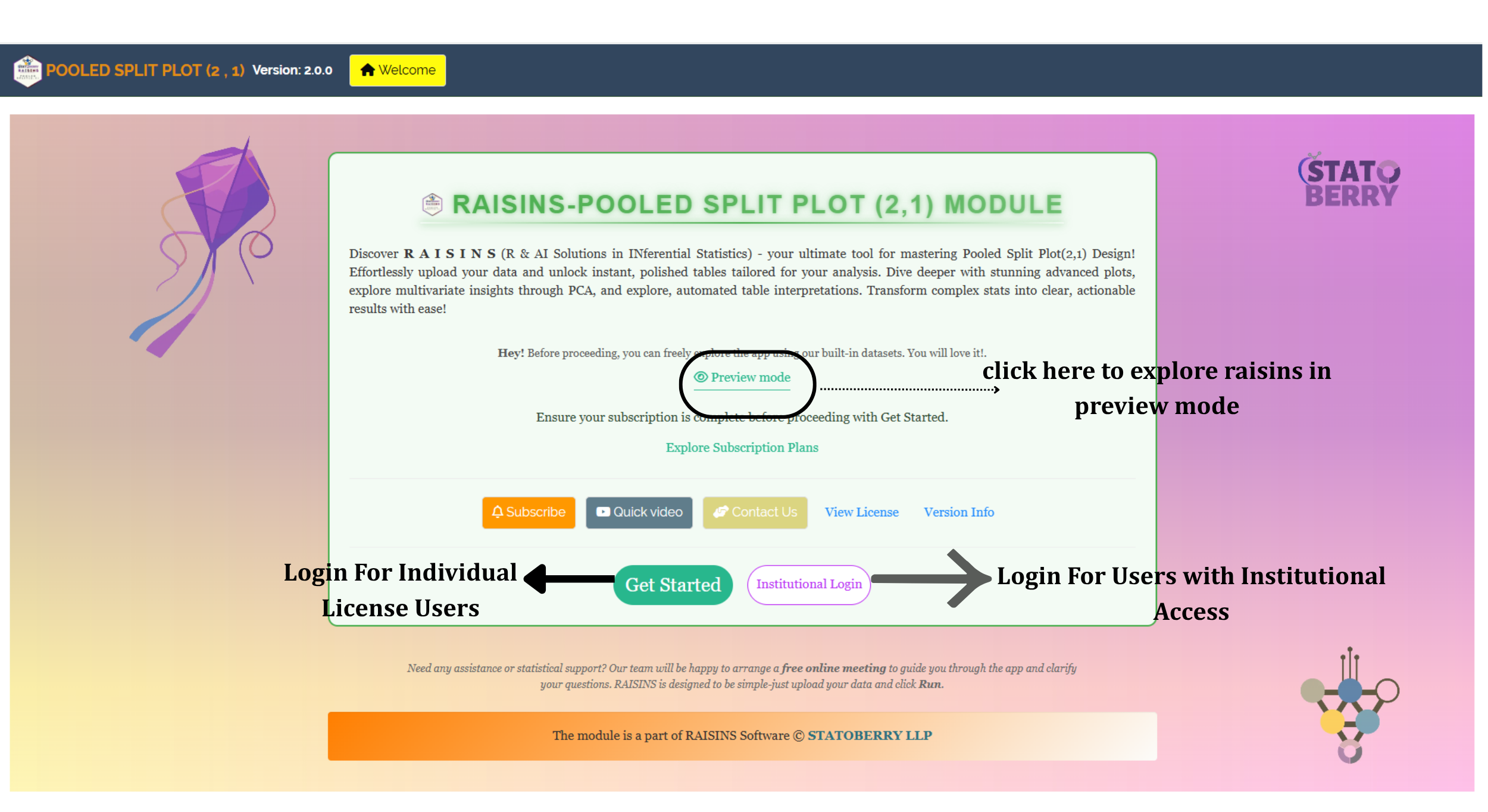
The Welcome page also routes you to the right sign-in. Get Started is for individual-licence users; Institutional Login is for users whose access comes through an institution. First-time users are additionally offered a Quick Tour, an interactive, step-by-step walkthrough that highlights each control and explains what it does. You can retake the tour at any time from the Quick Tour tab in the top navigation bar.
7 A working example
Everything from here on uses one dataset - Dataset 1 from the module’s Datasets tab (Section 8.3) - so that each screen you see is a step in a single continuous analysis rather than a disconnected illustration.
| Element | In this dataset |
|---|---|
| Environments | 2 locations, A and B |
| Main plot factor 1 (A) | 2 levels, M1 and M2 |
| Main plot factor 2 (B) | 2 levels, C1 and C2 |
| Sub plot factor (C) | 2 levels, S1 and S2 |
| Blocks | 2 per location |
| Main-plot combinations | 4 (M1C1, M1C2, M2C1, M2C2) per block |
| Treatment combinations | 8 (4 main × 2 sub) per location |
| Responses | 7 - Yield plus Char1 to Char6 |
| Rows | 32 - that is 2 locations × 2 × 2 × 2 treatments × 2 blocks |
This is the smallest arrangement that still exercises every part of a (2,1) design: two levels of each main-plot factor so there is a main-plot factorial with its own A × B interaction, two sub-plot levels so there is a sub-plot comparison and the A × C, B × C and three-way interactions, two environments so there are Location interactions throughout, and two blocks so both error terms have degrees of freedom to spare. Seven responses are carried through together, which is the normal case - you rarely measure just one thing - and lets us show how the module handles a file where different traits behave differently. The question the module will settle is the one posed in Section 1: do the two main-plot factors, the sub-plot factor and their interactions matter, and do their effects hold at both locations?
8 How to prepare your data
Your analysis is only as good as your data. Feed RAISINS high-quality data and it will deliver powerful insights; feed it messy data and the results will not be trustworthy. The module accepts a CSV or Excel file in one specific shape, and you have four routes to it:
- Create your dataset in MS Excel (Section 8.1)
- Build your dataset directly within the RAISINS app (Section 8.2)
- Using the Model datasets in RAISINS as a reference (Section 8.3)
- Create your dataset using the RA-One chat assistant (Section 8.4)
8.1 Preparing data in MS Excel
The rule is one row per sub plot and one column per variable. Five identifier columns come first - the environment, the first main-plot factor, the second main-plot factor, the sub-plot factor and the block - followed by one column for each response you measured. Figure 3 shows the working example laid out exactly this way.
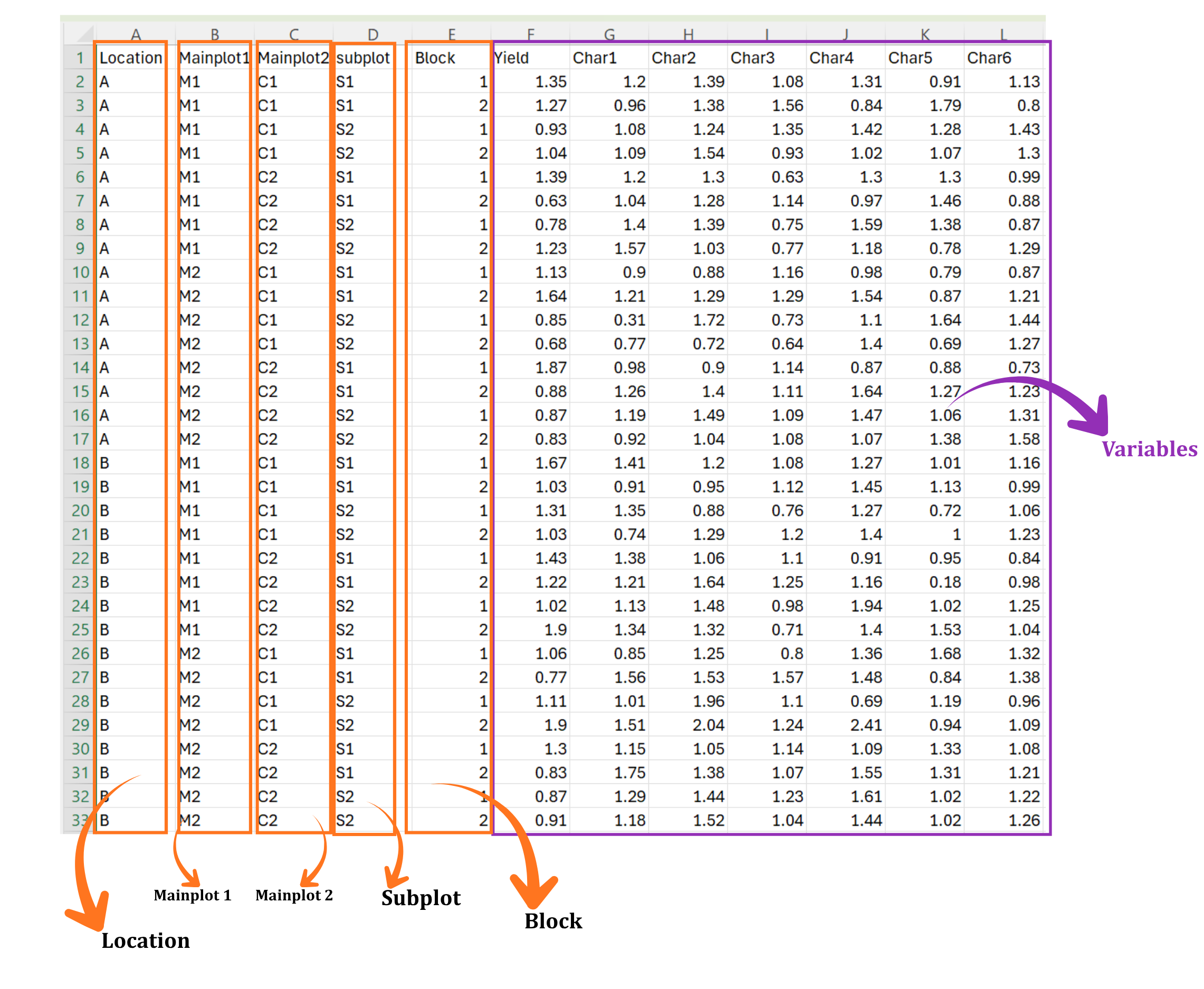
| Column | Holds | In Figure 3 |
|---|---|---|
| Location | The environment: location, season or year | A, B |
| Mainplot1 | Levels of the first main-plot factor | M1, M2 |
| Mainplot2 | Levels of the second main-plot factor | C1, C2 |
| subplot | Levels of the sub-plot factor | S1, S2 |
| Block | The replication or block within each environment | 1, 2 |
| Yield, Char1 … Char6 | One column per measured response | Numeric values |
Blank rows or blank columns inside the data block; a trailing space after a level name, which makes M1 a different level from M1; text such as NA, - or missing typed into a numeric column; merged cells; and an A × B × C combination missing from one block at one location. Every one of these is silent in Excel and fatal in analysis. The View Data tab (Section 18) is built to catch them before you run anything.
Dataset creation rules
- Column naming convention
- No spaces allowed in column names.
- Use underscores (
_) or full stops (.) for separation. - Avoid symbols and special characters such as %, #.
- Data arrangement
- Start the data towards the upper-left corner.
- Ensure the row above the data is not blank.
- Cell management
- Avoid typing or deleting in cells without data.
- If needed, select the affected cells, right-click, and choose Clear Contents.
- Column relevance
- Name all columns meaningfully.
- Exclude unnecessary columns not required for the analysis.
- Split-plot (2,1) layout
- Every combination of the two main-plot factors must appear with every sub-plot level, in every block, at every location.
- Keep the level names identical everywhere they appear -
M1throughout, neverM1in one place andm1in another. - The order of rows and columns does not matter, because you map each column by name in the Analysis tab.
How to save as CSV in MS Excel
Open your workbook. Ensure your data is arranged properly with only one sheet.
Click the ‘File’ menu. Go to the top-left corner and click File.
Choose ‘Save As’ or ‘Save a Copy’. Select the location where you want to save your file.
Set file type to CSV. In the ‘Save as type’ dropdown, choose CSV (Comma delimited) (*.csv).
Name your file. Enter a relevant file name without spaces (use underscores if needed).
Click ‘Save’. Click Save to export the file.
💡 Tip: Before saving, double-check that your data is on the first sheet and follows the required format.
8.2 Prepare using Create Data in RAISINS
If you are unsure about the correct format, do not worry, RAISINS can create the data layout for you using the prescribed template. Here is how:
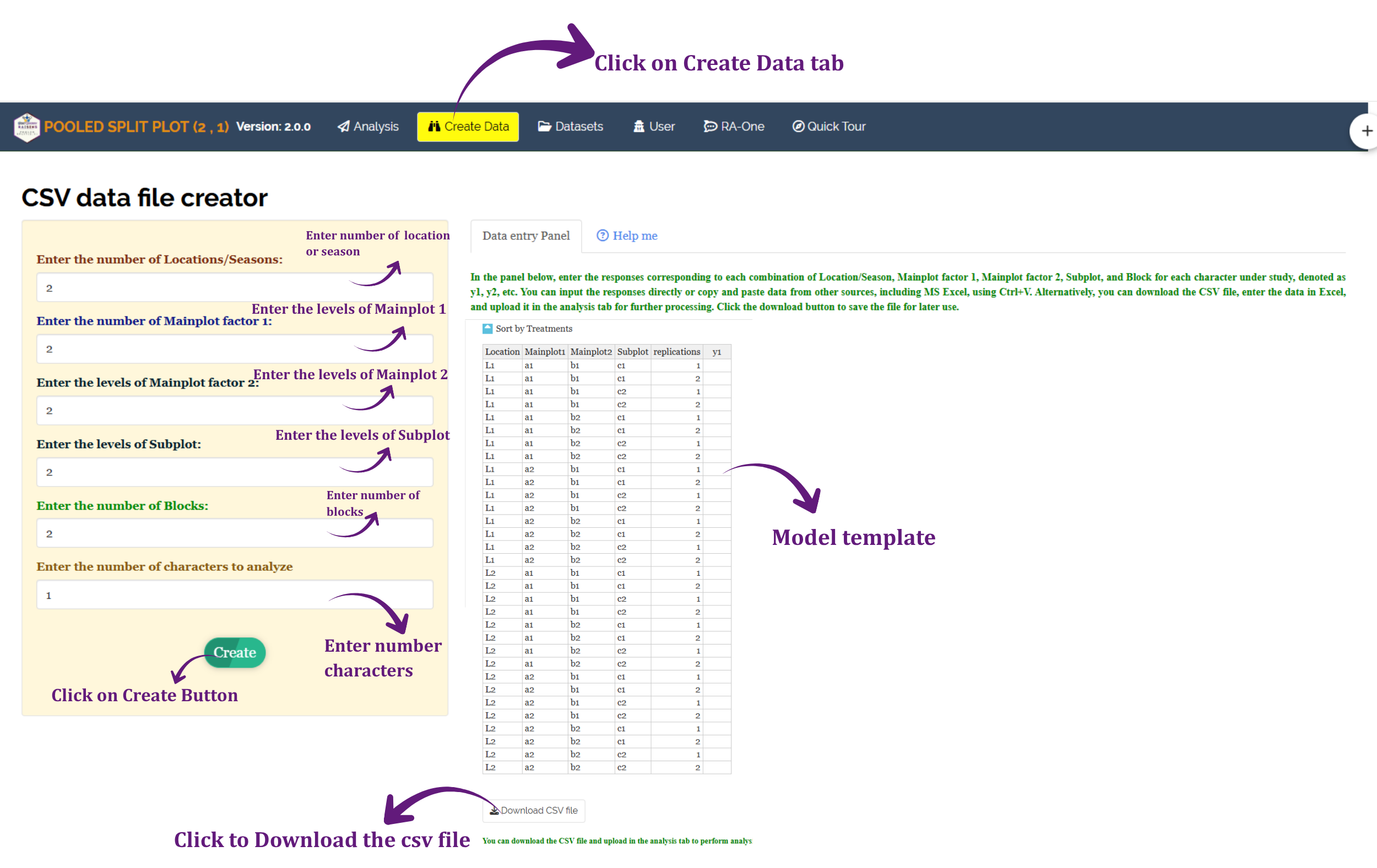
- Navigate to the Create Data tab
- Enter the number of Locations/Seasons, the number of levels of Mainplot factor 1 and of Mainplot factor 2, the number of levels of the Subplot, the number of Blocks, and the number of characters you intend to measure
- Click the Create button
The model template appears on the right, as shown in Figure 4, with one row for every location × A × B × C × block combination and an empty response column (y1, y2, …) for each character. A switch above the table orders the rows by treatments or by replications. You may type the observations straight into the template, or paste them from Excel with Ctrl+V. Download CSV file saves it, and the saved file uploads into the Analysis tab unchanged.
8.3 Download Model Datasets
If you are unsure about the required data format or would like to explore the module before using your own data, RAISINS provides model datasets for reference. To download them:
- Navigate to the Datasets tab
- Click the Download Dataset (CSV) link under the required dataset
- Save the file to your computer
- Use the model dataset as a reference for preparing your own data or upload it directly to explore the analysis
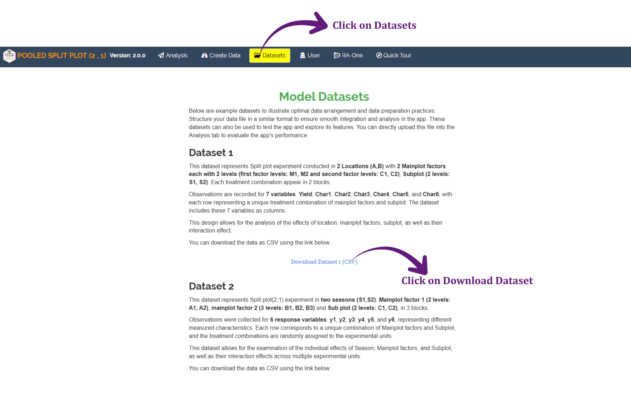
Figure 5 shows the page. Dataset 1 is the file used throughout this tutorial (Section 7): two locations, both main-plot factors at two levels, a two-level sub plot, and seven responses. Dataset 2 is a larger arrangement - two seasons, a first main-plot factor at two levels (a1, a2), a second main-plot factor at three levels (b1, b2, b3) and a two-level sub plot (c1, c2), in three blocks, with six responses named y1 to y6. It is worth loading once you want to see how the tables grow when a factor has more than two levels.
8.4 Creating a dataset using RA-One chat
RA-One, the built-in chat assistant, can help you create a properly formatted dataset through a simple conversation. Open the RA-One tab, or click the chat icon available within the app, and describe the design in plain English - for example, “Create a data template for 2 locations, 4 levels of main factor 1, 2 levels of main factor 2, 2 sub plots, 3 blocks and 3 responses”. RA-One builds the grid in the conversation, as in Figure 6.
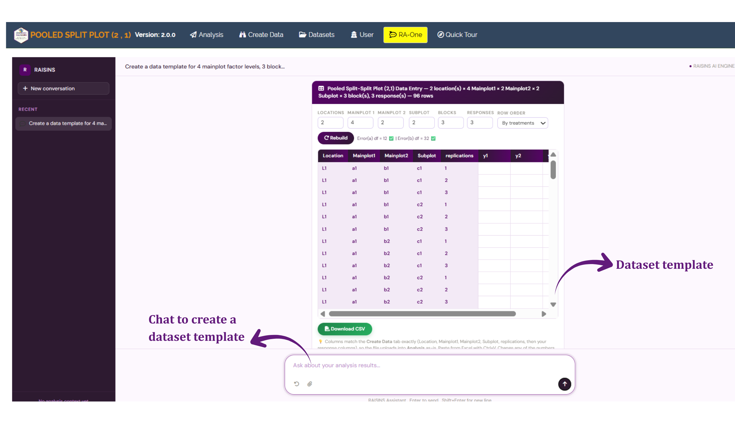
What comes back is a working table, not a picture of one. The header restates the design it understood - locations, the two main-plot factors, sub plots, blocks and response columns - each in an editable box, together with the total number of rows it implies. It even shows a live degrees-of-freedom check for the two error terms, so you can confirm the design is estimable before you fill in a single value. If it read the request wrongly, change the number and press Rebuild rather than starting the conversation again. Add column appends another response, and Download CSV saves the file for upload under the Analysis tab.
Your file is ready. Continue to Section 9 to run the analysis.
9 The Analysis Results tab
This is the tab where the analysis is specified and run. The panel on the left takes your file and tells the module what each column is; the strip along the top governs how the results are presented. Figure 7 shows it with the working example loaded.
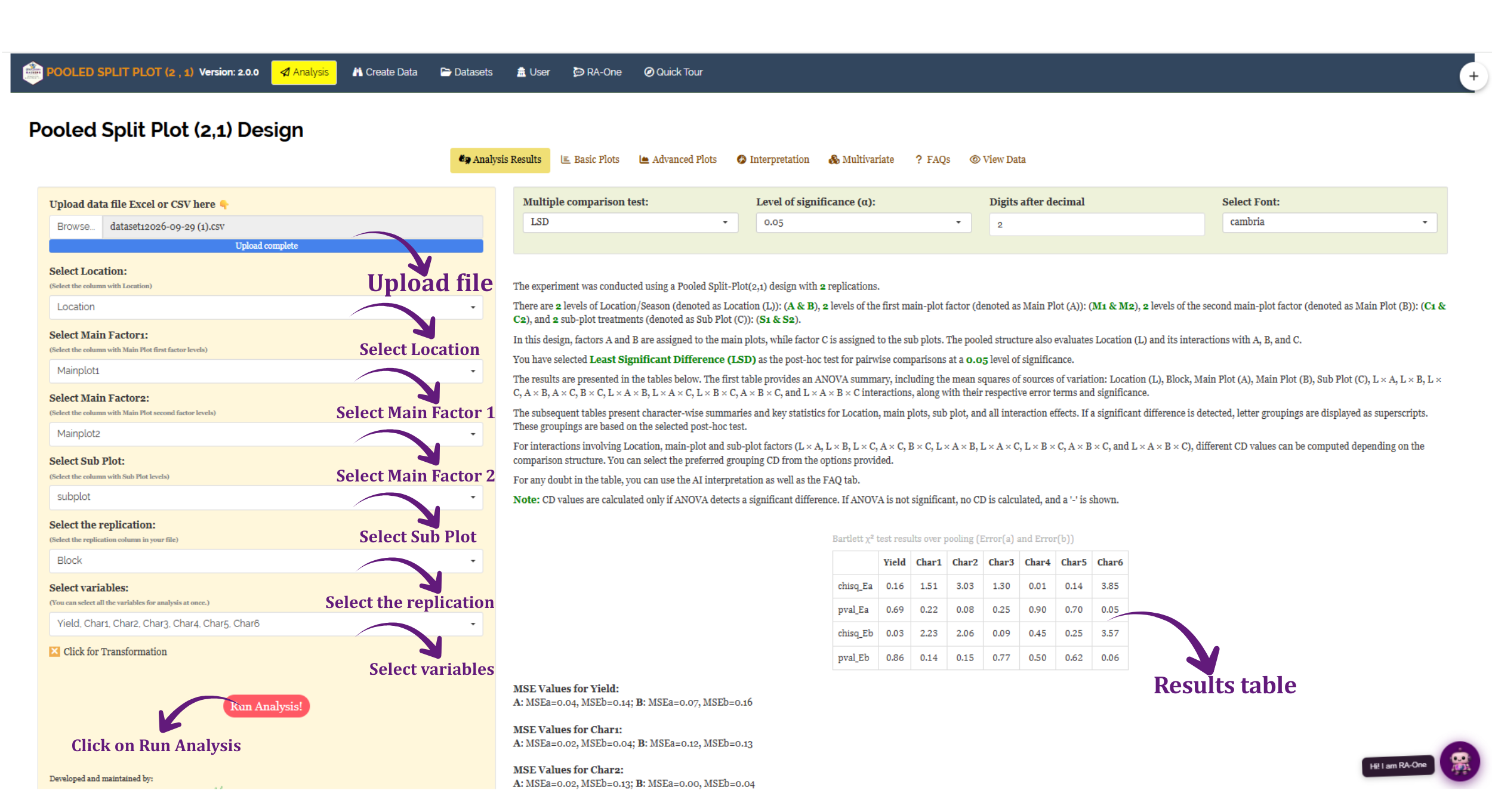
Work down the left panel in order. Each selector is a dropdown listing the column names read from your file, so nothing has to be typed. Note that a (2,1) design asks for two main-factor columns, not one.
| Control | What to give it |
|---|---|
| Upload data file Excel or CSV here | Browse to your file; a blue Upload complete bar confirms it |
| Select Location | The column identifying the environment - here Location |
| Select Main Factor1 | The column holding the first main-plot factor’s levels - here Mainplot1 |
| Select Main Factor2 | The column holding the second main-plot factor’s levels - here Mainplot2 |
| Select Sub Plot | The column holding the sub-plot levels - here subplot |
| Select the replication | The block column - here Block |
| Select variables | Every response you want analysed. All seven are selected at once |
| Click for Transformation | Optional; opens the panel described in Section 10 |
| Run Analysis! | Computes everything |
The variables selector is multi-select, and there is no penalty for choosing all of them. The module analyses each response separately - its own twin Bartlett check, its own ANOVA, its own mean separation - and lays the results out character by character, so a single run gives you the whole experiment.
Which column you map to Main Factor 1, Main Factor 2 and Sub Plot decides which effects are tested against which error (Section 2). Map the two factors that were applied to the large plots to the two Main Factor selectors, and the factor randomized within them to Sub Plot, exactly as the trial was laid out. Swapping a main factor for the sub-plot factor does not just relabel the output - it changes the analysis.
9.1 The presentation options
The green strip along the top of Figure 7 carries four controls. They change how results are reported, not how the ANOVA is computed, so you can adjust them after a run.
| Option | Choices | What it does |
|---|---|---|
| Multiple comparison test | LSD, TUKEY, DMRT (default LSD) | The post-hoc test used to separate means once an effect is significant |
| Level of significance (α) | 0.05, 0.01 (default 0.05) | The threshold for the post-hoc tests, the letter groupings and the CD values |
| Digits after decimal | 1 to 4 (default 2) | How many decimal places the tables display |
| Select Font | A list of fonts (default cambria) | The typeface of the rendered tables |
Which post-hoc test should I choose?
- LSD (Fisher’s protected least significant difference) is the most liberal of the three. It is defensible when the ANOVA F test for that effect is already significant, and it is the module’s default.
- TUKEY (HSD) controls the family-wise error rate across all pairwise comparisons. It is the conservative, widely accepted choice when you intend to compare every mean with every other.
- DMRT (Duncan’s multiple range test) sits between the two, using a critical range that widens as the means being compared move further apart in rank. When DMRT is chosen, the module adds tables of the tabulated values and critical ranges.
- Whichever you choose, each comparison uses the error the effect belongs to: Pooled Error (a) for the main-plot effects, Pooled Error (b) for everything involving the sub-plot factor.
- Choose before you look at the output, not after. Running all three and reporting whichever produced the most letters is the multiple-comparison problem in a new costume.
9.2 What the module tells you before the ANOVA
Below the options strip, the module prints a plain-language account of what it read from your file and what it found when it checked the data. For the working example it reports a pooled experiment in a split-plot (2,1) design with 2 replications, with the location/season taken as random and the treatments as fixed; 2 levels of the first main-plot factor (M1 & M2), 2 levels of the second (C1 & C2) and 2 sub-plot treatments (S1 & S2) over 2 locations (A & B); and LSD selected at the 0.05 level. It closes with a note that CD values are calculated only when the ANOVA detects a significant difference, and a - is shown otherwise.
Next comes the pooling diagnostic described in Section 3. The Bartlett χ² test results over pooling (Error(a) and Error(b)) table in Figure 7 gives, for every response, a chi-square statistic and a p-value for each error stratum - chisq_Ea/pval_Ea for the main-plot error and chisq_Eb/pval_Eb for the sub-plot error. In this dataset every character passes both checks. The tightest case is Char6, at pval_Ea = 0.05 and pval_Eb = 0.06; the rest sit comfortably away from the line (for Yield, for instance, pval_Ea = 0.69 and pval_Eb = 0.86). The error variances are therefore comparable between the two locations, and the data are pooled directly.
Underneath the Bartlett table the module lists the error mean squares of each response at each location - and because a (2,1) design has two error strata, it lists two for each location. For Yield in Figure 7 it reads A: MSEa = 0.04, MSEb = 0.14; B: MSEa = 0.07, MSEb = 0.16. MSEa is the main-plot error at that location and MSEb the sub-plot error. These are the numbers Bartlett’s test compares between locations, and, if a character had failed the check, the ones the Aitken transformation would use.
10 Transformation
Ticking Click for Transformation in the left panel (it then reads Yes I need Transformation) opens the panel shown in Figure 8. It offers three transformations, and each takes its own list of variables, so you can apply a log to one response, a square root to another, and leave the rest untouched in a single run.
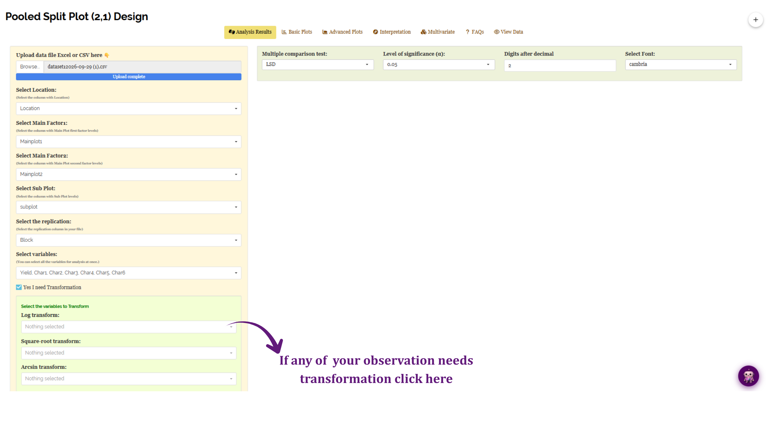
| Transformation | Use it for | What the module does |
|---|---|---|
| Log | Data whose variance grows with the mean; strongly right-skewed responses | log10(x); if any value is zero or negative the column is first shifted so that its minimum becomes 1 |
| Square-root | Count data, particularly small counts with several zeros | sqrt(x), or sqrt(x + 0.5) when the column contains a zero; refused with a warning if any value is negative |
| Arcsin | Proportions between 0 and 1 | asin(sqrt(x)), with exact 0s and 1s nudged inwards by 1/(4n); refused with a warning if any value lies outside 0-1 |
After a log transformation the analysis is carried out on the logged values, so the means the ANOVA compares are means of logs - not the log of the mean, and not in the original units. Report the scale you analysed on, and say in your methods that a transformation was applied. Note also that the Bartlett checks in Section 3 are run on the transformed values, so a transformation can change whether a character needs the Aitken correction.
The arcsin option works only on values between 0 and 1. A germination percentage of 72% must be entered as 0.72. If the column holds percentages the module refuses the transformation and tells you why, rather than producing a meaningless result.
Transformation is a remedy for the assumptions in Section 4, not a routine step. Run the analysis untransformed first, look at the QQ plot and the distribution plots in Section 13, and reach for a transformation only if they show a problem.
After choosing a transformation, or deciding against one, proceed to Section 11.
11 Analysis results
Pressing Run Analysis! fills the Analysis Results tab with, for each response, an ANOVA summary followed by the character-wise mean tables. The ANOVA summary reports the mean squares of every source of variation - Location (L), Block, Main Plot A, Main Plot B, Sub Plot C, and the eleven interactions L × A, L × B, L × C, A × B, A × C, B × C, L × A × B, L × A × C, L × B × C, A × B × C and L × A × B × C - each against its proper error term (Section 2) with its F statistic and significance. Beneath it come the mean tables: the mean of every factor level and every interaction combination, each with its standard deviation, and a letter grouping attached as a superscript wherever the effect was significant.
Read the ANOVA first. It tells you which effects are real; the mean tables then tell you what those effects are. Reading them the other way round invites you to interpret differences that the F test never licensed. A single asterisk marks significance at the 5% level, a double asterisk at 1%, and NS marks a non-significant effect.
For the working example, most of the seventeen sources are non-significant for most characters - which is itself a finding, and a common one. Four results stand out, and they are the ones worth writing up:
| Effect | Stratum | Character(s) | What it says |
|---|---|---|---|
| Location (L) | tested against Error (b) | Char1 (p = 0.04), Char6 (p = 0.00) | The two sites differ for these traits |
| L × Main Plot A | tested against Error (a) | Char2 (p = 0.02) | The first main-plot factor behaves differently at the two sites |
| L × A × B | tested against Error (a) | Char2 (p = 0.02) | Which main-plot combination is best depends on the location |
| Main Plot A, Main Plot B, Sub Plot C and their remaining interactions | both strata | (none) | No detectable effect for any character |
For most characters no main-plot, sub-plot or interaction effect was detected, and those absences held across both locations - a stronger statement than a single-site null would have been. What you may not say is that the treatments are equivalent: absence of evidence is not evidence of absence, and with only two blocks the design has limited power, especially for the main-plot effects tested against the coarser Error (a).
The mean separation that turns these F tests into a recommendation - which location, which main-plot combination - is read out in detail in Section 15, using the module’s own written interpretation. The full numeric account of every effect appears in the Analysis Results tab; a companion Interpretation tab (Section 15) narrates it in plain English.
What the other numbers in the result tables mean
- CD (Critical Difference): two means differ significantly if they differ by more than this. It is printed only when the corresponding F test was significant at the α you chose; otherwise a
-appears. Each CD uses the error its effect belongs to, so a main-plot CD is built from Pooled Error (a) and a sub-plot CD from Pooled Error (b). - Unrounded CD: the letters are decided at full precision, while the printed CD is rounded to your chosen decimals. The module also lists the unrounded values, so a rounded CD that seems to contradict a letter grouping can be checked.
- SE(m): the standard error of a mean - the precision of a single treatment mean.
- SE(d): the standard error of the difference between two means; √2 times SE(m) in a balanced design.
- CV(%): the coefficient of variation - the error expressed as a percentage of the grand mean. A rough guide to how well the trial was conducted; what counts as acceptable depends heavily on the crop and the trait.
- Letter groupings appear as superscripts on the means. Two means that share a letter are not significantly different. They are shown only where the F test was significant, so a table with no letters is not an error.
12 Basic plots
The Basic Plots tab offers five standard displays, each generated by clicking its icon. Figure 9 shows the tab with a boxplot drawn for the sub-plot factor.
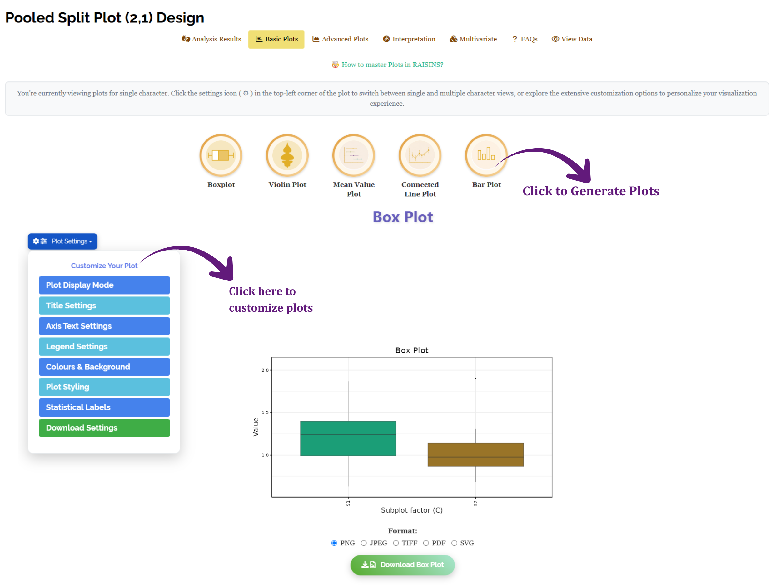
| Plot | Shows | Good for |
|---|---|---|
| Boxplot | Median, quartiles and outliers per level | Spotting unequal spread and stray values |
| Violin Plot | The full shape of the distribution per level | Seeing bimodality a boxplot would hide |
| Mean Value Plot | Treatment means with error bars | The figure most often wanted for a paper |
| Connected Line Plot | Means joined across levels | Trends across an ordered factor |
| Bar Plot | Means as bars | Presentations and extension material |
Every plot has a Plot Settings panel to customize it: Plot Display Mode, Title Settings, Axis Text Settings, Legend Settings, Colours & Background, Plot Styling, Statistical Labels and Download Settings. A note at the top of the tab explains that you are viewing plots for a single character, and that the settings icon switches between single and multiple character views. Each plot can be saved in PNG, JPEG, TIFF, PDF or SVG through the Format control beneath it, and the How to master Plots in RAISINS? link opens a guide to all of these options.
13 Advanced plots and diagnostics
The Advanced Plots tab carries ten further displays. Some are presentation graphics; several are diagnostics that speak directly to the assumptions in Section 4. Figure 10 shows the tab with the Summary Plot drawn for the full set of characters.
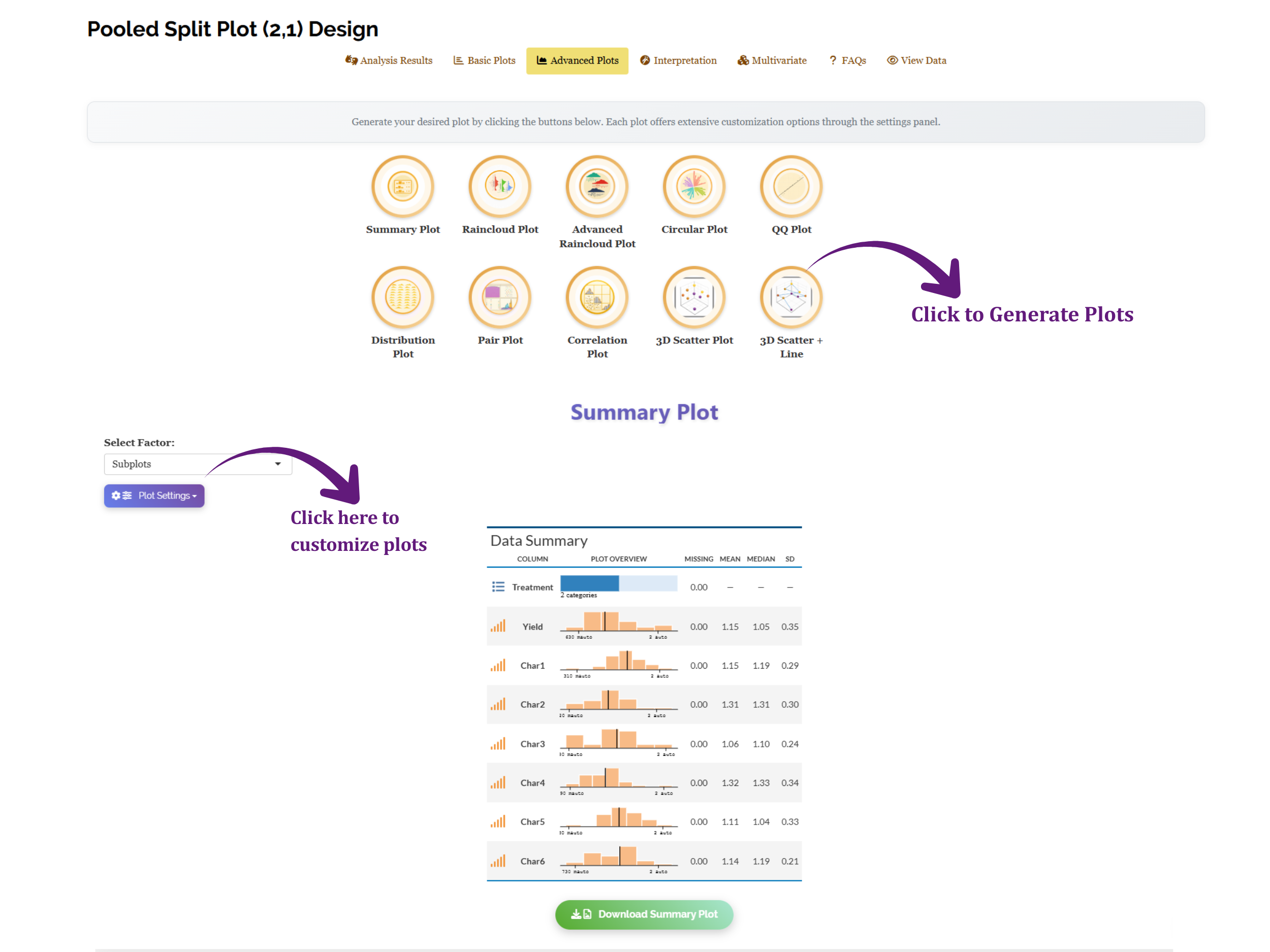
| Plot | What it is for |
|---|---|
| Summary Plot | A compact overview of every response - a miniature histogram, the count of missing values, and the mean, median and SD, side by side |
| Raincloud Plot, Advanced Raincloud Plot | Distribution, individual points and summary statistics in one figure |
| Circular Plot | Many treatment combinations arranged radially |
| QQ Plot | Diagnostic - checks the normality of the residuals |
| Distribution Plot | Diagnostic - the shape of each response |
| Pair Plot, Correlation Plot | Relationships between the responses, not between treatments |
| 3D Scatter Plot, 3D Scatter + Line | Three variables at once |
The Summary Plot in Figure 10 is a quick health read on the whole file: for the working example it shows Yield with a mean of 1.15 and an SD of 0.35, Char1 at 1.15 (SD 0.29), Char2 at 1.31 (SD 0.30), and so on down to Char6 at 1.14 (SD 0.21), with none of the seven responses carrying missing values. The Select Factor control above the plot lets you group the summary by the sub plots or the main plots, and the settings panel customises every element before download.
The QQ Plot and Distribution Plot exist to be looked at, not to be skipped. If the QQ plot’s points bend systematically away from the reference line, the normality assumption is strained and the p-values in Section 11 are approximate at best. That is the moment to consider a transformation from Section 10 - and the moment to do it is before you write the conclusions, not after. The QQ plot can also annotate each panel with a Shapiro-Wilk, Anderson-Darling or Kolmogorov-Smirnov test if you want a number alongside the picture.
14 Looking at all traits together: the PCA index
Seven separate ANOVAs answer seven separate questions. They do not answer the question a breeder or agronomist usually has, which is which treatment combination is best overall. The Multivariate tab addresses that with a principal component analysis, shown in Figure 11.
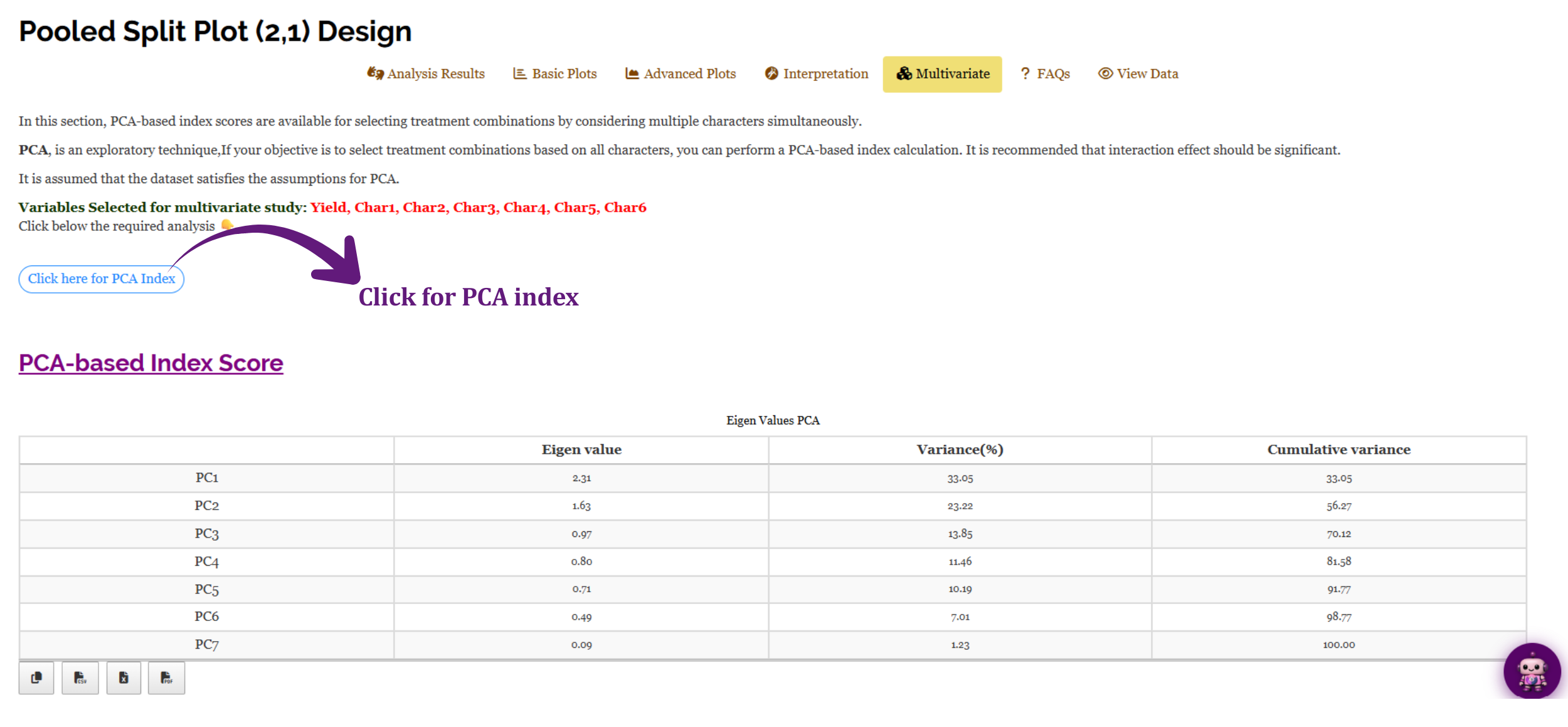
Press Click here for PCA Index. The module takes the mean of every character for each treatment combination and runs a principal component analysis on those means, with every trait standardized so that none dominates merely because of its units. The Eigen Values PCA table reports, for each component, its eigenvalue, the percentage of total variation it explains, and the cumulative percentage. In the working example the first component carries an eigenvalue of 2.31 and explains 33.05% of the variation, the second adds 23.22% to reach 56.27% cumulatively, and it takes five components to pass 90%. The scores on the leading components become scaled index scores from 0 to 1, and a cutoff control picks out the combinations that score above it.
PCA needs at least two characters to have any relationships to analyse, so the index is unavailable for a single-response file. It is computed from the uploaded values (after any transformation you chose in Section 10), not from any Aitken-scaled values used in the pooled ANOVA.
The index weights traits by how much of the variation they share, not by how much you care about them. A trait that varies a lot will dominate the first component whether or not it is the trait you are selecting for. Use the index to shortlist, then go back to the individual results in Section 11 to justify the choice. The More on PCA based index score entry in the FAQs (Section 17) explains the method in more detail.
The numbers are in. Section 15 shows what the module makes of them.
15 Interpretation
RAISINS provides a clear and concise interpretation of your results to help you understand the statistical findings with ease. Open the Interpretation tab, tick the confirmation box - “I’m not a robot and I have checked that on running analysis there was no error reported” - and press Click here for interpretation. Figure 12 shows the output for the working example.
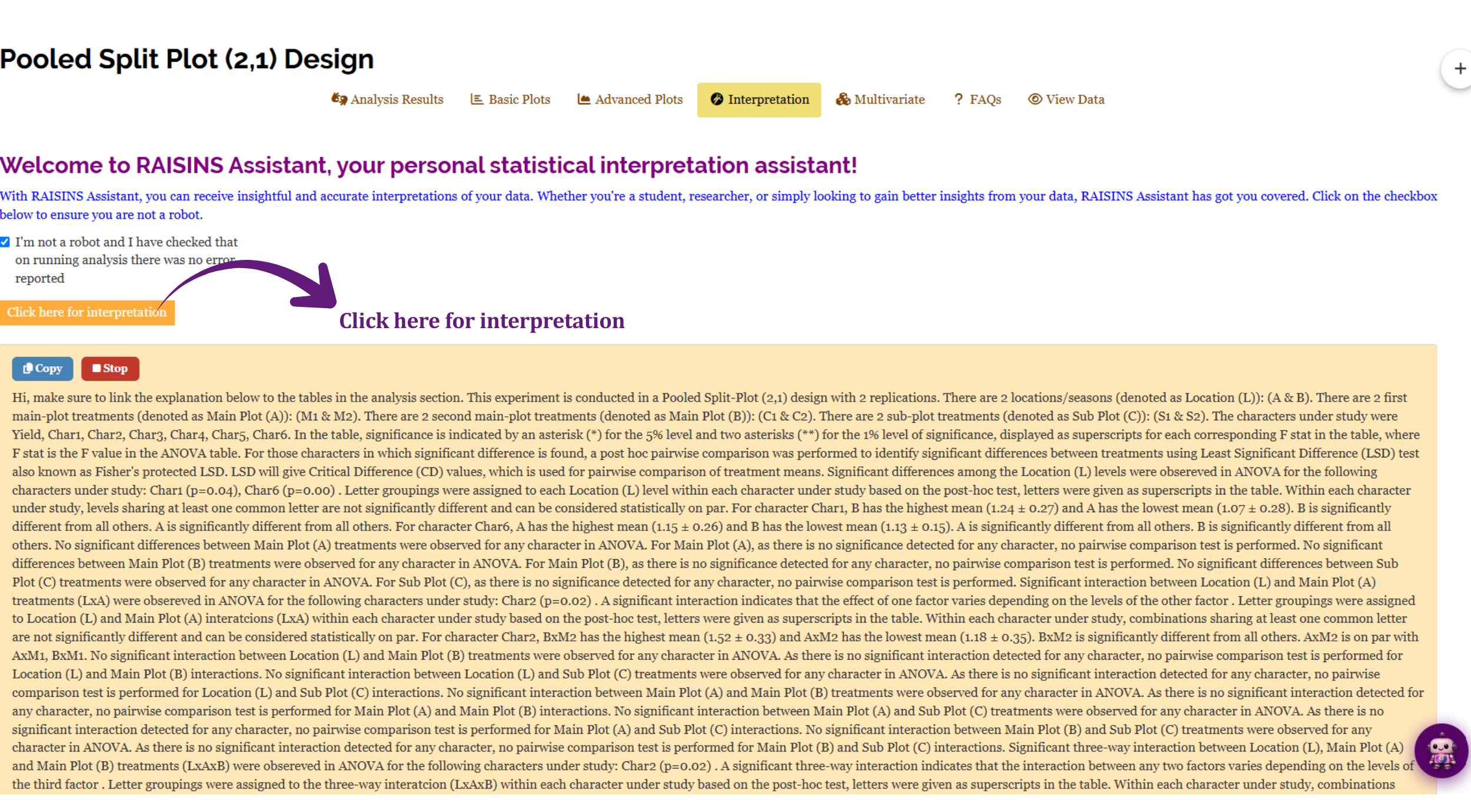
The narrative opens by restating the design it analysed - a pooled split-plot (2,1) experiment with 2 replications, a first main-plot factor at M1 and M2, a second at C1 and C2, and a sub plot at S1 and S2, across locations A and B - and lists the seven characters studied. After explaining the asterisk convention and the LSD test, it works through the effects one at a time, and for every effect where nothing was detected it says so plainly and notes that no pairwise comparison is performed there.
Four findings survive, and the interpretation reads out the means for each:
| Effect | Character | What the interpretation reports |
|---|---|---|
| Location | Char1 (p = 0.04) | B has the highest mean (1.24 ± 0.27) and A the lowest (1.07 ± 0.28); the two are significantly different |
| Location | Char6 (p = 0.00) | A has the highest mean (1.15 ± 0.26) and B the lowest (1.13 ± 0.15); the two are significantly different |
| Location × Main Plot A | Char2 (p = 0.02) | B×M2 has the highest mean (1.52 ± 0.33) and A×M2 the lowest (1.18 ± 0.35); B×M2 differs from all others, while A×M2 is on par with A×M1 and B×M1 |
| Location × A × B | Char2 (p = 0.02) | A significant three-way interaction: which main-plot combination does best depends on the location |
The two most consequential rows are for Char2. The significant Location × Main Plot A interaction says the first main-plot factor did not behave the same way at both sites, and the significant three-way interaction says the best main-plot combination itself depends on the location. For Char2, therefore, the treatments have to be compared within each location, not averaged over them - which is precisely the kind of result a single-site trial could never have surfaced. For Char1 and Char6 the only signal is between the locations themselves; the treatments were quiet.
The passage closes with the software citation - RAISINS (R & AI Solutions for INferential Statistics), citing Hisham et al. (2025) and R Core Team (2024). A Copy button places the whole text on the clipboard, and Stop halts generation if you launched it by mistake.
The interpretation is generated from the results the module just computed, so it will not contradict them. It is still your analysis and your paper. Two habits are worth keeping: confirm that every number quoted in the prose appears in the corresponding table, and satisfy yourself that the interpretation fits your experiment - the text can tell you that B×M2 had the highest mean for Char2, but only you know whether that combination is agronomically sensible or an artefact of one unusual block.
16 Chat with your data using RA-One
RA-One is the built-in conversational assistant for the Pooled Split Plot (2,1) module, available from the RA-One tab or the robot icon at the bottom-right of every screen. You ask questions in plain language and it answers using your own analysis rather than generic statistical advice. Every result it discusses is drawn from what the module actually computed - it never invents numbers, and if a value isn’t available it says so instead of guessing. All answers are in plain English, with no code or software commands.
The Interpretation tab writes one comprehensive account of everything. RA-One waits for a question and answers that question - “why was Location significant for Char6 when the two location means are almost the same?”, “which main-plot combination should I recommend at location B for Char2?”, “why is Main Plot A tested against a different error from the sub plot?” Once an analysis has run, its answers are grounded in that run’s results.
The same chat window can also prepare your data. It can build a correctly formatted dataset template (Section 8.4) for you to fill in, or fetch a model dataset (Section 8.3) so you can try the module straight away - so you never need to leave the tab to get a file ready. The sidebar keeps your conversations, and New conversation starts a fresh thread when you move to a different dataset.
RA-One can also generate plots on request. Ask for a boxplot, violin plot, bar plot or line plot of a character, and it draws the figure in the conversation from your analysis results.
Within a single conversation, RA-One can interpret your results, build a data template, fetch a model dataset, and produce plots - so most of a routine pooled split plot (2,1) session can be conducted without ever leaving the chat window.
17 FAQs
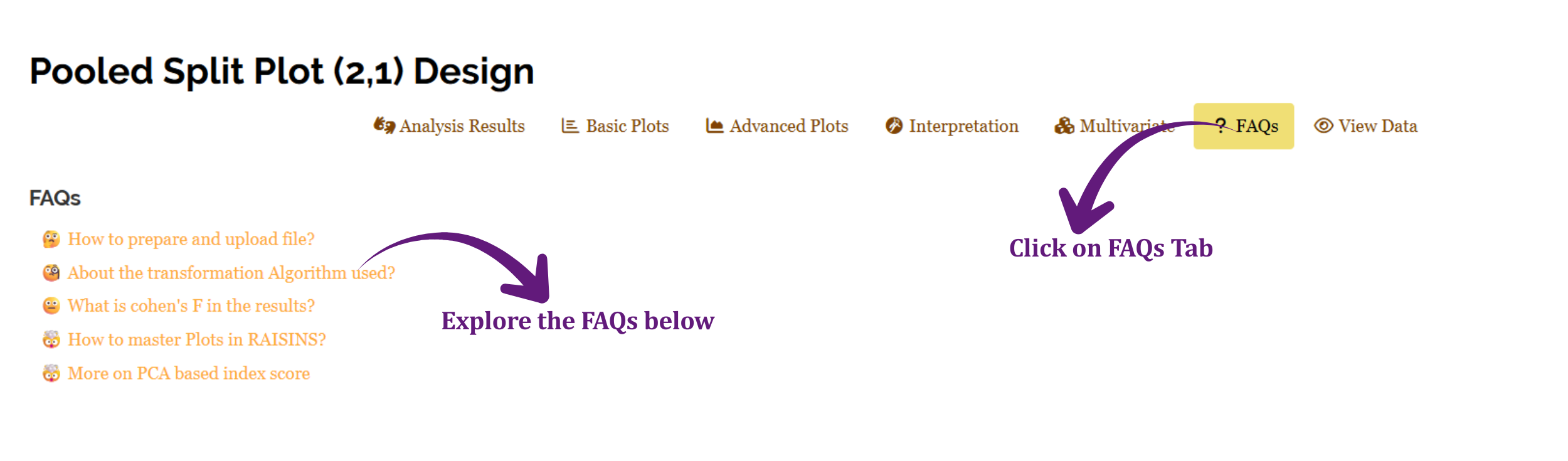
The module includes a dedicated FAQs section to clarify common doubts and guide you through the features. It offers detailed answers, additional information, and helpful tips for a smooth experience. Five entries are listed in Figure 13: how to prepare and upload a file, the transformation algorithm used, what Cohen’s f means in the results, how to master plots in RAISINS, and more on the PCA-based index score. The first two are worth reading before your first real analysis, and the entry on Cohen’s f is useful once you have significant effects and want a sense of their practical size rather than only their statistical significance.
18 View data
View Data is the primary diagnostic tool for ensuring data integrity before analysis. When you upload your dataset, the module performs an automated Health Check and shows the file exactly as it was read, colour-coded so that problems are visible at a glance. The rule is stated in the instructions panel: treatment columns should be highlighted in yellow or green, and all numerical values should appear in green. If both conditions hold, your file is in good health. In the working example the Location, Mainplot1, Mainplot2 and subplot columns are yellow, and Block together with Yield and Char1 to Char6 are green - exactly right.
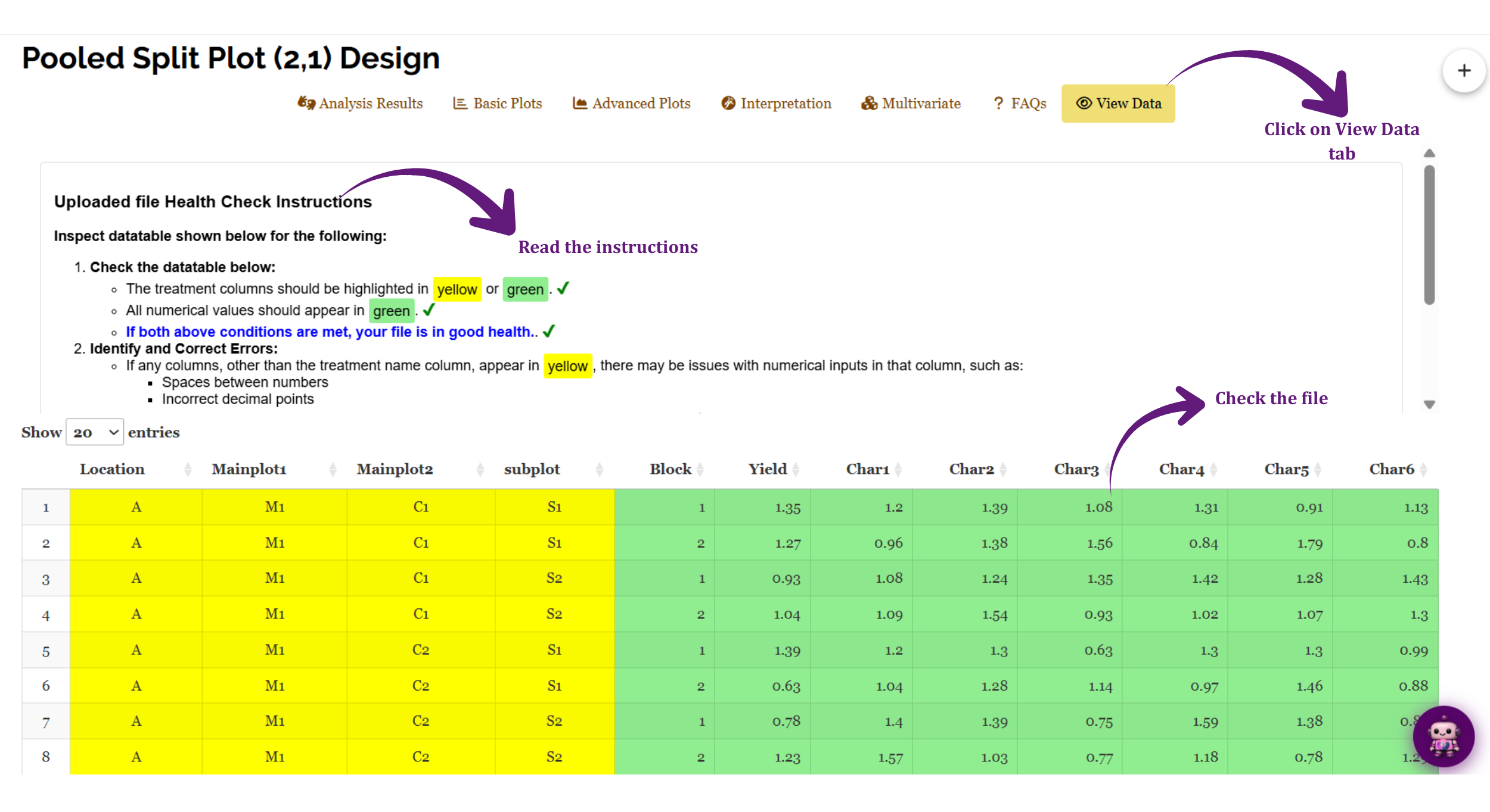
If a column that should be numeric appears in yellow, the module has read at least one of its values as text. The instructions name the usual causes: spaces between numbers, or incorrect decimal points. Other frequent culprits are a comma used as a decimal separator, a stray character left over from copying, or a placeholder such as NA or a hyphen typed into a blank cell. Find the offending cell, fix it in the source file, and re-upload.
The Show entries selector at the top left controls how many rows are displayed at a time, and the arrows beside each column heading sort by that column - a quick way to check that every A × B × C combination appears in every block at every location.
19 Wrapping up
The question a pooled split plot (2,1) exists to answer is not only do these treatments differ - a single-site split plot answers that. It is does the answer travel, asked with two factors on the main plots and one on the sub plots, measured at two levels of precision. Everything in this tutorial serves that question: the two error terms in Section 2, which make sure each factor is judged against the variation of plots its own size; the twin Bartlett checks and the Aitken correction in Section 3, which decide whether the locations may be combined at all; and above all the Location interaction terms in Section 11, which are where the answer actually lives.
Read them in that order and the analysis is straightforward. Significant Location interactions - Char2 in our working example - mean the recommendation has to be location-specific, and the mean tables tell you what to recommend where. Non-significant ones mean the treatment effects you measured were stable across the environments you sampled.
If your design is not quite this one, RAISINS carries neighbouring modules for it. One factor on the main plots and one on the sub plots, pooled over environments, belongs in the ordinary Pooled Split-plot analysis; a factorial in randomized blocks without the split belongs in Pooled Two Factor RBD; a single treatment factor pooled over environments belongs in Pooled RBD; and strips laid across one another belong in Pooled Strip-plot analysis. A split plot at a single location needs no pooling at all. And if you get stuck at any point, RA-One is available 24 × 7, or write to us at [email protected].
Record four things in your methods section, all of which the module has already told you: the result of the Bartlett checks and which characters, if any, were Aitken-transformed; which effects were tested against Pooled Error (a) and which against Pooled Error (b); the post-hoc test and significance level you used; and any transformation applied to a response. The CPRR in Section 5.1 supplies the version and function details that sit behind them.