Pooled Strip-Plot Design
Two factors in strips at right angles, several environments, three error terms. This tutorial explains how they fit together and works a complete pooled strip-plot analysis in RAISINS… Read more …
A strip-plot design applies one treatment factor in strips running one way across a block and the second in strips running at right angles to it, so that every combination occurs where the two strips cross. It is the design you are forced into when both factors need machinery that works in long passes - irrigation lines, tillage, spraying - and it buys that practicality at a specific statistical price: three separate error terms, with the interaction estimated more precisely than either main effect. Repeat the whole layout over several locations, seasons or years and you have a pooled strip-plot analysis, which asks the further question of whether those effects hold everywhere. This tutorial explains the three error terms and the homogeneity check that licenses pooling, then carries one dataset through the module from upload to conclusion - the ANOVA, mean separation, summary statistics, transformation, plots, principal component analysis and AI-assisted interpretation - without writing a line of code.
1 What is a pooled strip-plot design?
Suppose you want to test two irrigation regimes, R1 and R2, alongside two sowing dates, C1 and C2. Statistically that is an ordinary two-factor factorial, and you would like to randomize all four combinations independently within each block. In the field you cannot. The irrigation is delivered by a lateral line that waters everything in its path, so a regime has to occupy a long strip. The sowing is done by a drill that has to run the length of the plot without stopping, so a sowing date also has to occupy a long strip.
The strip-plot design - also called the split-block design - is the answer. Within each block, the row treatments are randomized in strips running one way, and the column treatments are randomized in strips running at right angles to them. Every combination of the two occurs exactly once per block, at the intersection where a row strip crosses a column strip. Both machines get the long uninterrupted passes they need, and you still get a complete factorial.
That convenience is not free, and the price is worth stating plainly before anything else. Because a row treatment is applied to a whole strip rather than to an individual plot, differences between row treatments are confounded with whatever varies between strips - and the same is true, independently, for the column treatments. The design therefore carries three different error terms rather than one, and the two main effects are tested less precisely than the interaction between them. Section 2 explains why, because it governs how you read every table in this module.
Now repeat the whole layout at a second location. A recommendation is a claim about places you did not test, and a single site cannot support one: you have no evidence about whether R1 will still beat R2 where the soil is heavier and the rain arrives later. Analysing the two sites separately does not help either, because two separate analyses cannot tell you whether a difference between them is real or is the ordinary noise of two independent experiments.
A pooled analysis puts every observation into one analysis of variance and so earns terms no single-site analysis contains: the effect of Location itself, and the interaction of each treatment factor with location. Those interactions are the reason the extra season is worth running. A significant Location × Row Treatments says the irrigation effect is not the same at the two sites, and one blanket recommendation would be wrong. A non-significant one says the effect you measured was stable across the environments you sampled.
A pooled strip-plot design tests two factors that each have to be applied in long strips, across several locations or seasons, and tells you both what they do and whether what they do stays the same from site to site.
2 Why there are three error terms
In a randomized block factorial, every treatment combination is randomized independently within a block, so one error term serves every comparison. A strip plot randomizes at three different scales, and each scale brings its own error.
| Error term | Measures variation between | Used to test |
|---|---|---|
| Error (a) | Row strips within a block | The row treatment main effect, and Location × Row Treatments |
| Error (b) | Column strips within a block | The column treatment main effect, and Location × Column Treatments |
| Error (c) | Intersection units - where a row strip crosses a column strip | The Row × Column interaction, and the three-way with Location |
The logic is that a comparison must be judged against the variation among the units to which the treatment was actually applied. Row treatments were applied to whole row strips, so they are judged against variation between row strips: Error (a). Column treatments were applied to whole column strips, so they are judged against Error (b). The interaction, however, lives at the intersections, and intersections are the smallest units in the design - so the interaction is judged against the smallest error, Error (c).
This inverts the intuition most people bring from a split-plot or a factorial RBD. In a strip plot the design deliberately sacrifices precision on both main effects in order to gain precision on their interaction. If your research question is mainly about the two main effects, a strip plot is the wrong design and you should not have been pushed into it by machinery alone. If the interaction is what you care about - and with irrigation × sowing date it usually is - the strip plot is giving you exactly what you want.
Pooling over environments does not change that structure; it replicates it. Each of the three errors is computed within every location and then pooled across them, which is why the ANOVA in this module reports Pooled Error (a), Pooled Error (b) and Pooled Error (c) as three separate rows rather than one residual line.
Where the degrees of freedom come from
With r blocks, a row treatments and b column treatments, at each location:
- Error (a) = (r − 1)(a − 1)
- Error (b) = (r − 1)(b − 1)
- Error (c) = (r − 1)(a − 1)(b − 1)
Pooling multiplies each by the number of locations. In the worked example of this tutorial r = 4, a = 2, b = 2 and there are 2 locations, so every one of the three comes to (4 − 1) × 1 × 2 = 6 degrees of freedom - which is exactly what Figure 9 shows. Notice how quickly these run out: with only two levels of each factor, three blocks instead of four would leave each error with just 4 df. Strip plots need replication.
One consequence is worth anticipating, because it surprises people the first time they see it. The module tests Error (a) and Error (b) against Error (c) and reports F values for them. A significant result there is not a problem with your data - it is the design working as designed, confirming that strip-to-strip variation really is larger than intersection variation.
3 How RAISINS decides whether your environments can be pooled
Pooling rests on an assumption that is easy to state and easy to violate: that the experimental error is about the same size at every location. If one site was uniform and the other a patchwork, their errors are not comparable, and averaging them gives a pooled error too large for the good site and too small for the bad one. Every F test in the table would then be wrong, in opposite directions at the two sites.
So the module checks first. Before the ANOVA it runs Bartlett’s test on the error variances across locations, separately for every response you selected. Bartlett’s null hypothesis is that the variances are homogeneous, so here - unusually - a non-significant result is the one you want.
| Bartlett’s result | What it means | What the module does |
|---|---|---|
| p > 0.05 (non-significant) | Error variances are homogeneous across environments | Pools directly; analysis proceeds unchanged |
| p < 0.05 (significant) | Error variances differ between environments | Applies an Aitken transformation, weighting each environment by its own error, before pooling |
The Aitken correction is not a fallback that quietly degrades your analysis - it is the standard remedy. Each environment’s data is rescaled by its own error variance so that, after transformation, the environments are on a comparable footing and the pooled error is legitimate. The module states plainly which path it took, and it does so per character, because a file routinely passes on most traits and fails on one or two.
It is tempting to read the Bartlett section as a formality. In the dataset used throughout this tutorial it is not. Two of the seven responses fail the test outright, and the module applies an Aitken transformation to those two while leaving the other five alone. Section 9 shows the numbers and Section 16 shows how the module reports it. If you take one habit from this tutorial, make it reading those lines before you read the ANOVA.
When an Aitken transformation has been applied to a character, the post-hoc letter groupings for that character are computed on the transformed means, not the raw ones. The module says so explicitly in its interpretation. Your methods section must say so too, because a reader comparing your means table against your raw data will otherwise not be able to reproduce the groupings.
4 Assumptions of the pooled strip-plot analysis
The pooled strip plot inherits the assumptions of an ordinary strip plot and adds the homogeneity requirement that makes pooling legitimate.
| Assumption | What it means | What to do if it fails |
|---|---|---|
| Homogeneity of error variance across environments | Each location contributes error of comparable size | Handled automatically - see Section 3. The Aitken correction is applied for you |
| Normality of residuals | Residuals follow an approximately normal distribution | Inspect the Q–Q plot in Advanced Plots (Section 14); consider a transformation (Section 10) |
| Homogeneity of variance across treatments | Spread is similar for every treatment combination | A log or square-root transformation usually helps (Section 10) |
| Additivity | Block and treatment effects add rather than multiply | A transformation often restores additivity |
| Correct strip randomization | Row treatments randomized afresh in each block; column treatments randomized afresh and perpendicular | Nothing after the fact. This is what licenses the three error terms |
| Independence | Observations do not influence one another | Design and field execution decide this; no post-hoc fix |
| Complete, balanced blocks | Every row × column intersection present once per block, at every location | The module expects a balanced file; check it in View Data (Section 19) |
A strip plot is only a strip plot if the strips were genuinely re-randomized in every block. If the same irrigation regime occupied the top strip in all four blocks because that is where the water main happened to be, the row treatment is confounded with position and Error (a) no longer estimates what the F test assumes it does. No transformation repairs that, and unlike ordinary independence failures it is easy to commit while believing you have done everything correctly.
With the structure clear, let us open the module and run an analysis - continue to Section 5.
5 Getting to the module
Visit the RAISINS home page at www.raisins.live and go to Data Analysis. Scroll to the Pooled Analysis group and choose Pooled Strip-plot analysis, as in Figure 1.
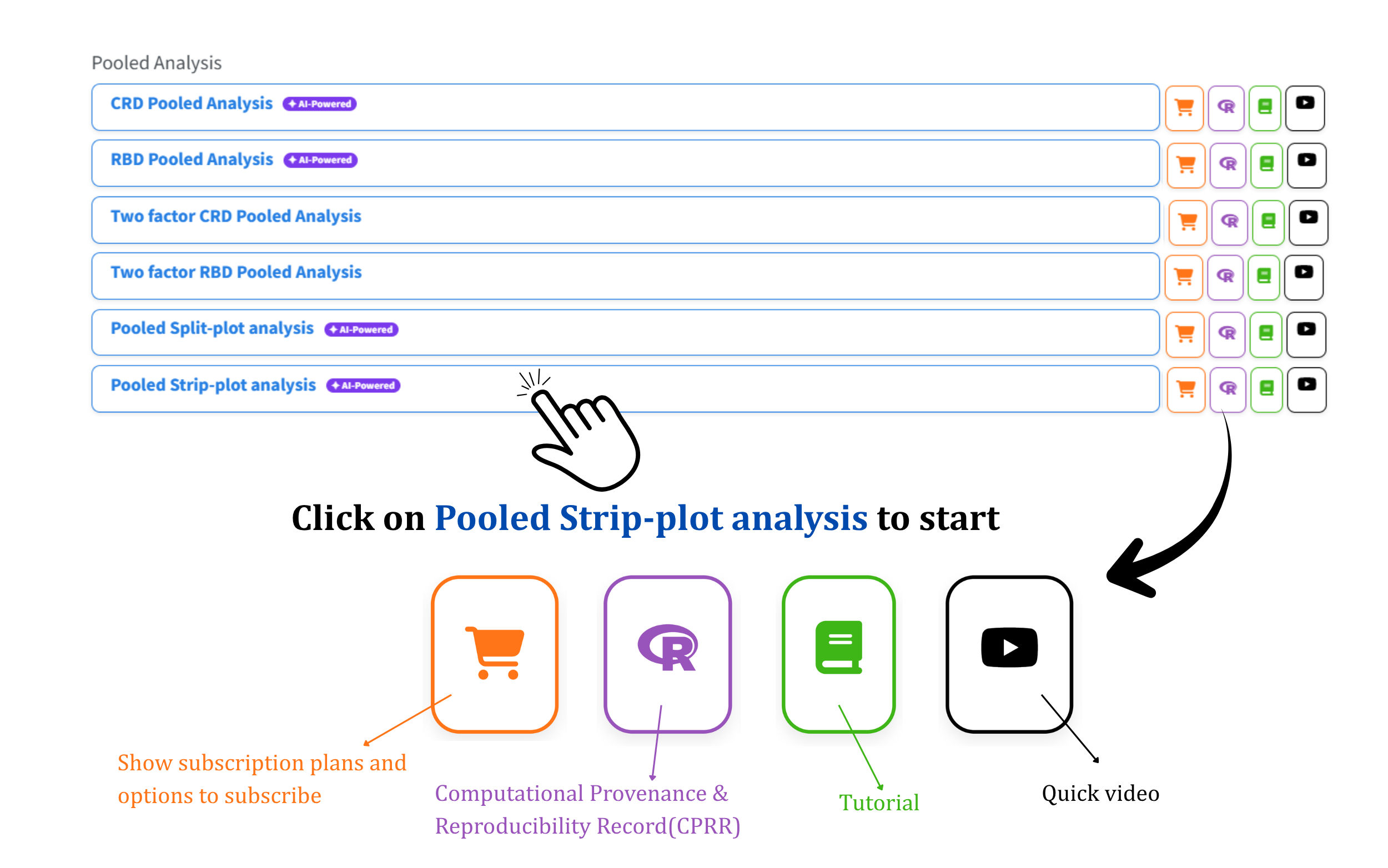
Each module in the list carries four icons on the right, and they are worth knowing before you click into any of them. The orange cart shows the subscription plans; the purple R opens the Computational Provenance & Reproducibility Record described in Section 5.1; the green book opens the tutorial; and the black play button opens a short video. Clicking the module name itself opens the Welcome page in Figure 2.
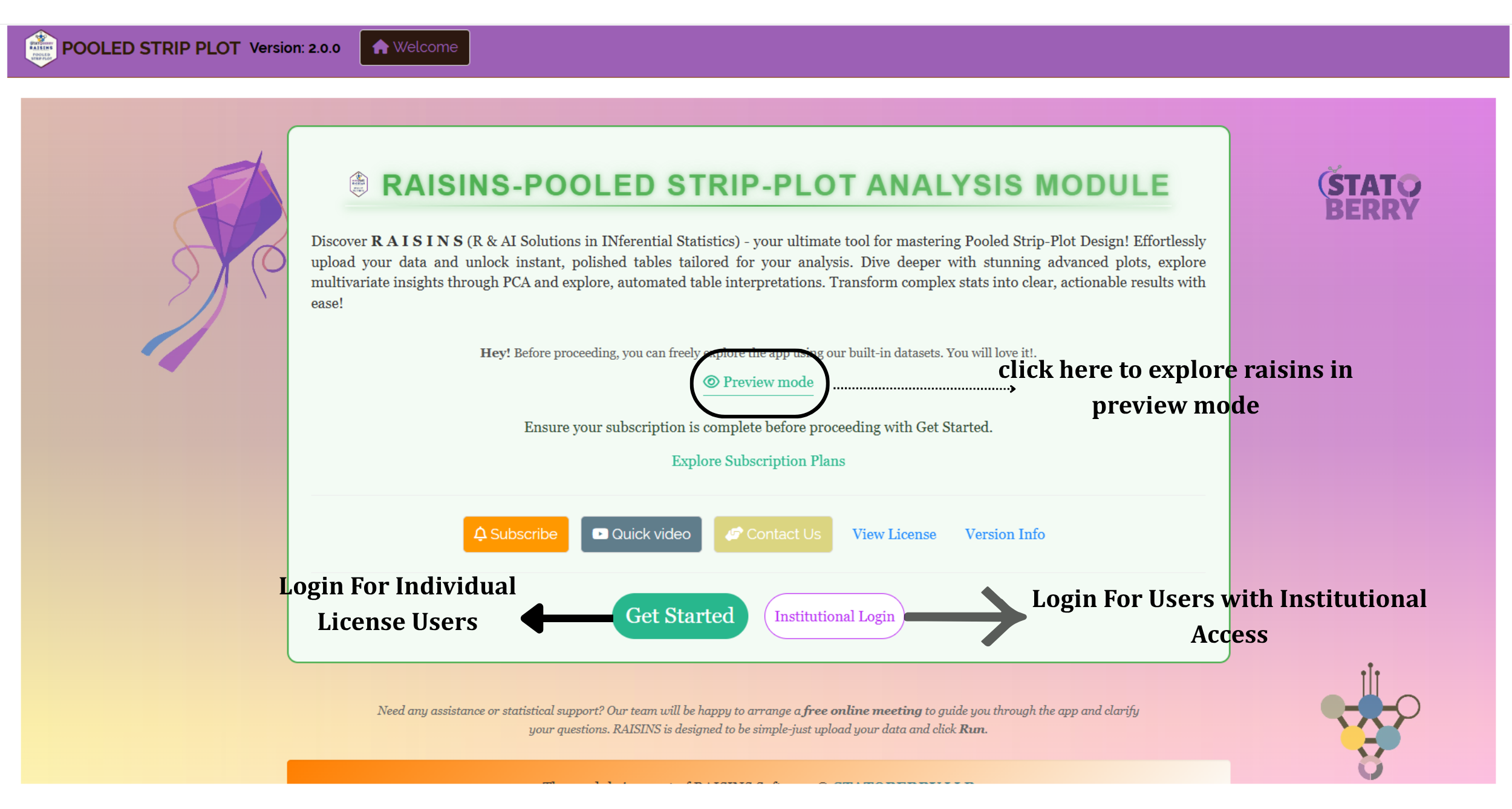
Two routes lead inside. Get Started is for users holding an individual licence; Institutional Login is for users whose institution has purchased access. If you have neither yet, Explore Subscription Plans and Preview mode are both on this page, and the latter needs no account at all (Section 6). The same page carries a Quick video, the View License and Version Info links, and a Contact Us button that reaches the team directly.
5.1 Computational Provenance & Reproducibility Record
CPRR (Computational Provenance & Reproducibility Record) provides a transparent and comprehensive record. Click on the purple R icon shown in Figure 1 to access CPRR and know about the computational workflow performed during the analysis. The record for this module states the R version and the exact version of every package used, and names the specific function behind each reported result. CPRR lists every default parameter and decision rule applied by the module and provides fully runnable R code that reproduces each analytical step. Users can execute the code in R to independently reproduce and verify the results. It carries its own DOI.
To cite the platform itself in a paper, thesis, or report, use the RAISINS citation, available in APA, Harvard, and BibTeX formats at www.raisins.live/citation.html. That is the primary reference, and for most manuscripts it is all you need.
The CPRR for the Pooled Strip-Plot Design is at www.raisins.live/module_record/pooledstrip.html.
Cite the RAISINS paper as your primary reference for the platform. Add the CPRR as supporting documentation when a journal asks for details of the computing environment, or when you want your methods section to be precise about versions and functions rather than saying “analysis was carried out using an online tool.” For this module the CPRR is particularly worth citing, because it states exactly how the three error terms are constructed and how the Aitken correction is implemented - the two specifications most likely to differ between software packages, and the ones a reviewer is most likely to query.
6 Preview mode and Quick Tour
Before subscribing, you can explore the entire module using Preview mode, reached from the Welcome page in Figure 2. In this mode the upload control is withdrawn - your own data cannot be submitted - and a demo dataset selector appears in its place, offering the model datasets described in Section 8.3. Every other facility remains available: the analysis, the summary statistics, the plots, the multivariate procedures and the RA-One assistant can all be exercised on the demonstration data before you commit to anything.
First-time users are also offered a Quick Tour, an interactive, step-by-step walkthrough that highlights each control and explains what it does, running from the upload panel through to the View Data diagnostic. You can retake the tour at any time from the Quick Tour tab in the top navigation bar.
7 A working example
Everything from here on uses one dataset, so that each screen you see is a step in a single continuous analysis rather than a disconnected illustration.
| Element | In this dataset |
|---|---|
| Environments | 2 locations, A and B |
| Row treatments | 2 levels, R1 and R2 |
| Column treatments | 2 levels, C1 and C2 |
| Blocks | 4 per location |
| Treatment combinations | 4 per location; 8 combinations of Location × Row × Column in all |
| Responses | 7 - Yield plus Char1 to Char6 |
| Rows | 32 - that is 2 locations × 2 row × 2 column treatments × 4 blocks |
This is the smallest arrangement that still exercises every part of the design. Two levels of each factor give a genuine interaction to test; four blocks give each of the three error terms six degrees of freedom after pooling, which is the minimum worth testing against; and two environments give the location interactions something to compare. Seven responses are carried through together, which is the normal case - and in this file they do not all behave the same way, which turns out to be the most instructive thing about it.
8 How to prepare your data
The module accepts a CSV or Excel file in one specific shape, and there are four ways to arrive at it. Build it yourself in a spreadsheet (Section 8.1), let the Create Data tab generate a blank template (Section 8.2), download one of the ready-made model datasets (Section 8.3), or describe what you need to the RA-One assistant in plain English (Section 8.4). All four produce the same layout; pick whichever suits you.
8.1 Preparing data in MS Excel
The rule is one row per observation and one column per variable. Four identifier columns come first - the environment, the row treatment, the column treatment and the block - followed by one column for each response you measured. Figure 3 shows the working example laid out exactly this way.
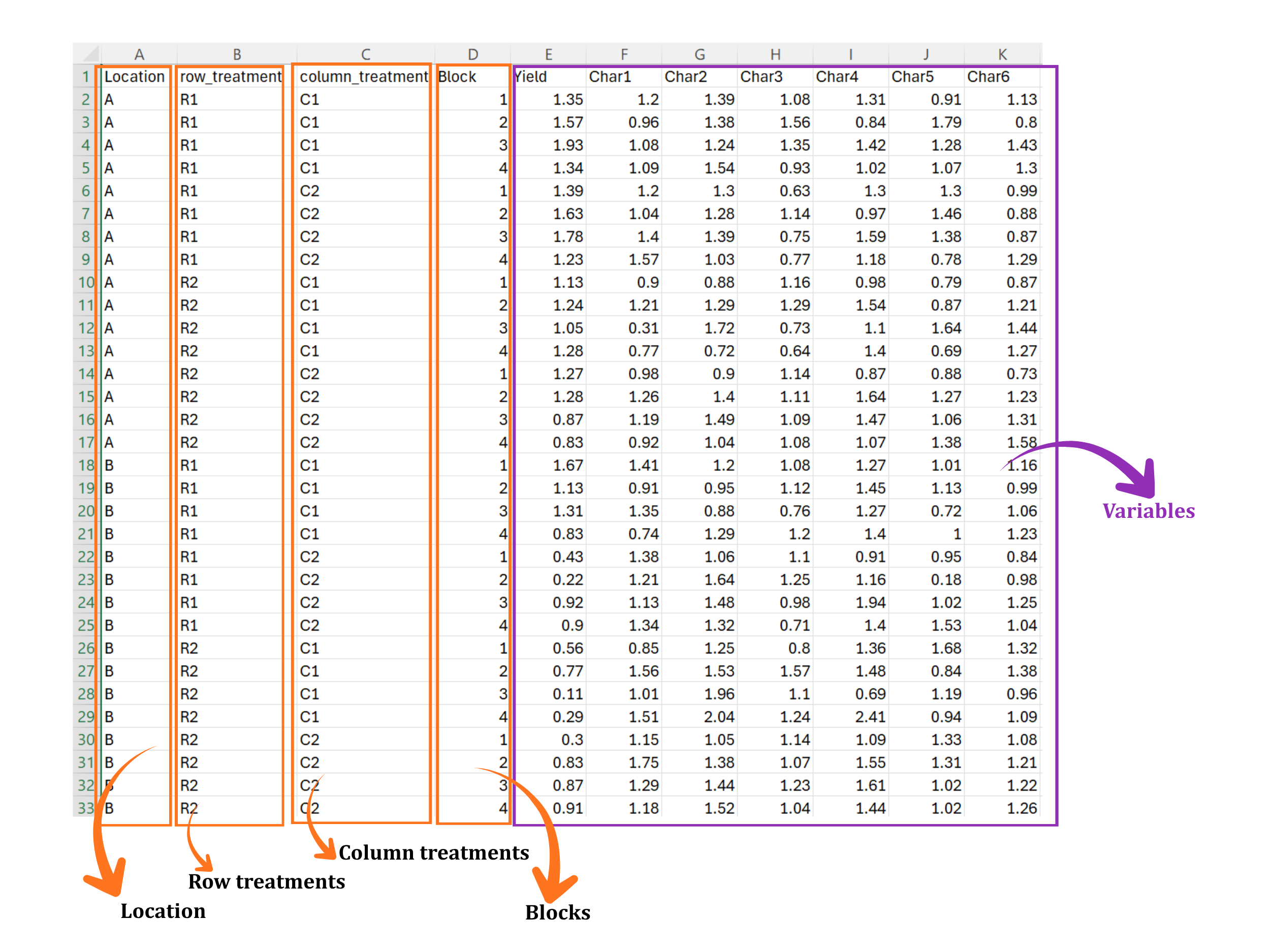
| Column | Holds | In Figure 3 |
|---|---|---|
| Location | The environment: location, season or year | A, B |
| row_treatment | Levels of the factor applied in row strips | R1, R2 |
| column_treatment | Levels of the factor applied in column strips | C1, C2 |
| Block | The replication or block within each environment | 1, 2, 3, 4 |
| Yield, Char1 … Char6 | One column per measured response | Numeric values |
Nothing in the spreadsheet records that row_treatment was applied in strips one way and column_treatment at right angles to it. You assert that when you map the columns in Section 9, and the module builds its three error terms on your word. If you map them the wrong way round the analysis still runs and produces a complete, plausible-looking table - with the row and column main effects tested against each other’s error. Check the mapping before you press Run.
Blank rows or blank columns inside the data block; a trailing space after a level name, which makes R1 a different level from R1; text such as NA, - or missing typed into a numeric column; merged cells; and a block numbered differently at the two locations. Every one of these is silent in Excel and fatal in analysis. The View Data tab (Section 19) is built to catch them before you run anything.
Naming rules for columns and levels
- Column names may contain letters, numbers, dots and underscores. Avoid spaces, and avoid starting a name with a digit.
-
Keep level names short and identical everywhere they appear -
R1throughout, neverR1in one place andr1in another. - The block column must be complete: every row × column intersection appears once in every block, at every location.
- Response columns must be purely numeric. If a value is genuinely missing, leave the cell empty rather than typing a placeholder.
- The order of the rows does not matter, and neither does the order of the columns - you map each one by name in the Analysis tab.
8.2 Prepare using Create Data in RAISINS
If you have not yet collected the data, the Create Data tab builds the empty file for you, correctly structured, so that you can carry it to the field and fill it in. Figure 4 shows it.
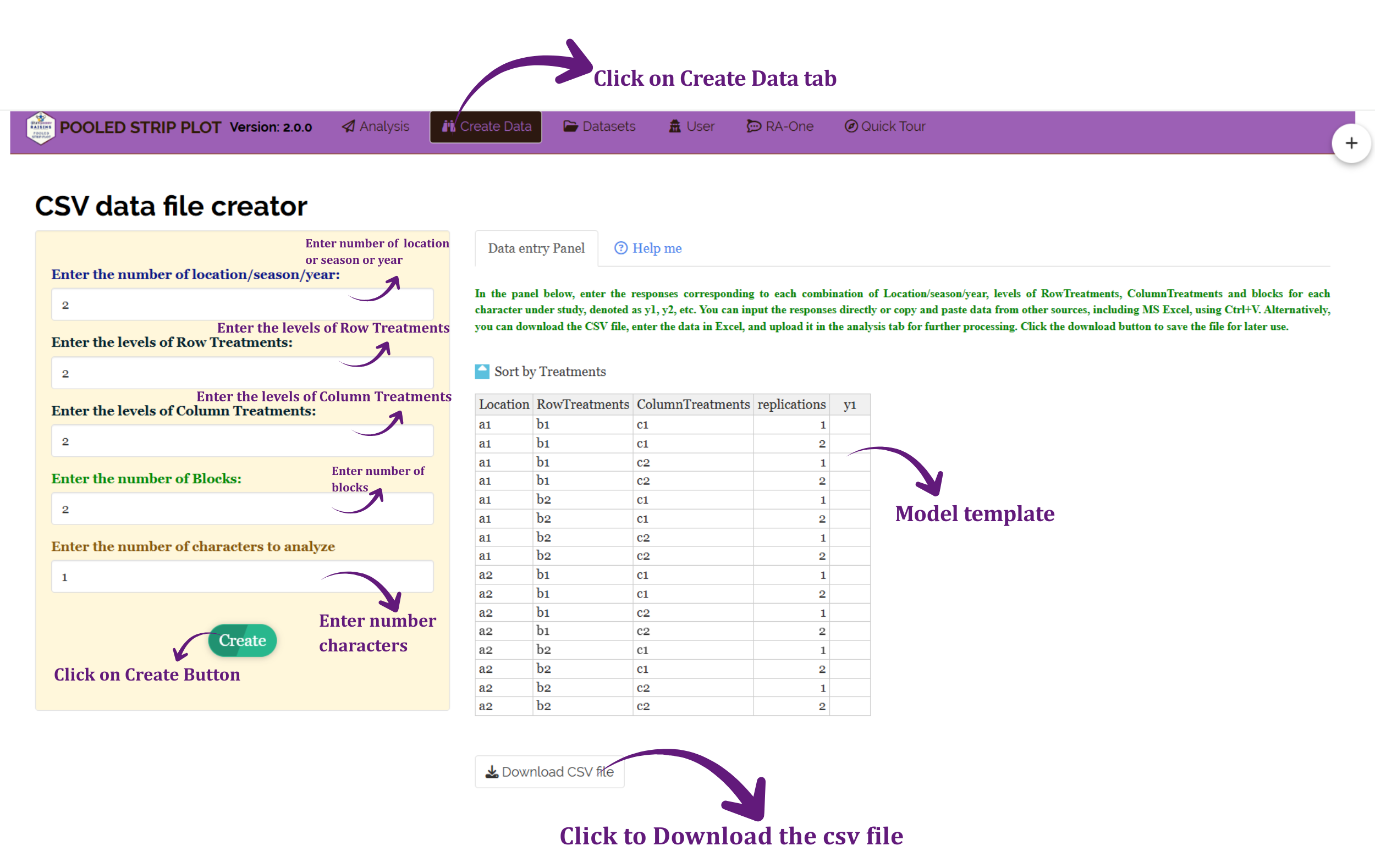
You supply five numbers - how many locations, seasons or years; how many levels of the row treatment; how many levels of the column treatment; how many blocks; and how many characters you intend to measure - then press Create. The panel on the right fills with a complete template carrying one row for every combination of Location, RowTreatments, ColumnTreatments and replication, with an empty response column y1 waiting for your readings. You can type into it directly, or paste a block of values straight from Excel with Ctrl+V. Download CSV file saves it, and the saved file uploads into the Analysis tab unchanged.
8.3 Download Model Datasets
The Datasets tab carries worked example files you can download and run immediately - useful for learning the module, and for checking that a problem is in your data rather than in the app. Figure 5 shows the page.
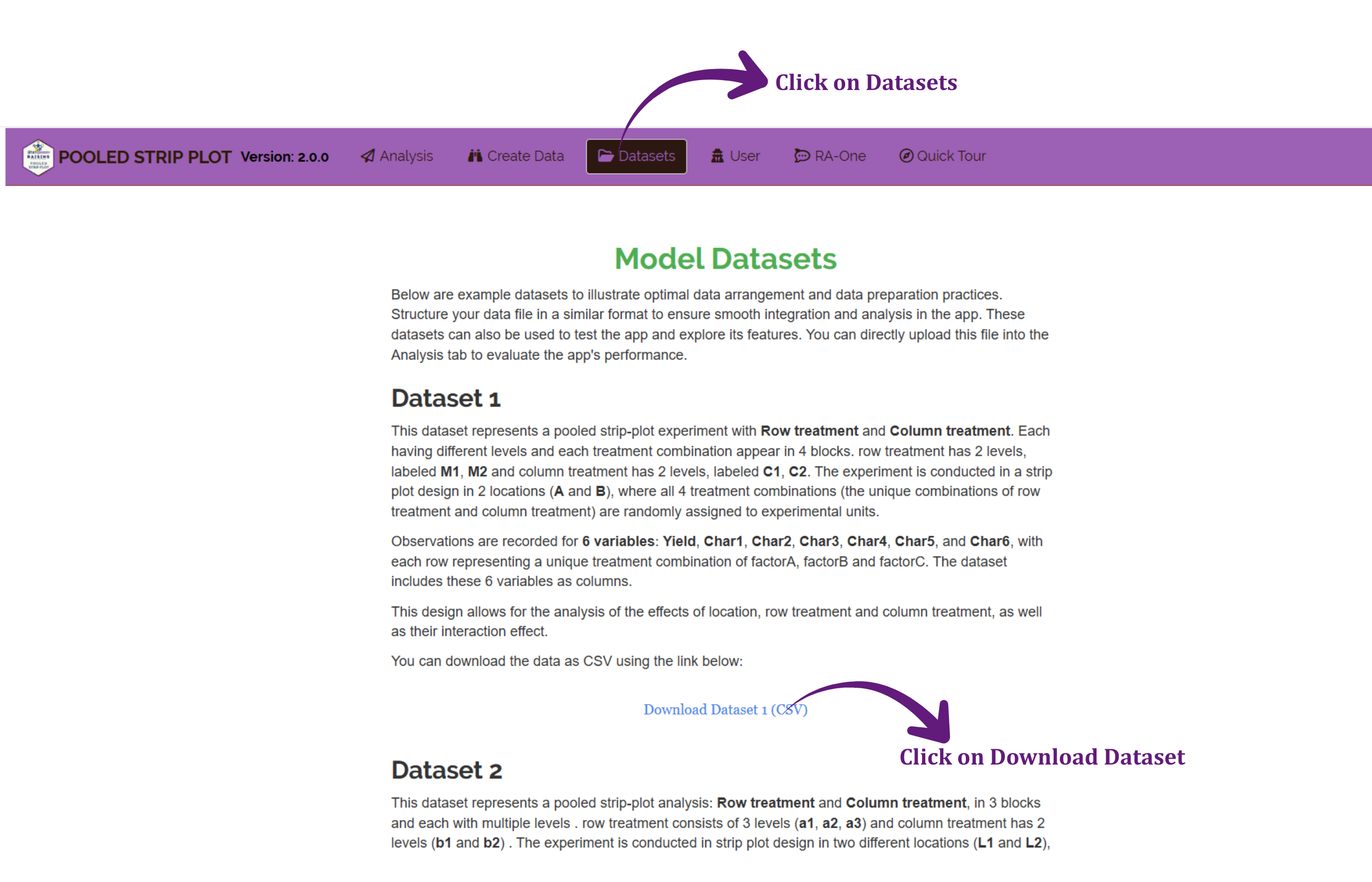
Dataset 1 is a pooled strip-plot experiment with a row treatment at two levels (M1, M2) and a column treatment at two levels (C1, C2), in four blocks across two locations (A and B), with Yield and Char1 to Char6 recorded. Dataset 2 is a larger arrangement - a row treatment at three levels (a1, a2, a3), a column treatment at two (b1, b2), three blocks and two locations (L1, L2) - which is worth loading once you want to see how the tables grow when a factor has more than two levels.
8.4 Creating a dataset using RA-One chat
The fourth route is to ask. Open the RA-One tab and describe the design you want in ordinary English - “Create a data template for 3 locations, 3 row treatments, 2 column treatments, 3 blocks and 3 responses”. RA-One builds the grid in the conversation, as in Figure 6.
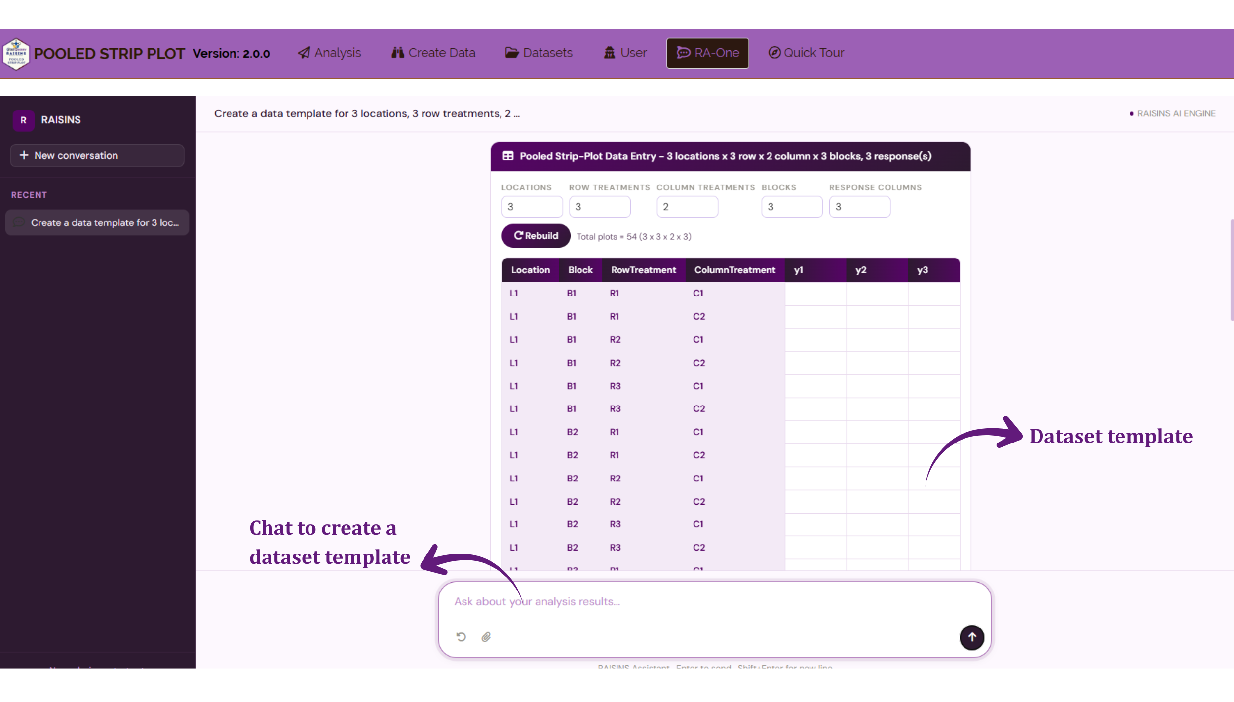
What comes back is not a picture of a table but a working one. The header restates the design it understood - locations, row treatments, column treatments, blocks and response columns - and each of those is an editable box, so if it read three responses when you meant two, change the number and press Rebuild rather than starting the conversation again. It also reports the total number of plots implied by your numbers, shown in Figure 6 as Total plots = 54 (3 x 3 x 2 x 3), which is a quick sanity check on whether the trial you are planning is one you can actually lay out in the field you have.
Your file is ready. Continue to Section 9 to run the analysis.
9 The Analysis Results tab
This is the tab where the analysis is specified and run. The panel on the left takes your file and tells the module what each column is; the strip along the top governs how the results are presented. Figure 7 shows it with the working example loaded.
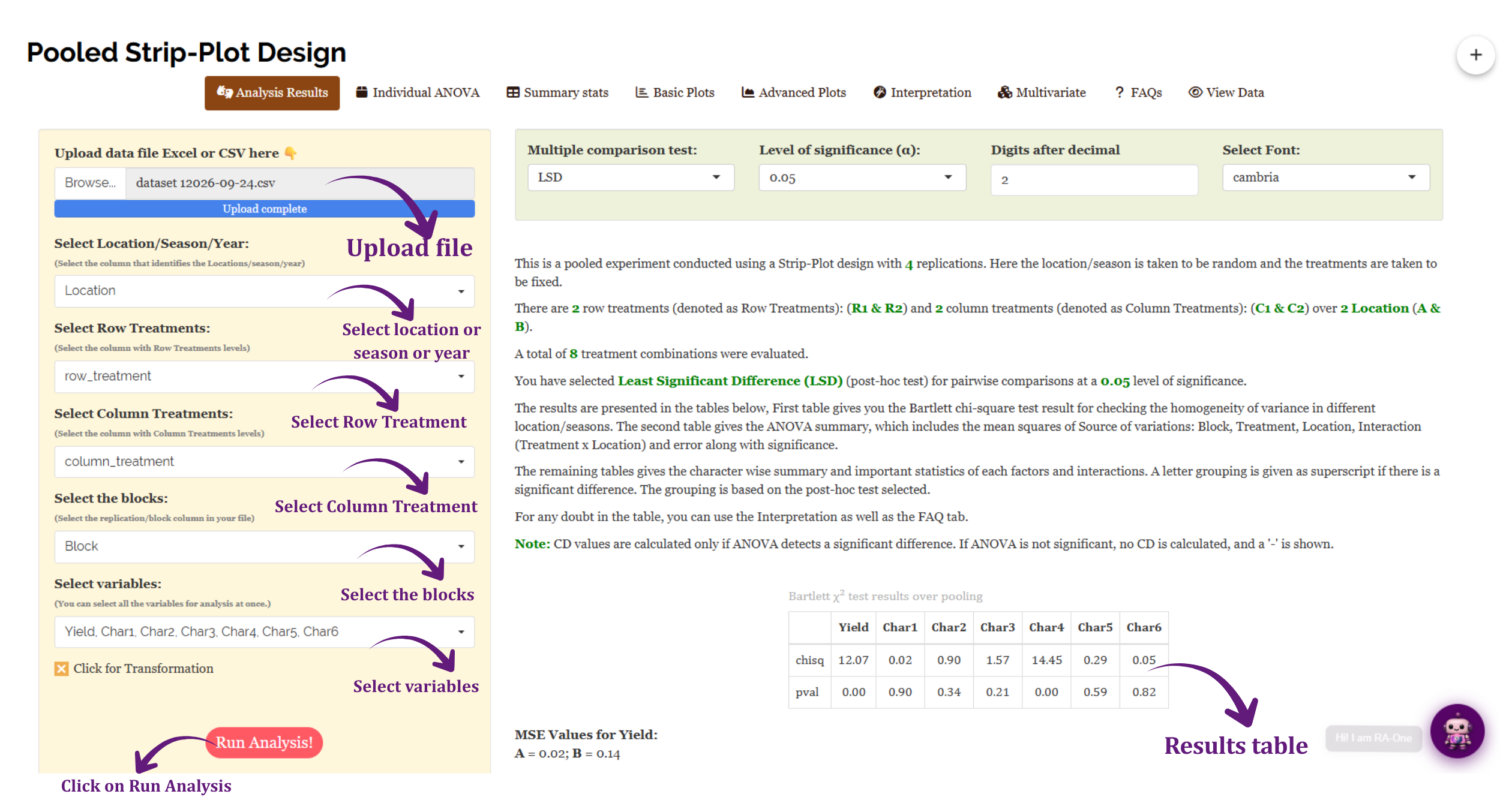
| Control | What to give it |
|---|---|
| Upload data file | Browse to your CSV or Excel file; a blue Upload complete bar confirms it |
| Select Location/Season/Year | The column identifying the environment - here Location |
| Select Row Treatments | The factor applied in row strips - here row_treatment |
| Select Column Treatments | The factor applied in column strips - here column_treatment |
| Select the blocks | The replication or block column - here Block |
| Select variables | Every response you want analysed. All seven are selected at once |
| Click for Transformation | Optional; opens the panel described in Section 10 |
| Run Analysis! | Computes everything |
Several other pooled modules ask you to choose between four models according to whether treatments and environments are fixed or random. This one does not. The strip-plot module fixes the specification and tells you what it is, in the first line of its own output: “Here the location/season is taken to be random and the treatments are taken to be fixed.” That is the standard multi-environment specification - your treatments are the ones you chose and intend to recommend, while the locations stand in for a wider region you want to generalise to. If that is not your situation, this is the wrong module rather than a setting to change.
The variables selector is multi-select, and there is no penalty for choosing all of them. The module analyses each response separately and lays the results out character by character, so a single run gives you the whole experiment. You do not need to run the analysis seven times.
9.1 The four presentation options
The green strip along the top of Figure 7 carries four controls. They change how results are reported, not what is computed, so you can adjust them after a run and the tables update without re-uploading anything.
| Option | Choices | What it does |
|---|---|---|
| Multiple comparison test | LSD, TUKEY, DMRT | The post-hoc test used to separate means once an effect is significant |
| Level of significance (α) | 0.05 and other conventional levels | The threshold against which p-values are judged |
| Digits after decimal | A number | How many decimal places the tables display |
| Select Font | A list of fonts | The typeface of the rendered tables |
Which post-hoc test should I choose?
- LSD (Fisher’s protected least significant difference) is the most liberal of the three. It is defensible when the ANOVA F test for that effect is already significant, and it is the module’s default.
- TUKEY (HSD) controls the family-wise error rate across all pairwise comparisons. It is the conservative, widely accepted choice when you intend to compare every mean with every other.
- DMRT (Duncan’s multiple range test) sits between the two, using a critical range that widens as the means being compared move further apart in rank.
- Choose before you look at the output, not after. Running all three and reporting whichever produced the most letters is the multiple-comparison problem in a new costume.
9.2 What the module tells you before the ANOVA
Below the options strip, and above the results proper, the module prints a plain-language account of what it is about to do and what it found when it checked your data. For the working example it restates the design it read from your file: a pooled strip-plot experiment with 4 replications, 2 row treatments (R1 and R2) and 2 column treatments (C1 and C2) over 2 locations (A and B), giving 8 treatment combinations, with LSD selected at α = 0.05. It also states the note that explains most of the dashes you will see later: CD values are calculated only if ANOVA detects a significant difference; if the ANOVA is not significant, no CD is calculated and a “-” is shown.
Then comes the pooling diagnostic from Section 3, and in this dataset it is not a formality. The Bartlett χ² test results over pooling table gives a chi-square statistic and a p-value for every response:
| Yield | Char1 | Char2 | Char3 | Char4 | Char5 | Char6 | |
|---|---|---|---|---|---|---|---|
| chisq | 12.07 | 0.02 | 0.90 | 1.57 | 14.45 | 0.29 | 0.05 |
| pval | 0.00 | 0.90 | 0.34 | 0.21 | 0.00 | 0.59 | 0.82 |
Yield and Char4 fail the test outright. Their error variances are not homogeneous across the two locations, so for those two characters - and only those two - the module applies an Aitken transformation before pooling. The remaining five pass comfortably and are pooled directly. Underneath the table the module lists the per-location MSE values that Bartlett was comparing; for Yield they are A = 0.02 and B = 0.14, a sevenfold difference, which is exactly why the test rejected homogeneity for that trait.
From this point on, Yield and Char4 are being analysed on a transformed scale. Their F tests, their CD values and their letter groupings all refer to transformed means. The other five characters are untouched. The module keeps track of this for you and says so again in Section 16, but when you write the results up it is your job to state which characters were corrected and why - a reader cannot deduce it from a means table.
10 Transformation
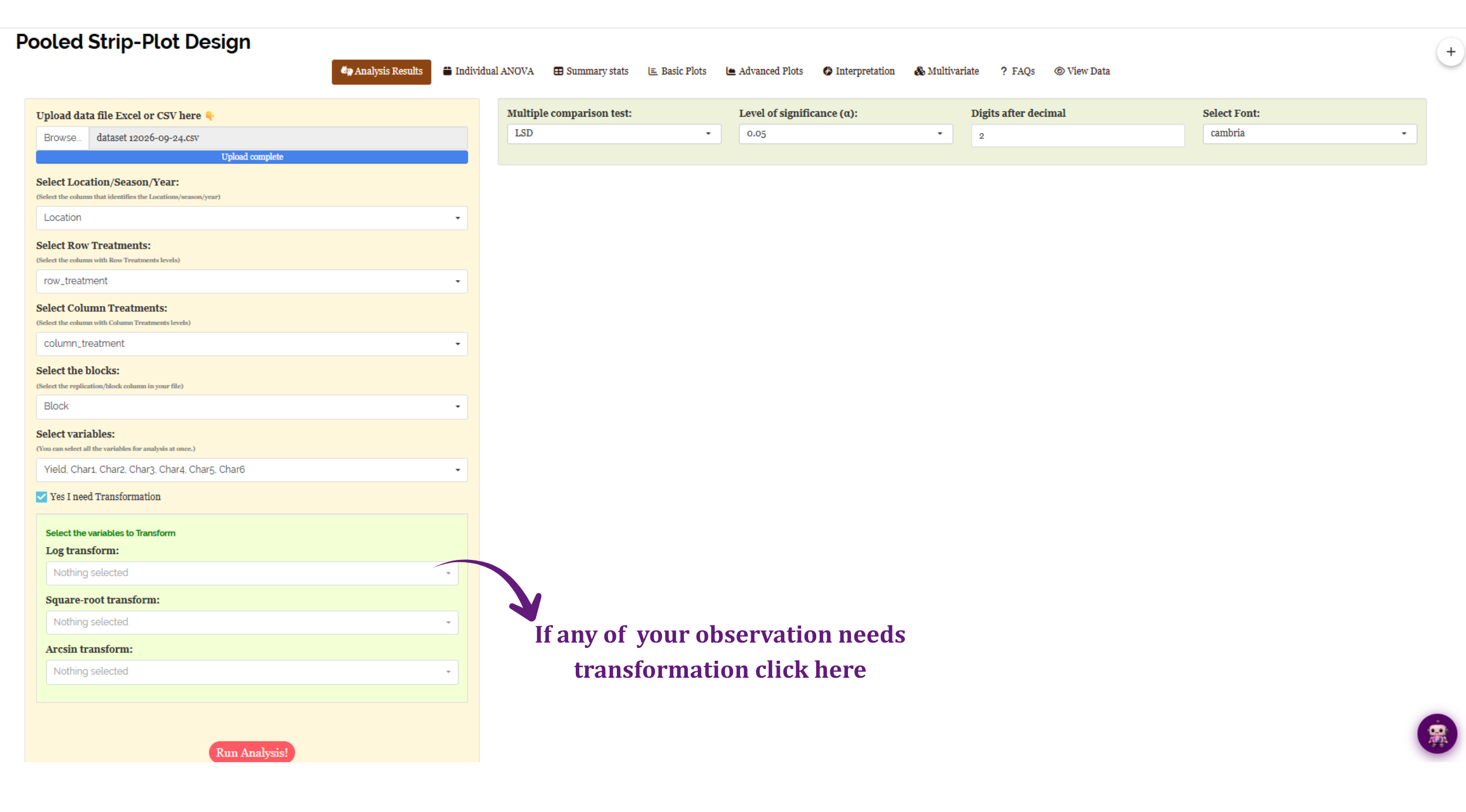
The Aitken correction in Section 9 is applied automatically and is about pooling. The transformation panel described here is something else entirely: a transformation you choose, applied to the response itself, to repair the assumptions in Section 4. Ticking Click for Transformation in the left panel opens the panel shown in Figure 8.
| Transformation | Use it for | Typical case |
|---|---|---|
| Log | Data whose variance grows with the mean; strongly right-skewed responses | Counts of insects, spores or weeds; yields spanning an order of magnitude |
| Square-root | Count data, particularly with small numbers and several zeros | Number of tillers, pods, branches |
| Arcsin | Proportions and percentages bounded between 0 and 1, or 0 and 100 | Germination percentage, disease incidence |
Each transformation takes its own list of variables, so you can apply a log to one response, a square root to another, and leave the rest untouched in a single run.
After a log transformation the analysis is carried out on the logged values, so the treatment means the ANOVA compares are means of logs - not the log of the mean, and not in the original units. Back-transforming a mean of logs gives a geometric mean, which is legitimate but is not the arithmetic average of your raw readings. Report the scale you analysed on, and say in your methods that a transformation was applied. RAISINS shows the transformed mean in parentheses alongside the original so that both are available to you.
Transformation is a remedy, not a routine step. Run the analysis untransformed first, look at the Q–Q plot and the distribution plots in Section 14, and reach for a transformation only if they show a problem. If the residuals look reasonable, leave the data alone.
After choosing a transformation, or deciding against one, proceed to Section 11.
11 Analysis results
Pressing Run Analysis! produces two kinds of output. The Analysis Results tab carries the character-wise summary tables - one block per response, giving the mean of every factor level and every interaction combination, with a letter grouping attached as a superscript wherever the effect was significant. The Individual ANOVA tab carries the ANOVA table itself, one character at a time.
Read the ANOVA first. It tells you which effects are real; the mean tables then tell you what those effects are. Reading them the other way round invites you to interpret differences the F test never licensed.
11.1 The pooled ANOVA table
Open the Individual ANOVA tab and choose a response from the Select Character dropdown. Figure 9 shows the result for Yield.
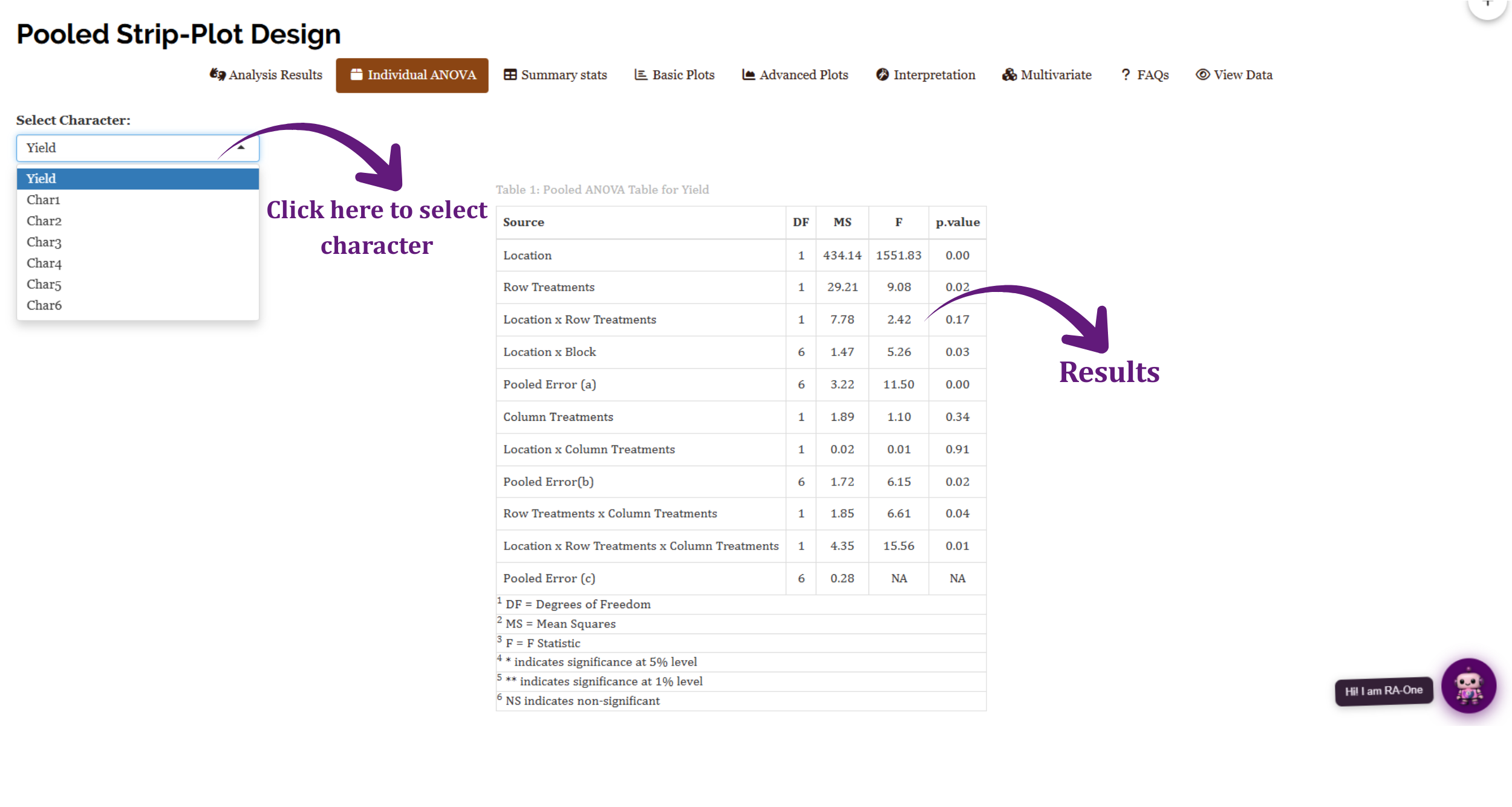
The layout is the design made visible. The table falls into three blocks, each closing with its own error term, and each effect is tested against the error of the block it sits in. That is what Section 2 described in words:
| Block of the table | Effects in it | Tested against |
|---|---|---|
| First | Row Treatments, Location × Row Treatments | Pooled Error (a), MS = 3.22 |
| Second | Column Treatments, Location × Column Treatments | Pooled Error (b), MS = 1.72 |
| Third | Row × Column, Location × Row × Column | Pooled Error (c), MS = 0.28 |
Divide any mean square by the error it should be tested against and you get the F in the table. Row Treatments: 29.21 ÷ 3.22 = 9.07, and the table reports 9.08. Column Treatments: 1.89 ÷ 1.72 = 1.10, as printed. Row × Column: 1.85 ÷ 0.28 = 6.61, as printed. The degrees of freedom check out too - 1 + 1 + 1 + 6 + 6 + 1 + 1 + 6 + 1 + 1 + 6 = 31, one less than the 32 rows in the file. If your own table does not add up this way, the file is unbalanced and Section 19 is the place to find out why.
11.2 Interpretation from Figure 9
Look first at the three error mean squares themselves: 3.22, 1.72 and 0.28. Error (c) is an order of magnitude smaller than Error (a). That is the strip-plot bargain in one line - variation between whole row strips is large, variation between intersections is small, and the interaction therefore gets tested far more sharply than either main effect. The module even tests the errors against each other, and both come out significant (Error (a) F = 11.50, p = 0.00; Error (b) F = 6.15, p = 0.02), confirming the structure rather than signalling a problem.
Location dominates everything: MS = 434.14 against Error (c), giving F = 1551.83 and p = 0.00. The two sites simply yielded very differently, which the cell means in Section 12 bear out - location A averages around 1.3 while location B averages around 0.75.
Among the treatments, Row Treatments is significant (F = 9.08, p = 0.02) while Column Treatments is not (F = 1.10, p = 0.34). Their interaction is significant (F = 6.61, p = 0.04), and so is the three-way Location × Row × Column (F = 15.56, p = 0.01). The two environment interactions involving a single factor are both non-significant: Location × Row Treatments gives p = 0.17 and Location × Column Treatments p = 0.91.
With Location × Row × Column significant at p = 0.01, the main effect of Row Treatments is no longer the headline - it is an average over a pattern that changes from site to site. The correct reading order is top-down by complexity: settle the three-way first, then the two-ways, and only then the main effects. Reporting “R1 beat R2” as the conclusion of this experiment would be true on average and misleading in practice, because the three-way term says the row × column pattern itself differs between A and B. The interaction plots in Section 14 are the fastest way to see what that looks like.
Remember also that Yield is one of the two characters that failed Bartlett’s test in Section 9. Everything in Figure 9 for Yield is computed after the Aitken correction. The means printed in the summary tables remain on the original scale - you can check this yourself, since the R1 and R2 marginal means quoted in Section 16, 1.23 and 0.85, are exactly the averages of the raw cell means in Figure 10 - but the letters attached to them come from the transformed analysis.
What the other numbers in the summary tables mean
- CD (Critical Difference), sometimes reported as LSD: two means differ significantly if they differ by more than this. It is printed only when the corresponding F test was significant - otherwise you see a dash, as the module warns on the Analysis Results tab.
- SE(m) - the standard error of a mean. In a strip plot this differs between the row means, the column means and the interaction means, because each is built from a different error term.
- SE(d) - the standard error of the difference between two means.
- CV(%) - the coefficient of variation. With three error terms there is no single CV for the experiment; read it alongside the error term it belongs to.
- Letter groupings appear as superscripts on the means. Two means sharing a letter are not significantly different. They are shown only where the F test was significant, so a table with no letters is not an error.
12 Summary stats
The Summary stats tab describes your data before any model is fitted. It gives one row per Location × Row Treatment × Column Treatment cell, for every character, as shown in Figure 10.
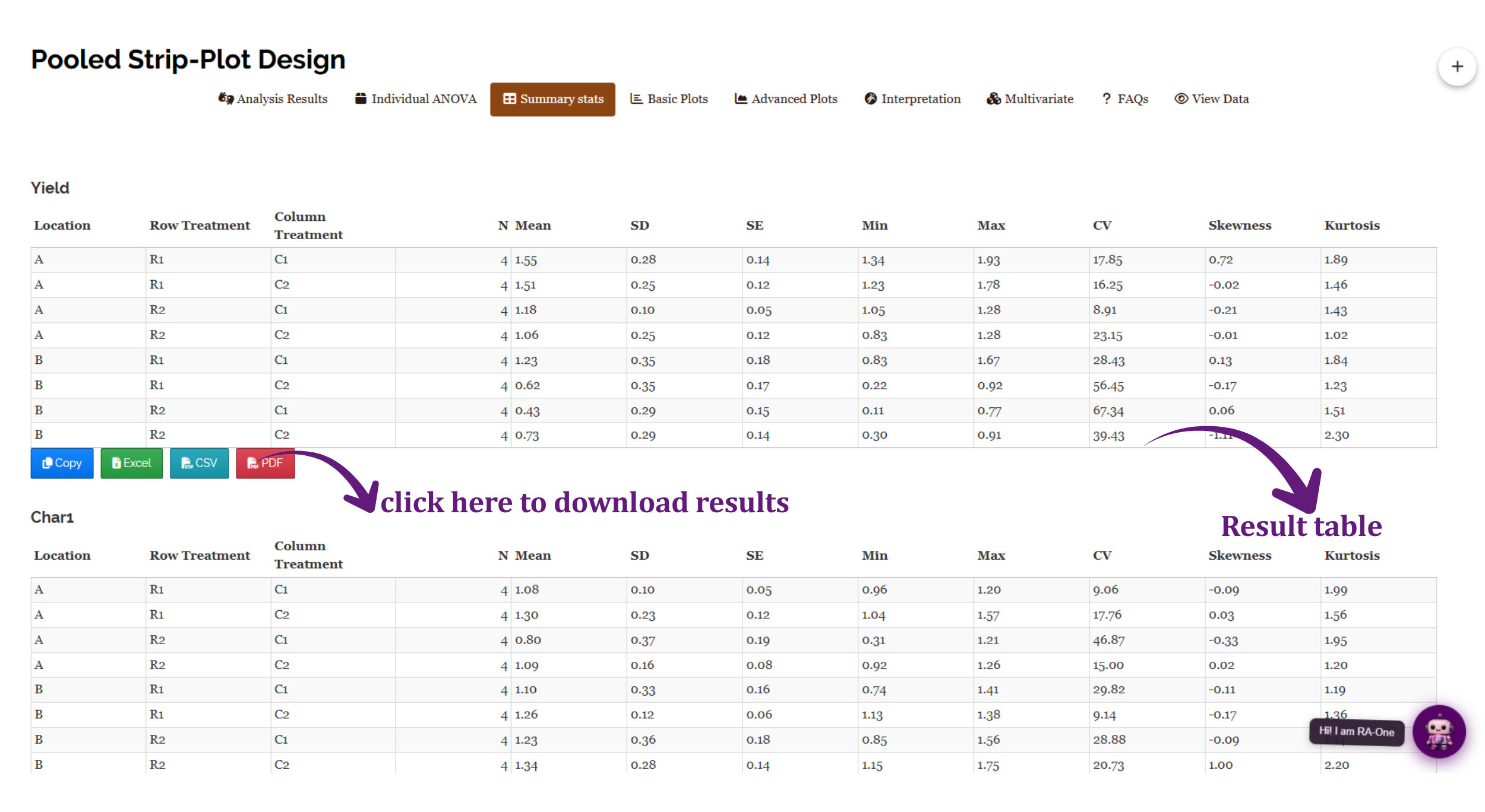
| Column | What it tells you |
|---|---|
| N | How many observations landed in that cell - should equal your number of blocks |
| Mean, SD, SE | Centre and spread of the cell |
| Min, Max | The range; the fastest way to spot a data-entry error |
| CV | Spread relative to the mean, as a percentage |
| Skewness, Kurtosis | Shape - large values warn that the normality assumption may be strained |
This tab is easy to skip and worth not skipping, because it explains the Bartlett result rather than merely reporting it. Look at the CV column for Yield in Figure 10. At location A the four cells return CVs of 17.85, 16.25, 8.91 and 23.15. At location B the same four cells return 28.43, 56.45, 67.34 and 39.43. Location B is between two and seven times more variable than location A, cell for cell. That is precisely the heterogeneity Bartlett’s test detected, and seeing it laid out this way makes the Aitken correction feel like an obvious necessity rather than an opaque intervention.
Every cell in Figure 10 shows N = 4, matching the four blocks. A cell showing 3 or 5 means the file is unbalanced - a row was lost, or duplicated, or a level name was misspelled and split one cell into two. Catching that here takes a moment; catching it after you have interpreted an ANOVA does not.
Each character’s table carries its own Copy, Excel, CSV and PDF buttons, so a table can go straight into a thesis appendix without retyping.
13 Basic plots
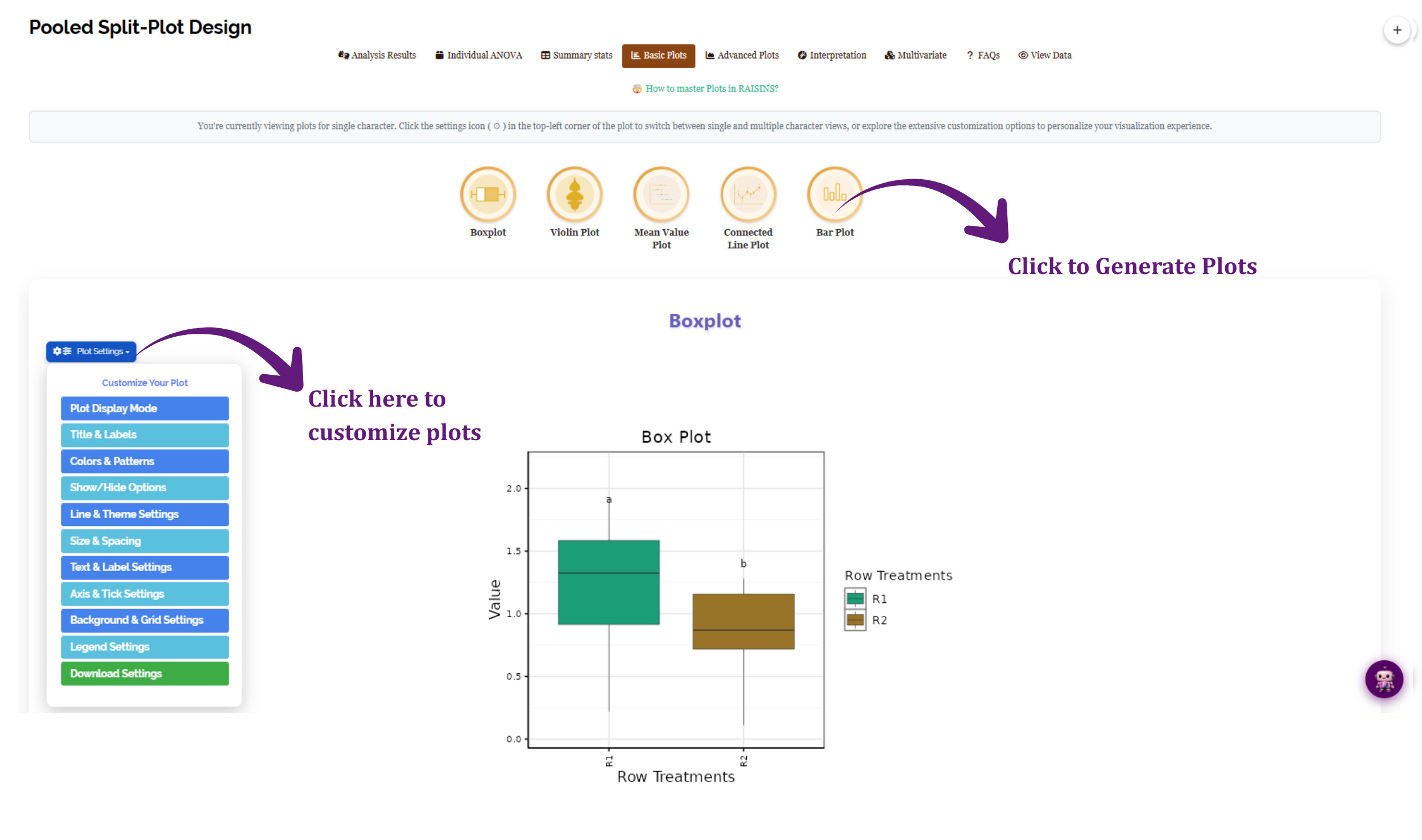
The Basic Plots tab offers five standard displays, each generated by clicking its icon. Figure 11 shows the tab with a box plot drawn for the row treatments.
| Plot | Shows | Good for |
|---|---|---|
| Boxplot | Median, quartiles and outliers per level | Spotting unequal spread and stray values |
| Violin Plot | The full distribution’s shape per level | Seeing bimodality a boxplot would hide |
| Mean Value Plot | Treatment means with error bars | The figure most often wanted for a paper |
| Connected Line Plot | Means joined across levels | Trends across an ordered factor |
| Bar Plot | Means as bars, with letter groupings available | Presentations and extension material |
The box plot in Figure 11 carries the letters a and b above R1 and R2 - the post-hoc separation from Section 11 drawn directly onto the figure, which is usually the form you want in a results section. Every plot opens with a Plot Settings panel covering display mode, titles and labels, colours and patterns, show/hide options, line and theme settings, size and spacing, text, axes and ticks, background and grid, legend, and download settings. A note at the top of the tab explains that you are viewing plots for a single character and that the settings icon switches between single and multiple character views.
Figure 11 compares R1 against R2 averaged over everything else. For this dataset that average conceals a significant three-way interaction, so the figure is true but incomplete. Use the basic plots to inspect distributions and to illustrate a main effect that the ANOVA supports on its own; use the interaction plots in Section 14 when an interaction term is significant.
14 Advanced plots and diagnostics
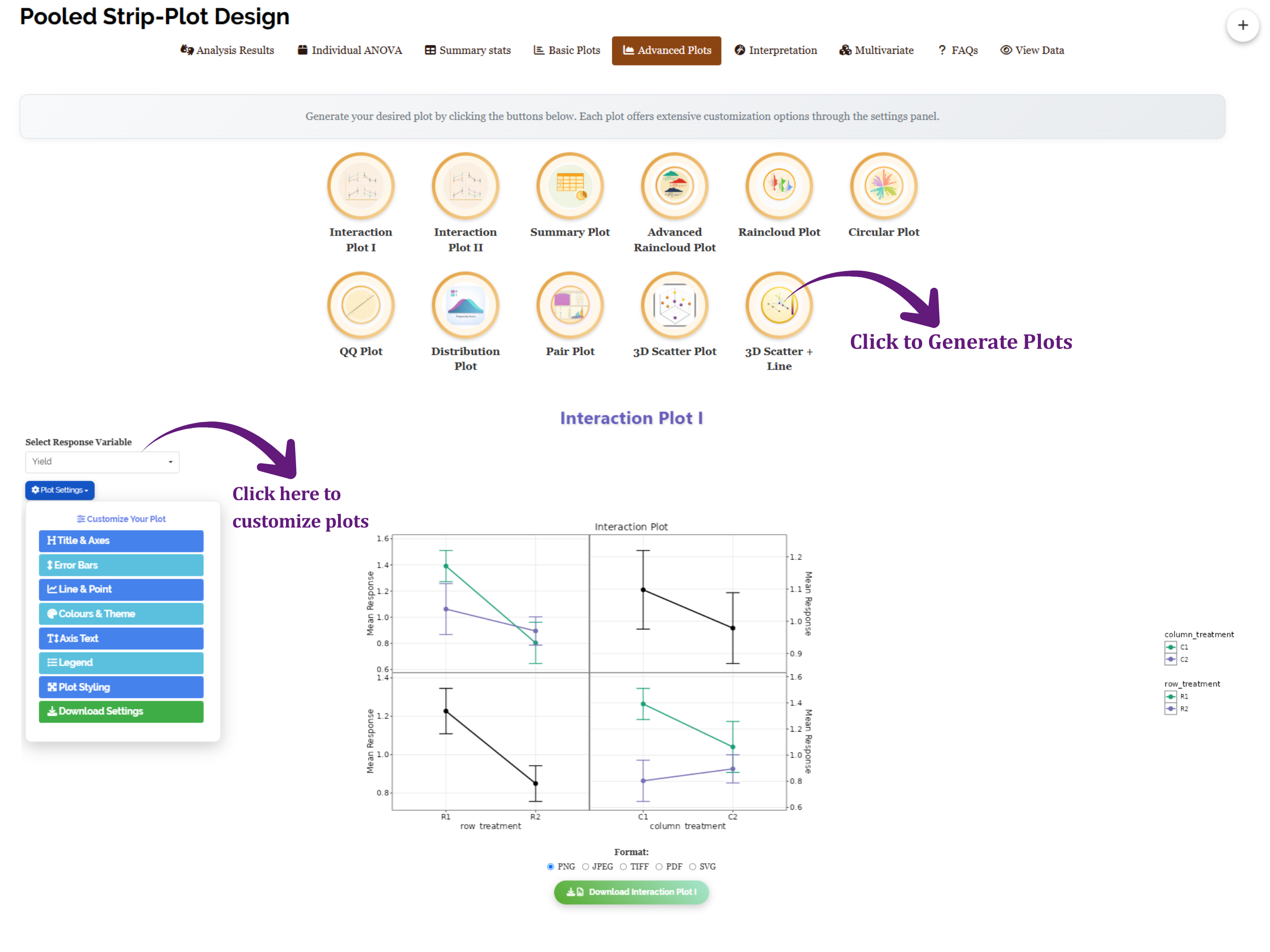
The Advanced Plots tab carries eleven further displays. Some are presentation graphics; several are diagnostics that speak directly to the assumptions in Section 4. Figure 12 shows the tab with Interaction Plot I drawn for Yield.
| Plot | What it is for |
|---|---|
| Interaction Plot I, Interaction Plot II | The visual counterpart of the interaction F test - parallel lines mean no interaction, converging or crossing lines mean a strong one |
| Summary Plot | A compact overview of all responses at once |
| Raincloud, Advanced Raincloud | Distribution, individual points and summary statistics in one figure |
| Circular Plot | Many treatment combinations arranged radially |
| QQ Plot | Diagnostic - checks the normality assumption |
| Distribution Plot | Diagnostic - the shape of each response |
| Pair Plot | Relationships between the responses, not between treatments |
| 3D Scatter Plot, 3D Scatter + Line | Three variables at once |
The interaction plots earn their place in this module more than in most, because the strip-plot design is built to measure interactions precisely. Choose a response in Select Response Variable and the plot draws the row treatment and column treatment panels side by side with error bars. In Figure 12 the lines for Yield are clearly not parallel - the gap between C1 and C2 at R1 is not the gap at R2 - which is the visual form of the significant Row × Column term read in Section 11.2.
The QQ Plot and Distribution Plot exist to be looked at, not skipped. If the QQ plot’s points bend systematically away from the reference line, the normality assumption is strained and the p-values in Section 11 are approximate at best. That is the moment to consider a transformation from Section 10 - and the moment to do it is before you write the conclusions, not after.
15 Looking at all traits together: the PCA index
Seven separate ANOVAs answer seven separate questions. They do not answer the question a breeder or agronomist usually has, which is which treatment combination is best overall. The Multivariate tab addresses that with a principal component analysis, which reduces many correlated traits to a few independent components and builds a single index score by which treatment combinations can be ranked.
PCA needs at least two characters to have any relationships to analyse, so the index is unavailable for a single-response file. And where an Aitken transformation was applied during pooling - Yield and Char4 in this dataset - the PCA is computed on the transformed treatment means rather than the raw ones. That is correct, and it is worth stating when you report the index.
The index weights traits by how much variance they contribute, not by how much you care about them. A trait that varies a lot will dominate the first component whether or not it is the trait you are selecting for, and traits measured on very different scales can distort the result. Use the index to shortlist, then go back to the individual ANOVAs in Section 11 to justify the choice.
The numbers are in. Section 16 shows what the module makes of them.
16 Interpretation
The Interpretation tab writes the results out in prose. Tick the confirmation box - “I’m not a robot and I have checked that on running analysis there was no error reported” - and press Click here for interpretation. Figure 13 shows the output for the working example.
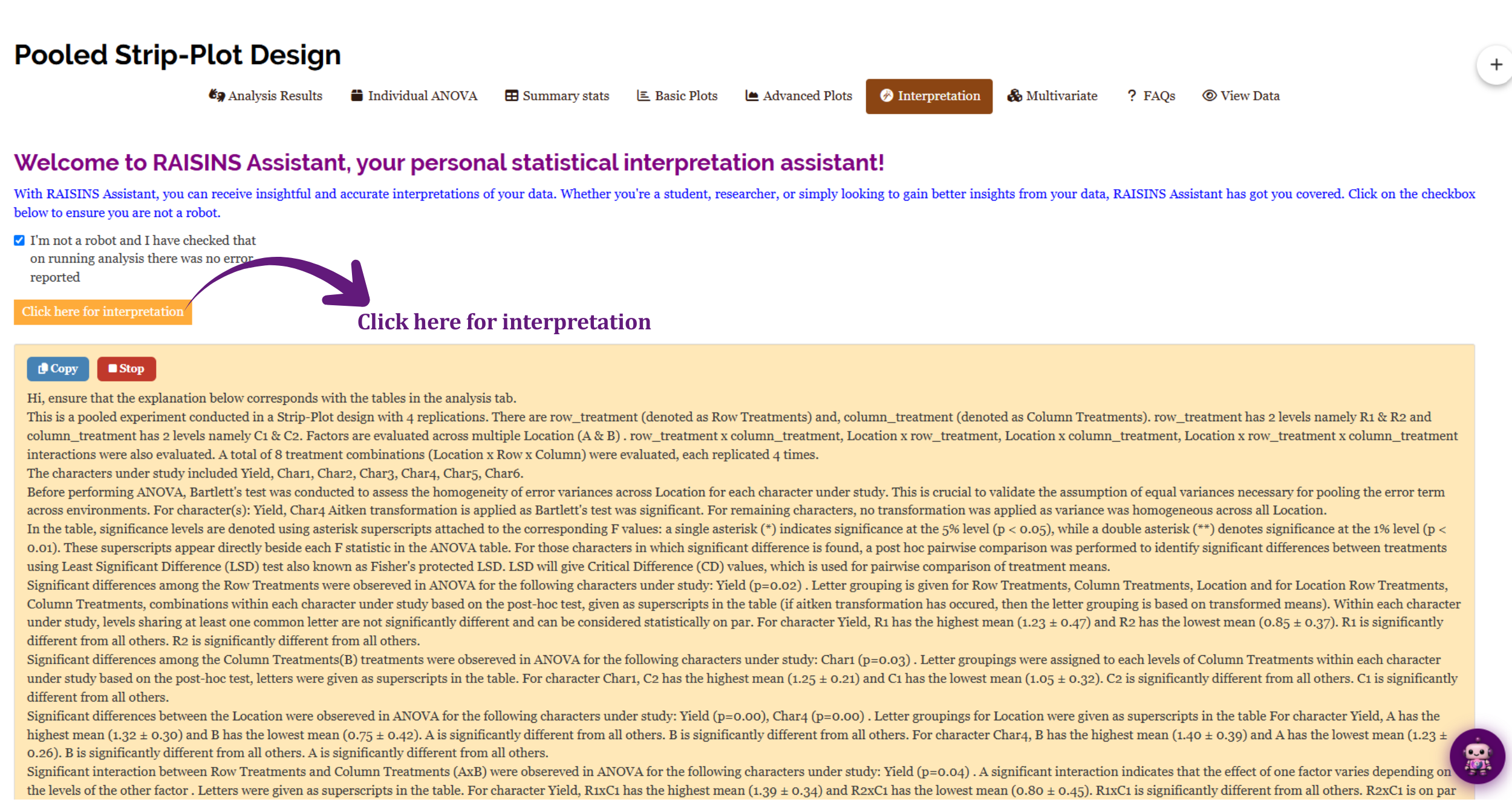
The narrative opens by restating the design it analysed - a pooled strip-plot experiment with 4 replications, row_treatment at levels R1 and R2, column_treatment at C1 and C2, across locations A and B, giving 8 treatment combinations each replicated 4 times - and lists the seven characters studied. It then reports the pooling check in the plainest possible terms: for Yield and Char4 an Aitken transformation was applied because Bartlett’s test was significant; for the remaining characters no transformation was applied. It adds the qualification that matters, that where an Aitken transformation has occurred the letter grouping is based on transformed means.
It then works through the effects one at a time, and for this dataset it has real findings to report. Among the Row Treatments, Yield is significant (p = 0.02), with R1 highest at 1.23 ± 0.47 and R2 lowest at 0.85 ± 0.37. Among the Column Treatments, Char1 is significant (p = 0.03), with C2 highest at 1.25 ± 0.21 and C1 lowest at 1.05 ± 0.32. For Location, both Yield (p = 0.00) and Char4 (p = 0.00) are significant: for Yield, A is highest at 1.32 ± 0.30 and B lowest at 0.75 ± 0.42; for Char4 the ordering reverses, B highest at 1.40 ± 0.39 and A lowest at 1.23 ± 0.26. For the Row × Column interaction, Yield is significant (p = 0.04), with R1×C1 highest at 1.39 ± 0.34 and R2×C1 lowest at 0.80 ± 0.45.
It is worth pausing on that pair. Location A gives the better yield but the poorer Char4, and location B the reverse. Two traits, two opposite rankings of the same two sites - which is exactly the situation the PCA index in Section 15 exists to arbitrate, and exactly the situation in which a recommendation based on yield alone would be incomplete.
The interpretation is generated from the results the module just computed, so it will not contradict them. It is still your analysis and your paper. Two habits are worth keeping: confirm that every number quoted in the prose appears in the corresponding table, and satisfy yourself that the interpretation fits your experiment. The text can tell you R1×C1 had the highest yield; only you know whether that combination is agronomically sensible or an artefact of one unusual strip.
A Copy button places the whole text on the clipboard, and Stop halts generation if you launched it by mistake.
17 Chat with your data using RA-One
RA-One is the assistant reached from the RA-One tab in the top navigation bar, or from the small robot icon that floats at the bottom-right of every screen. You met it in Section 8.4 building a data template; once an analysis has run, it can also answer questions about that analysis in ordinary language.
The difference between RA-One and the Interpretation tab is the direction of travel. The Interpretation tab writes one comprehensive account of everything, whether or not you wanted all of it. RA-One waits for a question and answers that question - “why is Error (a) so much larger than Error (c)?”, “which row and column combination should I recommend at location B?”, “what does it mean that an Aitken transformation was applied to Yield but not to Char2?” Its answers are grounded in the results your run produced, not in general statistical advice.
The sidebar keeps your conversations, so a line of questioning you began yesterday is still there today, and New conversation starts a fresh thread when you move to a different dataset. When no analysis has been run, the panel notes that there is no analysis context yet - a reminder that RA-One is most useful after Section 11, when it has real output to reason about.
RA-One will build you a data template before the trial (Section 8.4), explain a control you are unsure about while you set the analysis up, interpret a table once the analysis has run, and help you word a result for a methods or results section. It is the same assistant in all four roles - the only thing that changes is what you ask it.
18 FAQs
The FAQs tab collects short answers to the questions this module attracts most often, shown in Figure 14.
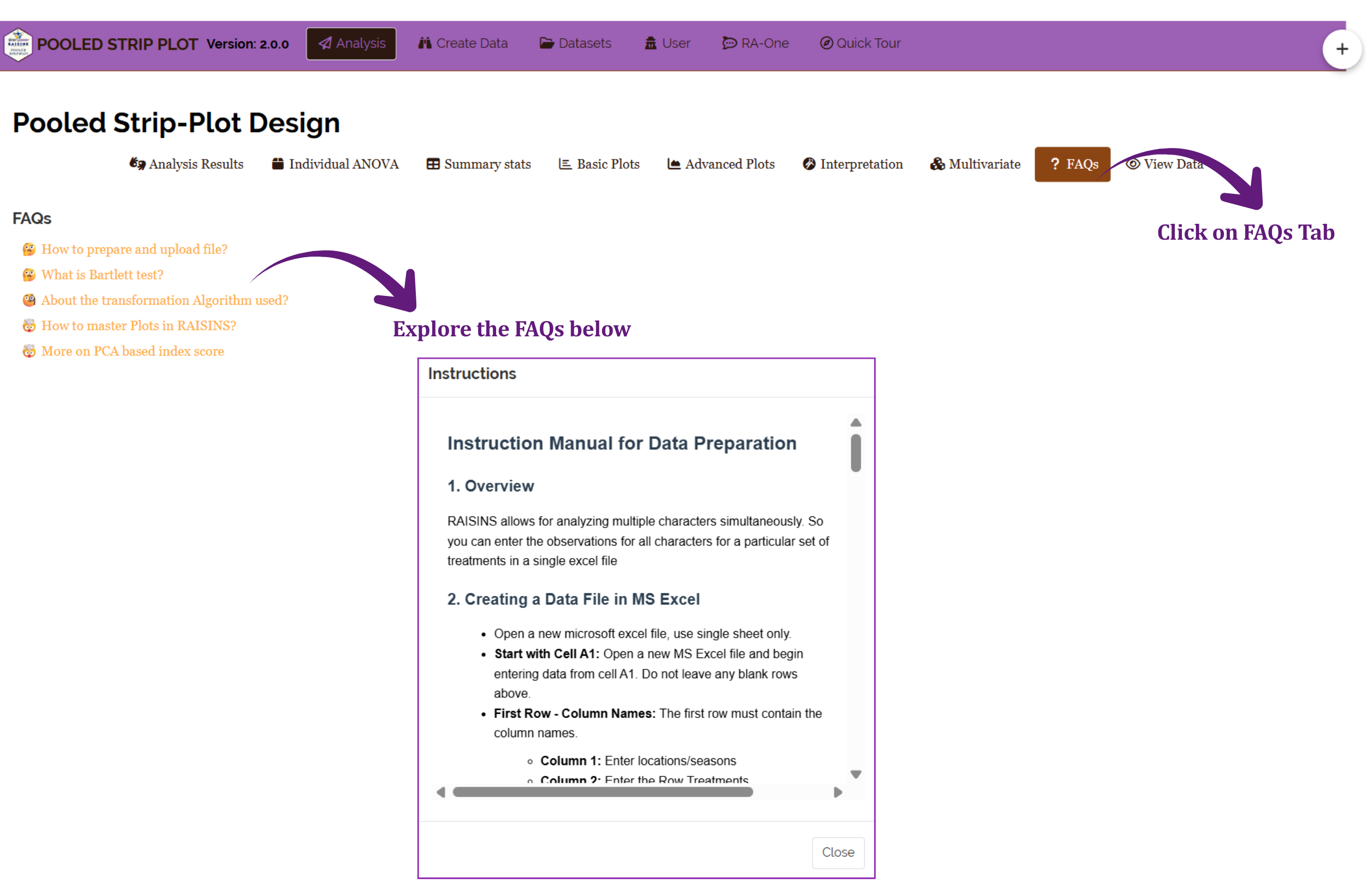
Five entries are listed: how to prepare and upload a file, what Bartlett’s test is, the transformation algorithm used, how to master plots in RAISINS, and more on the PCA-based index score. The second and third are the ones to read before your first real analysis, because between them they cover the decision that shapes every number in your output - the homogeneity check from Section 3 and the correction that follows when it fails.
The first entry opens a full Instruction Manual for Data Preparation in a scrollable panel, covering how to build the file in Excel from cell A1 onwards and what each column must contain. It repeats the guidance in Section 8.1 in the app itself, which is useful when you are preparing a file and do not have this tutorial open.
19 View data
The View Data tab shows the file exactly as the module read it, colour-coded so that problems are visible at a glance. Figure 15 shows the working example passing its health check.
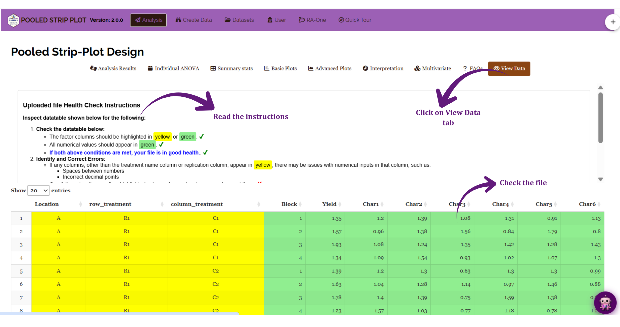
The rule is simple, and the instructions panel states it: factor columns should be highlighted in yellow or green, and all numerical values should appear in green. If both conditions hold, your file is in good health. In Figure 15 the Location, row_treatment and column_treatment columns are yellow, and Block together with Yield and Char1 to Char6 are green - which is exactly right, because those are the numeric columns.
If a column that should be numeric appears in yellow, the module has read at least one of its values as text. The instructions name the usual causes: a space between numbers, or an incorrect decimal point. Other frequent culprits are a comma used as a decimal separator, a stray character left over from copying, or a placeholder such as NA or a hyphen typed into a blank cell. Find the offending cell, fix it in the source file, and re-upload. Analysing a file in this state will either fail outright or silently drop rows.
The Show entries selector at the top left controls how many rows are displayed at a time, and the arrows beside each column heading sort by that column - a quick way to confirm that every block number appears the expected number of times at every location, which is the balance check that Section 12 turns into hard numbers.
20 Wrapping up
A strip-plot design is a compromise forced on you by the field, and a pooled strip-plot analysis is what makes that compromise answerable across environments. Two ideas carry the whole tutorial. The first is the three error terms of Section 2: row treatments judged against strip-to-strip variation, column treatments likewise, and their interaction judged against the much smaller intersection variation - which is why this design measures interactions better than main effects, and why it is the right design when the interaction is your question. The second is the pooling check of Section 3, which decides whether the environments may be combined at all, and which in our working example genuinely intervened on two of the seven traits.
Read the ANOVA in that order and the analysis is straightforward: settle the highest-order significant interaction first, then work down. In the worked example the significant three-way term means the row × column pattern itself differs between the two sites, so the honest recommendation is site-specific rather than general - and the fact that Yield and Char4 rank the two locations in opposite directions means even a site-specific recommendation has to say which trait it is optimising.
If your design is not quite this one, RAISINS carries neighbouring modules for it. A strip plot run at a single environment needs no pooling and belongs in the ordinary Strip Plot module. A main-plot/sub-plot arrangement carried over environments belongs in Pooled Split Plot (2,1); a factorial in blocks over environments belongs in Pooled 2FRBD; the same factorial unblocked belongs in Pooled 2FCRD; and a single treatment factor pooled over environments belongs in Pooled RCBD or Pooled CRD. All of them are in the Pooled Analysis group shown in Figure 1.
Record four things in your methods section, all of which the module has already told you: that location/season was treated as random and the treatments as fixed; the result of Bartlett’s test and which characters received an Aitken transformation; the post-hoc test and significance level you used; and any transformation you applied yourself. State the three error terms and their degrees of freedom in the ANOVA table rather than collapsing them into one residual line - a reader who knows the design will look for them. The CPRR in Section 5.1 supplies the version and function details that sit behind all of it.
If something in the module does not behave as this tutorial describes, or you would like a walkthrough with your own data, write to [email protected]. The team is happy to arrange a free online meeting to work through it with you.