Probit Dose/Time Response Analysis
Probit analysis models the probability of a response as a function of dose, concentration or time, and estimates effective doses such as LD50 and LC90. This tutorial explains the probit link, how RAISINS reports effective doses and fit, which goodness-of-fit statistics are valid for which data, and how to run the whole analysis code-free… Read more …
Probit analysis is the classical tool of the bioassay: it models the probability that a subject responds to a dose, concentration or exposure time, and from the fitted dose-response curve it reads off the effective dose for any response level, most famously the LD50 or LC50. This tutorial starts from first principles, what the probit (inverse-normal) link is doing, how to read an LD50 and its confidence interval, and what the likelihood-ratio test and the goodness-of-fit statistics are actually telling you (and when the latter are a valid test at all). It then walks through the complete workflow in RAISINS: preparing data in any of the three accepted formats, choosing the dose/time and response columns, the coefficient and effective-dose tables, the dose-response and diagnostic plots, a bootstrap confidence interval, automatic interpretation, and the RA-One AI assistant, all without writing a single line of code.
1 What is probit dose/time response analysis?
Let’s begin with a picture you already know from the field.
Imagine you are testing an insecticide. You take several batches of insects and expose each batch to a different dose. Then you simply count: at each dose, how many insects died?
At a very low dose, almost nothing happens, maybe one or two of the most fragile insects die. At a very high dose, almost every insect dies. And in between, as you raise the dose step by step, the fraction that dies climbs steadily, slowly at first, then quickly through the middle, then levelling off near the top.
If you plotted “fraction that died” against “dose”, you would not get a straight line. You would get a gentle S-shaped curve. Low and flat on the left, steep in the middle, high and flat on the right.
That S-shape is the natural signature of a dose-response relationship, and it appears everywhere: a pesticide against a pest, a drug against a symptom, heat or time against survival. Probit analysis is the tool that fits a smooth, principled S-curve to this kind of data, and then lets you use that curve to answer practical questions.
Why does the curve have this shape in the first place? Here is the intuition that makes everything else fall into place.
Think of each individual insect as having its own private breaking point, the smallest dose it can withstand before it succumbs. Some insects are delicate and give way at a tiny dose; some are tough and hold on much longer; most sit somewhere in the middle. If you imagine all those breaking points spread out, they pile up in a familiar bell shape: a few very sensitive, a few very hardy, and the bulk in the middle.
Now raise the dose gradually. A low dose only exceeds the breaking point of the most sensitive few, so only a few respond. A middling dose sweeps past the breaking points of the whole crowded middle at once, so the response jumps quickly. A high dose is past almost everyone’s limit, so nearly all respond. Add those up and you get exactly the S-curve. Statisticians call that spread of breaking points the tolerance distribution, and probit analysis assumes it follows that bell (normal) shape.
So probit analysis does two useful things at once:
- It draws the best S-curve through your data, describing how the chance of a response rises with dose.
- It reads answers off that curve, above all, the dose that produces any response level you care about (the dose that kills 50% of the population, or 90%, and so on), each reported with an honest measure of how sure we are.
One last question before we move on: of all the possible S-curves, how does the software decide which one is “best”?
It does not minimise distances the way fitting a straight line does. Instead it reasons like this: “Suppose the true curve were this one. How likely would I be to see exactly the pattern of deaths and survivals I actually observed?” It tries many candidate curves and keeps the single curve that makes your real, observed data the least surprising, the most probable. That sensible idea has a name, Maximum Likelihood Estimation (MLE), and it is the engine running quietly under the hood. You never have to touch it; RAISINS does it for you.
We can now write the model in one short line. Don’t worry about decoding it, read the plain-English translation just beneath.
\[\Phi^{-1}(p) \;=\; \beta_0 + \beta_1 \cdot \text{dose}, \qquad\text{equivalently}\qquad p \;=\; \Phi\!\left(\beta_0 + \beta_1 \cdot \text{dose}\right)\]
Reading it left to right:
- \(p\) is the thing we want, the probability of a response at a given dose.
- \(\text{dose}\) is your predictor, the amount applied.
- \(\beta_0\) (the intercept) and \(\beta_1\) (the slope) are the two numbers the model learns from your data; together they set exactly where the S-curve sits and how steeply it rises.
- \(\Phi\) is the bell-shaped (normal) curve from the tolerance-distribution story, and \(\Phi^{-1}\) is simply the mathematical step that un-bends the S into a straight line so it can be fitted with a slope and an intercept. That un-bending step is called the probit (or inverse-normal) link.
That is the whole model. The right-hand form says it most plainly: the probability of a response is the S-curve \(\Phi\) applied to a straight line in the dose.
Probit analysis fits the probability of a response against dose and reads off the dose that reaches any response level you choose (such as the LD50), together with a confidence interval that tells you how precisely that dose is known.
1.1 Reading an LD50 / LC50
Here is the number your reader, your reviewer, and your recommendation all actually want.
The LD50 is the dose at which the model expects half of the population to respond, the tipping point where you go from “most survive” to “most don’t”. Want the dose that affects 90%? That is the LD90. Any level works.
The name changes with what sits on your x-axis, but the idea is identical. If it is a concentration, we write LC50; if it is an exposure time, we write LT50. Same quantity, different label.
Now, the part people most often skip, and shouldn’t.
RAISINS never gives you a bare LD50. It always attaches a confidence interval, a plausible range for the true value. And that range is what turns a number into a decision.
Picture two studies that both report an LD50 of 3.3 mg. In the first, the interval is a tight [2.6, 4.1], we’ve pinned the dose down well. In the second, it is a sprawling [0.5, 9.0], the experiment simply did not have the resolution to say much. Same headline number; completely different confidence. Always read the interval next to the estimate.
And the slope (\(\beta_1\))? It tells you how sharply the curve turns. A steep slope means a small change in dose swings you rapidly from few responses to many, the population is uniform and reacts over a narrow dose window. A gentle slope means responses come on gradually over a wide range of doses.
1.2 The p-value, in plain language
Before any output tables appear, it helps to settle one idea you’ll meet again and again: the p-value. You do not need any formula for it, just the right mental picture.
Suppose, for a moment, that dose truly had no effect at all, and any pattern you see is pure luck. A p-value answers a single question:
“If dose really did nothing, how often would chance alone hand me a result at least as striking as the one I got?”
Think of it as a coincidence meter. A p-value of 0.40 means “this happens by chance all the time, nothing to get excited about.” A p-value of 0.001 means “a fluke this big would almost never happen by luck, something real is going on.” By long convention, researchers treat p < 0.05 as the line where a result is worth taking seriously as evidence of a genuine effect.
1.3 The null and alternative hypotheses
That p-value is really settling a small argument between two positions.
On one side stands a skeptic who insists nothing is happening, dose has no effect on the response. Statisticians call this cautious starting position the null hypothesis. On the other side is your claim, dose does affect the response, the alternative hypothesis.
A small p-value makes the skeptic’s position hard to defend, so you reject it and conclude the dose-response relationship is real. A large p-value means your data are perfectly compatible with “no effect”, so you fail to reject the skeptic, which, note carefully, is not the same as proving dose is useless. It only means this particular dataset did not manage to show an effect.
A little history: Bliss, the "probit", and Finney's bioassay
-
The word probit, a contraction of probability unit, was coined by the entomologist Chester Bliss in 1934 while studying how insecticides killed pests. Faced with a mortality curve that ran from 0 to 100%, Bliss straightened it by mapping each observed proportion through the inverse of the normal distribution, turning the S-shaped dose-response curve into a straight line he could fit by eye and by hand. David Finney then developed the method into a complete statistical procedure in his classic monograph Probit Analysis (1st ed. 1947), which for decades was the reference for dose-mortality and dose-response work in toxicology, pharmacology and agriculture. The closely related logit model, championed by Joseph Berkson in the 1940s, uses the logistic curve instead of the normal; the two give very similar fits, and the choice between them is largely one of tradition, probit remains standard in bioassay and toxicology, where the “tolerance distribution” story is a natural fit.
2 Dose, concentration, or time? LD, LC and LT
A quick, reassuring point before we touch any data.
The thing on your x-axis might be a dose, a concentration, or an exposure time. Good news: the mathematics is exactly the same in all three cases. The only thing that changes is the label on the effective-dose estimates, so that your report reads naturally. RAISINS asks you which one it is (an X-axis type selector) and names the estimates for you.
| If your x-axis is a… | The estimate is labelled | And it reads as |
|---|---|---|
| Dose (e.g. mg) | LD50, LD90 … | Lethal / effective dose for a given response level |
| Concentration | LC50, LC90 … | Lethal / effective concentration for a given response level |
| Time (exposure duration) | LT50, LT90 … | Lethal / effective time for a given response level |
You also choose which response levels you want, 50 and 90 by default, but any value from 0 to 100 is allowed, and RAISINS returns the corresponding effective dose for each. Pick LD50 and LD99 if that’s what your standard requires; the software simply reads them off the same fitted curve.
3 Three kinds of response data
People record bioassay results in a few different ways, and RAISINS is happy to accept any of them, it detects the shape automatically. But it is worth understanding the three shapes, because the shape you have quietly decides which extra statistics are trustworthy later on.
| Data type | What each row holds | How you enter it |
|---|---|---|
| Grouped counts | A dose, the number tested, and the number responding | A dose column, a response (count) column, and a totals column for the group size |
| Binary (0/1) | One subject per row: the dose, and whether it responded (1) or not (0) | A dose column and a 0/1 response column |
| Proportions | A dose and the fraction responding (a value between 0 and 1) | A dose column and one or more proportion columns |
All three tell RAISINS the same essential story, how response rises with dose, and all three give you the headline result: a valid effective dose (LD/LC/LT) with a confidence interval. Where they differ is in how much supporting detail they can honestly support.
Here is the key idea, in plain terms: to judge how well your curve fits, the software needs to know how many individuals stood behind each data point. Only one of the three formats carries that information.
- Grouped counts carry the group sizes, so this is the classical, fullest format. It is the only one for which the goodness-of-fit tests are a proper test, and where the “how much did dose explain?” measures are most meaningful.
- Binary data support the “how much did dose explain?” measures, but not a formal goodness-of-fit test, with one 0/1 subject per row, the fit statistic has no reliable yardstick to be compared against.
- Proportion data give you the effective dose, but with no counts behind each fraction, the “how much did dose explain?” measures cannot be computed at all (they are shown as N/A), and the goodness-of-fit numbers are shown for reference only.
You do not have to memorise this. RAISINS labels every table with the data type it detected and adds a footnote wherever a statistic should not be over-read, so you are never left to mis-interpret a number that doesn’t apply. We will meet these statistics again, in context, when they appear in Section 14.
4 Should you model on a log scale?
One small choice can noticeably improve your fit, and RAISINS makes it a single switch.
Doses and concentrations in a bioassay often span a huge range, 0.1, 1, 10, 100, jumping by powers of ten. On a raw scale those points bunch up at the low end and stretch out at the high end, and the neat tolerance-distribution story from Section 1 tends to hold better when the dose is measured on a log scale, which spaces those powers of ten out evenly.
So RAISINS offers an optional log₁₀ transform. Flip it on and the model is fitted against log₁₀(dose) behind the scenes, but, and this is the convenient part, your effective doses are automatically converted back into the original units for reporting. Your LC50 still comes out in mg/L, not in log units. (If some doses are zero or negative, which a logarithm cannot handle, RAISINS gently shifts the values first and undoes the shift afterwards, so you never have to think about it.)
For concentration bioassays spanning a wide range, the log scale is the traditional and usually the better choice. For a narrow dose range, the raw scale is often perfectly fine. Not sure? Try both, and look at the Probit Transform plot (Section 15): whichever scale makes the points fall most neatly along a straight line is the better-behaved model.
5 Getting to the module
Enough theory, let’s open the tool.
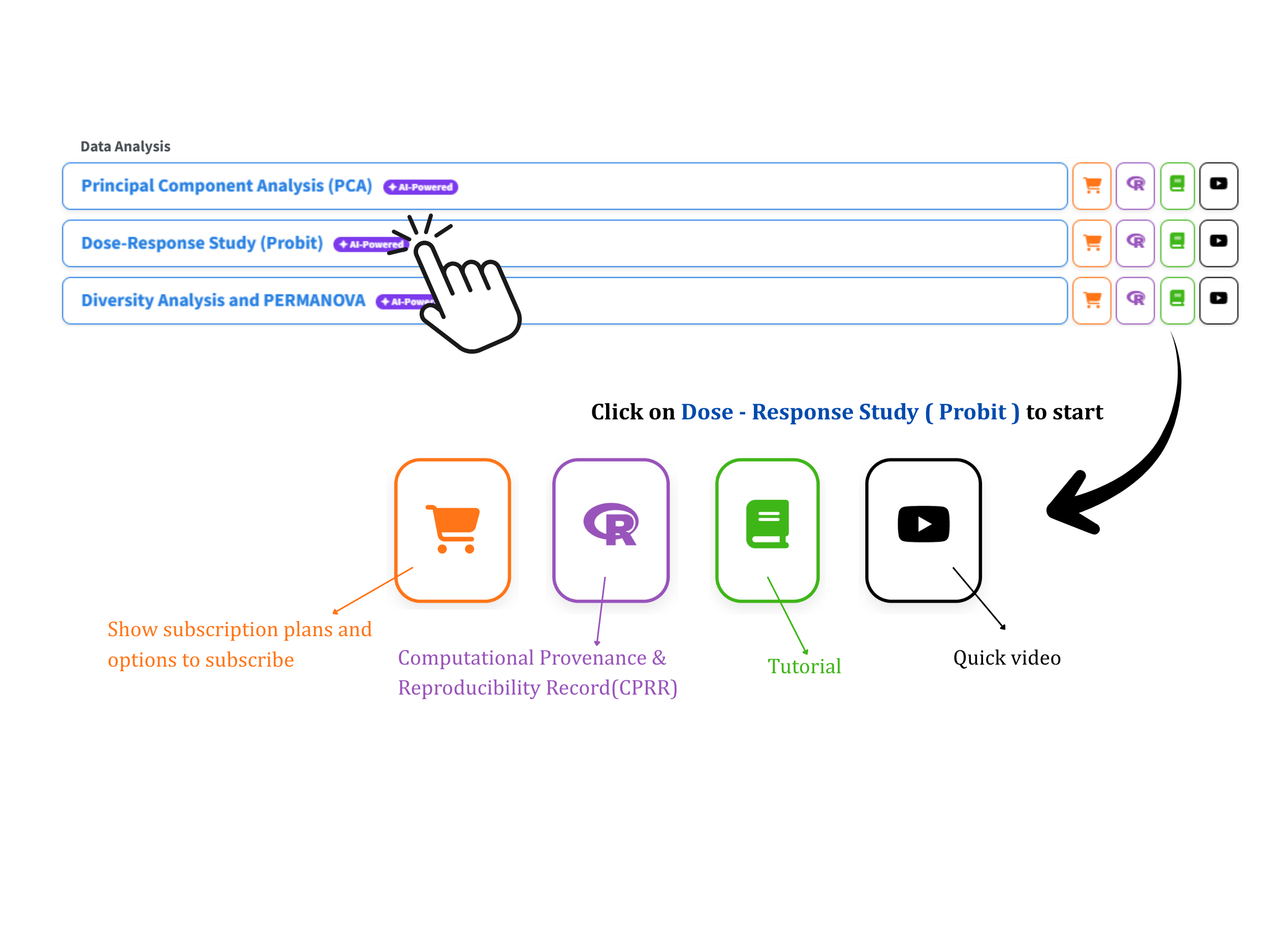
Go to the RAISINS home page at www.raisins.live and open Data Analysis. Choose the Probit Dose/Time Response Analysis module (Figure 1). There is nothing to install and no code to write: you upload your data, point to the dose/time and response columns, and RAISINS carries it all the way through to publication-ready tables and figures.
5.1 Citing RAISINS, and the record behind this module
When you write up your results, cite the platform using the RAISINS citation (available in APA, Harvard and BibTeX) at www.raisins.live/citation.html. That is your primary reference.
Alongside it, every module carries a CPRR, a Computational Provenance & Reproducibility Record. Think of it as the answer to a reviewer’s fair question: “What exactly did the software do to my data?” It names the R version and the exact version of every package, states the specific function behind each result, lists every default and decision the module makes, and includes runnable code that reproduces each step on a public dataset. It even has its own DOI, so you can cite it directly.
The CPRR for this module lives at www.raisins.live/module_record/probit.html.
Cite the RAISINS paper as your main reference for the platform, and add the CPRR when a journal asks for computing details or when you want a precise, defensible methods paragraph. The record supports the citation; it doesn’t replace it.
6 Preview mode and Quick Tour
Not ready to upload your own data yet? You don’t have to.
From the Welcome page, open Preview mode. It loads ready-made datasets so you can try everything, the analysis, the effective-dose estimates, the plots, the RA-One assistant, with no file of your own. And the first time you arrive, a friendly Quick Tour walks you through the app step by step, pointing at each tab and control and explaining what it does. You can replay the tour any time from the top navigation.
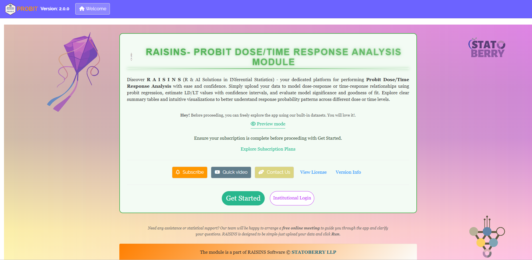
7 A working example we’ll follow throughout
So that every table and figure below shows real numbers you can reproduce, we’ll follow one dataset from start to finish, the Dose-Response Bioassay, one of the built-in examples in the Datasets tab (Section 11). Load the same file and you can follow along exactly.
It holds 50 individual observations. One column, Dose (in mg), is the amount applied; the other, Response, is scored 1 if the biological event occurred and 0 if it did not. Since each row is a single subject marked 0 or 1, this is binary data (Section 3). Our goal is simple and concrete: learn how the chance of a response climbs with dose, and pin down the LD50 and LD90, the doses that produce 50% and 90% response.
8 How to prepare your data
Everything downstream depends on clean input, feed RAISINS tidy data and it rewards you with trustworthy insight; feed it messy data and no statistic can save the result. Happily, you have four easy routes to a well-formatted file:
- Build it in MS Excel
- Build it right inside the app with Create Data
- Start from a built-in Model dataset
- Have the RA-One chat assistant generate it for you
9 Preparing data in MS Excel
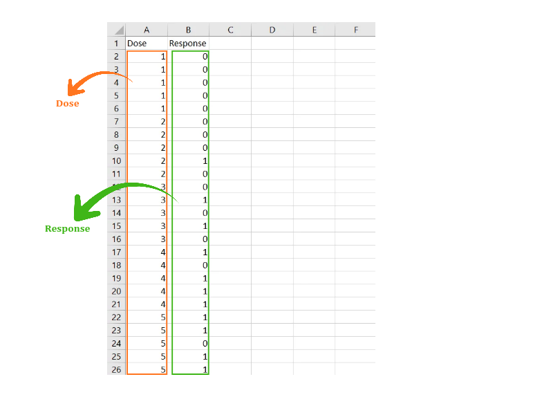
Open a fresh Excel sheet with nothing else on it. Lay the data out in columns: one column for the dose, concentration or time, and one column for each response, with one row per dose group (or per subject, for binary data).
Remember the three shapes from Section 3: a response column can hold a proportion (0 to 1), a binary 0/1 outcome per subject, or the number responding, and if it’s a count, add a totals column giving how many were tested at each dose. Keep numeric columns purely numeric (no “NA” or “–” in the cells), avoid blank rows above the data, and don’t put stray spaces in column names. Save as CSV, XLS or XLSX, CSV is lightest and loads fastest. Figure 3 shows the finished layout.
Dataset creation rules
- Column naming, no spaces; use underscores (
_) or dots (.); avoid symbols such as %, #. Always start a column name with a letter. - Data arrangement, start at the upper-left corner; the row above the data must not be blank.
- Cell management, do not type or delete in empty cells; if needed, select them, right-click and choose Clear Contents.
- Column relevance, name every column meaningfully and drop columns you will not analyse.
- Numeric only, the dose and response columns must be purely numeric. A proportion column holds values from 0 to 1; a binary column holds only 0 and 1; a count column holds whole numbers with a matching totals column.
How to save as CSV in MS Excel
- Open your workbook, data on a single sheet, correctly arranged.
- File → Save As / Save a Copy, choose a location.
- Save as type → CSV (Comma delimited) (*.csv).
- Name the file without spaces (use underscores).
- Save.
💡 Tip: before saving, confirm the dose column is numeric and increasing, and the response column holds the right kind of value (proportion, 0/1, or count with a totals column).
10 Prepare using Create Data in RAISINS
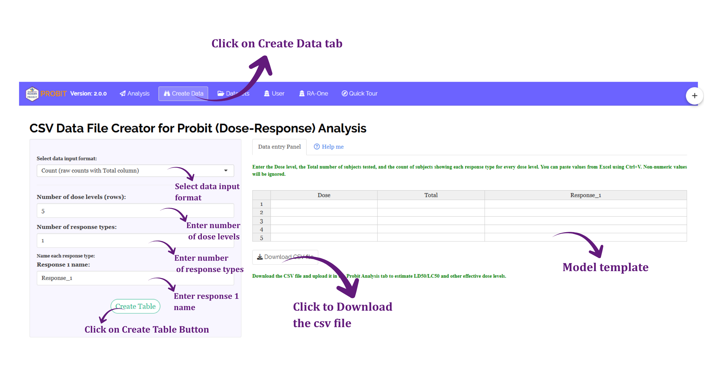
Not sure about the format? Let RAISINS build the template for you:
- Go to the Create Data tab
- Choose how many response columns you need
- Choose how many dose groups (rows)
- Click Create
A ready table appears with a Dose column and your response column(s). Type your values straight in, or download the blank CSV and fill it in Excel, either way, upload it under Analysis when you’re done.
11 Download Model Datasets
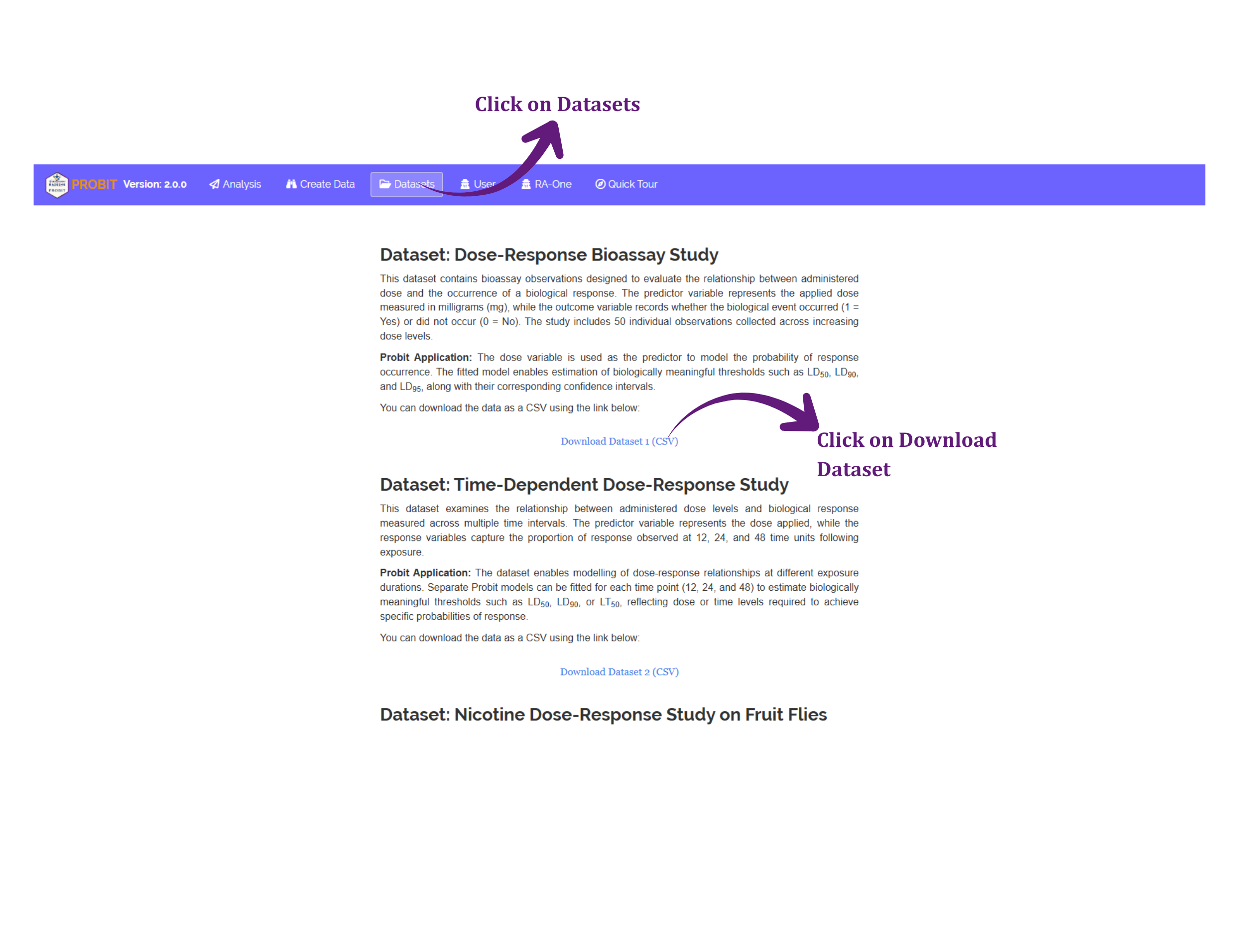
Want to explore before committing your own data? Grab a ready-made example. The Datasets tab offers three, one for each data shape you’ll meet:
- a Dose-Response Bioassay, a binary 0/1 response against dose (this is our working example),
- a Time-Dependent Dose-Response study, proportions recorded at 12, 24 and 48 time units (ideal for LT estimates), and
- a Nicotine Dose-Response study on fruit flies, proportion killed against concentration (an LC example).
Click Download CSV for the one you want, and use it as a formatting template or upload it directly to try the analysis.
12 Creating a dataset using RA-One chat
The friendliest route of all: just ask.
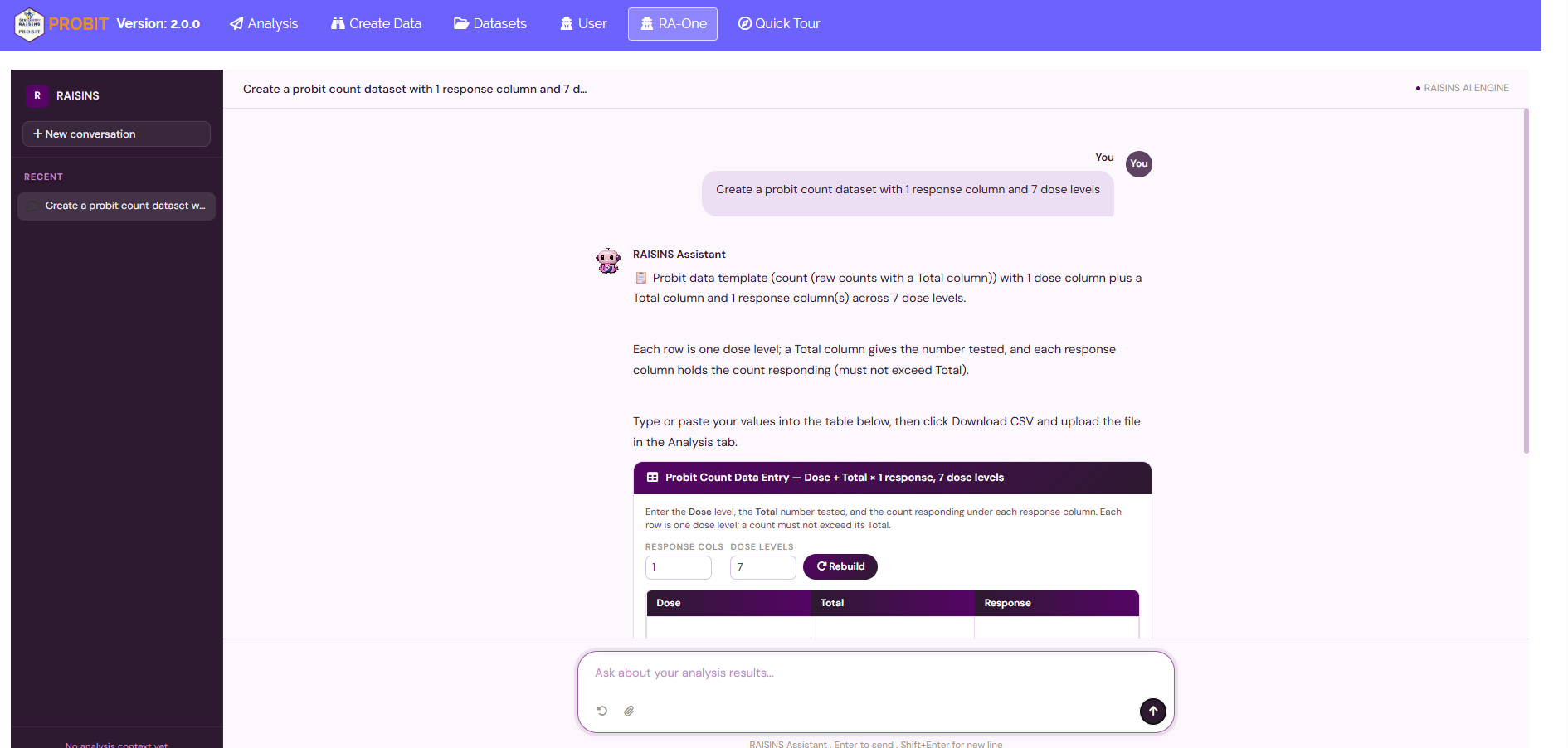
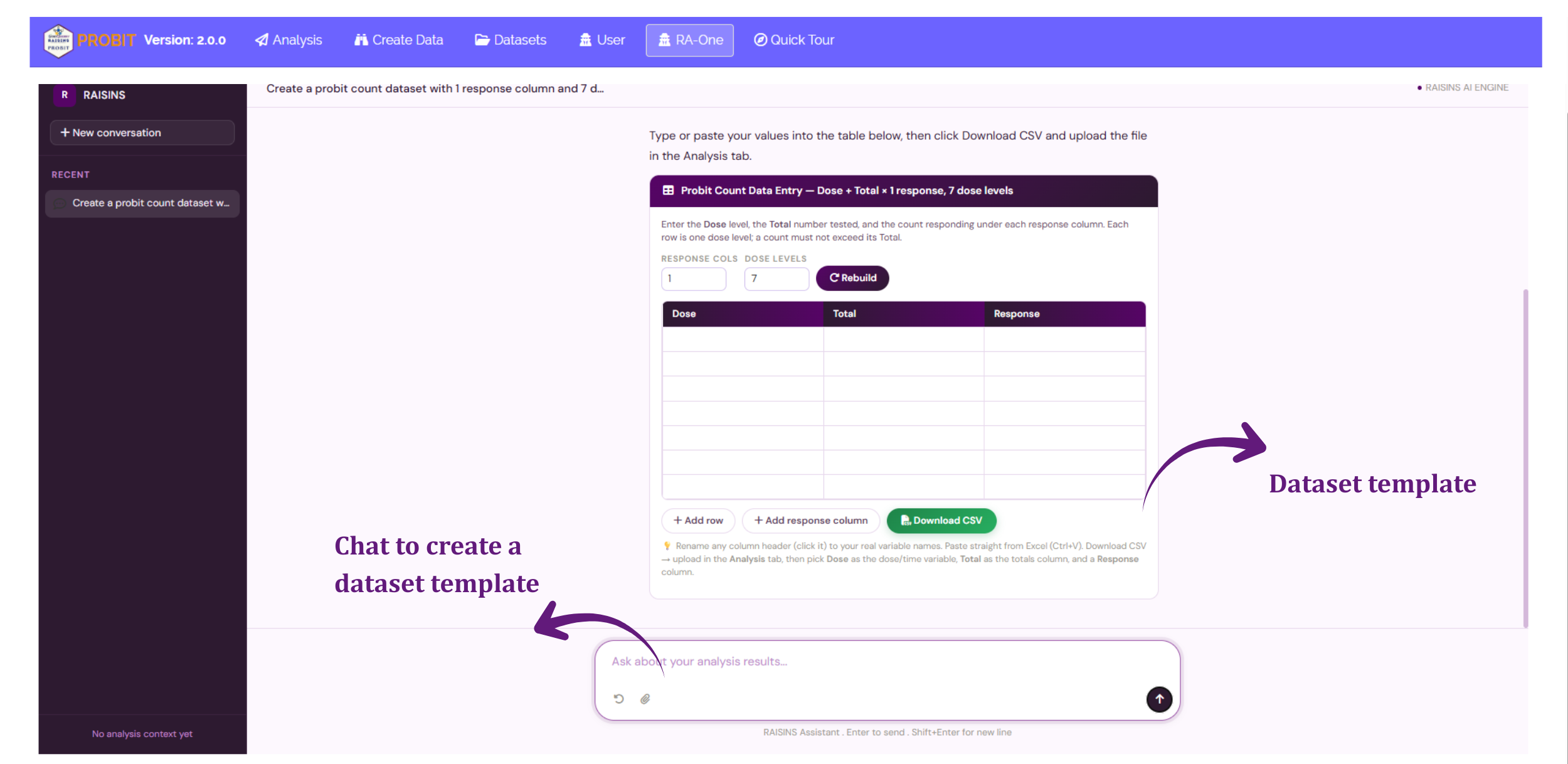
RA-One, the built-in chat assistant, will build a correctly formatted dataset for you through a plain conversation, in any of the three response formats (Section 3). Open RA-One from its tab or the floating chat bubble and tell it the format you want (proportion, binary or count), how many response columns, and how many rows, for example, “create a probit count dataset with 1 response column and 7 dose levels.” It hands back an editable template with a Dose column (and, for the count format, a Total column) ready to fill. Review it in the chat, download the CSV, and upload it under Analysis (Figure 6).
13 The Analysis tab
With a clean file in hand, running the analysis takes a moment. Figure 7 shows the Analysis tab.
Click Browse in the sidebar and upload your CSV or Excel file. A few selectors then appear, and each one just mirrors a choice we’ve already discussed:
- Dose/Time variable, the column with your applied dose.
- X-axis type (Dose, Concentration or Time), so your estimates are labelled LD, LC or LT (Section 2).
- Response variable(s), the column(s) with the outcome; and, if your data are counts, the Totals column.
- The effective-dose levels you want (50 and 90 by default), the significance level (α) for the intervals, and, optionally, the log₁₀ transform (Section 4).
Now click Run Analysis! Instantly, results fill the sub-tabs, Analysis Results, Plots and Graphs, Interpretation, RA-One, FAQs and View Data. On the results panel you can also set how many decimal digits the tables show. Let’s read those results next.

14 Analysis results
The Analysis Results sub-tab lays out everything the model learned, as six tables, in the same order they appear on screen and in a downloaded report: a look at your raw data, the fitted equation, the overall verdict on fit, the individual coefficient estimates, a goodness-of-fit check, and finally the effective-dose estimates you came for. We’ll take them one at a time, and explain each new statistic exactly where it appears, not before.
Table 1: Data Summary
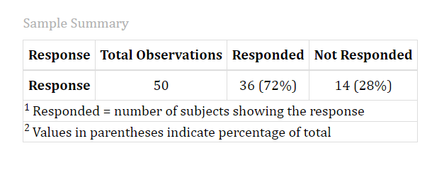
Before any curve or statistic, it helps to simply get your bearings in the data. This first table does exactly that: how many observations you have in total, and how many of them responded versus didn’t.
Interpretation from Figure 8
Our working example has 50 total observations, of which 36 (72%) responded and 14 (28%) did not. Nothing to interpret yet, this is simply a sanity check that the right file, with the right number of rows, has loaded correctly.
Table 2: Fitted Probit Regression Equation
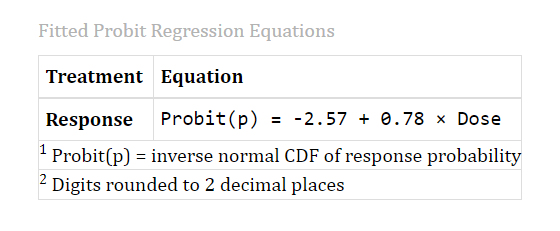
Recall the model equation from Section 1, the intercept and slope that together set exactly where the S-curve sits and how steeply it rises. This table hands you your curve’s actual numbers, slotted straight into that same equation.
Interpretation from Figure 9
For our example, RAISINS reports:
\[\text{Probit}(p) = -2.57 + 0.78 \times \text{Dose}\]
This is the exact line your model fitted. Table 4, next, breaks that intercept and slope apart and tests each one individually.
Table 3: Overall Model Fit
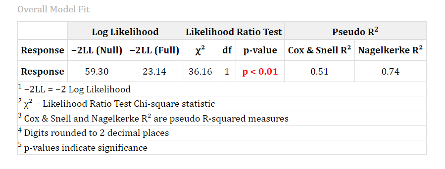
This table steps back and asks a bigger question: did the model, as a whole, do a good job? It answers in three gentle stages, and each has a plain idea underneath it.
1. How badly does the model miss? Every fitted curve leaves some gap between what it predicts and what actually happened. RAISINS reports that total gap as a single “miss score”, lower means the curve sits closer to your data. You’ll see two of these scores: one for a bare model that ignores dose entirely, and one for your real model that uses dose. The technical name for this miss score is the deviance (or, equivalently, the −2 log-likelihood), but you can simply read it as smaller = better fit.
2. Did adding dose actually help? Compare those two miss scores. If bringing dose into the model shrinks the gap by a lot, dose is pulling real weight; if it barely helps, dose might be adding little. RAISINS turns “how much did the miss score improve?” into a single test with a p-value, the same coincidence meter again, asking whether the improvement is bigger than luck would give. This overall test is the Likelihood-Ratio Test (LRT). A small p-value here means dose genuinely matters to the outcome.
3. How much of the story did dose explain? In ordinary regression you’d reach for R², the “percentage explained.” Probit models don’t have an exact R², so RAISINS reports a couple of well-established stand-ins that run from 0 (dose explains nothing) toward 1 (dose explains almost everything). These are the pseudo-R² measures, Cox & Snell and Nagelkerke. They tell the same story in two flavours: Cox & Snell is bounded a little below 1, so it can be awkward to read at face value; Nagelkerke rescales it so it can reach a full 1.0, which is why it’s the one most often quoted. Treat both as a rough sense of strength, not a precise percentage.
Understanding the Overall Model Fit table
| Column | What it means |
|---|---|
| -2LL (Null) | The miss score of a bare model that ignores dose entirely |
| -2LL (Full) | The miss score of your real model, using dose, smaller than the Null score means dose helped |
| Chi-sq, df, p-value | The Likelihood-Ratio Test: how much the miss score improved by adding dose, and whether that improvement is bigger than chance |
| Cox & Snell R² | A pseudo-R², bounded a little below 1 |
| Nagelkerke R² | The same idea, rescaled to reach a full 1.0, the more commonly quoted of the two |
Interpretation from Figure 10
For our example the miss score falls from 59.30 (dose ignored) to 23.14 (dose included), a highly significant improvement (likelihood-ratio chi-square = 36.16 on 1 degree of freedom, p < 0.01). Dose clearly explains a meaningful part of the response. The two pseudo-R² measures agree: Cox & Snell = 0.51 and Nagelkerke = 0.74 both point to a strong relationship. (As a reminder from Section 3, these pseudo-R² measures are reported as N/A for proportion data, since there are no subject counts behind each proportion.)
Table 4: Parameter Estimates of Probit Model
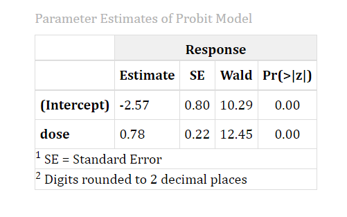
Table 3 gave you the overall verdict; this table zooms into the two individual numbers that built it, the intercept and the dose slope you just saw plugged into the equation in Table 2. For each, RAISINS reports the estimate, its standard error (a measure of how uncertain that estimate is, smaller is tighter), and then a small significance check of its own.
That check works exactly like the coincidence meter from earlier. It asks: “Could this slope really be zero, with the value we see just a fluke of sampling?” It measures how many standard errors the slope sits away from zero, squares that distance into a single score, and turns it into a p-value. The score has a name, the Wald chi-square, but the takeaway is the plain-language p-value beside it.
The number you care about most is the dose slope. A slope that is clearly positive and significant means the chance of a response genuinely rises with dose, your dose-response relationship is real.
Interpretation from Figure 11
In our working example the dose slope is 0.78, with a Wald chi-square of 12.45 that is highly significant (p < 0.01). In everyday words: as dose goes up, the probability of a response climbs steadily, and a rise this clear would essentially never appear by chance. The intercept (−2.57) just fixes where the curve sits; on its own it has no direct field interpretation, so we don’t try to read meaning into it.
Table 5: Model Fit and Goodness of Fit Summary
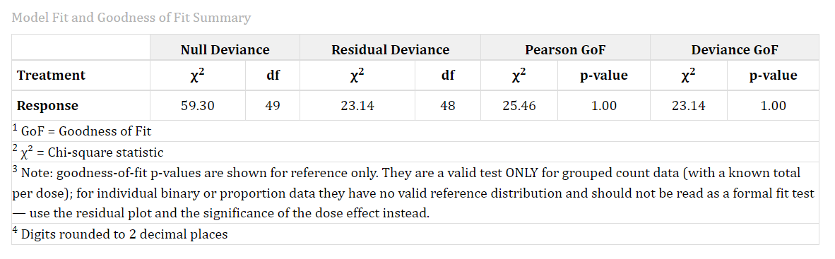
Table 3 told you dose matters, and Table 4 just quantified each term’s own significance. Neither one tells you whether the shape of the fitted curve is right. This table asks that different question: does the fitted S-curve actually track your data closely, dose group by dose group? RAISINS reports two versions of that check, the Pearson and deviance chi-square statistics, each measured against the residual degrees of freedom left in your data. A large p-value here is reassuring, it means there’s no strong evidence the curve is missing some real pattern; a small one flags a curve that isn’t capturing something it should.
Remember the fair-play rule from Section 3: this is a proper lack-of-fit test only for grouped count data, because only that format tells the software how many individuals stood behind each point.
For our binary working example, RAISINS still reports the numbers, but footnotes them for reference only, since the statistic has no valid reference distribution to test against for this data type. Treat them as a rough diagnostic, not a formal verdict, none of this is a limitation of the software, it’s simply being honest about what your data can and cannot support.
Interpretation from Figure 12
In our binary working example, the Pearson chi-square is 25.46 and the deviance chi-square is 23.14, both measured against 48 residual degrees of freedom, with p-values that round to 1.00. Because our data are binary, we read this only as a rough hint that nothing looks obviously wrong, our real check on the shape of the fit comes from the Probit Transform and residual plots, which we get to in the Plots & Graphs section below.
Table 6: Lethal Dose (LD / LC / LT) Estimates
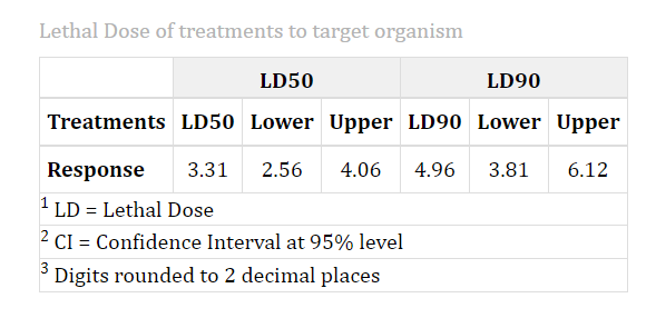
This is the table you came for, the payoff of the whole analysis.
Your response variable gets one row, and each response level you asked about gets its own group of three columns: the effective dose RAISINS reads off the fitted curve at that level, and the confidence interval around it (that plausible range we insisted on in Section 1). Behind the scenes, when you use a log scale, the interval is worked out on the fitted scale and then converted back to real units, which is why a logged fit gives a slightly lop-sided (asymmetric) interval, that is correct, not a glitch.
Understanding the effective-dose table
| Column | What it means |
|---|---|
| Treatments | The response variable this row summarises |
| LD50 (or LC50 / LT50) | The point estimate: the dose, concentration or time that produces a 50% response |
| Lower / Upper, under LD50 | The confidence interval around that estimate; a narrow range means a well-pinned-down effective dose |
| LD90, Lower, Upper | The same three columns again, repeated for your next requested response level, and so on for every level you asked about |
Interpretation from Figure 13
Here the LD50 is 3.31 mg, with a 95% confidence interval of [2.56, 4.06], and the LD90 is 4.96 mg, with an interval of [3.81, 6.12].
Read it like this: we expect half the population to respond at about 3.3 mg, and we’re fairly confident the true half-response dose lies somewhere between 2.6 and 4.1 mg, a tight, dependable range. The LD90 interval is wider, and that’s expected: doses far out in the tail of the curve are always harder to estimate precisely, because there are fewer data points to anchor them.
An effective dose without its confidence interval is only half an answer. Two studies can report the same LD50 and mean wildly different things, one nailed down, one barely guessed. Whenever you report an effective dose, report the interval right beside it.
15 Plots & Graphs
Tables tell you the numbers; pictures tell you whether to trust them. The Plots and Graphs tab gives you five figures, each answering a different question about your fit. Every plot has its own Plot Settings panel (titles, axis labels, colours, theme and more), and every plot downloads as PNG, JPEG, TIFF, PDF, SVG or EPS at the size and resolution you choose, ready to drop into a manuscript.
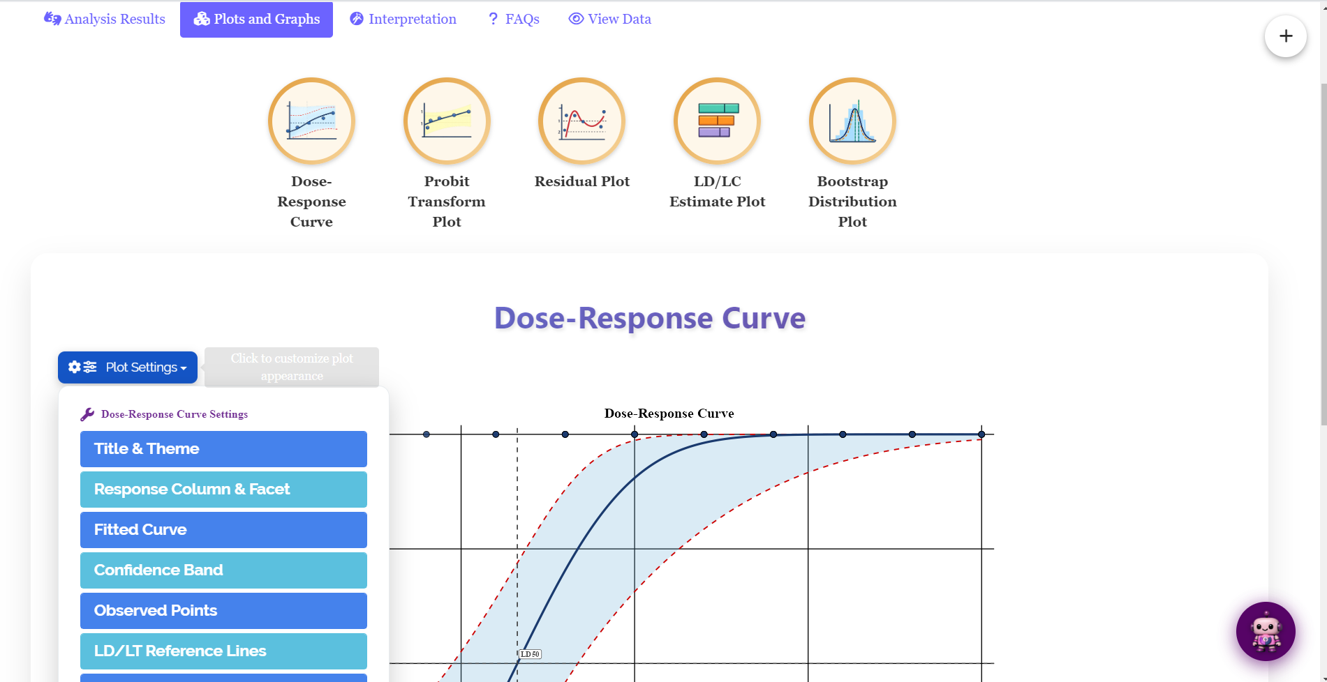
Here’s what each one is for. The dose-response curve is the picture of your result, the fitted S-curve with your data on top. The probit transform plot is your straight-line sanity check. The residual plot hunts for any pattern the curve missed. The LD/LC estimate plot shows your effective doses and their intervals at a glance. And the bootstrap plot double-checks your confidence interval a second, independent way. Hover over any thumbnail below to see what it shows.
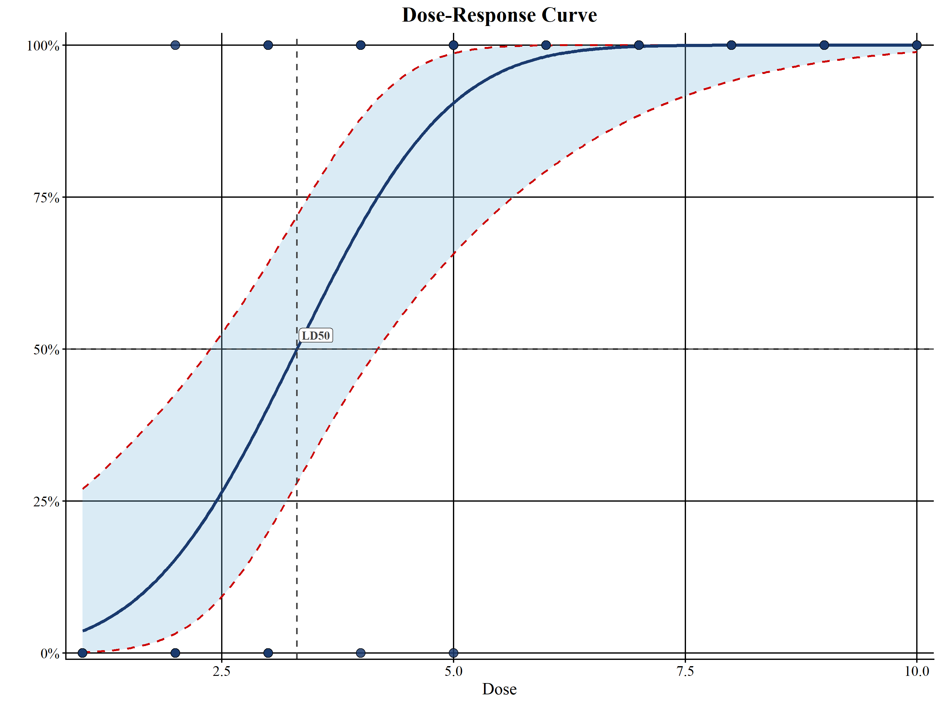
Dose-response curve, your fitted S-curve of response probability against dose, with the confidence band and your observed points overlaid, and optional LD50 reference lines. The main picture of your result.
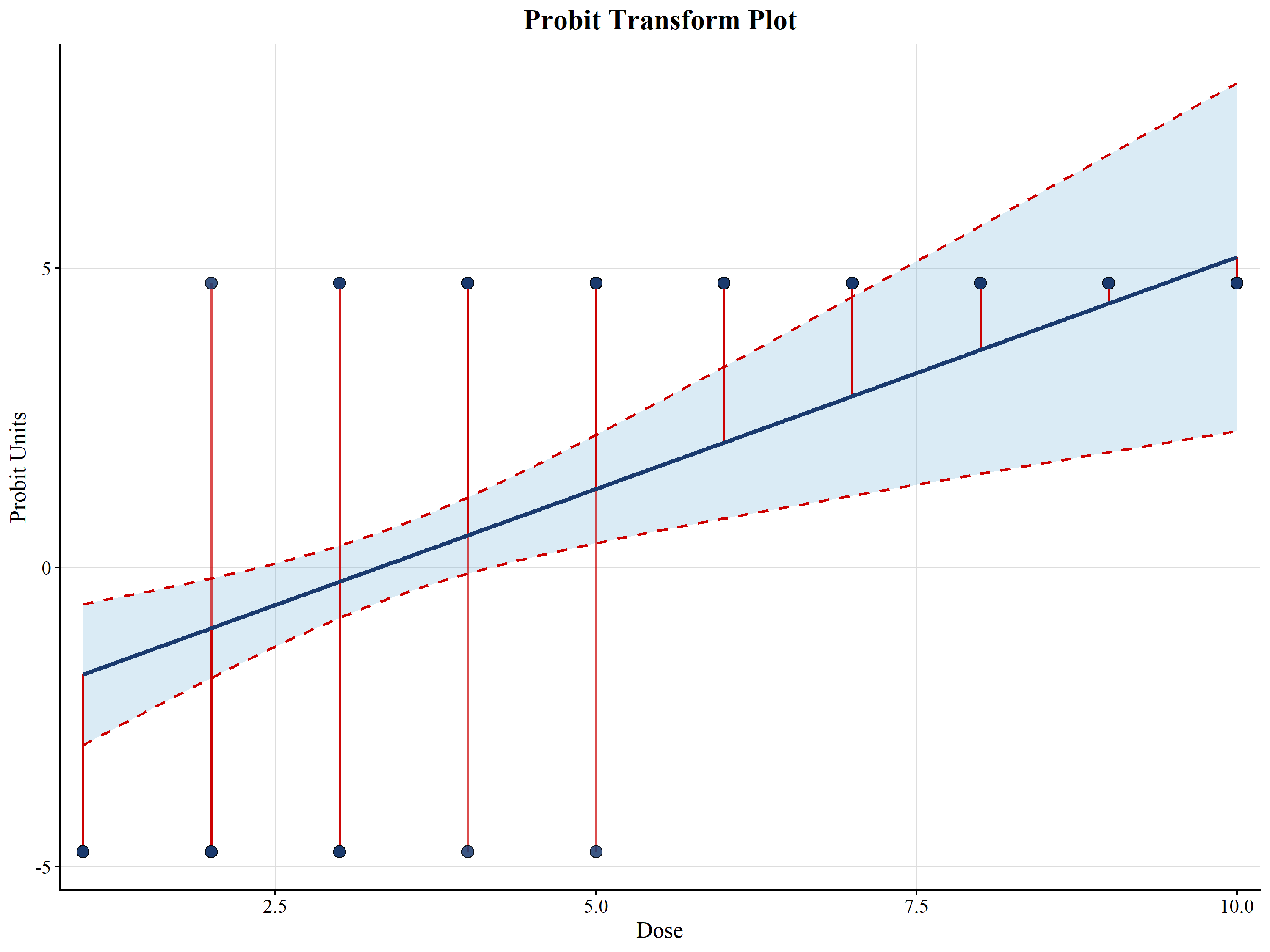
Probit transform plot, the same fit redrawn on the “un-bent” probit scale, where a good model shows up as a straight line. Points bending away from the line hint that a different (e.g. log) dose scale would fit better.
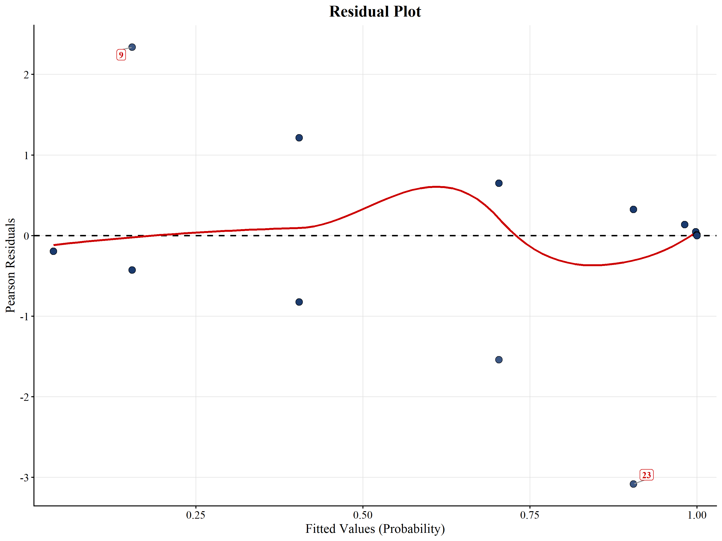
Residual plot (diagnostic), the leftover gaps between data and fit. You want a shapeless cloud around zero; any clear pattern or lone extreme point is worth a second look.
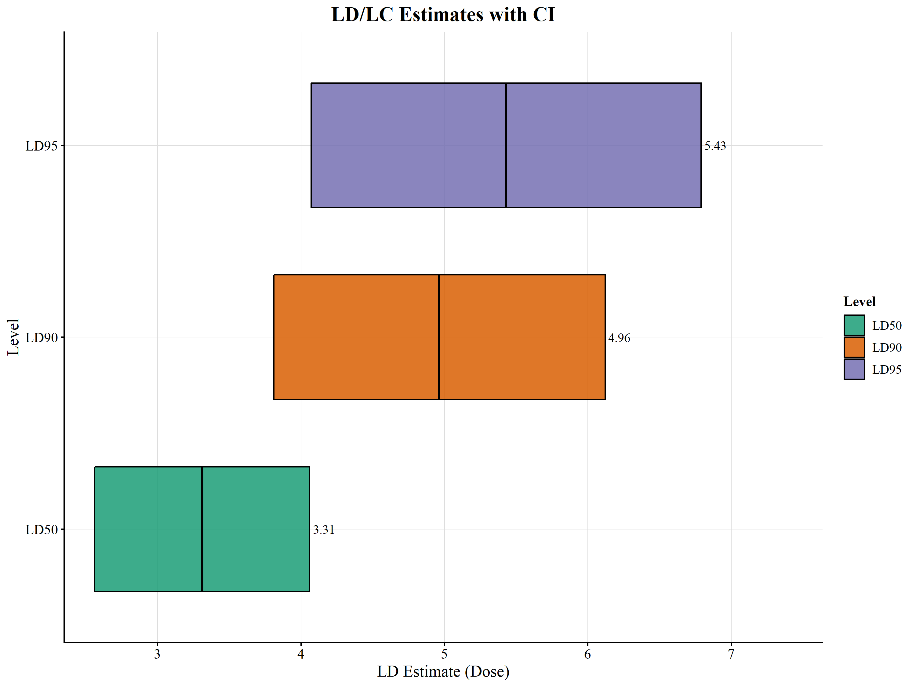
LD/LC estimate plot, each effective dose shown as a point with its confidence interval, a compact visual summary of the effective-dose table.
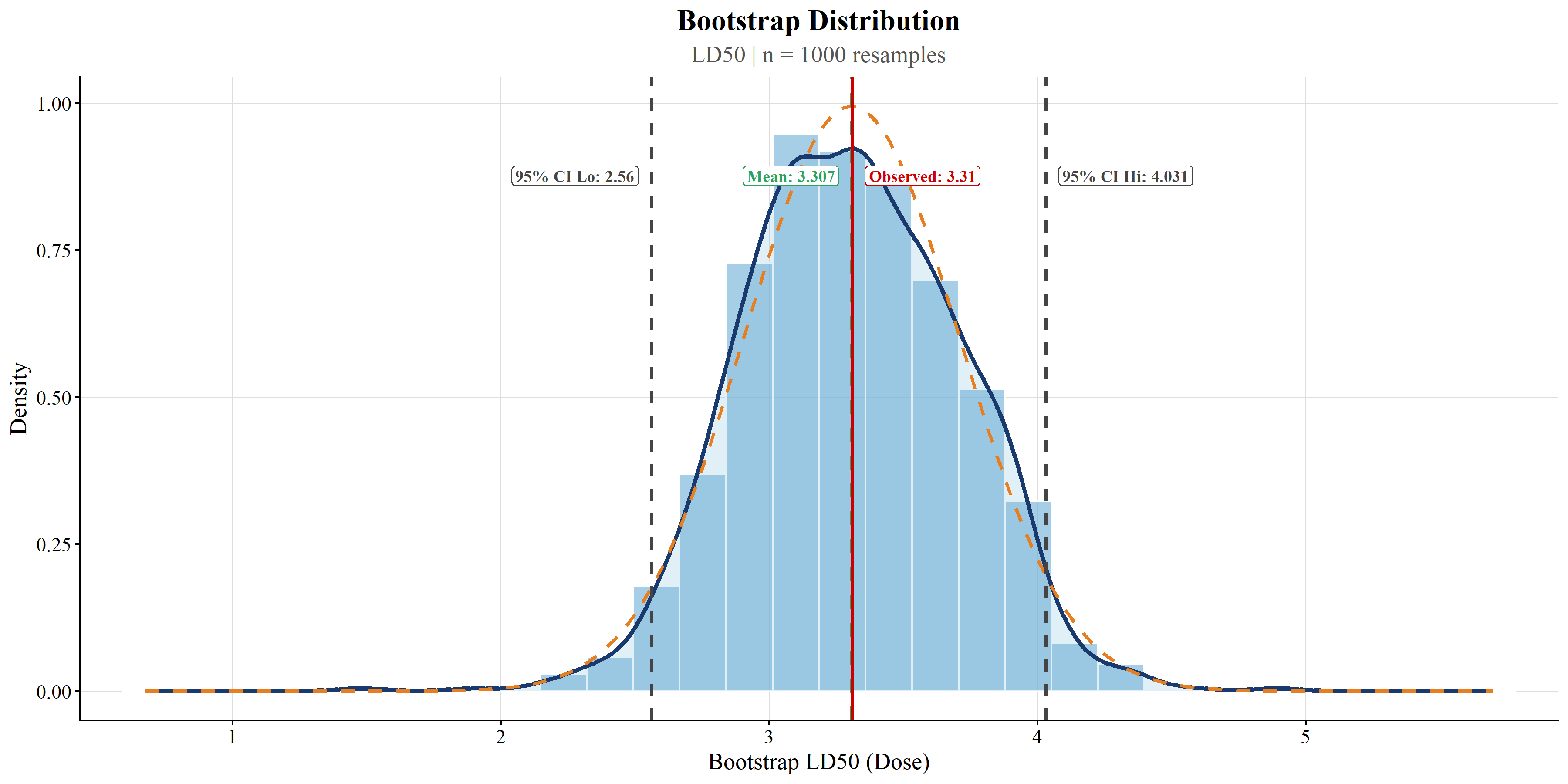
Bootstrap plot, an independent, assumption-light re-check of your effective-dose interval, built by re-drawing the sample many times (see below).
Two of those five deserve a word of intuition, because they lean on ideas we haven’t met yet.
The probit transform plot is the clever trick from the very start of this tutorial, undone. Recall that the probit link “un-bends” the S-curve into a straight line so it can be fitted. This plot simply shows you that straightened picture. If your model is a good match, the points hug a straight line; if they curve away, your dose scale probably needs a rethink (try the log switch from Section 4).
The bootstrap plot is a wonderfully honest way to double-check the LD50 interval. Instead of trusting a formula, the computer treats your sample as a stand-in for the whole population and re-draws it at random, over and over, computing a fresh LD50 each time. The spread of all those re-drawn LD50s traces out how much your estimate would wobble if you’d happened to sample slightly different individuals, and the middle 95% of that spread is a confidence interval built with almost no assumptions. If it lines up with the interval in Table 2, that’s reassuring. This resampling idea is called the bootstrap, and you don’t need any of its mathematics to read the picture: a narrow, tidy peak means a well-determined effective dose.
16 Interpretation
Now for the part that saves you an afternoon of writing.
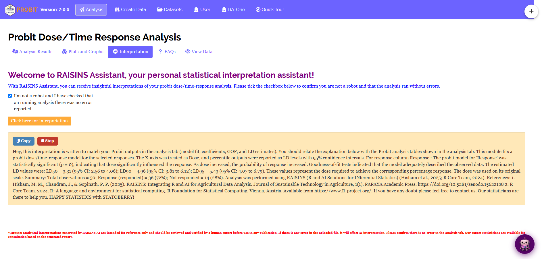
The Interpretation sub-tab turns all of the above into a clear, plain-English write-up of your results (Figure 20): whether the dose effect is significant and in which direction, the key effective doses with their intervals, how well the model fit, and, where your data type allows it, the goodness of fit, phrased so it reads like a ready-to-adapt methods-and-results paragraph. The text appears with a gentle typing animation; a Stop button reveals it all at once, and a Copy button drops the plain text onto your clipboard, ready to paste straight into a manuscript.
17 RA-One Chat
Still have a question? Just ask your data.
RA-One is the built-in conversational assistant, reachable from its own tab or the floating chat bubble. Ask anything in plain language and it answers from your analysis, never generic filler, and never invented numbers; if a value isn’t available, it tells you so. Every reply is plain English, with no code.
Because RA-One reads your Analysis Results and knows which data type you have, it interprets responsibly. It will happily explain your LD50 and its interval, but it will decline to claim a “good fit” from a goodness-of-fit p-value when your data are binary or proportions, pointing you to the residual and transform plots instead (exactly the fair-play rule from Section 3). It also answers general concept questions, what the probit link is, why a log scale helps, how LD50 differs from LC50, so you build understanding right alongside your results.
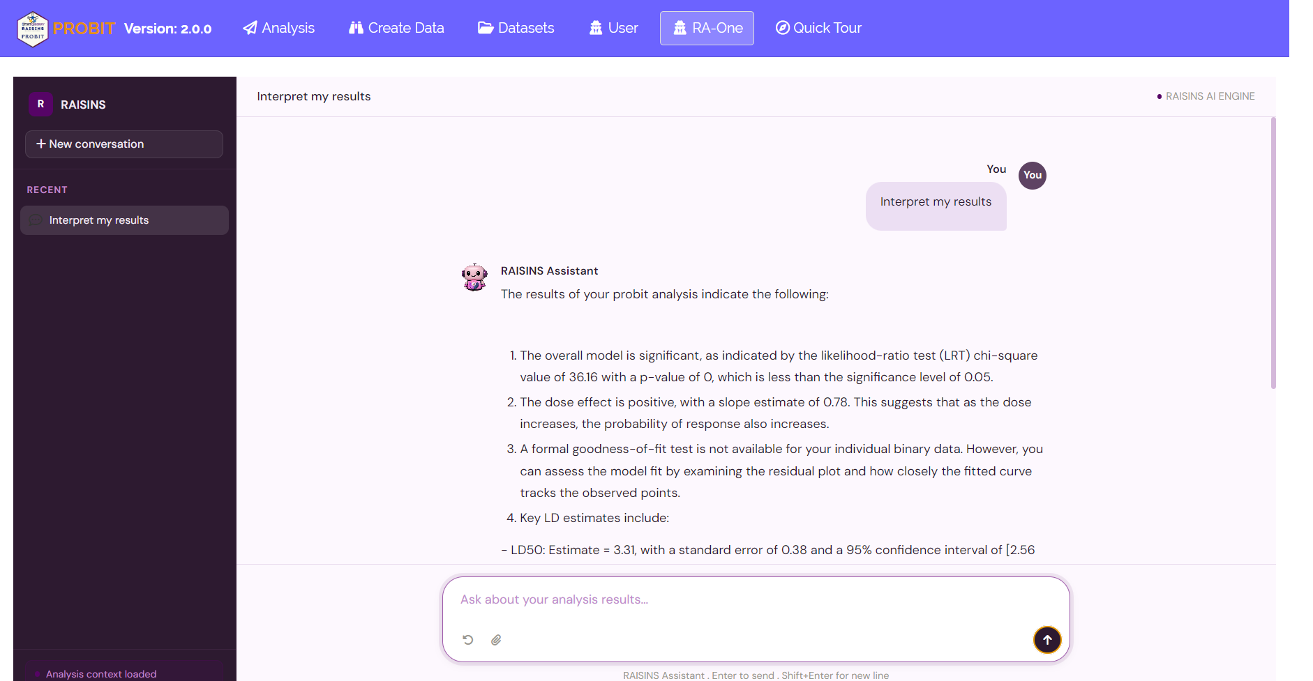
The same chat can also prepare your data, build a correctly formatted template (Section 12) or fetch a model dataset (Section 11), and, most usefully, draw plots on request. Ask for “the dose-response curve”, “the probit transform plot”, “the residual plot”, “the LD/LC estimate plot” or “the bootstrap plot”, all five figures from Section 15, and RA-One renders it right in the conversation. Each chat plot comes with a toolbar to switch graphics and a Plot Settings panel to pick the response and restyle it (colours, theme, point shape, the confidence band and LD reference lines, the residual LOESS smoother, the bootstrap display and resample count, and more), plus a one-click high-resolution download.
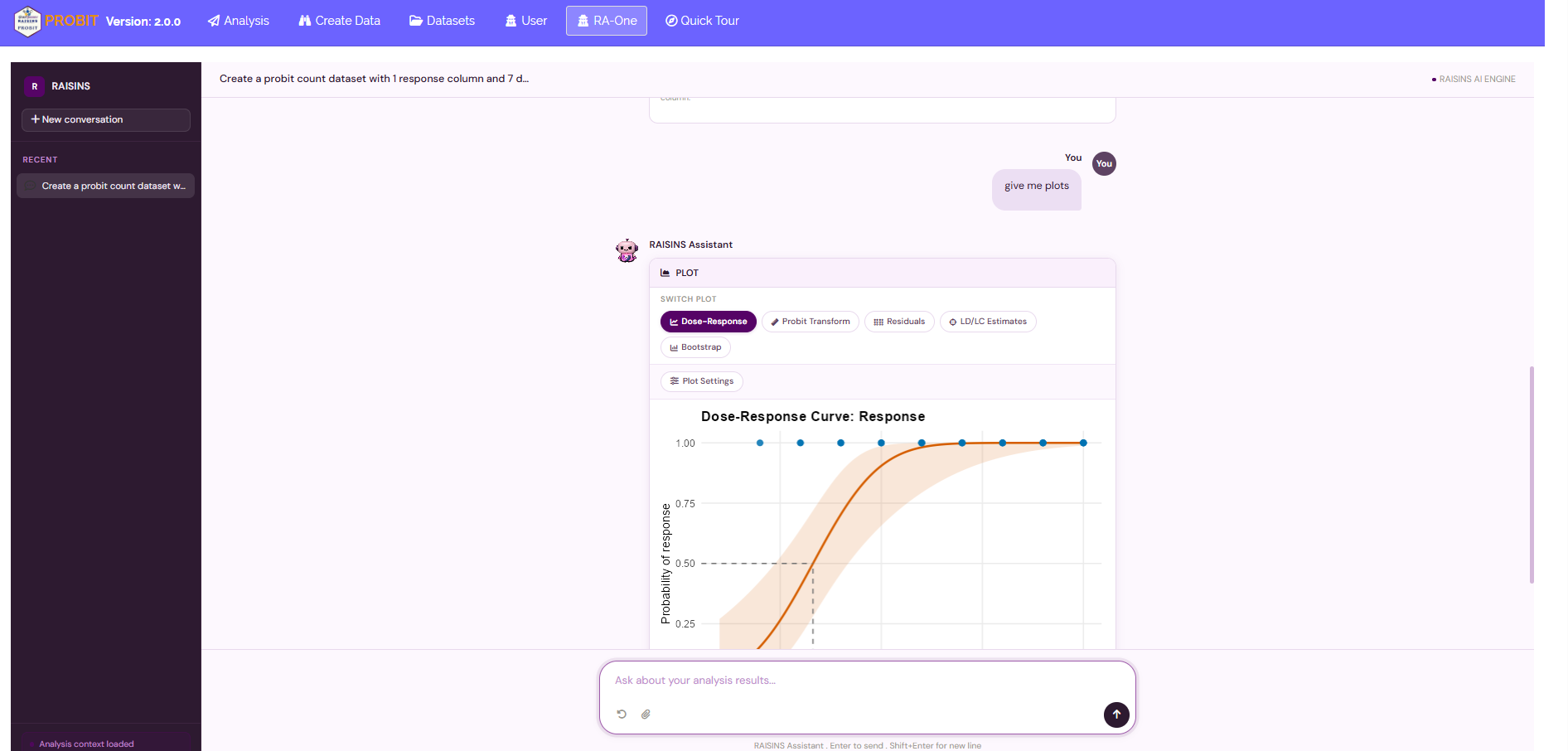
In a single conversation RA-One can interpret your results, build a data template, fetch a model dataset, and draw customizable plots, so much of a routine probit-analysis session can happen without ever leaving the chat.
18 FAQs
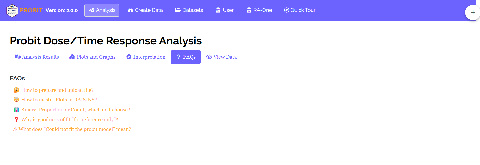
A dedicated FAQs tab answers the questions that come up most, how to read an LD50 and its interval, when to switch on the log scale, how the three data formats differ, and why a goodness-of-fit test is reported for some data and not others, with clear explanations and practical tips. If you’re ever unsure how something works, start here.
19 View data
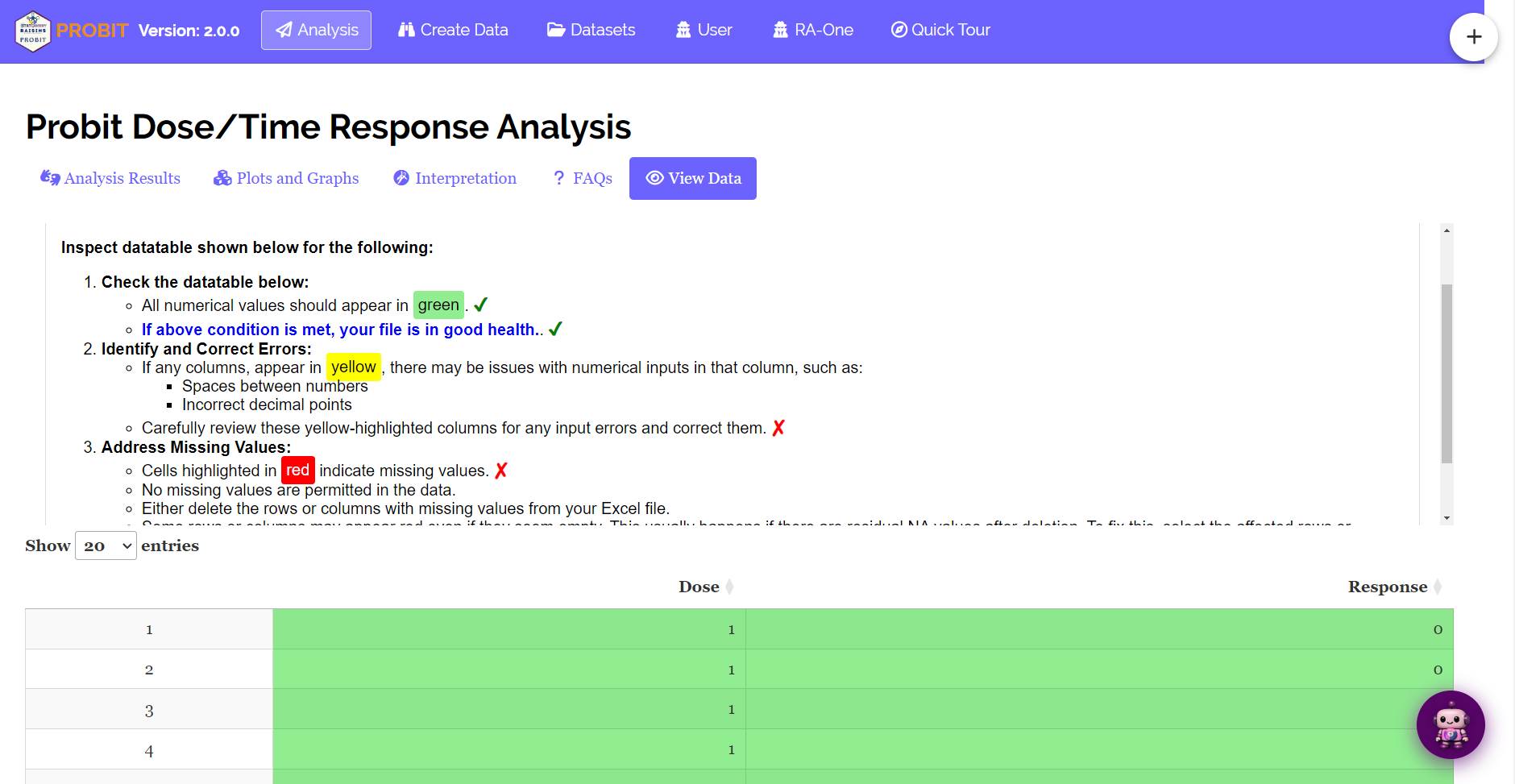
Finally, your safety net. View Data is the first line of defence for data integrity. The moment you upload, RAISINS runs an automatic Health Check: it inspects your columns and flags anything that would spoil the fit, non-numeric values, missing entries, or formatting slips in the dose and response columns. Clear those flags before you click Run Analysis!, and every result that follows rests on clean, correctly typed data.
20 Wrapping up
Step back and notice how simple the whole thing really was. Probit analysis rests on one honest question: at what dose does the population cross a chosen response level, and how sure are we?
Everything else you met, the S-curve and its probit link, the likelihood-ratio test, the goodness-of-fit numbers read in the light of your data type, the diagnostic and bootstrap plots, exists for one purpose: to estimate that effective dose fairly and report it with its uncertainty. RAISINS runs all of that machinery for you, so your energy goes where it belongs, into what the answer means for your research.
If you get stuck at any point, RA-One is on call 24 × 7, or write to us at [email protected]. Happy analysing!