Response Surface Methodology
Response Surface Methodology fits a smooth mathematical surface to a handful of well-chosen experimental runs so that the best combination of several continuous factors can be found without testing every possibility. This tutorial explains where the Central Composite and Box-Behnken designs come from, how to generate either one directly inside RAISINS, and how to run the whole analysis, from model fitting to optimisation… Read more …
Response Surface Methodology (RSM) is used when a continuous response variable is influenced jointly by several continuous factors and the goal is to find the factor combination that maximises, minimises, or hits a target for that response. RAISINS fits the appropriate second-order model for a Central Composite or Box-Behnken design, reports the ANOVA with a lack-of-fit test, performs a canonical analysis to classify the stationary point, offers ridge analysis and a full optimisation routine with desirability functions, and presents a plain-language interpretation of the results, all without requiring you to write a single line of code. This tutorial will guide you through the theory, the design, and the analysis step-by-step.
1 What is Response Surface Methodology?
Response Surface Methodology (RSM) is a collection of statistical and mathematical techniques for developing, analysing, and optimising empirical models that describe the relationship between a response variable and two or more continuous experimental factors. RSM is primarily concerned with identifying the nature of the response surface and determining the combination of factor levels that produces a desired response, such as its maximum, minimum, or a specified target value. The methodology typically involves fitting a low-order polynomial model, most commonly a second-order model, using an appropriately designed set of experimental runs. The fitted model is then used to study the effects of the factors, examine their interactions and curvature, and locate and characterise the optimum region of the response surface.
For example, suppose a farmer wants to find the best conditions for growing a crop. The farmer can change the amount of water, fertilizer, and micro nutrients. The best crop growth may not come from applying all of these at the heighest level. A moderate amount of water may work well with a particular amount of fertilizer, while too much of either may reduce growth. Trying every possible combination would require many experiments. RSM helps find the best combination of these factors using a smaller number of experiments.
When several factors affect a result, how can we find the best combination with fewer experiments?
RSM does this by using a simple mathematical model to describe how the factors affect the response. The model can capture curves and interactions, helping us understand the response and find the best settings without testing every possible combination.
RSM does not search for the best treatment among a few discrete options; it fits a smooth mathematical surface to a small, carefully placed set of experimental runs, and then studies that equation, algebraically and graphically, to locate where the response is largest, smallest, or closest to a target.
2 Designs available: CCD and BBD
For fitting a second-order model, the experiment requires at least 2 factors. A model with linear terms, two-way interactions, and pure quadratic terms for \(k\) factors needs each factor to appear at at least three distinct levels, otherwise the curvature terms (\(x_1^2\), \(x_2^2\), …) cannot be estimated at all. RAISINS currently support two response surface designs, Central Composite Design (CCD) and the Box-Behnken Design (BBD).
2.1 Central Composite Design (CCD)
A Central Composite Design (CCD) combines three types of experimental points to provide the information needed to fit a second-order response surface model:
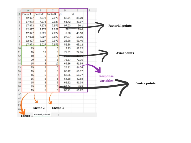
Factorial points - the \(2^k\) corner points of a cube, coded as \(\pm1\) for every factor. For a full factorial design, these points provide information about the linear effects and two-factor interactions. For larger numbers of factors, a fractional factorial arrangement may be used to reduce the number of runs, although some effects may then be confounded.
Axial (star) points - \(2k\) additional runs, with one pair for each factor. At each axial point, one factor is set to \(+\alpha\) or \(-\alpha\), while all other factors are held at their centre level, coded as 0. These points provide information about the quadratic effects and allow curvature in the response surface to be estimated.
Centre points - replicated runs with all factors set to their centre level, coded as 0. Replication at the centre provides an estimate of pure experimental error, which is required for a formal lack-of-fit test in Section 8. Centre points also improve the precision of the estimated model and provide useful information about curvature.
The distance \(\alpha\) of the axial points from the centre in Figure 1 is not arbitrary. RAISINS uses the rotatable choice, \(\alpha = F^{1/4}\), where \(F\) is the number of factorial points. For a full three-factor design, \(F = 2^3 = 8\), so \(\alpha = 8^{1/4} \approx 1.682\), the exact value visible in the coded design table later in this tutorial (Figure 7 (b)). A rotatable design has the useful property that the precision of a predicted response depends only on the distance from the design centre, not on the direction, so no region of the factor space is favoured over another purely by the geometry of the design.
2.2 Box-Behnken Design (BBD)
A Box-Behnken Design (BBD) takes a different approach to fitting a second-order response surface model. Instead of combining factorial points with axial points, it places experimental runs at the midpoints of the edges of the factor cube, together with replicated centre points. In a standard BBD, each run has one factor fixed at its centre level (0) while the remaining factors are set at either \(-1\) or \(+1\). Thus, the design does not include the corner points where all factors are simultaneously at their extreme levels. This makes the BBD particularly useful when combinations involving the most extreme levels of all factors are impractical, costly, or potentially unsafe. For example, it avoids a treatment combination in which temperature, pressure, and concentration are all simultaneously set to their highest levels.
| Feature | Central Composite (CCD) | Box-Behnken (BBD) |
|---|---|---|
| Levels per factor | 5 (−α, −1, 0, +1, +α) | 3 (−1, 0, +1) |
| Cube corners visited | Yes (factorial points) | No |
| Points beyond the cube face | Yes (axial/star points) | No, every point lies within or on the cube |
| Centre-point replicates | Yes, for pure error and lack-of-fit | Yes, for pure error and lack-of-fit |
| Good choice when | The extreme corners of the factor space are safe and informative to run | The extreme corners are impractical, costly, or unsafe |
The choice between CCD and BBD is made before the experiment is run, on the Create Data tab (Section 6.2) or through RA-One (Section 6.4), because it determines the exact factor combinations you will need to test. Once your data is collected in the layout of one design, RAISINS analyses it as that design; the Select RSM design type dropdown on the Analysis tab (Section 7) simply tells RAISINS which layout your uploaded file already follows, it does not convert one design into the other.
3 Getting to the module
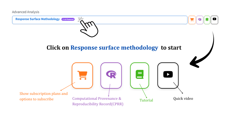
Once the underlying theory is clear, To perform the analysis in RAISINS. Visit the RAISINS home page at www.raisins.live and open the Analysis of experiment section. Move to Advanved Analysis section and Click Response Surface Methodology to start.
Each module provides four icons for accessing related resources. The cart displays subscription information, the R icon opens the Computational Provenance & Reproducibility Record described below, the book opens this tutorial, and the play button opens a video walkthrough.
3.1 Computational Provenance & Reproducibility Record
CPRR (Computational Provenance & Reproducibility Record) provides a transparent and comprehensive record. Clicking the CPRR icon on the module’s landing card shows the exact computational workflow behind the analysis. The record for this module states the R version and the exact version of every package used, and names the specific function behind each reported result, the second-order model fit, the ANOVA and lack-of-fit test, the canonical analysis, the ridge analysis, and the optimisation routine. CPRR lists every default parameter and decision rule applied by the module and provides fully runnable R code that reproduces each analytical step. Users can execute the code in R to independently reproduce and verify the results. It carries its own DOI.
To cite the platform itself in a paper, thesis, or report, use the RAISINS citation, available in APA, Harvard, and BibTeX formats at www.raisins.live/citation.html. That is the primary reference, and for most manuscripts it is all you need.
The CPRR for the Response Surface Methodology module is at www.raisins.live/module_record/RSM.html.
Cite the RAISINS paper as your primary reference for the platform. Add the CPRR as supporting documentation when a journal asks for details of the computing environment, or when you want your methods section to be precise about versions and functions rather than saying “analysis was carried out using an online tool.” The CPRR supports the citation and ensures computational reproducibility.
4 Preview mode and Quick Tour
Before subscribing, the complete module can be explored using Preview mode, available from the Welcome page. Preview mode loads a built-in RSM dataset so that the available features, model fitting, plots, ridge analysis and optimisation, can all be examined. Data upload is disabled in this mode. A Quick Tour is also available and provides a step-by-step explanation of the main controls. The tour can be repeated at any time from the Quick Tour tab.
5 A working example
The rest of this tutorial follows one dataset, shown in Figure 3. It is an experiment with 20 experimental runs, 3-factor Central Composite Design studying how 3 factors jointly affect quality attributes of a plant extract: y1, the bioactive yield. Six centre-point replicates at (15, 5, 5) supply the pure-error estimate used in the lack-of-fit test described in Section 8.
The first three columns hold the factor settings for each run, and every remaining column is a response. This tutorial follows the analysis of y1 throughout, exactly as selected in every screenshot that follows, though y2 is analysed the same way by simply choosing it instead on the Analysis tab.
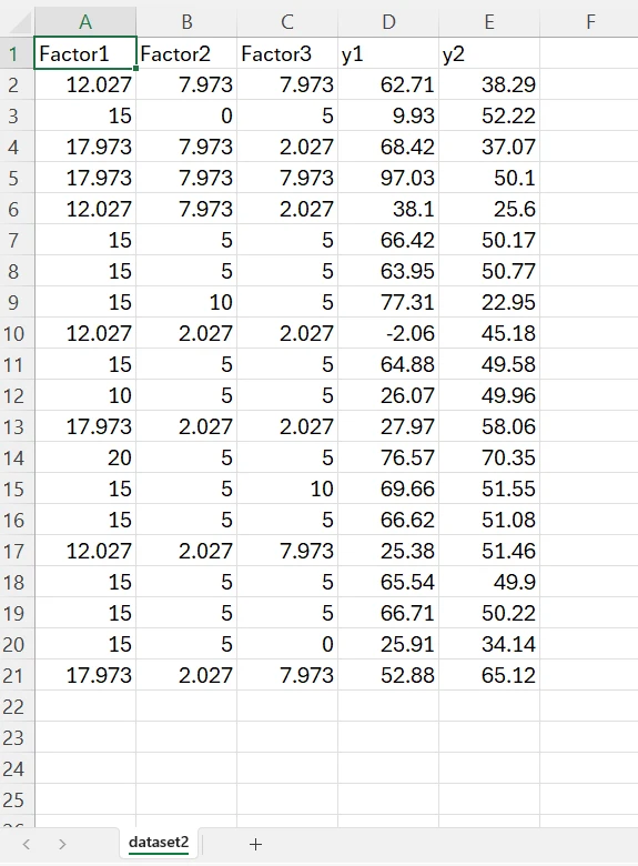
This dataset is present in the module as Dataset 2 on the Datasets tab (Section 6.3). If you want to follow the tutorial exactly, download it there and upload it under Analysis. or when you are trying the preview mode select dataset 2, to follow along the tutorial.
6 How to prepare your data
RAISINS provides four ways to prepare the dataset (Experimental Run Layout):
- Create your dataset in MS Excel
- Build your dataset directly within the RAISINS app
- Use the Model datasets in RAISINS as a reference
- Create your dataset using the RA-One chat assistant
6.1 Preparing data in MS Excel
Lay the file out with one column per factor, followed by one column per response: here Factor1, Factor2, Factor3, then y1 represent the response variable. Every row is one experimental run, so a 20-run CCD needs 20 data rows beneath the header.
Figure 4 marks up the same working-example file to show what each block of rows represents: the factorial points (every factor at its high or low extreme together), the axial points (one factor pushed beyond the cube while the others sit at their centre), and the centre points (every factor at its middle value, repeated several times).
Dataset creation rules
- Column naming convention
- No spaces allowed in column names.
- Use underscores (
_) or full stops (.) for separation. - Avoid symbols and special characters such as %, #.
- Data arrangement
- Start the data towards the upper-left corner.
- Ensure the row above the data is not blank.
- Cell management
- Avoid typing or deleting in cells without data.
- If needed, select the affected cells, right-click, and choose Clear Contents.
- Factor and response columns
- The first columns must be the factors, in the same order you will select them on the Analysis tab; every remaining column is a numeric response.
- Enter factor values in their original (uncoded) units; RAISINS converts them to coded units itself once you confirm the centre and half-width for each factor.
- The design must stay intact
- Do not drop or duplicate runs, and do not average replicated centre points into a single row. RAISINS needs every individual run, including the repeated centre points, to estimate pure error and run the lack-of-fit test correctly.
How to save as CSV in MS Excel
Open your workbook. Ensure your data is arranged properly with only one sheet.
Click the ‘File’ menu. Go to the top-left corner and click File.
Choose ‘Save As’ or ‘Save a Copy’. Select the location where you want to save your file.
Set file type to CSV. In the ‘Save as type’ dropdown, choose CSV (Comma delimited) (*.csv).
Name your file. Enter a relevant file name without spaces (use underscores if needed).
Click ‘Save’. Click Save to export the file.
💡 Tip: Before saving, double-check that your data is on the first sheet and follows the required format.
6.2 Generating a design in RAISINS (Create Data tab)
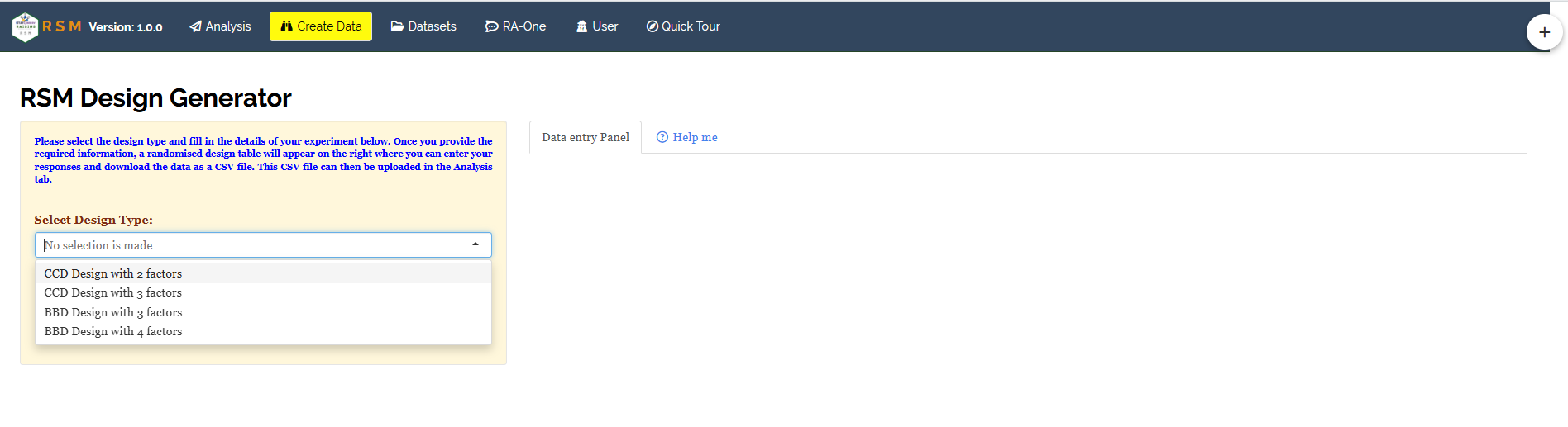
If you have not yet conducted your experiment, you can generate the correct run layout using the application. First, open the Create Data tab. Then, from the Select Design Type list (Figure 2), choose the design that fits your needs. You have four options: CCD Design with 2 factors, CCD Design with 3 factors, BBD Design with 3 factors, or BBD Design with 4 factors. Each design type helps you plan your experiment efficiently by organising the factors you want to study.
When you choose CCD Design with 3 factors, the form expands to show more options (Figure 5). You will see fields for the number of blocks, and the minimum and maximum values for each of the three factors in their natural units. You also need to specify the number of centre points and the number of characters (responses) to analyse. After you click Create, the Data entry Panel on the right will display a table. This table includes one row for each run, combining factorial, axial, and centre points, with empty columns for responses (y1, y2, …) where you will enter your data. There is a Show coded levels toggle that lets you switch the table view between the original units you entered and the \(\pm 1\) / \(\pm \alpha\) coded units, as explained in Section 2. You can enter values directly into the table or paste them from Excel using Ctrl + V. Once you have filled in the table, click Download CSV file. Then, upload this file under the Analysis tab to proceed.
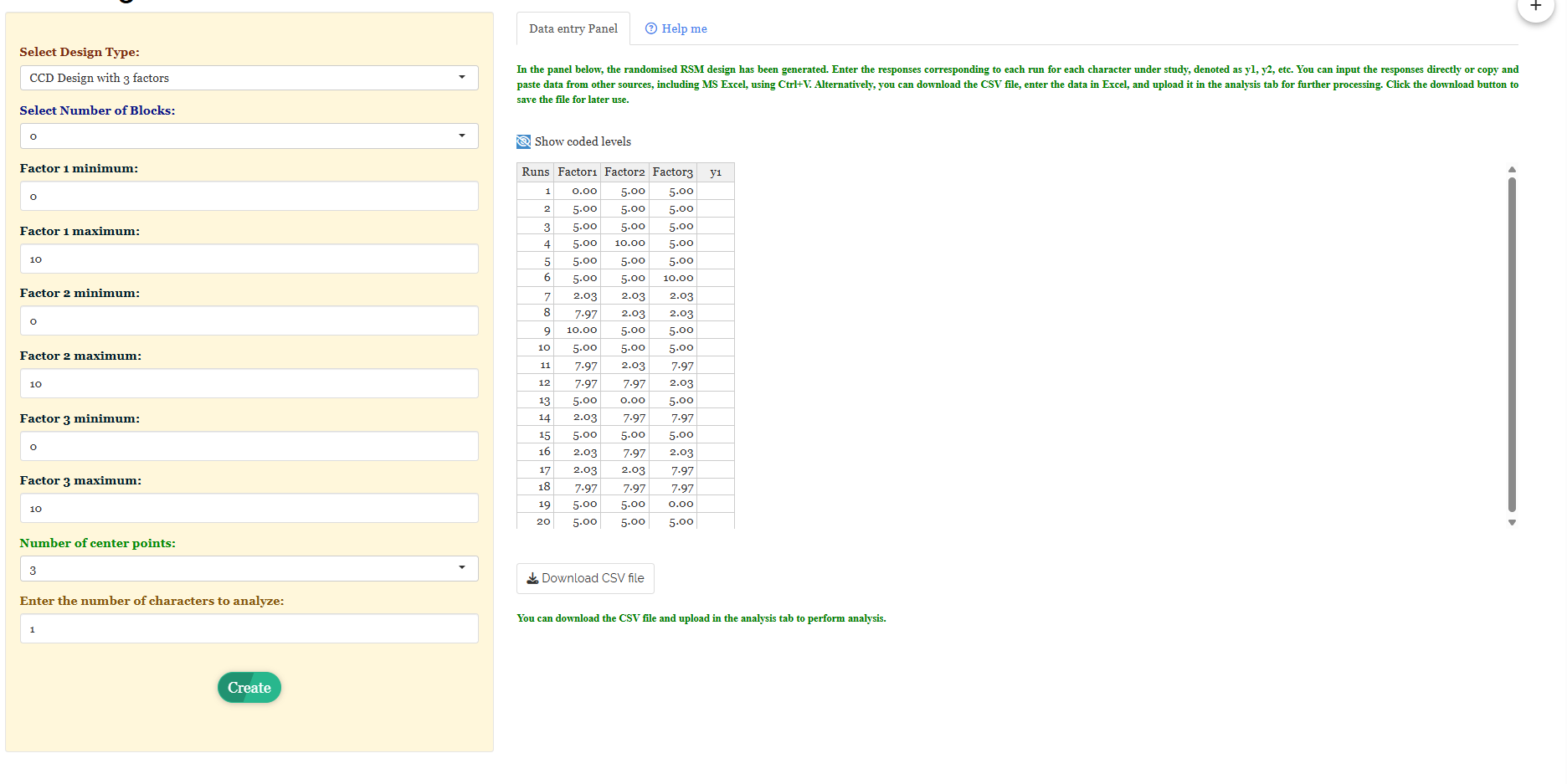
When you choose either BBD Design with 3 factors or BBD Design with 4 factors, you will see the same form. This form lets you set factor ranges, centre points, and the number of responses. The main difference is in the generated table. In this table, there are no axial runs, and each factor has only three levels. All other steps, such as entering data, downloading it, and uploading responses later, remain the same.
6.3 Download the Model datasets
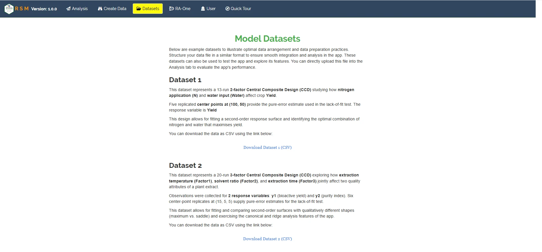
If you would like to explore the module before using your own data, RAISINS provides model datasets on the Datasets tab (Figure 6), each described in full before you download it. Dataset 1 is a 13-run 2-factor CCD studying how nitrogen application (N) and water input (Water) affect crop Yield, with five replicated centre points at (100, 50) supplying the pure-error estimate. Dataset 2 is the 20-run, 3-factor CCD used throughout this tutorial: extraction temperature, solvent ratio and extraction time (Factor1–Factor3) affecting two responses, y1 (bioactive yield) and y2 (purity index), with six centre-point replicates at (15, 5, 5). To use one:
- Open the Datasets tab
- Read the description and click the Download Dataset (CSV) link beneath it
- Save the file, then either study its layout as a reference for your own file or upload it directly under Analysis to see the full analysis at once
6.4 Creating a design using RA-One chat
RA-One, the built-in chat assistant, can build either design family through an ordinary conversation. Open the RA-One tab and describe your experiment in plain language, for instance “Build a CCD design for 3 factors” (Figure 7 (a)). RA-One returns a Design Generator form pre-filled with the design family and factor count you asked for, letting you name each factor and optionally give it a minimum and maximum; leaving the minimum and maximum blank builds a coded design directly, using \(-1, 0, +1\) and \(\pm\alpha\).
Click Build design, and RA-One returns a ready-to-fill table (Figure 7, Figure 7 (b)): one row per run, the coded factor settings already filled in, exactly as described in Section 2, factorial rows at \(\pm 1\), axial rows at \(\pm 1.681793\) (matching \(8^{1/4}\) for three factors), and centre rows at \(0, 0, 0\), with an empty response column waiting for your measured values. Fill in the responses, download the CSV, and upload it under Analysis. Asking instead for “Build a BBD design for 3 factors” returns the same kind of form and table, built on edge-midpoint runs rather than factorial-plus-axial runs.

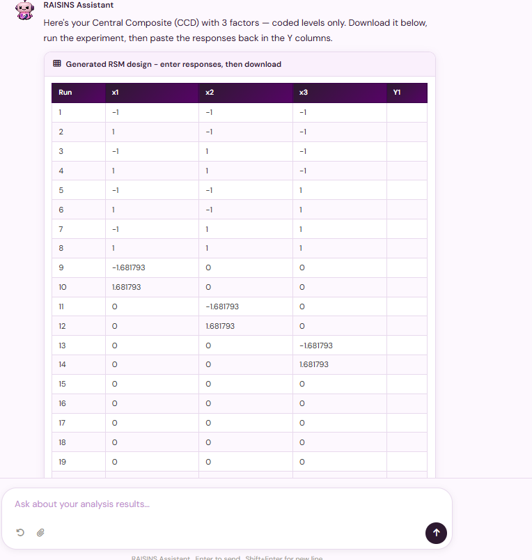
The same conversational flow builds a CCD or a BBD, whichever you name in your request. RA-One and the Create Data tab (Section 6.2) call the same design engine, so the two routes always agree on the run layout for a given design and factor count.
7 The Analysis tab
Once you have your CSV file ready, go to the Analysis tab. Find the section labeled Upload data file Excel or CSV here and click Browse…. Choose your file from your computer. When the file is successfully loaded, you will see a blue message saying Upload complete. At this point, the sidebar will expand to show the controls specific to RSM (Figure 8).
You use four selectors to set up your model. These selectors help you define everything from the overall design layout to the specific factors you want to analyse.
- Select RSM design type - the design your uploaded file actually follows, Central Composite Design (CCD) or Box-Behnken Design (BBD). This must match the layout the data was collected in; it tells RAISINS which points to expect and how to build the coded model matrix.
- Select independent variables (factor columns) - the columns holding the factor settings; here all three,
Factor1,Factor2andFactor3. - Select dependent variable - the single response column to model; here
y1. - Select Block Column (if any) - an optional column identifying blocks, if the design was run in more than one block.
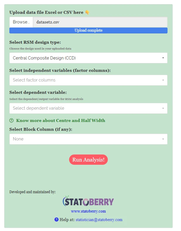
When you select the factor columns and the response, a Coding settings panel appears for each factor (Figure 9). This panel asks you to enter a Centre Value and a Half Width Value. These two numbers help convert the natural units you entered, such as temperature in °C, ratio, or minutes, into the \(\pm 1\) / \(\pm \alpha\) coded units used by the second-order model. For example, in the working example, Factor1 has a centre value of 15 and a half-width of 2.973. This means that a coded value of \(+1.682\), which is the axial distance from Section 2, corresponds to an original temperature of \(15 + 1.682 \times 2.973 \approx 20\). This is the upper axial run you can see in Figure 3. The application automatically fills in default values based on your data’s range. However, you should review these values because an incorrect centre or half-width will affect every coded coefficient and the stationary point calculated from them.
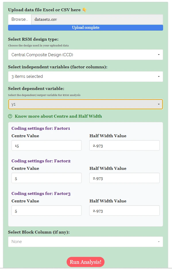
Once you have filled in every selector, click the “Run Analysis” button. This action fits a second-order response-surface model to your data. The results will then appear in several tabs: “Analysis Results”, “Plots & Graphs”, “Ridge analysis”, “Optimization”, “Interpretation”, “FAQs”, and “View Data”. Each tab provides different insights and visualisations of your analysis.
When you see a coefficient, a stationary point, or a plot axis label that says “Factor1” instead of “x1”, it has been translated using the Centre Value and Half Width you provided. This translation helps you understand the results in terms of the actual conditions you used in your experiment. In the Coded and Original Stationary Points table in Section 8, you will find both the coded and original values displayed side by side. The coded value is what the model estimated, while the original value represents the extraction temperature you used in the lab. This comparison allows you to see how the model’s estimates relate to your experimental settings.
8 Analysis results
The Analysis Results tab displays the fitted second-order model. A control strip allows you to set the number of digits after decimal and the font used in the tables (Figure 10). Above the model summary, the setup is restated: the dependent variable, the number of factors, the design type, and the coded label for each factor (Factor1 → x1, etc.), enabling the coefficient table to be read without cross-referencing the sidebar.
Table 1: Second-order RSM model summary with significance
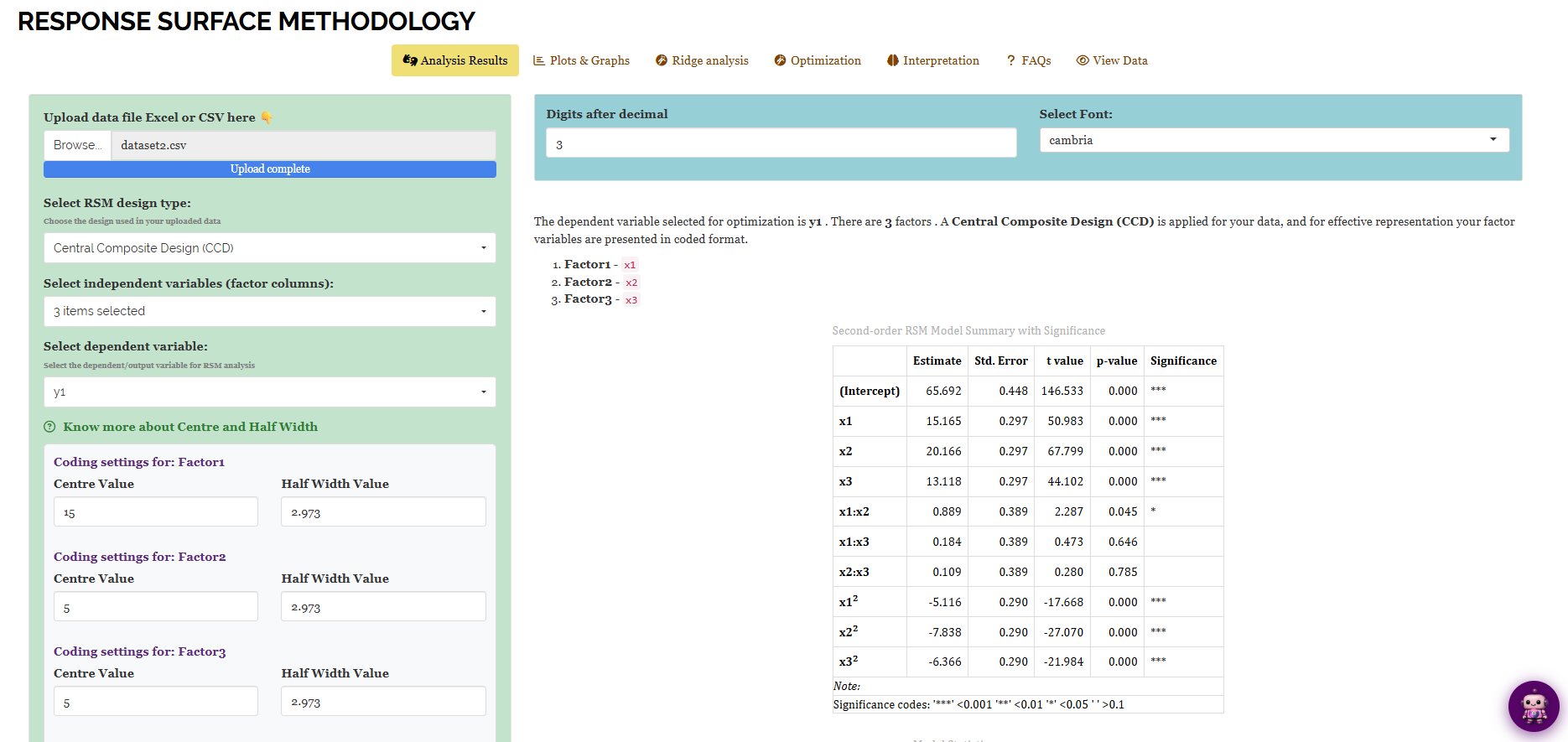
The table includes the intercept, three linear terms (x1, x2, x3), three two-way interactions (x1:x2, x1:x3, x2:x3), and three quadratic terms (x1², x2², x3²) of the full second-order model. In the example, all linear terms are highly significant: x1 at 15.165 (\(p < 0.001\)), x2 at 20.166 (\(p < 0.001\)), and x3 at 13.118 (\(p < 0.001\)). x2 has the largest coefficient, indicating the solvent-to-sample ratio has the strongest linear effect on bioactive yield. All quadratic terms are highly significant and negative (\(-5.116\), \(-7.838\), \(-6.366\)), indicating a downward curve near a maximum. Among the interactions, only x1:x2 is significant at \(0.889\) (\(p = 0.045\)); x1:x3 and x2:x3 are non-significant.
When you look at the coefficients, you will see them in coded units (x1, x2, x3, on the \(\pm 1\) / \(\pm\alpha\) scale from Section 2). They are not shown in the original units like temperature, ratio, or time. This is done on purpose. Using coded units allows you to compare the coefficients directly, no matter what physical units were used to measure each factor. This means you can identify which factor has the strongest linear effect, such as x2’s coefficient, without needing to convert any units first.
Table 2: Model statistics
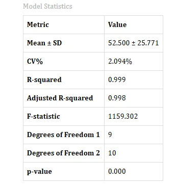
The response has a mean of \(52.500 \pm 25.771\) across the 20 runs. The fitted model achieves an R-squared of 0.999 and an Adjusted R-squared of 0.998, indicating that nearly all run-to-run variation in yield is explained by the three factors and their quadratic and interaction terms. The overall F-statistic is 1159.302 on 9 and 10 degrees of freedom, with \(p < 0.001\), confirming the model is highly significant. The CV% of 2.094% is very low, indicating precise experimental measurements relative to the response size, contributing to the model’s good fit.
Table 3: ANOVA with lack of fit, and the canonical analysis
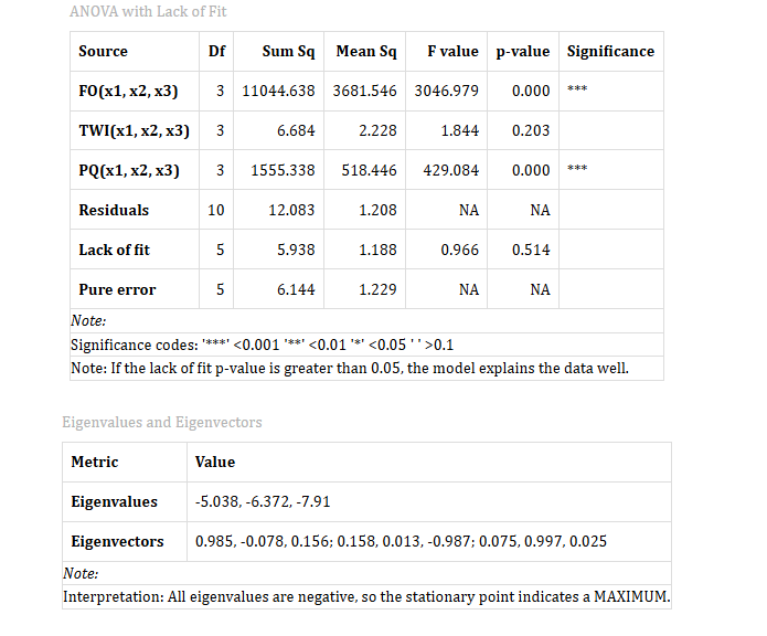
The ANOVA table divides the model’s sum of squares into three blocks: FO(x1, x2, x3), the combined first-order (linear) contribution, is highly significant (\(F = 3046.979\), \(p < 0.001\)); TWI(x1, x2, x3), the combined two-way interaction contribution, is non-significant (\(F = 1.844\), \(p = 0.203\)), despite x1:x2 alone reaching significance in Figure 10; and PQ(x1, x2, x3), the combined pure quadratic contribution, is highly significant (\(F = 429.084\), \(p < 0.001\)). The lack-of-fit test compares the residual variation after fitting the model against the pure error from replicated centre points. The lack-of-fit p-value is 0.514, above 0.05, indicating no evidence that a more complex model is needed.
You can calculate the lack-of-fit p-value because the design in Section 2 includes replicated centre points. When you have only one centre point or a design without any replication, you cannot tell if the model doesn’t fit or if there is simply no way to check the fit. This is why Section 6.2 and Section 6.4 always generate several centre-point runs instead of just one. Replicating centre points allows you to assess the fit of the model by providing a basis for comparison.
The canonical analysis shows that all three eigenvalues (\(-5.038\), \(-6.372\), \(-7.91\)) are negative, indicating the stationary point is a MAXIMUM. If the eigenvalues were mixed, the stationary point would be a saddle, acting as a maximum in some directions and a minimum in others. If all eigenvalues were positive, the stationary point would be a minimum.
Table 4: Coded and original stationary points
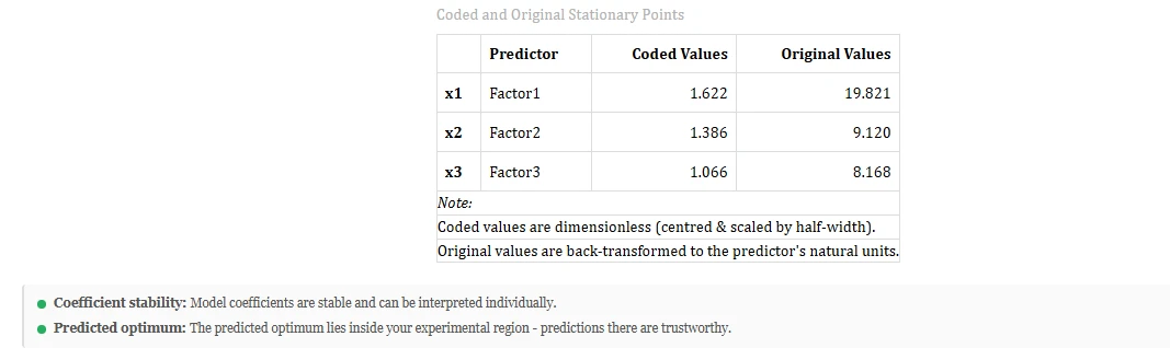
The stationary point from the canonical analysis is \(x_1 = 1.622\), \(x_2 = 1.386\), \(x_3 = 1.066\) in coded units, which back-transforms to Factor1 = 19.821, Factor2 = 9.120, Factor3 = 8.168 in original units using the centring from Section 7. Coefficient stability confirms the model coefficients are stable enough for individual interpretation. The predicted optimum confirms the stationary point is within the experimental region, allowing for a reliable prediction without extrapolation.
8.1 Interpretation from Figure 10
Read together, these four tables tell a single consistent story. The model fits the data almost perfectly (R-squared 0.999) and shows no sign of lacking fit (lack-of-fit \(p = 0.514\)), so the second-order equation can be trusted as a description of how yield responds to the three factors. All three factors matter linearly, and Factor2 (solvent ratio) matters most. All three quadratic terms are significant and negative, which on its own already signals a peak rather than an ever-increasing response, and the canonical analysis confirms it: three negative eigenvalues mean the stationary point is unambiguously a maximum, not a saddle. That maximum sits inside the region actually explored by the 20 runs, at an extraction temperature of about 19.8°C-equivalent coded units (in the natural units of your own experiment), a solvent ratio of about 9.12, and an extraction time of about 8.17, where the model predicts a yield close to 98.95 (the same figure the Optimization tab in Section 11 arrives at independently, by direct search rather than by algebra).
When you look at a p-value, it tells you how unlikely it is that a coefficient is zero. However, it does not tell you how much the response changes. For example, here x2 has a coefficient of 20.166, which is about 1.5 times larger than x3’s coefficient of 13.118. This means that even though both coefficients are statistically “significant,” the size of these coefficients relative to each other provides useful information. It helps you decide which factor to focus on if you have limited time or budget for further experiments.
How this table is built
RAISINS fits the full second-order model, intercept, linear, two-way interaction and pure quadratic terms, by least squares on the coded factor settings. Each term’s t-test in Figure 10 compares its estimate to zero using the model’s residual standard error; the ANOVA in Figure 12 re-expresses the same fit as three sequential sums of squares (FO, TWI, PQ) and adds the lack-of-fit F-test built from the centre-point replicates. The canonical analysis diagonalises the matrix of quadratic and interaction coefficients to obtain the eigenvalues and eigenvectors, and solves for the stationary point algebraically from the full set of fitted coefficients. The CPRR (Section 3.1) names the exact function used at each step and prints runnable R code that reproduces it.
Reading every row of the results tables
- Estimate / Std. Error / t value / p value - the usual regression output for each model term, on the coded scale.
- FO / TWI / PQ - the first-order, two-way-interaction and pure-quadratic sums of squares, grouped so the three “kinds” of term can be judged at a glance rather than term by term.
- Lack of fit / Pure error - the two pieces the residual sum of squares is split into; a non-significant lack-of-fit p-value supports the chosen model order.
- Eigenvalues / Eigenvectors - the canonical form of the quadratic part of the model; the sign pattern of the eigenvalues classifies the stationary point as a maximum, minimum, or saddle.
- Coded / Original stationary point - the optimum factor settings, on the \(\pm 1/\pm\alpha\) scale the model was fitted in, and back-transformed to the units you originally entered.
9 Visualising the results
The Plots & Graphs tab (Figure 14) visualises the fitted equation. It offers five icons: Pareto Chart, Residuals vs Fitted, 2D Contour Plot, 3D Surface Plot, and 3D Surface Plot 1 (interactive). Click an icon to generate its plot, then use Plot Settings to adjust and select a download format.
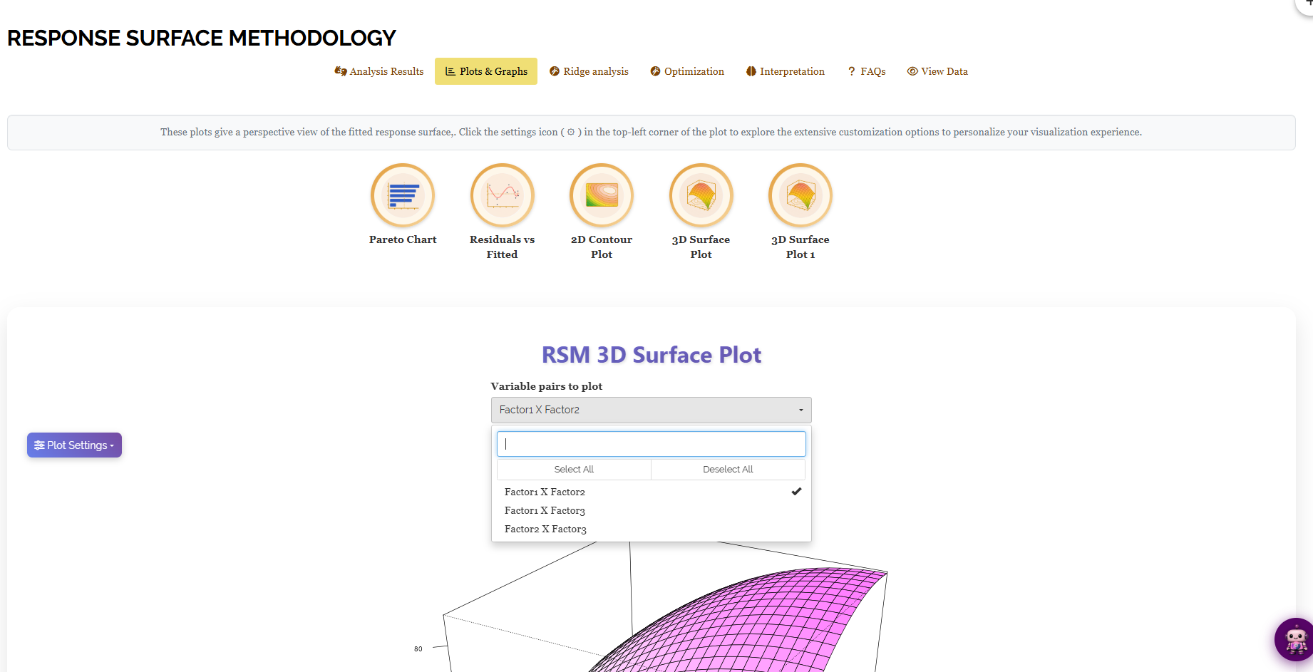
The 2D Contour Plot and 3D Surface plots provide a Variable pairs to plot dropdown with options: Factor1 × Factor2, Factor1 × Factor3, or Factor2 × Factor3. The factor not shown on the plot’s axes is fixed at its centre value, indicated on the plot (e.g., “Slice at Factor3 = 5”).
The Pareto Chart
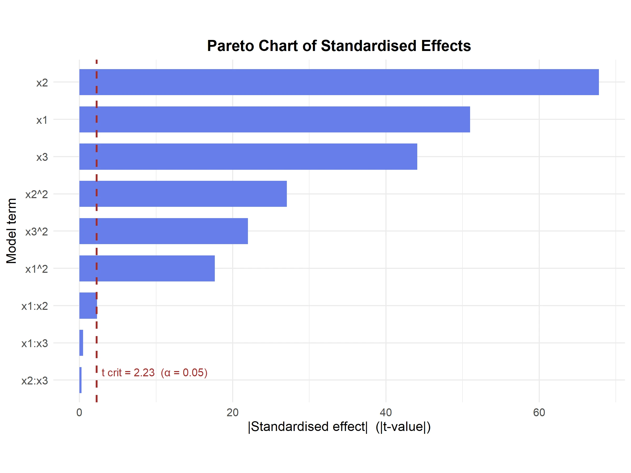
The Pareto chart (Figure 15) is the fastest way to scan Figure 10 visually: every model term is drawn as a bar sized by the absolute value of its t-statistic, longest first, with a dashed reference line at the critical t-value (\(t_{crit} = 2.23\) at \(\alpha = 0.05\) here). Any bar that crosses the line is significant. The ranking, x2 first, then x1, then x3, then the three quadratic terms, then the small, non-significant interaction terms trailing at the bottom, matches the coefficient table exactly, but makes the relative importance of each term immediately visible without reading a single p-value.
Residuals vs Fitted
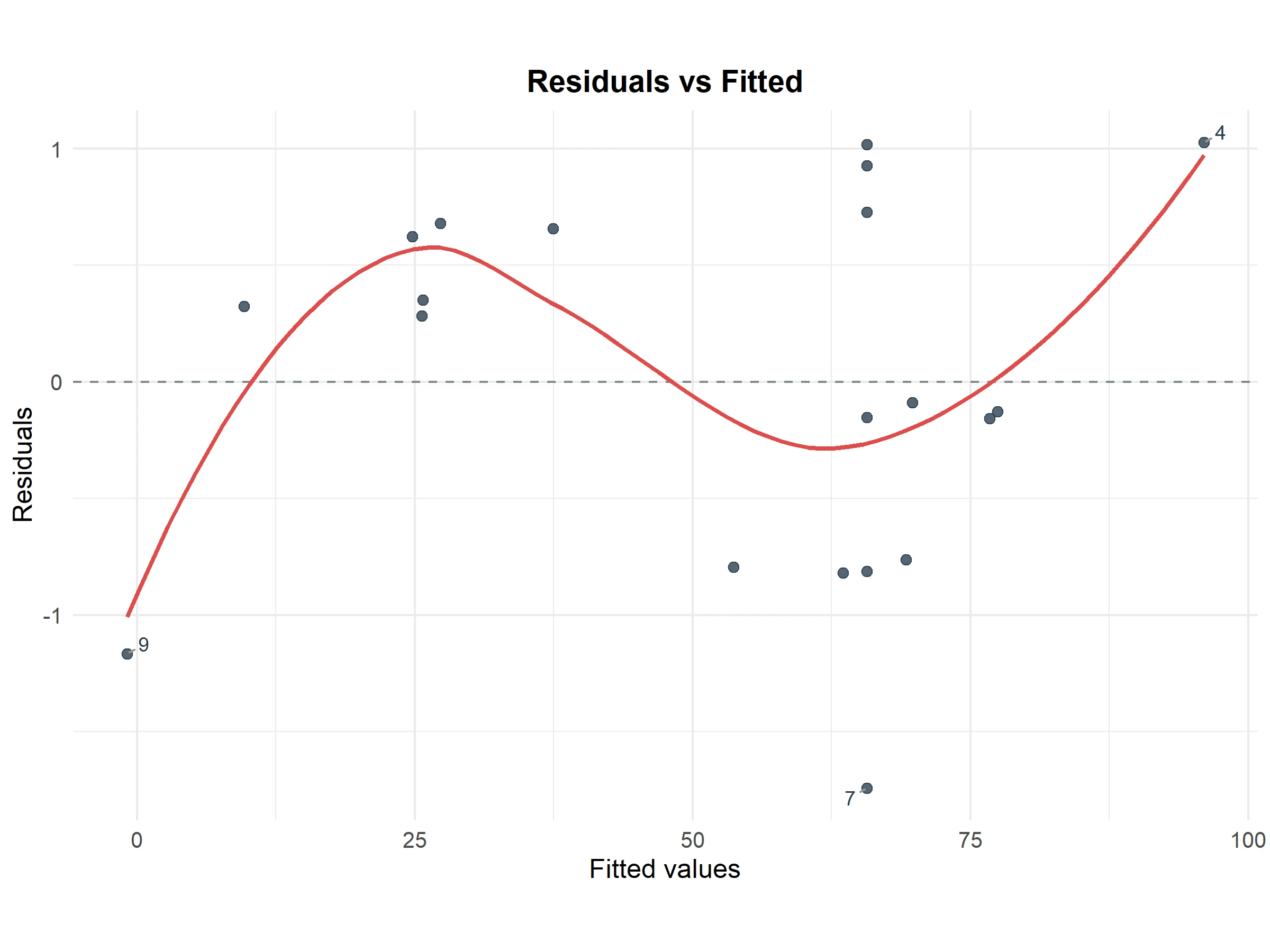
This plot (Figure 16) visually checks the same assumption as the lack-of-fit test in Section 8: that the model’s errors are patternless. Points scatter on both sides of zero across the range of fitted values, with only a mild wave in the smoothed trend line, aligning with the non-significant lack-of-fit p-value of 0.514. A few points are individually labelled (run 4, run 7, run 9), indicating the largest residuals for closer inspection, not suggesting any issue.
When you are analysing data, you might use a lack-of-fit p-value to check if your model fits well. However, this p-value might not always catch subtle patterns. For example, it might miss a curve that your model does not capture or a fan-shaped spread that suggests unequal variance. A residual plot can help you see these patterns. In this case, both the lack-of-fit test and the residual plot agree. The test is non-significant, and the plot does not show any obvious pattern. This means there is no reason to question the second-order model you chose in Section 7.
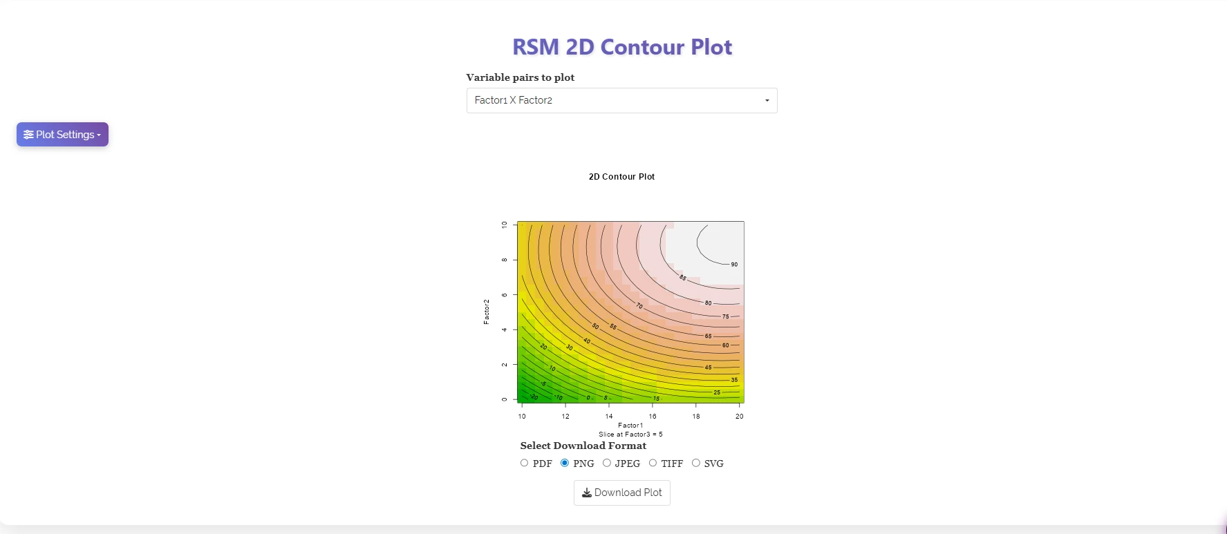
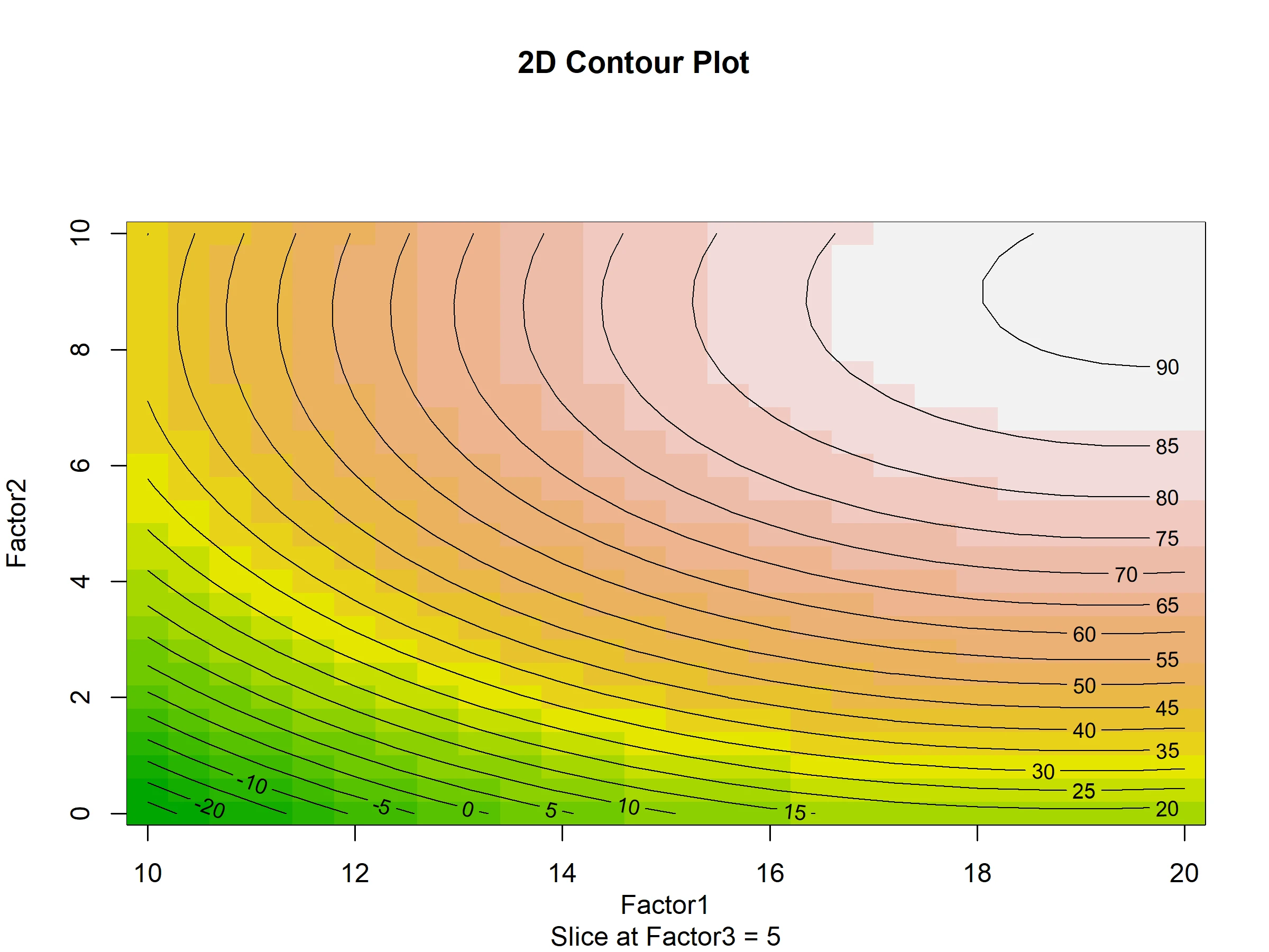
The contour plot (Figure 17) is the two-dimensional shadow of the fitted response surface: each closed curve joins points predicted to give the same yield, and the shading from green through orange to near-white traces the climb toward the peak. Because the stationary point (Factor1 ≈ 19.8, Factor2 ≈ 9.1) lies close to the top-right corner of the plotted region, the highest contour band (90 and above) appears there too, visual confirmation of the algebraic result from Section 8 rather than a separate finding.
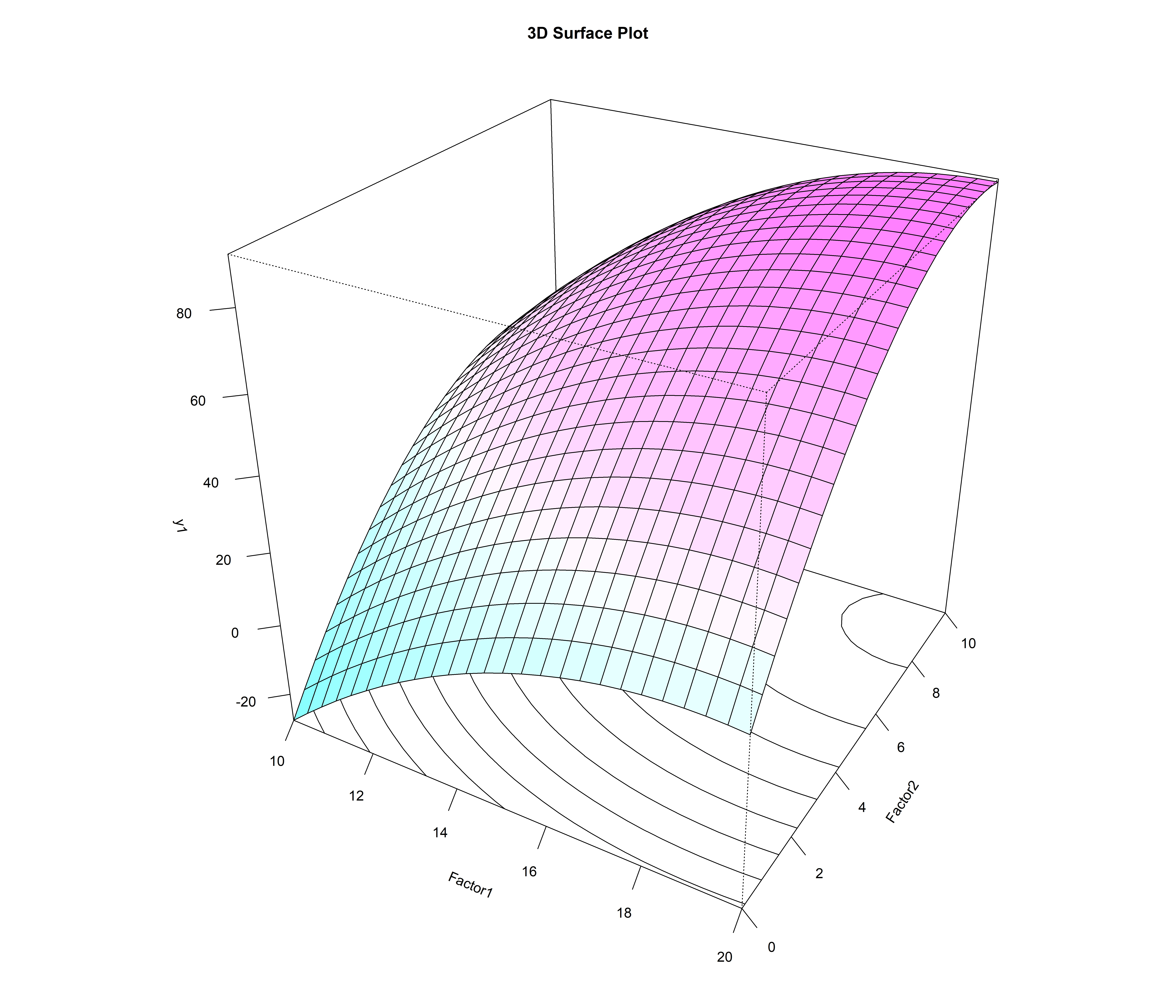
The 3D surface plot (Figure 18) represents data as a hill rather than contour rings, useful for reports or audiences unfamiliar with contour maps. The 3D Surface Plot 1 icon opens an interactive version (Figure 19) using a draggable, zoomable plotly widget.
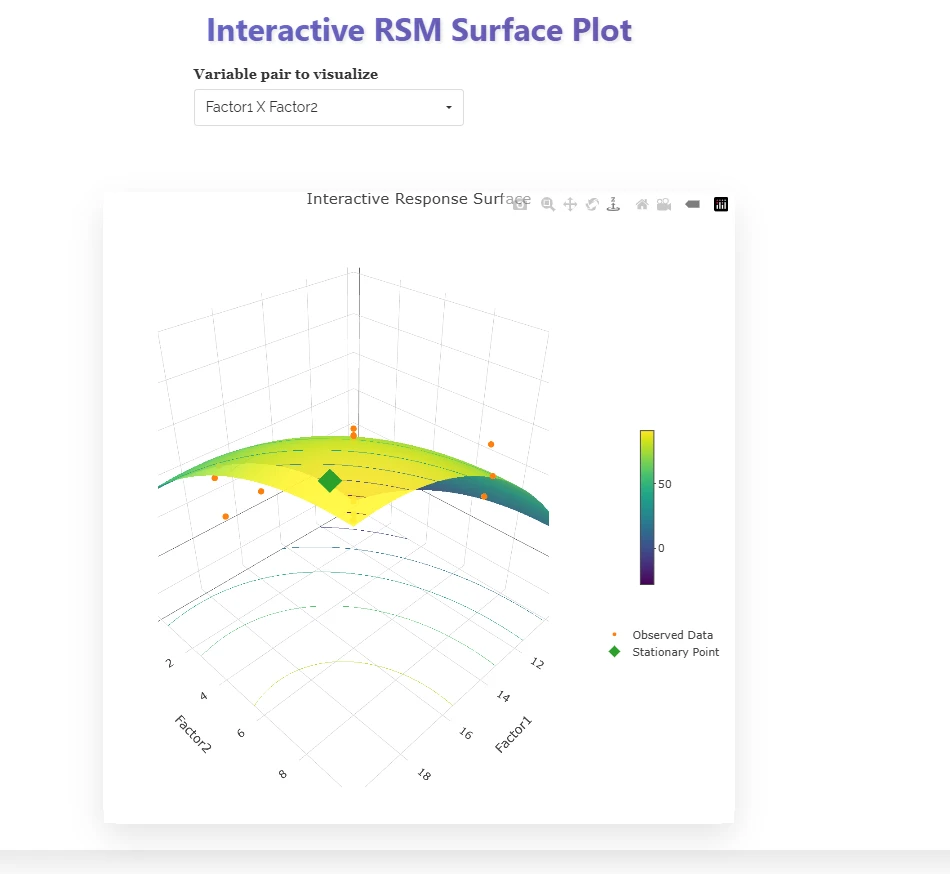
When you use the interactive version, it shows your actual Observed Data points on top of the fitted surface. These points are shown in orange. You can see how closely these orange points follow the coloured surface. This gives you a quick visual idea of how well your data fits, similar to what the R-squared value in Figure 11 tells you. The interactive version also displays the Stationary Point as a green diamond. If this green diamond is near the highest point of the surface, it visually confirms that the “predicted optimum lies inside your experimental region,” as noted in Figure 13.
10 Ridge analysis
When you open the Ridge analysis tab (Figure 20), you will see the canonical path. This path is a sequence of factor settings that gives you the highest predicted response as you move step by step away from the design centre. Imagine you are trying to find the best conditions for growing a crop. The canonical path shows you the best settings for each step as you move further from your starting point. This approach is based on the idea of the path of steepest ascent in Response Surface Methodology (RSM). Instead of jumping directly to the algebraic stationary point, which is the theoretical best setting, ridge analysis helps you find the best practical settings at each distance. This is especially helpful if the stationary point is outside the area you have tested in your experiment.
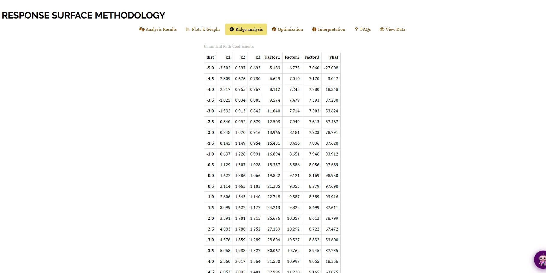
Imagine you have a table where each row represents a step along a path. The first column, dist, shows how far you are from the centre, using a coded distance. The next columns, x1–x3, display the coded factor settings that give you the highest predicted response at that specific distance. After that, columns Factor1–Factor3 show these settings converted back to their original units. Finally, column yhat provides the model’s predicted response at that point. As you look down the table for the working example, you’ll notice that the predicted yield increases as dist goes up from \(-5.0\) (\(\hat{y} = -27.008\)) to about \(\text{dist} = 0.0\) (\(\hat{y} = 98.950\)). After reaching this peak, the yield decreases beyond that point, dropping to \(\hat{y} = -3.075\) by \(\text{dist} = 4.5\). The highest point on this path is nearly at dist = 0.0. This is expected because Section 8 had already determined that the algebraic stationary point is a true maximum within the experimental region. This means the path of steepest ascent and the stationary point align.
Imagine you are conducting a canonical analysis in Section 8 to find the best conditions for your experiment. If this analysis suggests an optimal point that lies outside the area you have actually tested, or if it identifies a saddle point instead of a maximum, you should be cautious. This is because the suggested optimal conditions may not be reliable. In such cases, ridge analysis can help. Ridge analysis finds the best possible settings within a reasonable and justifiable distance from the centre of your design. This approach avoids making assumptions about areas you have not explored, ensuring that your conclusions are based on solid data.
11 Optimization
When you go to the Optimization tab (Figure 21), you can turn your fitted model into a direct recommendation. Start by selecting the factors you want to optimise. Then, choose the response or responses you want to optimise. For each response, you need to set a Goal. This could be to Maximize the response, Minimize it, or hit a specific Target. You also need to define an acceptance range for each response. This range is set with a A (lower bound) and a B (upper bound). The software automatically suggests sensible bounds based on the observed data. For example, it might suggest a range from \(-11.969\) to \(106.94\) for y1. Any values within this range are considered acceptable. The desirability of these values scales from 0 at the worst end to 1 at the best end. This means that values closer to the optimal point are more desirable.
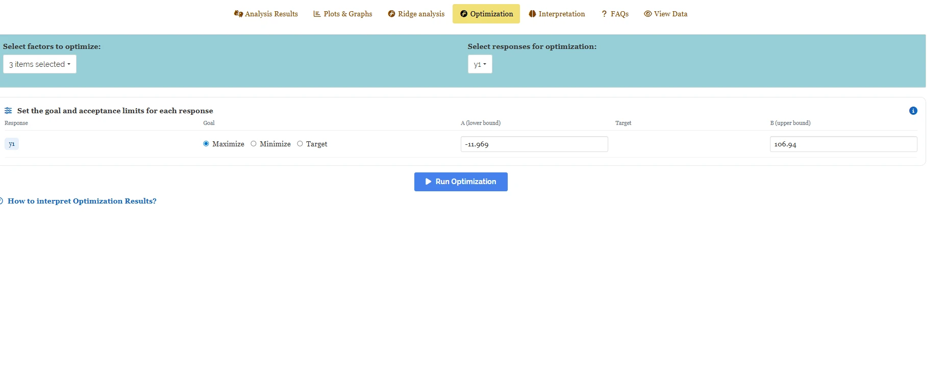
When you click Run Optimization, you see two types of results displayed side by side. The first result is called Best Candidate from Observed Data (Figure 22). This shows the best-performing experiment that you actually conducted, using the real design points, here, run 4, where Factor1 is set to 17.973, Factor2 to 7.973, and Factor3 to 7.973. The observed y1 for this run is 97.03, while the model predicted it to be 96.003. The desirability scores are 0.917 for the measured value and 0.908 for the predicted value. This result is important because it serves as a sanity check. It does not require any extrapolation, meaning it is based on a setting you have actually tested.
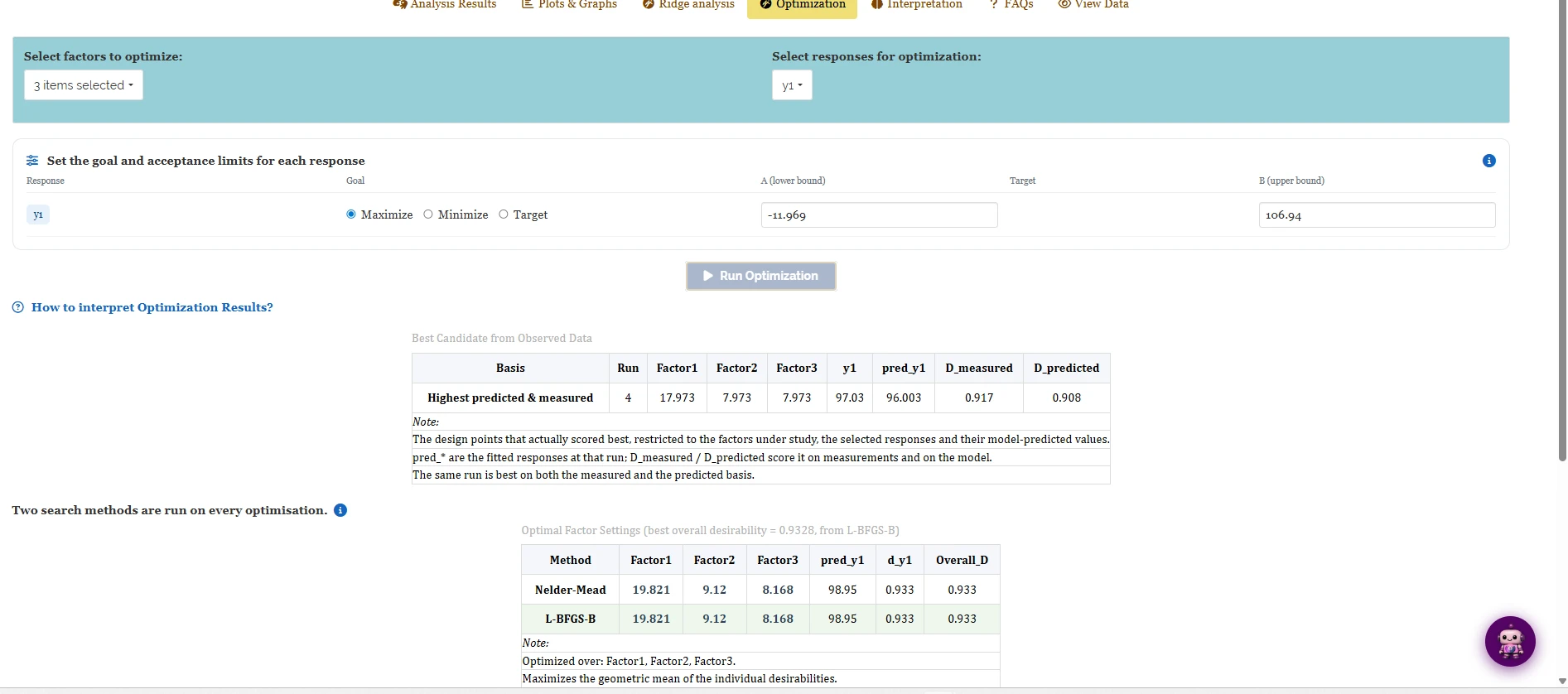
The second answer, called Optimal Factor Settings, explores the entire range of continuous factors, not just the specific points you tested (Figure 23). You use two separate search algorithms: Nelder-Mead and L-BFGS-B. Each algorithm starts from several points within the observed factor ranges and both results are reported. In the working example, both methods arrive at the same settings: Factor1 = 19.821, Factor2 = 9.12, Factor3 = 8.168. These settings predict a y1 of 98.95 and have an overall desirability of 0.933. This agreement between the two methods is important. It suggests that the optimal settings are a stable feature of the fitted surface, not just a result of one algorithm’s specific path. Additionally, these settings match the stationary point found algebraically in Section 8 and the peak identified in the ridge-analysis path in Section 10. This consistency across three different approaches strengthens the conclusion.
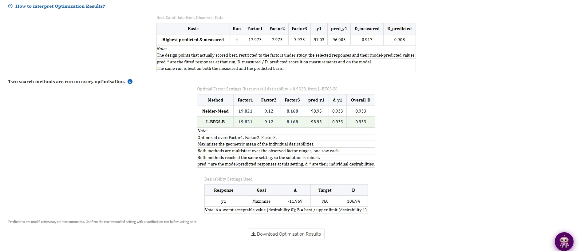
When you see the optimisation output, remember that the predictions you get are model estimates, not actual measurements. This means that the optimisation process uses a mathematical model to suggest the best settings, but it does not physically test these settings in a lab. For example, if the model suggests Factor1 = 19.821, Factor2 = 9.12, and Factor3 = 8.168, it has calculated these values based on the data in Section 8, not by running an experiment. Therefore, before you act on these recommendations, you should confirm them with a verification run. Think of the recommended setting as the most promising option to test next, rather than a final result to report without further confirmation.
When you want to optimise more than one response at the same time, you start by scoring each response individually. You use a desirability scale from 0 to 1 for each response. A score of 0 means the worst acceptable value, while a score of 1 means the best or target value. Once you have these scores, you combine them using their geometric mean. This combined score appears in the Overall_D column. By using this method, you can identify a single “best” setting even when multiple responses are involved, which may have conflicting goals.
12 Interpretation
RAISINS also provides a plain-language interpretation of the statistical results. Open the Interpretation sub-tab, confirm the checkbox that no error was reported while running the analysis, and click Click here for interpretation (Figure 24). RAISINS restates the model fit, the significance of the linear, interaction and quadratic effects, which factor has the strongest linear influence, the sign pattern behind the canonical analysis, and the stationary point in original units, closing with the reference citations for the platform and for R itself. The text is written to be adapted directly into a results section.
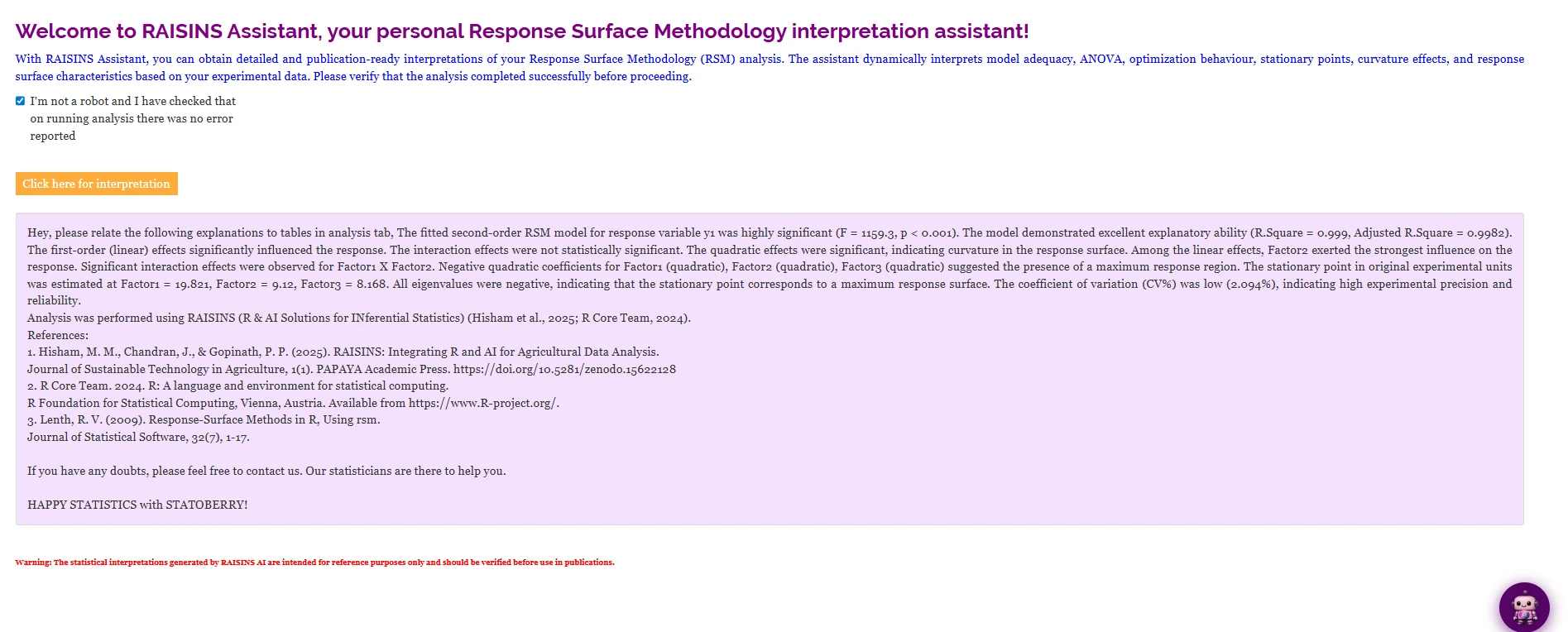
The interpretation for the working example states that “the interaction effects were not statistically significant” while, a few sentences later, also stating that “significant interaction effects were observed for Factor1 X Factor2.” Both statements are correct at once: the combined TWI block in Figure 12 is non-significant, but the individual x1:x2 term in Figure 10 is. Reading the generated text alongside the tables it summarises, rather than quoting it in isolation, is what resolves an apparent contradiction like this one.
13 Chat with your data using RA-One
RA-One is the built-in conversational assistant for the RSM module and is available from the RA-One tab. It answers questions using the results generated from your own analysis rather than relying on generic statistical explanations. The responses are grounded in the values already computed for your model, and unavailable results are identified rather than inferred.
Once your results are loaded, ask a direct question, for example “Interpret my fitted model” (Figure 25). RA-One returns a structured, numbered reading: the model type and predictors, the R-squared, adjusted R-squared, F-statistic and p-value, the lack-of-fit result, the specific significant terms broken down by linear, quadratic and interaction, the canonical-analysis verdict (maximum, minimum or saddle), and the stationary point in original units with its predicted response, each number matching the tables in Section 8 exactly.
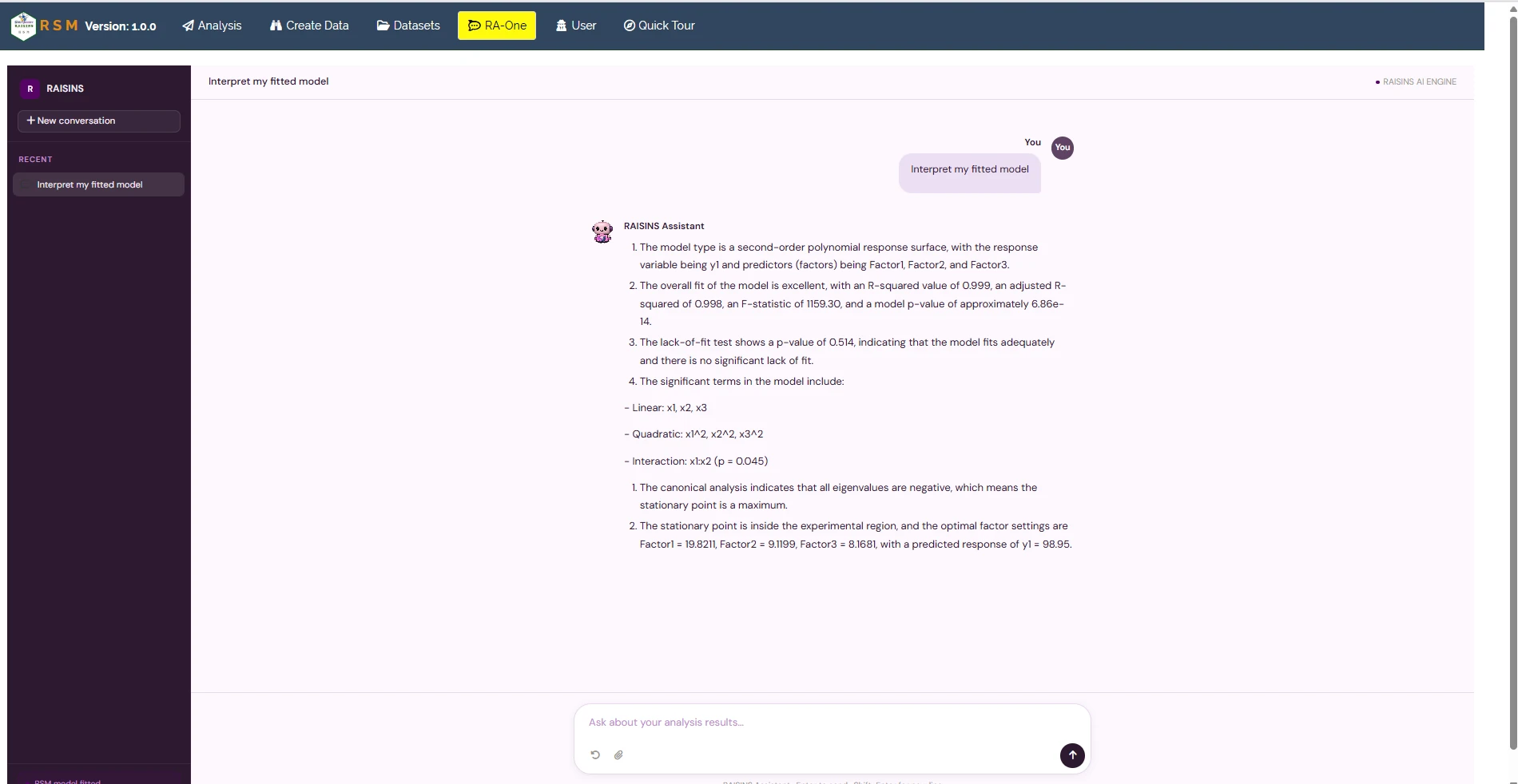
The same chat interface can also prepare data, generating a correctly formatted CCD or BBD design template (Section 6.4), and can be asked about any other tab covered in this tutorial, the meaning of a specific coefficient, why the lack-of-fit test matters, or how to read the ridge-analysis path, in ordinary language.
Within a single conversation, RA-One can build your experimental design, interpret the fitted model once results are in, and help you draft the write-up, so a complete RSM study can be conducted almost entirely without leaving the chat window.
14 FAQs
The module includes a dedicated FAQs sub-tab containing explanations of common questions and guidance on the available features. Two questions are particularly important for a first RSM analysis: how do I choose between CCD and BBD?, which restates the practical guidance from Section 2, and what does it mean if my stationary point is a saddle?, which extends the canonical-analysis reading from Section 8 to the case that did not occur in the working example. The same explanations are available at any time through the RA-One tab (Section 13).
15 View data
View Data is the primary diagnostic tool for ensuring data integrity before analysis. When you upload your dataset, RAISINS runs an automated Health Check to validate the file: it confirms that the selected factor columns are numeric, that the response column is numeric with no missing values, and that there are no stray blanks or misaligned rows.
For an RSM analysis it also checks the property the whole method depends on: that the run pattern actually matches the selected design type, factorial, axial and centre points in the right proportions for a CCD, or edge-midpoint and centre points for a BBD, and that enough centre-point replicates are present to support the lack-of-fit test in Section 8. If a run is missing, mislabelled, or the centre points were not replicated at all, the model can still be fitted, but the lack-of-fit test and the pure-error estimate behind it will not be trustworthy. Fix anything flagged here before relying on the canonical analysis or the optimisation recommendation.
16 Wrapping up
Response Surface Methodology answers a different question from most other RAISINS modules: not do these treatments differ, but at what exact combination of continuous factors is the response best. A Central Composite Design or a Box-Behnken Design supplies enough well-placed runs to fit a second-order model; the ANOVA and lack-of-fit test confirm the model is adequate; the canonical analysis classifies the stationary point as a maximum, minimum, or saddle; and ridge analysis and the Optimization tab turn that fitted equation into a concrete, defensible recommendation for what to try next.
Three routes converged on the same answer in the working example, the algebraic stationary point (Section 8), the peak of the ridge-analysis path (Section 10), and the direct search in the Optimization tab (Section 11), which is the strongest evidence a single dataset can offer that a recommended setting is real rather than a modelling artefact. Always treat that setting as the next experiment to run, not as a conclusion in itself: confirm it with a verification run before reporting or acting on it. If your factors are actually discrete treatment levels rather than continuous settings, the factorial CRD or factorial RBD modules are the more appropriate choice. RA-One and the support resources at [email protected] are available when further guidance is required.