Split-Plot Design
A split-plot design handles two factors when one of them must be applied to large units, splitting the experiment into a whole plot stratum and a subplot stratum with an error term for each. This tutorial explains where the design comes from, why it needs two critical differences, and how to run the whole analysis in RAISINS… Read more …
Split-plot designs are used when the levels of some treatment factors are more difficult to change during the experiment than those of others. The factor that is more difficult or costly to change is assigned to the whole plots, while the factor that is easier to change is assigned to the subplots within each main-plot. RAISINS fits the appropriate split-plot model, reports both error terms and their corresponding critical differences, provides post-hoc letter groupings and informative plots, and presents a plain-language interpretation of the results, all without requiring you to write a single line of code. This tutorial will guide you through the analysis step-by-step.
1 What is a split-plot design?
A split-plot design is used when two treatment factors are studied, but one factor is more difficult to apply or change than the other. The factor that requires larger experimental units is assigned to whole plots, while the factor that is easier to change is randomly assigned to smaller subplots within each whole plot.
Consider an experiment comparing two irrigation methods and three fertilizer doses. Fertilizer can be applied conveniently to relatively small plots, whereas irrigation methods such as sprinkler, flood, or drip irrigation may require larger areas and are more difficult to change from one small plot to another. Therefore, independently randomising all \(2 \times 3 = 6\) treatment combinations to small plots may be impractical.
A split-plot design addresses this practical constraint through two stages of randomisation. First, the factor that is more difficult to change is randomly assigned to the larger whole plots. Each whole plot is then divided into smaller subplots, and the easier-to-change factor is randomly assigned within those subplots. Because every whole plot contains all levels of the subplot factor, the main effects of both factors and their interaction can be evaluated. The defining feature is that the two factors are randomised at different experimental-unit levels.
When one factor must be applied to large units, how may both factors and their interaction still be tested fairly?
The two-stage randomisation produces two distinct sources of experimental error. Differences among whole plots provide the appropriate error for testing the main-plot factor, whereas differences among subplots within whole plots provide the error for testing the subplot factor and the interaction. Thus, split-plot ANOVA contains two error terms, commonly denoted Error(a) and Error(b). Using the appropriate error term ensures that each effect is tested against the variation associated with its experimental unit.
A split-plot design is appropriate when one factor is more difficult to apply or change than another. The main-plot factor is randomised first among whole plots, and the subplot factor is then randomised within each whole plot. Because subplot treatments are assigned to smaller experimental units, their effects are generally estimated with greater precision than the main-plot effects.
2 Presence of two error terms
- let the main-plot factor A have \(a\) levels,
- let the subplot factor B have \(b\) levels,
- and let the experiment be laid out in \(r\) replications.
Every replication contains \(a\) whole plots and every whole plot contains \(b\) subplots, so the total number of observations is
\[ N = a \times b \times r \]
The working dataset used later in this tutorial has \(a = 2\) main-plot levels, \(b = 3\) subplot levels and \(r = 4\) replications, giving \(2 \times 3 \times 4 = 24\) observations.
The ANOVA table contains two separate error terms. The main-plot factor is tested against Error(a), whereas the subplot factor and the interaction are tested against Error(b).
| Source of variation | Degrees of freedom | Formula | Tested against |
|---|---|---|---|
| Replication | \(r - 1\) | 3 | - |
| Main Plot (A) | \(a - 1\) | 1 | Error(a) |
| Error(a) | \((r-1)(a-1)\) | 3 | - |
| Sub Plot (B) | \(b - 1\) | 2 | Error(b) |
| A × B | \((a-1)(b-1)\) | 2 | Error(b) |
| Error(b) | \(a(r-1)(b-1)\) | 12 | - |
Because the design has two error terms, different types of mean comparison require different critical differences (CDs). Comparisons within the same whole plot use the subplot-level variation, whereas comparisons involving different whole plots also reflect whole plot variation. RAISINS therefore reports CD[A(B)] and CD[B(A)]. Their interpretation and appropriate use are explained in Section 8.1.
3 Getting to the module
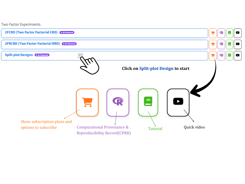
Once the design is understood, the analysis can be performed in RAISINS. Visit the RAISINS home page at www.raisins.live and open the Analysis of experiment section. Upload the dataset and identify the main-plot, subplot, replication, and response columns. RAISINS then performs the analysis and provides the corresponding tables, plots, and interpretation without requiring programming.
Each module provides four icons for accessing related resources. The cart displays subscription information, the R icon opens the Computational Provenance & Reproducibility Record described below, the book opens this tutorial, and the play button opens a video walkthrough.
3.1 Computational Provenance & Reproducibility Record
CPRR (Computational Provenance & Reproducibility Record) provides a transparent and comprehensive record. Click the CPRR icon shown in Figure 2 to see the exact computational workflow behind the analysis. The record for this module states the R version and the exact version of every package used, and names the specific function behind each reported result. CPRR lists every default parameter and decision rule applied by the module, including how the two error terms are formed and how each critical difference is computed, and provides fully runnable R code that reproduces each analytical step. Users can execute the code in R to independently reproduce and verify the results. It carries its own DOI.
To cite the platform itself in a paper, thesis, or report, use the RAISINS citation, available in APA, Harvard, and BibTeX formats at www.raisins.live/citation.html. That is the primary reference, and for most manuscripts it is all you need.
The CPRR for the split-plot module is at www.raisins.live/module_record/split.html.
Cite the RAISINS paper as your primary reference for the platform. Add the CPRR as supporting documentation when a journal asks for details of the computing environment, or when you want your methods section to be precise about versions and functions rather than saying “analysis was carried out using an online tool.” The CPRR supports the citation and ensures computational reproducibility.
4 Preview mode and Quick Tour
Before subscribing, the complete module can be explored using Preview mode, available from the Welcome page. Preview mode loads a built-in split-plot dataset so that the available features can be examined. Data upload is disabled in this mode. A Quick Tour is also available and provides a step-by-step explanation of the main controls. The tour can be repeated at any time from the Quick Tour tab.
5 A working example
The rest of this tutorial follows one dataset, shown in Figure 3. It is a split-plot experiment with Mainplot as factor A at 2 levels (M1, M2), Subplot as factor B at 3 levels (1, 2, 3), and 4 replications, giving \(2 \times 3 \times 4 = 24\) observations, one per row. The layout is exactly the one drawn in Figure 1, repeated four times.
The first three columns hold the main-plot label, the subplot label and the replication number; every remaining column is a response. Seven traits were measured on every subplot, Yield and Char1–Char6, and all seven are analysed together in a single run. The first row of the file, for instance, records the subplot that received main-plot treatment M1 and subplot treatment 1 in replication 1, with a Yield of 1.35, a Char1 of 1.20 and a Char2 of 1.39.
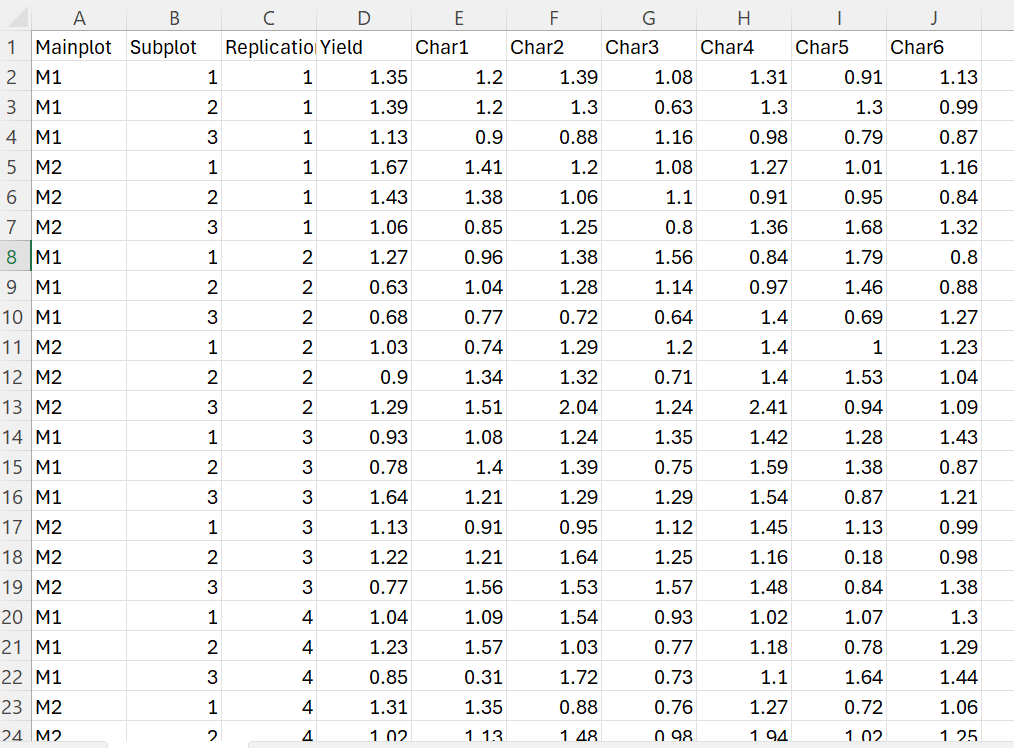
This dataset ships with the module as Dataset 1 on the Datasets tab (Section 6.3). If you want to follow the tutorial exactly, download it there and upload it under Analysis.
6 How to prepare your data
The quality of an analysis depends on the quality and structure of the input data. For a split-plot analysis, the treatment and replication structure must be represented correctly. RAISINS provides four ways to prepare the dataset:
- Create your dataset in MS Excel
- Build your dataset directly within the RAISINS app
- Use the Model datasets in RAISINS as a reference
- Create your dataset using the RA-One chat assistant
6.1 Preparing data in MS Excel
Lay the file out exactly as in Figure 3: the first column holds the main-plot levels (here Mainplot, with levels M1 and M2), the second column the subplot levels (here Subplot, with levels 1, 2 and 3), the third column the replication (here Replication, numbered 1–4), and each further column is one response variable (Yield, Char1, Char2, …). Every row is one subplot, the smallest unit on which a measurement was taken, so a file for a \(2 \times 3 \times 4\) experiment has 24 data rows beneath the header.
Two rules are particularly important. First, keep each treatment label consistent throughout the dataset, for example, use M1 rather than alternating between M1, m1, and M 1. Second, ensure that every subplot treatment appears once within every main-plot × replication combination. This complete nesting is required to represent the split-plot structure and to estimate the two error terms correctly. Avoid blank rows within the dataset and save the completed file as CSV before uploading.
Dataset creation rules
- Column naming convention
- No spaces allowed in column names.
- Use underscores (
_) or full stops (.) for separation. - Avoid symbols and special characters such as %, #.
- Data arrangement
- Start the data towards the upper-left corner.
- Ensure the row above the data is not blank.
- Cell management
- Avoid typing or deleting in cells without data.
- If needed, select the affected cells, right-click, and choose Clear Contents.
- Main Plot, subplot, replication and response columns
- The first three columns must be the main-plot factor, the subplot factor and the replication; every remaining column is a numeric response.
- Use the same label for a level everywhere it appears, so RAISINS reads the correct number of levels and replications.
- The nesting must be complete
- Each main-plot treatment appears once per replication, and each subplot treatment appears once inside each of those whole plots. Do not average subplots into a single row, and do not omit a subplot treatment from a whole plot; the design must stay balanced for the standard errors and critical differences to be exact.
How to save as CSV in MS Excel
Open your workbook. Ensure your data is arranged properly with only one sheet.
Click the ‘File’ menu. Go to the top-left corner and click File.
Choose ‘Save As’ or ‘Save a Copy’. Select the location where you want to save your file.
Set file type to CSV. In the ‘Save as type’ dropdown, choose CSV (Comma delimited) (*.csv).
Name your file. Enter a relevant file name without spaces (use underscores if needed).
Click ‘Save’. Click Save to export the file.
💡 Tip: Before saving, double-check that your data is on the first sheet and follows the required format.
6.2 Prepare using Create Data in RAISINS
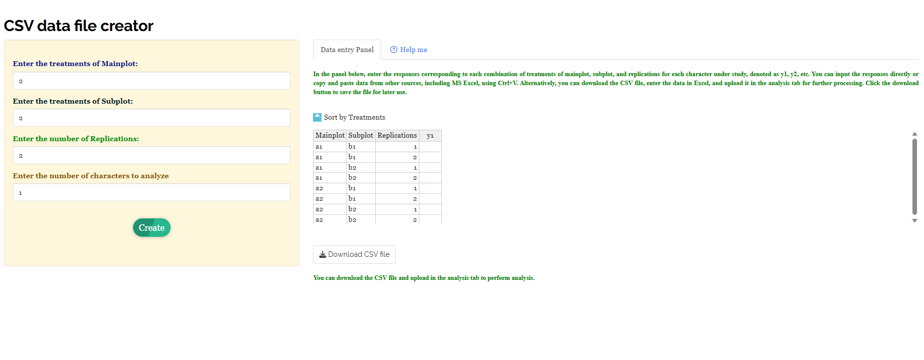
If you are unsure about the correct format, RAISINS can build the layout for you. Open the Create Data tab and fill in four boxes (Figure 4):
- Enter the treatments of Mainplot - how many levels the main-plot factor has,
- Enter the treatments of Subplot - how many levels the subplot factor has,
- Enter the number of Replications - how many times the whole layout is repeated,
- Enter the number of characters to analyze - how many response variables you plan to measure.
Click Create. The Data entry Panel generates one row for each main-plot × subplot × replication combination and provides empty response columns (y1, y2, …) for data entry. Values can be entered manually or pasted from Excel using Ctrl + V. The Sort by Treatments option groups related treatment combinations together for convenient data entry; the order of rows does not affect the analysis. After completing the table, click Download CSV file and upload the file under the Analysis tab.
6.3 Download the Model datasets
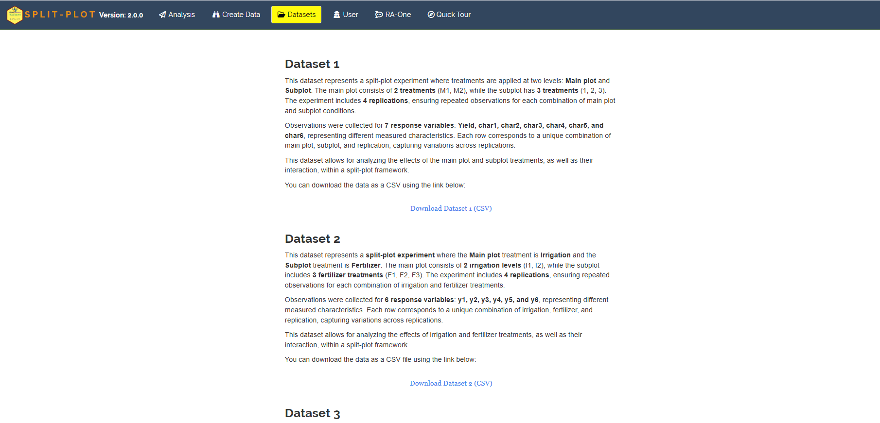
If you would like to explore the module before using your own data, RAISINS provides model datasets on the Datasets tab (Figure 5), each described in full before you download it. Dataset 1 is the file used throughout this tutorial: 2 main-plot treatments (M1, M2), 3 subplot treatments (1, 2, 3), 4 replications and 7 response variables. Dataset 2 is the same structure dressed in agronomic clothing, irrigation as the main-plot (I1, I2) and fertilizer as the subplot (F1, F2, F3), which is a useful reminder of what the two strata mean in practice. To use one:
- Open the Datasets tab
- Read the description and click the Download Dataset (CSV) link beneath it
- Save the file, then either study its layout as a reference for your own file or upload it directly under Analysis to see the full analysis at once
6.4 Creating a dataset using RA-One chat
RA-One, the built-in chat assistant, can build a correctly formatted template through an ordinary conversation. Open the RA-One tab and describe your experiment in plain language, for instance “Create data for 2 Main Plot levels, 3 Sub Plot levels, 4 blocks, 2 variables” (Figure 6 (a)). RA-One returns a ready-to-fill template with one row per subplot, the Main Plot, Sub Plot and Block columns already filled in, and empty y1, y2 columns for your readings (Figure 6 (b)).
RA-One does something the plain template cannot: it checks the size of the design for you. Above the table it prints the subplot error degrees of freedom, here Error(b) df = 2 × (3−1) × (4−1) = 12, which is the formula from Section 2 evaluated on your own numbers. If the design looks too thin, change the level counts in the boxes provided and click Rebuild before you ever collect data. Fill in the responses, download the CSV, and upload it under Analysis.

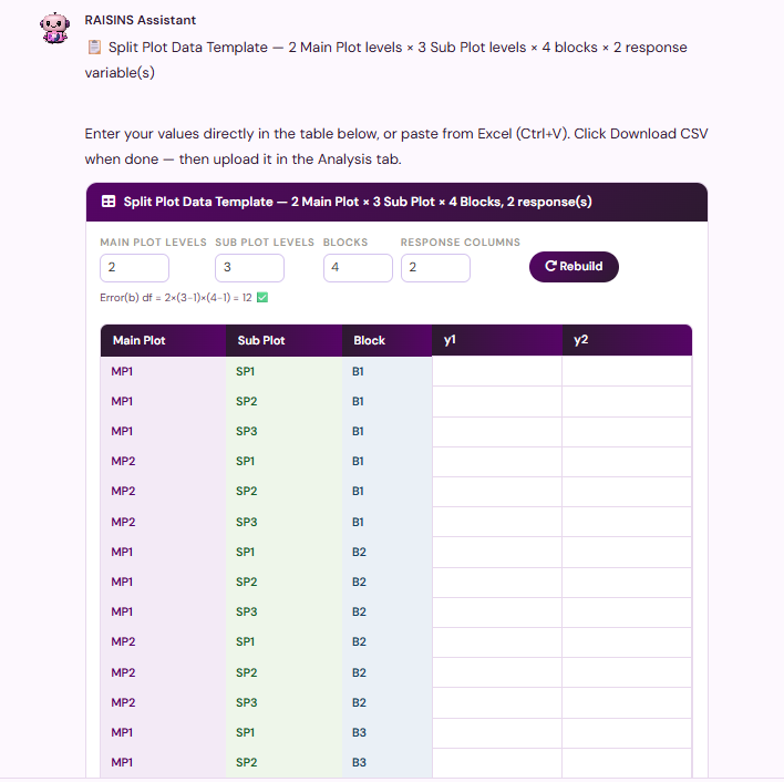
All three in-app routes ask for exactly the same three numbers, levels of the main-plot factor, levels of the subplot factor and number of replications, and produce \(a \times b \times r\) rows. The template directly represents the required observation count: one row per subplot, with the error-df formula printed back to you.
7 The Analysis tab
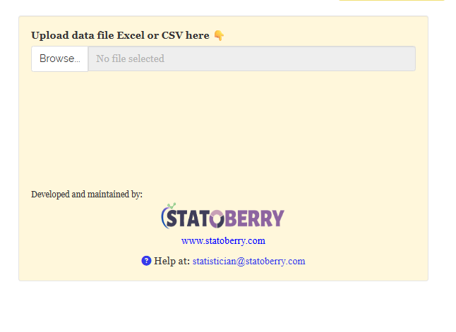
After preparing the CSV file, open the Analysis tab. Click Browse… under Upload data file Excel or CSV here and select the CSV file (Figure 7). A blue Upload complete message confirms that the file has been loaded.
Once the file is in, RAISINS reads its column names and asks you to point it at the right columns (Figure 8). The three selectors follow the structure of the design exactly, from the largest unit to the smallest:
- Select Main Plot - the column holding the main-plot (whole plot) levels; here
Mainplot, with levels M1 and M2. - Select Sub Plot - the column holding the subplot levels; here
Subplot, with levels 1, 2 and 3. - Select the replication - the column identifying the replication; here
Replication, numbered 1 to 4. - Select variables - one or more response columns to analyse. You may select all of them at once, here
Yield, Char1, Char2, Char3, Char4, Char5, Char6, and RAISINS analyses each in turn. - Click for Transformation - an optional toggle to transform a skewed response before analysis (see below).
Getting the first two selectors the right way round matters more here than in any other module. The main-plot column and the subplot column are not interchangeable: they decide which factor is tested against Error(a) and which against Error(b), and therefore how much precision each factor receives. If you swap them, the analysis will still run and still produce a table, but it will be answering a different experiment from the one you carried out.
When the columns are chosen, click Run Analysis!. RAISINS fits the split-plot model to every selected response and fills the results sub-tabs, Analysis.Results, Basic Plots, Advanced Plots, Interpretation, Multivariate, FAQs and View Data.
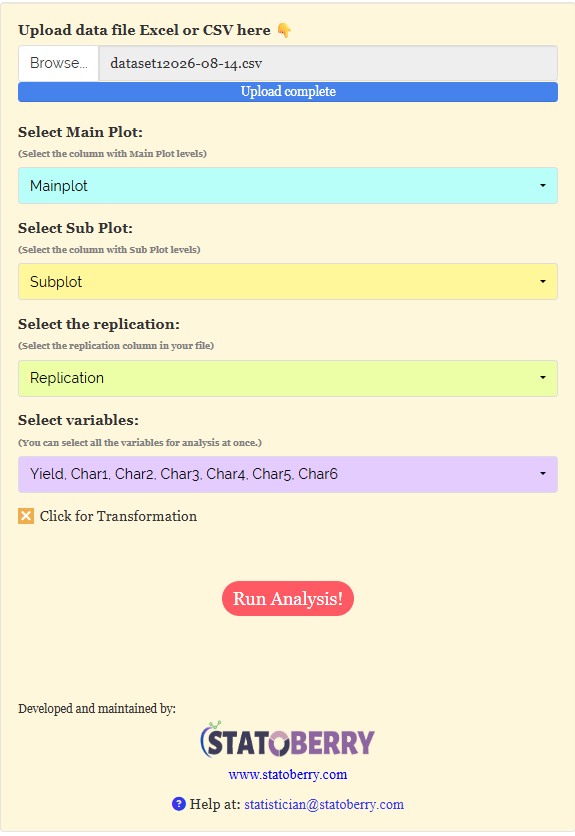
You do not need to run the module once per response. Select all the response columns together and RAISINS produces a complete ANOVA, mean-comparison and effect-size table for each. This is why every results table in the next section carries one column per trait, Yield through Char6.
7.1 Optional: transforming a response
The split-plot ANOVA assumes that the model residuals are approximately normally distributed and that the variability is reasonably similar across treatment combinations. If a response is strongly skewed or its variability increases with its mean, select Click for Transformation before running the analysis and choose an appropriate transformation. RAISINS then performs the analysis on the transformed scale and reports the transformed mean in parentheses alongside the original mean, allowing the analysis to be traced clearly.
A transformation is a temporary change of scale to make the test valid; it does not change your experiment. Report that a transformation was used, but discuss the means and recommendations in the original units. If no assumption is violated, leave the toggle off, an unnecessary transformation only makes the results harder to read.
8 Analysis results
The Analysis.Results sub-tab presents the split-plot ANOVA results. The control panel allows you to select the multiple-comparison test (LSD by default), the significance level (\(\alpha\), 0.05 by default), the number of decimal places, and the font (Figure 9). RAISINS also provides a brief summary of the design and analysis settings, followed by four main result tables: the ANOVA summary, main-plot means, subplot means, and interaction means. Each table contains a separate column for each response variable.
The note concerning critical differences is important: CD values are calculated only if ANOVA detects a significant difference. If ANOVA is not significant, no CD is calculated, and a ‘-’ is shown. Therefore, a dash in a CD row indicates that the corresponding ANOVA test was not significant; it does not indicate missing data.
Table 1: ANOVA summary - mean squares and significance
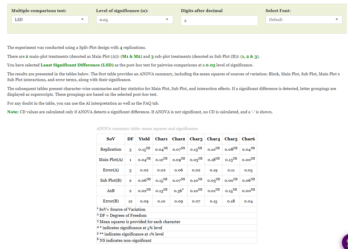
This table reflects the two strata described in Section 2. Its row order shows how the sources of variation are separated in a split-plot design. Replication (3 df) comes first, then Main Plot(A) (1 df) and immediately beneath it Error(A) (3 df), the error against which the main-plot is tested. Then the lower storey: Sub Plot(B) (2 df), A × B (2 df) and Error(B) (12 df), the error against which both of those are tested. The degrees of freedom match the formulas in Section 2 exactly for a \(2 \times 3 \times 4\) experiment.
Each cell is that source’s mean square for the response, carrying a superscript flag: * for significance at 5%, ** at 1%, and NS for non-significant. Scanning this table takes only a moment, because almost everything is NS. Neither the main-plot nor the subplot factor reached significance for any of the seven traits: the Main Plot(A) mean squares run from 0.00 (Char6) to 0.18 (Char4), and the Sub Plot(B) mean squares from 0.00 (Char5) to 0.15 (Char1), all against error mean squares of comparable size. Exactly one cell in the table carries a star: the A × B interaction for Char2, at \(0.36^{*}\). Every other interaction is non-significant, the largest of them being Char5 at \(0.15^{NS}\).
Note also the two error mean squares themselves, and how differently they behave. Error(A) is smaller than Error(B) for four of the seven traits (Yield 0.02 against 0.09, Char1 0.02 against 0.10, Char3 0.02 against 0.07, Char6 0.05 against 0.04 being the exception), but it rests on only 3 degrees of freedom against Error(B)’s 12. A small mean square on 3 df is a fragile thing: it is why the main-plot test is the weakest test in the design, and why a main-plot difference has to be large before it can be detected at all.
In every other ANOVA in RAISINS there is a single Error row, and every treatment mean square is divided by it. Here there are two, and each one belongs to a particular stratum. Error(A) measures how much whole plots that received the same main-plot treatment differ from one another, so it is the right denominator for the Main Plot(A) test and nothing else. Error(B) measures how much subplots within the same whole plot differ, so it is the right denominator for Sub Plot(B) and for the interaction. Using a single pooled error would test the main-plot too generously and the subplot too harshly. The whole design exists to keep these two apart.
How this table is built
RAISINS fits the split-plot linear model for each trait, with the replication effect, the main-plot effect and the whole plot error forming the upper stratum and the subplot effect, the interaction and the subplot error forming the lower stratum. Each source’s mean square is its sum of squares divided by its degrees of freedom. The F-test for Main Plot(A) divides its mean square by Error(A); the F-tests for Sub Plot(B) and A × B divide theirs by Error(B). The p-value behind each F decides the * / ** / NS flag against the chosen \(\alpha\). The CPRR (Section 3.1) names the exact function used and prints runnable R code for each step.
Table 2: Main Plot (A) - means and comparison statistics
The main-plot table presents the means for the two levels of the main-plot factor, averaged over subplot treatments and replications. It reports the mean ± SD, F statistic, p value, critical difference CD (A), and the associated SE(m), SE(d), CV(%), and Cohen’s F. Because none of the main-plot effects is significant in this dataset (Figure 9), the CD (A) entries are shown as “–” and no letter groupings are provided. The treatment means remain useful for describing the observed pattern. For example, Yield has means of \(1.08 \pm 0.31\) for M1 and \(1.16 \pm 0.24\) for M2, while Char1 has means of \(1.06 \pm 0.32\) and \(1.20 \pm 0.27\), respectively.
Table 3: Sub Plot (B) - means and comparison statistics
The subplot table has the identical layout, now averaging over the whole plots and replications to show the effect of the subplot factor across its three levels, 1, 2 and 3, with CD (B) as its critical difference. Again no trait reached significance, so the CD (B) row reads “–” throughout. The margins in Figure 13 show the pattern that did not quite reach significance: for Yield, subplot 1 averages \(1.22 \pm 0.24\) against \(1.07 \pm 0.29\) for subplot 2 and \(1.07 \pm 0.31\) for subplot 3; for Char1, subplot 2 is highest at \(1.28 \pm 0.17\) and subplot 3 lowest at \(1.01 \pm 0.41\).
Table 4: Interaction A × B - cell means and comparison statistics
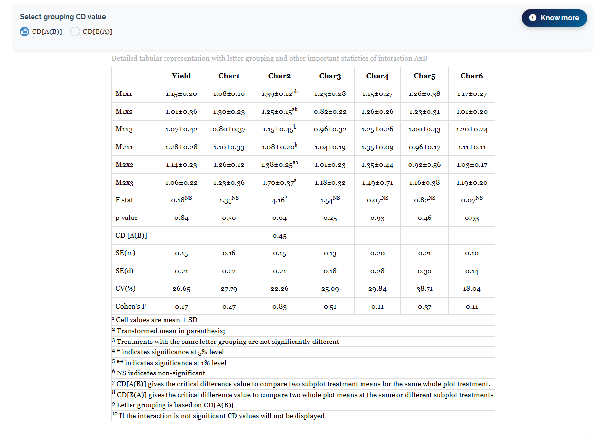
This is the table the split-plot design was built to produce. Its rows are the six treatment combinations, each main-plot level crossed with each subplot level (M1×1, M1×2, M1×3, M2×1, M2×2, M2×3), shown as mean ± SD. When the interaction is significant for a response, a letter grouping appears as a superscript: combinations sharing a letter are not significantly different.
Only one response earns its letters here. For Char2 the interaction F is \(4.16^{*}\) with \(p = 0.04\), and the critical difference CD [A(B)] is 0.45. The letters follow: M2×3 is highest at \(1.70 \pm 0.37\) (letter a), while M1×3 at \(1.15 \pm 0.45\) and M2×1 at \(1.08 \pm 0.20\) are lowest (letter b); the remaining three combinations carry ab, meaning they cannot be separated from either extreme. For every other trait the F statistic is non-significant, Yield \(0.18^{NS}\) (\(p = 0.84\)), Char1 \(1.35^{NS}\) (\(p = 0.30\)), Char3 \(1.54^{NS}\) (\(p = 0.25\)), Char4 \(0.07^{NS}\) (\(p = 0.93\)), Char5 \(0.82^{NS}\) (\(p = 0.46\)) and Char6 \(0.07^{NS}\) (\(p = 0.93\)), so those columns show no letters and their CD rows read “–”.
The lower rows report the standard error of a mean SE(m), the standard error of a difference SE(d), the coefficient of variation CV(%) and the Cohen’s F effect size. The CV values are also provide useful information about experimental precision: they run from 18.04% for Char6 up to 38.71% for Char5, which tells you that Char5 was measured with far less precision than Char6 and would need a much larger effect before any test could detect it.
8.1 The two critical differences: CD[A(B)] and CD[B(A)]
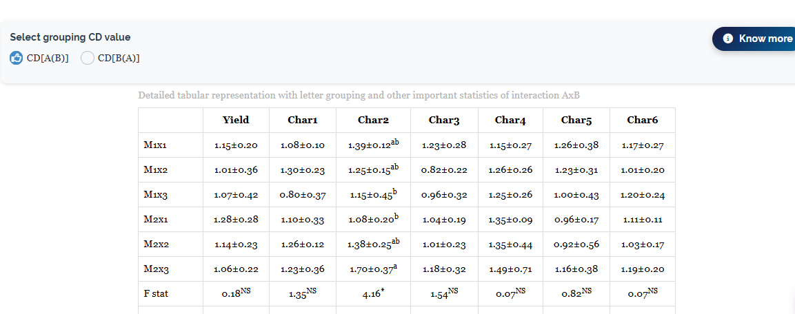
Above the interaction table, RAISINS provides two radio buttons labelled CD[A(B)] and CD[B(A)], together with a Know more button (Figure 11). These options allow the user to select the critical difference appropriate to the type of comparison being considered. Understanding this distinction is important when interpreting or reporting the interaction means.
The reason a split-plot needs two critical differences is simple, and it follows entirely from the layout in Figure 1. Some comparisons stay inside a single whole plot, and some have to cross from one whole plot to another. Those two kinds of comparison do not carry the same amount of noise, so they cannot share one yardstick.
RAISINS states the two definitions in the footnotes of Figure 10, in these words:
| Critical difference | What it compares |
|---|---|
| CD[A(B)] | “the critical difference value to compare two subplot treatment means for the same whole plot treatment” |
| CD[B(A)] | “the critical difference value to compare two whole plot means at the same or different subplot treatments” |
Put in the terms of the working example: comparing subplot 1 with subplot 3 within M1 is a CD[A(B)] comparison, because both subplots sit in the same whole plot, share the same main-plot treatment and differ only in the treatment applied to them individually. Comparing M1×1 with M2×1 is a CD[B(A)] comparison, because the two subplots being compared lie in different whole plots, and any difference between them therefore carries whole plot noise as well as subplot noise on top of the treatment effect.
Consequently, CD[B(A)] is generally larger and provides a more conservative comparison. It incorporates variation from the whole-plot stratum as well as the subplot stratum. Thus, differences within a whole plot can usually be detected more precisely than differences that involve comparisons across whole plots. This difference in precision is an inherent feature of the split-plot design.
Footnote 9 of Figure 10 states plainly that letter grouping is based on CD[A(B)]. So the a / ab / b letters printed against Char2, and the 0.45 quoted beside them, describe comparisons made between subplot treatments within the same main-plot. If the comparison you actually want to make crosses whole plots, switch the radio button to CD[B(A)] and read the regrouped letters, do not reuse the CD[A(B)] letters for a question they were not computed to answer.
The arithmetic behind the two yardsticks
Both critical differences have the same shape, a \(t\) value multiplied by the standard error of a difference, \(CD = t \times SE(d)\); what differs is which error mean squares enter the standard error and how many degrees of freedom the \(t\) carries.
For a comparison of two subplot means within the same whole plot, the comparison is based on the subplot error, so the standard error of the difference is constructed from \(MSE_b\), with the \(t\) value based on the Error(b) degrees of freedom (12 in the working example). This corresponds to CD[A(B)] and generally provides the more precise comparison.
For a comparison that crosses whole plots, both strata contribute. The standard error has to combine \(MSE_a\) and \(MSE_b\), and because the resulting quantity is a mixture of two mean squares with different degrees of freedom, the appropriate \(t\) is itself a weighted blend of the \(t\) values for Error(a) and Error(b) rather than a single tabulated value. This is the CD[B(A)] case. The CPRR for the module (Section 3.1) prints the exact expressions RAISINS evaluates, together with runnable R code, if you need to reproduce or cite them.
8.2 The two-way table view
Three toggles sit above the results tables and control how they are displayed (Figure 12): Show mean ± standard deviation, Two-way table, and Show letter grouping. Switching on Two-way table redraws the interaction results for each trait as a grid, main-plot levels down the rows and subplot levels across the columns, with Mean(A) and Mean(B) margins and the overall mean in the bottom-right corner (Figure 13).

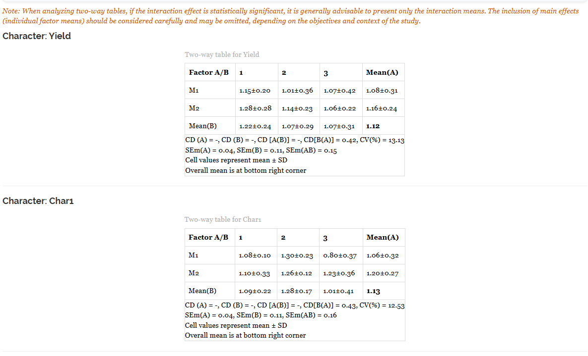
This is the most readable form of the results, because it shows the margins and the cells at the same time, and because it prints all four critical differences on one line beneath each table, CD (A), CD (B), CD [A(B)] and CD[B(A)], alongside the three standard errors SEm(A), SEm(B) and SEm(AB) and the coefficient of variation. For Yield the line reads CD (A) = -, CD (B) = -, CD [A(B)] = -, CD[B(A)] = 0.42, CV(%) = 13.13, with SEm(A) = 0.04, SEm(B) = 0.11, SEm(AB) = 0.15 beneath it and an overall mean of 1.12. For Char1 it reads CD[B(A)] = 0.43, CV(%) = 12.53, with SEm(A) = 0.04, SEm(B) = 0.11, SEm(AB) = 0.16 and an overall mean of 1.13.
The three dashes on each of those lines are the significance rule doing its work: no main-plot, subplot or interaction effect was significant for Yield or Char1, so RAISINS withholds those three yardsticks. Notice too how the three standard errors grow as the comparison becomes finer-grained, SEm(A) is 0.04, SEm(B) is 0.11, and SEm(AB), the standard error of an individual cell mean, is 0.15 for Yield. A margin is averaged over more observations than a cell, so it is estimated more precisely.
The two-way tables also provide an important reporting guideline: when the interaction effect is statistically significant, it is generally advisable to present the interaction means rather than interpreting the main effects separately. When the effect of one factor depends on the level of the other, the marginal means can obscure this relationship. In the present dataset, this consideration applies to Char2.
8.3 Interpretation from Figure 9
Taken together, the results show one statistically significant finding and six responses for which no statistically significant treatment effect was detected.
The significant result concerns Char2. Its A × B interaction is significant (\(0.36^{*}\) in Figure 9; \(F = 4.16^{*}\), \(p = 0.04\) in Figure 10), which means the effect of the subplot treatment on Char2 depends on which main-plot it sits in. The cell means show what that looks like: under M1, Char2 falls as you move from subplot 1 to subplot 3 (\(1.39 \rightarrow 1.25 \rightarrow 1.15\)), whereas under M2 it rises across the same three subplot treatments (\(1.08 \rightarrow 1.38 \rightarrow 1.70\)). The two profiles run in opposite directions, which is the textbook signature of an interaction, and it is exactly what Figure 17 draws. With CD [A(B)] \(= 0.45\), only the extremes separate: M2×3 (\(1.70 \pm 0.37\), letter a) is significantly above M1×3 (\(1.15 \pm 0.45\)) and M2×1 (\(1.08 \pm 0.20\), both letter b), while the three ab combinations sit between them and cannot be told apart from either end. Note also that Char2 carries the largest Cohen’s F in the table, 0.83, so this is not merely a significant effect but a substantial one. Because the interaction is significant, the correct thing to report for Char2 is the table of six cell means, not the main-plot or subplot averages.
For Yield, Char1, Char3, Char4, Char5 and Char6, none of the main-plot, subplot, or interaction effects was statistically significant at \(\alpha = 0.05\). Thus, the experiment did not provide sufficient evidence of treatment differences for these responses under the conditions and replication level used. These non-significant results should be reported alongside the significant result for Char2 rather than omitted.
The Cohen’s F values should be considered alongside the p-values. Char2 has a large effect size (0.83) and a statistically significant interaction. Char3 (0.51) and Char1 (0.47) also show relatively large effect sizes, although their corresponding tests are not significant. Given the limited degrees of freedom, particularly the 3 degrees of freedom for Error(A), non-significance should be interpreted as insufficient evidence of an effect rather than evidence that the effect is absent. Additional replications may provide greater precision where scientifically justified.
Reading every row of the results tables
- Mean ± SD - the treatment or cell mean and its standard deviation; a transformed mean, if a transformation was applied, is shown in parentheses.
- F stat / p value - the F-test for that source and its probability; the superscript (
*,**,NS) marks significance at the chosen \(\alpha\). Remember which error each F used: Error(A) for the main-plot, Error(B) for the subplot and the interaction. - CD - the critical difference from the selected post-hoc test; two means differing by more than the CD are significantly different. Shown as “–” whenever the corresponding F-test was non-significant.
- CD [A(B)] / CD[B(A)] - the two split-plot critical differences explained in Section 8.1; the letter groupings follow CD[A(B)].
- SE(m) / SE(d) - standard error of a single mean and of a difference between two means.
- SEm(A) / SEm(B) / SEm(AB) - in the two-way view, the standard errors of a main-plot margin, a subplot margin and an individual cell mean respectively.
- CV(%) - coefficient of variation, the error SD as a percentage of the grand mean; it gauges experimental precision, and a large value warns that only large effects will be detectable.
- Cohen’s F - a standardised effect size for the source (roughly: below 0.10 very small, 0.25 small, 0.40 medium, above 0.40 large).
9 Visualising the results
Tables provide the numerical results, while plots provide a visual representation of treatment differences and patterns. RAISINS groups its graphics into two sub-tabs, Basic Plots and Advanced Plots. Every plot is drawn by clicking its icon, then customised in a Plot Settings panel and exported in the format you choose.
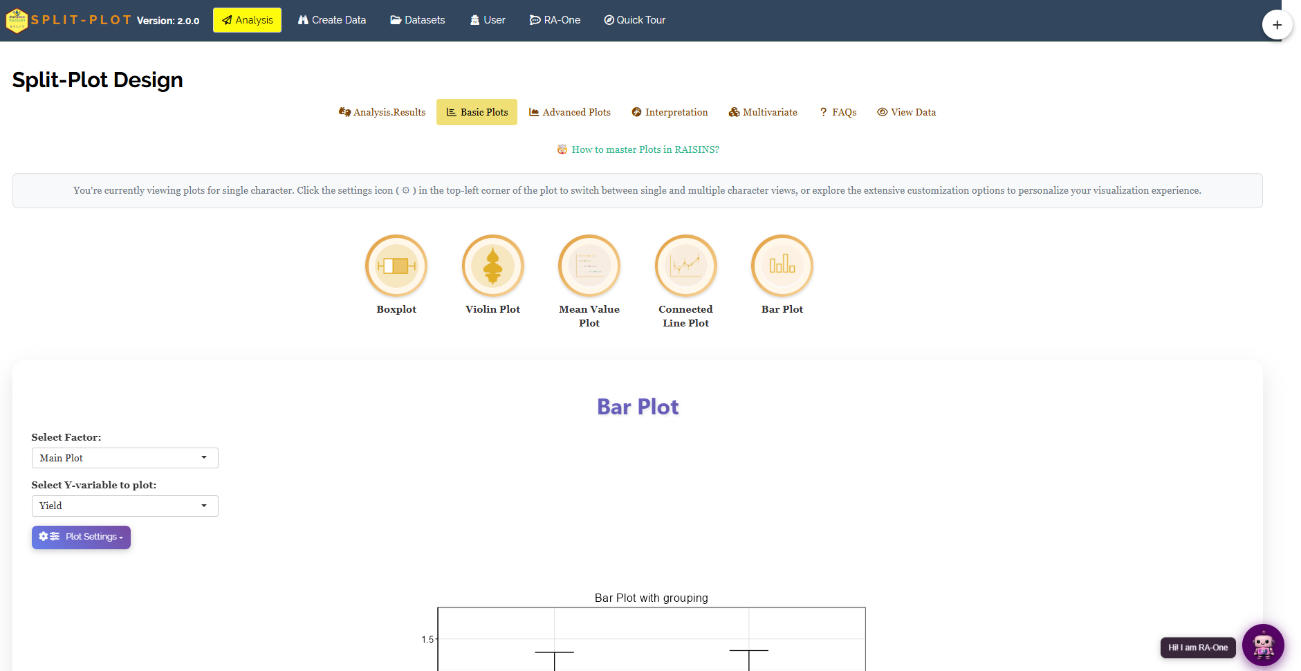
The Basic Plots tab (Figure 14) offers five everyday graphics: Boxplot, Violin Plot, Mean Value Plot, Connected Line Plot and Bar Plot. Two dropdowns sit outside the settings panel because these controls allow the factor and response to be selected: Select Factor, which chooses whether the x-axis shows the main-plot, the subplot or the interaction, and Select Y-variable to plot, which chooses the response. A note at the top of the tab reminds you that the plots open in single-character view, and that the settings icon in the top-left corner of each plot switches between single and multiple character views. Figure 15 shows the same set of means drawn four different ways.
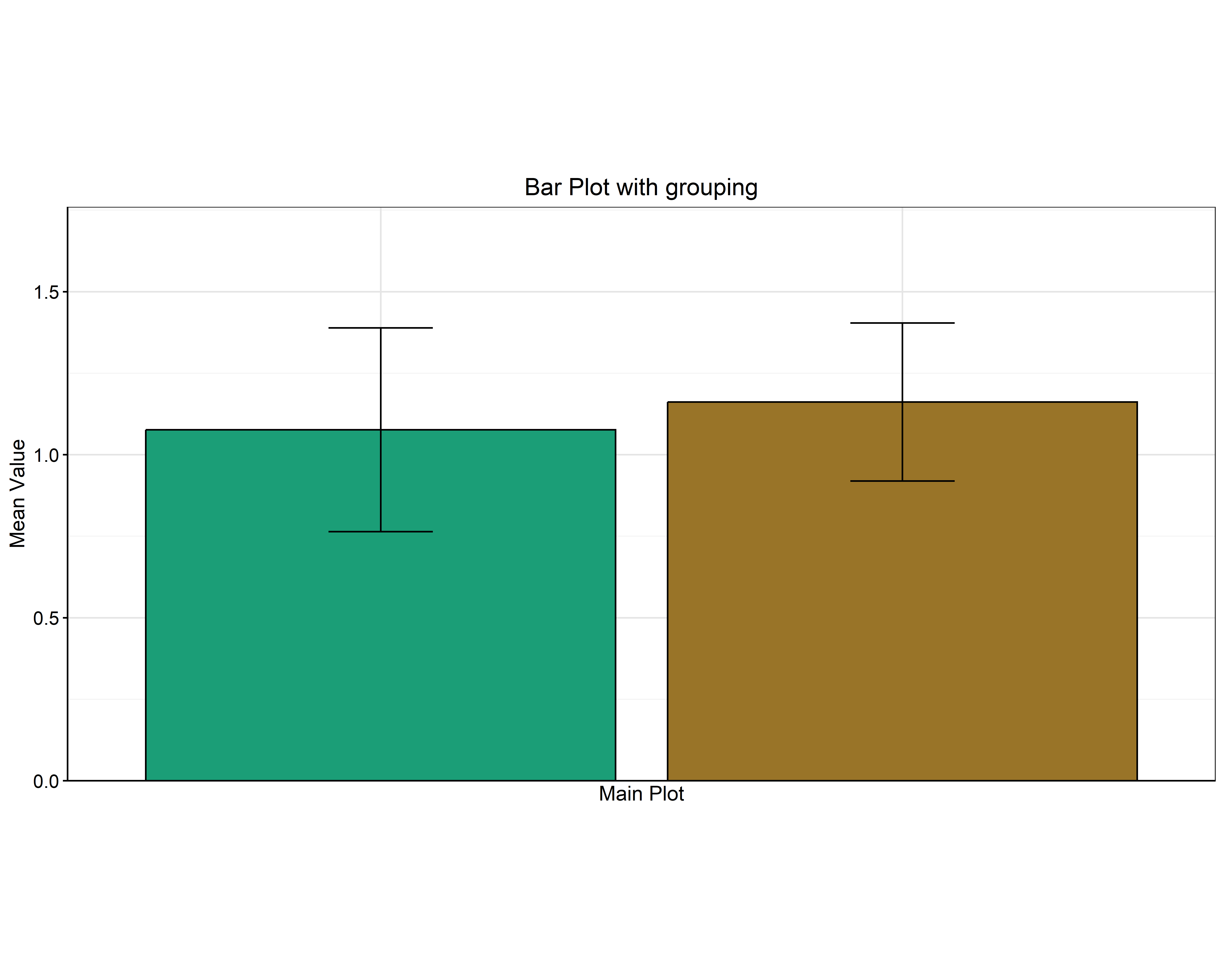
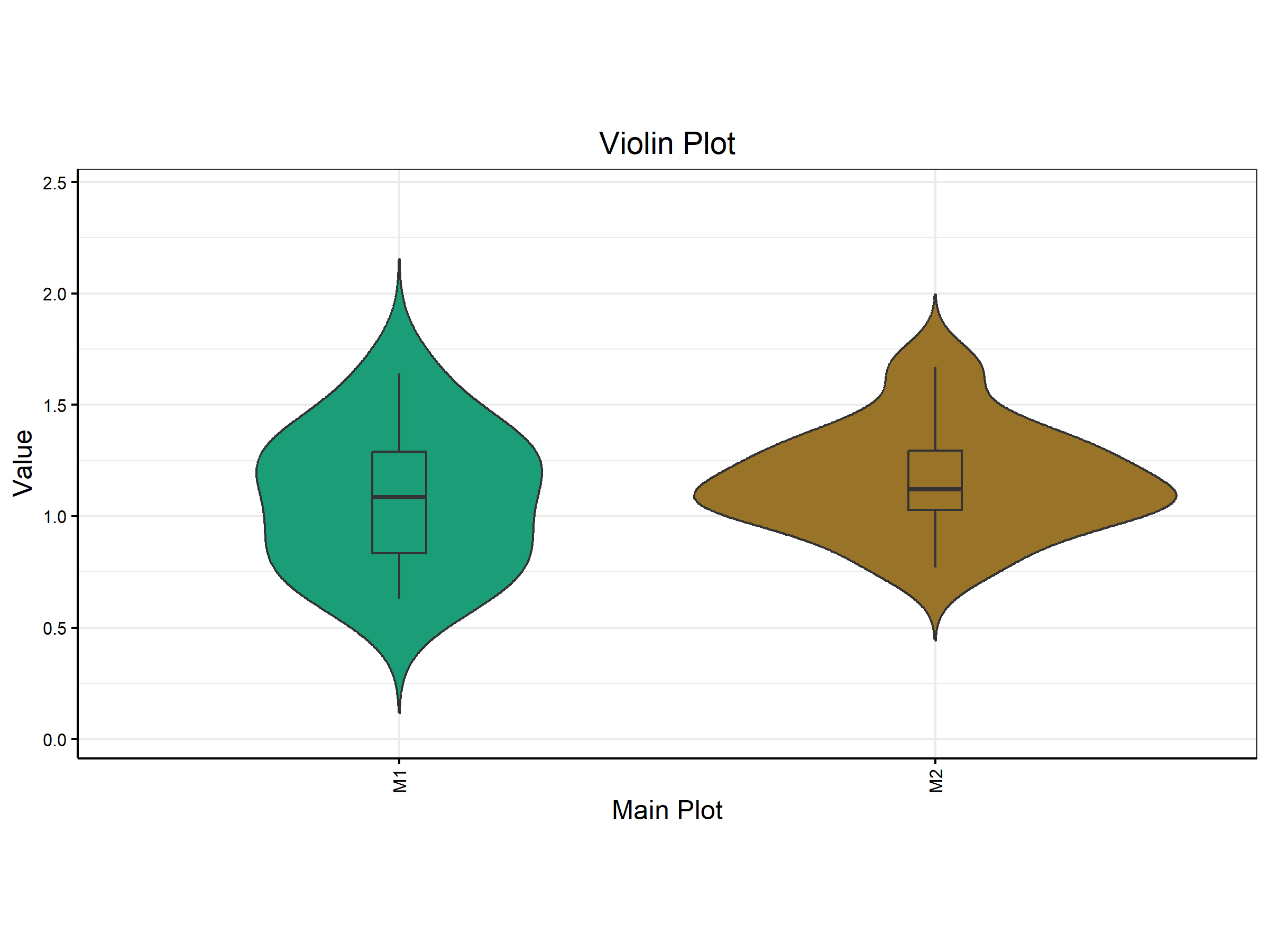
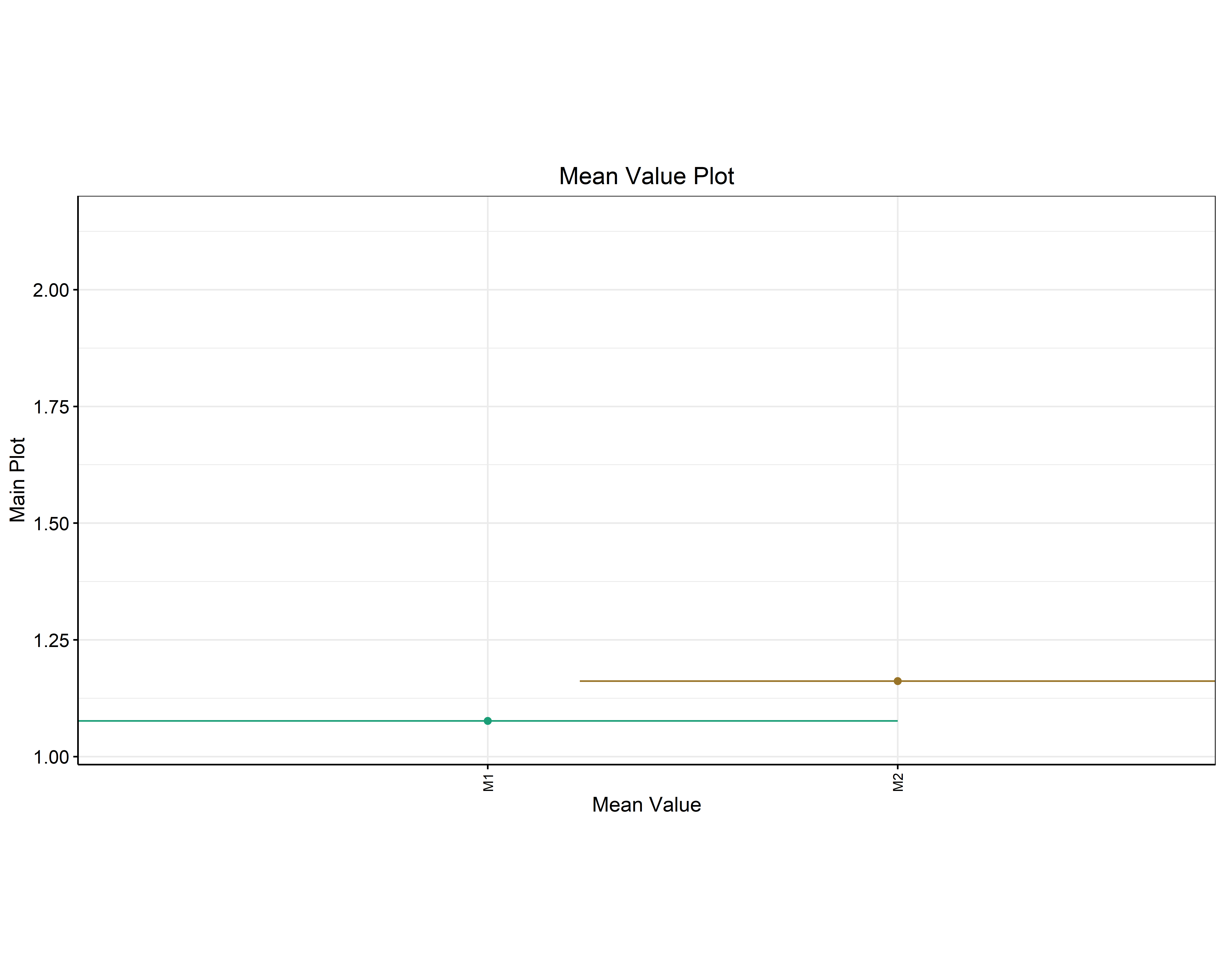
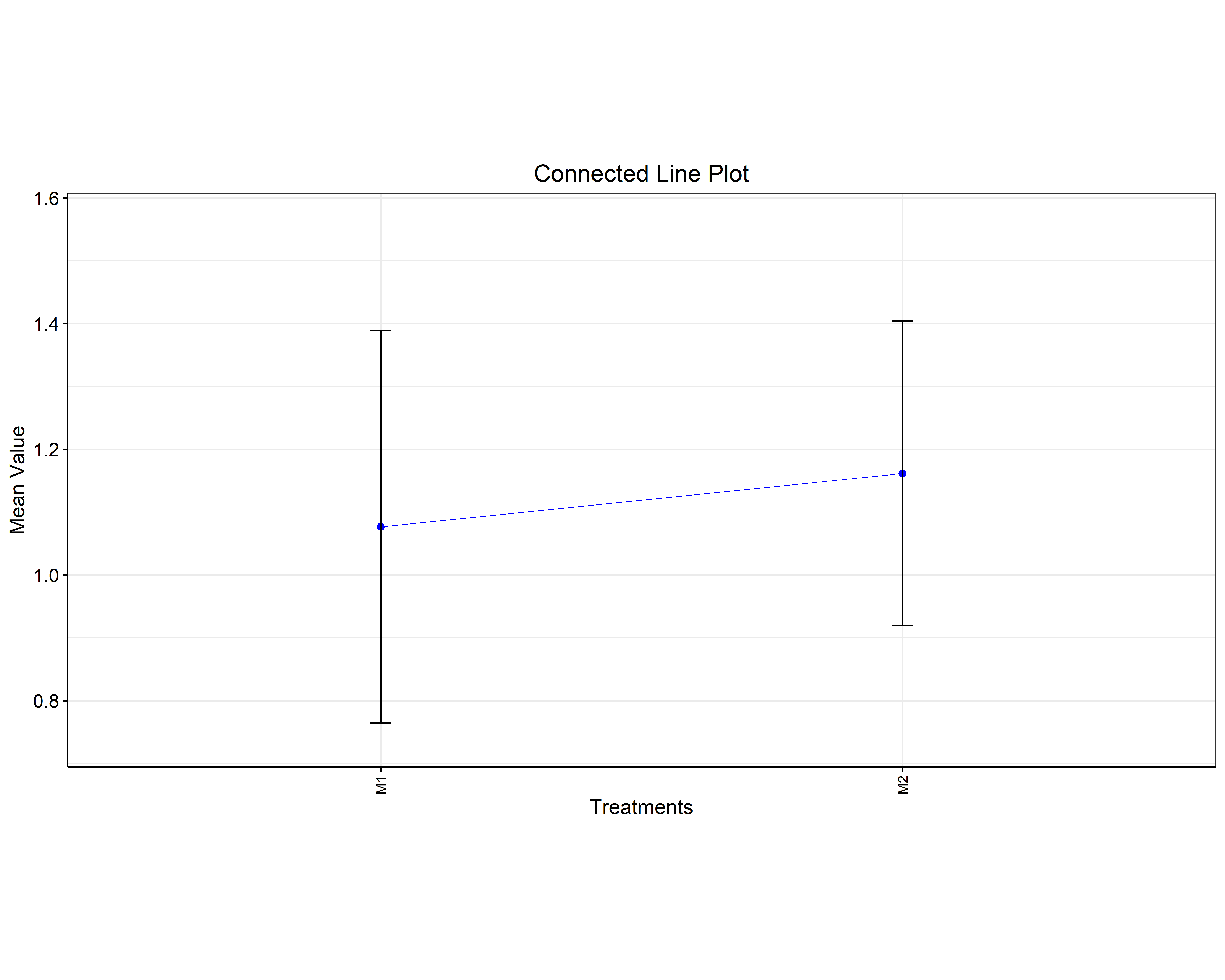
Any letters displayed above a bar, box, or point correspond to the same post-hoc groupings reported in the results tables. The plots and tables therefore represent the same statistical comparison in different forms. The format can be selected according to the purpose of the presentation or report.
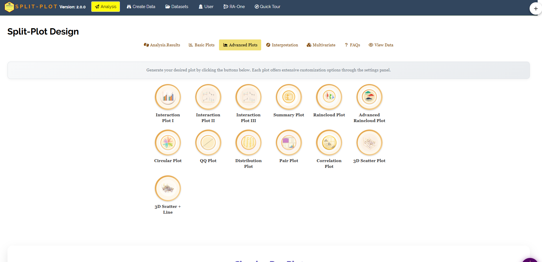
The Advanced Plots tab (Figure 16) adds thirteen specialised graphics, arranged as a grid of icons: Interaction Plot I, II and III, a Summary Plot, a Raincloud Plot and an Advanced Raincloud Plot, a Circular Plot, a QQ Plot, a Distribution Plot, a Pair Plot, a Correlation Plot, a 3D Scatter Plot and a 3D Scatter + Line. Click any icon to draw its plot, then fine-tune it in the settings panel beneath.
The interaction plot
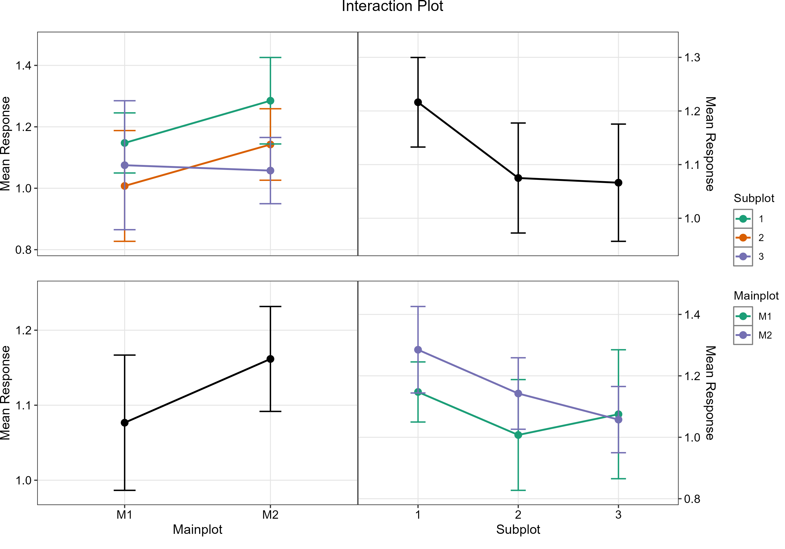
The Interaction Plot is particularly important because it provides a visual assessment of whether the effect of one factor depends on the level of the other factor. It draws the mean response for each level of one factor as a line across the levels of the other, and RAISINS shows both orientations at once together with each factor’s own main-effect line. Parallel lines signal no interaction; lines that cross or fan apart signal one. Compare this against the algebra of Section 8.1: whenever the lines are not parallel, no single “best” level of one factor exists independently of the other, and the interaction table rather than the margins is what you should report.
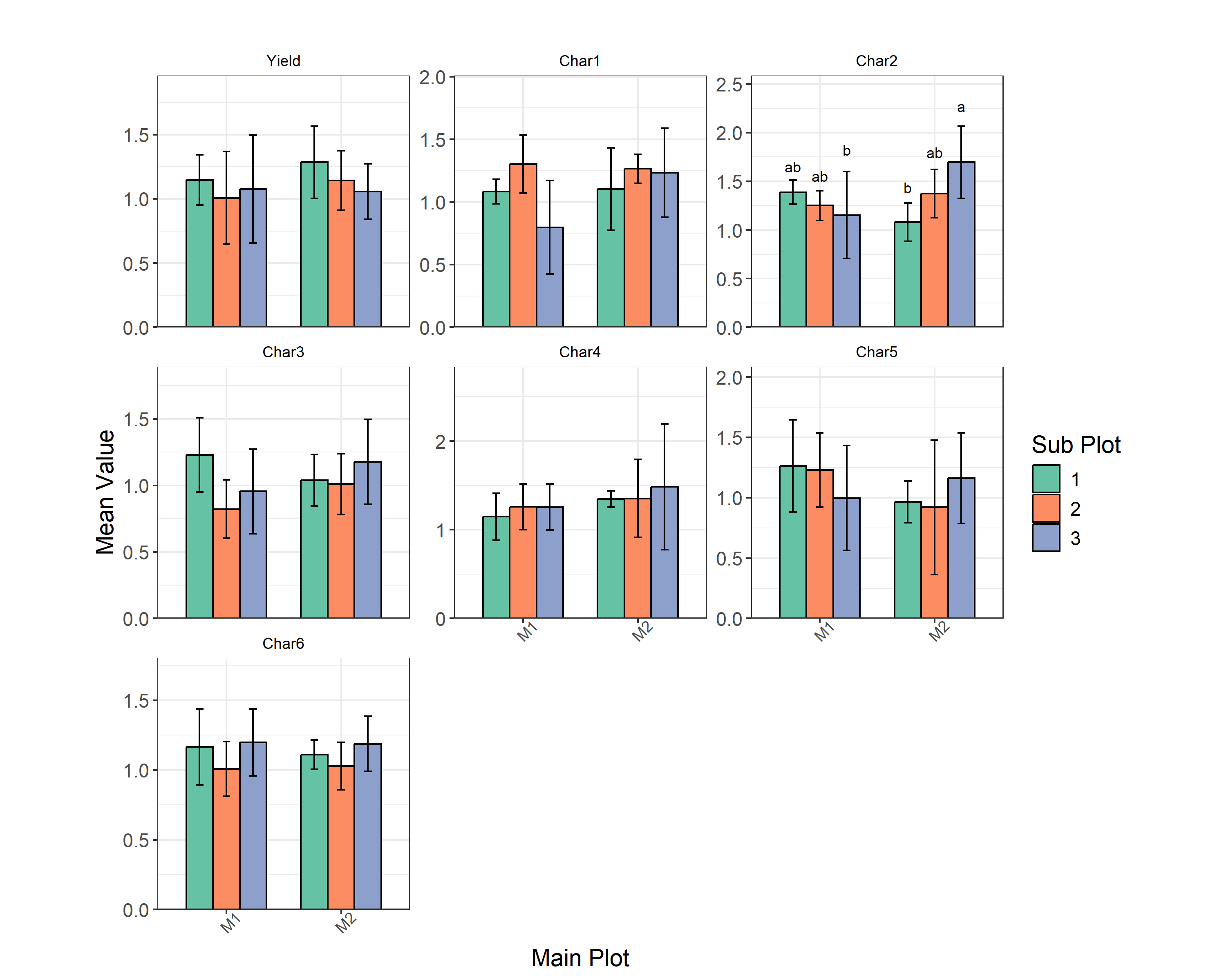
Figure 18 draws all seven traits at once as grouped bars, and it makes the argument of Section 8 visible in a single glance. Six of the seven panels show bars of much the same height with heavily overlapping error bars, the picture of a non-significant result. The Char2 panel is different: it is the only one carrying letters, and the three bars under M1 slope gently down while the three under M2 climb steeply up to the a-lettered M2×3. That crossing pattern is the significant A × B interaction, drawn.
The Summary Plot
The Summary Plot provides a compact summary of the uploaded data and can also be exported as an HTML document. For each column it reports a miniature distribution overview, the proportion of missing values, and the mean, median and SD. It is the quickest way to confirm that RAISINS read your file the way you intended before you trust anything downstream.
| Column | Missing | Mean | Median | SD |
|---|---|---|---|---|
| Treatment (M1 and M2) | 0.00 | 2 categories | – | – |
| Yield | 0.00 | 1.12 | 1.12 | 0.28 |
| Char1 | 0.00 | 1.13 | 1.16 | 0.30 |
| Char2 | 0.00 | 1.32 | 1.29 | 0.32 |
| Char3 | 0.00 | 1.04 | 1.09 | 0.27 |
| Char4 | 0.00 | 1.31 | 1.31 | 0.36 |
| Char5 | 0.00 | 1.09 | 1.02 | 0.37 |
| Char6 | 0.00 | 1.12 | 1.11 | 0.20 |
Three checks are particularly useful. First, Missing is 0.00 for every column, indicating that no observations are missing in this dataset. Second, Treatment is correctly identified as a categorical variable with two categories. Third, the overall means agree with the corresponding values in the two-way tables: Yield has an overall mean of 1.12 and Char1 has an overall mean of 1.13. Agreement between these summaries provides a useful check that the correct variables have been selected.
Where the mean and the median sit close together, as they do for Char4 (1.31 and 1.31) and Char6 (1.12 and 1.11), the distribution is roughly symmetric. Where they drift apart, as for Char5 (1.09 against 1.02), the trait is skewed and should be examined using the QQ or distribution plot before you rely on the ANOVA, and possibly a candidate for the transformation toggle in Section 7.
The remaining graphics look past a single response to the shape of the data and the relationships between traits. Figure 19 gathers three of them.
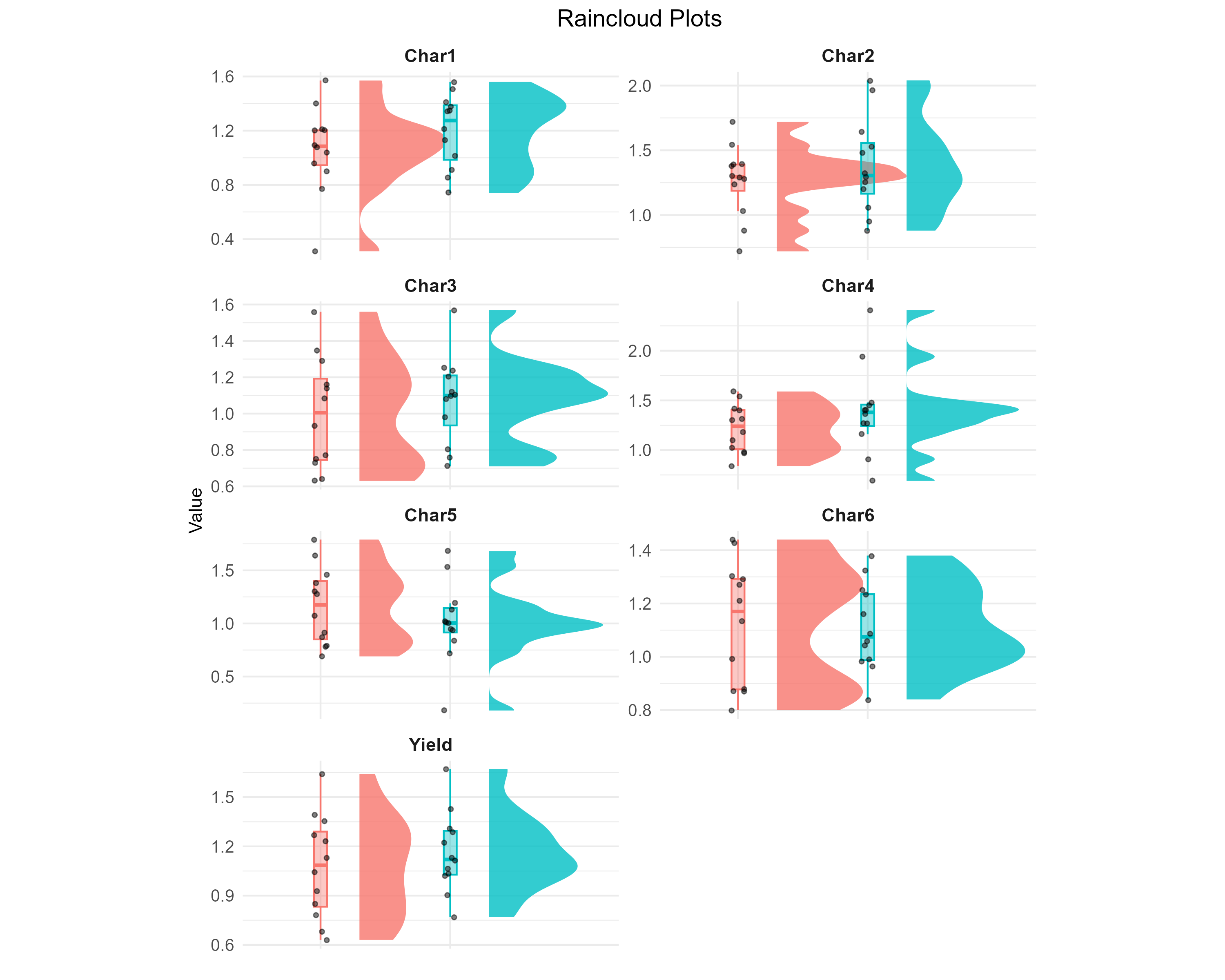
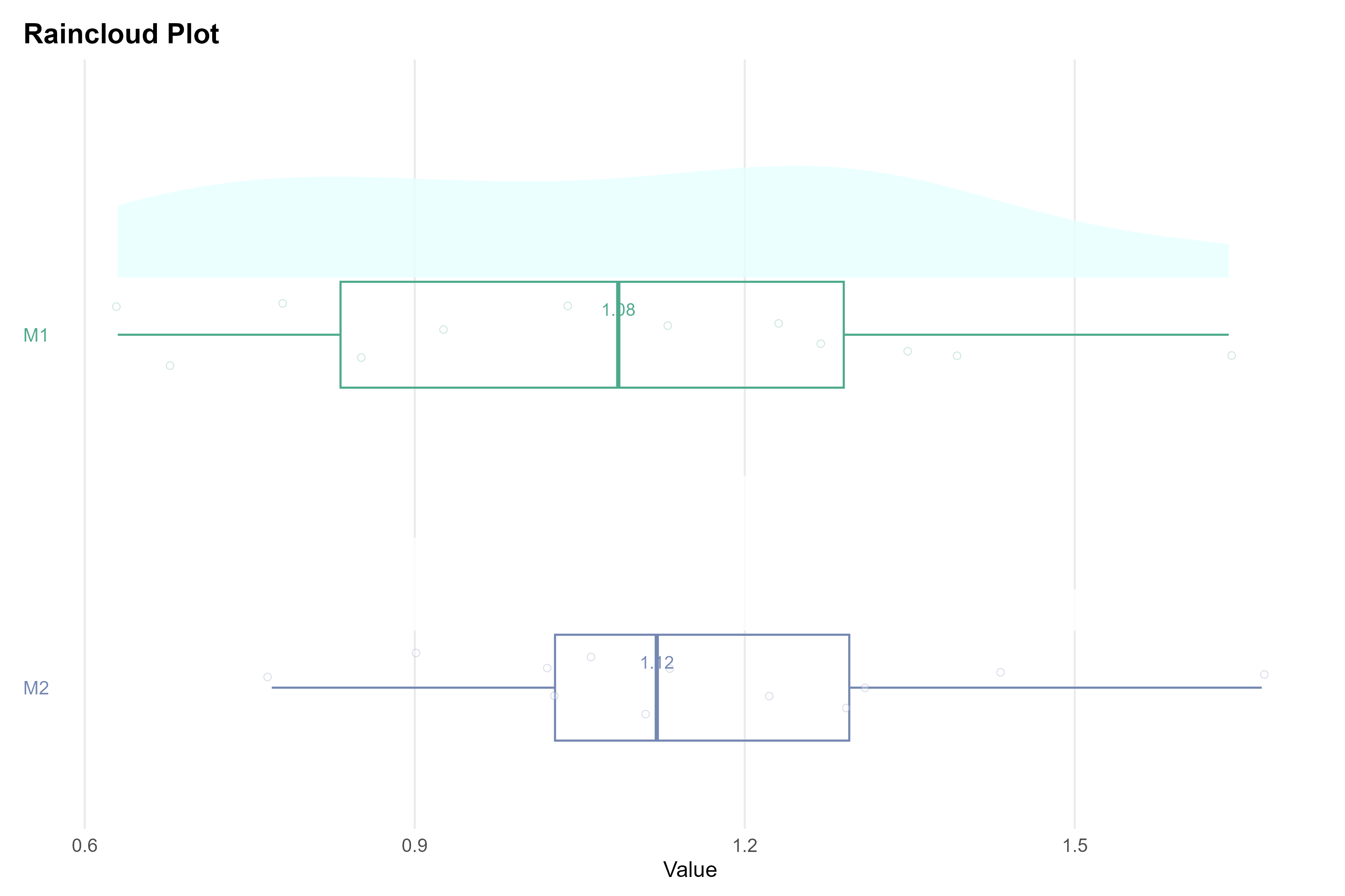
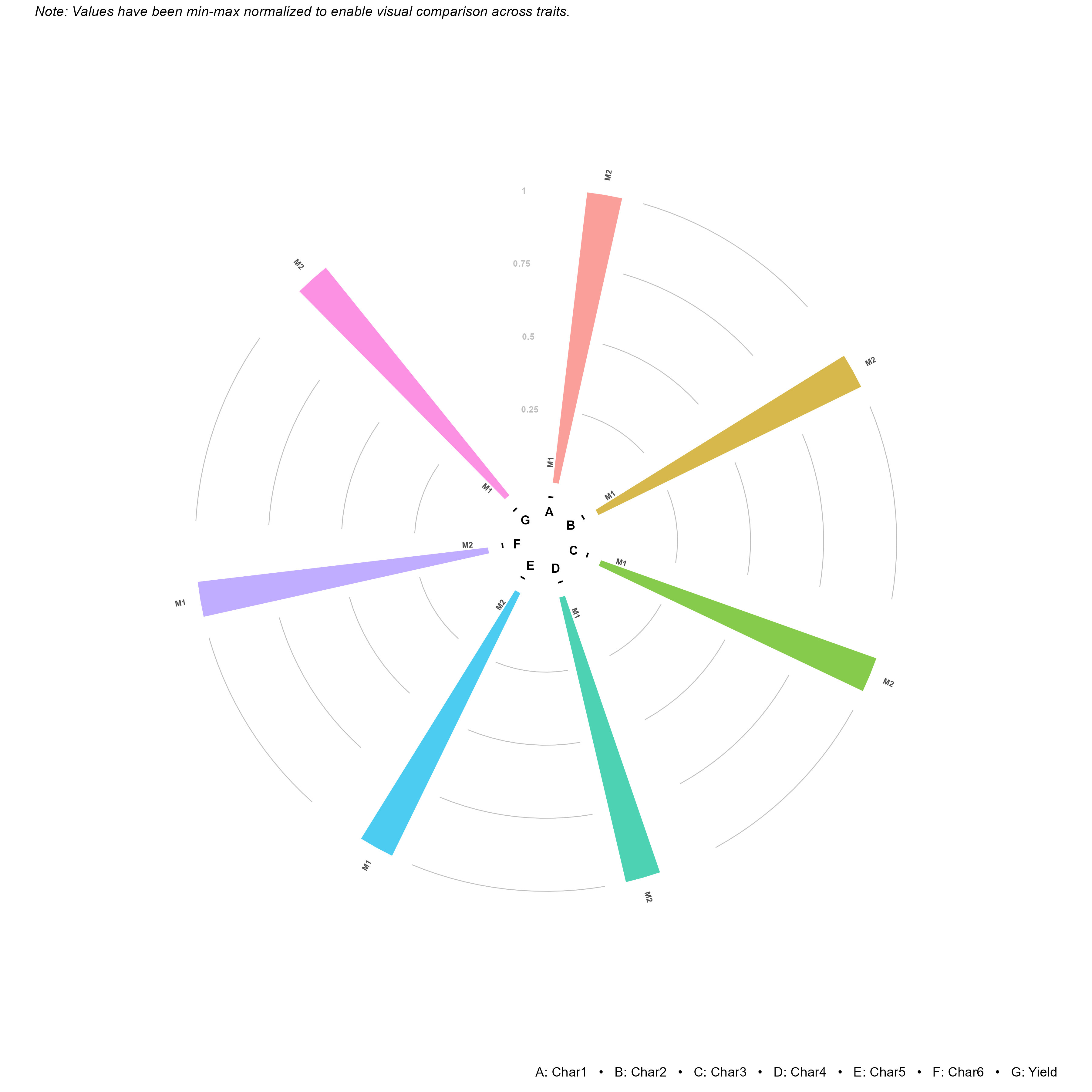
The remaining advanced graphics serve the usual supporting roles. The QQ Plot checks the normality assumption by plotting the model residuals against normal quantiles: points hugging the diagonal support normality, while a pronounced curve or S-shape suggests a transformation (Section 7) may be needed. The Distribution Plot shows the shape of each response directly. The Pair Plot and Correlation Plot are two views of the same pairwise story, a matrix of every trait against every other, and they are the natural preparation for the index score in Section 10, since an index is only worth building from traits that actually move together. The 3D Scatter views place the mean response of each treatment combination over the main-plot × subplot plane, with the connected version tracing the trend across levels.
10 Ranking treatments on all traits: the PCA index
The Analysis.Results tab evaluates each response separately. When several traits are measured and a combined ranking of the six treatment combinations is required, the Multivariate tab provides a PCA-based index score. Principal component analysis summarises patterns of variation among correlated traits through a smaller number of principal components, and the resulting index can be used to rank treatment combinations across the selected traits.
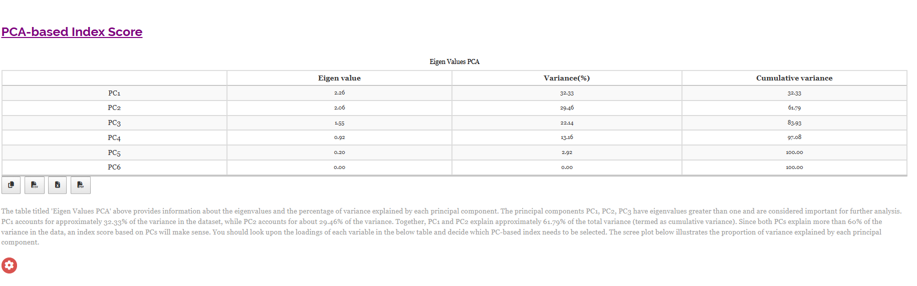
The eigenvalue table (Figure 20) provides information for deciding how many principal components to retain. Here PC1 has an eigenvalue of 2.26 and accounts for 32.33% of the variance, PC2 has 2.06 and accounts for 29.46%, and PC3 has 1.55 for a further 22.14%. All three exceed the conventional eigenvalue-of-one threshold and are worth carrying forward. Together PC1 and PC2 explain 61.79% of the total variance, and RAISINS notes that because both exceed 60% cumulatively, an index built on them is meaningful. PC4 (0.92, 13.16%) falls below the threshold, and by PC6 the cumulative variance has reached 100%.
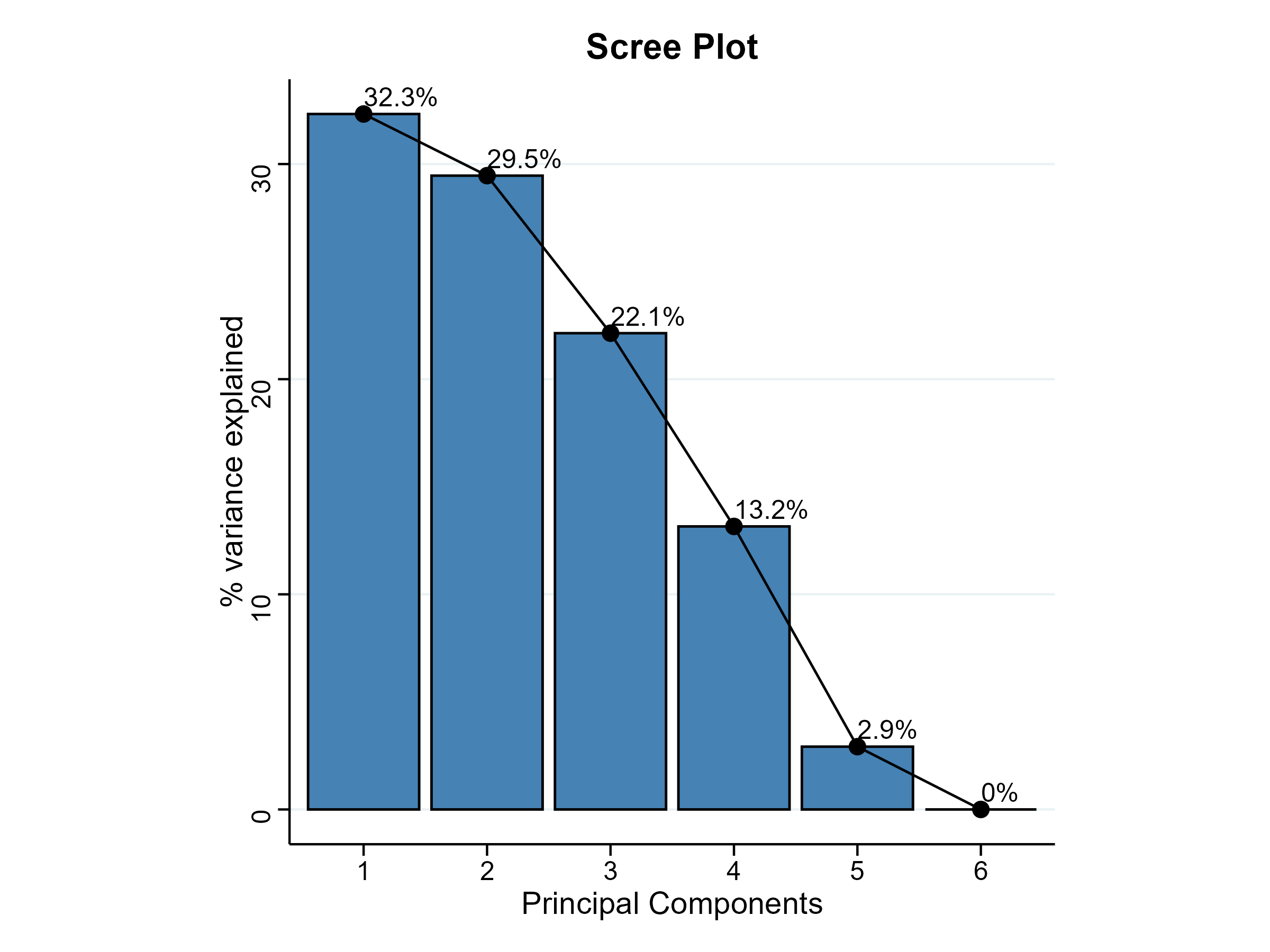
The scree plot (Figure 21) shows the same information graphically, and the reason to look at both is that the picture makes the shape of the decline obvious in a way the table does not. Here the bars fall gently from 32.3% to 29.5% to 22.1% before dropping to 13.2% and 2.9%. There is no sharp elbow after the first component, which tells you something useful: the variation in this dataset is spread across three components rather than dominated by one, so no single index will capture the seven traits particularly cleanly.
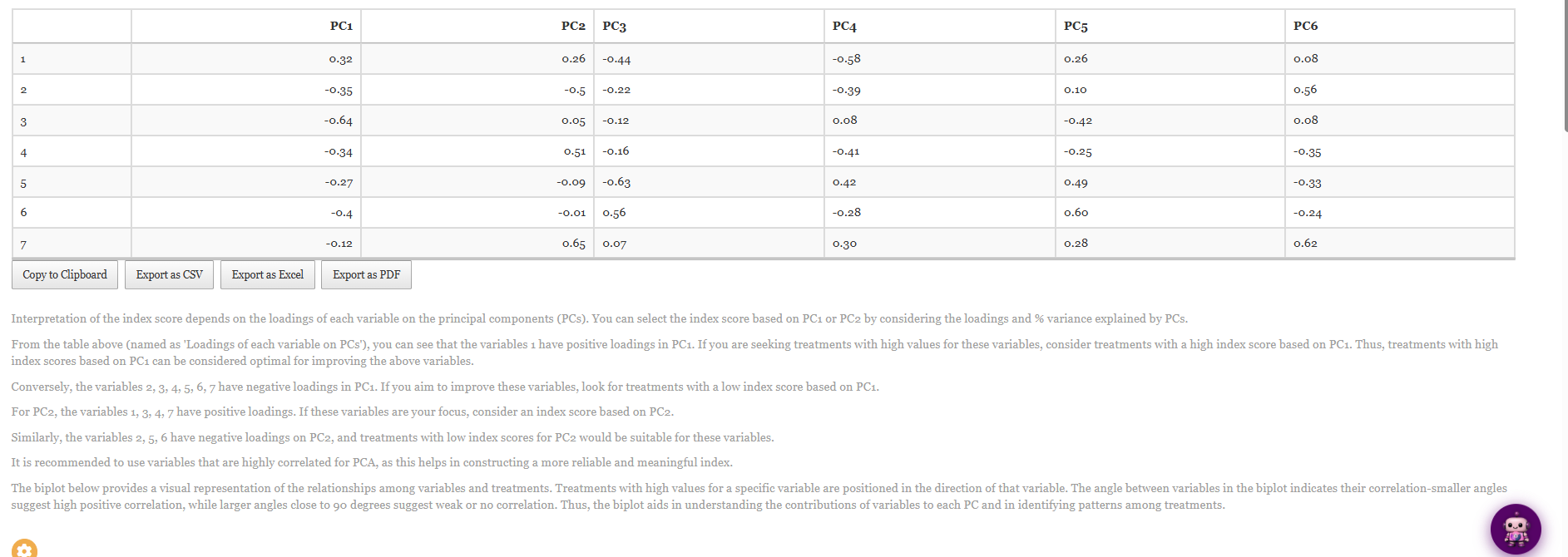
The loadings table (Figure 22) tells you what each component means, and it must be read before any index is used. A loading is the weight a variable carries on a component: variables with large positive loadings push a treatment’s score up, variables with large negative loadings push it down. On PC1, variable 1 is the only one with a positive loading (0.32) while variables 2 through 7 are all negative, the strongest being variable 3 at −0.64 and variable 6 at −0.40. On PC2 the split runs differently: variables 1, 3, 4 and 7 load positively (variable 7 most strongly, at 0.65, followed by variable 4 at 0.51) while variables 2, 5 and 6 load negatively (variable 2 at −0.50).
The practical consequence, spelled out by RAISINS beneath the table, is that the direction of the index depends on which traits you are trying to improve. If you want high values of variable 1, choose treatments with a high PC1 index score; if you want high values of variables 2 to 7, look instead for a low PC1 score. There is no universally “good” end of a component, only an end that matches your breeding or production objective.
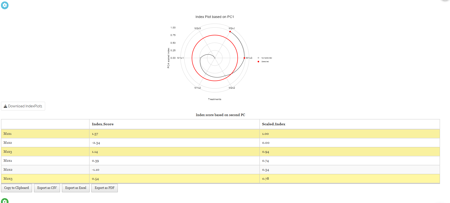
RAISINS then converts the selected principal component into a score for each treatment combination and scales the values to a 0–1 range (Figure 23). The circular index plot draws the six combinations around a dial with the selection cutoff marked as a red ring, and the table beneath lists the raw Index.Score and the Scaled.Index. On the index shown, M1×1 ranks highest with a raw score of 1.37 and a scaled index of 1.00, followed closely by M1×3 (1.14, scaled 0.94) and then M2×3 (0.54, scaled 0.78) and M2×1 (0.39, scaled 0.74); M1×2 sits at the bottom with a raw score of −2.34 and a scaled index of 0.00. The Select cutoff for Scaled Index Score control decides how many of these are highlighted as selected.
The PCA index is exploratory, not inferential. It produces an ordering of treatments, but no p-value, no critical difference and no statement that one treatment is significantly better than another. Nothing in Figure 23 contradicts the finding of Section 8 that only Char2 showed a significant effect; the index is answering a different question. Use it to shortlist candidates for a follow-up experiment, and be especially careful with it here, where the scree plot showed the variance spread thinly across three components and where the letter groupings gave you almost nothing to separate.
The index plot and the score table each name the component they are based on, and they can be switched independently, the plot in Figure 23 is drawn on PC1 while the table beneath it is headed Index score based on second PC. Since PC1 and PC2 weight the traits in genuinely different directions, as Figure 22 shows, always confirm which component produced the ranking you are about to quote.
11 Interpretation
RAISINS also provides a plain-language interpretation of the statistical results. Open the Interpretation sub-tab to generate a summary of the analysis. RAISINS restates the design, a Split-Plot with 4 replications, 2 main-plot treatments and 3 subplot treatments, names the post-hoc test and the significance level, then reads each response in turn: which effects were significant against which error term, what the letter groupings mean, and how large the effects were. For the working dataset it reports the significant A × B interaction for Char2 and the absence of any significant effect for the other six traits. The text is written to be pasted almost directly into a results section.
The interpretation is generated from the same computation as the tables, so use it as a guide, not a substitute. Read it with Figure 9 and Figure 10 open beside it, the numbers in the prose should match the numbers in the tables exactly, which is your quickest check that you selected the main-plot and subplot columns the right way round.
12 Chat with your data using RA-One
RA-One is the built-in conversational assistant for the split-plot module and is available from the RA-One tab. It answers questions using the results generated from the user’s analysis rather than relying on generic statistical explanations. The responses are based on the values available in the analysis, and unavailable results are identified rather than inferred. The explanations are presented in plain language without requiring code or software commands.
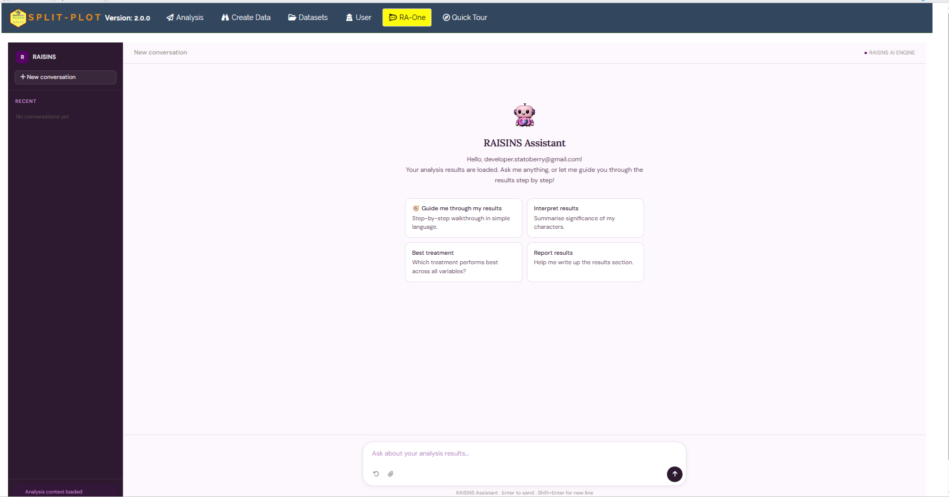
Once your results are loaded, RA-One greets you and offers four quick-start prompts (Figure 24): Guide me through my results for a step-by-step walkthrough in simple language, Interpret results to summarise the significance of each character, Best treatment to ask which combination performs best across all variables, and Report results to help draft the write-up. You can also type your own question, for example “is the interaction significant for any trait?” or “which subplot treatment gives the highest Char2 under M2?”. A small status line in the corner confirms that the analysis context has been loaded.
The Report results prompt is particularly useful for a split-plot, because the reporting conventions are less familiar than for a one-way ANOVA. Asked “How should I report this results in a paper?”, RA-One returns an ordered checklist (Figure 25): state that the design was a Split Plot Design with 4 replications; name the main-plot factor and its 2 levels; describe the subplot factor and its 3 levels; give the multiple-comparison procedure and the alpha level; report the significance of the main-plot, subplot and interaction for each response; and then the rule that matters most here, if the A×B interaction is significant for any variable, present the A×B means table with grouping letters; if not significant, present the main effect means for A and B separately. It closes with the citations for RAISINS and for R itself.

The same chat interface can also prepare data. It can generate a correctly formatted design template (Section 6.4), including a check of the error degrees of freedom, or provide a model dataset (Section 6.3) for practice and demonstration.
Within a single conversation, RA-One can interpret your results, build a data template, fetch a model dataset, and help you draft the write-up, so most of a routine split-plot session can be conducted without ever leaving the chat window.
13 FAQs
The module includes a dedicated FAQs sub-tab containing explanations of common questions and guidance on the available features. Two questions are particularly important for a first analysis because they are specific to the split-plot design: which factor should go on the main-plot?, which restates the practical rule from Section 1, and why are there two CD values?, which covers the same ground as Section 8.1 from the reporting side. The same explanation is always one click away inside the analysis itself, through the Know more button beside the CD selector (Figure 11).
14 View data
View Data is the primary diagnostic tool for ensuring data integrity before analysis. When you upload your dataset, RAISINS runs an automated Health Check to validate the file: it confirms that the main-plot, subplot and replication columns are present and read as categorical labels rather than numbers, that the response columns are numeric, and that there are no stray blanks or misaligned rows.
For a split-plot it also checks the property that defines the design: that every subplot treatment appears once inside every main-plot × replication combination. If a subplot is missing from one whole plot, or a treatment label is spelled two different ways, the nesting breaks, the two error terms can no longer be cleanly separated, and the critical differences of Section 8.1 stop being exact. Fix anything flagged here before trusting the results, and cross-check the Missing column of the Summary Plot in Section 9, which should read 0.00 throughout.
15 Wrapping up
A split-plot design is appropriate when a practical constraint prevents one factor from being randomised over small experimental units. The resulting two-stage randomisation creates two types of experimental unit and, consequently, two error terms. These error terms lead to different critical differences: CD[A(B)] for comparisons within a whole plot and CD[B(A)] for comparisons involving whole-plot differences. When interpreting the results, identify the error term used for each F-test and select the critical difference that corresponds to the comparison of interest.
The design also has an important limitation: the main-plot factor is tested using relatively few degrees of freedom and therefore generally has lower precision than the subplot factor. A split-plot design is most appropriate when this loss of precision is justified by the practical requirements of the experiment. If both factors can be randomized freely to small experimental units, the two-factor factorial CRD module may be more appropriate. When natural blocks are present, the two-factor factorial RBD module can be considered. If an additional level of splitting is required, the split-split-plot module provides the corresponding analysis. RA-One and the support resources are available when further guidance is required.